How to design a contemporary book cover
Create appealing book cover designs for the digital world.
Illustration, typography or photography?
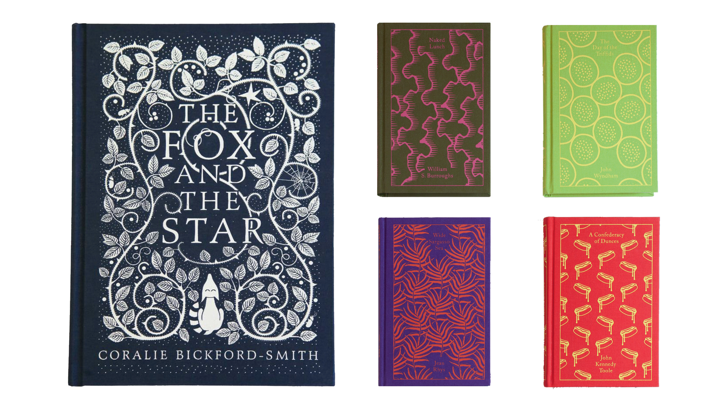
Looking at current book designs, it’s hard not to conclude that illustration is enjoying a fertile period. Coralie Bickford-Smith is widely celebrated for her illustrated covers, which use naturalistic patterns and motifs.
When asked whether she thinks her work is representative of a preference amongst book buyers for illustrated covers, she says, “It is more likely a trend that is coming from the number of illustrated covers coming out of the publishing houses that end up adorning the bookshops, rather than the book buyers making a deliberate aesthetic choice.” Bickforth-Smith adds that the use of photography and illustration on book covers seem to go in cycles of popularity.
Although she has previously used photography in her cover designs, Bickford-Smith isn’t keen on doing so. “A shoot is usually over in a day, and the results are final, bar some great Photoshop work,” she says.
“I like to work slower than that. I like time to consider the idea. I need to stare at rough work a lot. I really think it’s a personal thing. Also, given how I’m obsessed with pattern, right now illustration is a perfect way for me to express those ideas visually.”

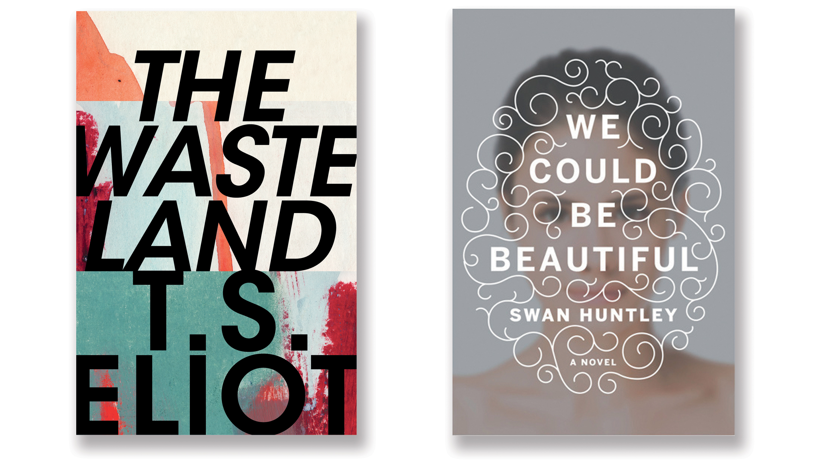
For Pearson, the choice is easy: “I cannot illustrate covers – I have to rope in others to do that – and I’m terrified of photography – cropping other people’s art to fit a cover shape makes me feel sick. That leaves typography, and I tend to lean on it for everything. Using lettering in place of representational imagery can also help to activate reader interpretation – I think we enjoy working for answers.”
Pearson adds that typography also presents a lovely challenge for a designer – to sum up an entire book using such limited graphic means.
“I think typographic covers are great for being timeless, not revealing too much, and they work particularly well if the title is just brilliant,” says Erkas. “Illustrated covers are great for capturing feelings that photography can’t. And photographic covers are great for showing something real, but can also be dreamy, abstract and illustrative.”
Get the Creative Bloq Newsletter
Daily design news, reviews, how-tos and more, as picked by the editors.
Books online and e-Books
Just as record cover designers had to adjust to the loss of the 12-inch square album cover, replaced by the reduced canvas of the CD, book jacket designers are learning to adapt to the e-book format. But what is the role of a cover in publishing e-books?
In Pearson’s opinion, “beyond working as a thumbnail at the point of sale in the online shop”, there is no role for a cover in electronic format. “When the e-book is purchased and installed, there seems no good reason for a cover image at all, especially if it takes up more memory than the book itself,” he argues.
Crow takes a similarly stringent line. “I have never read an e-book. I read manuscripts on an iPad, but a paperback isn’t much heavier than an e-book reader, and I prefer real pages. Our covers are used to sell e-books online in any case. It would be less interesting to buy a book from a list of titles without some visual trigger to hint at the contents,” she says.

For Stoddart, the need for a book to have an online presence is factored into his thinking from the start. “One recent project I’ve been very excited about is an update to the Penguin Modern Classics series, initiated with a casual discussion about whether we could make [the series] more visible as online thumbnails."
"This is a contentious issue – many people will argue that more and more books are bought online and their visibility at a small size is fundamental. Yet books listed on websites are usually accompanied by text, a reiteration of title and author, and a bucket of metadata.”
To find a solution, Stoddart turned to colour. “A recent update of the Modern Classics template uses Penguin ‘eau-de-nil’ – a muted light turquoise which has evolved from other parts of Penguin’s history. This eau-de-nil is a beautiful colour that works well in the flesh and online. I’ve moved it onto the spines (which were an all too crisp white) and the back covers, and have used it as a brand note on the front cover titling.”
It’s flashes of creativity like this that keep the field exciting. “If all bookshops ended up having to stock books with giant titles and images, the world may as well be over,” Stoddart concludes.
This article originally appeared in a 2017 edition of Computer Arts magazine. Subscribe here.
Related articles:

Thank you for reading 5 articles this month* Join now for unlimited access
Enjoy your first month for just £1 / $1 / €1
*Read 5 free articles per month without a subscription

Join now for unlimited access
Try first month for just £1 / $1 / €1
Current page: Illustration, typography or photography?
Prev Page How to achieve shelf standout
Adrian Shaughnessy is a graphic designer, writer, publisher, and senior tutor at RCA. Adrian is co-founder of the publishing imprint Unit Editions. The company publishes a wide range of graphic design books. Shaughnessy is the author of monographs on Herb Lubalin, Ken Garland, FHK Henrion and Lance Wyman. He has also edited, or co-edited: GraphicsRCA: Fifty Years and Beyond. (RCA); Manuals 2. Design and Identity Guidelines (Unit Editions); and Total Design 1963–73. Expanded edition (Unit Editions).
