How to design a contemporary book cover
Create appealing book cover designs for the digital world.

The fine art of book cover design is a tricky one to master. Consider: when the graphics on the packaging of Heinz baked beans are changed, or the typography is modified on the wrappers for Kit Kats, the alterations are barely noticeable to the untrained eye. The design of household brands is tampered with as little as possible.
An even more stringent, no-tampering rule is applied to album covers. No record label would dare think about changing the covers of Sgt Pepper’s Lonely Hearts Club Band, The Dark Side of the Moon or Nevermind. It appears that the packaging design of baked beans, chocolate bars and pop music is treated with more reverence than the jackets of literary fiction.
Literature is universally accepted as high art, which might lead us to think that the covers of literary classics are free from the need for frequent stylistic updates. Not so. It is common practice amongst publishers to update the covers of the classics almost constantly, in much the same way that Nike updates its trainers.

Book cover design challenges
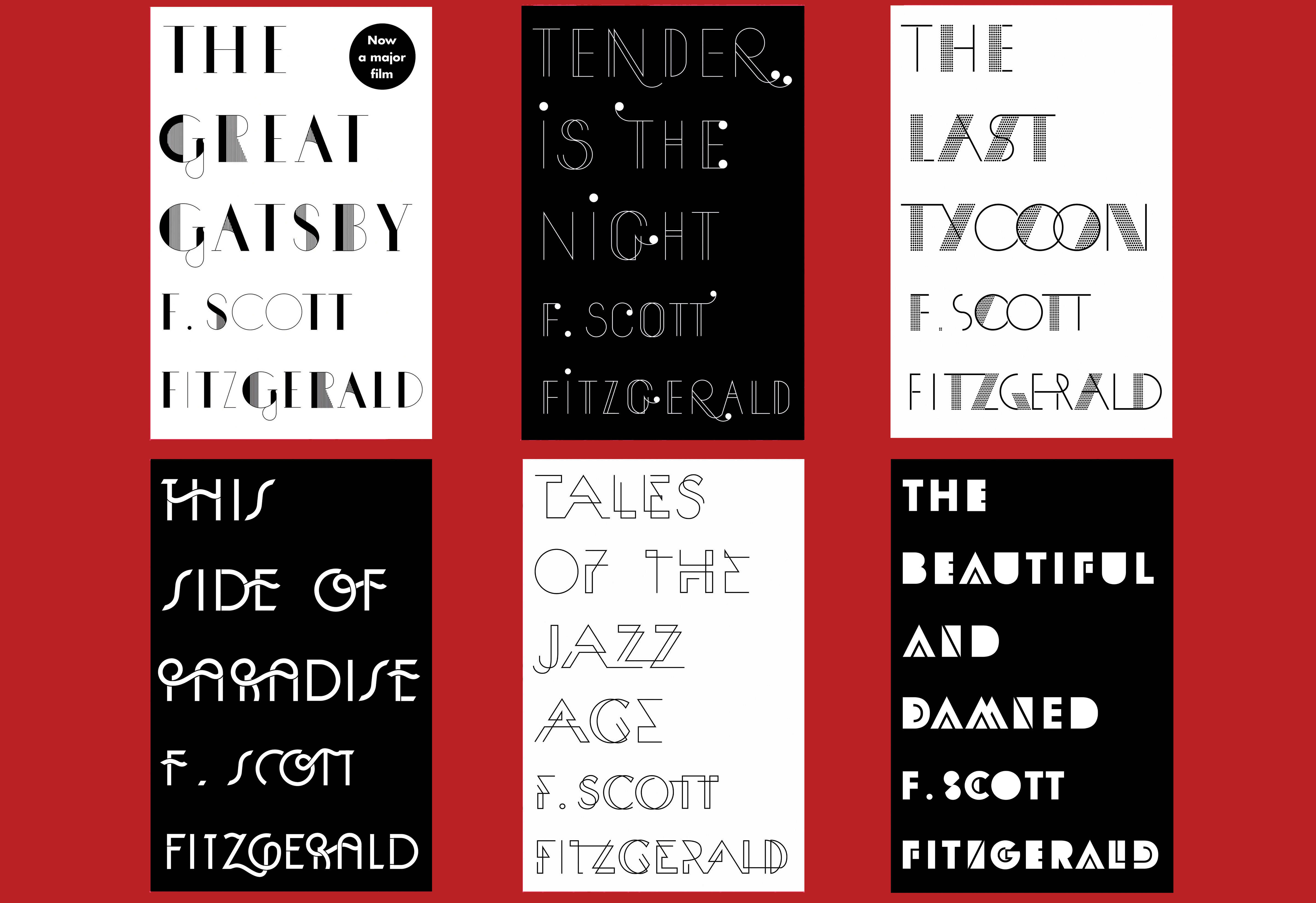
Sinem Erkas has been designing book jackets for eight years, and her typographic covers for F. Scott Fitzgerald’s novels are a lesson in putting a fresh spin on a classic text.
“At the time, Fitzgerald’s stories were out of copyright, so loads of publishers were republishing his books, and I imagined many of them would end up as pastiches. I wanted to avoid that, so instead took the opportunity to draw inspiration from beautiful Art Deco typography and the Jazz Age, but making my own custom typefaces that felt contemporary and hinted at Art Deco rather than looking like they were from the 1920s. There was no budget for finishes, so we decided to stick to a monotone colour palette and uncoated stock.”
The challenge of designing a new take on a ubiquitous text is good news for designers. And even if designing a cover for a new edition of On the Road may not be as financially rewarding as tweaking the Kit Kat logotype, I know which I’d rather do.

Designing book covers is in one way like designing album covers: most people do it for love rather than reward. I spoke to some book cover designers to find out more about working in the field.
Get the Creative Bloq Newsletter
Daily design news, reviews, how-tos and more, as picked by the editors.
Why be a book cover designer?
David Pearson is one of the UK’s leading book jacket designers. He studied at Central Saint Martins, and after a period working as a text designer at Penguin, he now runs his own studio. “My inclination to overthink, fuss and fiddle could only be accommodated by the relatively slow-moving nature of publishing,” he says. “Working within constraints – be they because of brief or budget – also seems to speak to my nature.”
Pearson’s career in publishing began while he was at university. “I was fortunate to be asked by my tutor, Phil Baines, to lay out a Phaidon book. Part of the job was to present our ongoing work to the great Alan Fletcher – at that time, creative director of Phaidon – for his feedback.”
Later, during his time setting the type for the interiors of Penguin books, Pearson was to discover that he was working in what he describes as, “a nice, sedate job.” There was room to focus on the detail and lose yourself in the book. Plus: “Nobody really had an opinion on your work, unless you did it wrong.” But this all changed when Pearson began to design book covers.

In contemporary publishing, the cover is subjected to the same intense scrutiny as any consumer product. It’s also the case that many authors care deeply about the covers of their books. In his acceptance speech on receiving the 2011 Man Booker Prize for his book, The Sense of an Ending, the novelist Julian Barnes paid generous tribute to the book’s cover designer, Suzanne Dean.
He said: “Those of you who’ve seen my book – whatever you may think of its contents – will probably agree that it is a beautiful object. And if the physical book, as we’ve come to call it, is to resist the challenge of the e-book, it has to look like something worth buying and worth keeping.”
Not only must a book cover attract attention by reflecting the content, it must do this online, in bookshops and as an e-book. It must also satisfy the demands of publisher, author and designer – not to mention the book buyer. This is quite a lot to demand of a few square centimetres of card.
Next page: Do you need to read the book to design a great cover?

Thank you for reading 5 articles this month* Join now for unlimited access
Enjoy your first month for just £1 / $1 / €1
*Read 5 free articles per month without a subscription

Join now for unlimited access
Try first month for just £1 / $1 / €1
Current page: Book cover design challenges
Next Page Do cover designers need to read the book?