How to create a photorealistic 3D scene
Discover the four main stages to follow in order to create a photorealistic 3D still life.
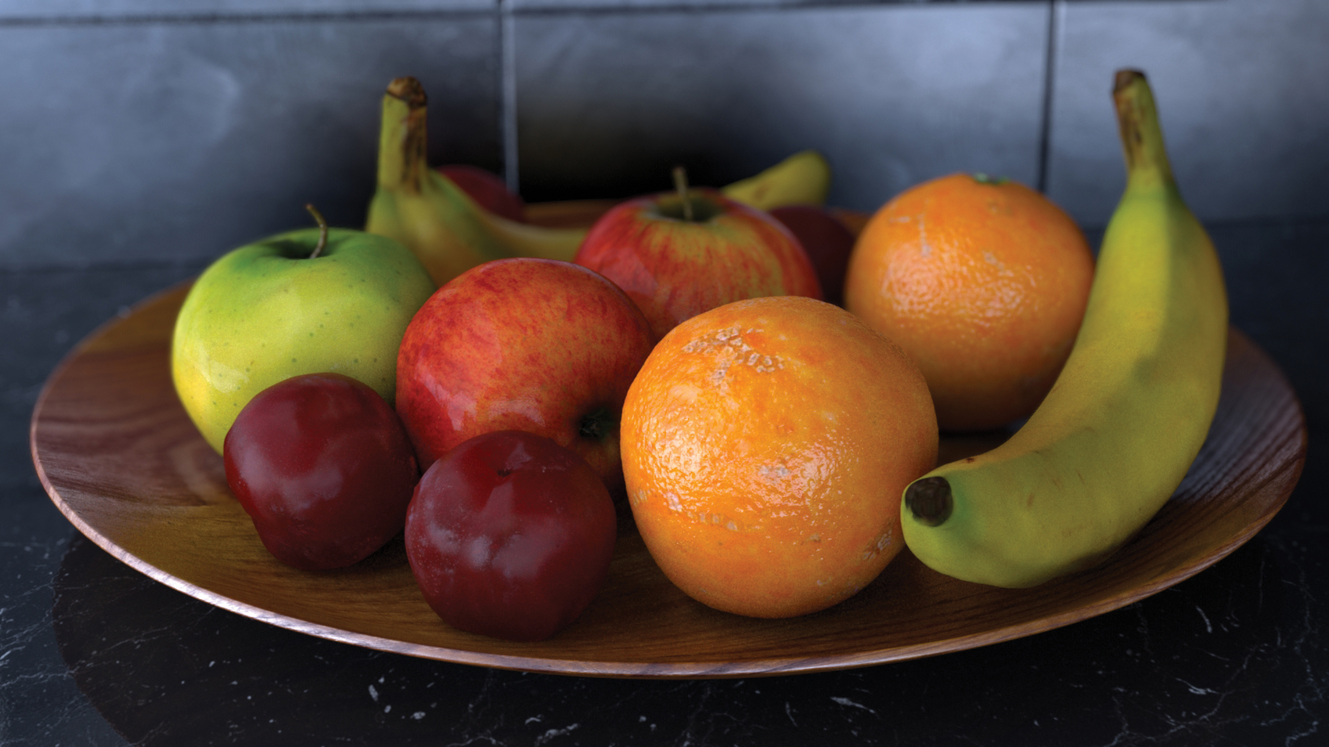
In order to achieve photorealism with 3d art we need to consider the four main stages of the pipeline; modelling, texturing, look development and lighting. If we neglect any one of these stages, our image will fall flat and won’t look right.
With a given shot you will start with a model; don’t jump ahead by adding textures just yet, let’s add a physically plausible shader and set our diffuse colour to 50% grey with some specular, and 0.5 roughness and set up our lighting. For most of my shots I’ll use three main lights; a HDRI, an area light for nice soft shadows; and a directional/sun light.
Next, align the directional light to the angle of the sun in your HDRI. Typically a HDRI will give a reasonable result with weak shadows so I tend to decrease the HDRI’s gamma in Photoshop to around 0.75 and increase the contrast to achieve more dramatic and darker shadows. Only add lights into the scene that physically make sense in real-world terms. In addition, lights are added to create rim highlights which can really make an image pop. Only add lights that could be added on set or in the real world.
Article continues belowTo achieve a photorealistic shader we need to pay close attention to the specularity and roughness attributes
Once our lighting is set up we can move on to our shader. To achieve a photorealistic shader we need to pay close attention to the specularity and roughness attributes. Typically they will need texture maps assigned to the slots to break up the surface of the material and create variation.
A quick tip would be to add HSV/remap nodes inbetween the texture map and your shader so we can quickly darken or lighten the texture to achieve a more rough or shiny surface. Have a play around with the shader, testing it out and tweak the numbers (learning from your mistakes!) making minor corrections until you’re happy with the result. Lastly I like to add some depth of field to the camera to enhance the real-world feel of a physically based real-world camera.
01. Modelling
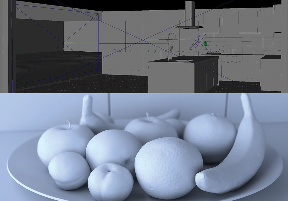
I like to get the basic outline of the model correctly matching the photo reference. Keep it very low poly then subdivide when complete. The orange was the only piece that needed displacement mapping so take your basic orange model into ZBrush and use a texture map as an alpha to reproduce the bumpy effect of an orange. Examine the pores of the orange closely!
02. Lighting
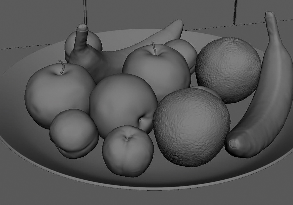
I placed two area lights from the windows and an additional area light at a 45 degree angle above the fruit to give a nice rim highlight. Divide one HDRI image into three separate images in Photoshop and put them in the colour slots of the area lights. This will add a lot more colour info in the light and shadows and break up that uniform based look an area light gives.
Sign up to Creative Bloq's daily newsletter, which brings you the latest news and inspiration from the worlds of art, design and technology.
03. Texturing & shading
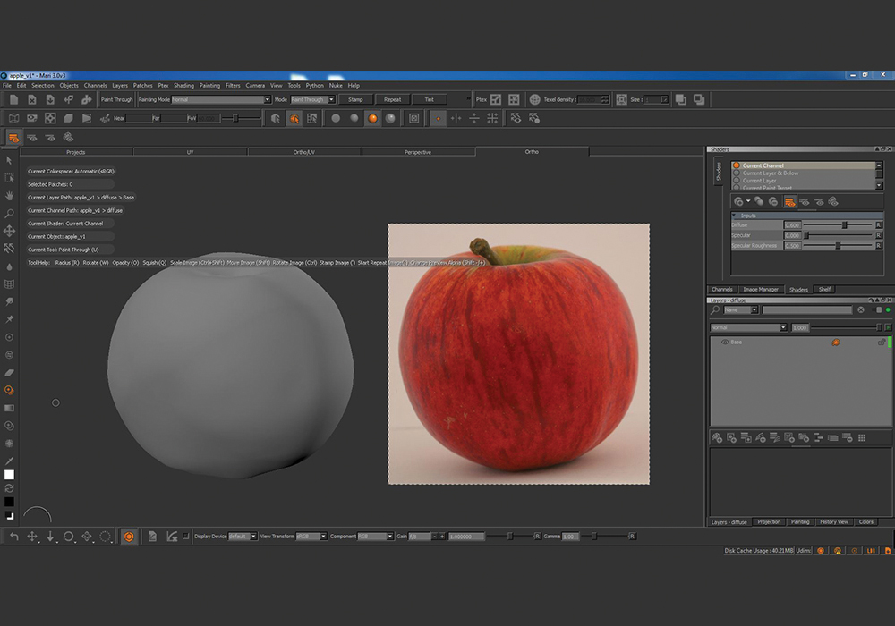
Import the subdivided model into Mari and hand paint our textures. Next export the maps and connect them up to an energy conserving shader such as an alSurface or VrayMtl. We can create all the maps (diffuse/ bump) with the diffuse map alone using Photoshop. To create a specular map convert the diffuse map to black and white and for a roughness map just invert the specular map.
04. Sub surface scattering (SSS)
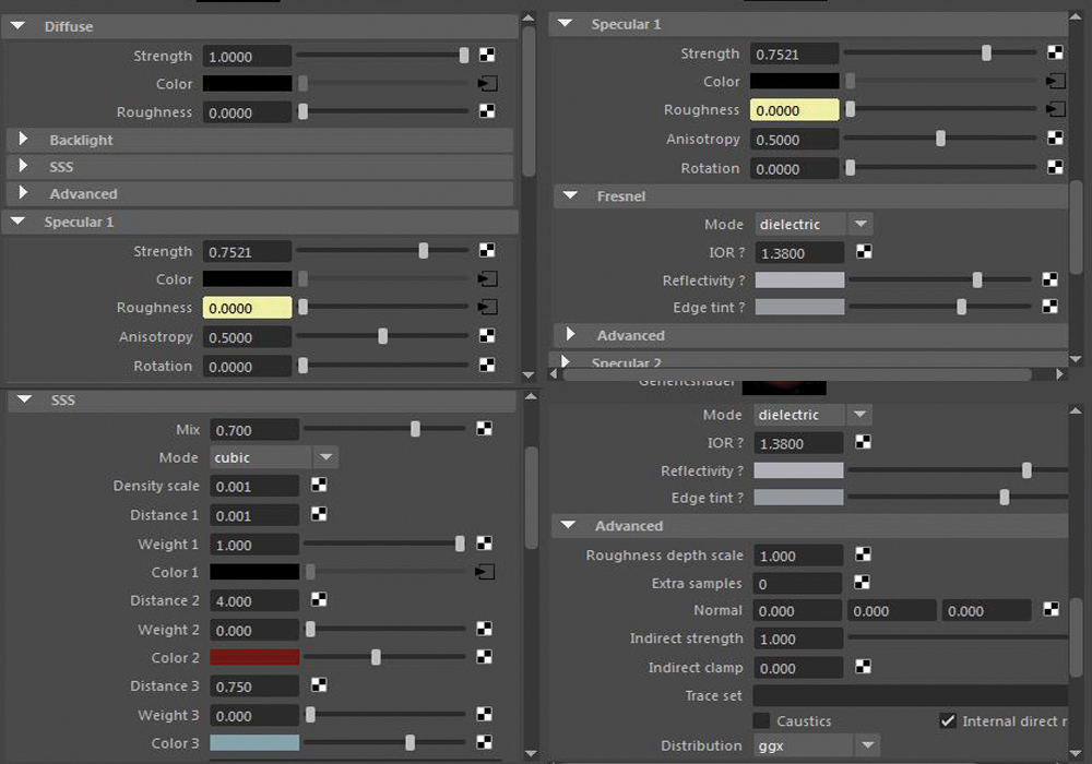
This is what makes our fruit look juicy and soft and without this setting it just doesn’t look real! I have more SSS on the bananas and the oranges because they appear softer. An apple is a lot shinier suggesting that more light is reflected off the object rather than being absorbed and scattered inside of it. Once we’ve set that up our shader is finished so we can hit render!
This article was originally published in 3D World magazine issue 211. Buy it here.
