How to create a killer social media campaign
Five pro tips to use images more effectively in branded social posts.
Catching people on social media can be equal parts art and science. Attention spans are short, with users often scrolling quickly through their feeds, and dipping in and out of multiple conversations.
Classic pitfalls when trying to engage people through social media campaigns include being too dry and corporate, or conversely, trying too hard to be 'cool' and missing the point entirely. Some campaigns hit the mark in some places, but might be culturally tone-deaf in others and face a backlash as a result.
Brands such as Wendy's, Innocent and Oreo are all famously on-point when it comes to their social interactions across multiple platforms. And much of that comes down to brand voice and personality.
Images can be hugely effective to grab attention and encourage social sharing, if you get them right. Read on for our five-step guide to using images more effectively on social media...
01. Tailor images to different platforms
First up, it's important to understand that an image that flies on one social network won't necessarily gain any traction on another. So it pays to tailor the images to the right platform.
Beautiful, striking and evocative images tend to fare well on Instagram, particularly if they're simple and dynamic in composition. Conversely, Pinterest users respond better to pictures that have lots of detail and visual interest to explore, such as collections of handcrafted objects or inspiring interiors.
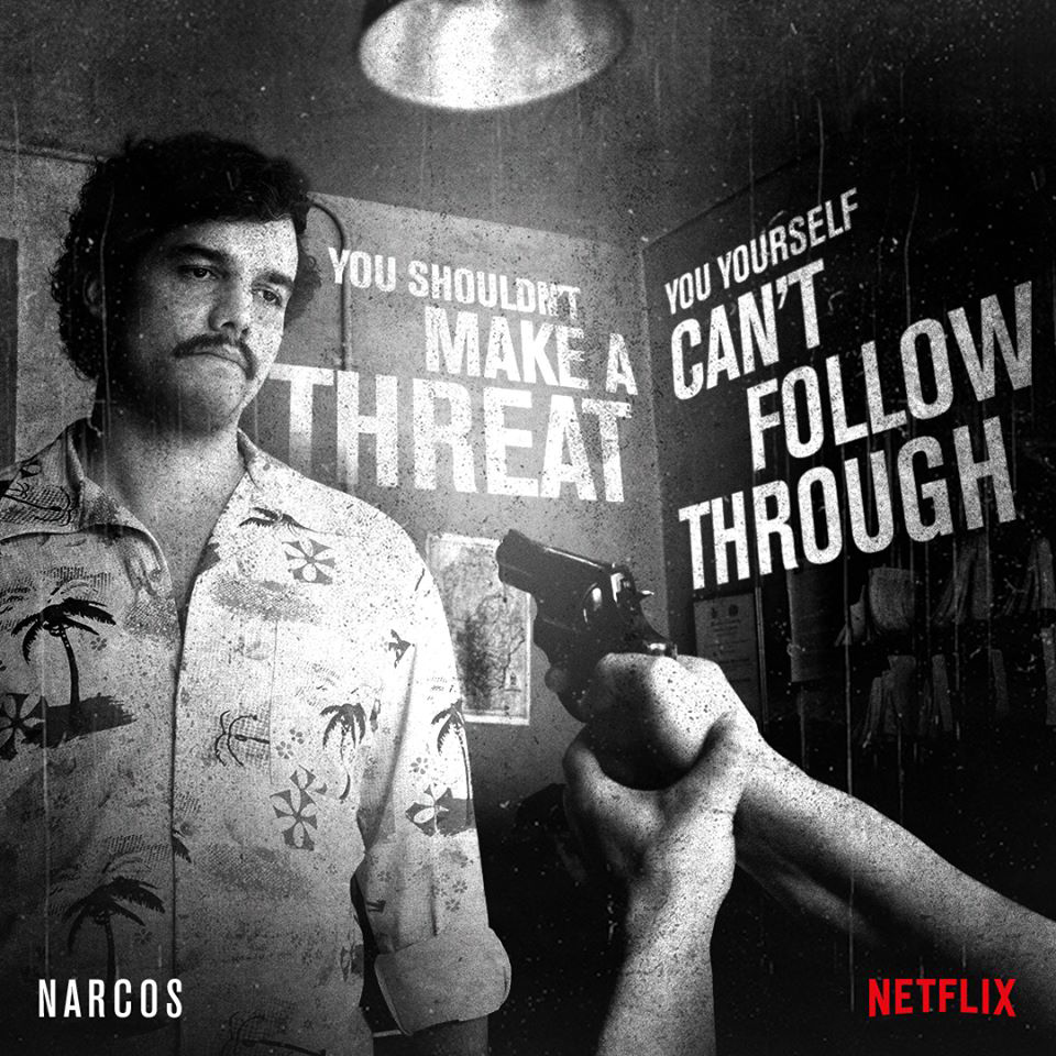
Facebook users tend to share funny and entertaining images that have some kind of emotional resonance within their friend group. Twitter is much more fast-paced, and images that offer interesting information quickly fare better – such as Netflix's awareness-raising campaigns for its shows, which combine compelling quotes with striking promotional stills.
Daily design news, reviews, how-tos and more, as picked by the editors.
As well as content, each social network also has its own guidelines for image dimensions, so take the time to optimise your campaign accordingly. Don't just crop and resize to try and squeeze a square peg into a round hole.
02. Have a clear goal for each image
Consider what the end-goal of your social campaign should be, and tailor the imagery and messaging accordingly. If its about general brand awareness, you can afford to be more abstract, but a coherent brand voice is still crucial.
If you're selling a product, overtly promotional posts are unlikely to fare as well as humorous, clever or entertaining images that have shareable value in their own right - even if the product is prominently featured.
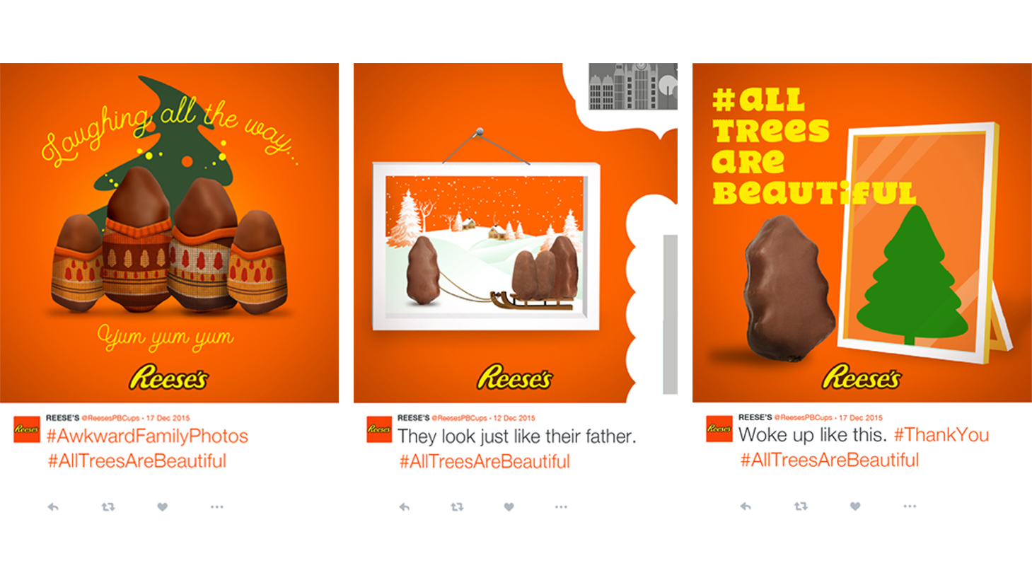
One great example is Reese's Webby Award-winning 'All Trees Are Beautiful' campaign, which was an inspired tongue-in-cheek response to complaints about the misshapen nature of its Christmas Tree-shaped chocolates.
Amusing 'love your body' inspired social media images were shared around the #AllTreesAreBeautiful hashtag, cleverly turning a negative online conversation into a selling point for the brand.
03. Consider why people will share it
In a feed cluttered with noise, both welcome and unwelcome, people will only click on, share or like your campaign image if it genuinely resonates with them - so understanding the motivations of your target audience is essential.
If you've run similar campaigns before, study all the data you have available to determine what images fared best with which demographics – Facebook Insights is particularly useful here. Or study the competition's most successful efforts, and why they worked.
As a rule of thumb, shareable images are simple and manageable, and visually convey a message or piece of information that is easy to digest and recognise - something universal.
They could be amusing, such as the Reese's example above – but not all brands can pull off humour, nor is it always appropriate. Useful or thought-provoking images, or images that make a canny observation on our everyday lives, can all touch a nerve if pitched right.
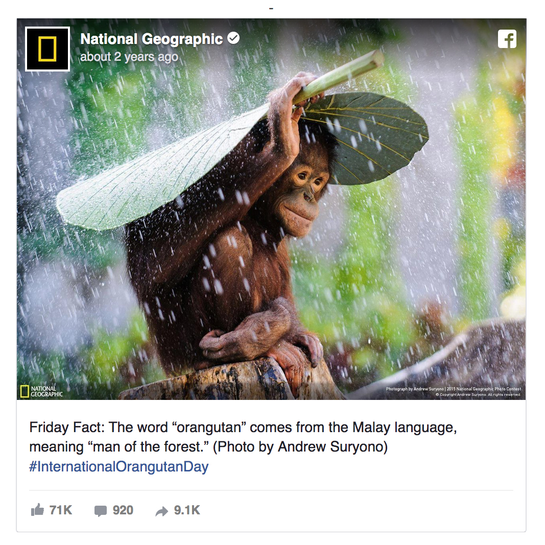
Sometimes, it's enough just to have an image that's beautiful enough for people to want to spread around the internet. National Geographic's Friday Fact campaign on Facebook, for instance, combined a snippet of interesting information with a stunning photo – the perfect combination for that audience.
04. Pick images that tell a story quickly
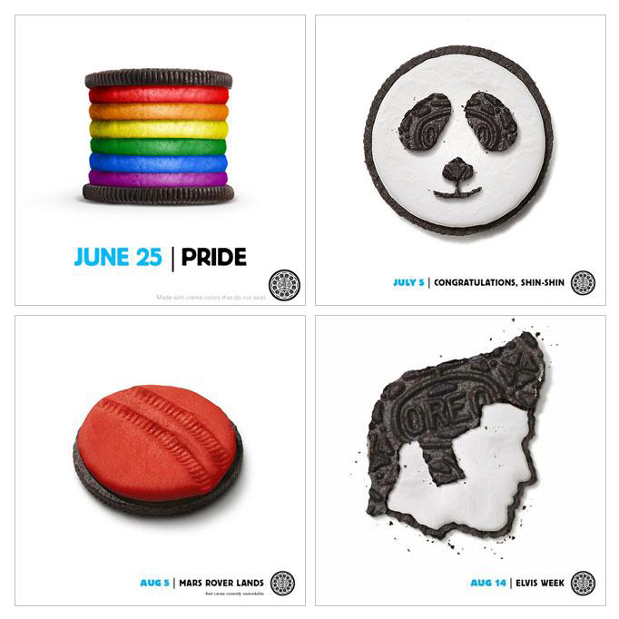
Appealing, shareable social images manage to combine a visually appealing subject with a layer of context as quickly and simply as possible. Visual shorthand can help tell more complex stories: it needs to be immediately clear which brand it belongs to, and quick and easy for a viewer to understand.
As mentioned above, Oreo is well-known for its mastery of social imagery - producing a constant stream of fresh, original, relevant visual content for its various social platforms. These have included cookie-themed graphics for everything from Pride to the Mars Rover landings, and even a whole series of Vine videos spoofing classic horror films for Halloween.
Different types of imagery can cater to different needs. For instance, photography is ideal when there's a powerful, unusual image that speaks for itself, whereas bold text over a bright, simple background puts all the onus on a particular message or quote. Illustrations, meanwhile, can help stimulate the audience's imagination, and give you more scope for abstract, surreal or unusual subject matter.
05. Design for short attention spans
When attention spans are short, you need a way to hook people in – and sometimes a killer image alone isn't enough. Like any creative campaign, the ultimate goal on social is to create something compelling enough to stop people in their tracks, and spread it to their friends.
Diner chain Denny's has built a reputation for being playful, silly and weird in its social campaigns - often poking fun at other brand, such as the Apple-baiting 'Pancake[S]. Always available in golden' that accompanied a stack of mouth-watering syrup-drizzled pancakes.
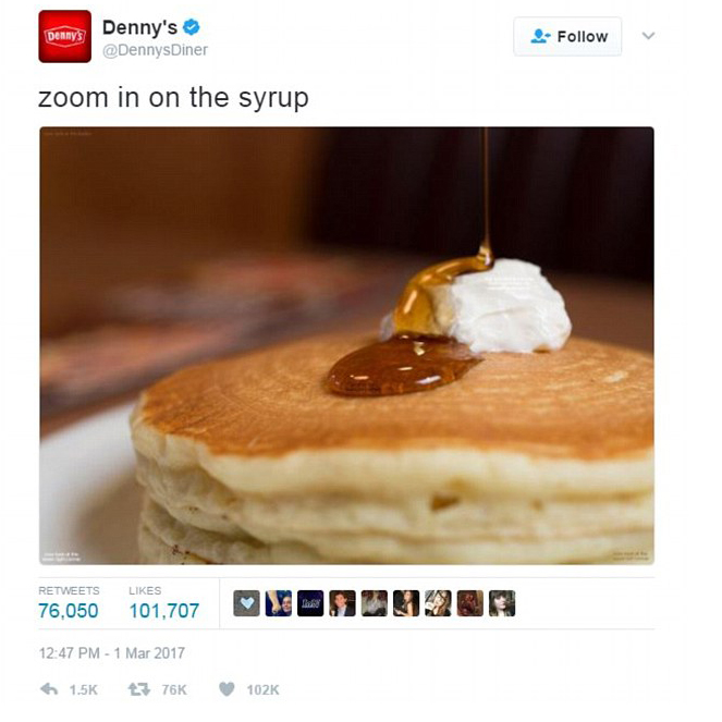
In that case, a quality stock image could theoretically have done the job - but the simple, playful spoof of a well-known ad was what hooked people in. Once of Denny's most successful social images to date was also pancake-themed, and was accompanied simply by "Zoom in on the syrup."
In classic 'zoom in' meme style, a tiny message inside the syrup takes you to each corner of the image in turn, before finally ending up in the butter with the final pay-off: "Has this distracted you from overwhelming existential dread lol."
Beautifully simple, very on brand, and it ultimately got hundreds of thousands of people to like and share an otherwise fairly unremarkable (albeit very appetising) picture of some Denny's pancakes. That's the power of a savvy social campaign.
Related articles:

Nick has worked with world-class agencies including Wolff Olins, Taxi Studio and Vault49 on brand storytelling, tone of voice and verbal strategy for global brands such as Virgin, TikTok, and Bite Back 2030. Nick launched the Brand Impact Awards in 2013 while editor of Computer Arts, and remains chair of judges. He's written for Creative Bloq on design and branding matters since the site's launch.
