Portfolios are for life, not just for internships. Throughout your career, your design portfolio will be a vital tool in winning better jobs and new freelance contracts. But talented creatives often fail to capitalise on these opportunities by neglecting to raise their portfolio to the right level.
Whether you’re a student looking for your first gig, a middleweight wishing to advance, or a senior hunting for your dream position, your portfolio could probably do with some attention.
At its most fundamental, design is about empathy. So the essence of getting your portfolio right lies in understanding your audience – in this case, the designers, agency heads and recruitment specialists who’ll be looking at it. And there’s one thing you need to appreciate about all of these people: they have very little time.
We’re going to assume you’re already familiar with the basics of creating a good design portfolio. In this article, you’ll find extra tips and advice from hirers at top agencies, for every stage of your career, and if you're in need of more inspiration, take a look at our round up of the best graphic design portfolios from around the web.
Grab attention with a visual portfolio
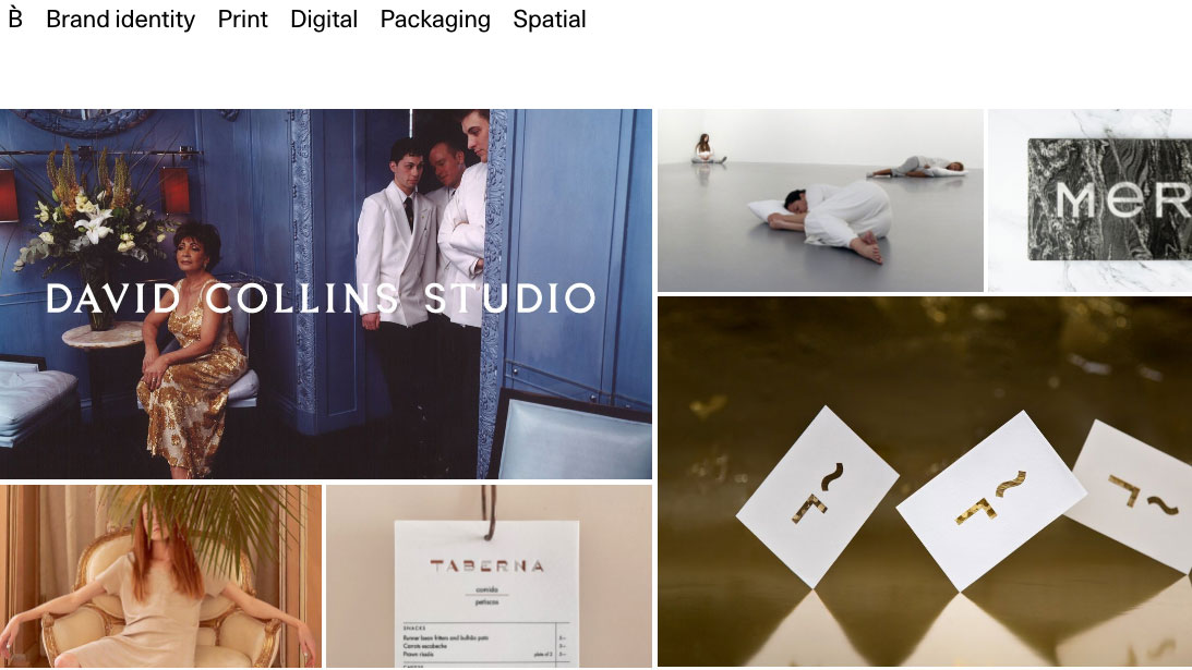
Olly St John, a designer at boutique agency NB Studio says: “Because we’re quite a small team, I tend to deal with looking at interns’ and freelancers’ portfolios,” he explains. “But we get tons of them. With such an intense amount to look at, that dictates how much time I can spend looking at them.
Imagine that the person looking at it is going to spend seconds on it. It’s got to be visual
Olly St John, NB Studio
"I tend to skim, if I’m completely honest. I’m an occasional guest lecturer, so I always tell my students: ‘Imagine that the person looking at it is going to spend seconds on it. It’s got to be visual.’”
St John tells a tale that echoes throughout the industry. However great your portfolio is, don’t expect it to be read cover to cover; expect little more than a glance or a quick scan. So how do you make the most of that brief opportunity?
Get the Creative Bloq Newsletter
Daily design news, reviews, how-tos and more, as picked by the editors.
If you’re trying to get your first job or internship, here’s some good news: your portfolio doesn’t have to be perfect, and agencies are more than aware that you probably won’t have a lot of experience.
“With junior designers, we’re looking at potential,” says Tim Smith, principal of design at digital agency ustwo. “A real raw spark of something exciting. The rest you can refine. There are a lot of skills you can learn, but there are some that are really difficult to teach.”
That doesn’t mean that you shouldn’t make your portfolio as good as you can, of course. But it does mean you shouldn’t pretend to be something you’re not.
Explain your projects and contributions clearly
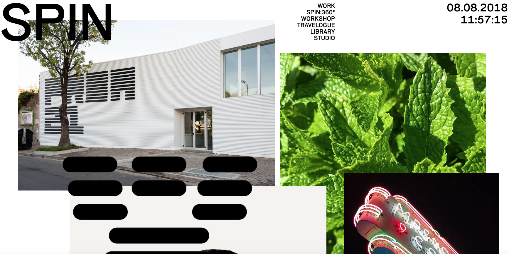
“For me, it’s very frustrating when I don’t know if certain projects are ‘real’ or not,” says Sean Murphy, creative director at Moving Brands. “So flagging up whether something is actual freelance work that’s out in the world, or a personal or student project, is very important.”
There’s nothing wrong with showing personal work per se, says Tony Brook, creative director at Spin. “People often do show personal work, and that can be quite useful to see. Especially if it indicates what their interests are, or what they’re passionate about.”
Flagging up whether something is actual freelance work that’s out in the world, or a personal or student project, is very important
Sean Murphy, Moving Brands
Nor is there anything wrong with including group projects. “Again, that doesn’t particularly worry me; quite often things are a group effort,” Brook reasons.
However, do make sure you don’t pass off the work of others as your own, either consciously or subconsciously. “Remember, you often get people applying from the same university, who’ve worked on things together,” says St John. “So if I don’t know it’s group work, and then I see the same project in someone else’s portfolio…”
Rely on good work – not gimmicks

One recent trend is for students to feature ‘personal branding’ for themselves, such as their own logo, in their portfolio. But be warned: hirers aren’t keen on this trend, and in all honesty, would rather just see your name nicely typeset. “Personal branding gets in the way of what you’re trying to look at, which is the work,” says Murphy. “It opens candidates up to criticism too: if they create a personal brand, they have to expect that brand to be critiqued in some way.”
Personal branding gets in the way of what you’re trying to look at, which is the work
Sean Murphy, Moving Brands
Tim Beard, partner at Bibliothèque concurs. “The portfolio itself is the ‘branding’,” he argues. “It doesn’t really need a logo. Good control of ideas, type and articulation of content is a much better use of your time.”
In short, trying too hard to stand out from the competition can often be counterproductive. “Interns tend to be take more ‘creative’ approaches when they send us their folio,” reflects Madeleine Fortescue, resource and recruitment manager at Moving Brands. “But I think this often just takes away from the work.”
For example, one candidate sent a recording of him singing his CV; another sent instructions on how to create an origami bird; a third sent the team a box of crisps. “At some places, maybe gimmicks like that go down well,” muses Fortescue. "But for us, it’s all about the work, so I think that focusing on producing a curated, solid and confident portfolio is a much better approach.”
But what if that solid portfolio isn’t getting you anywhere? How do you find out what’s wrong? Simple, says St John: just ask. NB Studio, he says, sends a simple ‘capsule reply’ to every portfolio submission, acknowledging receipt – but if you don’t hear anything for a while, there’s no harm in directly asking for feedback. “I’m never harsh, but I’m usually quite honest,” he smiles.
Keep polishing your portfolio (in case of emergencies)
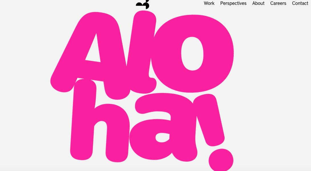
So you’ve got your feet under the table in your first job. It’s all going well, meaning that you can forget about your portfolio for a while, right? Wrong. Even if you’ve got no immediate plans to look for another job, you never know when you might need to.
Redundancies often come like a bolt from the blue. And the principle of ‘last in, first out’ normally applies, so as a fresh hire you’re unfortunately particularly vulnerable. On a more positive note, perhaps the powers that be have noticed your great work and are thinking about promoting you.
But be honest: if a superior suddenly asked you into their office and asked to see your latest portfolio, would it be ready for viewing? Would you be ready to show it?
As a hirer, the thing you really notice with a more experienced designer’s portfolio is how stuff’s photographed
Olly St John, NB Studio
In short, if you want to continue advancing, you’re going to need to keep updating, refining and improving your design portfolio throughout your career. The good news is that you don’t necessarily have to do a radical redesign. Simply adding new work will often be enough to get you a long way.
“As a hirer, the thing you really notice with a more experienced designer’s portfolio is how stuff’s photographed,” says St John. “That’s often because most of it’s been done at an agency level, where they’ve spent a few thousand on great photography. So it is usually quite easy to see the quality over the student-level work.”
Curate your portfolio for a specific role

Besides the chore of updating a portfolio, there is another, greater challenge for mid-career designers. Now you have more work to choose from, you need to put more effort into curating it. While at student level, curation just means choosing your best work, it’s now time to think more seriously about what direction you want to go in future, and start gearing your selection towards that choice.
A portfolio should demonstrate why you’re a match for the role you’re looking to fill
Madeleine Fortescue, Moving Brands
Doing so will help hirers have a much better understanding of where your interests lie, and as a result, where you might best fit in an organisation. Not doing so, in turn, may convey a lack of purpose or direction.
“One of my biggest bugbears is when people include everything; try to cover all angles, all bases,” says Fortescue. “A portfolio should demonstrate why you’re a match for the role you’re looking to fill. It needs to say: ‘This is why I’m really the best person for this, look at the work I’ve done.’ Rather than, ‘Hey look, I do a bit of everything.’”
At this stage, recruiters aren’t just looking for high-quality work from candidates, they’re usually looking for something specific.
“What really gets me excited is fit and relevance,” says Smith. “Not just in the kind of work that you’ve been doing but also in the way you carry yourself, the way you talk about yourself, the personality you portray. It’s nice to see a portfolio from someone that seems to have very similar personality to us as a company.
"I can imagine other agencies that are a bit more serious might be put off by the portfolios we get, and vice versa. Because it’s important to fit into the company culture as well as the sort of work we do,” he explains.
Don't give up when you reach the top

You’ve finally become a senior designer. With widespread respect for your work and good relationships in the industry, putting together a winning portfolio will be a doddle, surely?
Sadly, it’s not always that simple. For a start, the more responsibility you take on within your studio, the more confidentiality agreements you have to sign, and the more difficult it can be to actually show what you’ve been working on.
In this case, at least, peers will empathise. “It’s often the case that more experienced designers will be reluctant to email over confidential work, or have it on their website,” says Smith. “So we’re very aware of that.”
And depending on the client, there are various strategies you can take to circumvent restrictions, such as showing the work in the more confidential circumstances of an interview setting, or maybe restricting it to a password protected area of your website.
Senior portfolios need careful explanations
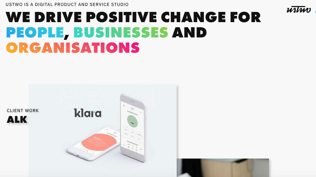
Perhaps a trickier problem is that the more senior you become, the less hands-on and the more strategic and managerial your involvement in projects gets. And this can be difficult to convey in a portfolio. “With senior candidates, it can sometimes difficult to tangibly distil what they were responsible for, what value they brought to the project,” says Smith. “And so you find that more senior people’s portfolios tend to be less visual as a result.”
Rather than relying on large-scale images, then, you may now need to present your projects more like a blog or a case study, with concise but careful text explaining the brief, how it was met, and the specific part you played. Again, it’s important to avoid overstating your role in projects, whether intentionally or accidentally.
“I once had someone come in for a senior design position here, and they presented my own work back to me as their own,” Smith reveals. “They’d worked on the project, but they were actually just doing asset creation for the developer, and the graphic design was all my work from a year previously. So it was incredibly embarrassing. I had to say: ‘I know you didn’t do what you say you did, because I did that.’ Needless to say, he didn’t get any further.”
One senior sent me a video of each of his projects. The whole thing was just one minute long... It was the perfect time-saver
Tim Smith, ustwo
On the positive side, once you’re a senior designer you’ll probably have enough experience and wisdom under your belt to consider experimenting with how your portfolio is presented.
Smith recalls one particularly memorable example: “One senior sent me a video of each of his projects. The whole thing was just one minute long, and he spoke over them in a quite personal way; explaining what the final product was, the process they used to get there, and what his own involvement had been. It was the perfect time-saver because it was like five short clips of five different projects, very easy to digest.” He got the job.
Keep it clean
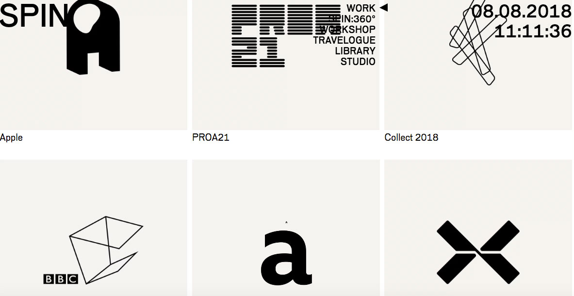
It’s clear that, whether you’re just starting out, are a seasoned pro or somewhere in between, there are plenty of portfolio traps to avoid and mistakes to steer clear of. But all our experts stressed that as long as your portfolio meets certain criteria – is clear and uncluttered, easy to navigate, thoughtfully curated and concisely annotated – you won’t go far wrong.
Any portfolio that ticks all of the standard boxes is going the right way... [but] if it’s awesome work, then I’m sure I’d get over any personal bugbears
Tim Beard, Bibliothèque
Remember, your portfolio is only one of many ways you’ll be assessed, along with your CV, cover email and interview. And the notion of an ‘amazing’ portfolio that instantly puts one candidate ahead of the running seems to be little more than a myth.
As Fortescue puts it: “I can’t think of a portfolio where we’ve gone: ‘Oh my God, that’s the person.’ That doesn’t really happen in real life. A curated, clear, concise, bold portfolio is the only thing we’re looking for.”
Beard takes a similar view. “Any portfolio that ticks all of the standard boxes is going the right way,” he states. “But, you can’t really define what works precisely; there is no formula, just like creativity. If it’s fucking awesome work, then I’m sure I’d get over any personal bugbears.”
This article was originally published in Computer Arts, the world's leading design magazine; subscribe here.
Related articles:

Thank you for reading 5 articles this month* Join now for unlimited access
Enjoy your first month for just £1 / $1 / €1
*Read 5 free articles per month without a subscription

Join now for unlimited access
Try first month for just £1 / $1 / €1

Tom May is an award-winning journalist and author specialising in design, photography and technology. His latest book, The 50th Greatest Designers, was released in June 2025. He's also author of the Amazon #1 bestseller Great TED Talks: Creativity, published by Pavilion Books, Tom was previously editor of Professional Photography magazine, associate editor at Creative Bloq, and deputy editor at net magazine.
