How to challenge brand stereotypes
Five projects that have successfully bucked market trends.
Breaking the branding mould with a bold, fresh approach can be tricky at the best of times. Throw in a conservative sector, or a market stuck in a rut filled with stereotypes and tried and tested formulae, and that challenge is multiplied.
Lazy broad-brush targeting of complex demographics like ‘millennials’ under the guise of innovative design just doesn’t cut it. It takes a combination of a forward-thinking agency and a brave, risk-taking client to find a new approach, and ditch those tired trends.
Read on to discover five projects that have torn up the rule book for all the right reasons, and found a new way of attracting consumers’ attention…
01. Provoke and tease the audience
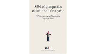
Ask someone to pick a market sector known for dry, corporate stereotypes and predictable uses of colour, language and iconography, and chances are they’ll pick financial services.
Banks and building societies have tried hard to shake off that image in recent years, particularly after the global credit crisis dented public trust in even the most established of institutions. Younger, fresher, more off-the-wall campaigns for the likes of First Direct are worthy of mention here.
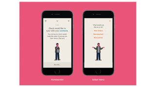
Perhaps the most category-defying example, however, is Zhuck – a project by ELSE, Daljit Singh, Michael Wolff and NB Studio for leading Russian bank Bank24.ru, aimed at disillusioned entrepreneurs, accountants, managers and investors.
The word ‘zhuck’ translates directly as 'beetle’, but its local significance is more similar to ‘shark’ – a person who can be aggressive, predatory, cunning and malicious, but also savvy, clever, entrepreneurial and driven. In short, someone you want on your side.
Get the Creative Bloq Newsletter
Daily design news, reviews, how-tos and more, as picked by the editors.
The Zhuck app jokes, provokes and even playfully insults the user, cajoling them into action, making ‘doing nothing’ seem like the difficult option. It’s a brave, and totally original approach.
02. Celebrate the brand's past impact
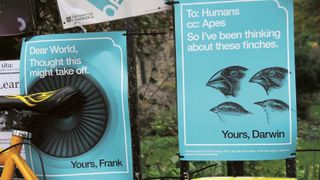
Winner of Best of Show at the 2016 Brand Impact Awards, Dear World… Yours, Cambridge is a branded campaign for a university with a difference.
Like banking, the education sector has plenty of ingrained tropes and techniques. In a climate where students have become consumers, recruitment campaigns often focus on pushing the individual value and desirability of the degree, quoting stats, league tables or employment prospects.
Presented with a brief from the University of Cambridge, Johnson Banks took a totally different tack – exploring and celebrating the past, present and future impact that the institution’s notable graduates have had on the world at large, all framed as a series of open letters that begin ‘Dear World’ and end ‘Yours, Cambridge’.
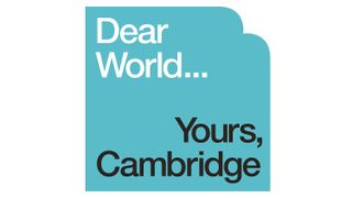
It’s a wonderfully simple but totally original construct that puts the campaign head and shoulders above the rest of its sector, and establishes the 800-year-old institution as an outward-facing, thought-provoking ideas lab.
For even more inspiration, take a look at the Brand Impact Awards 2017 shortlist.
03. Make even mundane products fun
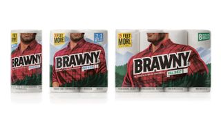
In an environment driven by impulse purchasing, price wars and bulk buying, the Fast-Moving Consumer Goods (FMCG) sector is defined primarily by the need for shelf standout, and not an area famed for its innovative branding.
It doesn’t get much more disposable than paper towels, but in 2016 Turner Duckworth took on a brief to rebrand much-loved American brand Brawny, with particular focus on its brand character – the Brawny man.
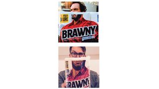
Turner Duckworth reinvented its mascot as a strong, capable giant, tightly cropped with the top half of his head disappearing off the top of the pack to give him an air of mystery.
Consumers found the urge to hold the pack in front of their faces to ‘become’ the Brawny giant irresistible, and shared the photos on social media in their droves. When was the last time you tweeted a picture of you holding up a paper towel?
04. Embrace authentic cultures
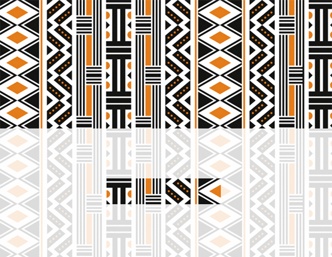
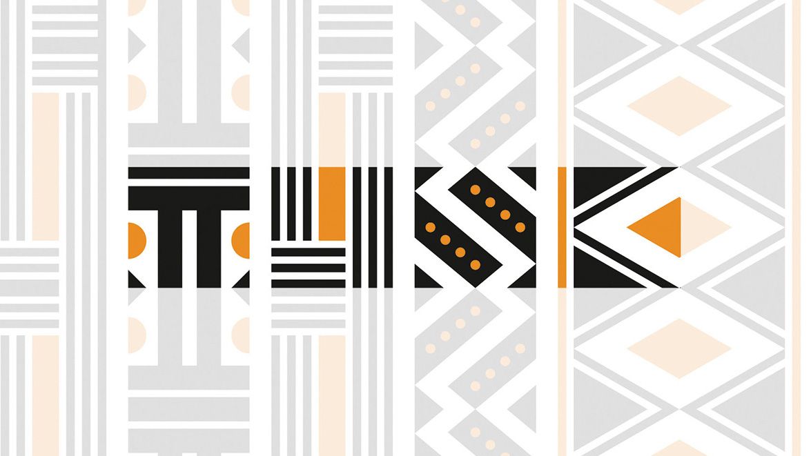
The Partners’ 2015 rebrand for Tusk Trust of the Tusk Conservation Awards, a scheme that initiates community development and environmental programmes across Africa, is a masterclass in truly meaningful collaboration.
At the core of the identity is an African-style pattern, subtly constructed from the letterforms T-U-S-K for a satisfying reveal when the word emerges from the background across a variety of touchpoints, from brochures to online.
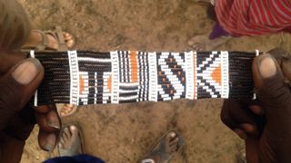
Many agencies attempt to appropriate the aesthetic of traditional cultures from around the world for their clients – from Mexican to Japanese and everything in between. But the authenticity is often dubious, and they run the risk of cheap pastiche.
Not so The Partners, which after extensive research sought out local inspiration from the people of Enkiito, Kenya on the project. They created 50 traditional beaded wristbands in the brand’s signature pattern, which attracted 17.5 million online impressions for their photos.
05. Discard traditional genre imagery
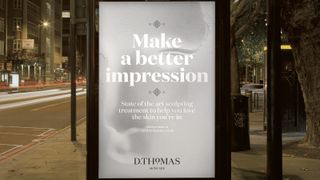
A bold departure from traditional ‘beauty’ imagery of immaculate glamour models art directed within an inch of their lives, SomeOne’s rebrand of D.Thomas skincare is underpinned by a striking set of photos, created by imprinting mannequins in flour.
With a particular focus on problem skin, D.Thomas specialises in improving first impressions for its customers, and SomeOne set out to represent those impressions visually.
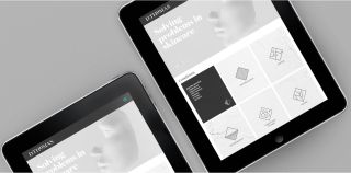
100 bags of flour were poured into ‘impression tanks’, into which the agency pressed mannequins’ faces, hands and bodies to create brand imagery corresponding to the areas that D.Thomas caters to.
With no traditional ‘spa’ images in sight, SomeOne’s rebrand is a radical departure in the beauty sector, and definitely makes an impression.
Related articles:

Thank you for reading 5 articles this month* Join now for unlimited access
Enjoy your first month for just £1 / $1 / €1
*Read 5 free articles per month without a subscription

Join now for unlimited access
Try first month for just £1 / $1 / €1

Nick has worked with world-class agencies including Wolff Olins, Taxi Studio and Vault49 on brand storytelling, tone of voice and verbal strategy for global brands such as Virgin, TikTok, and Bite Back 2030. Nick launched the Brand Impact Awards in 2013 while editor of Computer Arts, and remains chair of judges. He's written for Creative Bloq on design and branding matters since the site's launch.
