How to be a better concept artist
Artist Eddie Del Rio shares his tried and tested creative workflow techniques.
Time and time again I get asked what’s my process as a concept artist. Truth be told, I don’t have just one process. Instead, I use a tool box that’s full of art techniques. It helps to save time and create a smooth flow of ideas.
Generally, no two assignments are the same. They’re not cookie-cutter tasks. They require different moods, design, creativity, touch and feeling. After a while you figure that out and you pick the best tools for the job.
So, for this article, I'm sharing several tools from my creative box. I’ll show you how I use them individually and in tandem with others. Sometimes one technique works well for something, while other times you’ll need the whole arsenal of tools and tricks to make the image sing and hit the deadlines.
Okay, let’s begin!
01. Paint fast sketches for fun
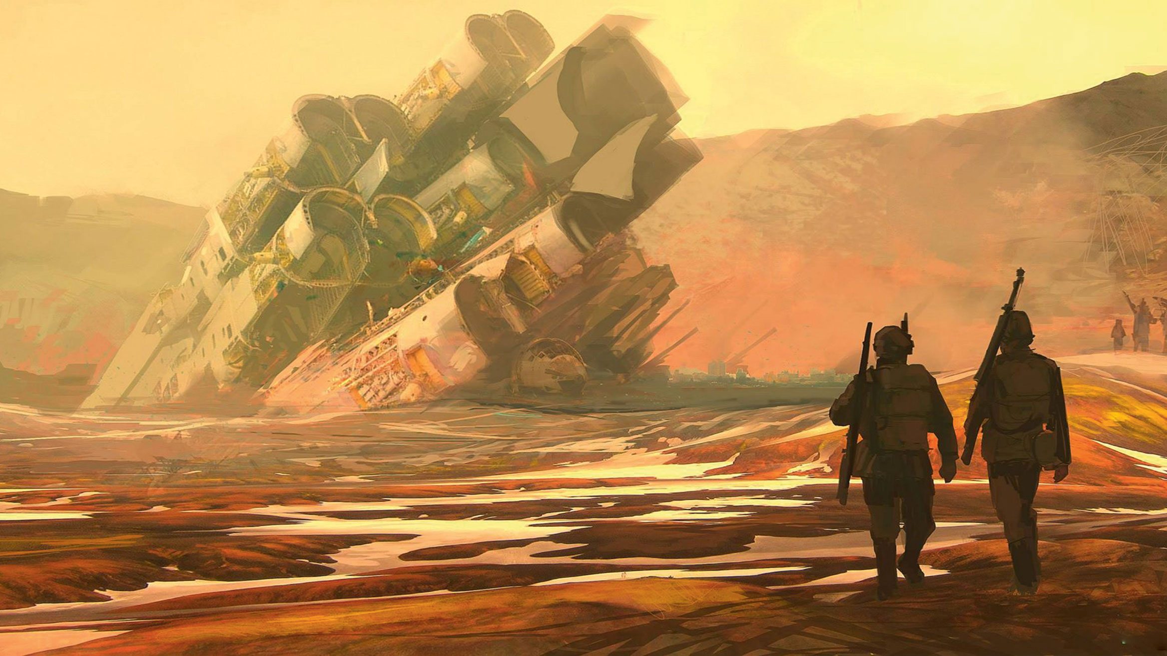
I spend about an hour on each one of these guys. Fun, simple sketches like these can be cranked out and help to fill out a portfolio. Try and take some time out of a day or evening, and do a quick colour sketch now and then. You may not always be happy with the final piece, but there’s a good chance that you’ll have learned something new during the image creation process – and you may even produce a decent portfolio piece out of it to boot.
02. Promote yourself online
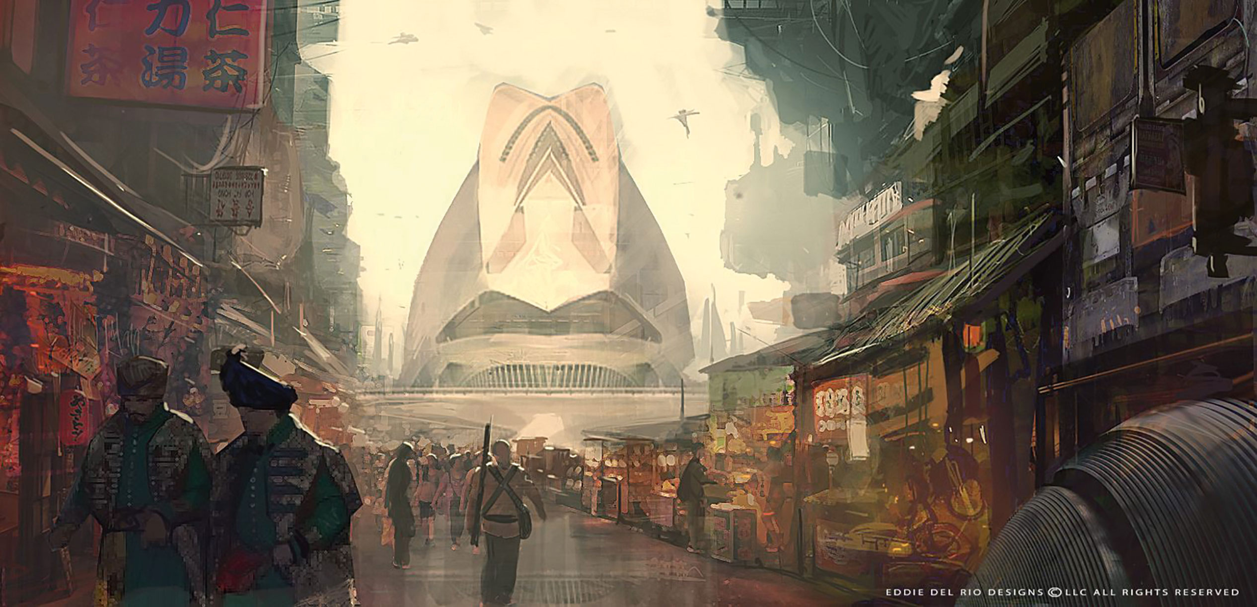
As well as having experimental, high-energy pieces interspersed throughout your portfolio, you can use them as a handy calling card for a spot of self-promotion.
After you’ve produced a piece that you’re happy with, add it to your online portfolio. Then roll up your sleeves and get busy on social media. Hit all the outlets: Twitter, Instagram, Facebook and more. Remind people that you’re still making art. Artists can’t always show off their client work because of NDAs. Personal pieces go a long way towards maintaining your online presence.
Get the Creative Bloq Newsletter
Daily design news, reviews, how-tos and more, as picked by the editors.
03. Flesh out a variety of styles and content
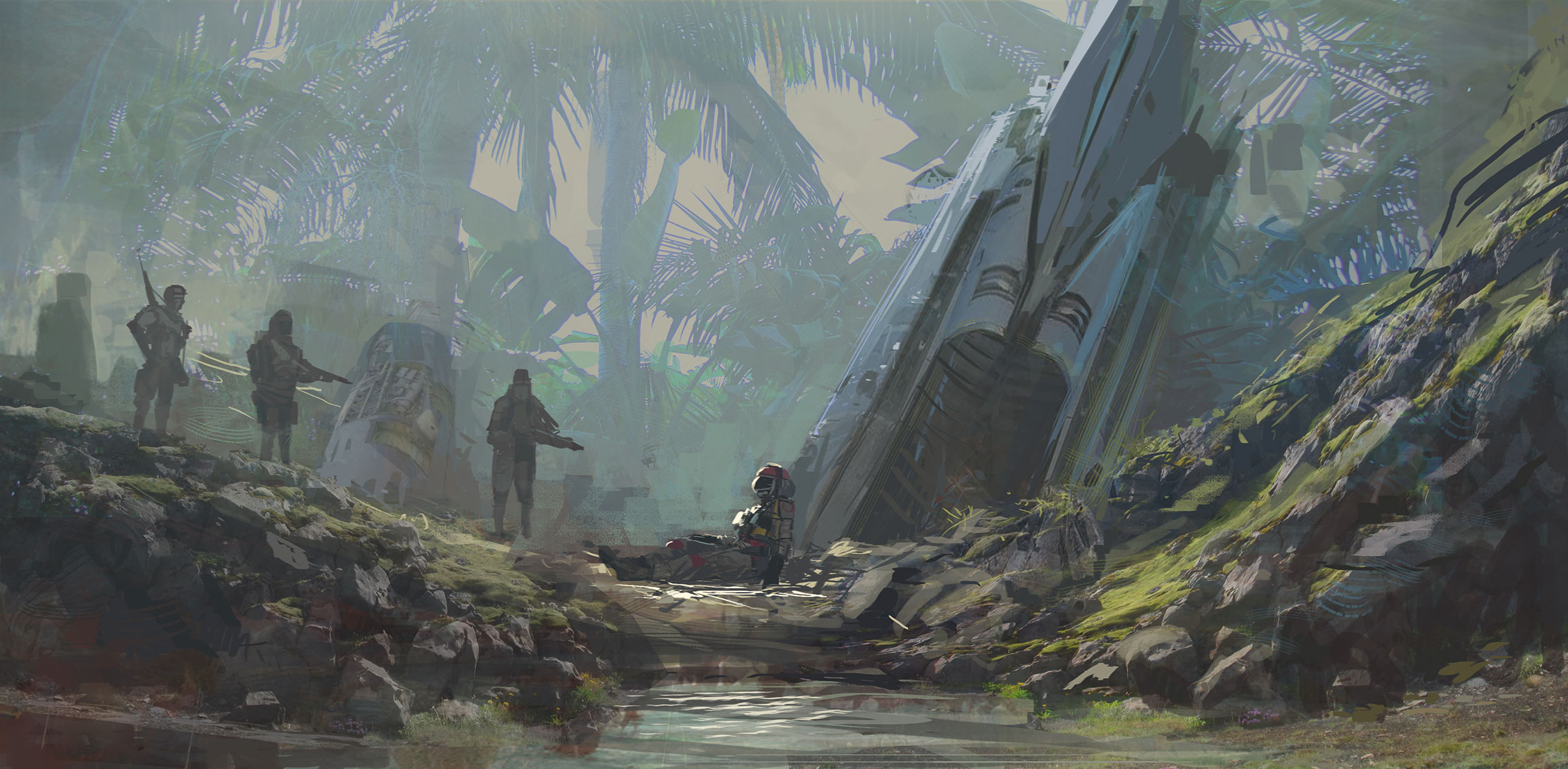
Here’s another reason to produce some quick sketches. Perhaps you’ve heard from a friend that a project’s coming up and you’d like to show you’re capable of working in that genre or style. Do a sketch to show that you’d be a good fit. It doesn’t need to be on the nose as far as content is concerned – just something that looks like it would fit in that particular world. There’s a chance the art director will see it and think that you’re a good match. If not, no matter – you still have another quality promotional piece to use as you see fit.
04. Learn to become a good storyteller
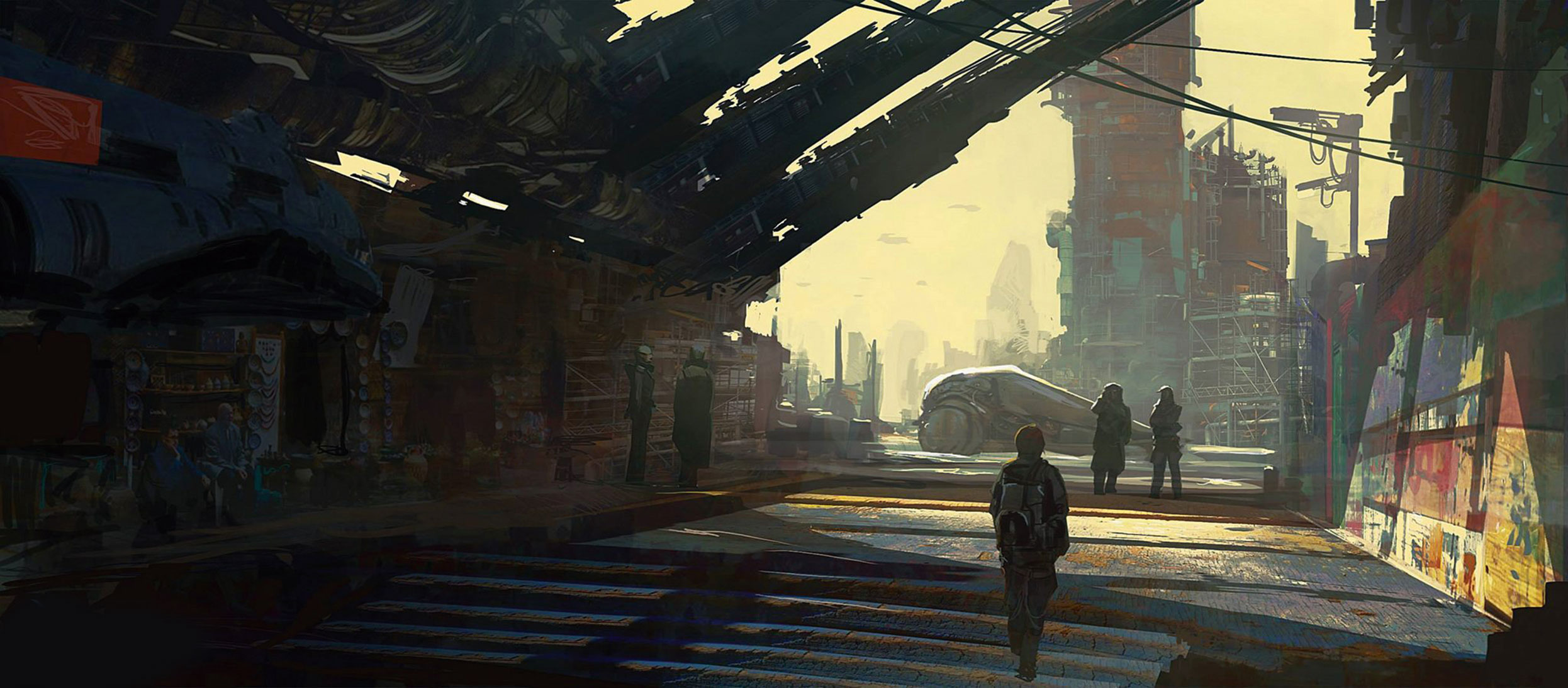
One good thing that these quick sketches force you to do is think about storytelling. For this piece, I didn’t know what I was going to paint before I started. And I’m sure I spent the first 10 minutes going back and forth on what the subject matter was going to be. But eventually I started to illustrate a corridor and some shapes in the background.
Because I was working so fast and loose I began to think about smaller facets of the story. For example, how I do I express these ideas in a very simple visual language? Here, the two characters outside are clearly together, while the character in the foreground is alone. The foreground character represents the viewer and the background figures are the mystery and the action.
As the viewer, you’re forced to walk into that microcosm of mystery. It’s the drama and mystery that really sells this piece. All of this was conceived while I was working. It’s pretty fun and adds a whole other layer to a piece that would otherwise have been pretty generic.
05. Use little design illusions
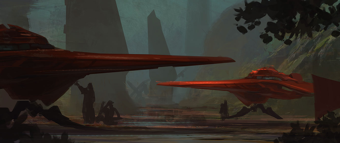
Previously, I’ve described how I approach my sketch work. Here, I’ve broken down my sketching process into two steps. I kick things off with a basic block-in. I might have a prepared textural background that I pre-paint or I’ll just paint it during this step. Then I add the larger shapes and start to work out the composition and the story in the scene. The textures that I paint give the illusion of more detail present in the image then there really is. Some stuff like the figures are just scribbled blobs at this point.
Now that I have my story planned out, I begin to fully realise it…. or realise it just enough so that it’s clear to the viewer. I add some lighting breaking through the tree foliage. Well, foliage that you really don’t see. You only have the light hitting the ship and the small little clump of tree foliage in the foreground to inform the viewer of the space that’s outside the picture frame.
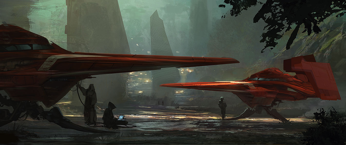
Little design tricks such as this add scope to something that, on the surface, is pretty simple. The viewer’s mind then works to fill in those gaps with the little hints and bread crumbs that I leave for them. I let the viewer’s own imagination do some of the heavy lifting. As a result, they also feels more committed to the image and the story that it’s trying to tell.
06. Start with a strong silhouette
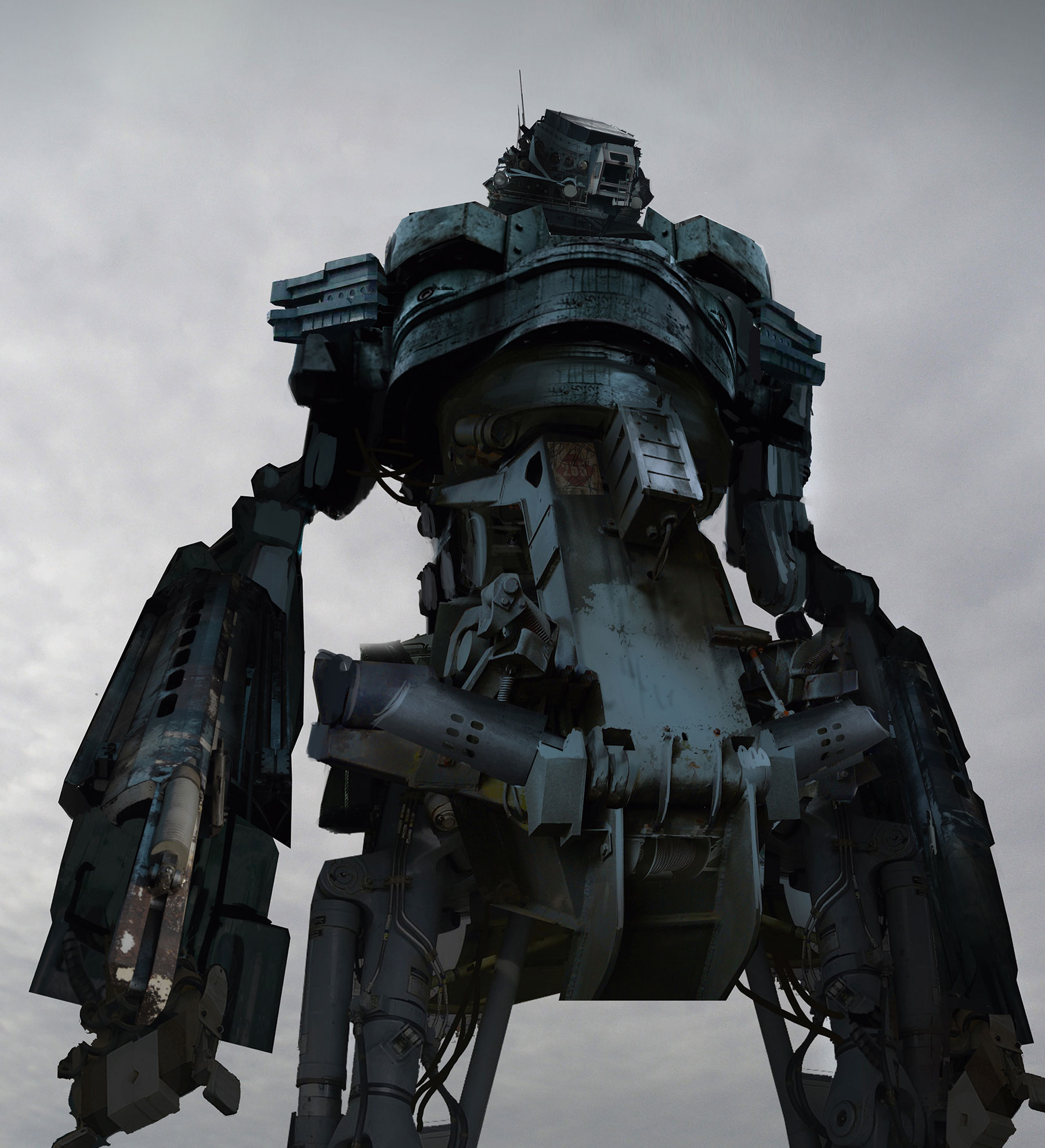
This image of a mech seen at an imposing angle may look like it was modelled and rendered in a 3D program, but it was actually photobashed together. I began by getting hold of a large collection of photographs of mechanical objects – some that I had taken myself. Then I fired up Photoshop CC and sketched out the silhouette of the mech.
Only when I was happy with the general shape and design direction did I reach for the stack of photos. After that, I transformed and colour-matched elements from my photos to fit what I wanted. This image took between three and four hours to create.
07. Use photobashing to create illustrative art
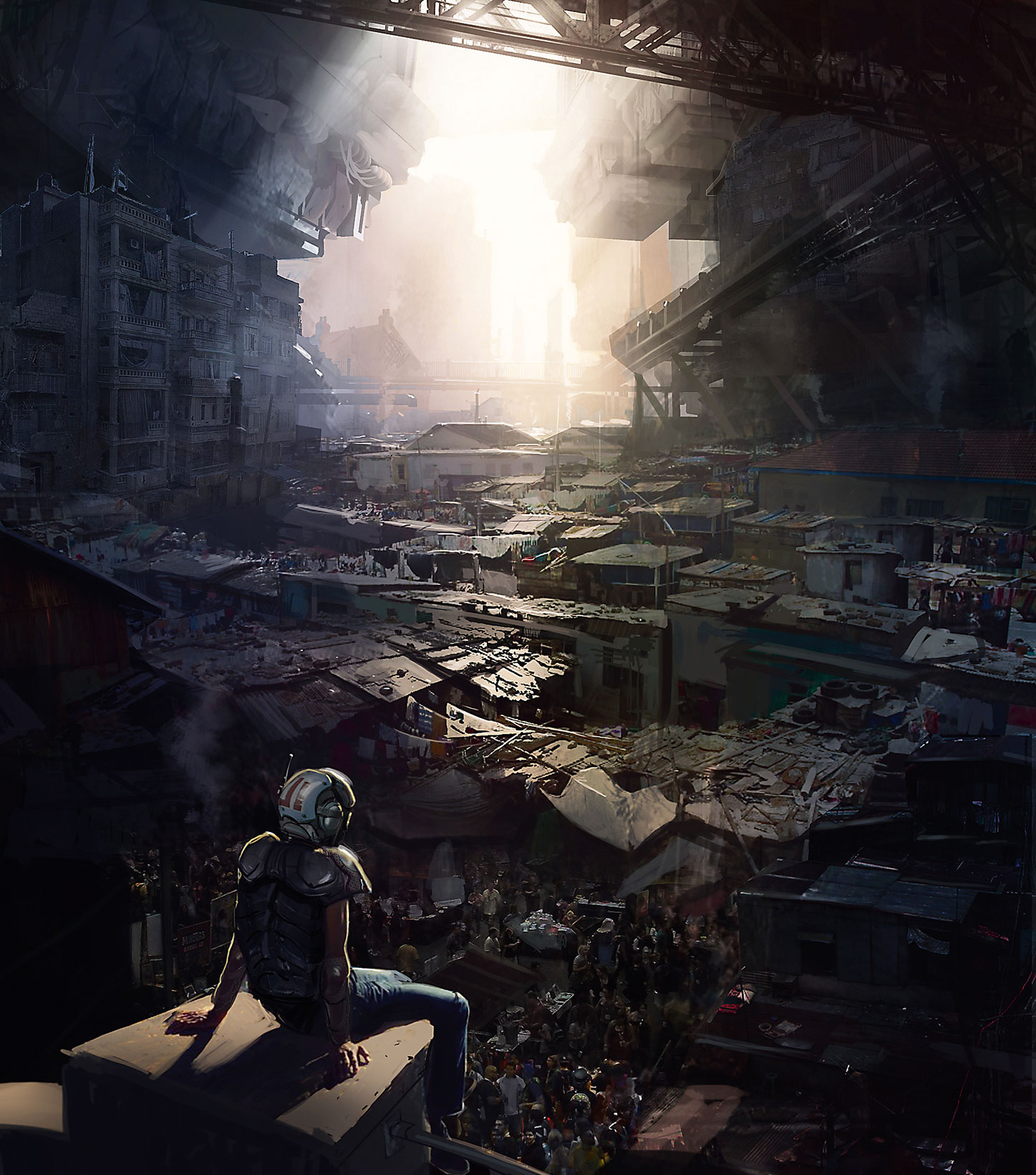
Although it may not look it, there’s a ton of photobash work here – about 80 per cent, I’d say. But it’s heavily painted on. I start by laying in images almost immediately… almost designing with them. While I’m laying in images and bashing them together, I’m also selecting light and dark areas, and painting into them. I’m after the detail and texture: I leave out what I don’t need and push the shapes that support the composition.
For some parts I want lots of detail; elsewhere, I’ll blow out the light values. This image contains dozens of elements from photos. You can see them on close inspection, but at first glance most people think it’s a fully painted piece. I often use photobashing to a lesser degree in my art, towards the end of the painting process. It’s an effective way of introducing a layer of texture to a scene.
This method works for me because I know the basics of painting. Photobashing enables me to expand on my core art skills – it’s not a shortcut to becoming a good artist. It takes a lot of practice to use photos this way.
08. Depict hard surfaces in 3D
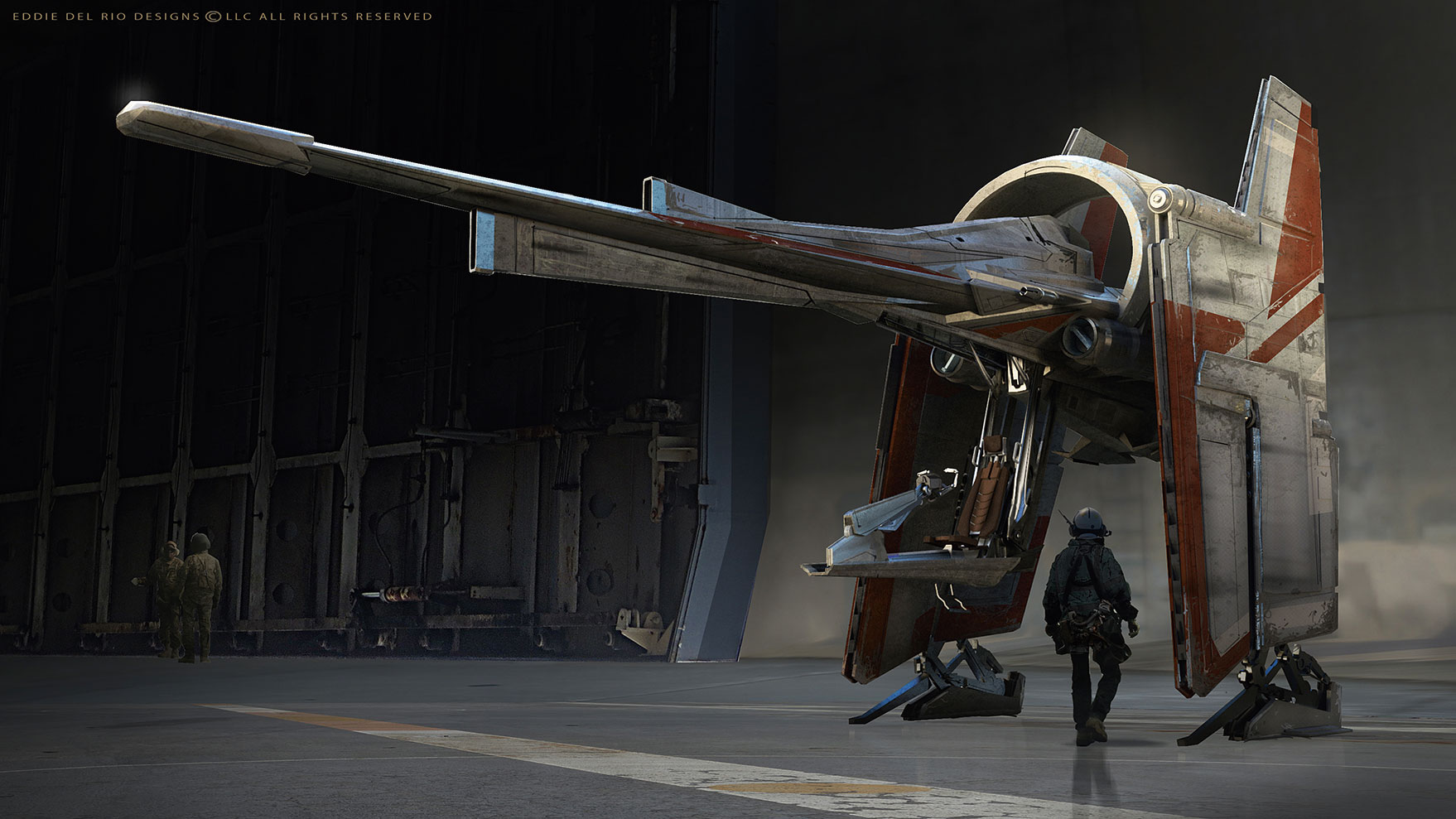
For spaceships, vehicles, mech designs or in fact anything mechanical, I tend to use 3D tools. They enable me to design from multiple angles, and ensure that the finished work has a clean look. The art will be more precise, with sharper edges compared to the painterly results from using standard 2D tools. In addition, I can design the object from multiple angles, knowing that nothing will end up being fudged. It’s going to be accurate. I like to see that in mechanical designs.
09. Use a repetitive architecture workflow
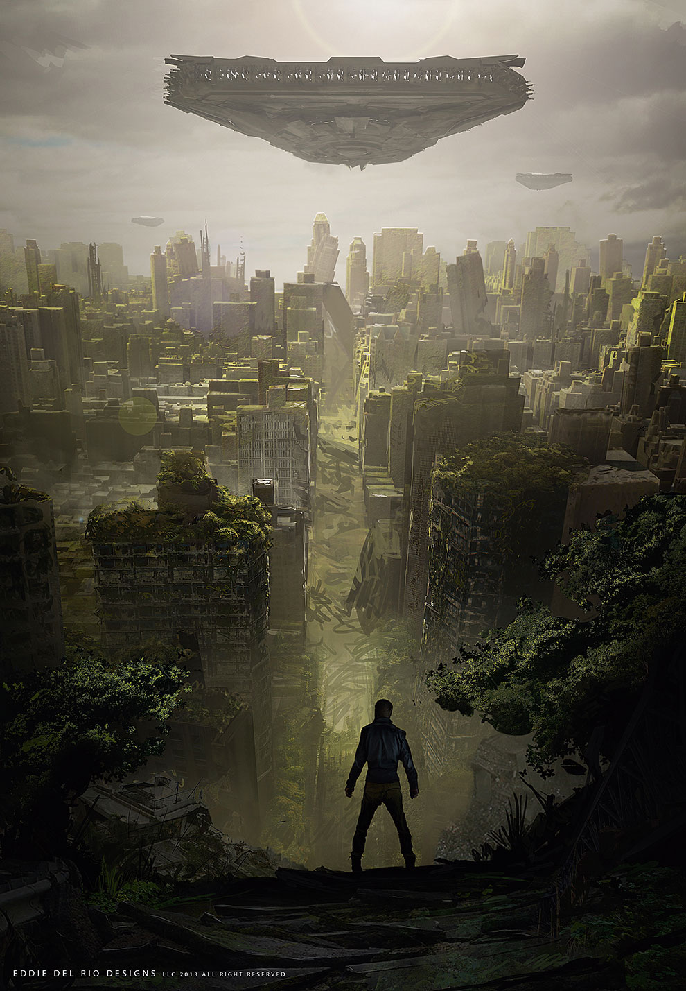
Similar-looking buildings or architecture from dramatic angles is another reason for using 3D tools. Even if I’m going to end up painting on the art, it’ll save me time if I model instead of drafting and plotting everything in 2D. Examples include rows of columns in interiors or building blocks in a street scene. 3D tools will boost your workflow in these assignments.
10. Create reusable assets

Another reason for using 3D is if an asset is going to be used in a range of images. I spent a week or so designing this racing mech in 3D. I began with some rough 2D sketches, modelled the design, asked for feedback from friends and did multiple revisions. I was happy to spend this time up front because I knew I was going to use this asset across multiple images, and that having a fully formed design at the start would save me time later on. For example, take the reflections on the mech and the decals on the design. Achieving that look with just 2D would be a challenge.
11. Use 3D assets to create key frames
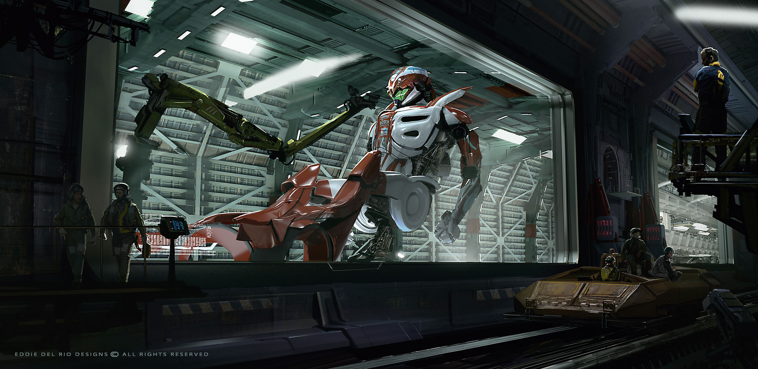
Thanks to the pre-designed mech asset, it took me just under a day to put this scene together. This is one of six key frames that I developed featuring the mech. In the end, it speeds up the creative process – important when it’s your IP and you have to do everything in your own time!
12. Model complex scenes in 3D
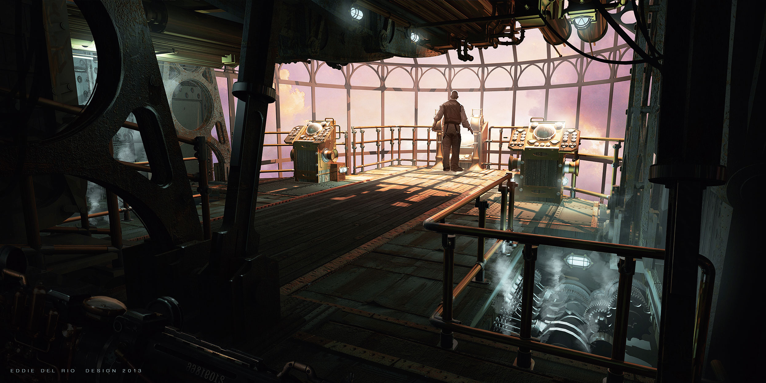
This design was going to be pretty complicated with all the pipes and gears in a 3D space. To help save me time I modelled the scene in 3D and even lit and rendered it. All those pipes and railing would have been a pain to replicate in 2D, as well as taking time. But using 3D tools helped me to complete the scene quickly. The room is largely symmetrical so I could just mirror the geometry, and the rest is a lot of duplicated pipes.
13. Experiment with framing and focal points
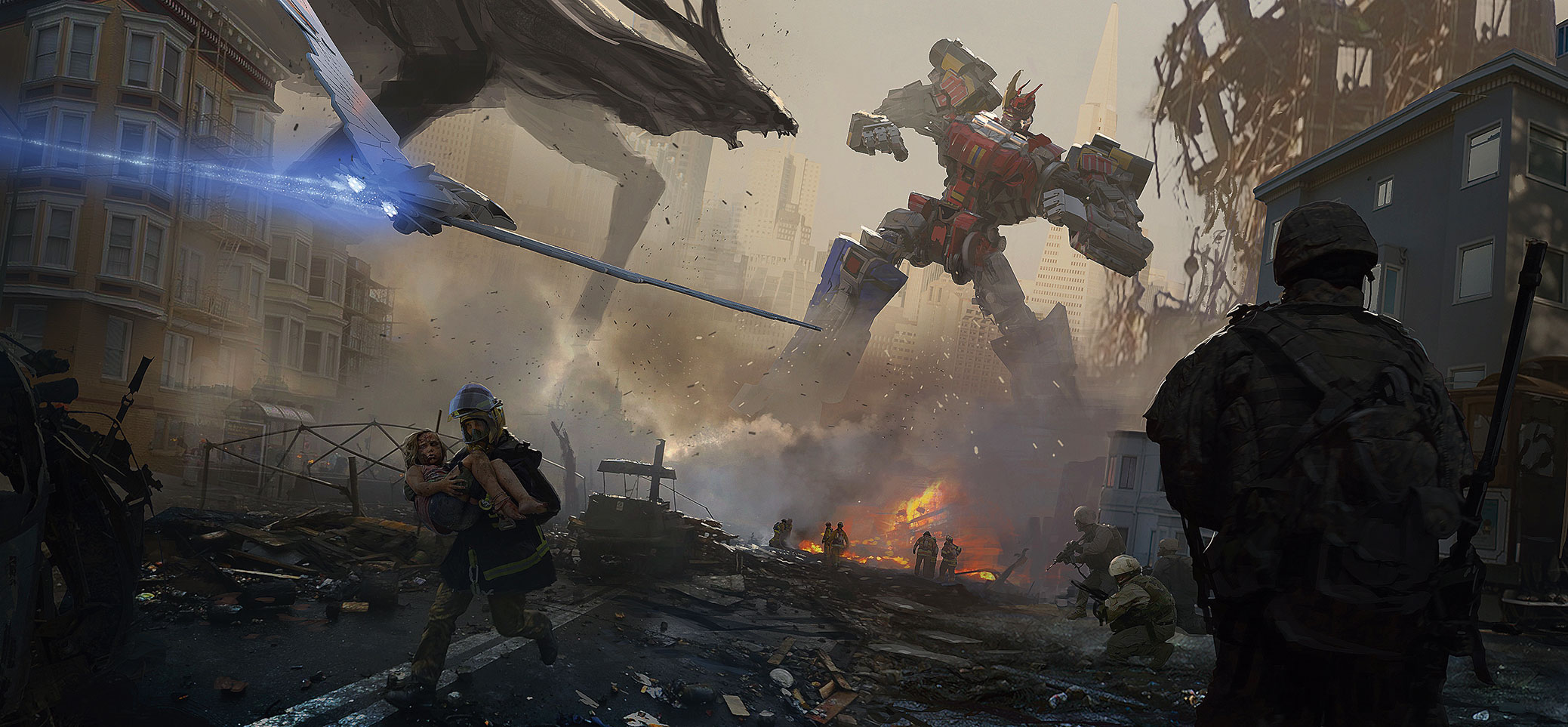
Here, I wanted to do some fan art from a sci-fi children’s show. I knew I didn’t want to spend more than a day on it. The piece I had in mind was pretty epic, so I had to think how I could effectively develop the frame.
First, I did a quick sketch that conveyed the energy, the basic story premise, all the big elements and the overall composition. Then I got some photos and began taking out bits and pieces, comping them in while painting and editing the piece. After that I looked at the big mech and Kaiju battling in the background, which was still pretty sketchy. Because it was the focal point I felt I could get a lot of bang for my buck if I modelled the mech. I didn’t spend too much time modelling: it was all blocks and cylinders.
Then I photographed the actual toy of the mech and overlayed that photo on to the front of my model. It wasn’t perfect, but it worked fine for me. I posed it quickly and then rendered it. I must have spent no more than and hour or so on the mech. I decided that the kaiju could be painted up a little more than the sketch I did at the beginning.
I was about to call it quits, but then felt the chaos of the foreground elements was fighting with the flow of the image and distracting from the focal point. So I decided to add the bird fighter flying into the image, which I quickly modelled in my 3D package. I added it to the frame and painted the blue energy thrust. The fighter helped with the flow, directed the viewer into the focal point and framed the action – all at the same time!
14. Leave room for interaction
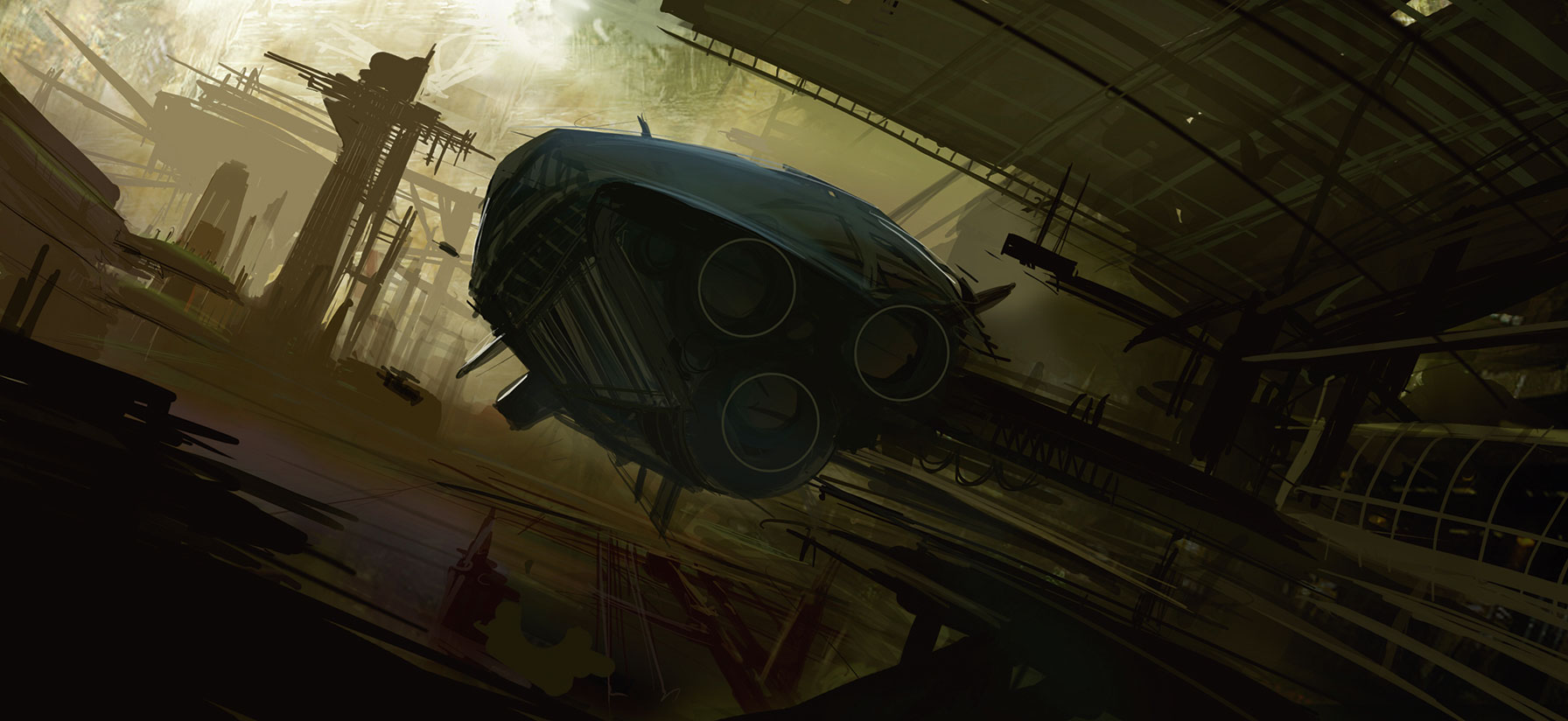
I lay down a fast and quick background, mostly to establish the palette and the general directions I want to go. This step prompts me to ask questions, such as what do I want to accomplish with this piece, and identifying the story I want to tell. Now I begin to answer the question of story. I choose my focal point and begin to build the scene.
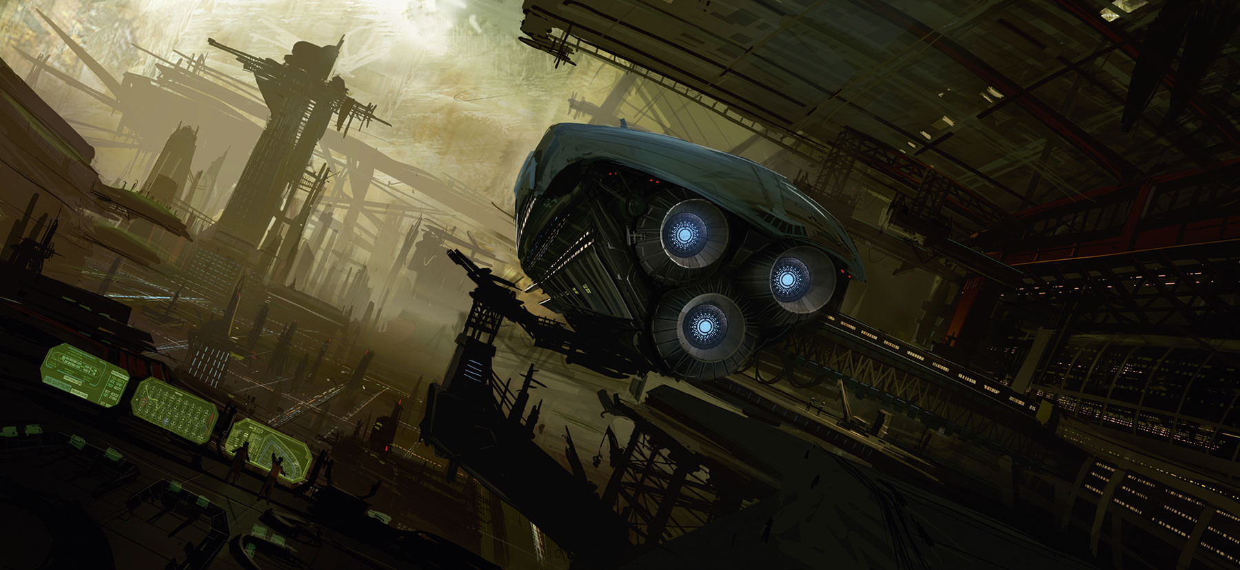
I start to think about how people will interact in this world and begin to add smaller details to help define objects in the scene. This is definitely the fun part! You can bring in all kinds of little story moments to help enrich the composition.
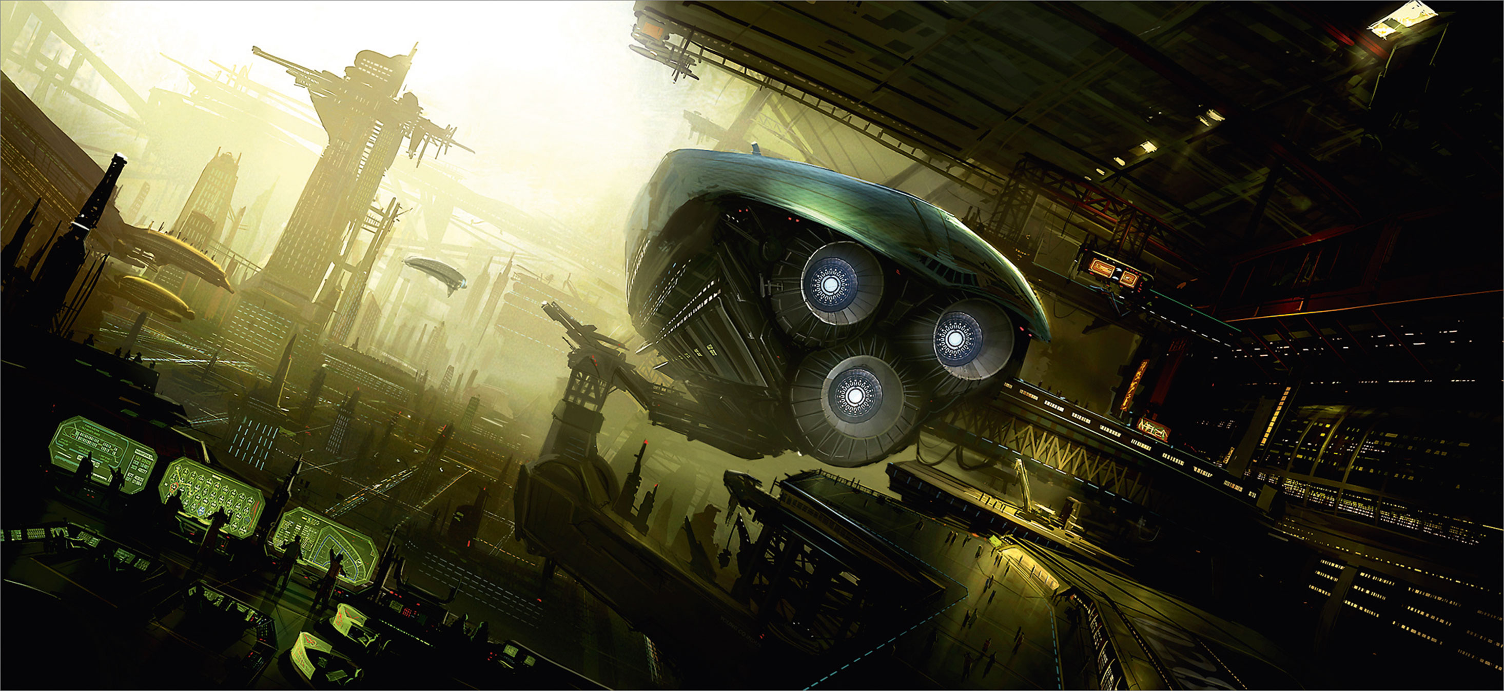
Now I just finish up the piece and begin to add more details and make sure that the image has a clean read. The viewer’s experience is key!
15. Go light on photos
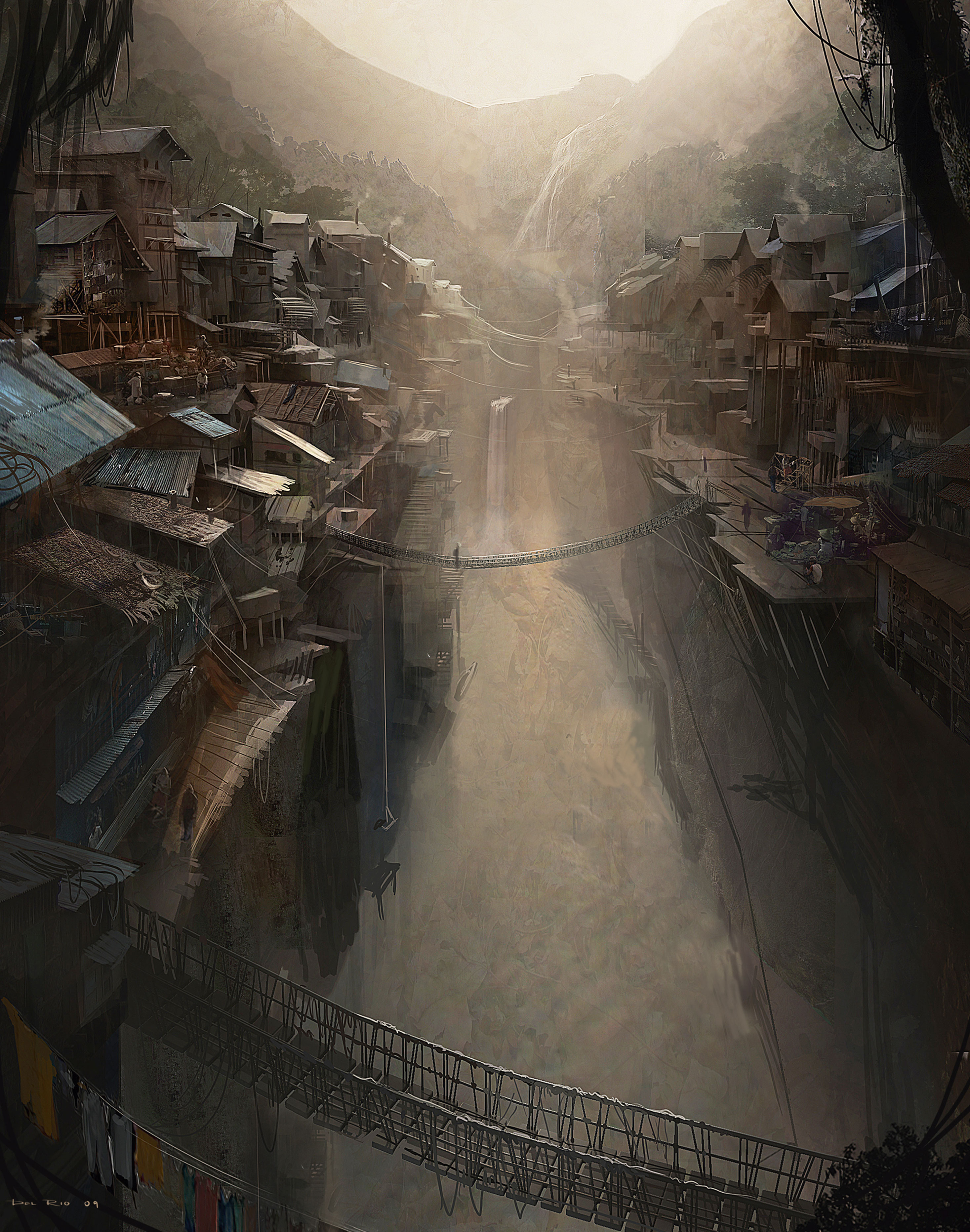
This piece was done primarily in 3D in the early stages. I then painted some values and some other large-scale details. But for the finer details and texture, I used photos. You can’t really see them, but they’re there. This was done more to add texture, creating the illusion that there’s more detail than there is.
This article was originally published in issue 164 of ImagineFX, the world's best-selling magazine for digital artists. Buy issue 164 here or subscribe to ImagineFX here.
Related articles:

Thank you for reading 5 articles this month* Join now for unlimited access
Enjoy your first month for just £1 / $1 / €1
*Read 5 free articles per month without a subscription

Join now for unlimited access
Try first month for just £1 / $1 / €1
