How to add perspective to your images
Ramp up the perspective in your scene with these quick tips.

Struggling to give your work a strong sense of perspective? There are perspective tools built into both Photoshop and Illustrator that will help (for example, click Edit>Perspective Warp in Photoshop).
When you’re first experimenting with perspective I’d strongly suggest using these tools as a guide to help you with your compositions. Once you feel more confident and understand which is the right perspective for your composition, then you can start to create your own perspective grid for more flexibility. (And if you need a refresher on the basics, see our how to draw perspective guide or guide on 5-point perspective.)
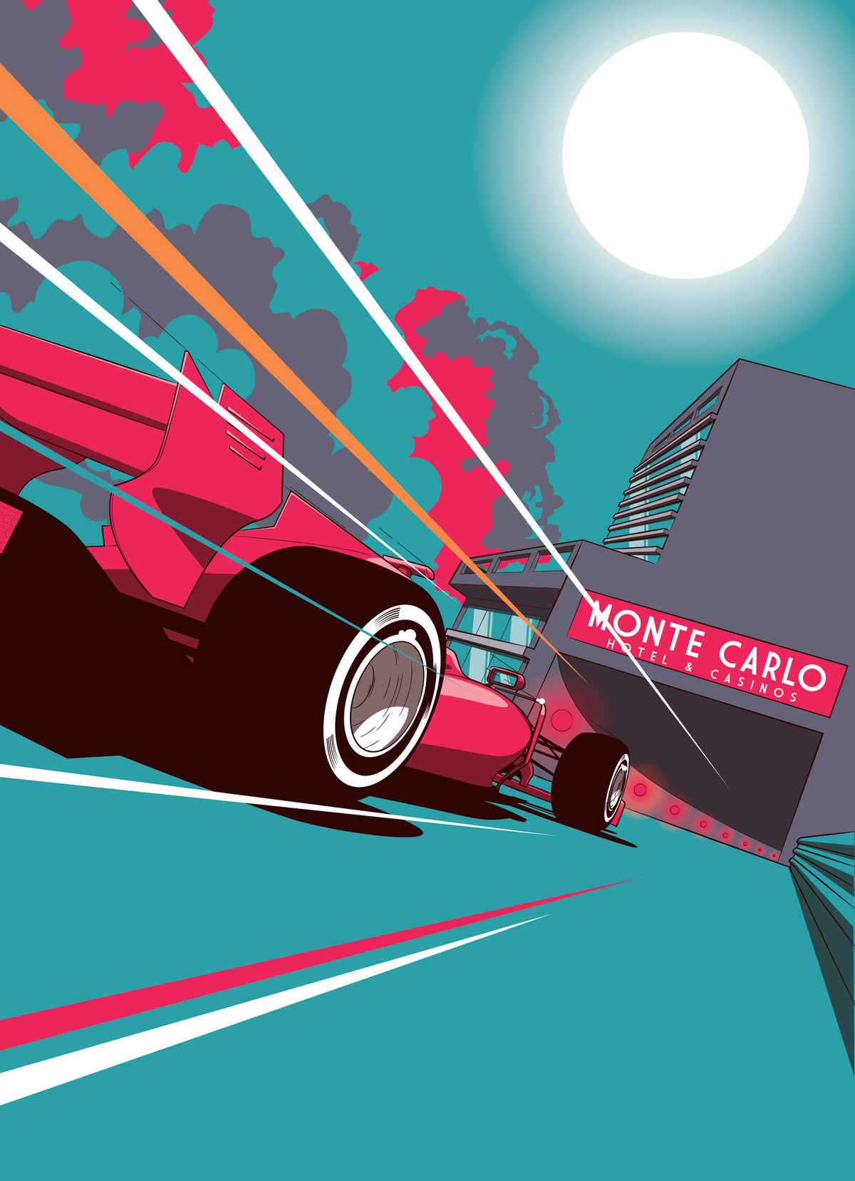
Having a strong perspective in your work helps the image feel more realistic, and it also enables you to convey the power you want the image to have. For example, picking a lowangle perspective, like in my racing car piece here, gives a real sense of speed and power, whereas picking a higher perspective angle (imagine looking down from a tall building) can give a sense of height and fear.
Once you’ve decided on a perspective and angle for your composition, you can start to bend the rules slightly and exaggerate your perspective for a more dramatic effect. However, don’t go too far because it will begin to feel unrealistic!
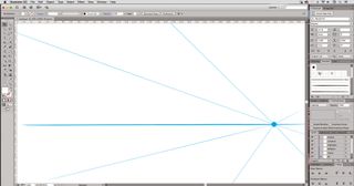
01. Create a horizon line

It all starts with your horizon line. Once you have this you can then pick your primary vanishing point and begin to create your guides from the point. Keep your angles simple to make your life easier – you can always rotate your artwork later.
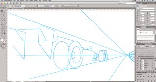
02. Place your object

Once you’re happy with your perspective, sketch some loose shapes to see where and how you want your objects to sit. I often have multiple sketches with different angles and perspectives before I decide on the one I feel works best.
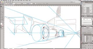
03. Add details

When your angles and perspective are working well together, start to add detail and flesh your drawing out. You can also add a secondary vanishing point if necessary. For my piece here I added a secondary vanishing point for the buildings.
Get the Creative Bloq Newsletter
Daily design news, reviews, how-tos and more, as picked by the editors.
This article was originally published in issue 156 of ImagineFX, the world's best-selling magazine for digital artists. Buy issue 156 or subscribe to ImagineFX here.
Related articles:

Thank you for reading 5 articles this month* Join now for unlimited access
Enjoy your first month for just £1 / $1 / €1
*Read 5 free articles per month without a subscription

Join now for unlimited access
Try first month for just £1 / $1 / €1
