How to adapt your digital art to feedback
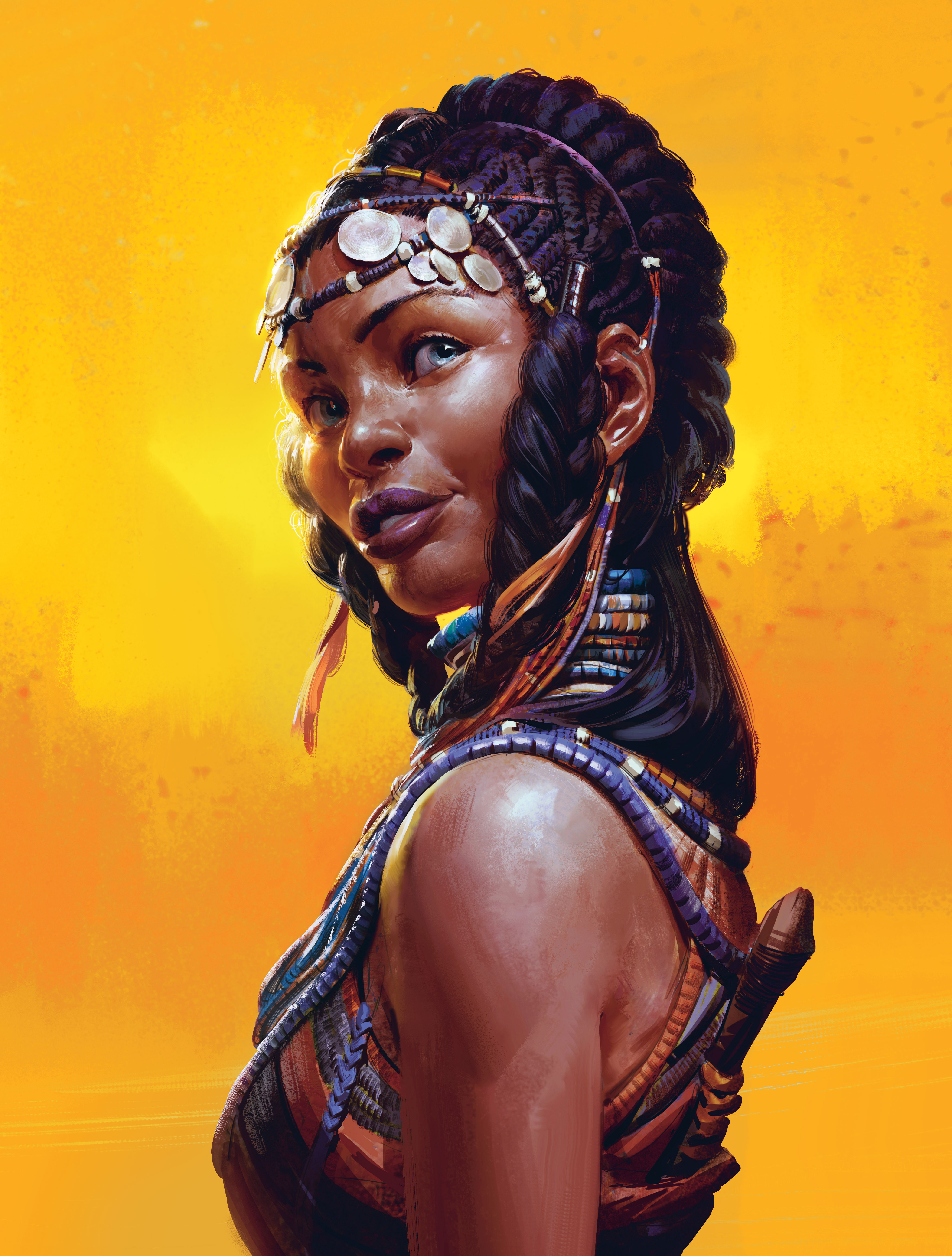
To create this cover for ImagineFX magazine, I went through some pretty well-established steps from my creative process, which can be applied either to character design work or more elaborate illustration work.
My aim with this workshop was to focus more on the chosen subject matter than on art techniques. However, it turned out to be more of a lesson on why it’s so important to spend enough time on planning out your pieces properly, so you don’t have to spend your time fixing mistakes later on.
A job with even the tightest of deadline is manageable if you put in a basic amount of ground work. So read on to learn some dos and don’ts about how to deal with feedback, avoid and fix mistakes, and check out where I nearly mucked things up big time!
01. Work up initial character ideas
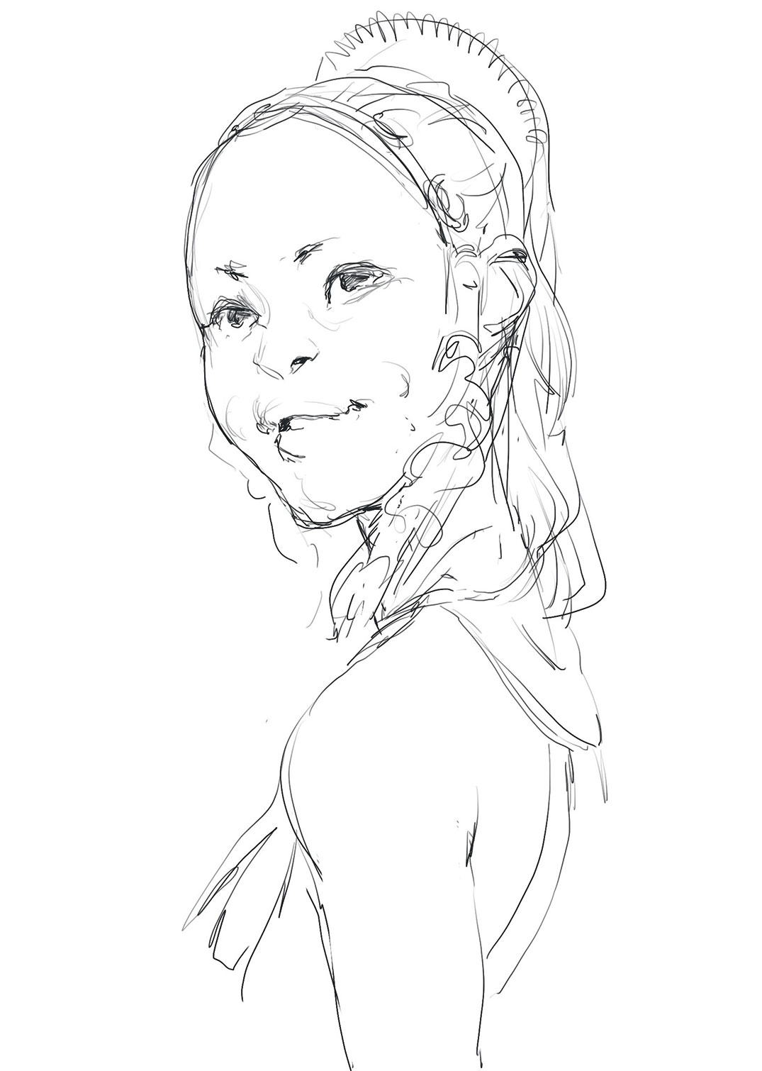
After I receive the brief and collection of reference material, I work up a very basic sketch. The ImagineFX team have a pretty clear idea of what they want for the piece, so for the technical aspect it’s more about making something interesting out of some subtle character nuances. That turn of the head, the crook of the smile, the eye contact. These gestures will eventually play a pretty central role in selling the image.
02. Create key shapes
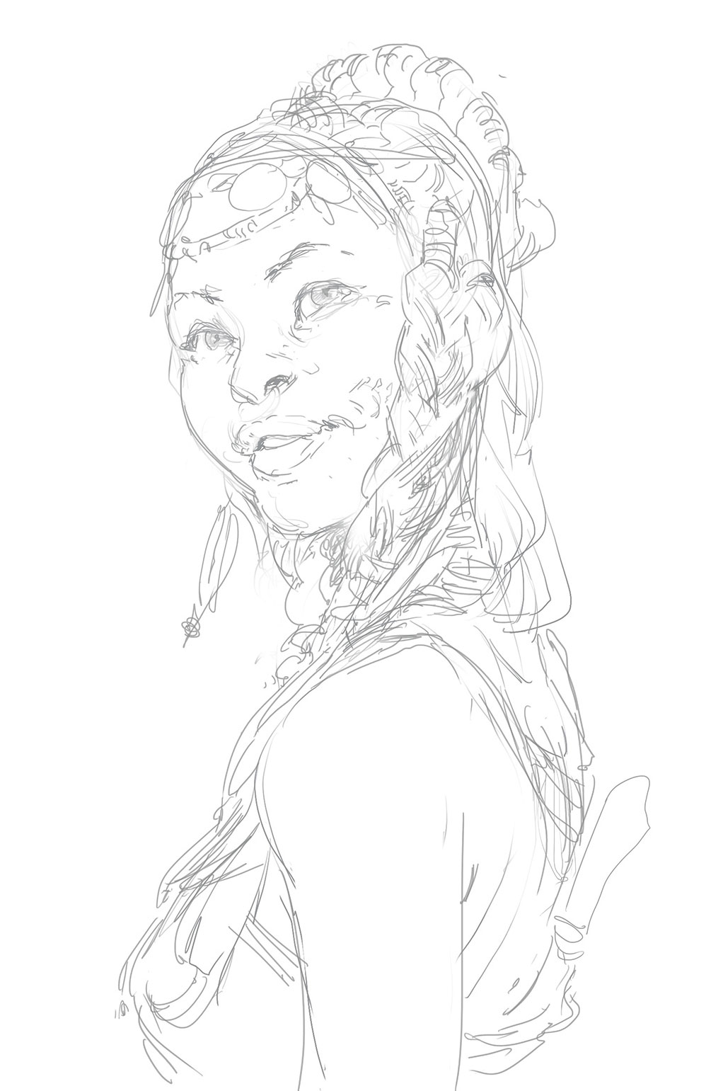
I have a good idea of what I want to do with the figure and her pose, so I sketch it out. I focus on the key details and overall shapes that would both work well and enable me to show off some interesting tribal elements. After I send off my sketch, I receive an edit for the angle of the face, but the rest of the details are approved.
03. Combine sketches to check for errors
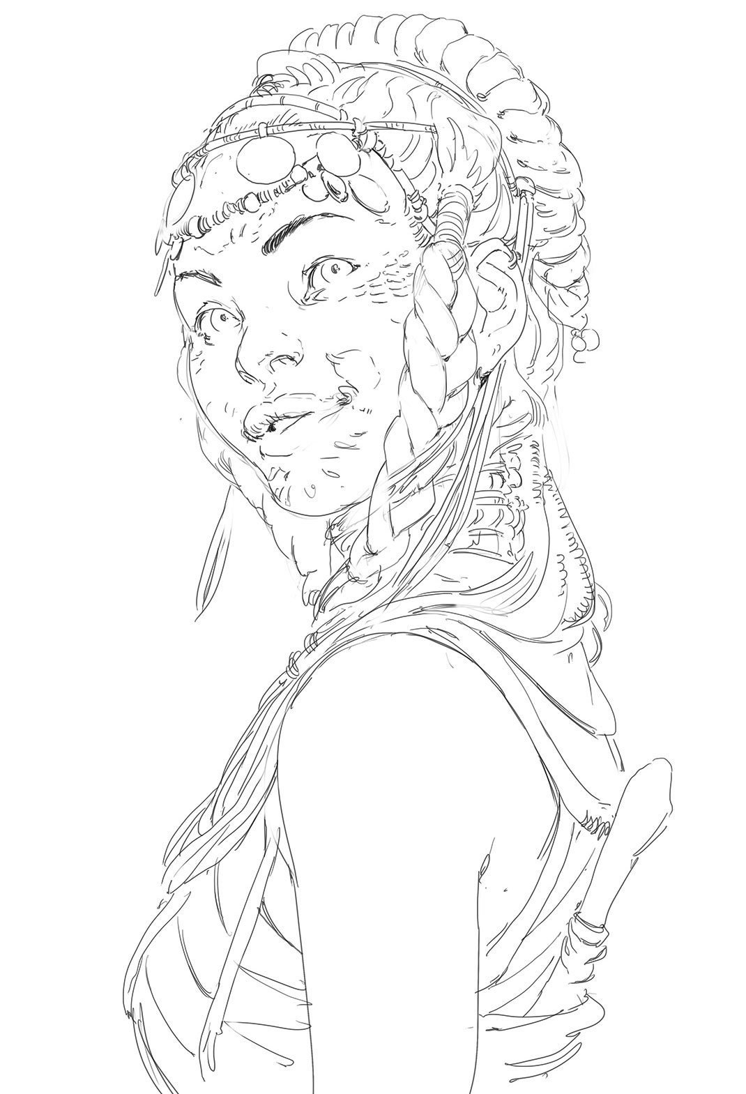
Using the previous sketches as a base, I combine the elements into a single sketch, and then set to work creating a clean piece of line-art to work from. It’s now that I run into my first mistake. At this stage I should have taken a step back and constructed the face properly. Had I done so, I would have seen what would later be revealed as I began to add colour and light. This does happen from time to time, and it comes down to the fact that you can get away with a lot more in a drawing without it becoming problematic, than you can in a painting.
04. Start on the colours
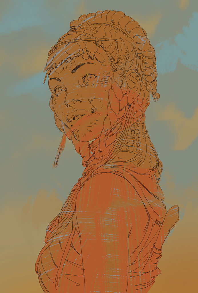
I decide on a simple desaturated background to begin with, choosing to focus on a lot of contrast and colour play on the character. During this point in the process I spend time looking up some references. As well as taking some deep dives on Google and Pinterest, I enjoy leafing through Jimmy Nelson’s Before They Pass Away. This is a book about tribal societies around the world, and is filled with beautiful photos on each of them.
Daily design news, reviews, how-tos and more, as picked by the editors.
05. Introduce light and shade
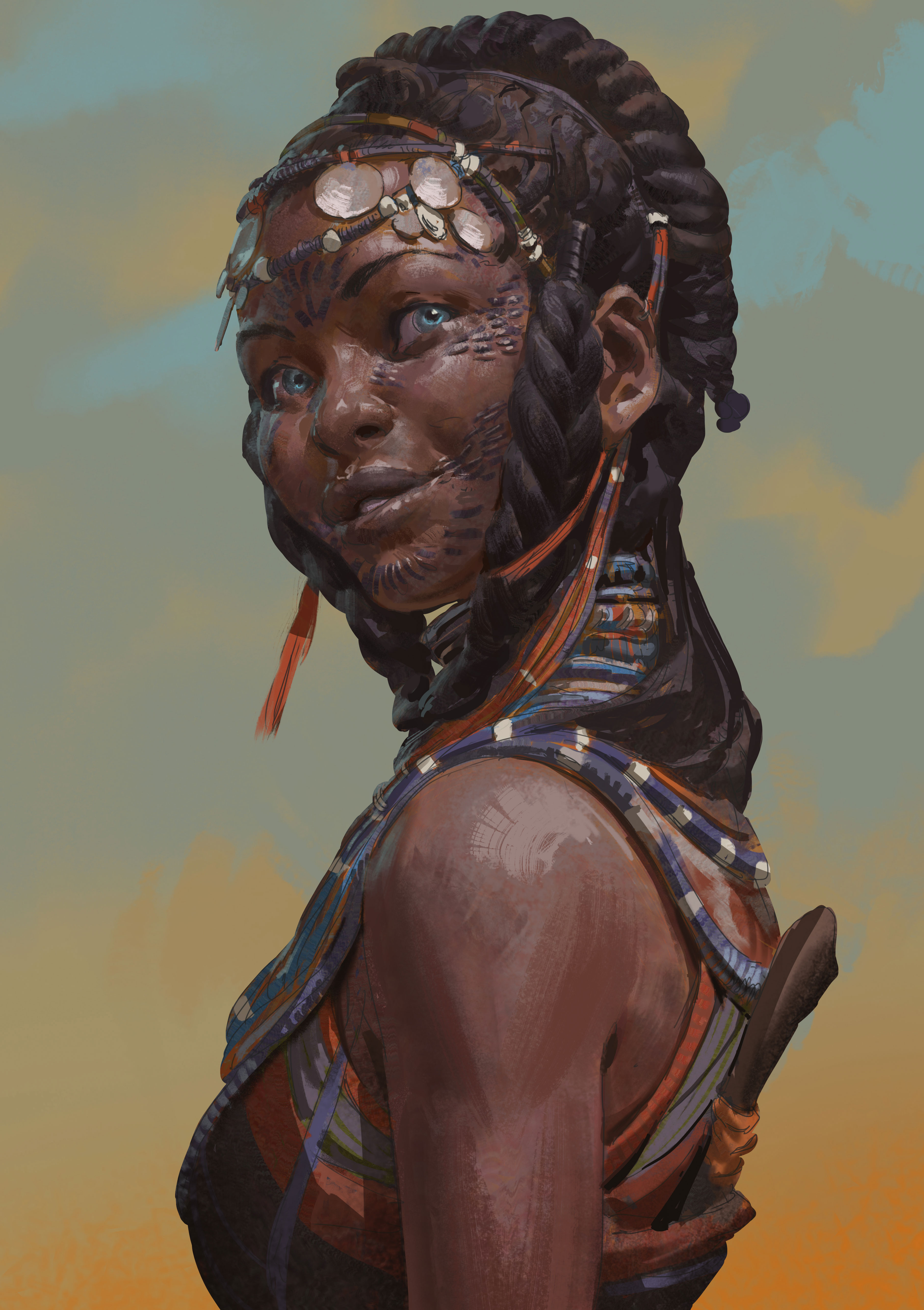
Once the colours are established, I move on to the lighting and shadows, and in the process run straight into my second mistake. I like to put down my shadows using a Multiply layer: first laying them in very simply and directly, before going over and softening up any edges that need it. I’ll usually spend a good amount of time in this stage to make sure I have something I like before moving on, and while I don’t rush it here, I should have spent a lot more time working out my details beforehand.
Yet I had a somewhat painterly result in mind, and this was my second mistake. I had spent time researching the subject matter, but none on working out the precise execution, and this will come back and bite me in the proverbial ass.
06. Fix the background
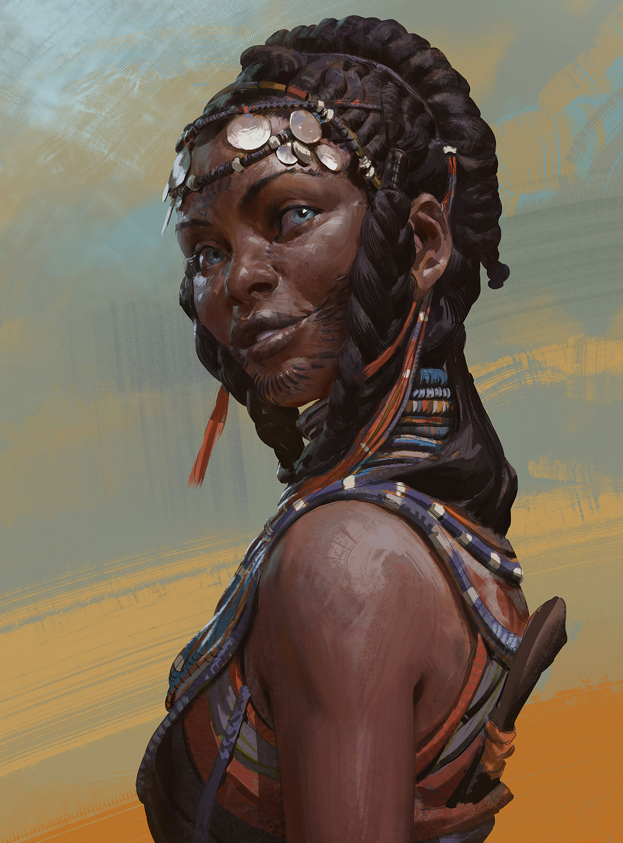
When I have all the lighting information established, I pop a Normal layer on top of everything and begin to paint for real. At this point, depending on how well I’ve done in the other steps, I usually get to have a lot of fun rendering out neat little details, pushing and pulling volumes, and designing all the little elements that gives a viewer a reason for a second look.
It’s during this stage that I decide the background is looking dull, so I try to rectify things with larger brush strokes. I want to leave it abstract, yet use it to help move the eye. However, because I’ve already established the light on the character, I can’t alter the main elements in the background.
07. Streamline my workflow
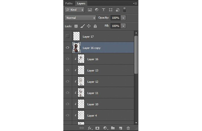
As I began to find something I can push to a finish, I decide to commit to what I’ve got so far. So I duplicate all the composite layers that make up the character and combine them separately. This enables me to more easily work with the Smudge and Mixer Brush tools.
08. Go back to the background
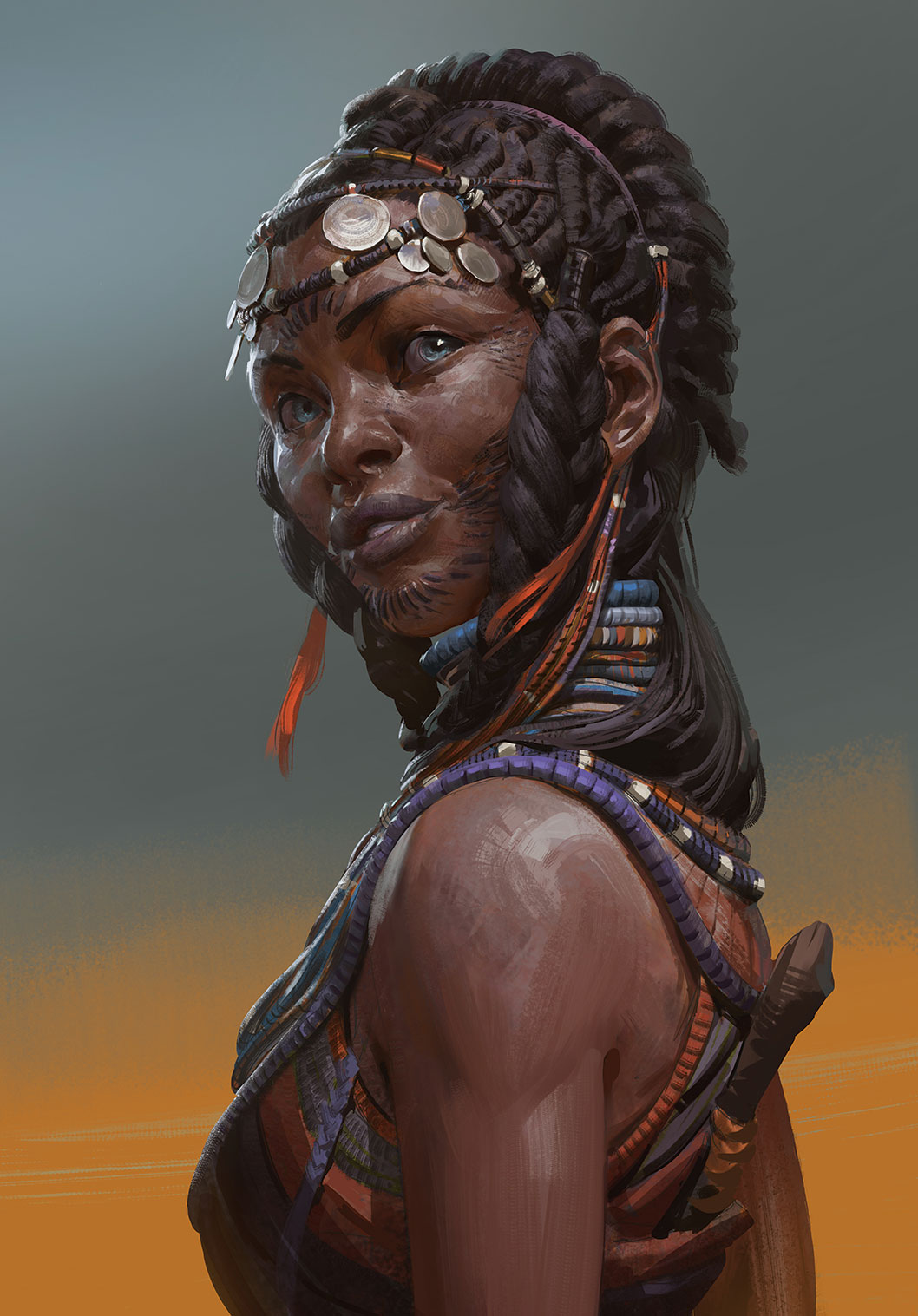
At this point I realise that I’ve stared at this painting for too long, so I leave it for half a day before coming back to it. And of course, by then I’ve had just enough time to let my insecurities get to me, and so began to fiddle some more with the background.
09. Tackle the values in the scene
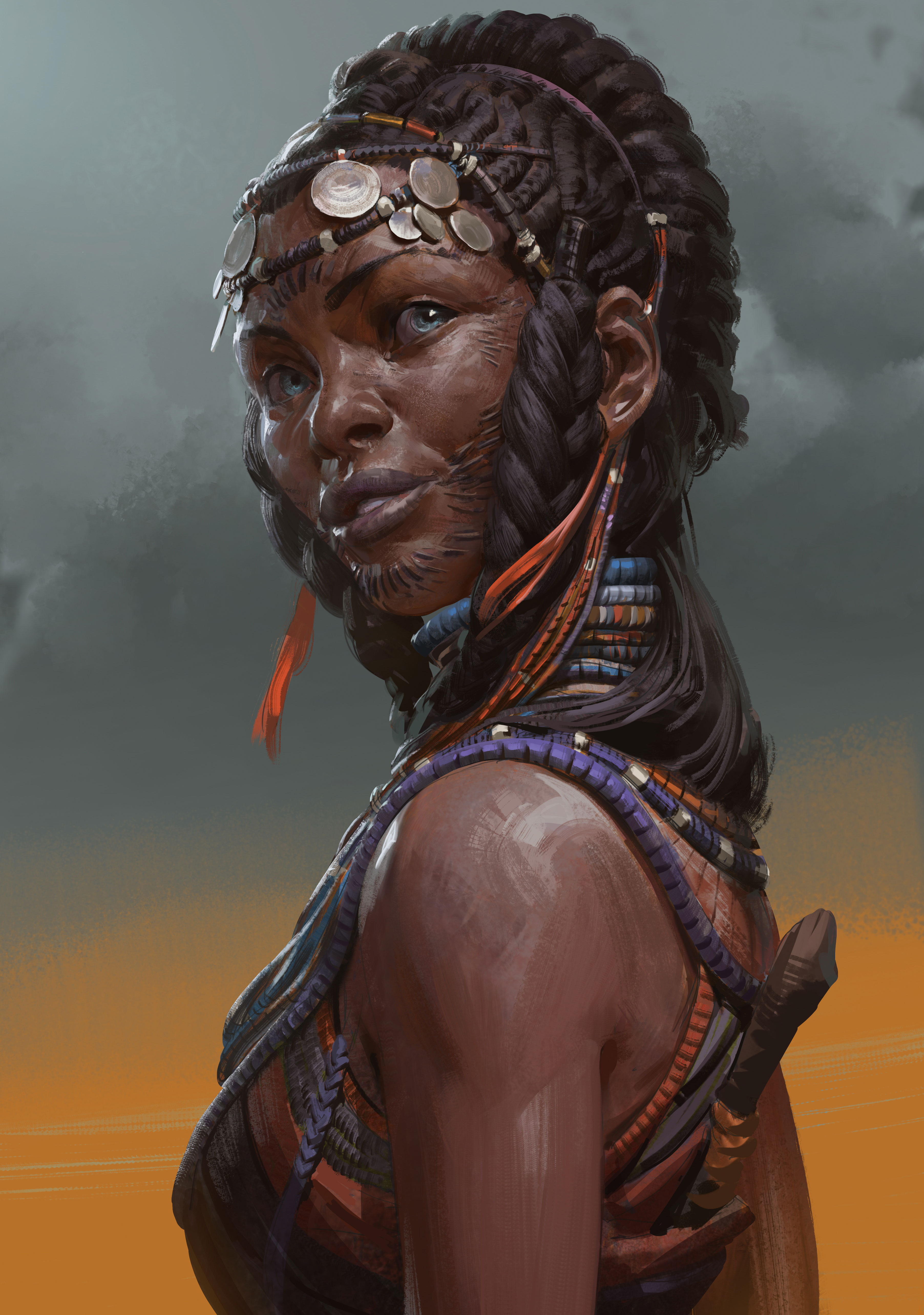
It’s at this point that I look for values rather than colours, and begin to play with the idea of stormy clouds in the background and cold light from an overcast sky contrasting with the tons of reflected light from the landscape. I work more on the character, too – getting her to a place that’s close to her final appearance. Once there, I send it in for ImagineFX’s final approval before finishing.
10. Act on feedback
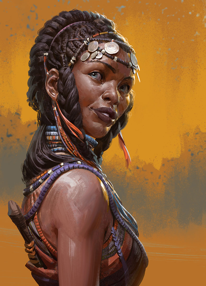
After the second round of feedback I go to work addressing the team’s notes. In general, there was a call for more colour and a brighter background, perhaps something that would read like a sandstorm. I like the idea of that as a palette, although the sandstorm itself might look odd with the character being so formally dressed. I end up getting what I had wanted before, however – a nice, rough, painterly background – and thanks to the art direction this really helps the image.
11. Increase the contrast
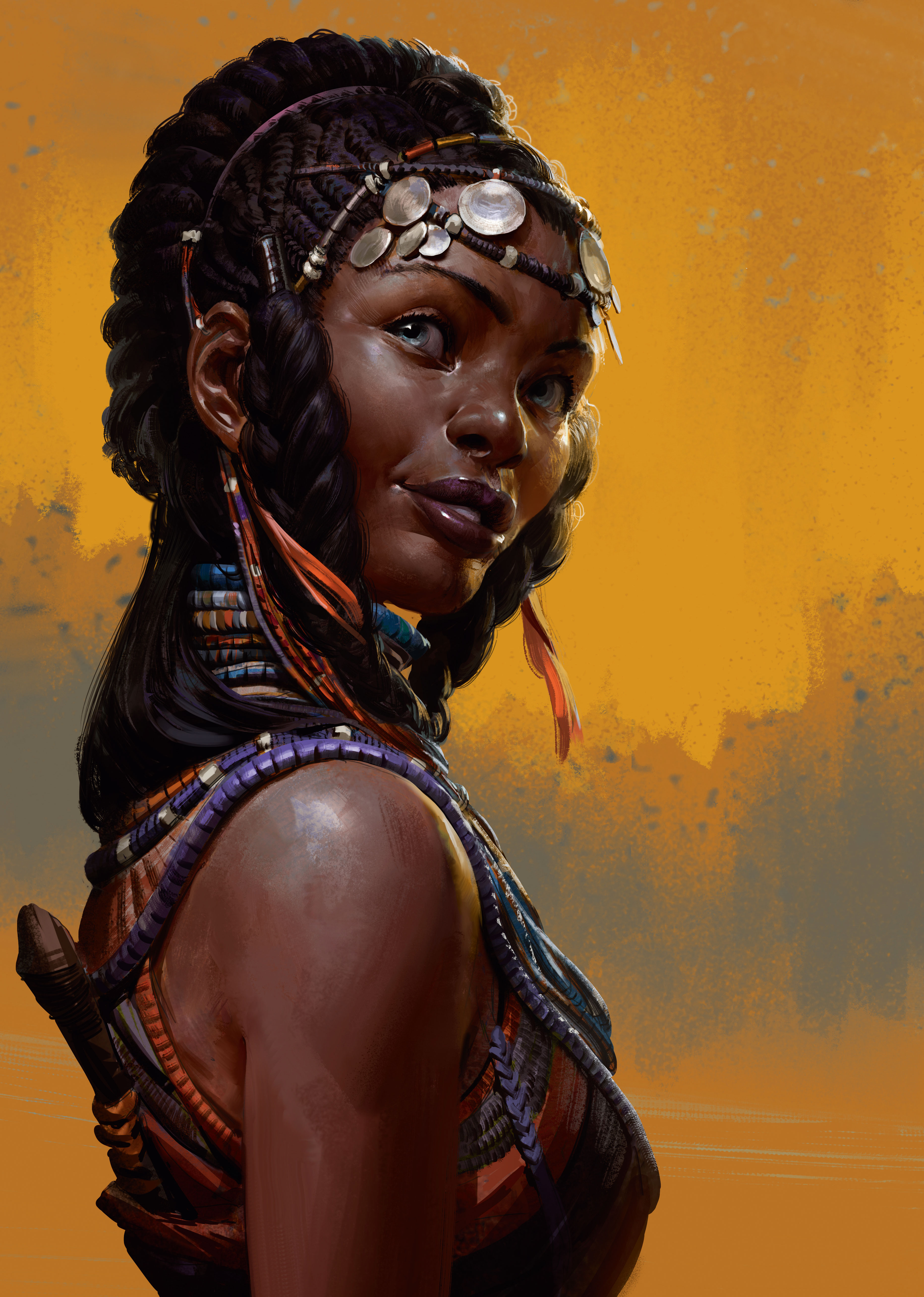
The second round of feedback had also done away with her tribal scar patterns, and so I want to leverage the details of the figure in another way, by really pushing the contrast within the figure. Using a Curves adjustment I achieve something I like. Then I begin to do a second round of rendering on top, collapsing all contributing layers down into one for ease of painting.
12. Solve lighting and anatomy issues
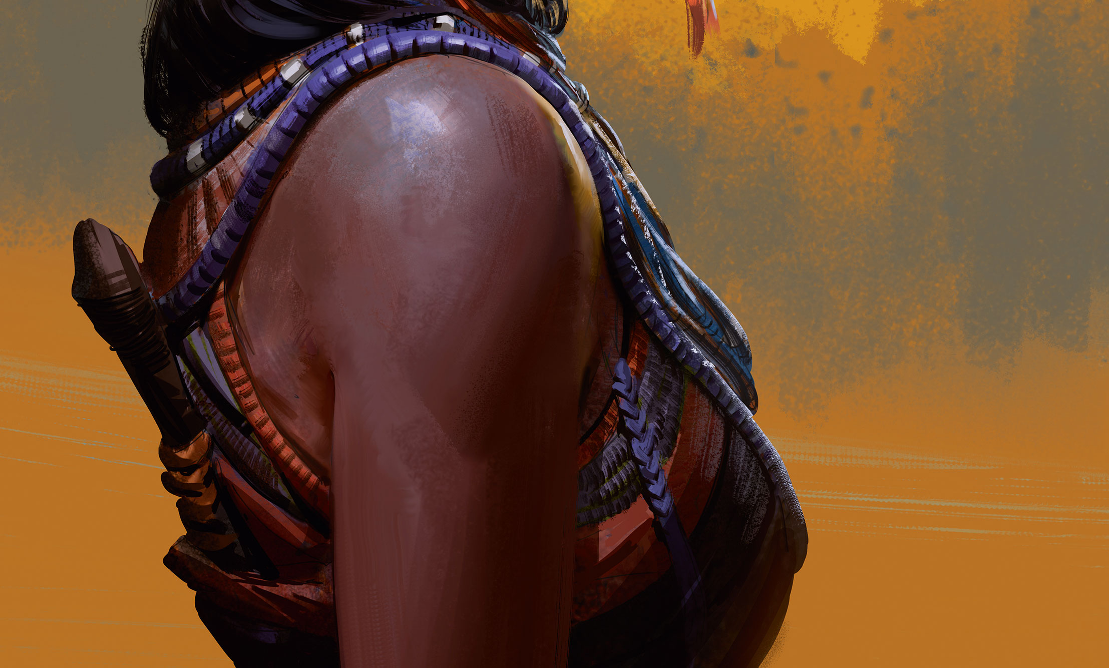
As I’m wrapping things up, I decide that the contrast between the background and foreground light isn’t working for me, so I use a Darken layer to alter the colour of the front light, which sets up a clearer contrast. This is something I should have planned from the start, and could have done a much better job in setting up so that the overall effect would have worked better, but sometimes you just have to improvise. I also have to deal with my sloppy initial drawing when I finally realise that the face is reading too wide. I use the Lasso tool to make the necessary adjustments.
13. Add finishing touches
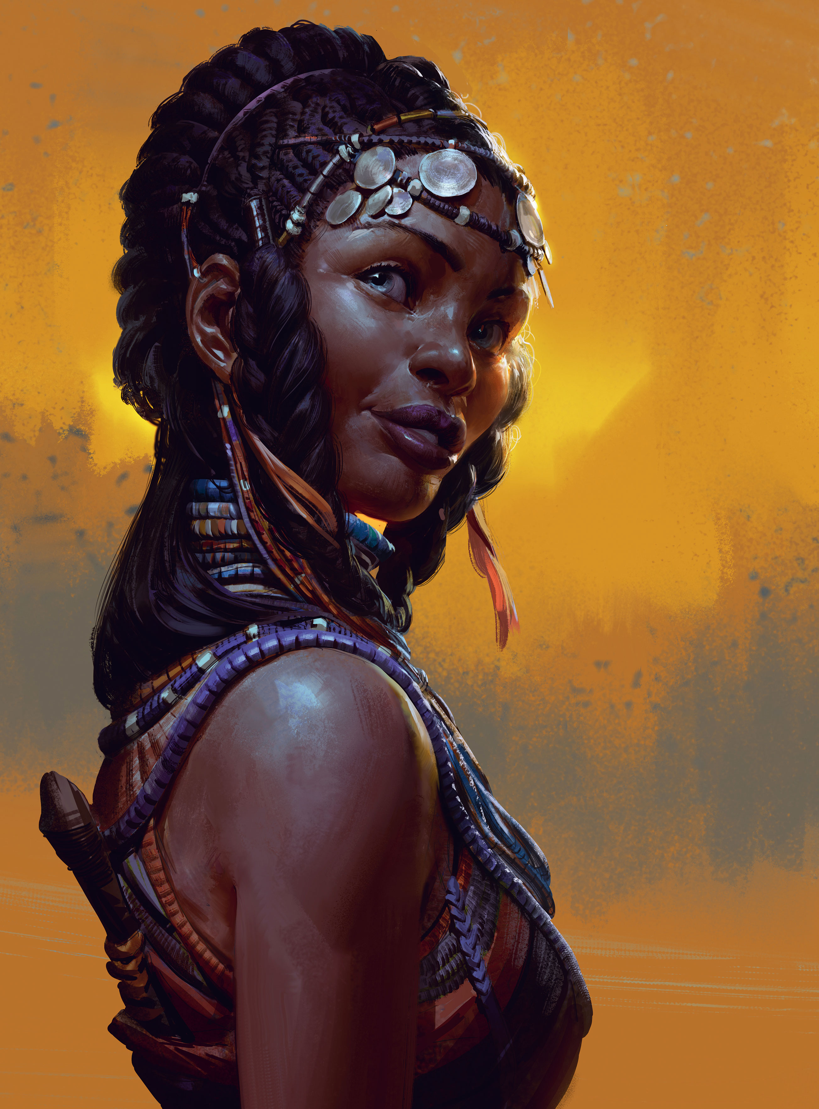
One last round of rendering, when I push a few details around and simplify some of the busier parts of the silhouette, and I’m ready to call it done. I add a final Curve adjustment layer to gently move the colours into the blues, to contrast a little more with the background.
Lessons learned from my process
Overall, I’m happy with how the piece has turned out, although the path I took in getting here was less than optimal. Solid planning prevents poor performance and in this case it’s proved to be true, if not disastrously so. Spend your time where it matters: the initial stages is where you’ll ultimately make or break your image.
Check that the fundamentals are solid, that your choices aid the image, and always have a plan that you can refer to. That way you won’t freak out too much when you realise you’ve screwed something up, and you’ll always find a way to finish the piece. I hope this workshop has been helpful, and I also hope the fine people at ImagineFX will have me back sometime in the future!
This article originally appeared in issue 162 of ImagineFX, the world's leading magazine for digital artists. Buy issue 162 or subscribe here.
Read more:
