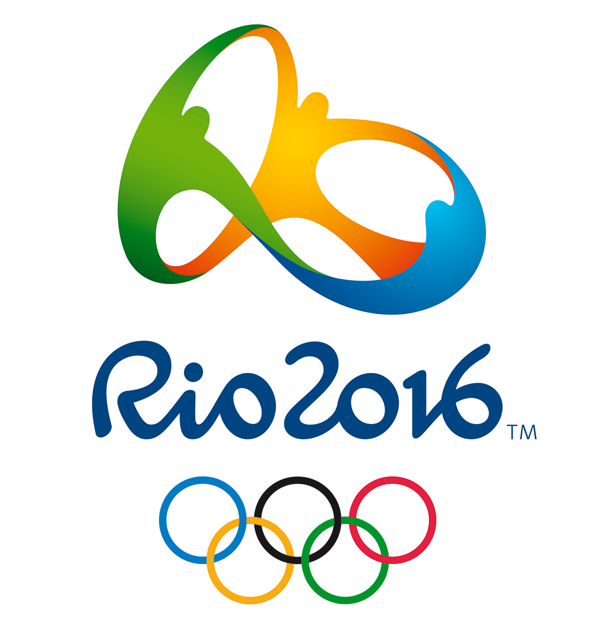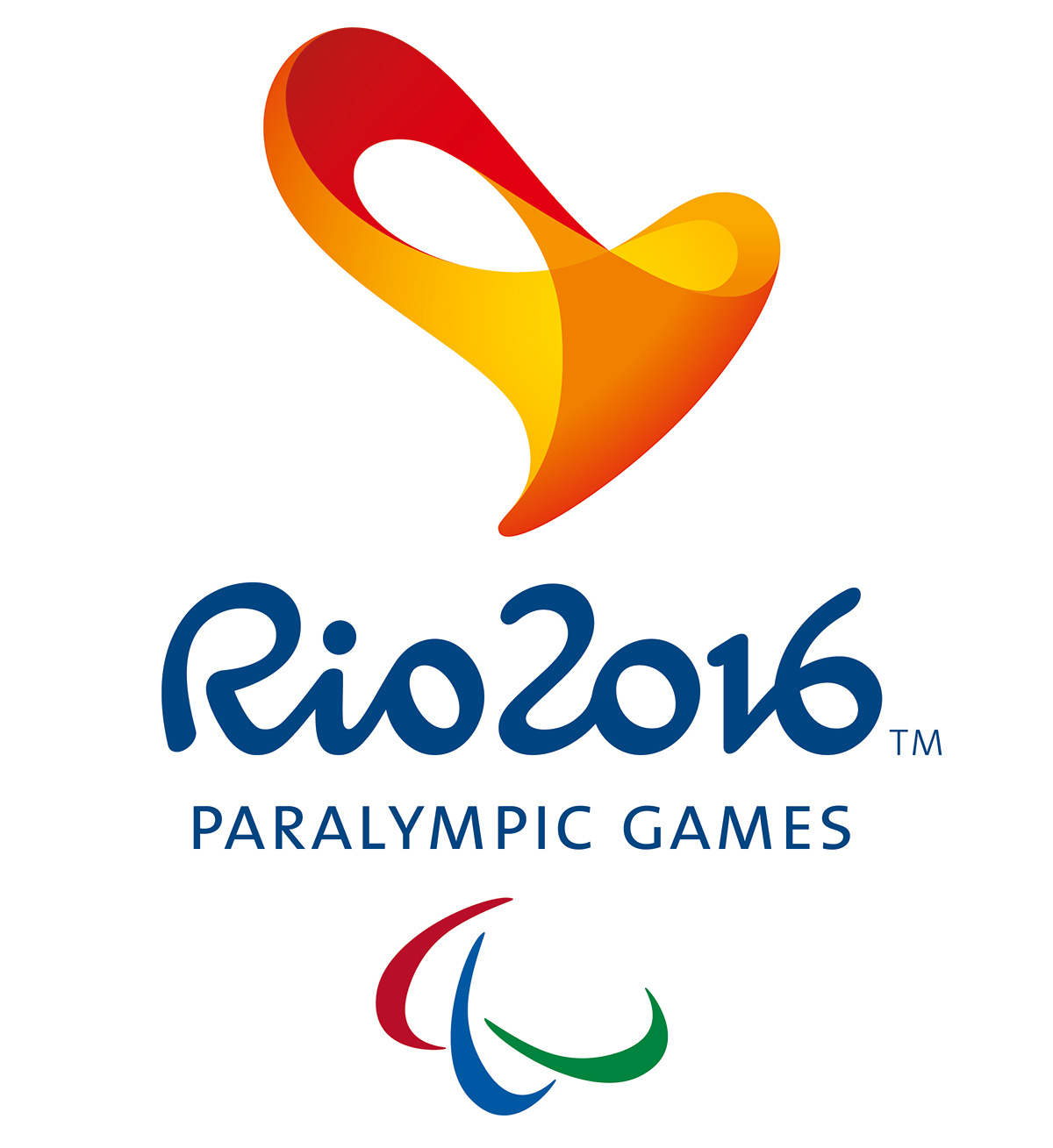
There's only a few days to go until the Olympics kick off in Rio, but the team at Tatil have had the games in mind for a lot longer. They created the logo design and identity package for Rio 2016; here creative manager Daniel Souza reveals some of the secrets behind their work.
"Developing the visual identity for Rio 2016 was a unique project, and meant so much to me as a Brazilian. For our initial bid, we invested everything in a very intense journey, with only one month between briefing and delivery.
"We began by trying to understand the brand essence and how to translate it for a worldwide audience. Using our strategic tool, BranDirection, we came up with a 12-point checklist, setting out the parameters of our brand. Then two teams, from our Rio and São Paulo offices, met by video-conference each week to share ideas, concepts, roughs and designs.
"The design selected to represent Tatil in the bid was the one that got a majority vote among office staff. We'd designed it to represent the encounter of the Olympic spirit with the Carioca soul ('Carioca' is a term used to refer to anything related to the city of Rio de Janeiro). Born with three-dimensional DNA from the very first sketches, it stands for the warmth and welcoming spirit of our people, who are ready to celebrate the Olympic Games. The core symbol shows people joining hands, while the colour scheme reflects Rio's environment: yellow for the sun, blue for the sea, and green for the forests.

"The logo took a little longer In the early stages, we tried several different typefaces to match our symbol. But we finally realised that no prêt-à-porter type would carry the same DNA we had created, so we invited a type designer to help us develop the logo with the same characteristics that shaped our symbol. It took over another month to give this set of seven characters the right personality.
"Before the design was revealed to the world, we had to face a pretty scary NDA. During this time we were working in a small room in the office with no windows, no internet and no phones. No mobiles were allowed inside and access was restricted by a fingerprint lock.
"Our Olympic branding was finally revealed on New Year's Eve 2010, five-and-a-half years ahead of the Olympic Games. There was still lots to be developed and made over the following years though – it needed to still remain relevant, right up until Games time."
Get the Creative Bloq Newsletter
Daily design news, reviews, how-tos and more, as picked by the editors.
This article originally appeared in Computer Arts issue 254. Buy it here!

Thank you for reading 5 articles this month* Join now for unlimited access
Enjoy your first month for just £1 / $1 / €1
*Read 5 free articles per month without a subscription

Join now for unlimited access
Try first month for just £1 / $1 / €1

Tom May is an award-winning journalist and author specialising in design, photography and technology. His latest book, The 50th Greatest Designers, was released in June 2025. He's also author of the Amazon #1 bestseller Great TED Talks: Creativity, published by Pavilion Books, Tom was previously editor of Professional Photography magazine, associate editor at Creative Bloq, and deputy editor at net magazine.
