How one illustrator took aim at Trump – and went viral
The art of resistance: How a small and personal campaign of online graphics ended up at protests around the world.
Is Edel Rodriguez Donald Trump's most hated artist? That was a question asked by Hollywood Reporter back in February 2017 – and the answer is most likely yes.
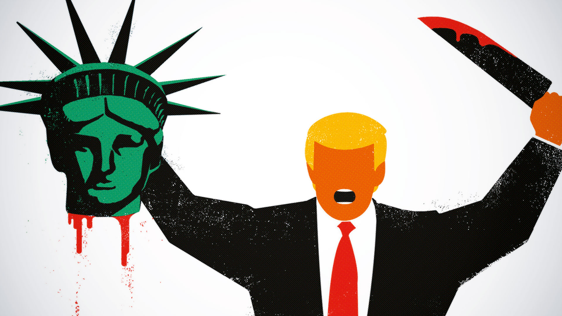
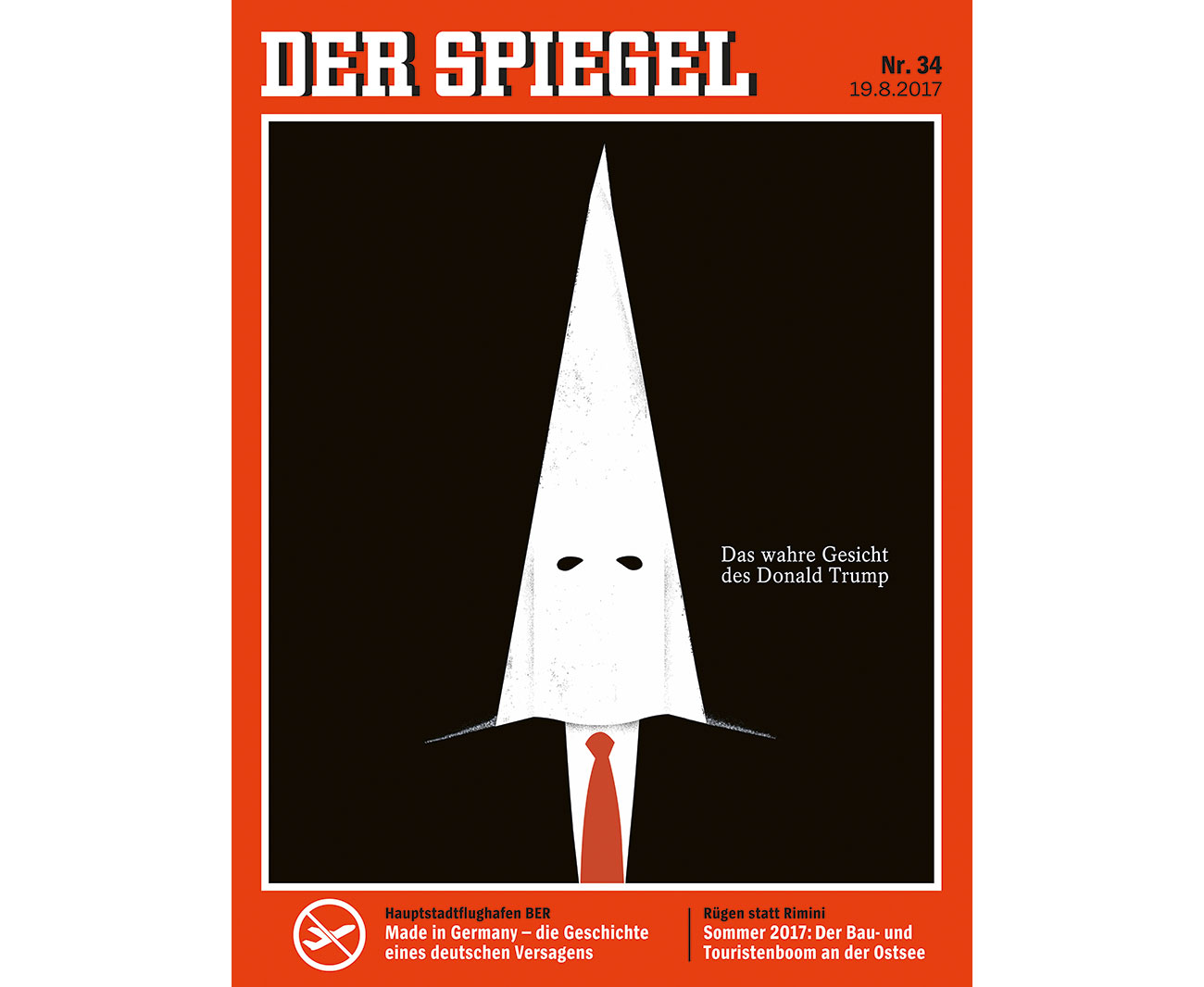
The Cuban-born illustrator has unleashed a devastating visual commentary on US politics since Trump was elected president. He's imagined Trump melting, as a baby surrounded by nuclear warheads and burning American flags. But it's his provocative covers for German magazine Der Spiegel – Trump dressed in a KKK hood; Trump decapitating the Statue of Liberty – that have ignited public outrage.
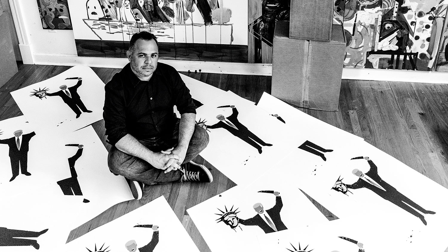
Rodriguez arrived in the US as a political refugee at the age of nine. He didn't speak English, so drawing became a universal language. And over two decades later his ability to transcend language and background through bold, simple graphics remains a hallmark of his work.
At Cape Town conference Design Indaba, where we caught up with Rodriguez, he was described by Pentagram partner Michael Bierut as "an artist who reacts in real time to events we see on the news and translates them into indelible moments of social commentary". Here, we find out how a small and personal campaign of online graphics spread to the covers of magazines before ending up at protests around the world – and how Rodriguez became part of the story.
You're the most prominent illustrator of the Trump era. What is it about your work that's caught the world's attention?
Edel Rodriguez: I don't think the world had ever seen a president quite like Trump, so they didn't know what to do, what to say, how to confront it. There was a lot of shock about what was going on. When people are in shock, they sometimes freeze, trying to figure out how to react. Trump's actions were a barrage, a constant, daily attack on everything democracies were accustomed to.
When my visuals started to appear, confronting this man, I think there was a release of emotion and outrage. It gave people something to hold up, to throw back at the cause of their angst. People had had enough, and these images gave them the weapons they needed to fight back.
The fact that major magazines like TIME and Der Spiegel were publishing the images raised it to another level. Some people were probably wondering if they were alone, but the magazines confirmed their outrage was rightly placed.
Get the Creative Bloq Newsletter
Daily design news, reviews, how-tos and more, as picked by the editors.
What drives you to create such politically charged images? What is it that you hope to achieve through your work?
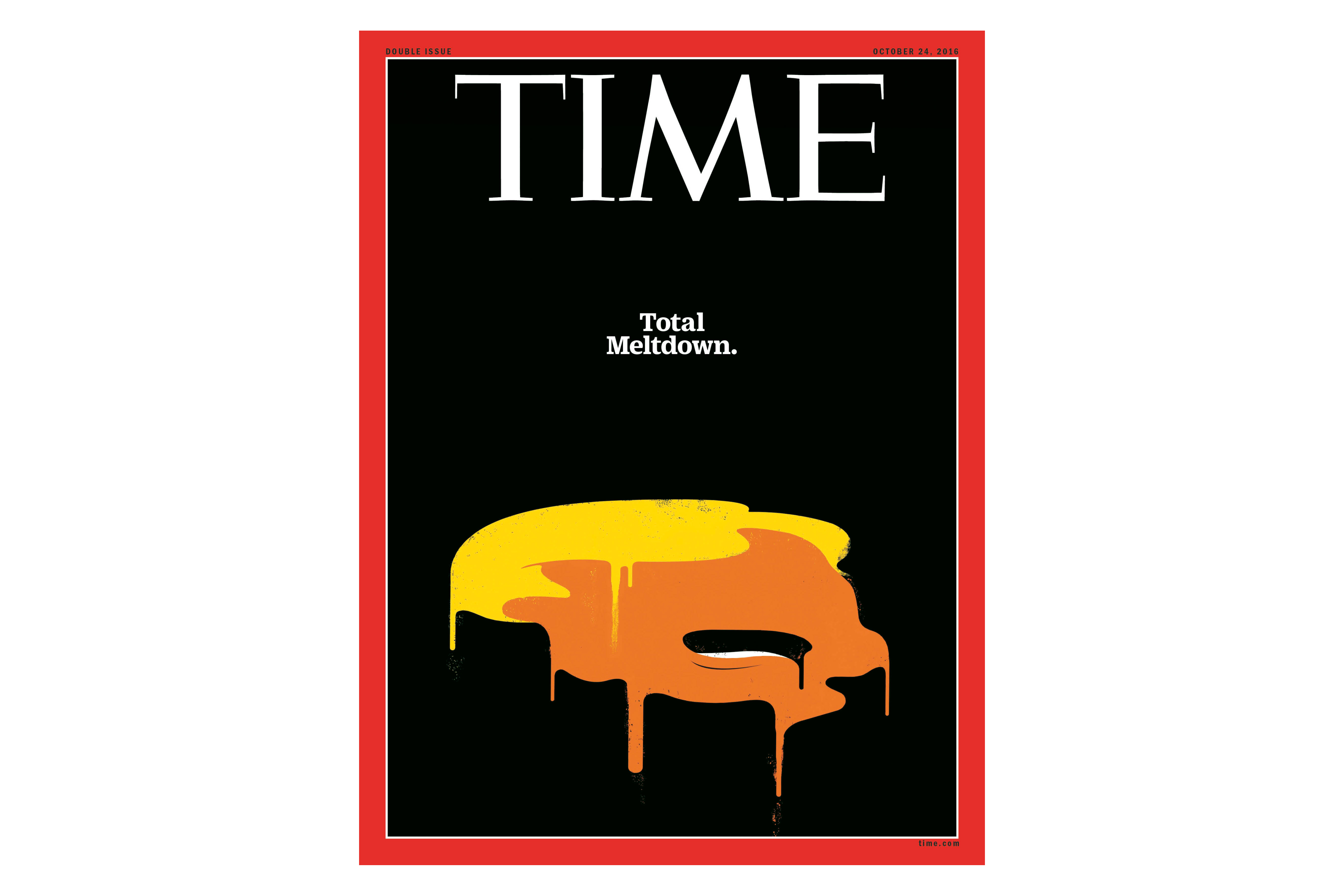
I have very immediate, guttural reactions to abusive behaviour. If I'm walking down the street and see someone being taken advantage of, I'll most likely do something about it. I've chased down purse snatchers, thieves, things like that. My father is the same way. I spent a lot of my youth on a tow truck with him, and he taught me a lot about right and wrong. He would talk back to shady characters, drug dealers, etc, if he didn't like what was going on.
I've witnessed a lot of wrong things in the United States over the last two years: the mocking of a veteran, John McCain, and of a handicapped journalist, insults aimed at the parents of a dead soldier, disgusting language about women, and I'm just reacting to it in the same way.
My main goals are to inform people who might not follow the news as keenly as others, encourage those who want to fight against what's going on, and to stop this president's behaviour from becoming normalised.
In your view, which of your illustrations has been the most powerful or provocative?
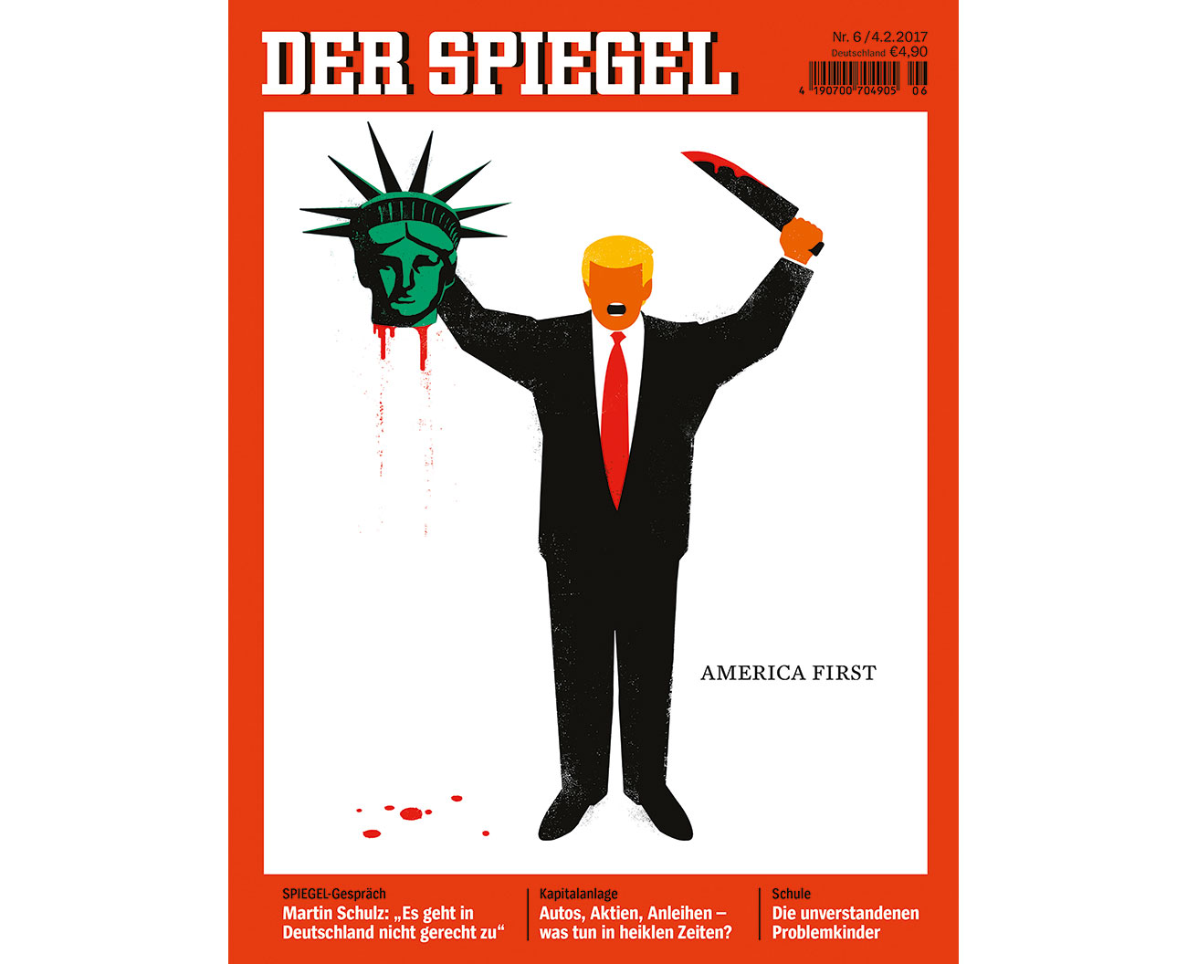
The America First cover for Der Spiegel, which shows Trump beheading the Statue of Liberty. When the Muslim ban was announced I was outraged. Banning people from entering the country based on their religion, while they were travelling – as the planes were in the air – is the behaviour of a dictator, of a tyrant. It's not what America should ever do, especially with the country's long history of welcoming people who have been persecuted because of their religion.
I had a prior image that I'd done of a terrorist with a knife, beheading himself, a comment on ISIS's level of violence. As a reaction to the Muslim ban, I took the existing terrorist image and pasted Trump's head on it, along with the beheaded statue on one hand, and the preexisting knife on the other. I was comparing him to an extremist, who had killed the American Dream.
I posted it online and it received a lot of attention. A few days later, Der Spiegel called to give me a cover assignment on the Muslim ban. I did a number of sketches but none were quite there. They saw the beheading image I'd posted and said they wanted to run it on their cover. I made some minor revisions and they went ahead and published it.
Before the magazine was on the newsstands, people began downloading it from their Twitter feed and printing giant posters of the image. It appeared at airport protests that night and the next morning, and led to a lot of newspaper articles and television coverage.
The biggest challenge was dealing with film crews, radio stations and journalist requests, all of that. Plus dealing with all the angry messages and hatred from people that disagreed with the cover.
How much of your work is driven by a desire to show that the US is still a place where people can speak their minds?
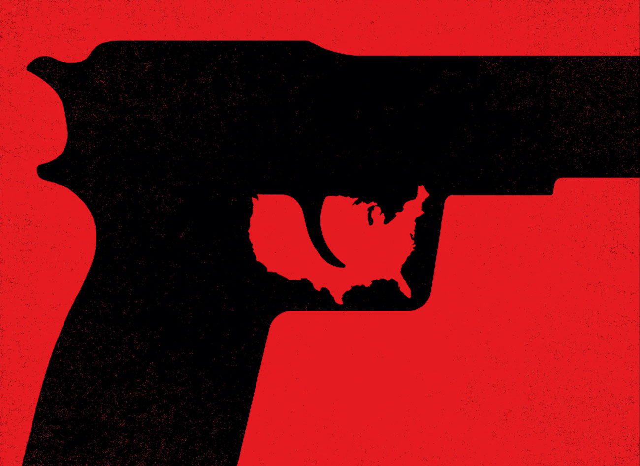
Most of my political work about the country is driven by this motivation. I believe in the ideals of this country, and I'm thankful for all the freedoms here. I want the world to see what is possible here: the idea that one person can directly confront the president, can comment freely on what's happening, and isn't imprisoned for it. This isn't possible in many countries around the world.
At a craft level, how do you make images that all people – no matter their education, background or language – can understand and relate to?
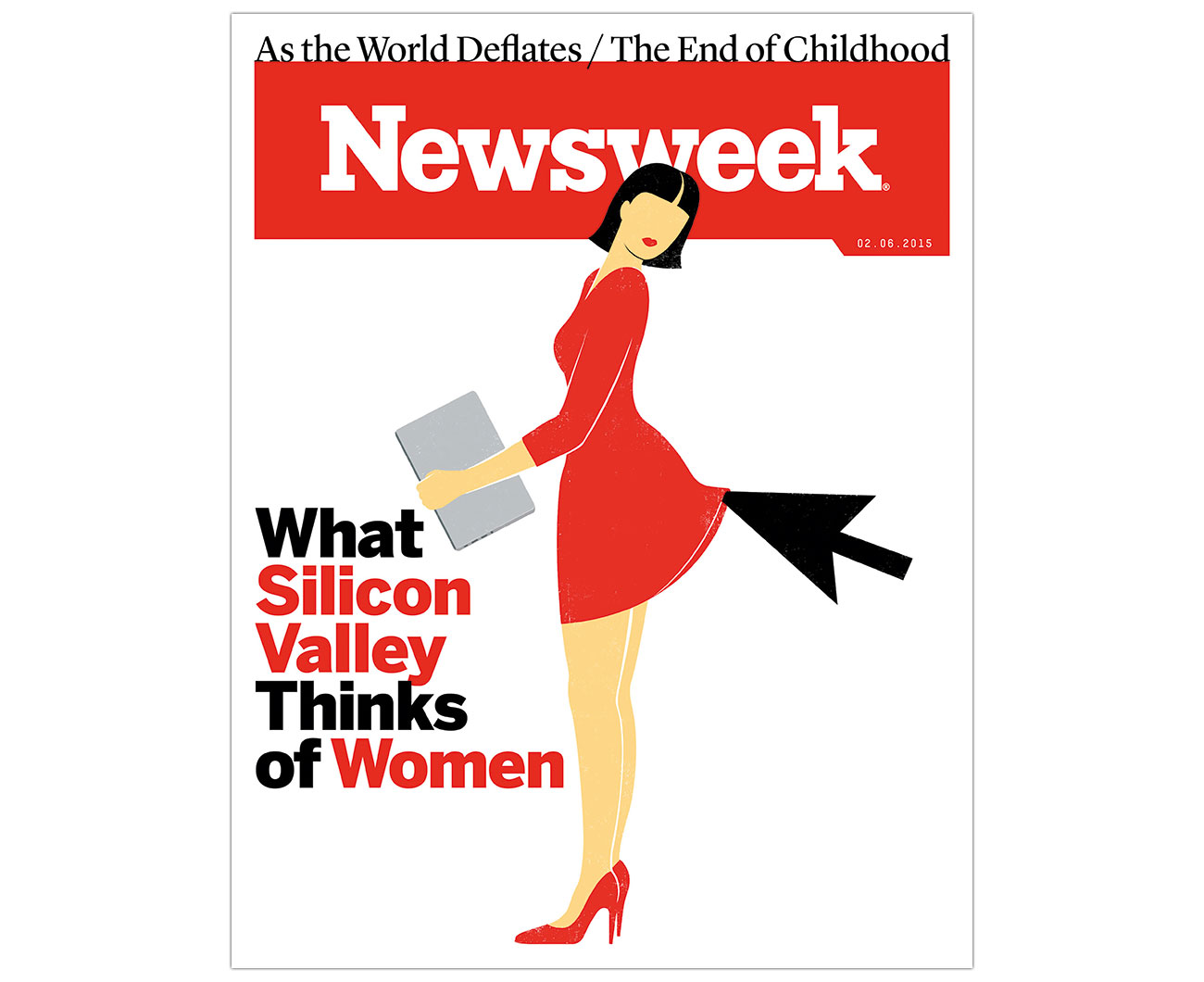
I don't have a specific process; it varies according to the topic and the assignment. Sometimes the idea arrives out of thin air, fully formed; other times I end up doing numerous pencil sketches until I find the right direction.
I do want my images to communicate to everyone, regardless of their visual education level. Sometimes I feel that designers are making things to be seen or appreciated by other designers. The visual language becomes very abstract, or multi-layered, and the point – or the communication – is often lost.
For me, communication is key, communicating to everyone directly. The art is in the service of the idea. This is why the images are so graphically simple, why some elements repeat from one image to another. I've now created a familiarity within the visual language, and want to get to the idea as directly as possible.
Tell us about your alternative cover for Fire and Fury…
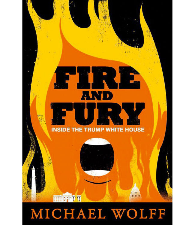
When the book came out, the cover visuals were very flat. I started getting messages from people saying I should have been asked to do it, or wondering what I would have done with the cover. I don't like to have questions hanging out there – I wondered what I would have done with it myself.
So I made a book cover design from an idea I had after the neo-Nazi torch march in Charlottesville. The original sketch had a large Trump fire coming from the tiki torches, which I removed and replaced with a landscape of Washington DC. I posted it on my Twitter account, expecting a small reaction.
Instead it's the most shared image I've made – more than the magazine covers. Many people downloaded the image and pasted it on their books because [they] didn't want to look at the existing one.
Fire is a recurring theme in your Trump illustrations. What does it symbolise for you?
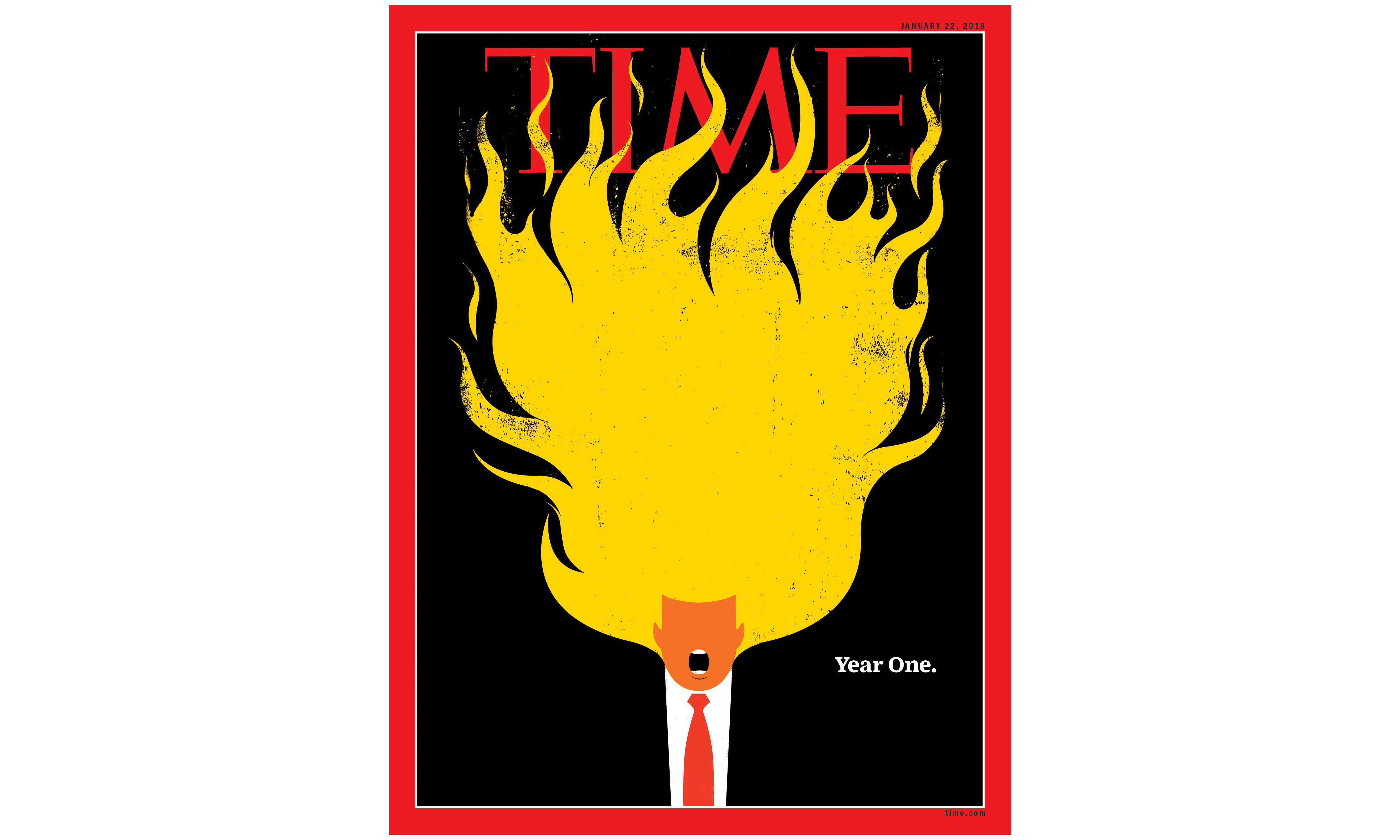
He's like a wildfire: unpredictable, jumping from one place to another, dangerous to the country. I've used fire in a lot of my work going back many years. I grew up in Miami around race cars, pin striped flames, paint and body shops, and so on. My family was in the used car and junkyard business, and I loved hot rod races. I think that has something to do with the visual.
How does working in such a politically and socially charged environment affect your mental health or outlook?
I have a fairly even keeled and content personality. Not much affects me or brings me down. I have an ability to stay calm throughout all of this; it's my nature, I guess. I also value free speech greatly and respect another person's right to have an opinion, even when it's full of vulgarities or insults.
I've never been involved in an ongoing project where I felt [like] I was on the right side of history more than I do now. I have no doubt about it. This is about what is right and just. When you have justice on your side, nothing affects you. You just move forward.
What advice would you give to someone who wants to get into creative activism and has real passion to encourage change, but doesn't know where to start?
If you feel a calling to speak up about topics that move you, then just go for it. Don't ask for permission; don't wait. Put it out there and see what happens. Have empathy for others and speak for those who can't. Make work at the service of others. You may be surprised at how many people will connect with it.
This article was originally published in issue 280 of Computer Arts, the world's best-selling design magazine. Buy issue 280 here or subscribe to Computer Arts.
Related articles:

Thank you for reading 5 articles this month* Join now for unlimited access
Enjoy your first month for just £1 / $1 / €1
*Read 5 free articles per month without a subscription

Join now for unlimited access
Try first month for just £1 / $1 / €1
Julia is editor-in-chief, retail at Future Ltd, where she works in e-commerce across a number of consumer lifestyle brands. A former editor of design website Creative Bloq, she’s also worked on a variety of print titles, and was part of the team that launched consumer tech website TechRadar. She's been writing about art, design and technology for over 15 years.
