How neuroscience and UX impacts video game design
4 ways to design player-friendly video game art and UI.
Whether it be rendering 3D environments, 2D character sprites or slick UI, talented artists and designers play an absolutely crucial role in video game development.
Gaming is a medium that has incredible scope for artistic variety, from collapsed underwater civilisations to worlds populated with Russian dolls. But it's also one that demands very different considerations of its artists.
After all, encoded in a game's art are messages that the player must understand and respond to accordingly in order to progress, which makes for a unique relationship between designer and consumer.
Celia Hodent, director of UX at video game behemoth Epic Games and holder of a PhD in psychology, has written a book on this subject called The Gamer's Brain: How Neuroscience and UX Can Impact Video Game Design.
In it, she sets out to explain how cognitive science and an understanding of player psychology can make for better design decisions.
Below are some of her practical tips on how game artists can design around the complexities of the human brain.
01. Consider a diegetic interface
Some semblance of an HUD (heads-up display) has long been a staple of video game UI design. The principle behind this is simple: that key information, such as health or ammo supply, is always available to the player.
Get the Creative Bloq Newsletter
Daily design news, reviews, how-tos and more, as picked by the editors.
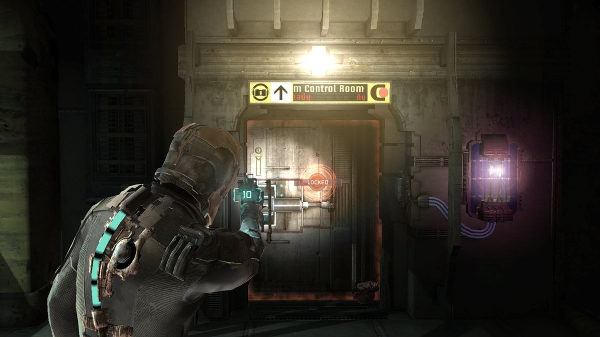
But more recently, games like Dead Space – which stylishly displays the health bar on the spine of the playable character – have experimented with diegetic UI elements.
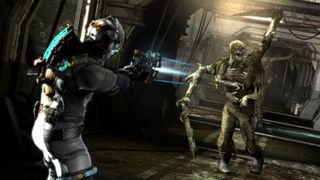
This means that unlike with a traditional HUD, the information is contextualised within the game world and made visible to characters themselves.
Another example of diegetic UI is the iconic Pip-Boy from the Fallout series [below]. But cognitively, there are cases both for and against.
“If you can actually convey some information where the eyes are looking and where the attention is, it's going to help the player not having to try and find information in the corners,” Celia Hodent tells Creative Bloq.
In her book, she explains that this is down to the way in which our visual perception works, with visual acuity far sharper in the centre of our gaze than in our peripheral vision. “When you look at eye-tracking for shooters, the eye is really towards the reticule at the centre of the screen,” she adds.
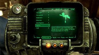
Another argument for the diegetic interface is that with the HUD stripped away, players are able to immerse themselves more fully in the game world. Hodent is not fully convinced of this.
“A lot of people say 'if you want a more immersive experience, remove the HUD and then you got it',” she considers. “Which is not always the case. If you try too hard to do that at the expense of usability principles, this is when you have a problem.”
Indeed, she adds that such a move can have the unintended result of increasing a player's 'cognitive load' – in other words, increasing demands on attention and memory – which can lead to frustration.
02. Have form follow function
Adapted from Jakob Nielsen's set of oft-cited usability guidelines, written in 1994, Hodent's book includes her own 'Seven Usability Pillars for Game UX'. One that particularly stands out is 'Form Follows Function', which quite succinctly encapsulates the task faced by video game artists.
She argues that “the visual expression of a game element should intuitively inform the player how to interact with it.”
Of artists, she adds: “their assets are constrained by what players need to understand, and that they need to follow 'Form Follows Function' as an aesthetic guide.”

Simply having a brilliant imagination and incredible technical ability isn't enough to be a great game artist. For that, you need some sense of coherence with the overall vision.
“One of the misconceptions about UX is that it is going to hamper your creativity,” Hodent explains. “But in an interactive experience, everything has to be cohesive and you're here to serve gameplay.”
“The art has to serve two purposes: it has to really support the gameplay elements, and it has to delight the players. A lot of times, there's design there but I'm not sure what it's saying to me.”
03. Don't make players read
Similar to the idea that form follows function, another of Hodent's usability pillars is 'Signs and Feedback'. Signs are what invite the player to take a specific action – like a flashing red screen may prompt a player to use a health pack – while the appropriate feedback both affirms the action and effectively teaches for the future.
Effective use of signs and feedback can significantly minimise the need for blocks of tutorial text, which Hodent believes should be avoided where possible.
“The brain is taking shortcuts all the time, the brain wants the minimum workload,” she says. “We're actually using heuristics ourselves to go straight to the point.”
“If you have a lot of text, it's likely that the player is not going to read it, or try to parse it for keywords. Motivation is the origin of any behaviour. If you just give them instructions, that's not going to be as compelling.”
04. Test with real people

If there's one thing from her academic background that Hodent would like to see implemented in the games industry, it's the rigorous approach to testing a hypothesis.
You think your UI is intuitive, but how will you really know until it's in the hands of players? Big game companies such as Epic have a whole protocol in place for this kind of testing, but Hodent maintains that even small companies can take steps towards assessing usability.
“Really get the basic understanding of how perception works, the Gestalt Principles,” she advises.
“Study the principle of memory; don't rely on the memory of the players, assuming that when you put a tutorial text that: one, they read it; two, they understood it; and three, they're going to remember it.
“You bring people over and they test your game, and they can't see that little thing in the HUD,” she continues. “Once you understand that they're not doing it because they don't have the same context that you do to understand the HUD, that helps you iterate faster.
“And when you ship the game, it's going to be way more likely to be successful.”
The Gamer's Brain: How Neuroscience and UX Can Impact Video Game Design, published by CRC Press, is available now.
Related articles:

Thank you for reading 5 articles this month* Join now for unlimited access
Enjoy your first month for just £1 / $1 / €1
*Read 5 free articles per month without a subscription

Join now for unlimited access
Try first month for just £1 / $1 / €1

