How chatbots are learning
Conversational interfaces are improving, but the UX still needs work, Giles Colborne tells us.

We caught up with Giles Colborne, co-founder and CEO of cxpartners. One of the world’s leading independent experience design consultancies, Colborne is the author of Simple and Usable, a book on the topic of simplicity aimed specifically at interaction designers.
What will be left after the chatbot hype? Who/what will survive?
Giles Colborne: The problem with hype is that it leads people to put stuff out there without discriminating whether it’s good or not, and it encourages people to assume that anything is possible, so they wildly overreach. It’s the same story with any new or emerging technology.
So after the hype, I expect a few good, solid, simple, robust examples and patterns to emerge on which we slowly build more complex experiences. It’s wonderful to listen to the hype and to dream, but if you’re building a system for people to rely on, you shouldn’t be afraid of doing something simple and functional.
I think that with any system that relies on machine learning (and a lot of natural language interfaces do rely on machine learning), the people with the big data sets will have an advantage. I’d like to hope that doesn’t turn into platform lock-in.
Back in the early days of the consumer internet, we avoided platform lock-in thanks to the web, which had an open specification that anyone could use. It’s hard to see something like that happening this time around – legislation may need to come into play. But all that is probably still years away.
What are the benefits of chatbots and conversational UIs?
Get the Creative Bloq Newsletter
Daily design news, reviews, how-tos and more, as picked by the editors.
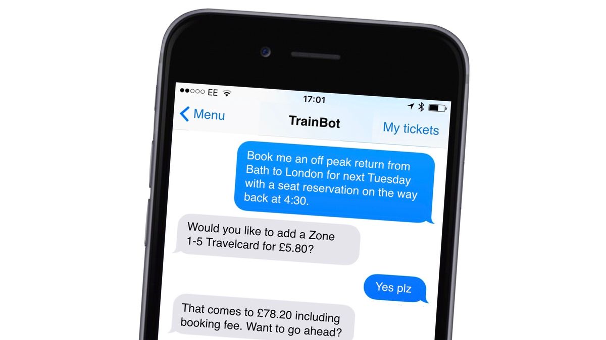
GC: First, I should draw a distinction between chatbots and conversational UIs and full Natural Language Interfaces (NLIs). Chatbots sometimes ask the user to select from a number of possible answers – rather like the horrible IVR systems that sort voice calls on telephone lines ("press 1 for balance enquires, 2 for customer service, etc."). NLIs allow you to type a response in your language and then respond based on that. I’m more interested in NLIs and that’s my focus.
What I like about NLIs is that there’s almost no user interface to learn. Apps like Facebook Messenger are among the most commonly used apps on smartphones today. The user interface is simple, and the idea behind them is easy to understand. So building services on top of that familiar, widely used interface looks like a good idea – so long as the services themselves are easy to use.
What’s more, if you can build an interface that works on something really basic like SMS, then it’ll work on Facebook Messenger, or WhatsApp, or some other chat platform – so there’s the promise that you can extend your reach.
The preference for chat type services grows as you look at younger audiences. They’ve grown up with social media and they seem to prefer to interact with those types of services rather than phone or email. But, of course, this is an interface that’s inherently accessible to people with visual or hearing impairments and is easy for users of all ages to understand.

What fascinates me, though, is that Natural Language Interfaces mean we can design systems that feel more human. Human conversation has a lot of interesting qualities that graphical user interfaces struggle with.
For instance, if you’re asking a person for help finding something, like an airline ticket, you often start out with quite a vague description and slowly zero in on a couple of good choices. We can do that in faceted search interfaces at the moment, but people struggle to use them effectively – especially on small screens. What you tend to get on small screens is a series of menus that you drill into. That can feel clunky or confusing. Natural Language Interfaces can bypass that.
Finally, the next wave of computing isn’t about laptops or mobile phones – it's about environments full of smart devices that know you and that interact with you. You don’t want a touchscreen on every device or an app for each device on your smartphone. You want a common interface that knows you and that you can communicate with easily. That’s why I think NLIs and artificial intelligence technologies have such an important role to play in the next generation of user experience.
And what are some of the pitfalls in conversational interfaces and how can we avoid them?
GC: I think the biggest pitfall is in creating conversations that look like flowcharts – ones where the dialogue is mapped out in minute detail. In reality, conversations are rather vague and squidgy. If you try to map them out in detail, you end up missing the complexity – or you just create another one of those IVR systems.
For instance, if you ask someone their name, one person might give you their full name including title, while another might just give you their first name. You have to let them do that, and then circle back for the missing details. That’s not an error, it’s just a different way of answering the question.

How can we improve bots to enhance the user experience?
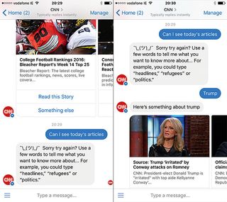
GC: When you listen to people using voice systems especially, a great deal of the conversation is about the user figuring out how to ask questions and learning what the system can and cannot do. I think most NLIs do a terrible job at handling those situations.
For instance, say you ask your voice assistant to play a song, like 'Bohemian Rhapsody', but you get the name wrong and you call it ‘Mama, just killed a man’. From the point of view of the user, and a human listening in, the user has given a valid and useful request. But most voice assistants fail to match the title and give up and the user is back to square one.
This kind of thing happens all the time with voice assistants, but a human would try to use the information given and ask a sensible follow-up question like ‘Can you remember who it was by?’ or ‘Is that the title or a line from the song?'. If we’re going to make these systems tolerable, we need to spend more time thinking about how the system should respond when it doesn’t understand.
What are some of the characteristics of chatbots or conversational UIs that get things right?
GC: A lot of the best conversational UIs and chatbots don’t try to do too much. For instance, when you’re driving and you ask your smartphone to give you directions home, there’s not much of a ‘conversation’ going on – in fact, the shorter the better. But you get a lot of output (an hour’s worth of driving instructions) for minimal input (‘get me directions home’). And the input is kept minimal because the smartphone uses a lot of contextual data to fill in the blanks – it assumes you mean driving directions, it gets your current location from GPS, and it finds your home address from your smartphone settings.
I’d say those are pretty good design maxims: keep the conversation short, make use of contextual data, offer maximum output for minimum input.

Where is conversational design going next?
GC: There are lots of interesting things happening right now. There are voice assistants that distinguish between different people in the room, and voice assistants that manage the emotional undercurrent of conversation, not just the exchange of information.
There are also tools that make complex features easier for designers to access, and interfaces that mix voice and visuals (so you can see a travel itinerary build up as you speak to a virtual travel agent, for instance). It’s an exciting time.

Thank you for reading 5 articles this month* Join now for unlimited access
Enjoy your first month for just £1 / $1 / €1
*Read 5 free articles per month without a subscription

Join now for unlimited access
Try first month for just £1 / $1 / €1
Oliver is an independent editor, content consultant and founder of Pixel Pioneers. Formerly the editor of net magazine, he has been involved with the web design and development industry for more than a decade and helps businesses across the world create content that connects with their customers. He is passionate about content, user experience, accessibility and designing for social good.


