How can designers deal with plagiarism?
We explore the difference between coincidences and plagiarism.
“Good artists copy, great artists steal.” It’s a quote that's often attributed to Pablo Picasso, and has famously inspired the likes of Steve Jobs. But while it’s a memorable zinger, the line touches on a prevalent issue in the design industry: where do we draw the line between a coincidence, or imitation, and outright plagiarism?
Plagiarism isn’t a new problem for designers, but the internet seems to bring more opportunities for pointing fingers (or Tweets) at possible copycat designs. With even the most obscure source material being dredged up on social media, and rightfully defended if a new piece of work emerges that bears more than a passing resemblance, there's more pressure than ever for creatives and brands to play fair. In this day and age when news – and accusations – spread like wildfire, it's also a lot more embarrassing and potentially reputation damaging if you are caught out.
Here, we take a look at some high-profile cases of plagiarism, look at their outcomes, and talk to expert, Michael Johnson of Johnson Banks, to find out what designers can do to deal with, as well as avoid, such claims.
Do your research
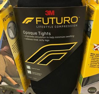
One of the most bizarre incidents of uncanny design similarity occurred in January of last year, when a keen-eyed Reddit user noticed a resemblance between the Formula 1 logo and a pack of 3M compression tights. Both feature an 'F' logo with a comparable curve, but is this an example of big brand plagiarism or something more innocent?
The story spread like wildfire, with industry leading names including Johnson weighing in to discuss the perils of trademarking logos. Shortly after the incident, we caught up with Johnson to hear how coincidences can arise, despite a designer’s best intentions.

“It’s very easy to have a knee-jerk reaction to an example like this,” says Johnson of the brouhaha between Formula 1 and 3M. “Yes, they look similar. Yes, they both use a lined ‘F’, both are italic. But, technically speaking, even though 3M filed their registration early last year, their registration itself is buried very deep in the US trademarking machinery – and is for medical clothing. It only seems to exist in one picture of some point of sale, and isn’t even on 3M’s website.”
Start off trying to do something new, rather than something that seems familiar
Michael Johnson
“Now, Wieden + Kennedy [the independent advertising agency behind the Formula 1 rebrand) tell me that they did thorough trademark checks in all their relevant categories – but imagine for a moment the enormity of that task."
Get the Creative Bloq Newsletter
Daily design news, reviews, how-tos and more, as picked by the editors.
"There are 45 different classes of goods and services, and 29 image classifications – and that’s just in Europe. The US system is slightly different, and in some countries registration is still done on paper and fax! So, factor all that in, and it’s easy to see how one single application for medical clothing slipped past the eyes of the checkers.”
Johnson adds that a delay between registrations being applied for and granted also allows for clashes to be spotted.
Research, then, is plays an important part in the design process as it prevents headaches further down the line, but where do designers start?
Five-pronged approach
When it comes to checking whether or not a potential piece of branding has been done before, Johnson has a five-pronged approach up his sleeve.
- Try to do something new, rather than something that seems familiar.
- Scour logo and symbol books for designs that have been done before, and try to mentally ‘log’ them (but don’t copy them).
- Do basic logo searches online – but bear in mind these are not definitive and only give you a broad indication.
- Train yourself to use trademark databases that are publicly available. (Watch out, they're tough to use).
- Or, employ a professional.
Damage control
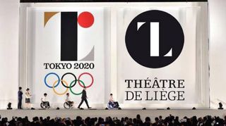
Sometimes, despite a designer’s best efforts and intentions, a design can be released that appears similar, if not practically identical, to another piece of creative work. Cue a barrage of social media outrage.
Practically speaking though, what options do designers and studios have? Should you lick their wounds and start all over again, or do both parties enter stalemate and wait for the other to budge?
“You have to look at this from two directions,” says Johnson. “Obviously, from a creative point of view, it’s embarrassing if a design looks uncannily similar to something that already exists. But – if they genuinely hadn’t seen it – and the original wasn’t registered, we then get into muddy water.”
“As far as I understand, you have a genuine copyright claim if your design has been seen and used for seven years, and then you have a degree of legal ‘claim’ if something appears that’s too similar,” Johnson adds.
“But if your design has lain buried in a portfolio website, unseen really by anyone but your mum and your aunty, it gets much harder.”
You have a genuine copyright claim if your design has been seen and used for seven years
Michael Johnson
A notable example of such difficulties is the fiasco surrounding the Tokyo Olympics logo. Unveiled in 2015, the design of a stylised, seriffed letter ‘T’ was binned after a plagiarism row when Belgian designer Olivier Debie flagged up its similarity to his logo for Theatre De Liege.
As with the Formula 1 logo, the internet descended into a witch-hunt as people decided whether or not the two designs were more than just a coincidence.
“Now, ask yourself,” says Johnson, “how was a designer in Japan to have known of a symbol in Belgium, that was only two years old, in a different sector, that probably wasn’t registered anyway? That would have meant doing a worldwide symbol search for every ’T’ logo ever designed, in every class and category?”
“As it happens, the proposed design was withdrawn and Debie dropped his lawsuit, doubtless realising that he was on sticky, and expensive, legal ground. He may feel that his was a moral victory though.”
Keep your cool
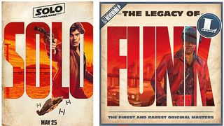
Looking at the situation from a different angle, what’s the best course of action to take if a piece of design for, say, a huge movie franchise, is released and it looks like it’s borrowed a lot of elements from a piece of work you did years ago? That’s exactly what happened when the typographic posters for Solo: A Star Wars Story were unveiled.
Initially designers were quick to praise the posters, which were an original spin on an established franchise. It wasn’t long though until designer Hachim Bahous took to Facebook to point out the similarities between the posters and a series of album covers he created for Sony Music France in 2015.
It’s an understandable course of action to take in the heat of the moment, but given that the internet makes it blindingly fast to share your outrage, you might want to think twice before posting a status update.
Posting ‘your design’ into the comment string of a blog doesn’t achieve anything
Michael Johnson
“Be careful before you plaster your ‘original’ all over social media,” warns Johnson. “Posting ‘your design’ into the comment string of a blog doesn’t achieve anything. First of all – is your design registered and trademarked? If so, is it trademarked in the same categories? If not, this will be an issue.
“If it isn’t trademarked, you may be able to make an ‘infringement of copyright’ claim, but the design has to be either seven years old, or have been done for a world-famous company. Failing all of this, you could try to simply embarrass those you feel have ripped you off – but you will end up coming across as essentially naive and possibly a bit desperate.”
When to take action

One of the biggest difficulties with plagiarism is knowing when to take legal action. It’s a dilemma that affects everyone from small designers to the biggest studios, and it’s made all the worse by the blurred boundary between what’s merely similar and what’s outright theft.
Even a studio like Johnson Banks can struggle to know how to proceed in the face of imitation. “When we did our ‘Mandagrams’ research project in 2009/2010, we took certain Mandarin characters and expressed their pictogrammic roots,” Johnson explains.
“The work was shared online, and was part of an exhibition in Shanghai – so it was ‘seen’ but possibly not outside a design and education audience. We didn’t think to register the design – but two years later, ‘Chineasy’ launched with essentially the same idea.”
“Did they know of our work? Almost certainly. Do they answer our emails/tweets? No. Is it worth us making a legal claim? Well, it would rest on us being able to prove that our idea was unique, and had been ubiquitous for years – both tricky to argue, and very expensive.”
Hope for a happy ending
With all the online disputes and legal battles setting a nasty tone, it is great to hear that some victims of plagiarism end up with a happy ending to their ordeal. Drew Barrymore posted a picture of her daughter wearing a Jelly Mallow jacket that Canadian illustrator Marc Johns recognised as his own design.
After Johns made some serious internet noise, Jelly Mallow got in contact and the two parties came to a mutually beneficial conclusion: Johns was to be paid in full for the backdated royalties, and a proper licensing arrangement has been put in place for current and future collections.
You can find out more about this case, and other examples of plagiarism in our piece: Stolen design work: the ugly truth.

To compound the issue, Johnson adds that there is a huge amount of disinformation around the whole topic of plagiarism. “Designers of all ages don’t really realise the issues faced in this area,” he says.
“Yes, it’s annoying when something comes up that seems to have ripped you off – but take care before you start any form of legal action. I think it all comes down to the fact that, whilst ‘copyright’ does lie with whoever has created a particular logo, trademark registration seems to beats copyright.
Trademark registration seems to beats copyright
Michael Johnson
“The two big lessons for all of us are that, one: you should start off trying to design something that hasn’t been done before – it’s much easier to protect. And two: however great you think that logo is, there’s a chance that it’s been done before.
“For our big identity projects, once we're down to our final two or three favoured designs, we’ll always recommend doing trademark searches at that stage – prior to final decisions. Yes, it might knock out a favourite. But better to know early than late, don’t you think?”
Related articles:

Thank you for reading 5 articles this month* Join now for unlimited access
Enjoy your first month for just £1 / $1 / €1
*Read 5 free articles per month without a subscription

Join now for unlimited access
Try first month for just £1 / $1 / €1
Dom Carter is a freelance writer who specialises in art and design. Formerly a staff writer for Creative Bloq, his work has also appeared on Creative Boom and in the pages of ImagineFX, Computer Arts, 3D World, and .net. He has been a D&AD New Blood judge, and has a particular interest in picture books.


