5 huge ways that Apple changed design forever
We look back at the phenomenal impact of Apple’s creative product design.

Doesn’t time fly? This year, we’re celebrating 10 years of Creative Bloq, and to mark the occasion, we're looking back at some of the key moments in design that we've seen in the time the site has been running. Today, it’s Apple’s turn as we cast an eye over the ways in which the Cupertino giant has changed the world of design forever.
While Apple's a tech company, it's one that's held in great esteem for its design prowess, and at every level, from its products to its marketing. The company has become a beacon of quality design in the tech world, widely praised for products that combine premium aesthetics with innovative new functions.
For more examples of Apple's impact on design see our pick of the best Apple products of all time. And if you're looking to buy any, make sure you follow our roundup of the best Apple back to school 2022 deals. For now, let's take a look at how Apple designs have altered the course of creative history over the years. You might be surprised.
01. Apple made design fun

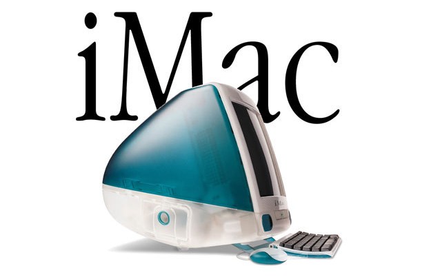
One of the most important impacts Apple has had in the world of design is to brighten it up. Back in the 1990s, most computers were bland beige boxes appealing only to the nerdiest of PC connoisseurs. That all changed in 1998.
That’s when Apple launched the iMac G3. With its bright, colourful design, swooping edges and translucent shell, this device showed that computers could be upbeat, offbeat, and downright playful. Suddenly, average folks felt like they could give this whole computer thing a go without needing a world-class engineer to show them the ropes.
But this wasn’t just a flash in the pan. Apple has stuck with this ethos ever since, seen in products like the iBook, the iPod Shuffle, the iPhone 5c, and the recent M1 iMac. All these devices added a splash of colour to their palettes, creating exciting alternatives to the sea of black and silver that dominates most products these days.
02. It's put the focus on simplicity

Both Steve Jobs and Jony Ive have always been very vocal on one design principle above all others: simplicity. It’s what first united them, and it helped forge one of the most productive design pairings in recent history. Here’s Ive explaining his take on the concept: “Simplicity isn’t just a visual style. It’s not just minimalism or the absence of clutter. It involves digging through the depth of the complexity. To be truly simple, you have to go really deep… You have to deeply understand the essence of a product in order to be able to get rid of the parts that are not essential.”
Get the Creative Bloq Newsletter
Daily design news, reviews, how-tos and more, as picked by the editors.
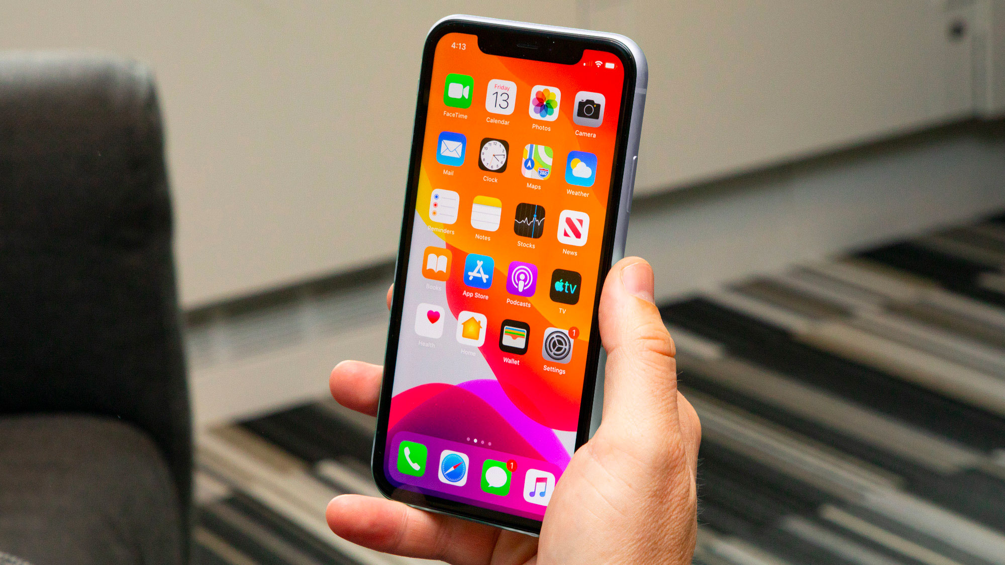
That philosophy has been reflected throughout Apple’s products and helped shape the tech world as we know it. The original iPhone, for example, ditched the tiny, fiddly keyboards present on many other phones because an all-screen design was so much simpler and made so much more sense. The iMac proved you don’t need a separate monitor and computer tower when everything can be condensed into a single unit.
In both these cases and more, Apple took the prevailing design orthodoxy and turned it on its head. Inevitably, other companies followed suit, but few have understood simplicity in the way that Apple has.
03. It made design accessible

These days, considering user accessibility is a key part of design. While many people and organisations who have contributed to this, Apple has played a major role. One place where that’s clear is in the company’s operating systems.
Throughout the years, both iOS and macOS have been designed with accessibility in mind. Accessibility features (including inverted colours, mono audio, and VoiceOver) first made an appearance in iOS in 2009 and have gone from strength to strength since.
Apple’s iOS implementation of accessibility features is considered one of the best in the mobile industry, and the iPhone’s popularity has helped push the company’s rivals to also adopt similar features. Without the prominent addition of accessibility features to such a popular platform like the iPhone, it’s possible that accessible design would be nowhere near as commonplace as it is today.
04. It put quality first

Apple is rarely first to market with new products, but that’s not its style. Rather than rushing to launch an unfinished design just so it can plaster “world’s first” all over billboards, Apple is all about making something so good that all the earlier attempts become irrelevant. For Apple, being best is more important than being first.
That has a knock-on effect: price. There’s no doubt that Apple products are expensive, but there’s a big difference between being costly and being overpriced, and I think it would be wrong to say an iPhone or a MacBook is the latter. Apple designs command a high price because of the quality of their components – they’re frequently shown to last longer and cost less long-term than rival devices – and it certainly hasn’t held them back.
Indeed, Apple has shown that products can have a relatively high price tag and still sell like hot cakes. Consumers aren’t stupid – if Apple products were overpriced, the charade would quickly fall apart. But Apple has proved that people are willing to pay more for top-notch design.
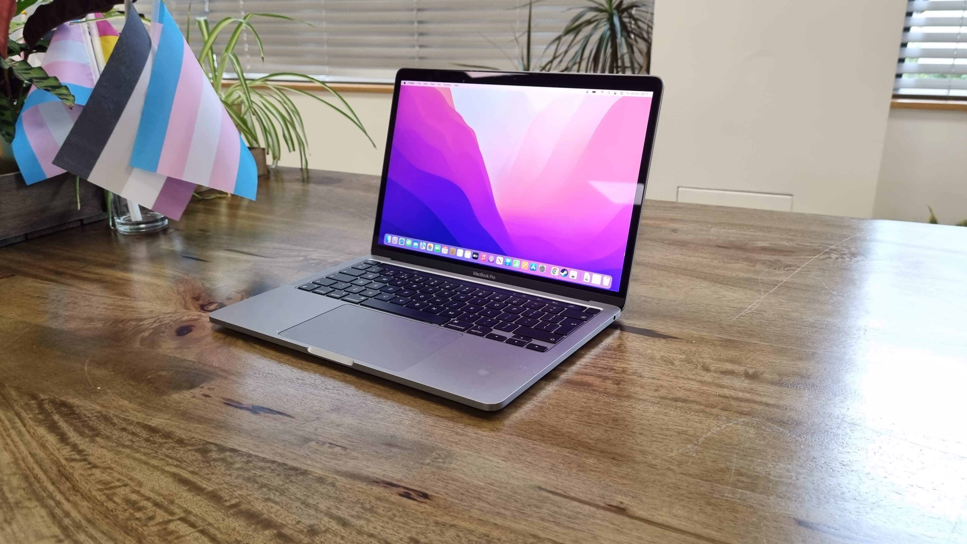
In other words, Apple has made quality tech design something worth paying for. Just look at how many other companies have tried to emulate the premium look of the iPhone, or the all-metal chassis of the MacBook Pro. By being unashamedly in favour of high-quality designs, Apple has put a premium on, well, premium.
05. It revolutionised software too

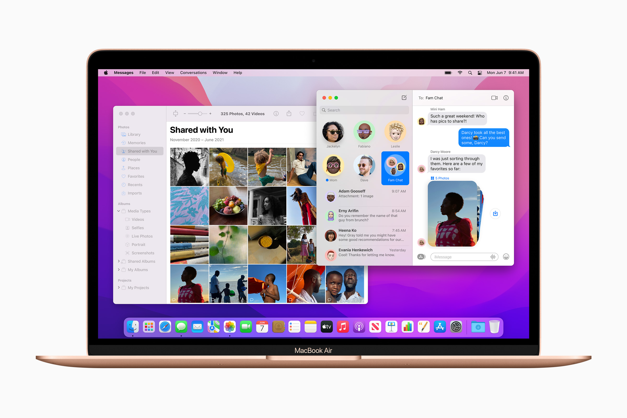
Apple hasn't only changed the world of hardware design – it’s had a similar effect on software. A great example of that is in interface design, which was pioneered and popularised by the Mac. In 1979, Steve Jobs paid a visit to Xerox PARC, where ground-breaking research was taking place on the graphical user interface. Impressed, Jobs ensured that things like windows, menus, and checkboxes became key parts of Apple’s operating system designs, which in turn helped popularise these concepts and spread them to the rest of the computer world.
Apple products have influenced interface design in other ways. The massive popularity of the iPhone – and the way it kickstarted the mobile phone industry more generally – has led to sweeping changes in the way we consume content. These days, for instance, most website visits come from mobile devices rather than desktop computers, meaning designers now need to think about mobile first when creating websites. That could never have happened if Apple’s iPhone design was not so remarkably successful.
Read more:

Thank you for reading 5 articles this month* Join now for unlimited access
Enjoy your first month for just £1 / $1 / €1
*Read 5 free articles per month without a subscription

Join now for unlimited access
Try first month for just £1 / $1 / €1

Alex Blake is a freelance tech journalist who writes for Creative Bloq, TechRadar, Digital Trends, and others. Before going freelance he was commissioning editor at MacFormat magazine, focusing on the world of Apple products. His interests include web design, typography, and video games.
