How a legendary brand guideline manual was reborn
A graphic designer, a crowd-funding campaign, and a personal obsession came together to recreate British Rail's identity manual.
There's something borderline OCD about identity guidelines, brand manuals and style guides. Designing the perfect combination of lettering, pictograms, colour schemes and other brand elements, ensuring they can be used across huge numbers of assets and products of vastly differing scale and shape, and then meticulously assembling a guide to ensure that no unwanted variants of the carefully prepared identity are utilised… it's an obsession, but one that many of us will find hugely rewarding.
Graphic designer Wallace Henning read an article by Michael C Place about the British Rail Corporate Identity Manual, a four volume, 220-page set of brand guidelines for the UK's national rail service, and was instantly hooked. He focused his MA in communication design on "creating an identity for a renationalised transport network", then came up with the idea of reprinting the original manual.
The original
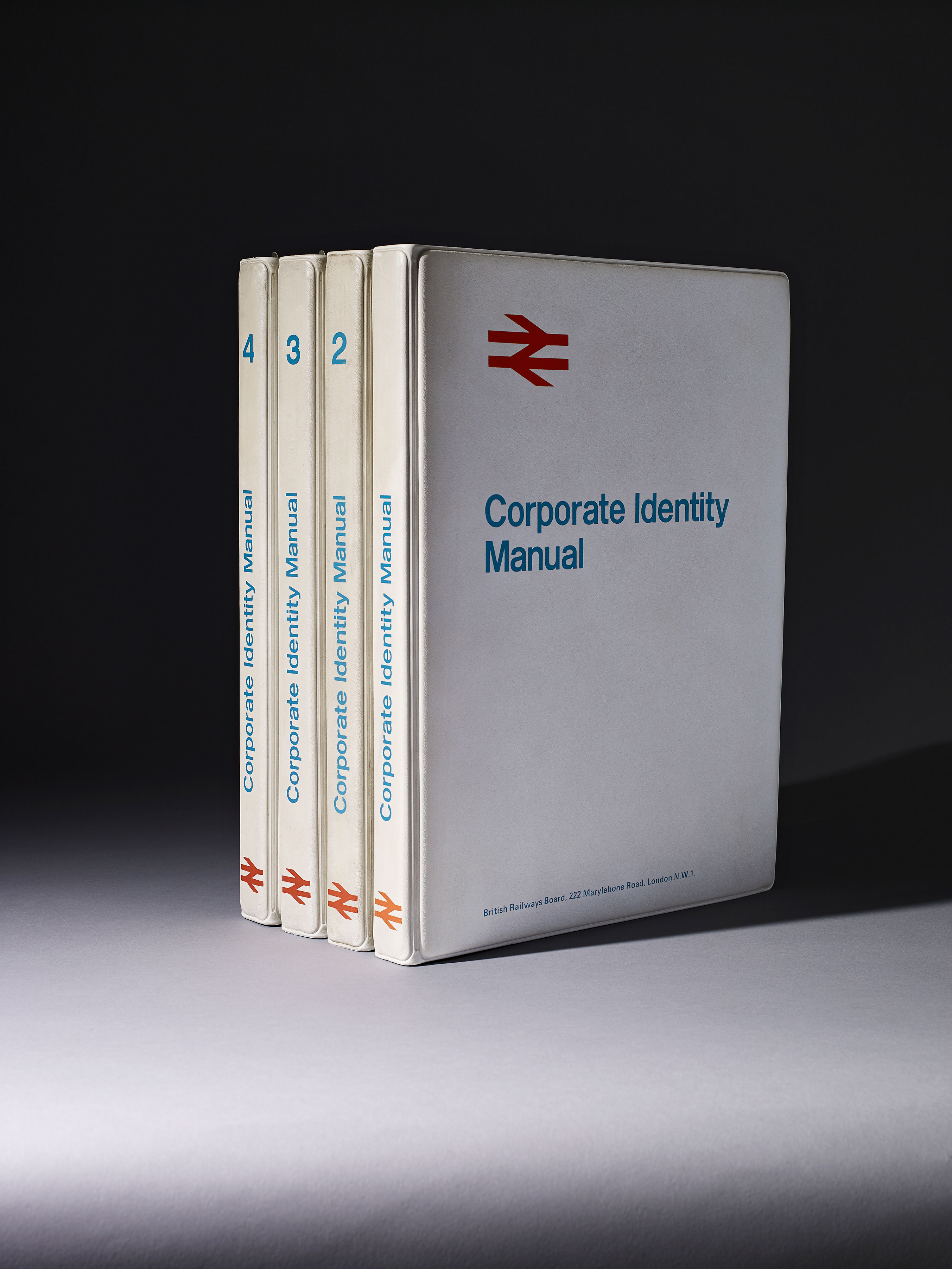
The original British Rail Corporate Identity Manual was presented in four ring-bound volumes.
"The nature of the ring binder system used to hold the individual Sheets of the original Manual has meant most, or quite possibly all sets of the Manual were never complete," says Henning.
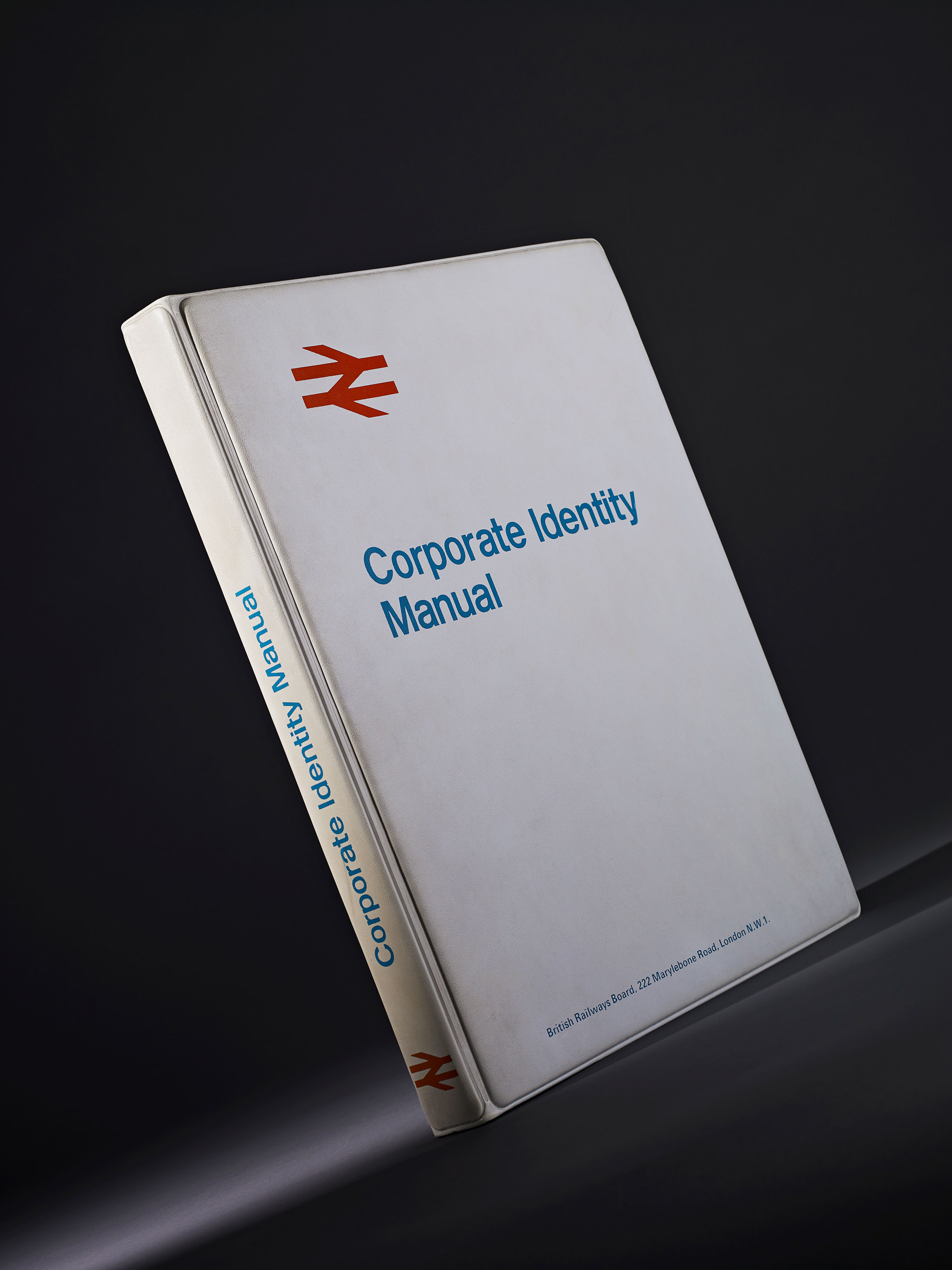
As revealed on www.doublearrow.co.uk, the four binders were issued in three instalments: Binder 1 (not numbered), issued in July 1965, contained information on Basic Elements (symbol, logotype, lettering and colour).
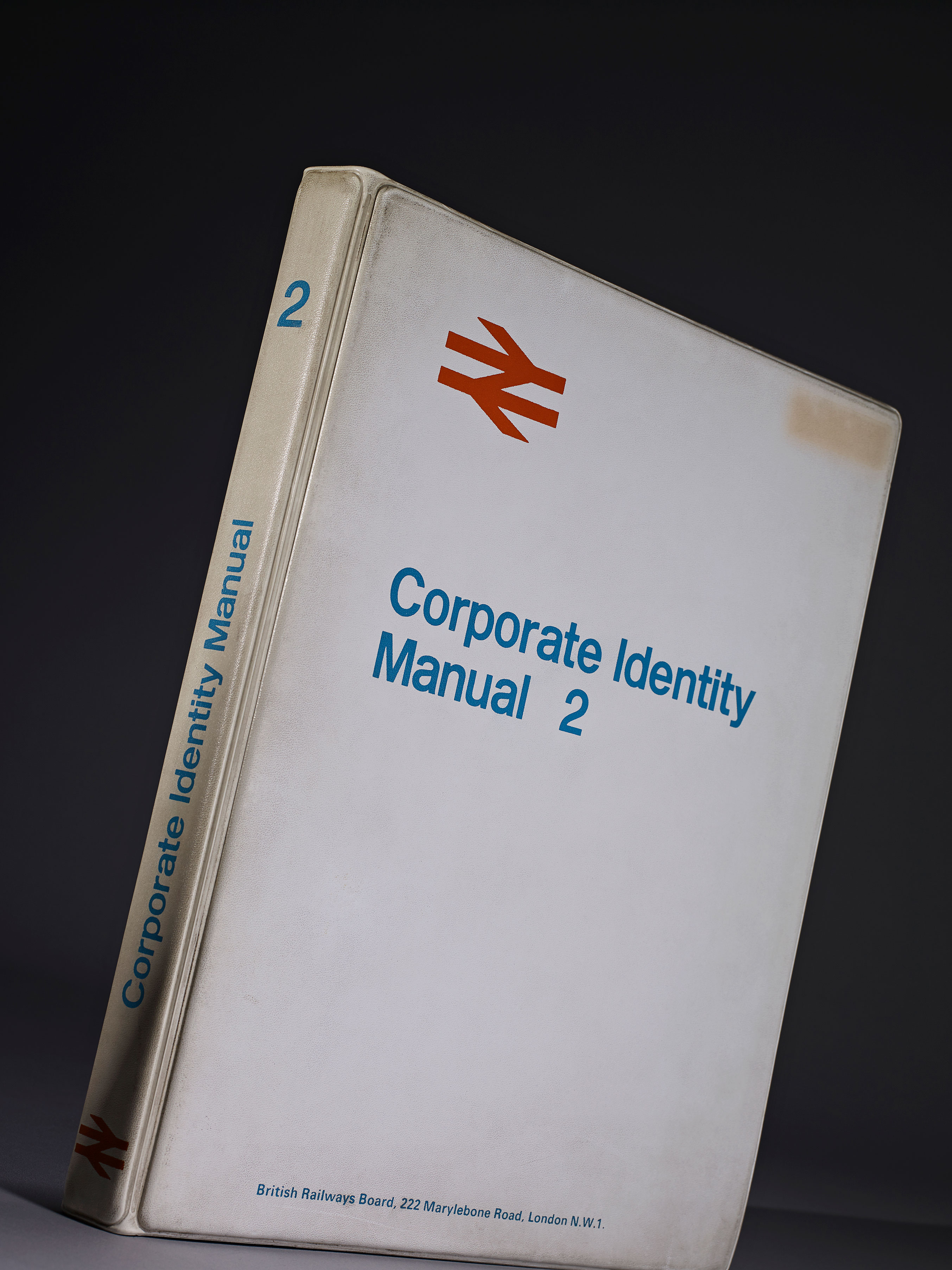
Binder 2, issued in November 1966, contained guidance on Printed Publicity plus some additional sheets for insertion into Binder 1, and future insertion into Binders 3 and 4.
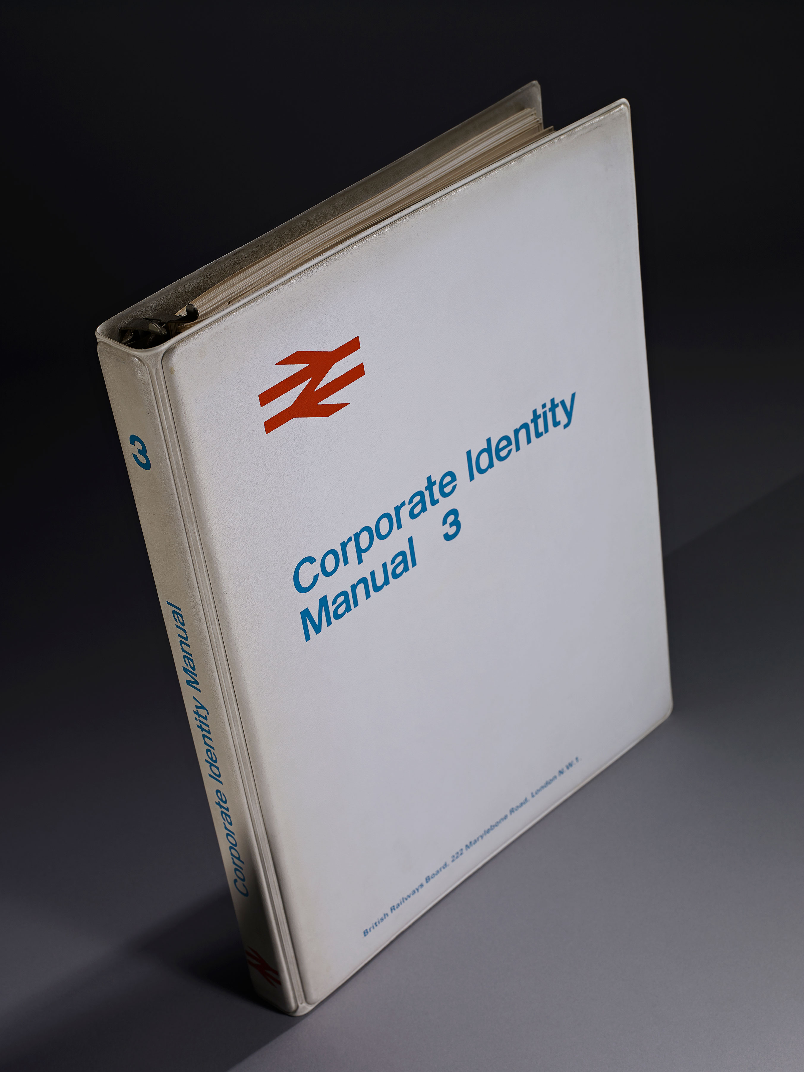
Binders 3 and 4 were issued together in April 1970, together with additional sheets for the first two binders.
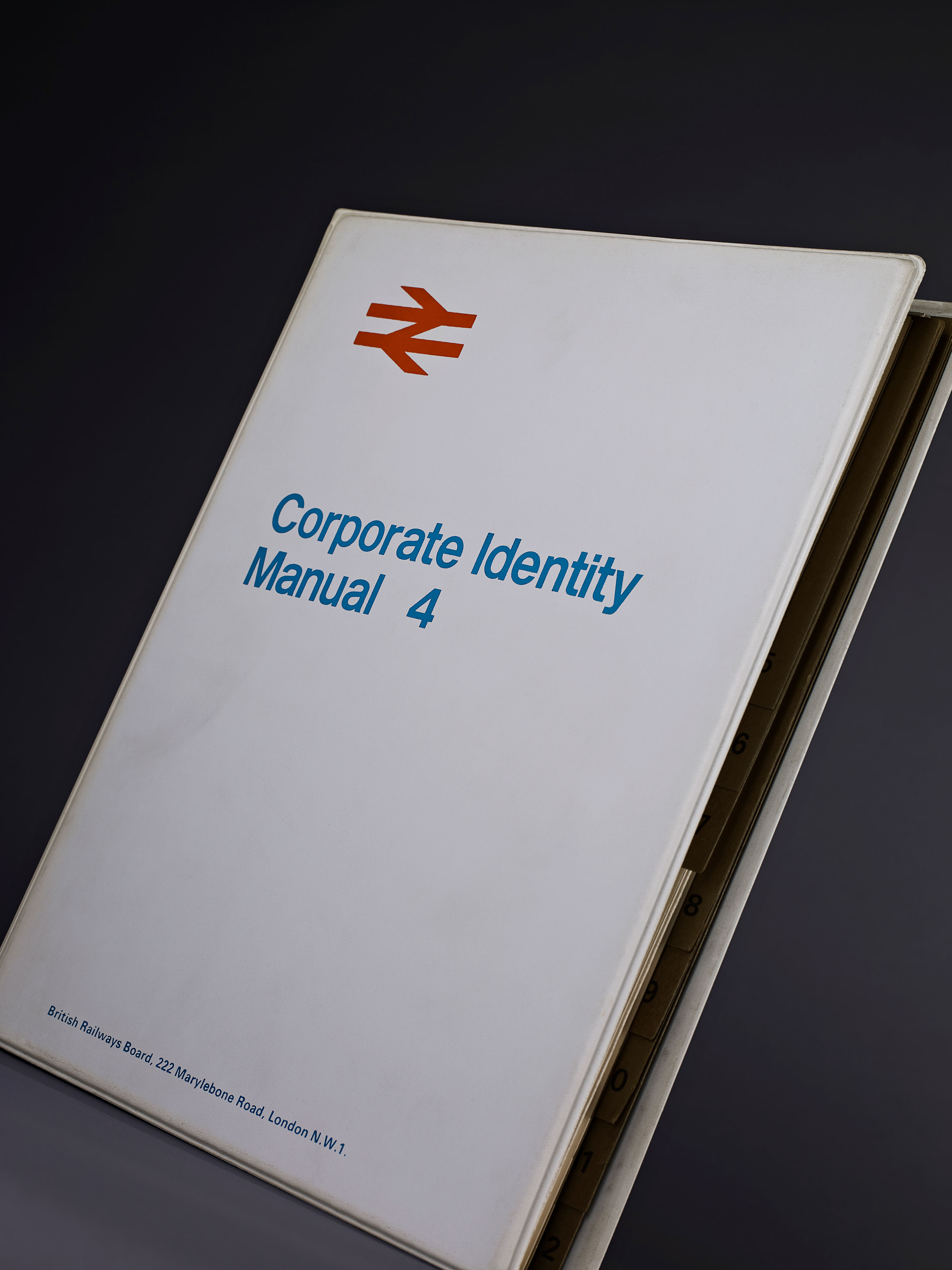
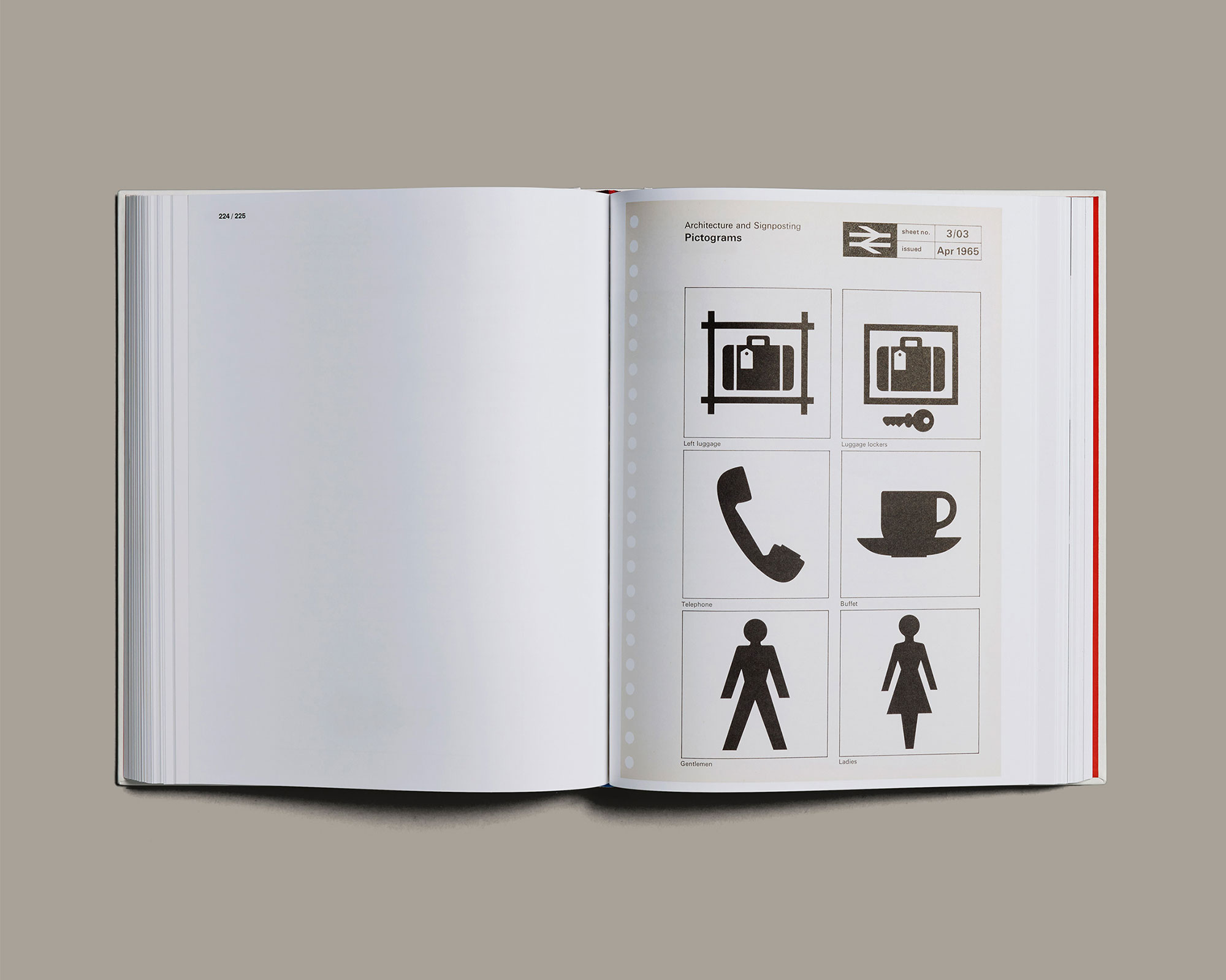
Binders 3 and 4 contained information on architecture and signposting, rolling stock, lineside equipment, road vehicles, ships, liner trains, uniforms, stationery, miscellaneous and appendices (including an index) although two sections were ultimately to remain empty.
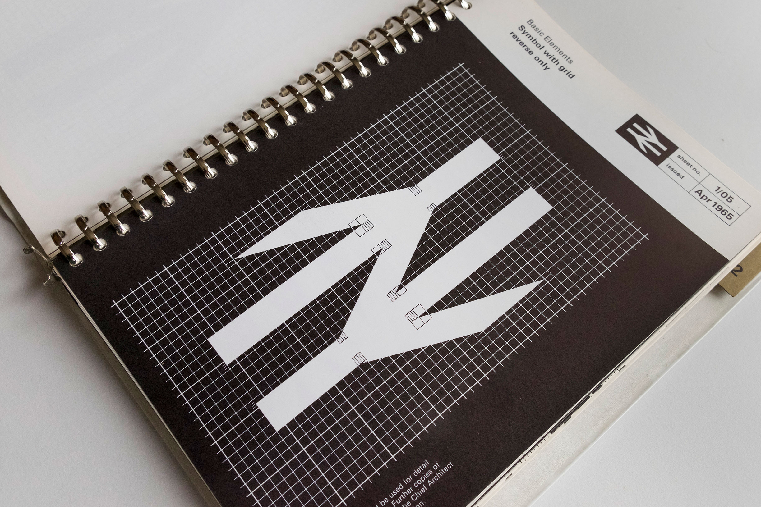
The distinctive 'double arrow' British Rail logo, which has become a graphic design classic.
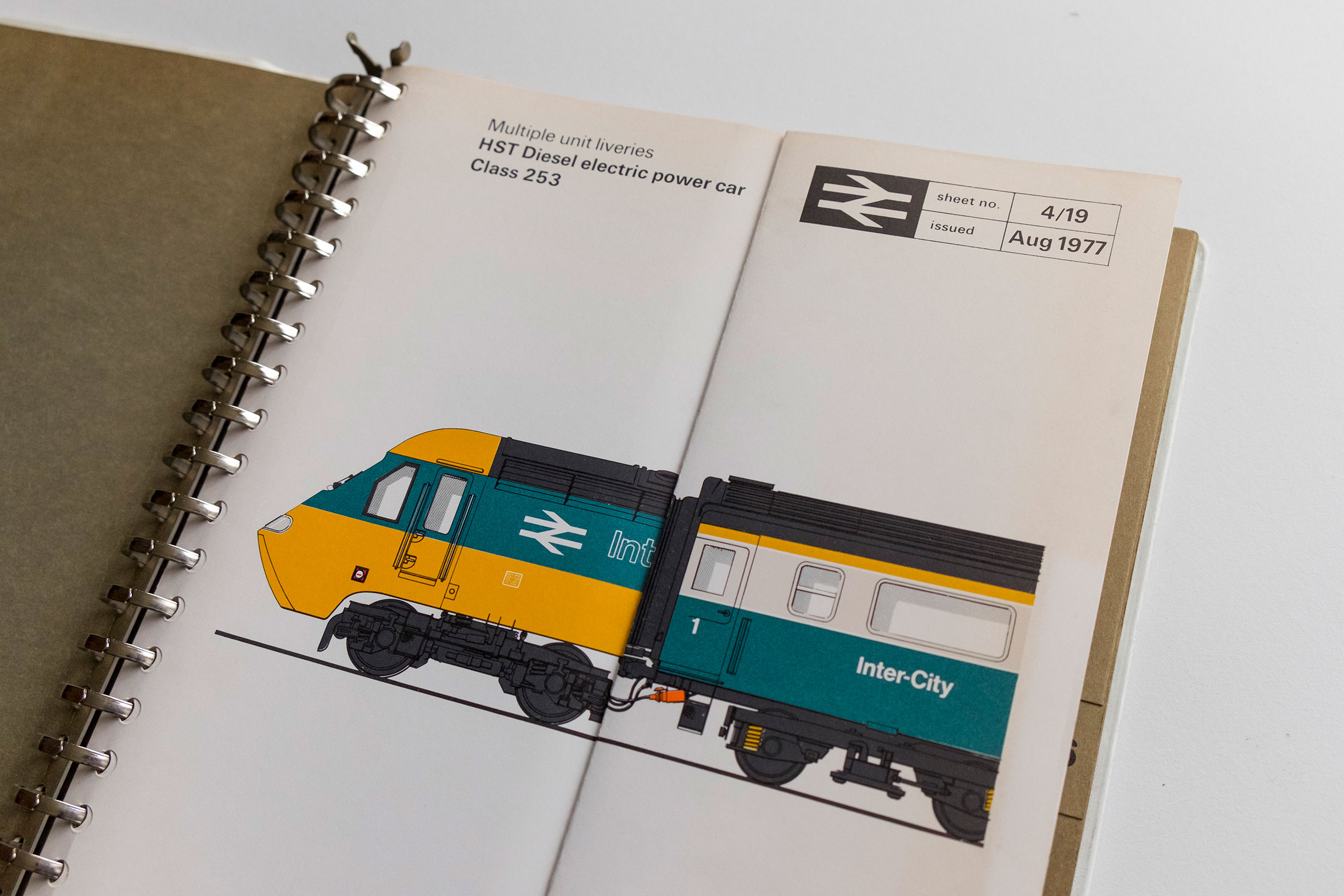
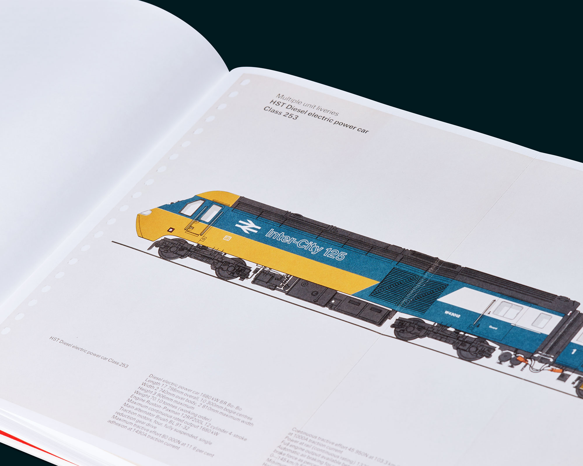
The rolling stock image pages, including this HST Class 253 Diesel Electric (the Inter-City 125) featured a parallel double-fold.
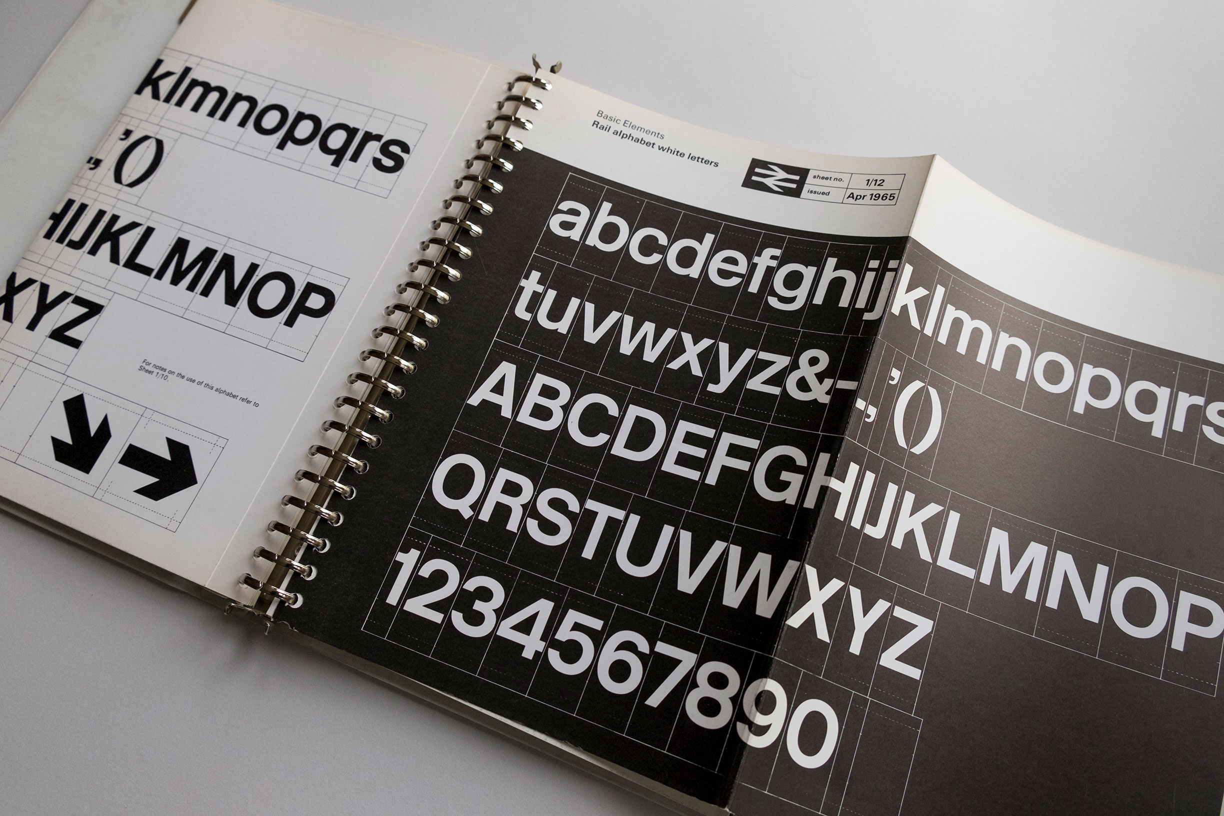
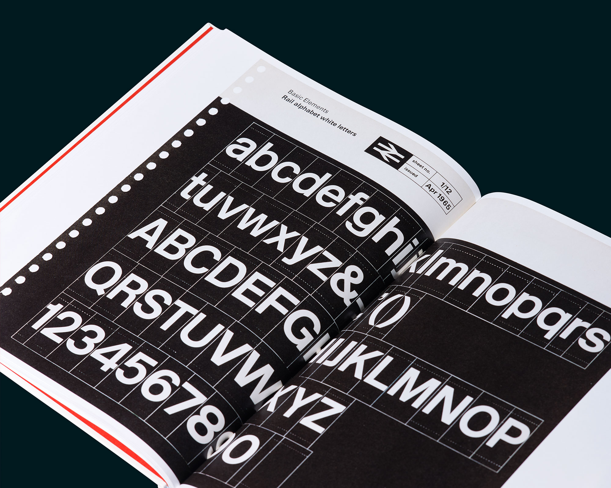
The famous typeface Rail Alphabet featured on a gatefold page, and each volume was bound using the MULT-O 23-ring binder system.
The crowdfunding
In 2015, Henning launched a Kickstarter campaign to republish the British Rail corporate identity manual.
"This book celebrates British Rail’s identity in its entirety – not only its distinctive symbol but its full graphic design programme, from detailed specimens of the famous Rail Alphabet typeface to the livery of the Inter-City 125," says Henning.
The proposal was backed by the Department of Transport and the plan was that the new book would feature a foreword by Michael C Place of Build, introduction by former British Rail head of design Tony Howard and essay from James Greenfield, creative director and founder of Koto.
The crowd funding campaign ran until 22 December 2015, and comfortably exceeded its target of £40,000, eventually topping out at £55,102. The next stage could now begin.
The paper
Being a graphic designer as well as a British Rail enthusiast, Henning was determined that every aspect of the print production would be carefully selected and managed.
Get the Creative Bloq Newsletter
Daily design news, reviews, how-tos and more, as picked by the editors.
"The book has been printed with a rare H-UV litho press that dries the ink faster than traditional methods, resulting in an uncompromised sharper printed image," says Henning. "The uncoated smooth paper has been sourced from Sweden and required special making which ensured that it has a short grain, allowing this 472 page book to lay open easier, giving a more enjoyable read."
The britishrailmanual.com website goes into great detail about the paper utilised. Supplied by Fenner Paper in the UK, Lessebo Design Smooth White in 130gsm is from the Lessebo Mill, located in remote area of southern Sweden called Småland. Founded in the middle of the 17th century as an iron mill, it was granted permission by the local government to produce paper in 1693.
"The custom making for the British Rail Manual meant that grain direction could head to foot of the book (i.e. parallel to the spine)," says Henning. "The grain direction refers to the way the fibres lie in the direction of the paper machine and is one of the most important physical characteristics of a paper. This is important because of the way the paper feels and 'rolls' and the way the text flops and lays open."
The reprint
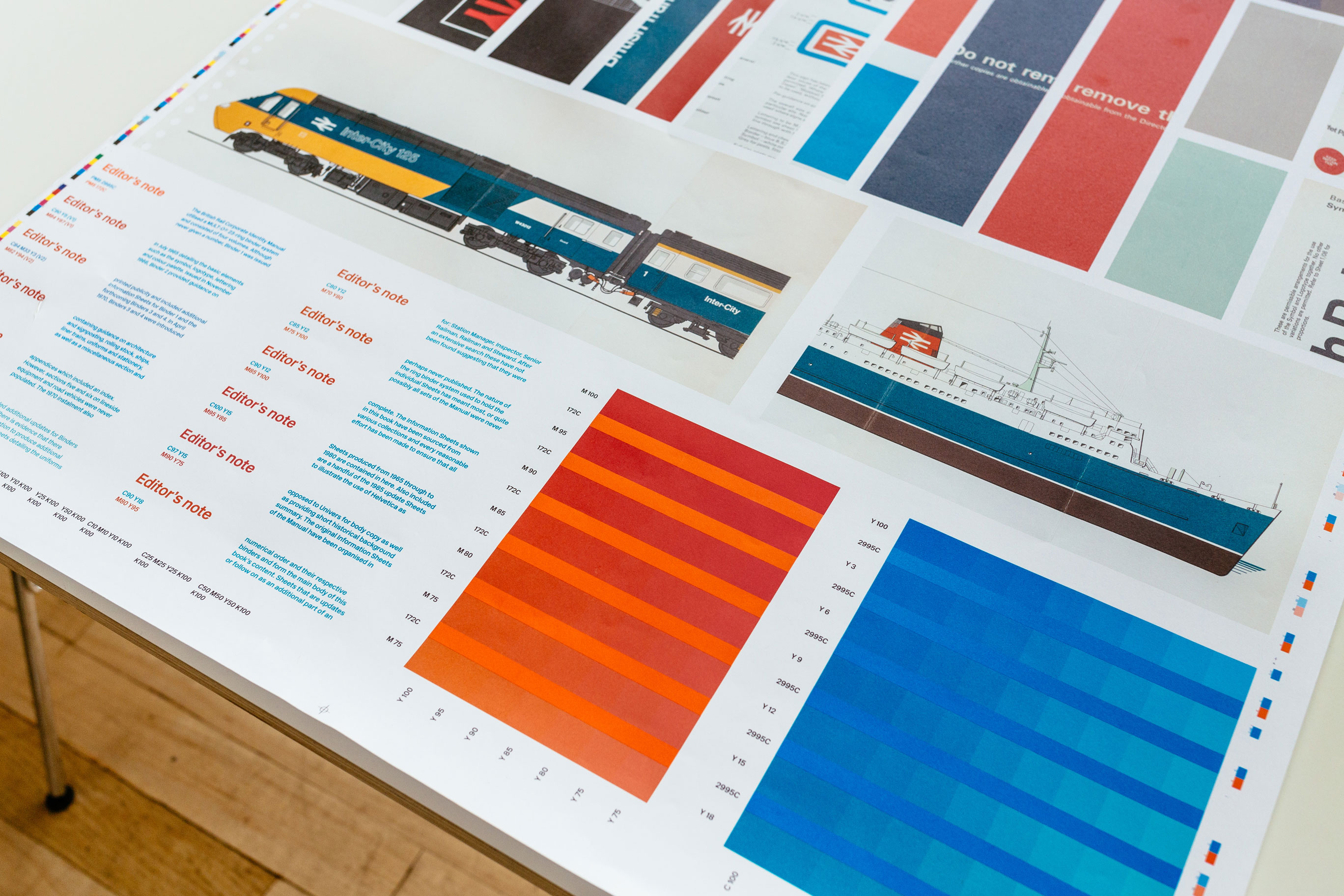
Wet proof.
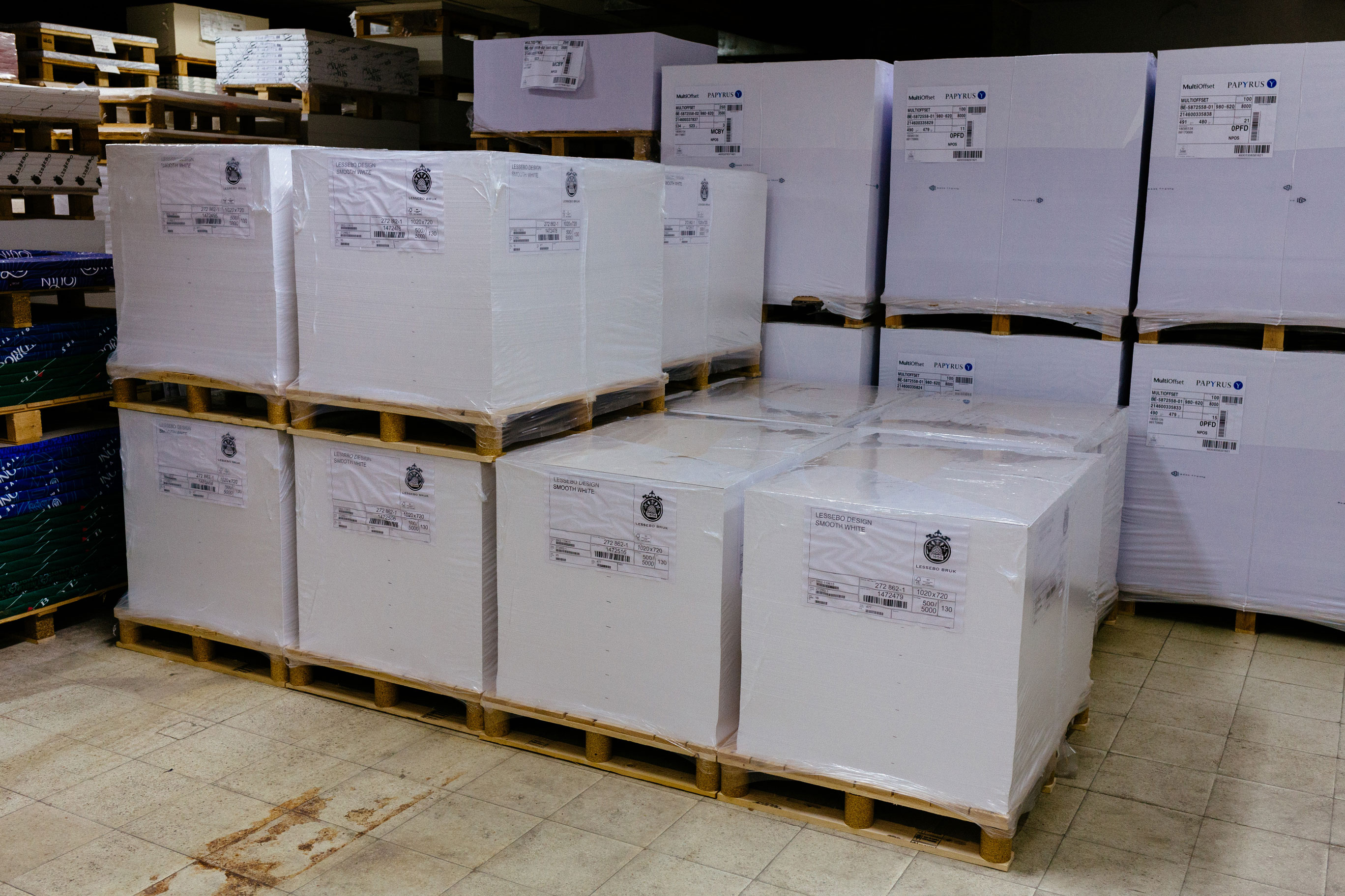
Paper order - not even all of it!

The H-UV press.
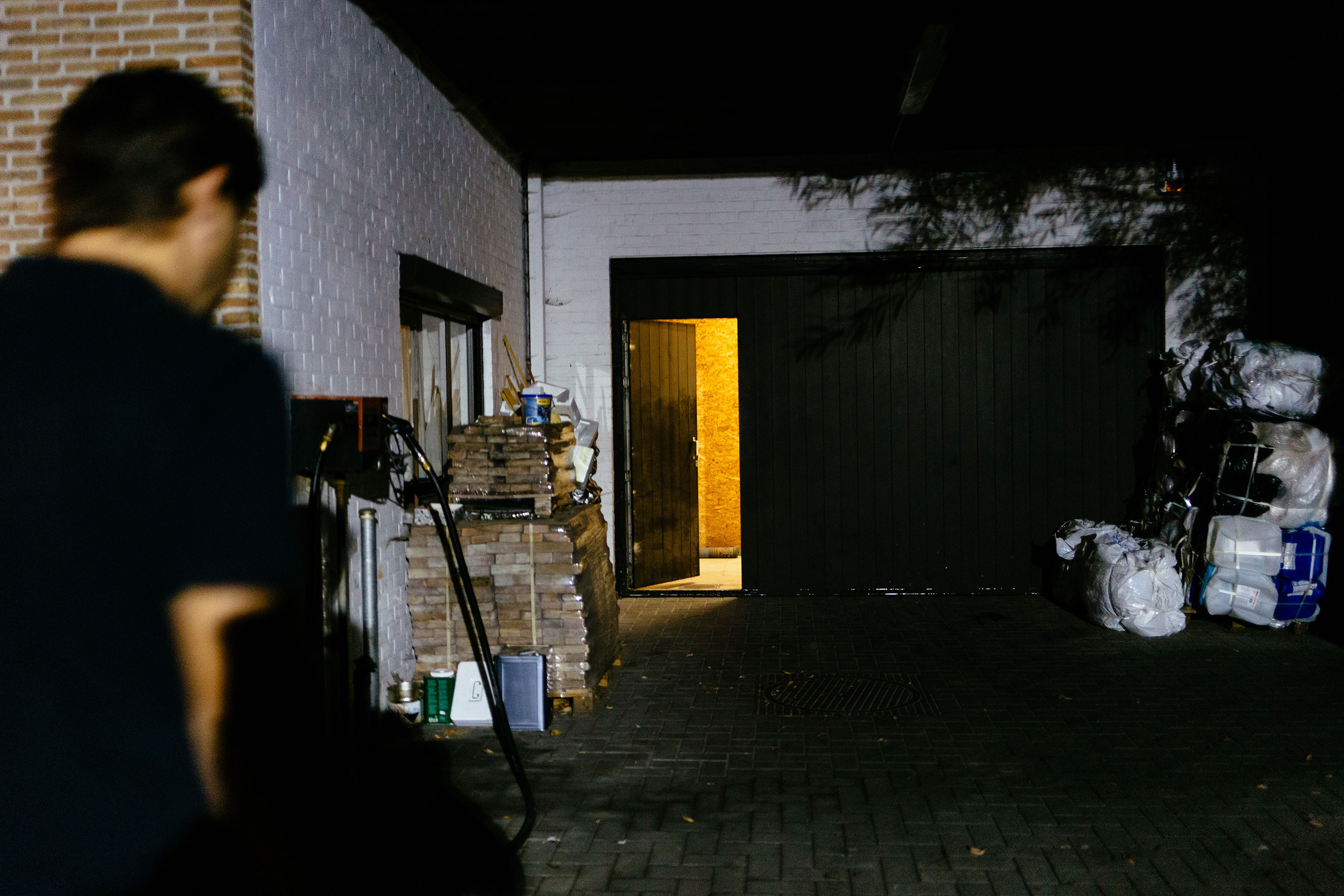
Early morning press passing.
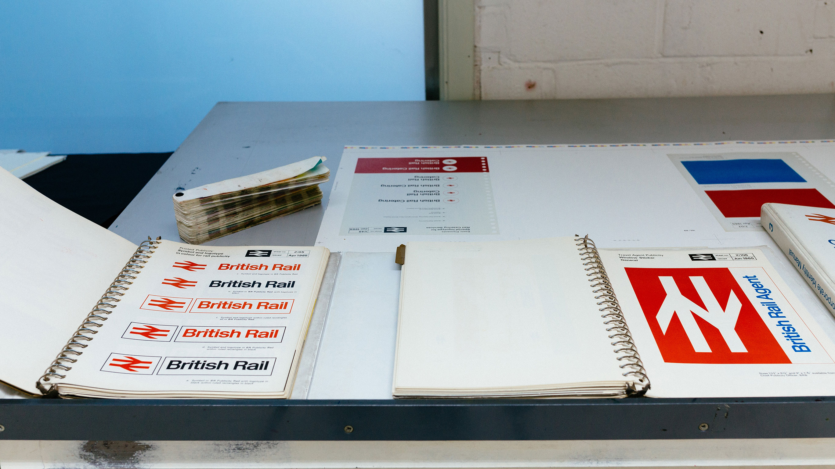
Referencing the manual at the printers.
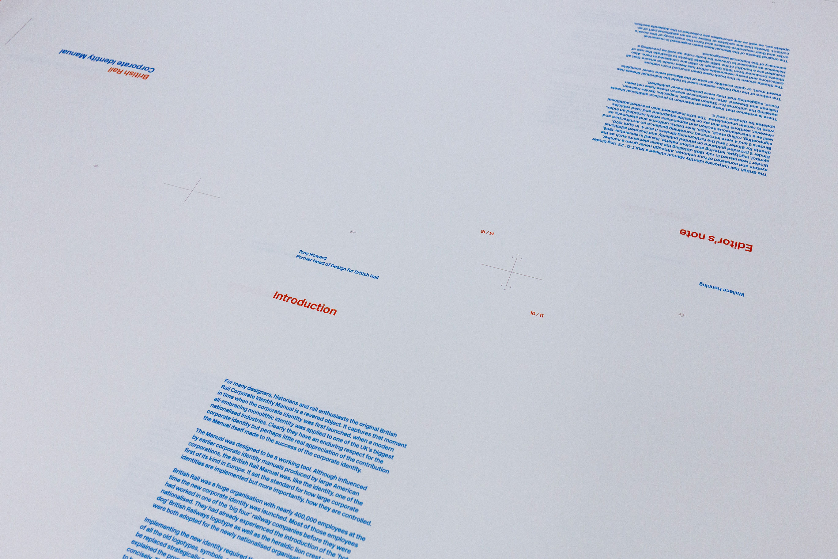
First sheet run of the text pages.
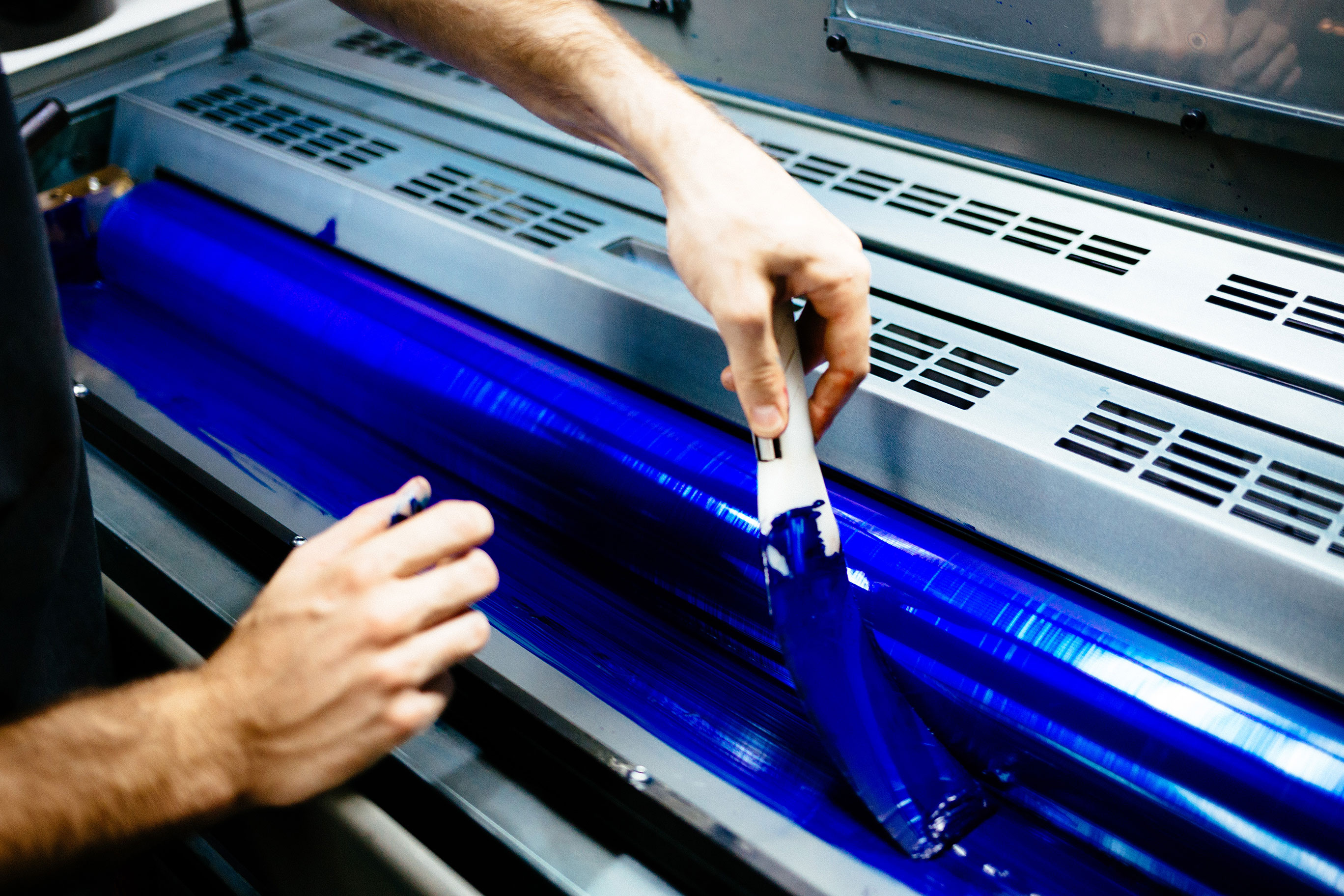
Ink for the spot colours.
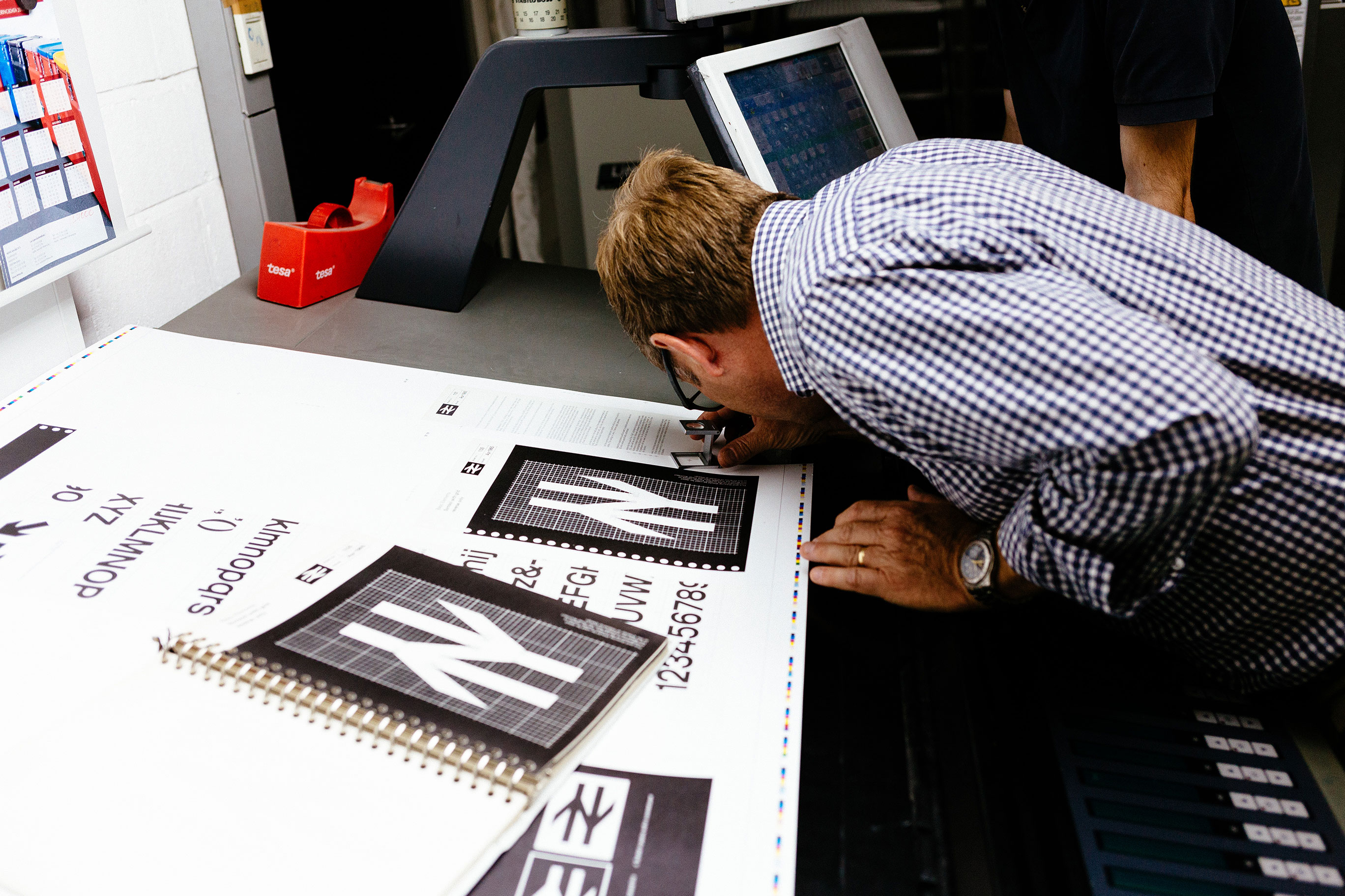
Referencing the manual at the printers.
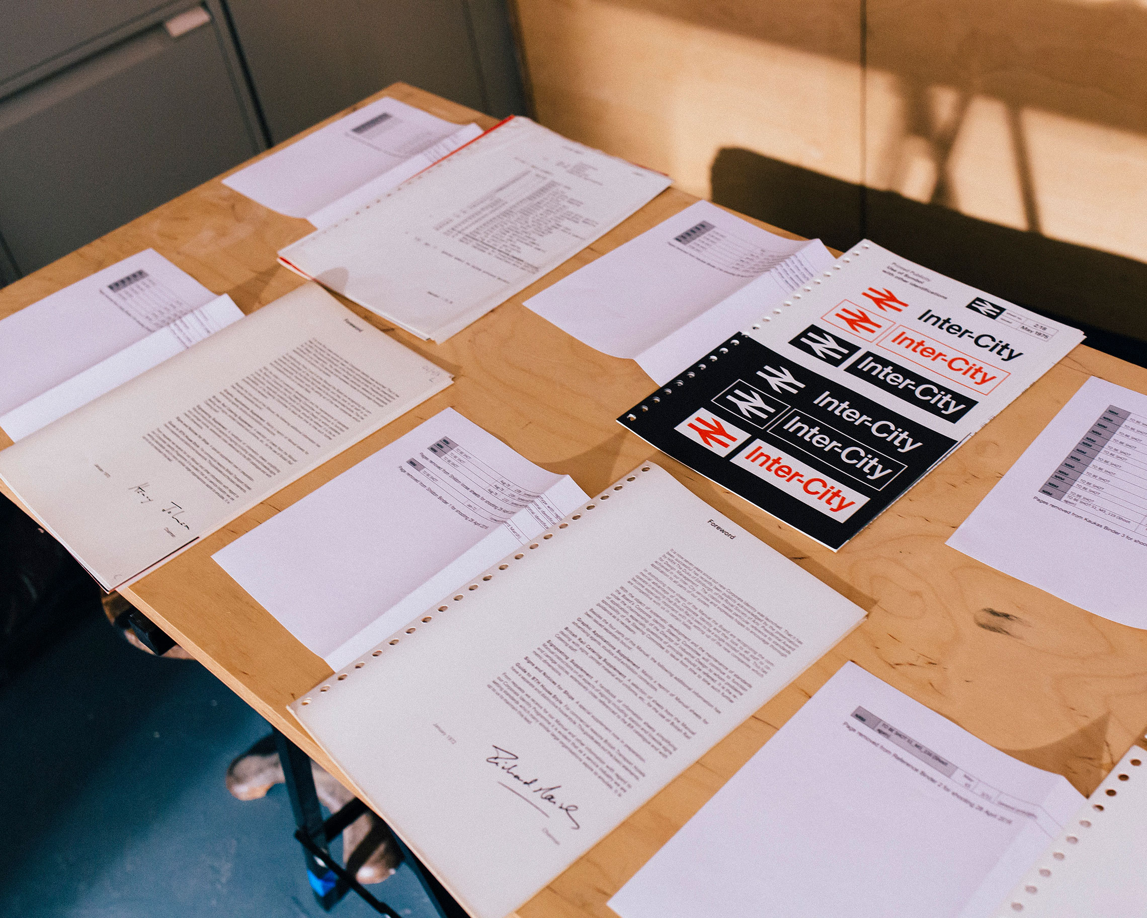
Additional sheets from the National Railway Museum on set.
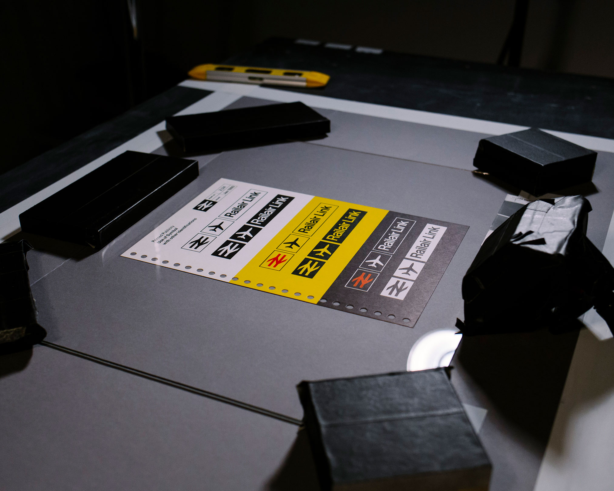
Manual sheet being shot.
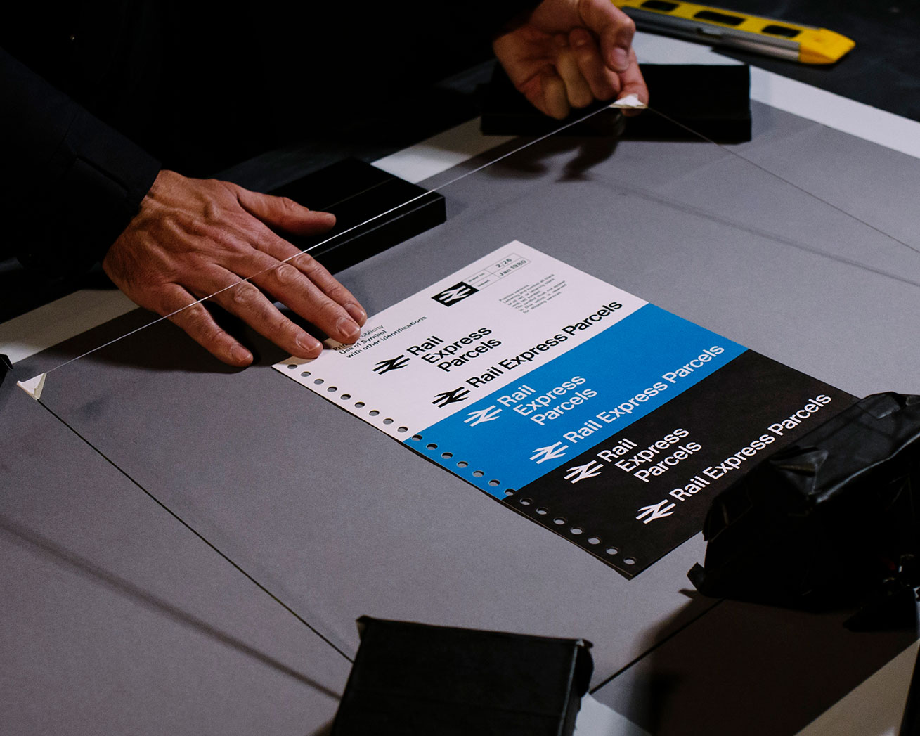
Manual sheet being shot.
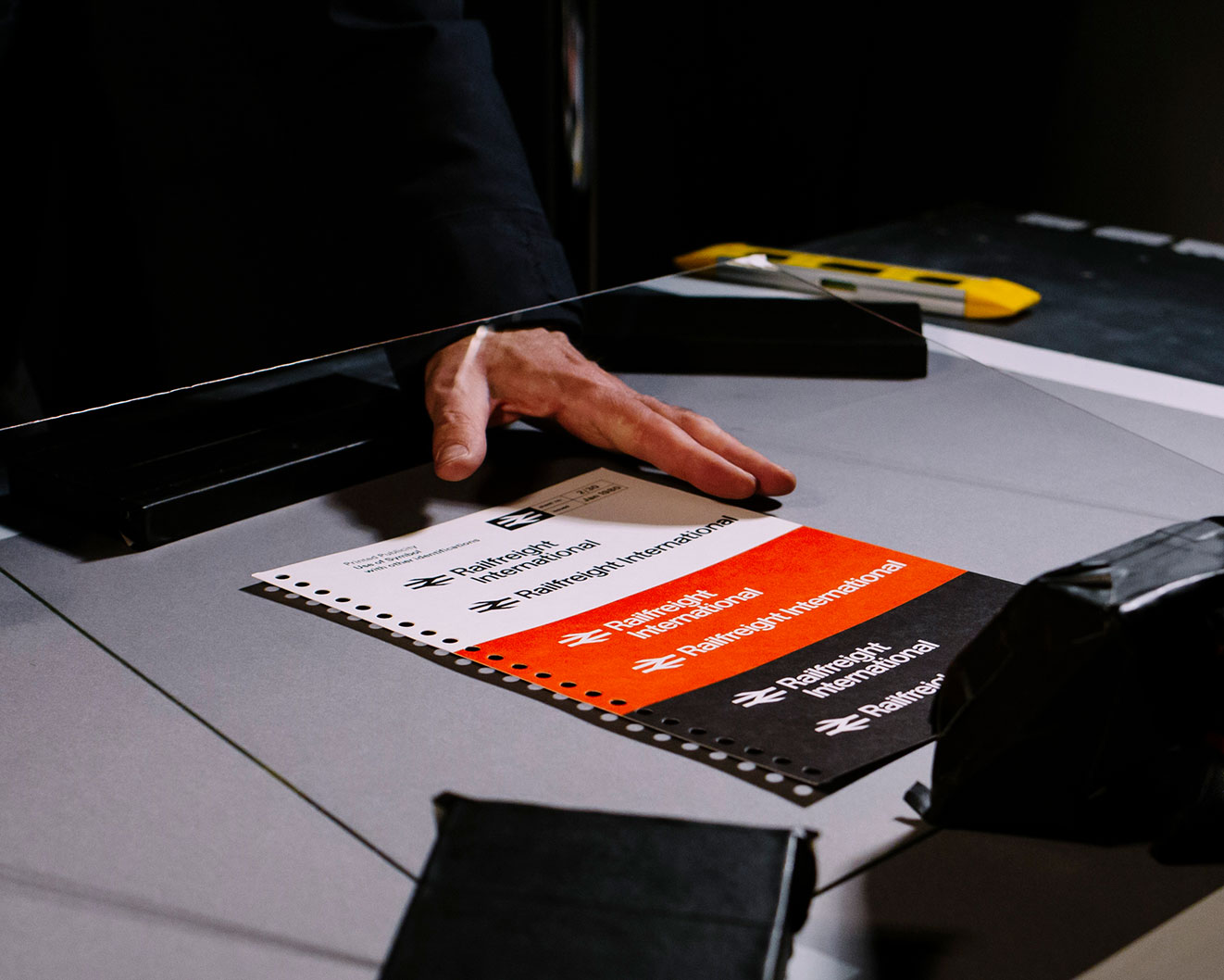
Manual sheet being shot.
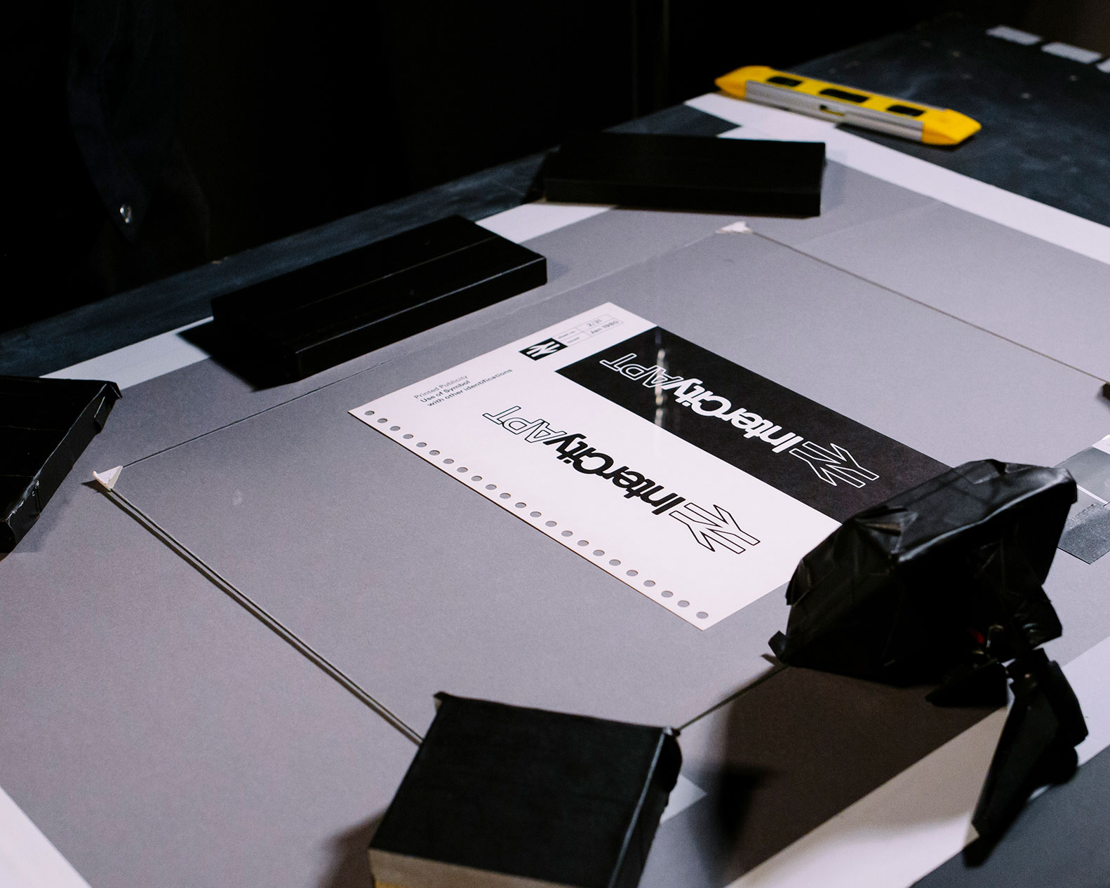
Manual sheet being shot.
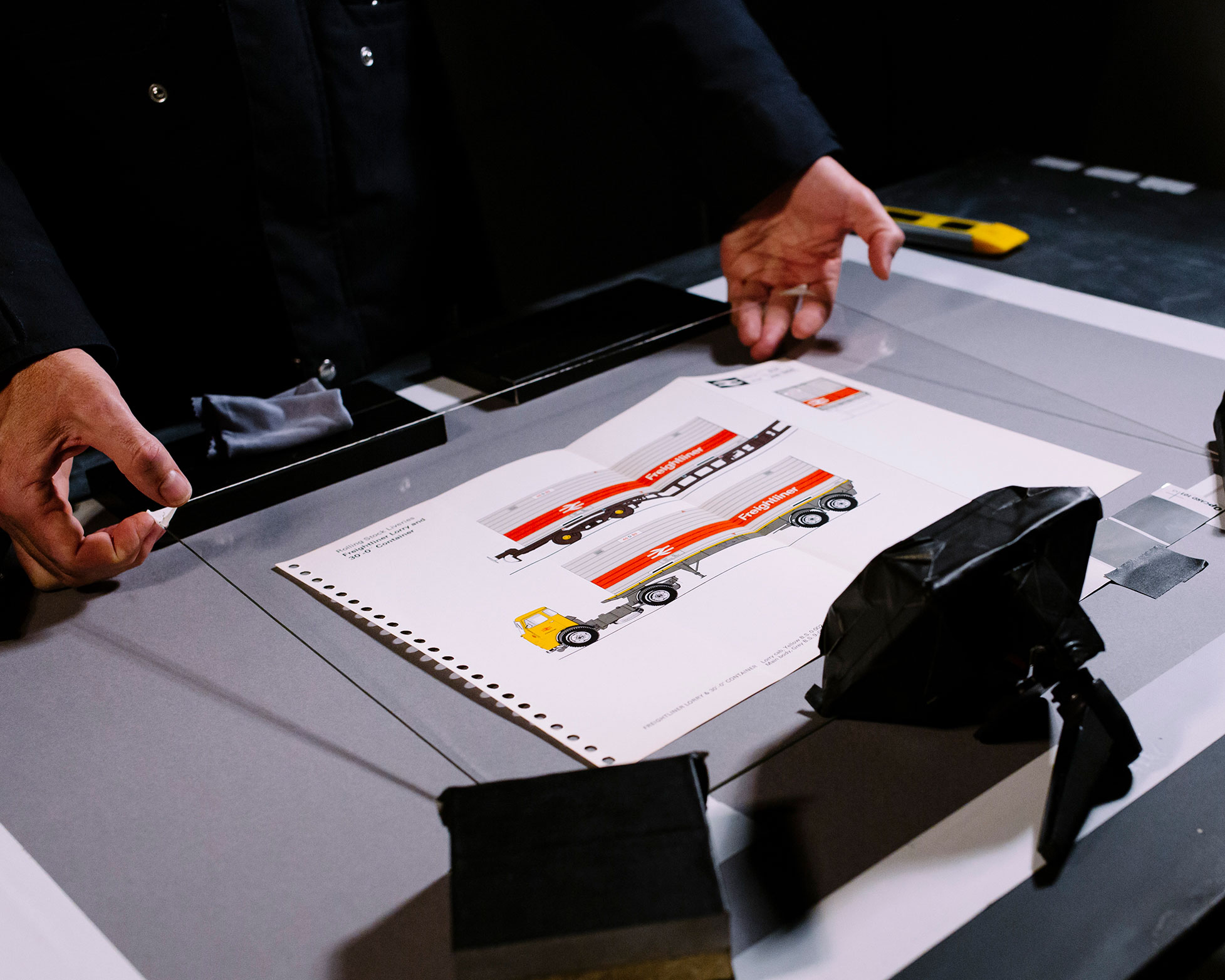
Manual sheet being shot.
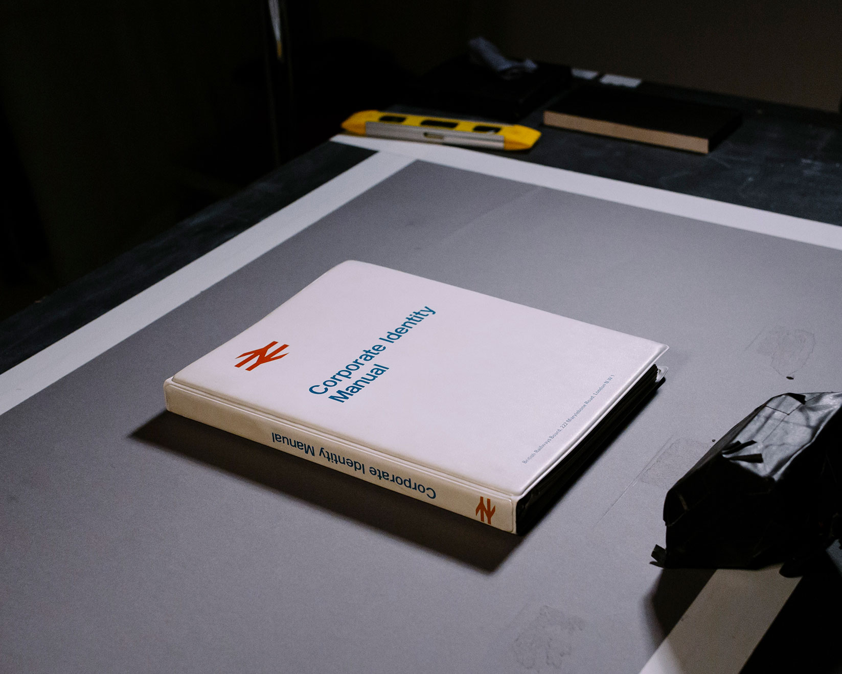
Manual being shot.
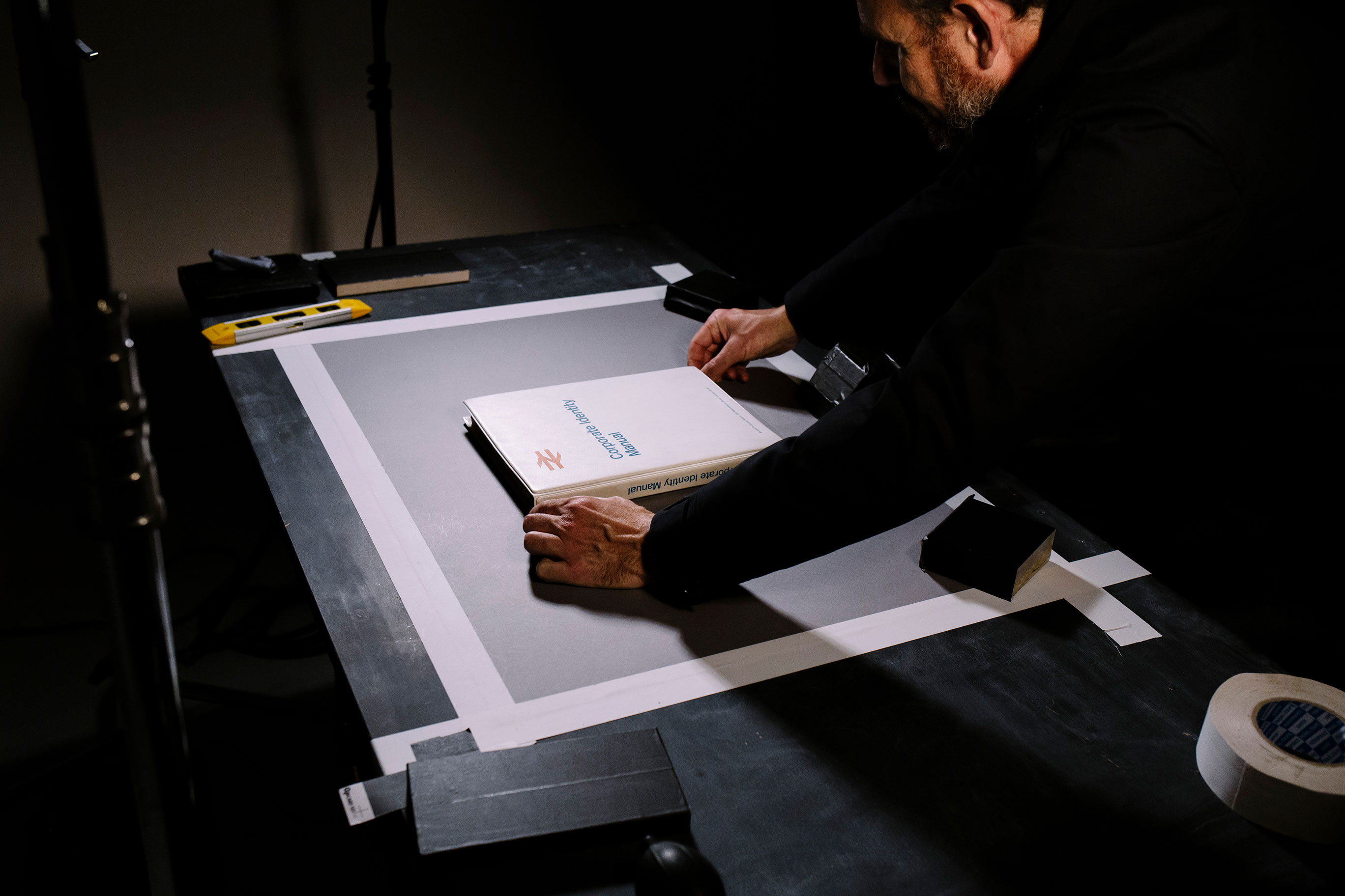
Manual being shot.
The extras
Alongside my collection of Letraset catalogues and the signed copy of Wim Crouwel's Mode en Module, [the original manual] is a prized part of my design library. The BR Manual is not only a thing of great beauty in itself; it is also one of those rare things of beauty: an idea that is defined by rigour and incredible vision.
Michael C Place
The reproduction contains a foreward from the man who was in many ways the inspiration for Henning at the inception of the process: Michael C Place. Other additional nuggets of information provided in Henning's reimagining of the BR manual is an interview with Gerry Barney, the designer of the iconic double-arrow logo, an essay on redesigning iconic logos by James Greenfield, and an essay by Dr Paul Rennie on the identity of mass-transit systems – each a fascinating read.
The result
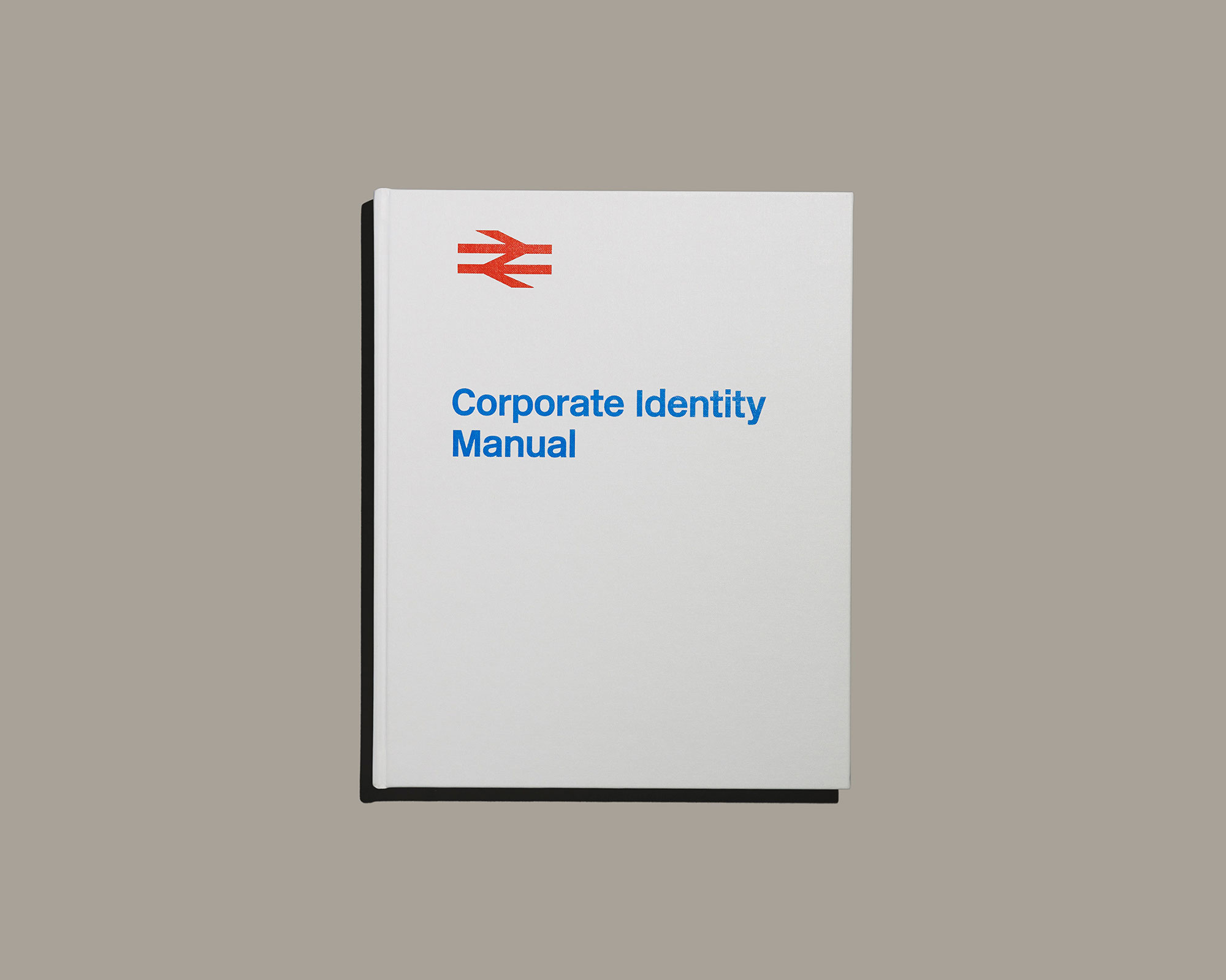
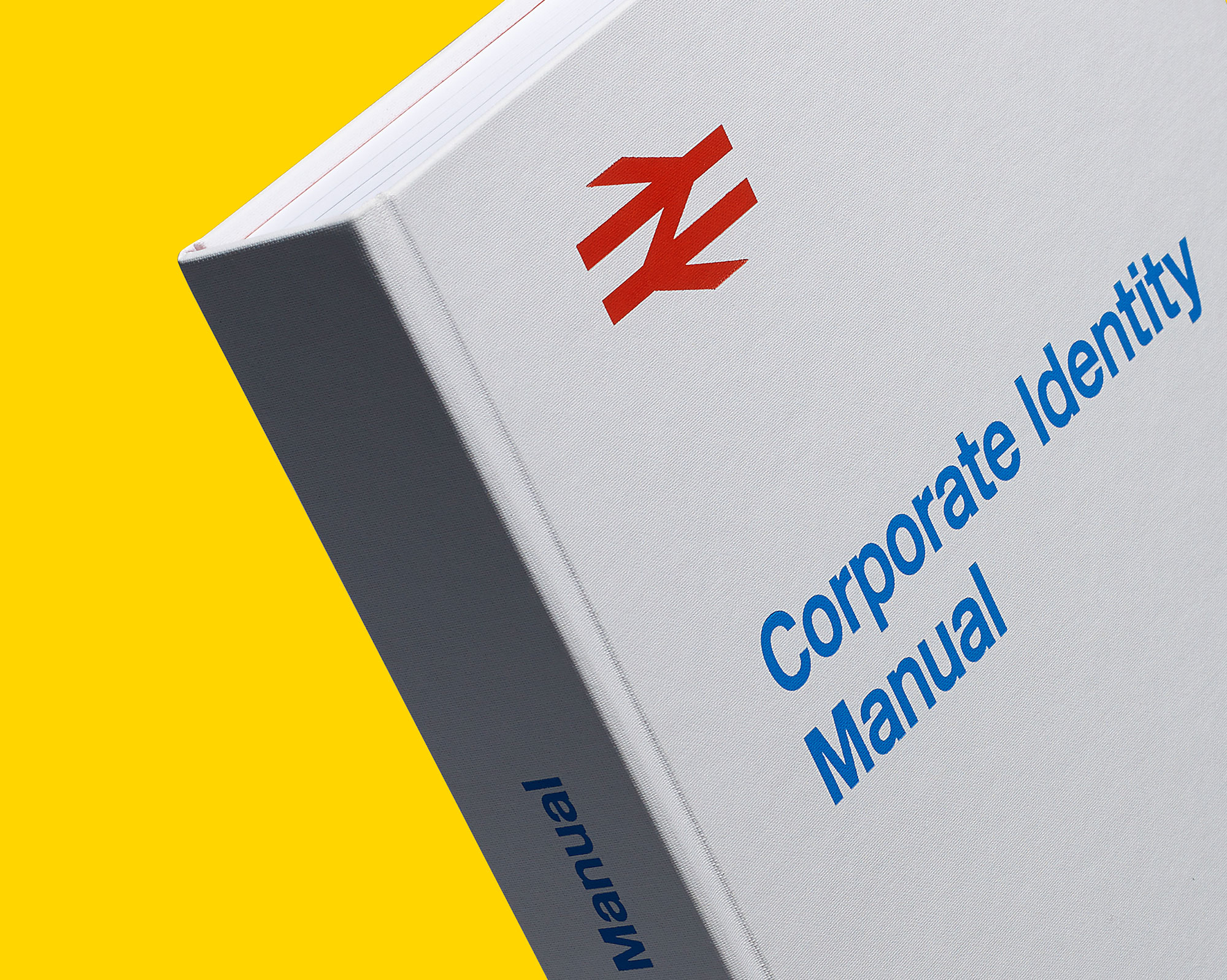
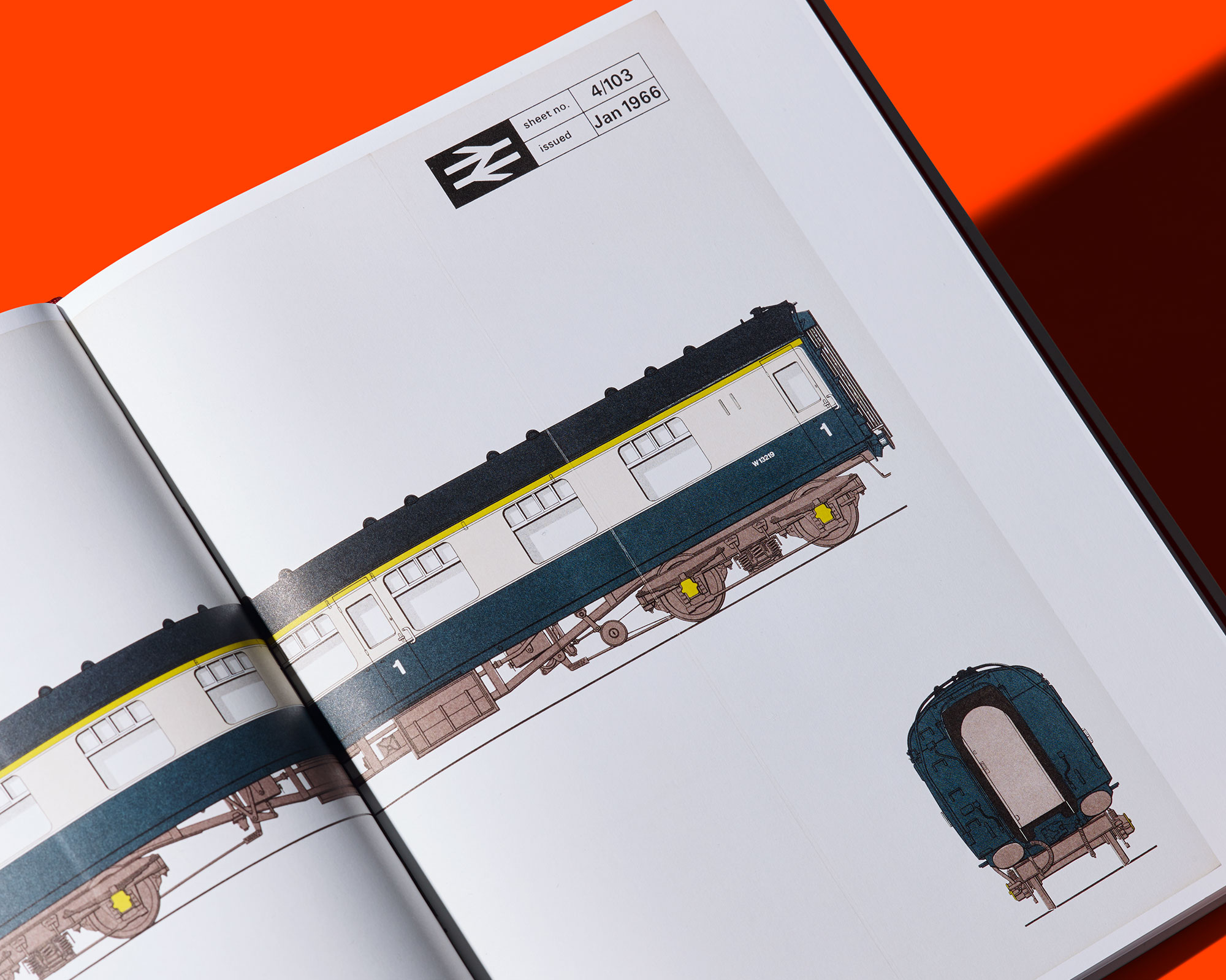
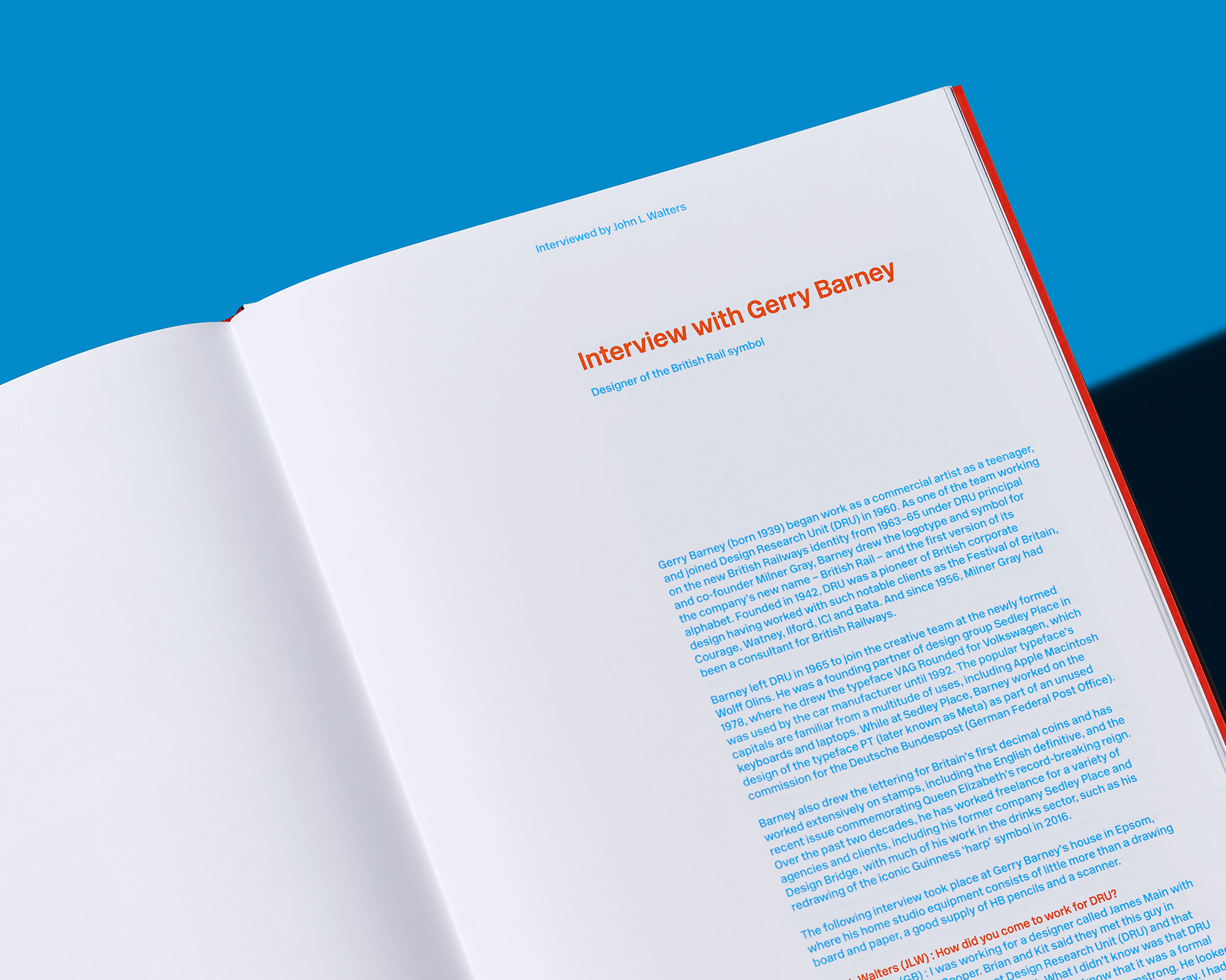
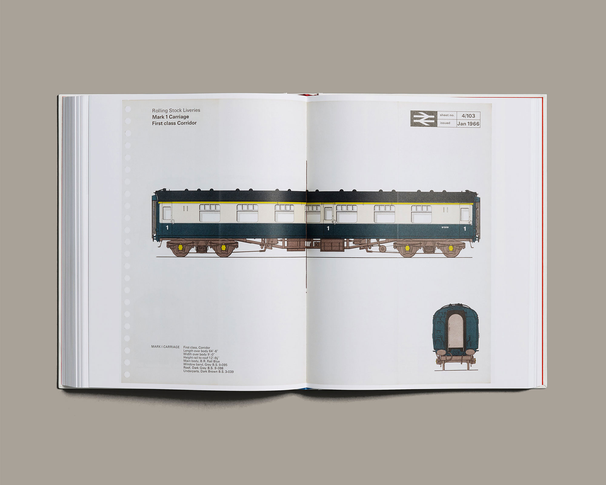
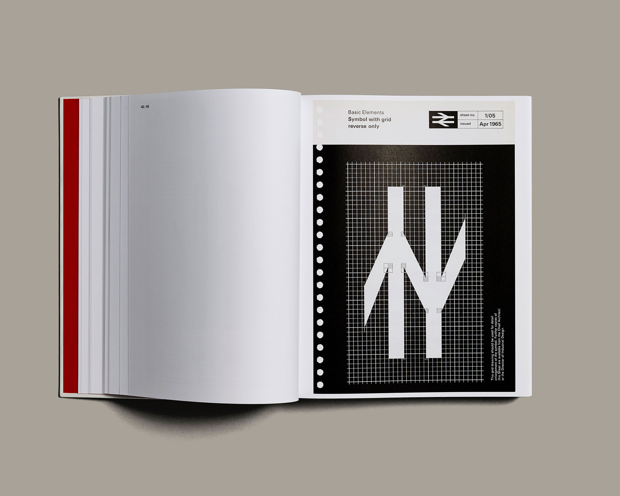
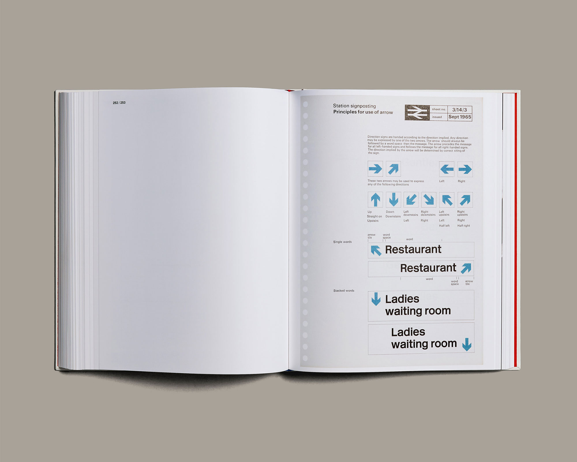
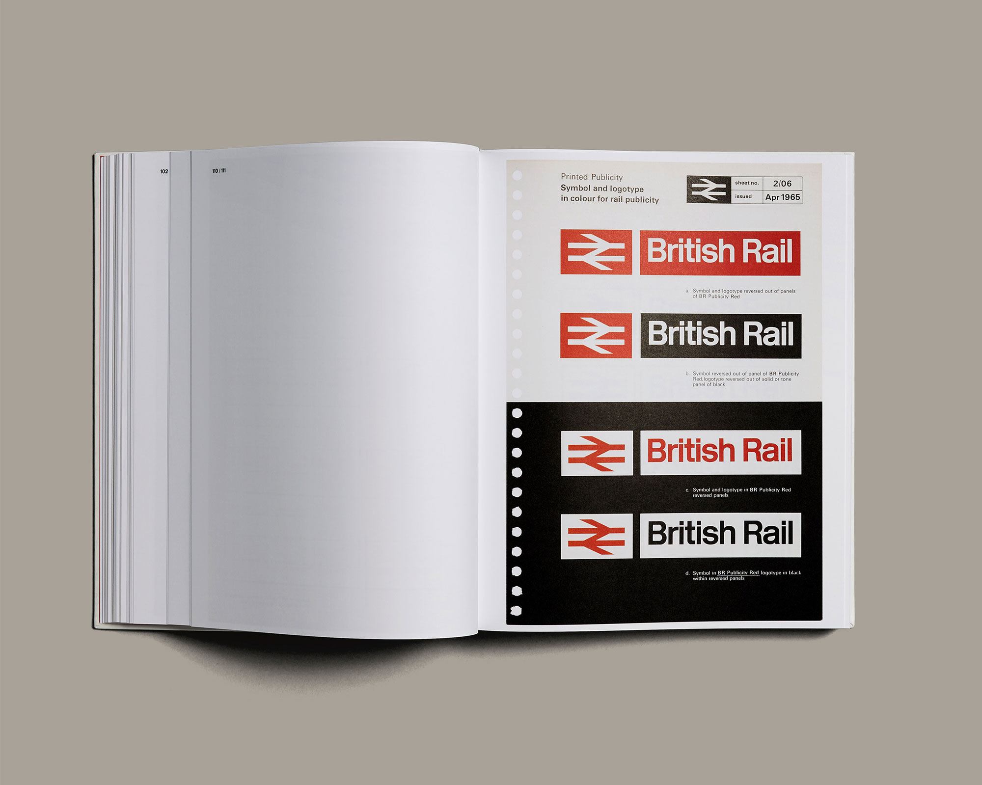
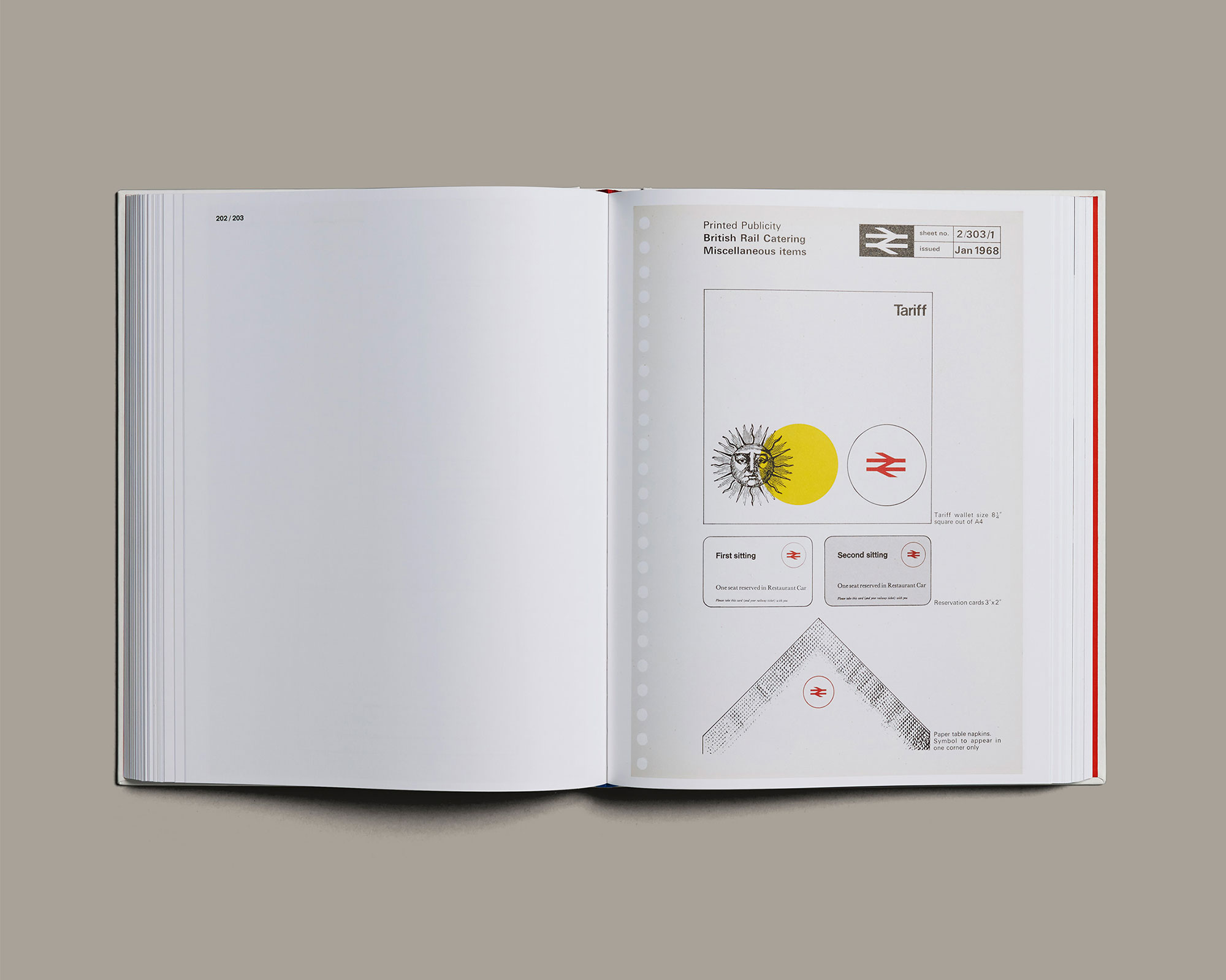
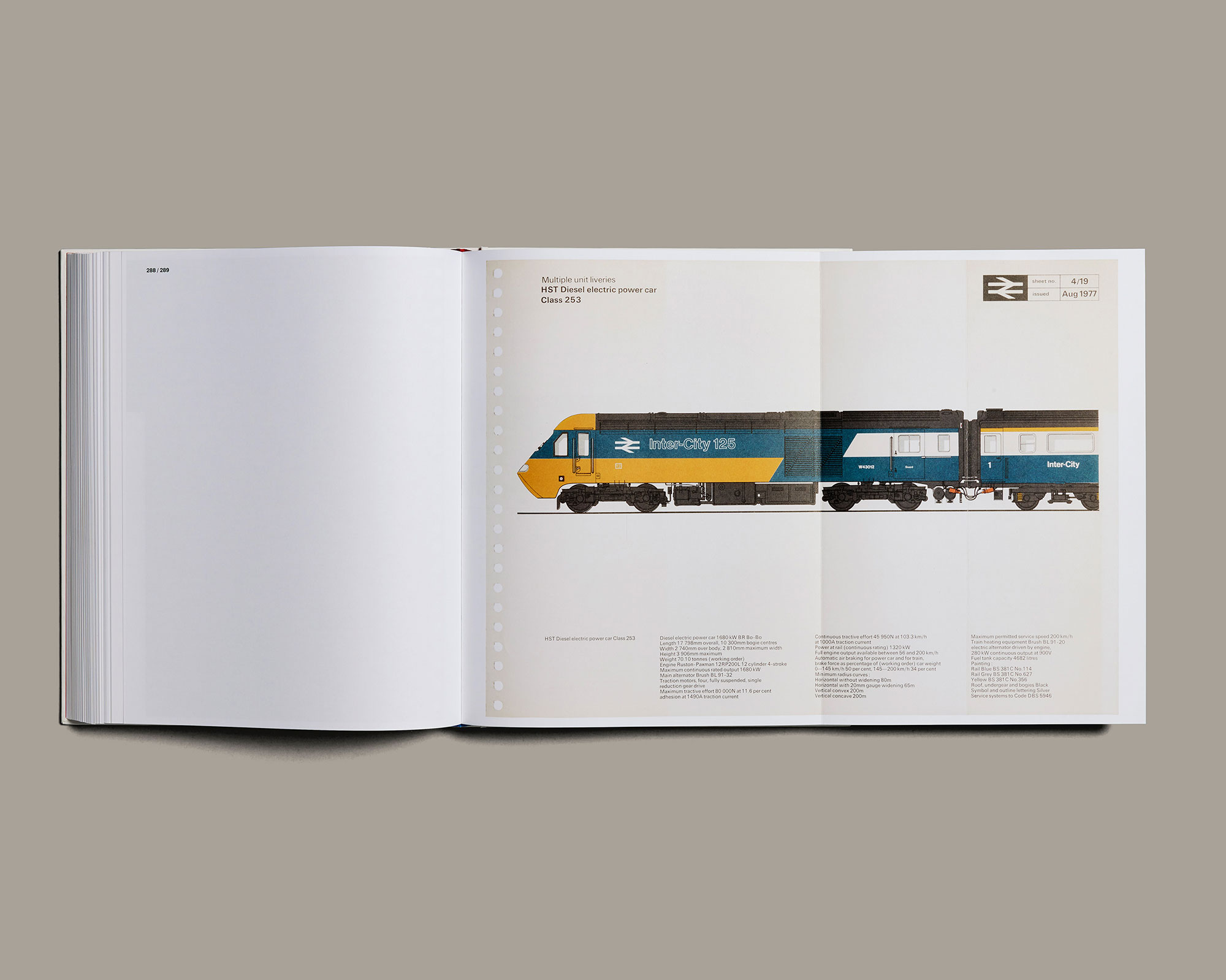
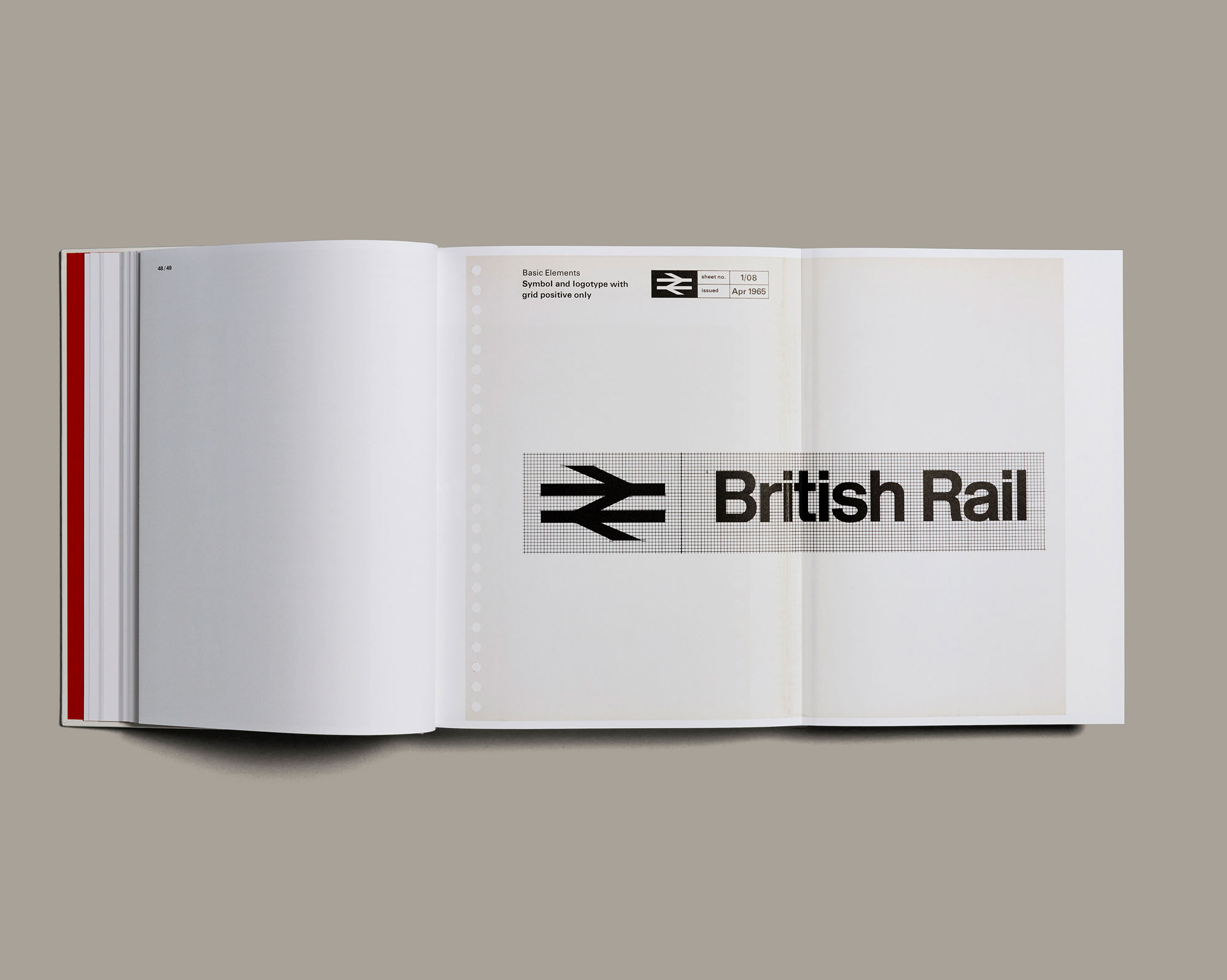
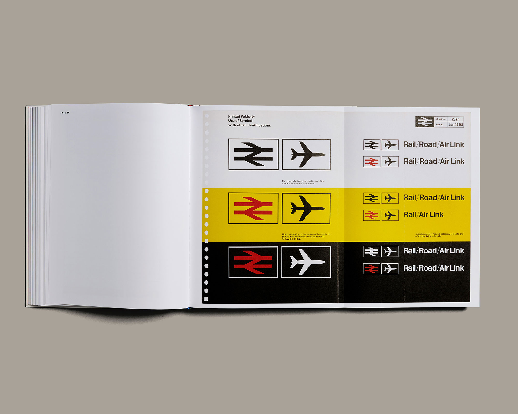
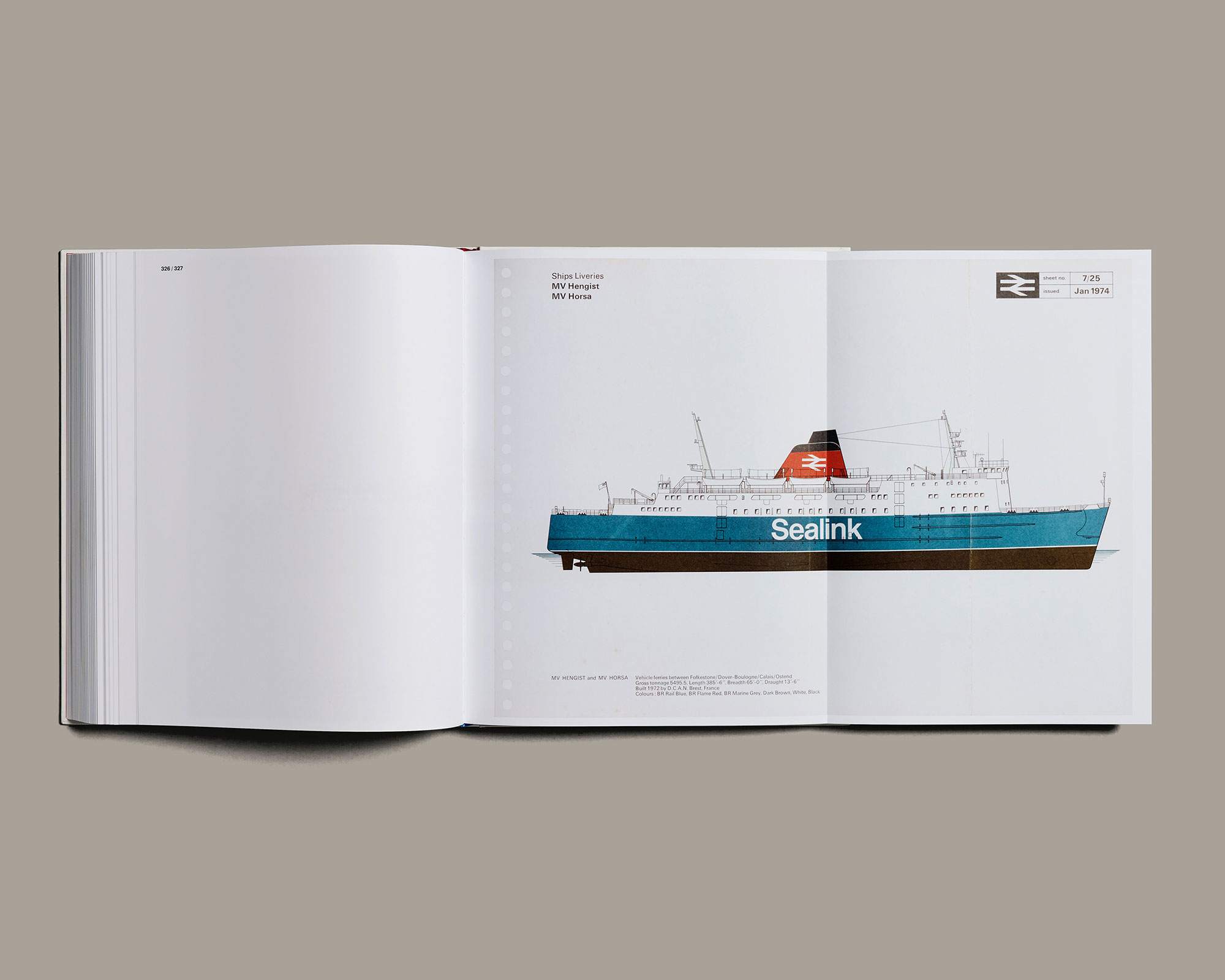
The high specification reproduction of the iconic British Rail Corporate Identity Manual costs £75 and you can get hold of a copy here.
Related articles:

Thank you for reading 5 articles this month* Join now for unlimited access
Enjoy your first month for just £1 / $1 / €1
*Read 5 free articles per month without a subscription

Join now for unlimited access
Try first month for just £1 / $1 / €1

Craig Stewart is a writer, SEO strategist and content marketer, and is a former editor of Creative Bloq. Craig has written about design, typography, tech and football for publications including Creative Bloq, T3, FourFourTwo and DSG, and he has written a book on motoring for Haynes. When he's not writing, you'll usually find Craig under his old car learning about DIY repairs the hard way.
