5 web design trends that will dominate the internet in 2021
The hot trends to look out for this year.
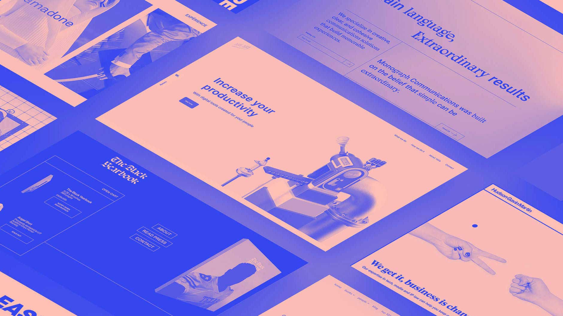
Last year was a tumultuous year, from the coronavirus pandemic to a new wave of social justice movements and a contested presidential election. Many of us don’t think about how broader societal events and technological developments affect design, but especially when creating for the fast-paced web, designers need to be apprised of wider trends.
As we design for the web in 2021, there are multiple emerging trends to consider stemming from 2020. From a greater focus on inclusive design to more immersive experiences, these trends will map out the future for web design in 2021 and beyond.
Below are the top five web design trends I believe will storm the internet this year. If you want to use them in your own work, make sure you've got the right web design tools to implement them, and the best web hosting solutions to back you up.
01. Web that's inspired by print
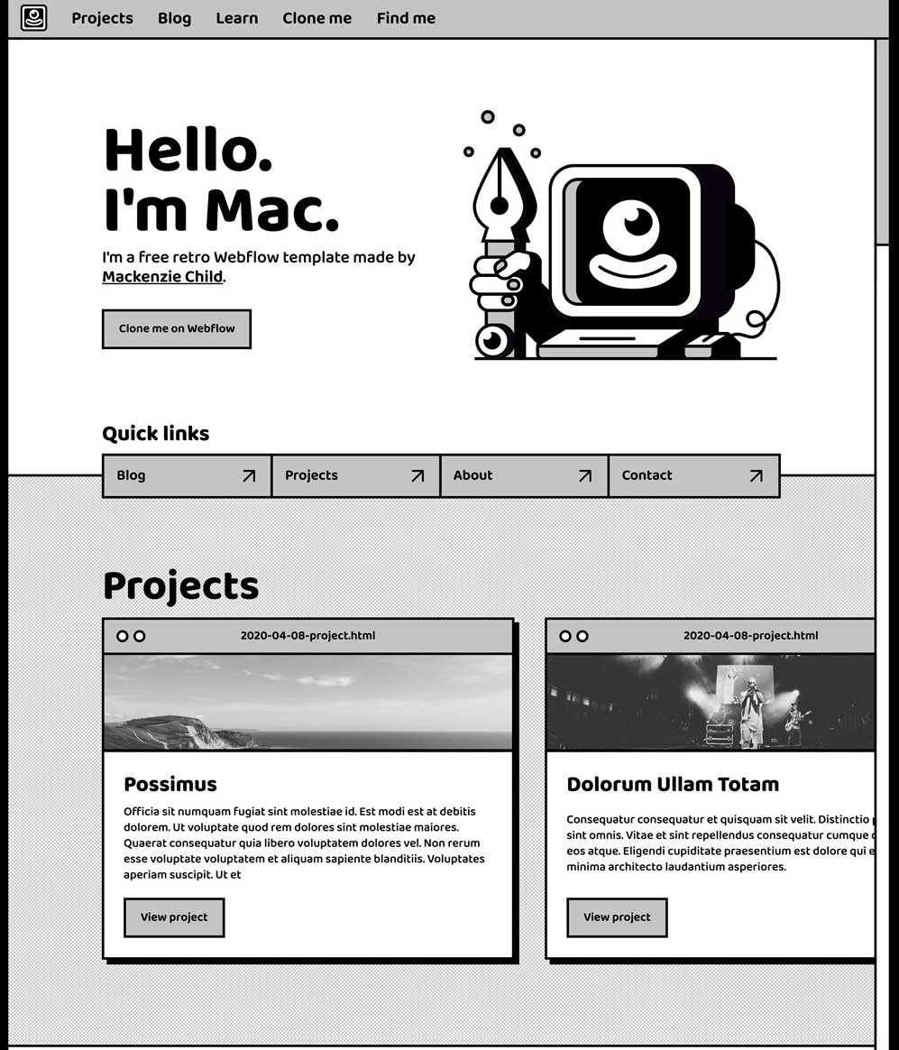
Visuals inspired by print meet a viewer’s need to connect with something from the real world -- especially in a time when many of these connections are severed. What may seem antiquated is actually drawing inspiration and improving on tried-and-true methods of informing and capturing an audience.
You can draw from print without letting your website feel outdated or clunky, and we’ve seen success when designers follow these key steps:
- Choose the right typography: This can be achieved easily, especially when considering headlines that are bigger, bolder, and should be designed to be scanned quickly by the viewer. (See our free fonts for lots of typography options.)
- Design for readability: A block layout with strong borders can clearly group a section of a website and is reminiscent of a style that is found in comics. When doing so, it’s important to focus on flow and readability, as Mackenzie Child does in many of his projects and his portfolio and seen in the image above.
Additionally, designers can easily pull from the layouts used in newspapers and magazines as inspiration on how to design for scale. Newspapers historically filled the entire page, which is a valuable lesson for web designers to learn as they explore scale and canvas sizes for the web.
02. Immersive experiences using AR
Augmented reality (AR) is an underused method for reaching your target audience and introducing them to your product in a more comprehensive and compelling way. It can be used for both business-to-consumer (B2C) and business-to-business (B2B) companies because it fully immerses the user, and that experience can be moulded to fit any organisation or product.
Get the Creative Bloq Newsletter
Daily design news, reviews, how-tos and more, as picked by the editors.
As the pandemic continues, many people aren’t able to experience a product in-person and are seeking alternatives that still allow them to experience a brand and potential purchase. What’s more, sales teams are hurting because they’re unable to travel for business meetings, product demos and events. Because AR helps with data visualisation and prototypes, some B2B brands are using it to create immersive experiences. Nutanix designed an immersive “booth” for a virtual conference in 2020 (above) that demonstrated both its tech savvy and its advanced use of AR to support its customer’s needs.
If this feels daunting, there are many ways to inch into the world of AR. Apple’s AR kit is a great place to start, but if designers are looking for a simple project to dip their toes in they can also create a branded AR filter for Instagram.
03. Custom cursors
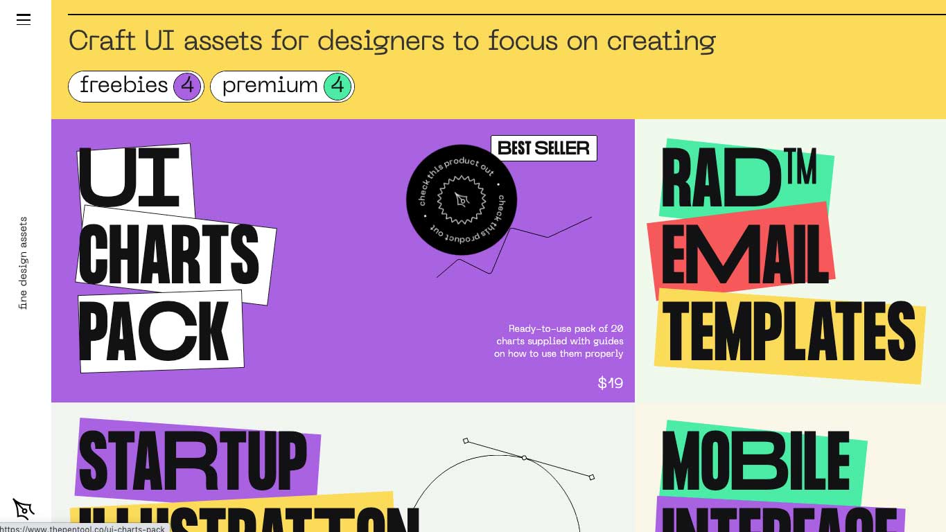
Cursors aren’t usually seen as an area for significant web design, leaving a lot of room for designers to turn them into something memorable. Small, personalised touches like custom cursors can help people feel more connected to your website and therefore the message, brand or product it's presenting.
There are a few easy things to keep in mind when updating cursors. First, reflect on the key images or aspects that make your brand unique and try to anchor this around the cursor's design. Keep it simple and something that looks appealing when small; detailed or intricate ideas won’t translate well.
Additionally, remember that at its core a cursor's purpose is to communicate function. Be sure to choose a custom cursor that adds personality and reflects your brand while preserving its function. Test your cursor across browsers and include a fallback for cases where your cursor isn’t supported.
The Pen Tool above is an example of a brand that uses animation and text in its circular cursor and the result is a web page that easily catches a viewer’s eye.
04. Muted colours
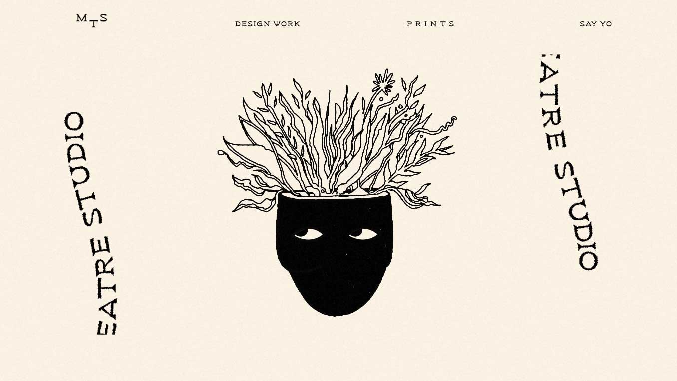
As colour hues lose trendiness 'value' from year to year (remember the millennial pink trend we saw in 2016?), it's important to update your website to communicate that you’re a modern, adaptive organisation.
Muted colours are going to be big this year because they draw the viewer’s eye to the illustration or focal point of the webpage in a natural way. Muted colours reduce eye strain, letting people know they can take their time with your website. Especially with the current proliferation of hand-drawn illustrations and grain-accented backgrounds, muted colours are the perfect complement.
A great example is Magic Theater Studio’s website, which uses a light colour scheme alongside dark chunks of colour to give off a very contrasting look that distinguishes sections of the website.
To be most effective with this type of design, make sure you're choosing colours with adequate contrast so that all of the text is still readable by those with visual impairments. One tool that makes this really easy to check is WebAim’s Contrast Checker .
05. No code website design
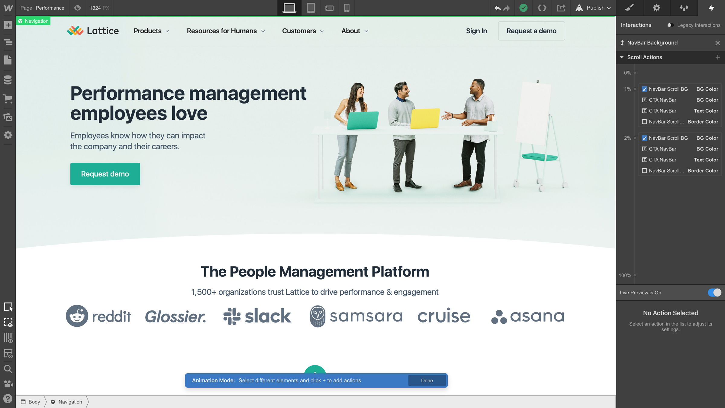
No code web design may sound jarring, but it doesn’t mean the complete end of coding a website. Rather, it democratises the building of the web to persons of all backgrounds instead of leaving it up to the few who have a deep understanding or experience with complex coding and website design.
For those who worry about how no code websites will appear, rest assured that your design will still look as sophisticated and modern as you'd like. Lattice is a brand that built its website with no code, and as you can see above, its website feels and looks no different than a coded one. The perks of doing so, of course, are that you’re less reliant on a particular person or their skill set and can update your website more regularly and with input from a multitude of people. This will be crucial in 2021 as more teams work remotely and need an 'all-hands-on-deck' approach to accommodate for these changes in schedules and priorities.
If these first few days of 2021 are any indicator, it’s clear that this year will continue to be full of unprecedented events. Without a crystal ball, it’s difficult to predict exactly what web design trends will best complement the future, but ultimately creativity and being user-centric at its core is the key to all good website design (and are all reflected in the above trends).
If you’d like to read about even more trends, head to Webflow's breakdown of this year's web design trends.
Read more:

Thank you for reading 5 articles this month* Join now for unlimited access
Enjoy your first month for just £1 / $1 / €1
*Read 5 free articles per month without a subscription

Join now for unlimited access
Try first month for just £1 / $1 / €1
Bruno is the Growth Marketing Lead at Webflow. He manages the paid spend that helps the company reach designers across the globe. He previously worked in growth at various startups and studied comprehensive marketing at the University of West Florida.
