Last year was an exciting time for graphic design, and by the looks of things, 2019 is going to be no different. In this article, we take a closer look at the trends that started to emerge last year and examine where they're heading now.
To put together this report, we spoke to a wide range of creatives, from diverse disciplines and at different levels, at creative studios across the world, to hear their takes on the hottest goings on in everything from logo design to illustration. Read on to discover some of the standout themes they picked up on.
01. Millennial pink
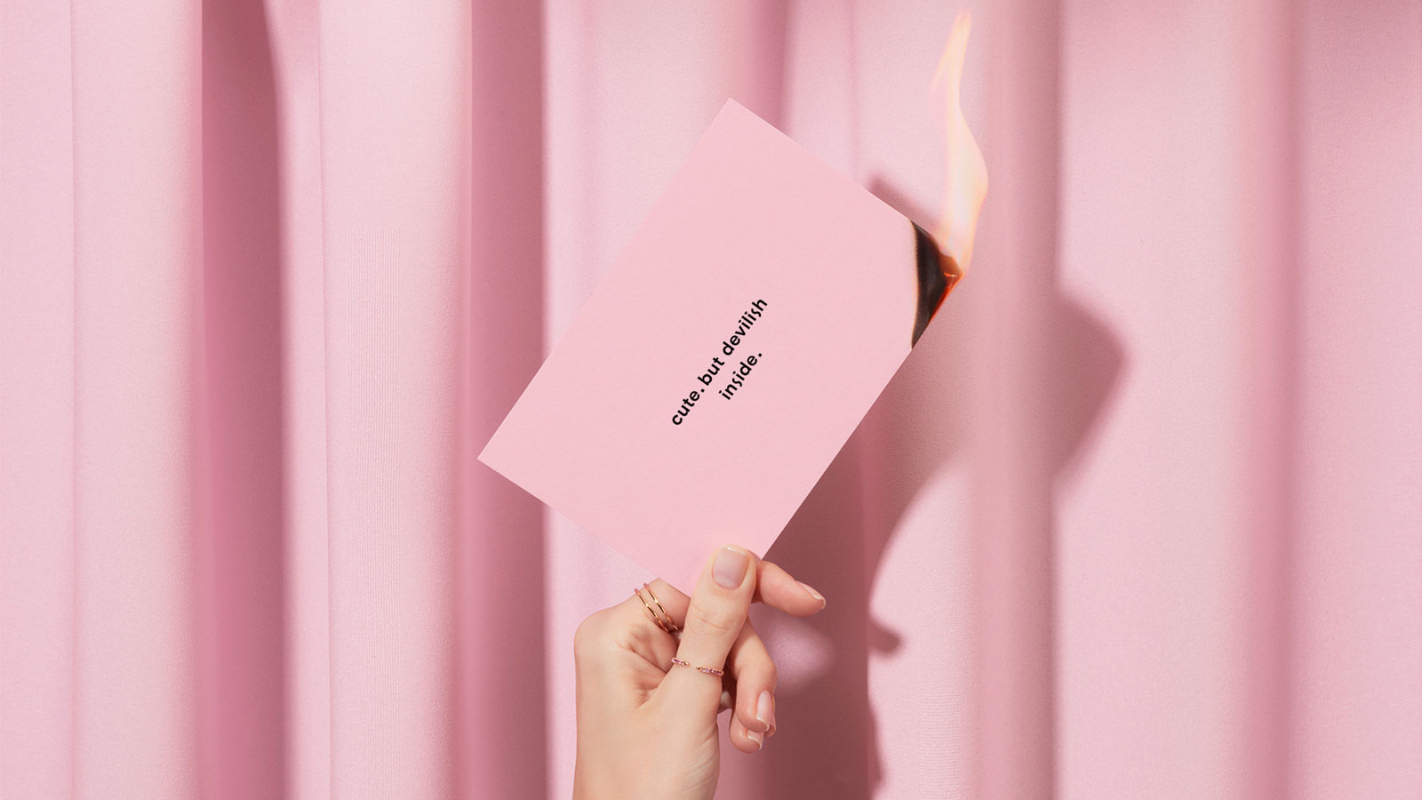
Last year saw the dominance of one particular hue. “The colour known as ‘millennial pink’ provoked think piece after think piece in 2018,” says Optimist Inc's Nomi Leasure. “Bright, cheery and androgynous, it was colour that instantly made products sell, Instagram posts amass ‘likes’ and restaurants procure multi-day wait-lists.”
The love of this hot hue is starting to fade already. “At some point we will reach fatigue, and seek another hue to unite us a culture of consumers,” she predicts. “Indeed, right now, social media stars and brands alike seem to be leaning into browns and beiges to feature products and spaces.”
02. Smashing stereotypes
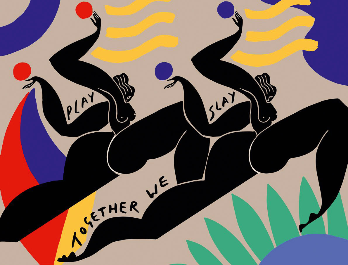
In illustration, there's one standout trend right now: the varied ways in which women are being represented. "From gender issues to body politics, what it's like to be a woman today is being explored in a more unapologetic way than ever before," says Alex Thursby-Pelham, lead designer at Wieden+Kennedy London.
Galvanised by #MeToo and similar movements, illustrators are feeling encouraged to break away from caricature and explore more nuanced and multi-dimensional portrayals of women that confront the status quo. "Scrolling through Instagram, Matisse-inspired nudes follow politically charged illustrations of female solidarity and resistance," Thursby-Pelham enthuses. "Empowered, angry, joyful, funny, flawed, opinionated… they're all here."
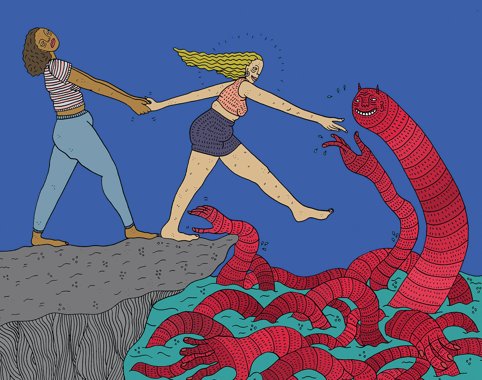
And it's not just about what is being produced but what isn't, the designer continues. "The furore caused by the recent cartoon of Serena Williams in Melbourne's Herald Sun – deemed sexist and racist – goes to prove that today, gendered stereotypes aren't met with a shrug, but with fiery backlash."
Get the Creative Bloq Newsletter
Daily design news, reviews, how-tos and more, as picked by the editors.
"This year feels like a time where these varying perspectives aren't just 'nice to have', but absolutely necessary," she concludes.
03. Colour gradients
Advancements in screen and display technology led many to dub 2018 the 'year of the gradient', and this trend is showing no signs of going anywhere in 2019.
"HTML5 enables people to code gradients rather than having to manually make graphics for them," explains Mitchell Nelson, lead creative at Jazzbones. "And this year, there's been a big focus on duotone gradients as opposed to flat colours, which are more limited. A lot of websites are now using brighter gradients with dark schemes, to give a slick, almost tech feel."
Helen Baker, a freelance brand identity designer based in Wiltshire, concurs. "Gradients are now recognised as colours in their own right, and are seen in an increasing number of logo designs," she says. "The Brit Awards, for example, has moved from the use of flat colours in previous years to a rich 'red carpet' gradient."
Rachel Brandon, graphic designer at PLMR, posits that this trend may be a reaction against digital design in general. "With a sense of movement and 3D to it, a gradient appears as though it has life and weight to it," she says. "As screens take over from physical, print-based mediums, the lifelike look these elements create could be one reason for their sudden surge in popularity."
04. Custom fonts

One mainstream way that designers have been adding extra personality to their typography has been through the rise of custom fonts. "Brands are asking themselves: how can I be myself if I'm using the same font as a hundred other brands, especially when that other brand is a real asshole?" says Chris Harmon, art director at Loyalkaspar. "In response, more and more brands are making custom fonts that honestly feel like themselves, and no one can copy them."
“At this rate it won’t be long until every company has a custom typeface,” believes Tyler Hendy, graphic designer at Wunderman. “This trend will be a force to reckon with, as it’s incredibly affordable and allows the ultimate creative freedom for designers.”
05. Striving for simplicity
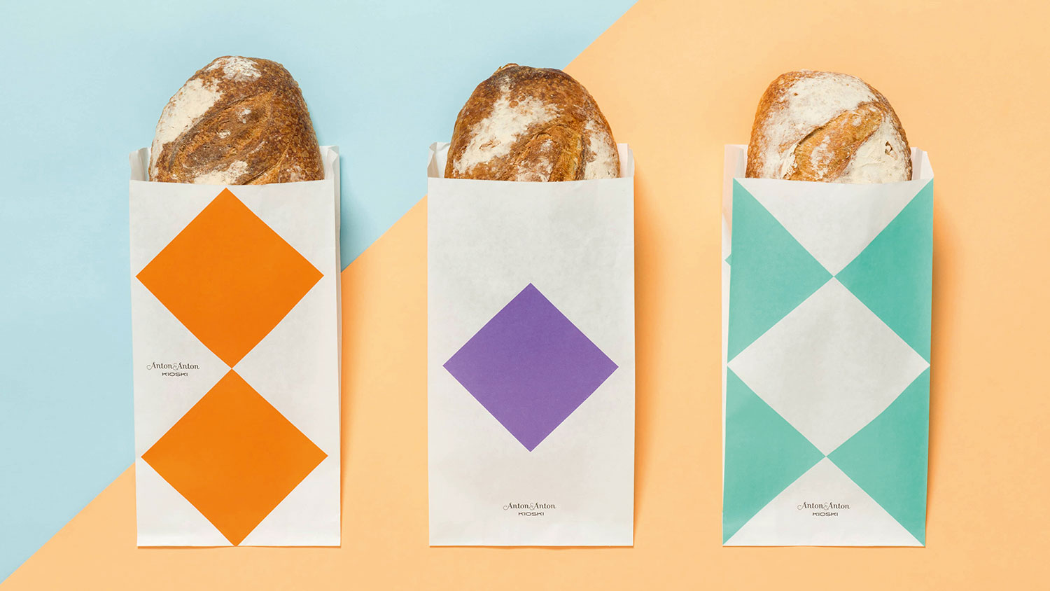
There's been a broad trend towards simplicity in design for some years now, and it shows no signs of slowing down. In fact, as we live more of our lives on apps and websites, it seems only to be accelerating.
"Consumers are now used to seeing a flatter, cleaner, uncluttered design aesthetic in the apps and sites they use," says Alastair Holmes, associate creative director at This Place. "So it makes sense that companies should want to reflect this in their overall branding."
Examples abound. "Burberry recently turned heads with a bold step in typographic simplicity, cutting ties with the elegant graphic ornament of the past and adopting a timeless, grotesque approach to its new identity," notes Lee Hoddy, creative partner at Conran Design Group.
06. Super-functional logos
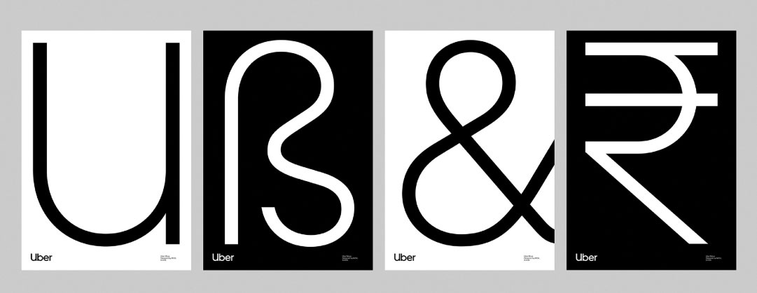
"This year has seen more and more corporates adopting the 'lowercase sans serif' model, with a reductionist, one-colour symbol floating nearby," says Michael Johnson, founder of Johnson Banks. "So now we see virtually the same typography used by everyone – from BT to the Premier League, to Airbnb, to Spotify, to Uber's latest wordmark, to you-name-it."
He's not sure whether we've seen this trend peak. "At first this approach seemed more interesting, more stripped down, more 'less' if you like," says Johnson. "But I'm really starting to wonder quite how long this kind of corporate me-too-ism can continue."
Chris Maclean, creative director of Wolff Olins, is among the optimists, though. "We're losing those glossy sheens and skeuomorphic embellishments that are a hangover from the UI design 10 years ago," he points out. "We're witnessing a return to classic logo design, where less is more, and anything that doesn't express the core essence of the brand is discarded."
Furthermore, he believes that the simplicity of the logos themselves is being balanced out elsewhere. "While some might argue that logo design has become more conservative, exciting things are happening in the expressions that surround the logo," he argues. "More and more brands are recognising that a cohesive brand identity can be a much more expressive palette than the logo alone. This means the identity can evolve while the logo remains consistent over time."
07. Pastel hues
“Fintech and financial services startups are favouring restricted colours, typically in pastel hues,” says David Shalam, founder and creative director at Studio 2br. “Flat, soft-edged, vector illustrations are also popular. Monzo was one of the first to do this, followed by the likes of Habito, Kinsu, Tink and Trussle. These brands, which all target millennials, are attempting to create a friendly, human feel. But this trend is starting to border on cliché.”
Jason Mayo, managing director of Postal, reports another simplified colour trend. “We’ve noticed the ubiquity of pastel still-life photography, especially on the
New York subway,” he says. “It has a sophistication that places it just above ‘normal’ product photography; artfully arranged, part minimal, part fine art, part decorative, but definitely aspirational. It feels like the new upper-middle class, urban go-to photography style of the year.”
08. Disruptive typography

We're experiencing a noticeable trend towards more sophisticated typography in web design," says Alex Blattmann, senior designer at Dalton Maag. "Serif styles are, once again, taking centre stage, after years of avoidance in the pursuit of simpler, sans serif forms."
Rick Banks, director of Face37, takes a similar view. "Last year, I predicted in Computer Arts we'd see a reaction to the geometric sans-serifs that dominated 2016, and I think I've been right," he says. "I see this trend continuing over the next few years, with brands and designers wanting more personality in their type and logos."
In terms of 'more personality', there's been mini-trend for what Riccardo De Franceschi, senior designer at Dalton Maag, describes as a 'brutalist' approach. "This is where type gets compressed or expanded to the extreme, as well as being outlined or even mechanically slanted," he explains.
09. Motion graphics in branding
2018 saw a major change in what motion designers are being asked to produce, with a seismic shift towards social content. Creative agency DMS has seen a 60 per cent increase in this area, reveals head of motion graphics Nico Vargas.
"In today's world, our clients need to engage with their audiences faster," he says. "So we're using bumpers – a five-second teaser before a promotion trailer – that incorporate engaging dynamic subtitles to entice the audience to click and view the promotional content."
Designing for social means rethinking your approach, says Katie Cadwallader, senior designer at Supple Studio. "Twitter and Instagram now loop videos, encouraging our films to be more like GIFs and less like stories with a beginning and end," she says. "The length of animations is adapting too. Anything between 30 seconds and five minutes is now a no-man's land: you're either designing for likes or for a lunch break viewing."
This is just a part of a larger trend, which is seeing motion design become better integrated into the branding mix, according to Wouter Sel, co-founder and animation director at Volstok. "More than ever, video is part of the brand instead of merely being a billboard for it," he says. "Motion design is now deeply embedded in the customer journey."
10. Tactile typography
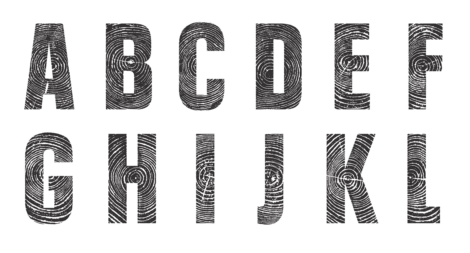
Over the past few months we've seen a mini-trend for physical materials (either the material itself or a graphic representation ) in their letterforms.
“Things like wood, stone and ceramic give brands a more premium and honest look,” says Martyn Garrod, creative director at Carter Wong. “The rebrand of Shakespeare’s Globe is a great example of this, with a red, circular, woodblock-printed emblem, as is Dutchscot’s restaurant menus for Meraki. Our own work for fashion brand Howies embraced this trend, with the creation of a typeface created out of the wood of a fallen tree, near the company’s base in Wales.”
11. Playful illustration
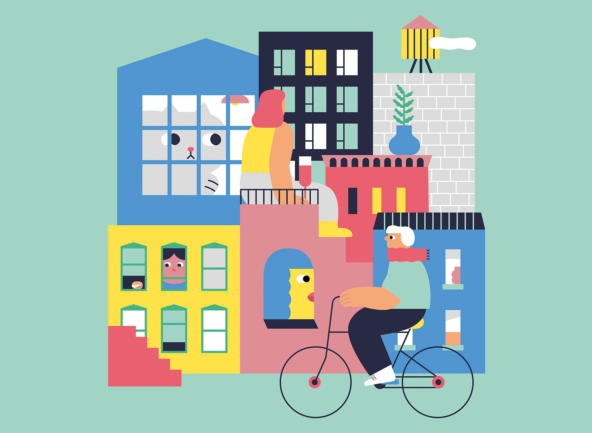
There has been a shift towards more straightforward concepts and a more simple and playful approach to illustration,” says Andrea Chronopoulos, illustrator and D&AD judge. “Clear, bold shapes and lines with bright colour palettes and sometimes an ironic retro feel are certainly a must. Many illustrators over the past year started using more tools such as the iPad Pro, which gives a more direct feeling to digital image-making. They’ve been sharing lots of work-in-progress of their illustrations, with sketches and speedpaint videos.”
This article originally appeared in issue #287 of Computer Arts. You can buy a copy, or subscribe to Computer Arts here.
Read more:

Thank you for reading 5 articles this month* Join now for unlimited access
Enjoy your first month for just £1 / $1 / €1
*Read 5 free articles per month without a subscription

Join now for unlimited access
Try first month for just £1 / $1 / €1

Tom May is an award-winning journalist and editor specialising in design, photography and technology. Author of the Amazon #1 bestseller Great TED Talks: Creativity, published by Pavilion Books, Tom was previously editor of Professional Photography magazine, associate editor at Creative Bloq, and deputy editor at net magazine. Today, he is a regular contributor to Creative Bloq and its sister sites Digital Camera World, T3.com and Tech Radar. He also writes for Creative Boom and works on content marketing projects.
