The start of a new decade is often the signal for fresh thinking and novel approaches to come to the fore, not least in the ever-evolving world of graphic design. So as we move from the 2010s to the 2020s, what are the emerging trends we should be keeping an eye on?
To take the temperature of creative opinion, we’ve spoken to design professionals at all levels of the industry to discover the trends they’ve been spotting, and the predictions they’re making. Read on as we reveal 20 graphic design trends, covering everything from logo design to illustration, that look set to be big in 2020.
01. Intensifying minimalism
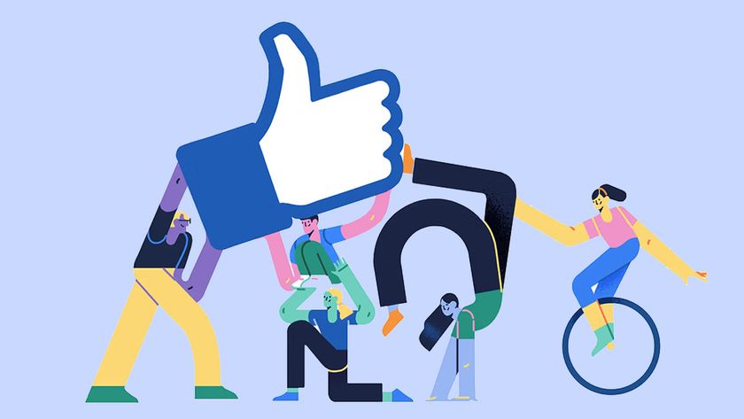
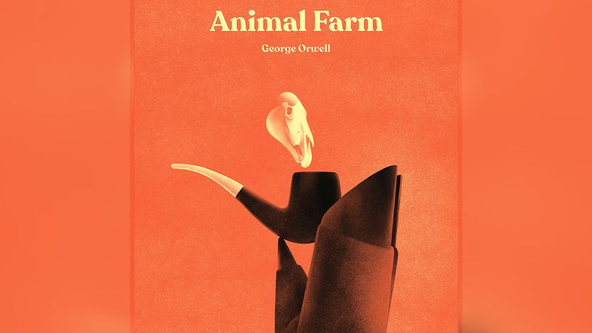
In the latter half of the 2010s, we’ve seen minimalist, flat design dominate the world of digital. And the designers at Grady Britton believe the trend is only going to intensify as we enter the 2020s. “In line with marketing’s ongoing quest for transparency and honesty, design will continue to strip away extra flair and embellishment and move toward a much simpler, straightforward presentation,” says group creative director Brian Dixon. “It may even veer into intentionally unfinished at times, as believability is the priority.”
Designer Paul Levy concurs. “The ubiquity of flat design, involving primary colours, simple, intuitive two-dimensional illustrations and easy-to-read type, will continue to grow,” he predicts. And this isn't just about aesthetics, but function too. “The main benefit of flat design is in allowing users to quickly interact with interfaces, and find the content they're looking for.”
But while flat design owes its origins to digital, its principles have started to influence the printed medium as well, he adds. “Increasingly, we're seeing analogue content being broken down into a more user-friendly hierarchy, making content relevant to the reader easier to find," he says. "In fact whatever the medium, flat design, along with the evolving discipline of UX design, is giving graphic designers a powerful tool to help people easily navigate content."
And while flat design has a reputation for being cold and unfeeling, it needn't be so. Indeed, senior art director Adam Murdoch believes that in 2020, “Design minimalism will shift toward the warm and cosy, with interactive design’s white-and-light, luxury brand colour palette going warm and friendlier; and beige, sage and pale yellow showing up more frequently.”
02. Abstract 3D and vibrant colours
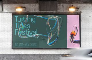
Perhaps as a backlash against the popularity of flat minimalism, we’ve seen abstract 3D forms coming into their own over the last year. “Software updates that have democratised 3D render technology are helping drive this trend,” notes Tamryn Kerr, associate creative director at VMLY&R. “The stunning work produced for the Greenwich Peninsula Festival by Droga5 is a great example, both on the posters and animated for digital. Like watching a well-designed lava lamp, a mesmerising bubble shape moves elegantly across the screen, instantly catching your attention and drawing you into the information piece.”
Get the Creative Bloq Newsletter
Daily design news, reviews, how-tos and more, as picked by the editors.
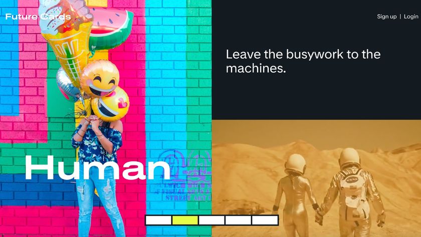
Consuela Onighi, UX designer at Illustrate Digital, is seeing similar things. “I’ve noticed that over the past few months, most designs have created a 3D feel by combining layers of typography, images and abstract shapes, often reflective of the company branding, to create depth,” she says. “This is often paired with bright, vibrant colours and gradients, which I believe will become a strong trend in the next year too.”
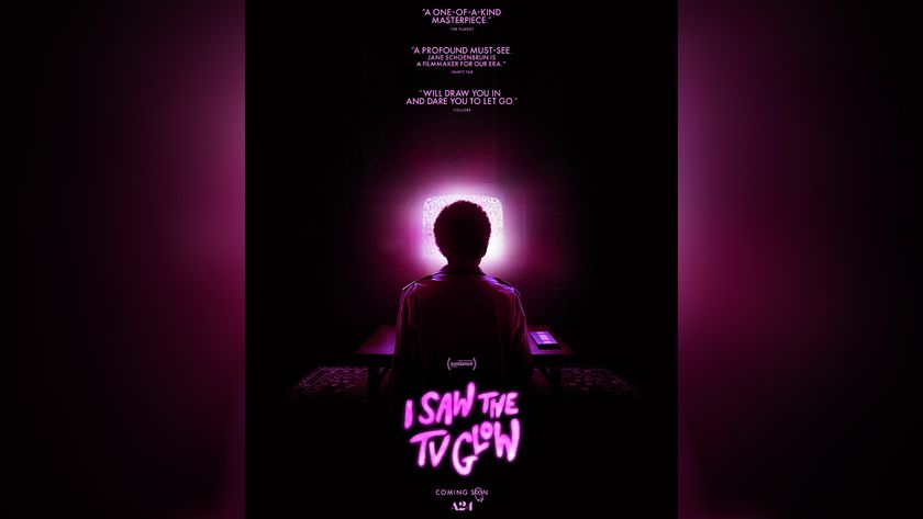
Alex Halfpenny, design director at Elmwood, paints a similar picture. “Neons, fluorescents and bright vibrant colours continue to be the go-to for designers to help design stand out,” he stresses. “Favouring digital application, or special print colours, the addition of subtle gradients help colours feel alive, and give design a youthful and future-facing, optimistic aesthetic.”
03. Type-only approaches
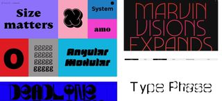
Have you noticed how the number of designs taking a type-only approach appears to be growing? Us too. “Finally brands are braving typographic design over photography and I expect we’ll see even more businesses adopt this attitude in 2020,” says Emily Benwell, digital design and marketing specialist at Liberty Marketing.
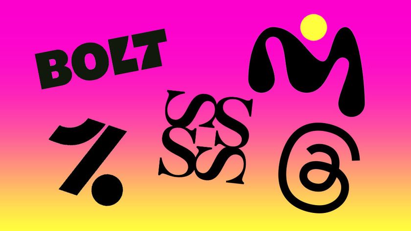
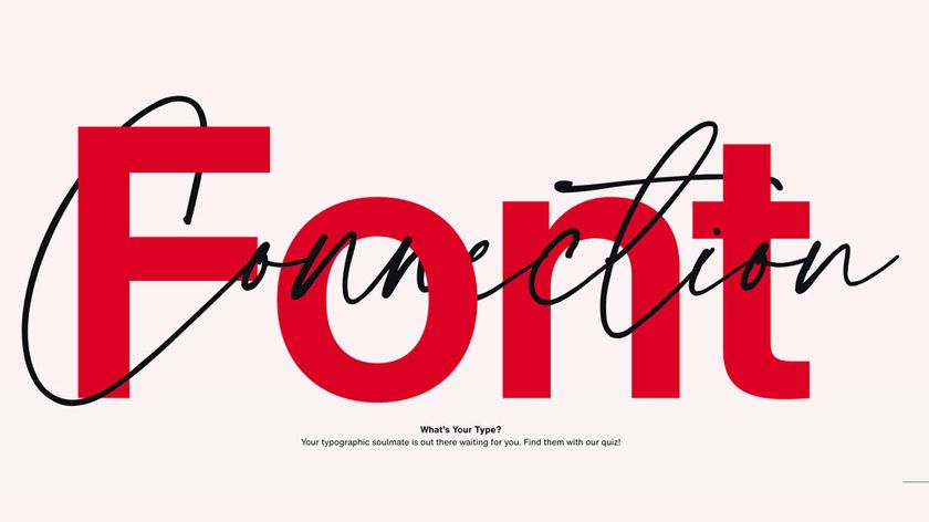
Davide Baratta, design director at Impero, agrees. “I’ve been seeing greater use of typography and bespoke typefaces as defining elements in branding,” he says. As does Nazar Begen, head of project at VistaCreate (formerly Crello), who notes that “designers are playing with typography more than ever, to create more innovative and modern compositions. Artistic typography, maxi typography spilt into multiple lines, and semi-transparent fonts forming various shapes are all on the rise.”
Simple, bold typography has been a big 2019 trend, and that's set to continue in 2020, believes Steve Sharp, director of Fat Cow Media. “We’re finding this technique to be extremely effective, helping brands to deliver messages via simple, strong, singular statements,” he says. "It's a good technique for brands that are straight-talking and to-the-point.”
Meanwhile Chris Willis, head of design at VMLY&R, feels 2020 could finally be the year of variable fonts. “There are several high profile designers already working in this space, so it’s poised to go mainstream,” he says. “This technology is especially exciting in the digital space, where the possibilities are endless.”
And Grady Britton designer Katie Larosa believes that type is only going to get more creative in this next decade. “There’s recently been a trend to break the rules that, as designers, we never thought you could break,” she says. “In 2020, I predict we’ll see more bold, decorative typography that pushes conventional boundaries, and some ‘bad’ design done on purpose.”
04. Super-maximalist and ultra-minimalist
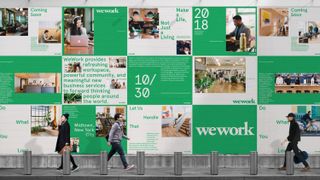
Justin Au, designer at Gretel, has seen two divergent typographic trends grow over the last year. “On the one hand you have a super-maximalist approach, filled with exuberant letterforms, 3D distortion, and alternate methods of image-making such as acid graphics or collage,” he says. “An example is the work we did for Nike By You.
“On the other hand, there’s a return to an ultra-minimal editorial approach, driven by tiny typographic nuances and a dedication to presentation by stripping all excess. You can see an example of that in our design system for WeWork. I think both are successful in cutting through the blandness of clean, geometric sans-serifs that have dominated subway walls and Instagram feeds alike."
05. Taking GIFs to the next level
“Something we’ve seen more and more from brands in 2019 are clever, branded animations that bring to life messages in a fun and innovative way,” says Steve Sharp. “As GIFs grow in popularity across social media platforms, animations have also grown in quick succession and are more popular in email marketing and web page design than ever before."
Mark Chatelier, executive creative director at StormBrands, agrees. “We’re seeing more brands use GIFs to offer quick and quirky responses to notable events throughout the year: look at Google’s mini Twitter animation for Movember for example.” And he believes an alternative approach to GIFs will begin to reshape the digital landscape in the coming year.
“Think storytelling, dynamic use of identity and content, animated mascots and brand assets that move and interact with each other across websites and social media,” says Chatelier. “Designers can no longer afford to sit still. It’s time for brands to follow and explore how the popularity of the updated GIF format can work for them. Otherwise, it’s an opportunity wasted.”
06. Multisensoral moving content

Still not got around to learning those motion design skills? Then 2020 would be a good time to do so, as the discipline is increasingly in demand. “Motion design and moving images are becoming more popular than stills,” says Davide Baratta. “There has been a rise of processing and expressions in motion design over classic keyframe animation."
And that’s for good reason. "Brands are becoming more aware of how important good motion design is,” says Iain Acton, head of motion design at DixonBaxi. “Not only as a tool to unify every aspect of their design but also in further communicating their key messages. A well thought out motion vocabulary lets you speak with a unique voice, helping you stand out in an ever-noisier world.”
And he stresses that motion design is no longer just about ‘animating the logo’. “Here at DixonBaxi, motion design is a vital part of every project from day one,” says Acton. “Next year I expect to see more projects that invite multiple artists to collaborate, as we saw earlier this year with both BBC2 and ITV. I also expect the use of code to continue to grow as people build new tools to solve creative problems, resulting in new and exciting ideas that push design boundaries.”
Emma Newnes of B&B Studio adds that, “As our attention spans get shorter and our desire for immediate gratification increases, we'll see many more brands invest in moving content. As we move into the future, brands will attempt to gain recognition for their style of motion graphic or brand sound. Visual brand equities will transcend into kinetic equities as multi-sensorial branding takes on a whole new literal meaning.”
07. Motion with intent

It's not just that we'll be using motion design more in 2020, but we may also be using it in different ways. Kelli Miller, creative director and partner at And/Or, cites some specific trends in motion design right now, including “hyperreal geometric/sculptural 3D forms in plastic-y, colourful materials, generative computational work in both 2D and 3D, illustrative character-driven narratives, and unconventional typography animations."
In general, she feels there’s an honest sense of playfulness and interest in how far we can push our digital tools at the moment. "And it seems the narrative character driven animation work is a direct response to that: it’s more crafted, human-centred work butting up against digital/computational work.”
More broadly, Dan Healy, image and motion director at Bulletproof, feels we're seeing a shift towards “more meaningful motion; motion with intent. This can be seen in the use of seamless transitions, for example. And with Instagram being more and more relevant, we need to be much more efficient with our motion."
Healy predicts that in 2020 motion design will appear in more and more digital formats, with a consistent feel. “There will be a continuation of using mixed media, a combination of 2D and 3D motion and cinematography. The value of sound design will play a pivotal role in brand recognition and awareness, and with meaningful motion we can really add value. And within web design, I think we’ll see never-ending scroll take on a new life, with clever scroll transitions like the new AirPods website from Apple.”
08. Ingrigue overtakes legibility
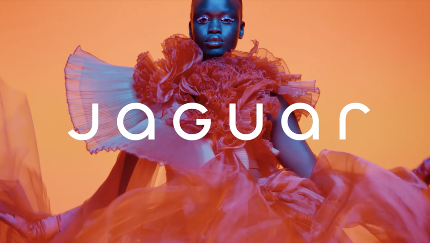
“Adaptive typography has continued to grow in popularity in 2019, as designers have found more practical and productive uses for kinetic fonts,” says Alex Halfpenny, design director for Elmwood. “Interest can be found in deformed letters, bespoke glyphs and disruptive typesetting, where intrigue overtakes legibility in the design hierarchy.”
Emily Benwell, digital design and marketing specialist for Liberty Marketing, points to the example of Uber Move. “They developed a sans-serif typeface that has been a major player in their rebrand, delivering their brand messaging via moving posters hyper-effectively,” she says. And Dave Gee, co-founder of Jam_, predicts this trend will continue in 2020. “We’re seeing much more from big brands using moving typography as the main graphic element in creative across the web and social,” he says.
09. Graphical disruption

If many areas of design in 2019 have seemed anodyne, bland and coldly functional, then hold onto your hats; things might be about to change. “We're noticing a push towards 'graphical disruption': grabbing attention and quite intentionally stopping you in your tracks,” reports Sarah Sanders, head of strategic insight at Precipice Design. “In certain categories, there is a lessening of the calm, considered and controlled colour palettes, refined fonts and negative space that have dominated. Instead, these are replaced with intense almost rebellious hues and juxtapositions, protest-like repetition of messages and bold and dense use of black.”
In short, there’s a graphical sense of urgency and intensity at a level not seen for quite some time. “It's no coincidence that this shift is happening in a time of such political, social and ecological unrest,” argues Sanders. “Look from the bright, bold, intense clashes of the latest GoCompare print campaign to the material of Extinction Rebellion and you will find clear parallels. This approach won’t be right for all products, of course, and in fact needs order and control to push against. The question will be which brands and designers are brave enough to embrace the discord and create something that risks being deemed offensive or ugly.”
Social media is one factor driving this trend, believes Kelli Miller, creative director and partner at And/Or. “We’re living in a time period where experimentation and playful mistakes have an easy and temporal place to live on our social media feeds,” she notes. “The work is not as permanent or labour-intensive as it once was, which makes it easier and less risky to quickly try new things. I love that playful, punk rock spirit, it’s really fun and exciting to see what people are making.”
The positive feature of this trend is that people are not being precious with their work, but there is a potential flipside, she adds. “ I think it’s just as important to be aware of what feels overly trendy, and keep the parts that feel authentic and genuinely connected to an idea, let the rest of it get lost in the feed.”
10. Backlash against Insta-perfection
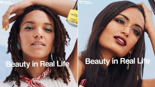
Is the Instagram-inspired notion of showing idealised versions of our selves on its way out? “Lately, we’ve seen a huge shift in how brands are portraying people so that audiences feel a truer connection,” says Jennie Potts, design director at B&B Studio. “In a backlash against the image-obsessed, overly filtered selfie culture, we have seen the rise of un-retouched imagery, using real people over models and representing truer diversity.
“Brands are realising the power in celebrating their consumers instead of promoting just one, outdated aesthetic," she continues. "This has been happening mostly within beauty and fashion sectors, but I think we’ll see it expand across different sectors as we move into 2020.”
11. Focus on Gen Alpha

In case you’re not keeping up, Millennials are now approaching their forties, Generation Z are entering their twenties, and the focus of branding experts is now starting to fall on Gen Alpha: those born during the 2010s. “Generation Alpha are now up to nine years old,” explains Lee Hoddy, creative partner at Conran Design Group. “But what they lack in age, they more than make up for in influence in the family dynamic and spending behaviour; so brands ignore them at their peril in 2020.”
Gen Alpha interact with tech more naturally and instinctively than any previous generation, and this will influence brand touchpoints and micro behaviours profoundly. “Branded moments are softer, more empathic, more ambient. It’s subtle, it’s clever, and it’s meaningful in their day to day activities.”
As a result, Hoddy predicts, more brands in 2020 will move away from just using visuals to communicate to customers. “Instead they’ll craft interface-less, designed moments that surprise and delight to create long term brand loyalty, and if you’re lucky, adoration. The opportunity for designers and brand guardians is massive.”
12. Organic look and feel
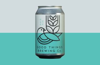
Throughout the 2010s, we’ve seen more and more brand and packaging design focus on the organic, the calming and the natural. And right now, that trend is only heightening. “This is in response to the precarious relationship with our ever-depleting planet coupled with increasingly digitally connected and dissected, data-rich but time-poor lives,” says Andy Capper, creative director at Echo Brand Design. “We all crave more openness and transparency, and we’re seeing type, colour, illustration, packaging and product design influenced by this.”
He offers some examples of what this looks like in practice. “From digital lifestyle brands like Uber we’re seeing a softening and a simplicity, through their use of more approachable typography with fewer capitals, more circular letterforms and clean, naturalistic icons. In recent campaigns from Nike and Adidas, we’re seeing greater honesty to styling and photography, focusing on real individuals in less staged environments, reflecting a desire for more one-on-one conversations.
“Natwest and Monzo, banking old and new, are embracing softer, more naturalistic colour palettes and stripped-down illustration, a big step away from the authoritative and autocratic banking of old. And we’re seeing technology product companies adopting aesthetics and materials that are inspired by nature and in tune with our homes. Rather than the shiny black tech monoliths of old, soft forms and interesting textiles are being combined. Out is the hipster world of complex filigree and industrial masculinity for consumer brands. In are stripped back brand identities and pack graphics. Good Things Brewing Co.'s identity by Horse Studio is a great example of a simpler presentation that’s still rich in meaning.”
13. Action on sustainability
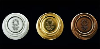
The focus on sustainability right now isn’t just affecting what designs look like, but the design process itself. “More brands are trying to make a positive contribution by transitioning towards innovative approaches to packaging, such as using recyclable or ethically sourced materials,” says Charlie Smith, creative director at Charlie Smith Design. “The types of inks we use, the different finishes we see, and the materials we specify are all contributing to a more pared-back design trend, and this is set to gain momentum in 2020."
“The global issue of sustainability and impact on climate change is one overriding theme that runs through all our design and production teams’ creative minds,” says Steve Austen-Brown, creative director at Avantgarde London. “This topic resonates with all the brands we work with, and across all design approaches. Our approach to sustainability has been key in the way we tackle 3D spatial design. The materials, and the reuse and recycling life span of structures and environments, are also spilling into the way we think about other design disciplines."
Alex Halfpenny, design director at Elmwood, takes a similar view. “As designers take more responsibility for the collateral they help create, the desire to find sustainable materials, techniques and finishes are at the front of mind when every new brief comes in," he says. "These include more environmentally alternatives to things like foil blocking, dialling up premiumness while reducing material cost, embracing natural paper stocks and simplified techniques.”
14. New perspectives on gender and sexuality
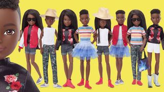
Changing attitudes to gender and sexuality are certain to have a big impact on how the industry evolves in the year to come. “Design in 2020 will be more human focused, celebrating the benefit and the individual compelling product attributes, rather than just who it’s for,” says Lee Hoddy. “We’ll see even more brands moving away from the traditional ‘This is designed for a woman therefore it needs to be pink' approach, and instead celebrate personalisation and the real person behind the product.
“Our job as designers will be more of the critical friend, challenging what’s been designed, what this says, and why," he continues. "How brands behave and position themselves in this environment will raise questions with consumers that could have a lasting impact on sales and profitability.”
Take character design, for example. “We’re seeing the rise of gender-neutral characters in advertising,” notes Davide Baratta, “which is a reflection of what is also going on in the real world, where more and more younger people are identifying as gender-neutral.”
15. A spirit of rebellion
We live in chaotic times, and this is having a clear influence on the creative industries, believes Maisie Benson, designer at B&B Studio. “People are turning to individual activism to try and deal with the growing sense of societal uncertainty, and we're seeing this assertive rebelliousness filter into design,” she explains. "Verbal identity and tone of voice has never been so important, and 2019 has seen a rise in the bold repetition of words and sentences in typography. We've also seen more outlined type, another visual protest to the traditional rules on legibility and messaging. And brands that attempt to replicate this aesthetic in an inauthentic way certainly feel the backlash.”
Designers are being energised by change-makers at the grassroots, and are also aware of their own ability to shape change, she adds. “So we’re seeing fonts inspired by handwritten protest messaging from the Berlin Wall, as well as Greta Thunburg’s handwriting.”
Curro de la Villa, creative director at 72andSunny Amsterdam, offers a similar take. “Overall I have the feeling that 2020 will be the year where imperfection and rawness become a more mainstream vibe, embraced by big brands on their visual identity like never before,” he says. “While invisible design is getting slicker and more present in functional design in the UIs of our phones, global companies want to go the other way and look more human, adopting an unpolished and almost punk tone of voice: it’s no longer a visual language that belongs just to small rebellious start-ups or fashion labels."
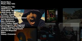
And that's a good thing, he feels. "It gives designers a chance to experiment, almost vandalise typefaces, use bold contrasty and unexpected layouts, absurd kerning, neon colours… all combined in crazy ways, embracing imperfection. This is happening in almost every discipline, and I'm loving the experimental side of it. We see it in photography: I love the messiness of Dexter Navy’s website and its photography. We see it in editorial content: the layouts of the online articles of The New York Times Magazine are always a beauty. And we see it in typography and 3D, such as Thom Yorke’s latest 3D animated music video.”
16. Device dependent design

Do you develop a website that works across all devices, or make a device specific app that only works on one of them, such as the iPhone? Harry East, co-founder and creative director at Equals Collective, believes that in the coming year, you’ll increasingly need to do both.
“In 2020, we’ll continue to see the chasm widen in responsive design,” he says. “Although styled similarly, the designed experience will become fully tailored for the platform consuming it. Expect to see websites and web apps designed with unique experiences for each format. Our experiences are now consumed differently depending on the way they are viewed and used. The best web experiences will be defined by their ability to meet this new design challenge and captivate an audience with specific designs matched to experiences across different platforms.”
17. Cause-based branding
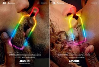
The time when brands would avoid taking a stance on social and political issues is long gone. And that trend is only going to become more marked in 2020, believes Adam Murdoch, senior art director at Grady Britton. “Equity-focused marketing will continue, as brands continue to show they ‘believe everyone is of equal and important value’,” he predicts. “But what will change in 2020 is putting real funds toward actual causes behind their message.”
18. Immersive experiences
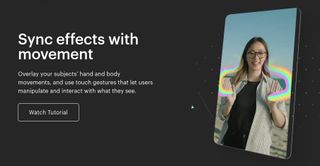
We’ve been hearing this for a while, but Dave Gee is convinced that 2020 will be the year of augmented reality. “We predict that AR and the use of immersive experiences is going to dominate the design industry next year,” he says. Why now? “With tools like Spark AR, and the development of phone and camera technology, it’s much easier to create professional content,” he argues. “As a result, brands are turning to AR to increase engagements and sales.”
Mark Davis, creative director at me&dave, is singing from the same hymn sheet. “Something that’s already made waves in design is a focus on experience, and I think 2020 will see a renaissance in this approach," he says. "It’s about empowering the consumer to become part of the brand experience, rather than remain a passive receiver that’s endlessly dictated to. The way to do this is by marrying the digital with the physical.
“Digital can’t exist in isolation,” he argues. “It needs to be integrated with a ‘real-world’ experience seamlessly and intelligently, and brands like Burberry are masters when it comes to this kind of experiential engagement. They recently used their WeChat site to create a parallel social event to a significant launch, including live streams, forums and even virtual 360 degree tours of the physical exhibition, which directly connected with people using personalised content.
“Obviously, few have pockets quite as deep as Burberry’s, but crack the formula and you’ve got a blueprint for an authentic, engaging brand experience that invites people to become part of your storymaking. The best way to sell experience is with experiences: this ethos must be at the forefront of strategic design thinking in 2020.”
19. Making brand stories more believable
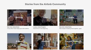
Storytelling has been the mainstay of branding for some years now. Yet Andy Askren, partner and creative director at Grady Britton, believes that brands in 2020 will be under greater pressure than ever to make those stories seem authentic and believable.
“More brands, both old and new, will work to introduce 'roots' to their stories, any way they can,” he predicts. “This has been coming for a while, but it's going to explode this year.” And what visual tricks can designers use to aid this effort? “There will be a continual looking-to-the-past for inspiration," Askren believes. "Heavier, rounder fonts mixed with larger, more pronounced serif fonts, saturated colourways and design cues from the vaults will be what’s hot.”
20. Uncertainty

In a world that seems to be becoming more unpredictable, perhaps the only solid prediction we can make about graphic design in 2020 is that anything is possible. "Nothing will be precious in 2020," says Alex Halfpenny, design director at Elmwood.
"From multiple and gradient colour palettes to flexible typography and procedurally generated brand identities, design itself will have to move quickly to keep pace with the unstable political climate, on-demand culture and shortening attention spans of a society with little patience, and little appreciation for the previous generations’ meticulous approach to long-lasting, but ultimately, static design." So buckle up, and the best of luck to you all!
Read more:

Thank you for reading 5 articles this month* Join now for unlimited access
Enjoy your first month for just £1 / $1 / €1
*Read 5 free articles per month without a subscription

Join now for unlimited access
Try first month for just £1 / $1 / €1
Tom May is an award-winning journalist and editor specialising in design, photography and technology. Author of the Amazon #1 bestseller Great TED Talks: Creativity, published by Pavilion Books, Tom was previously editor of Professional Photography magazine, associate editor at Creative Bloq, and deputy editor at net magazine. Today, he is a regular contributor to Creative Bloq and its sister sites Digital Camera World, T3.com and Tech Radar. He also writes for Creative Boom and works on content marketing projects.

