If you want a safe, reliable and boring job, don't become a graphic designer. This is a discipline that never stands still, with new trends emerging all the time. And everyone needs to keep up.
Of course, you don't have to follow trends blindly: that would be hugely uninspiring and win you no favours at all. But totally shutting your eyes to what's going on around you… well, that's not ideal either. The trick is to know what the trends are, let them inspire you where appropriate, and forge your own path; perhaps even generating fresh trends of your own along the way, whatever graphic design software you're using.
To help you out, we've spoken to leading graphic designers, and got their hot takes on the most prominent graphic design trends right now, as well as real-world examples of each trend in action so you can understand them better. From digital dreamscapes to multidimensional visual identities, angular designs to platform-agnostic aesthetics, these are the biggest graphic design trends of 2023 that creatives need to know about.
01. Digital dreamscapes
In an era where drag-and-drop design tools, free stock libraries and cheap creative labour are more accessible than ever, graphic design runs the risk of becoming generic and boring. So clients are increasingly calling on graphic designers to push the boundaries and create something truly unique, which the brand can own outright.
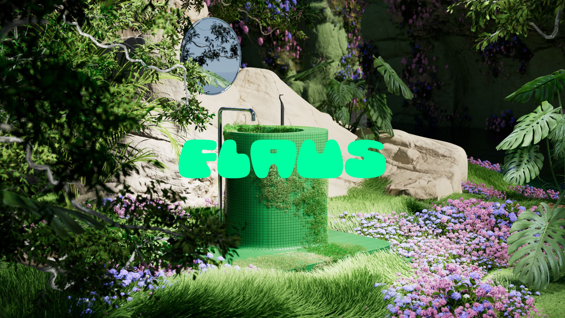
Digital dreamscapes is a trend that fits right into that wheelhouse. "These are hyper-realistic and hyper-beautiful places that transport users into the brand's world," explains Matt Hauke, senior designer at Design by Structure. "What's interesting is they're not just restricted to tech brands like the gaming company Homa. Nowadays, even consumer brands like Flaus, which sells electric flossers, are capturing their brand ambition through these idyllic, utopian landscapes."
Importantly, the trend is not just about pretty pictures, Hauke stresses. "I see dreamscapes, and a strong focus on 3D in general, as way to push brands to be more distinctive in their visual assets; if you can dream it, you can create it."
02. Sharp and angular
"Cyberpunk, sci-fi, post-apocalyptic and dystopian: all these words stir up rich visions of the future, embedded from years of film, art and fashion," says Tom Gudgeon, head of design at Elvis. "A future sometimes rusty and broken, but often slick and exquisite in form and function." And it's an aesthetic that designers are once again taking inspiration from in 2023.
Get the Creative Bloq Newsletter
Daily design news, reviews, how-tos and more, as picked by the editors.
But this is not, he stresses, a sake of simply copying the past. "Take 80's sci-fi design. It's recognisable for its square and often blocky features, which feel clunky and unnecessary now when compared with the advancements in lightweight, aerodynamic technology. Yet we see a clear similarity in current footwear, with the chunky-sole trend. This reminds me of Judge Dredd's boots and uniform in the 2000AD comics I used to read as a boy. Even the machine I'm using right now, the latest MacBook Pro, has taken a step back, replacing its iconic sleek curves for more angular, sharper and an overall squarer appearance."
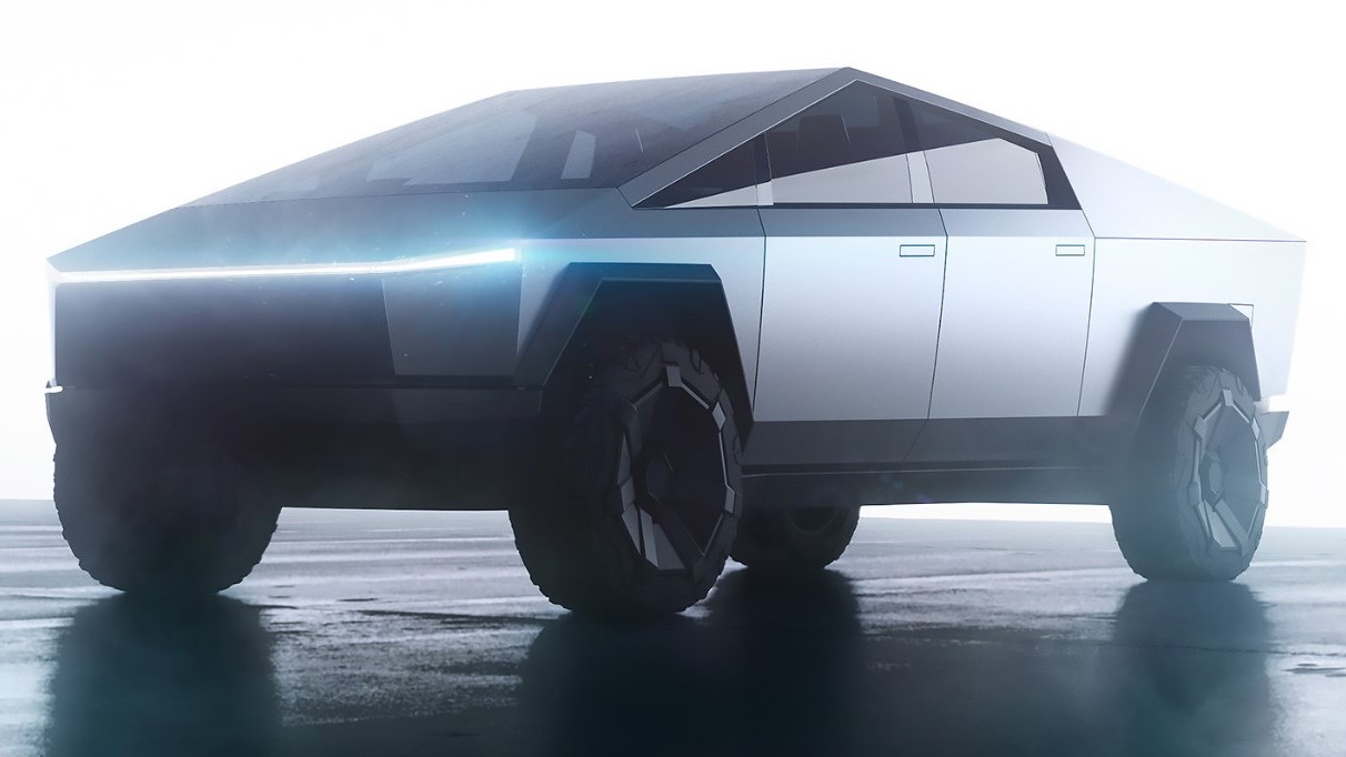
The same, he adds, can be seen with current mobile phones, which are now "slim glassy shards, shrouded in cold stainless steel which resemble weapons more than telephones. And Tesla's recent Cyber Truck looks astonishingly like the M577 armoured personnel carrier from the 1986 movie Aliens, which not so long ago looked dated and dysfunctional."
What's common to all these examples and more is how the resurgence of sharp angles is meshing with new, super-sharp, amorphic shapes. Gudgeon says: "I've happily watched this grow, from the chrome type seen on classic automobiles into detailed typography, which sprawl across fabulous graphic layouts; tribal tattoos that have been refined and reinterpreted into delicate body art of the future; and jewellery that clings onto its owners’ bodies like insects."
03. Platform-agnostic aesthetics
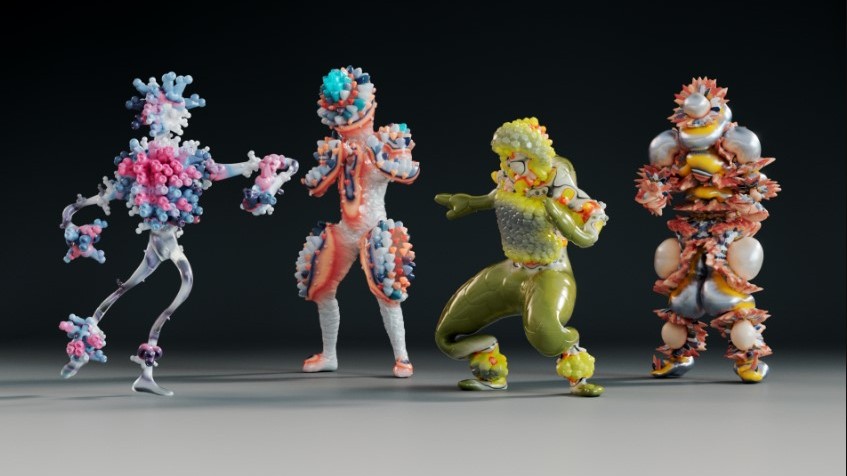
Once upon a time you designed with the platform in mind, which may have been analogue or digital. Nowadays, however, there are so many outlets for creative work across both spaces that the profession is shifting towards platform-agnostic aesthetics, believes Svet Lapcheva, executive producer at FutureDeluxe and FutureResearch.
"From FutureDeluxe’s Spirits 3.0 cross platform avatars to Masha Batsi’s augmented bags – which come in AR and soon in a physical equivalent – our designs are no longer bound by a prescriptive box, but united by a fluid visual identity," she explains. "They exist across all platforms, all media, all screens, and beyond.
"We can call this ‘bridge aesthetics’ and let ourselves be a lot less precious about how exactly our work exists," Lapcheva continues. "From very crafted renders to the raw, low-poly goodness required for a smooth online experience, nothing we make has to be just one thing or final, but an amalgamation of versions. For example, we may start with a highly polished 3D character whose expressive qualities and looks are vividly humanoid, but this avatar will shape-shift – or 'poly shift', rather – depending on the platform it’s taken into."
04. More is more
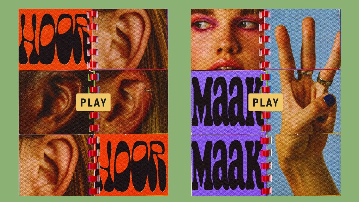
While many big brands have spent the last few years chasing a minimalist ('less is more') aesthetic, Tom Robey, creative director at Glock, reckons the tide is turning. "Increasingly, designers are going for a 'more is more’ approach, in which all of design history is up for grabs," he explains.
Mixing analogue and digital techniques, clashing colours and overlaying photography with expressive type and illustrations, this should not be mistaken for an 'anti-design’ trend. Instead, Robey sees it as "a much more nuanced and thoughtful exploration of graphic design that moves away from uniformity in the pursuit of individual expression; across everything from FMCG and beverages, to music and leisure."
Examples of the trend include Couplet Coffee's packaging system designed by Javier Garcia, and Amsterdam's Museum Night Campaign, created by FromForm.
05. Sober-curious drinks branding
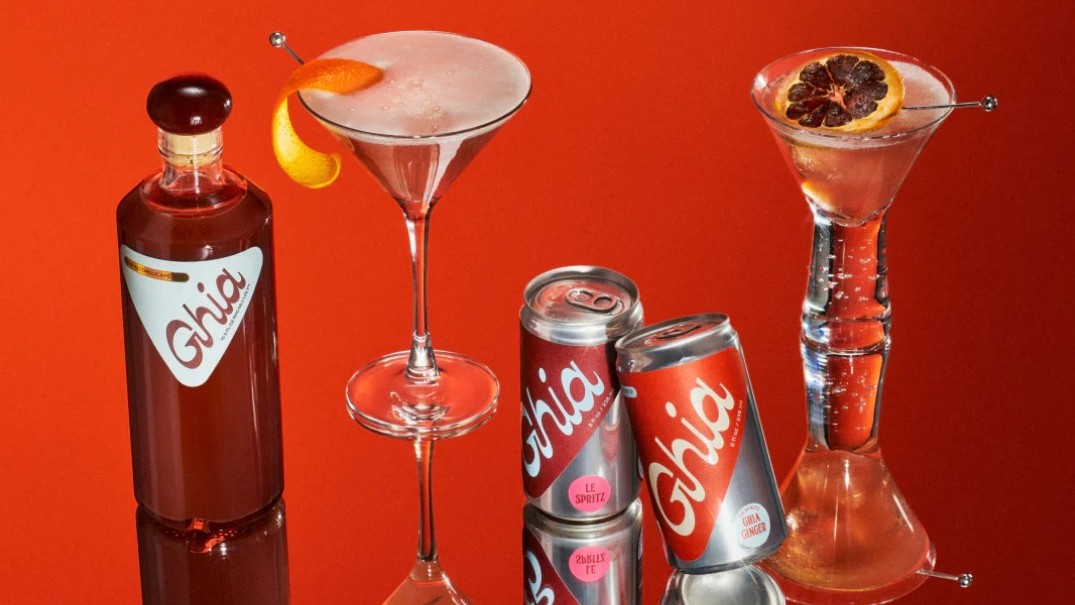
In the past, drinks branding was largely about promoting booze. But zero-alcohol drinks are increasingly seen as a worthy alternative, and the design industry is stepping up to promote them… in inventive and thoughtful ways.
"Sober-curious brands, like Kin Euphorics and Ghia, are redefining what it means to not drink," notes Eve Warren, senior creative at Love. "In the past, sobriety has revolved around a sense of deprivation. But these brands are playing with euphoric and psychedelic design aesthetics, creating a new age escapism that strikes a balance between old school revelry and modern mindfulness.
"It’s a rebellion against the wellness industry’s embrace of minimalism, with its overuse of sans serif typography and muted colour palettes," Warren continues. "These brands are seizing a vibrant, more-is-more approach, injecting the fun back into self-care with bright colours, child-like optimism and a sense of the surreal, carving out a new reality for the no and low space."
06. Nuanced nostalgia
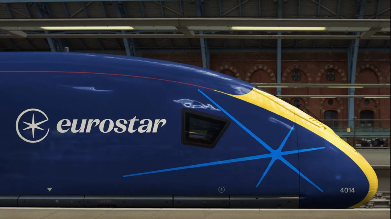
Nostalgia has always been with us. But Matt Taylor, senior designer at Free The Birds, reckons something a bit different's going on than just mining the past for its own sake. "Brands with heritage are starting to wind back the clock and bring their historic assets to the present day," he explains. "Look at Burberry, for example, which has revitalised its mounted knight logo, first introduced in 1901, and rebelled against the modern trend of bold sans-serif logos, in favour of a more characterful subtle serif typeface.
"The National Portrait Gallery also dug into its archives to create a stunning monogram first sketched by Sir George Scharf in 1893," Taylor continues. "Even brands without hidden ancient sketches are looking for inspiration in times gone by. Eurostar's fresh new brand design features a play on their '90s logo and a retro nostalgic feel in the typography, colour palette and illustration style."
Joe Waterfield, associate creative director at Wolff Olins has spotted the same trend, which he dubs "Looking back to step forward". As examples, he cites the emblem for King Charles's coronation, created by former Apple designer Sir Jony Ive, and the Olympic pictograms for Paris 2024, designed in a coat of arms style.
"As brands and institutions edge away from minimalism in favour of something more emotive and stirring, many are looking to the past to bring character and spirit to their present," says Waterfield. "And importantly, with an ambition that feels more future-facing than it does nostalgic."
07. Multidimensional visual identities
A post shared by STUDIO DUMBAR/DEPT® (@studiodumbar)
A photo posted by on
"The future of visual design is multidimensional," predicts Sofia Papadopoulou, creative director at UNIT9. "And 2023 is the year we’ll really see it firing up."
So what does 'multidimensional' mean in this context, exactly? "Designers need to be thinking beyond just colours, shapes and typography and start considering space as well, developing flexible identities that flow across platforms and across dimensions," explains Papadopoulou. She gives the examples of Studio Dumbar/Dept's recent identity for MTV Music Awards, where multidimensional lettering transports the viewer to an immersive universe, and DIA's kinetic identities, which show how 2D typography used in 3D space can create layers and depth in motion, print and in AR."
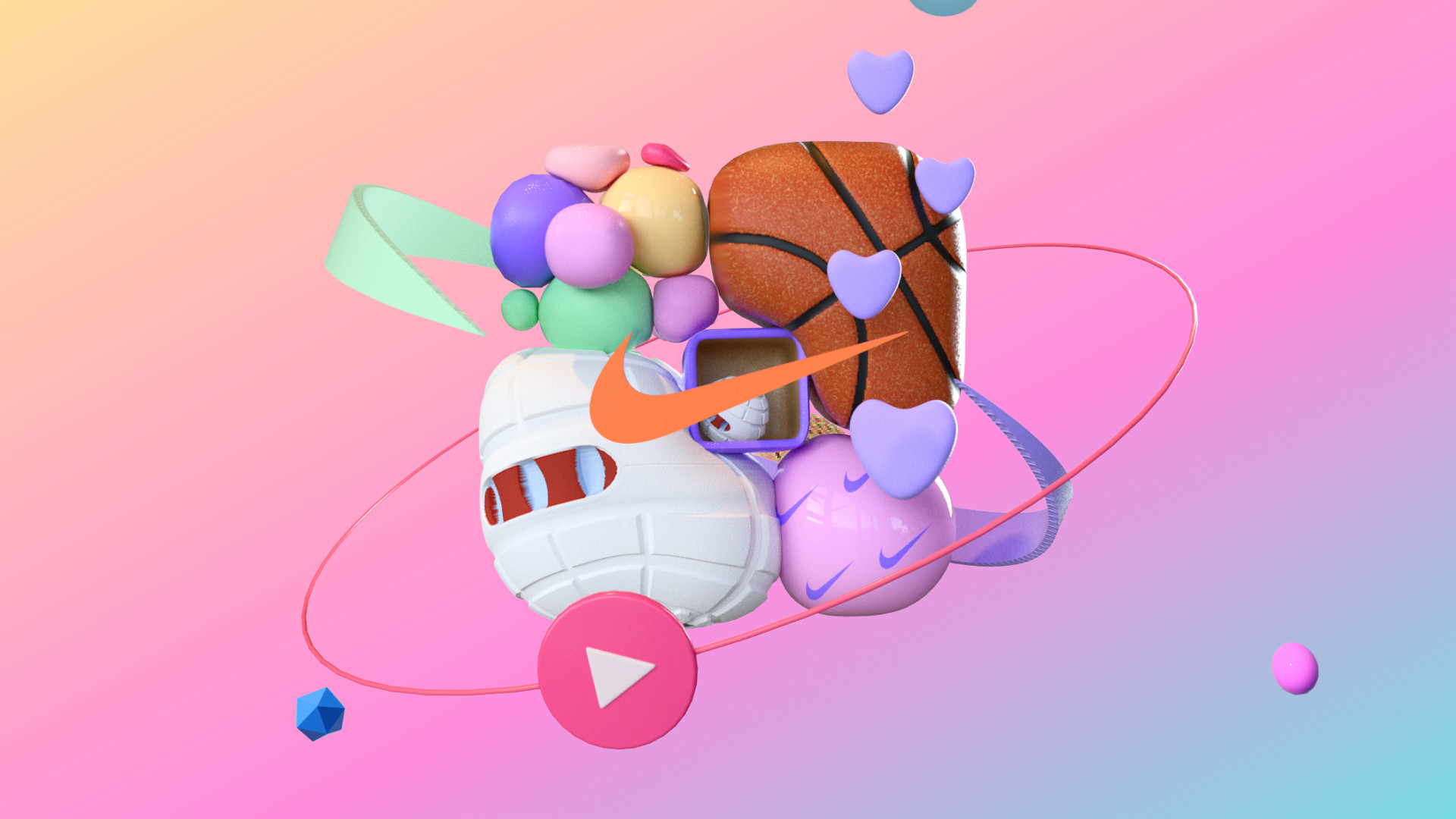
Beyond typography, branded content is another aspect of visual identities where she's seeing 3D gain more ground. "Materials, textures and animations are used to create highly engaging and imaginative visuals, breathing new life into storytelling techniques," she explains. "A perfect example is the Nike GTM app we worked on, where we turned users' fitness and purchase data into playful, personalised 3D profiles to tell their unique story and celebrate their unique journey with Nike."
08. Carbon-conscious design
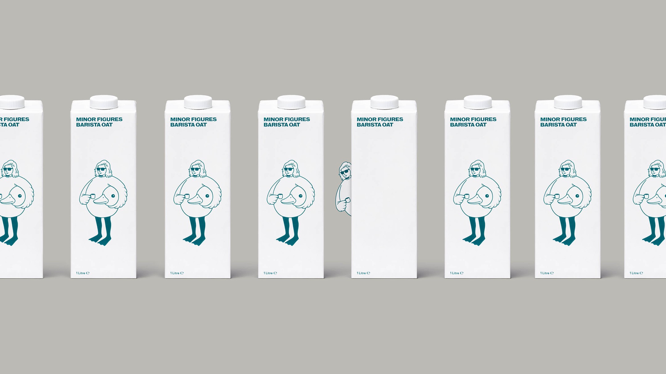
A couple of decades ago, creative types were in the vanguard of people sounding the alarm about climate change. But now that message has entered the mainstream, it's time for designers to look inwards at their own behaviour and industry.
"The world is waking up to the huge contribution that the digital industry makes to our global carbon footprint," says Elliott Holman, design director at This Place. "So designers are getting carbon-conscious, for example using less energy-intensive colours, such as dark mode, off white: the eco-conscious creative studio Earthly Made offers a great example. Other strategies include employing simple vector illustrations, retro line art and anti-branding over heavy and rich imagery, as in the packaging for Minor Figures' oat milk collection (shown above).
09. Metaverse aesthetics
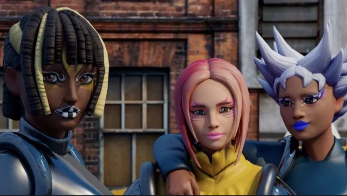
Ever since Mark Zuckerberg made the metaverse the prime focus of Facebook, it's been central to all discussions of tech and digital design. And Amy Ramage, founder, MD and creative director at Célibataire describes it as "absolutely unavoidable and 100% likely to be one of the biggest design trends this year".
So what does that look like on the ground? "To create fully immersive brand experiences, designers must now be able to combine the physical and digital: a combination of AI, AR, VR, and IRL," Ramage explains. "These areas are evolving incredibly quickly, making it an exciting time to be a creative. It also holds big opportunities for brands, who can use this tech to add value to their offering, and consistency to their brand identity, as more luxurious and/ or unique.
In that light, she predicts that: "Moving forward, there will be more references to metaverse culture in projects, such as game-inspired 3D illustrations or AI-inspired avatars. Web design, in particular, must be indebted to the metaverse aesthetic. An effective way to do this, in a 'reality' where shoppers are not limited to one device and will take digital shopping across all of our senses – including touch, hearing and sight – is to integrate techniques that appeal to all of them. By including design elements such as sounds, music and animated icons, brands can create a more engaging multi-sensory experience.
"Finally, in print and graphic design, futuristic stylings can be achieved with neon colour palettes, glitch style effects to mimic a deep fake mood, or dark mode designs to create a more visually immersive feel."
Examples include L’Oreal's multi-brand avatar partnership on Ready Player Me, where they've have created hair and makeup looks with L’Oreal Professional and Maybelline (they’ve also launched a startup accelerator with Meta.) Plus there are Coca-Cola's NFTs, which reimagine some of the brand’s iconic assets for the metaverse – with dynamic motion, movement and multisensorial elements – inspired by shared moments of friendship.
Read more:
- 10 NFT trends that could change the world
- Monotype's hot typography trends for are here
- 'Psychic waves' new trend for, predicts Adobe

Thank you for reading 5 articles this month* Join now for unlimited access
Enjoy your first month for just £1 / $1 / €1
*Read 5 free articles per month without a subscription

Join now for unlimited access
Try first month for just £1 / $1 / €1

Tom May is an award-winning journalist and editor specialising in design, photography and technology. Author of the Amazon #1 bestseller Great TED Talks: Creativity, published by Pavilion Books, Tom was previously editor of Professional Photography magazine, associate editor at Creative Bloq, and deputy editor at net magazine. Today, he is a regular contributor to Creative Bloq and its sister sites Digital Camera World, T3.com and Tech Radar. He also writes for Creative Boom and works on content marketing projects.
