Graphic design in film: the ultimate guide
Get top advice from the design duo behind the Harry Potter universe.
What myths about working in the film industry can you dispel?
"People think it's dynamic and romantic and exciting," says Mina. "And I'm afraid to say that is a little bit of a myth. Quite a lot of the time it's quite boring, long hours and very demanding. Much of our time is spent in a studio environment opposed to being on set, and when you are on set, that's quite boring as well because there's a lot of waiting around.
The day you go and see a film that you've worked on – if it's a good one – it's bloody exciting
Miraphora Mina
"You also spend a lot of time putting out fires. So you might be bobbing along being creative and then someone will come and tell you a scene has been cut and you then need to do 50 handwritten letters for the next day. It's not a linear way of working at all.
"That said, the day you go and see a film that you've worked on – if it's a good one – it's bloody exciting. When the cinema goes dark and the film comes on, to be part of that is really special. But I do think people need to know that it's not for everyone, you can be working in places that are really badly equipped, for example. It's not 'showbiz' in the glamorous sense."
What's the best thing about working in film?
"I think we have a slightly warped perspective having worked on really amazing films," Mina says. "But if you've contributed in some way to popular culture, that's pretty amazing. And the spin-off of that is if you've contributed to someone's perception of what they can do, as in if they decide to go into graphic design because of what they saw in that film, then that too is amazing."
"To be attached to a project that has a nice message, like Harry Potter, is really incredible," Lima adds.

How do you approach a project on the scale of Harry Potter?
"The first thing we have to do is scrutinise the script and hope that you're going to get a shooting schedule because we need to prioritise which of the props will be needed first," Mina explains. "You very rarely shoot chronologically, so it might be something that's right at the end of the film needs to be shot first, and it's really important that we know that information.
"Then the exciting bit of doing research starts, which we throw ourselves into, making sure that our walls are plastered with reference material. And that can be anything from pure graphics, so posters from the period, typography patterns textiles, wallpapers, through to photography, architecture and even sometimes little paragraphs of writing that might describe something from that period. That can take a good few weeks to really immerse ourselves in that. It's a bit like a military operation, getting your arsenal ready for the attack!
Get the Creative Bloq Newsletter
Daily design news, reviews, how-tos and more, as picked by the editors.
"We start shooting about four months ahead of principal photography, so all that's happening with us trying to work in advance of whatever they're shooting. So even once filming starts, we're always trying to work one or two weeks ahead."
How much creative freedom are you allowed?
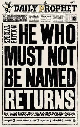
While this will vary depending on what film and director you might be working with, in terms of the Harry Potter universe, the MinaLima team were given loose reigns. "They totally expect us to get on with it and figure it out what's needed from the script," says Mira. "And then once we've come up with a concept, say, for the Daily Prophet, it will then go to the set director and production designer. If they are happy with the way it's looking visually, it will then go to the director and often the producer as well. The key hero props sometimes went to Jo (J.K Rowling) too.
"That said, things did change quite a bit in that sense, as a lot of the graphics we were working on were so detached from the set that they just went straight to the director," Lima adds.
Want to know more? Look out for part two of this interview, where we chat to Miraphora and Eduardo in more detail about their work on Harry Potter and go inside their super-popular shop The House of MinaLima – coming soon!
Read more:

Thank you for reading 5 articles this month* Join now for unlimited access
Enjoy your first month for just £1 / $1 / €1
*Read 5 free articles per month without a subscription

Join now for unlimited access
Try first month for just £1 / $1 / €1

Kerrie Hughes is a frequent contributor to Creative Bloq, and was once its editor. One of the original CB crew, Kerrie joined the team back in 2013 after moving from her role as staff writer on 3D World. Since then she's written regularly for other creative publications such as ImagineFX, Computer Arts and Digital Camera World. After a stint working for the police, Kerrie is back reviewing creative tech for creative professionals.


