Grammy-winning artist Klaus Voormann on why hand-drawn is best
The Beatles’ cover artist looks back on 50 years of Revolver and explains why he still thinks working in analogue is top.
Just over 50 years ago, Klaus Voorman created one of the world’s most iconic album covers for a little band called The Beatles. Revolver signified a change in direction for the band, and they needed a cover that spoke of this new sound. Step in Klaus Voormann, who went on to win the Grammy Award for Best Cover – Graphic Arts on 2 March 1967; the first time for a rock and pop album.
“I don't know how many covers I've signed, because everybody wants me to sign one,” he says, reflecting on the anniversary milestone. “It's really amazing the amount of records that are out there, it's just incredible.”

The 79-year-old first met The Beatles during their time in Hamburg from 1960 to 1962. After the band played at The Reeperbahn, Voormann approached John Lennon with the first cover artwork he’d created – Walk Don’t Run by The Typhoons – which Lennon ended up buying from him.
“From then on, we met every day. We went out to the movies, we went out to the seaside, we made lots of things together because they didn't have anybody there. All they had was playing all night and being very exhausted, so they were happy that they could have a good wash at my place,” Voormann explains.
The friendship eventually led to a collaboration, when Lennon called Voormann and asked him to create a cover for the new album. “I couldn't believe it. I was just so amazed and I was scared – what am I going to do for these boys?” Voormann says. “And then I heard the music and it was even more difficult because the music was so way out, and such a big step.”
Going against the grain
Voormann knew that he had to create something that signified the new sound of the band, while also incorporating his own personal flair. At the time, most covers were full of colour, so he decided to go black and white. Then he decided to go against the grain by not including the band’s name on the cover, simply placing the title ‘Revolver’ at the bottom.
“Everybody else was doing it the standard way and I wanted it not to be standard, because the music wasn't standard, so the cover wasn't supposed to be,” he recalls. “I racked my brains. I knew I had to think of something really good.”
Get the Creative Bloq Newsletter
Daily design news, reviews, how-tos and more, as picked by the editors.

Voorman began by doing what he does best: sketching out a bunch of little designs with a magic marker. “One was in a boat – they're all sitting in the boat – and another was in an air balloon; several different things. It was a really large size of paper and I drew several ideas along the bottom.”
A eureka moment struck when he thought of the band’s hair. “I had several ideas of how I could do something with their hair – the hair, I thought, was really sensational. At the time, it was completely unknown to wear your hair on your forehead and just let it grow. I had a version of the cover – the way it was finally done. They saw the sketch and immediately liked it.”
Graphic novel style
Voormann explains that while he’s not “good with words like John was”, he wanted to do something to commemorate the iconic cover’s anniversary. So, he teamed up with Genesis Publications for REVOLVER 50: Grammy Anniversary – a graphic novel that tells the story of the making of the collage. Each copy comes with a signed original drawing by Voormann.
“I wanted to express and show people, instead of explaining to them, how it was to live in an attic apartment and how the walls were, and that the bathtub was in the kitchen. Of course, when you draw that – ‘Oh, he's sitting in the bathtub and the phone rings’ – it's much more lively; that makes much more sense for people to look at in a graphic novel comic style,” he explains.

Voormann had never created a graphic novel before – “All the time people come to me and ask for things I've never done!” – but thanks to a few in-the-know friends who could explain the process, he relished the task. “You have to think it's like a movie,” he adds.
He began the black-and-white sketches, reminiscent of the album cover itself, and explains that although he completed the project by himself, he didn’t want to use a computer. “I find it interesting that I didn’t use a style that was very intricate, like some of those graphic novels you see,” he says.
“I started by doing little pencil sketches. It was all analogue. I stuck to pencil on paper; rubbing it out and gluing it on. I explored lots of different ways of [laying out the story] – I did lots and lots of them. In the end, I put them on there with sellotape – I had a fingerprints all over it and I had rubbed certain things out.”
Story behind the artwork
Voormann argues that by keeping everything as it is, fingerprints and all, the project is given a more human touch, rather than being robotically perfect. “I kept everything like that on there so that people would not only have this story, but could actually see how I was involved in creating something like that.”
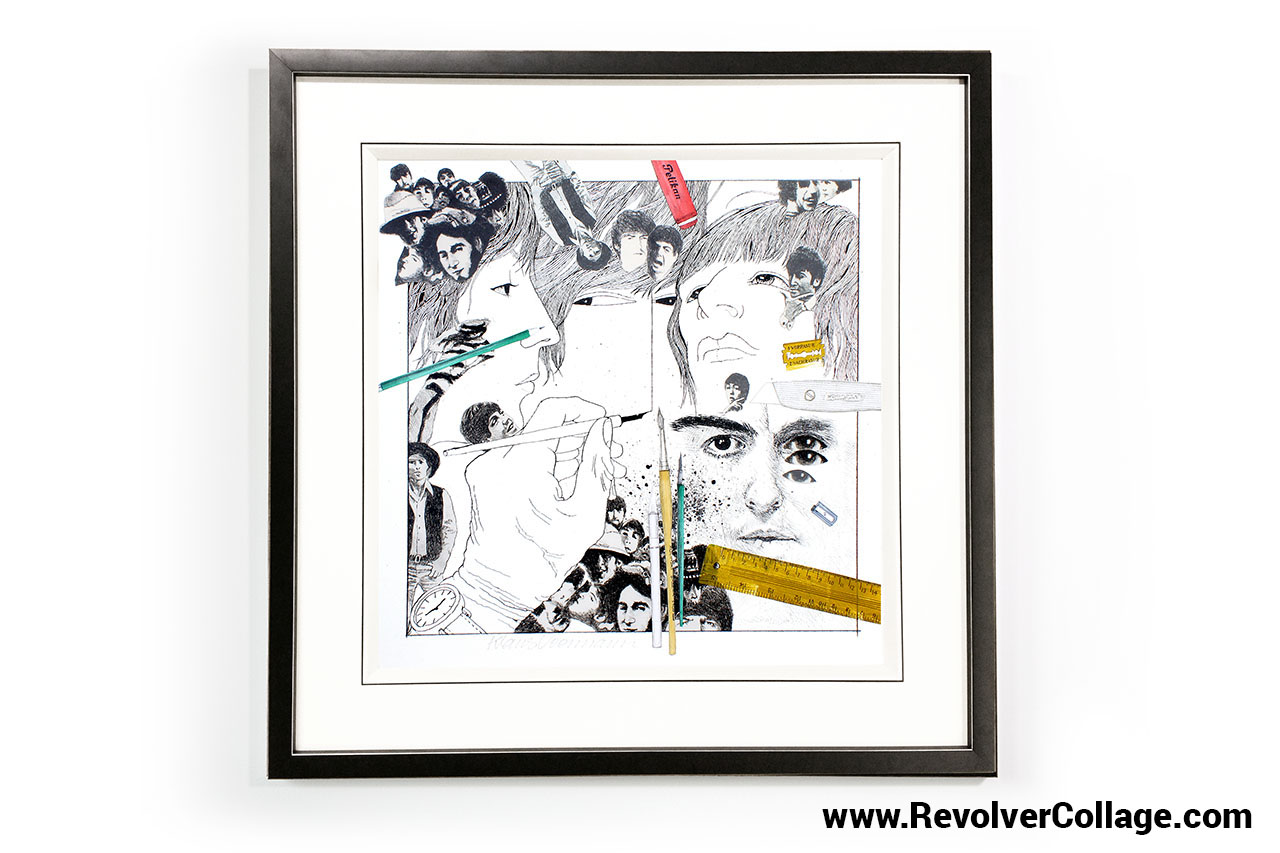
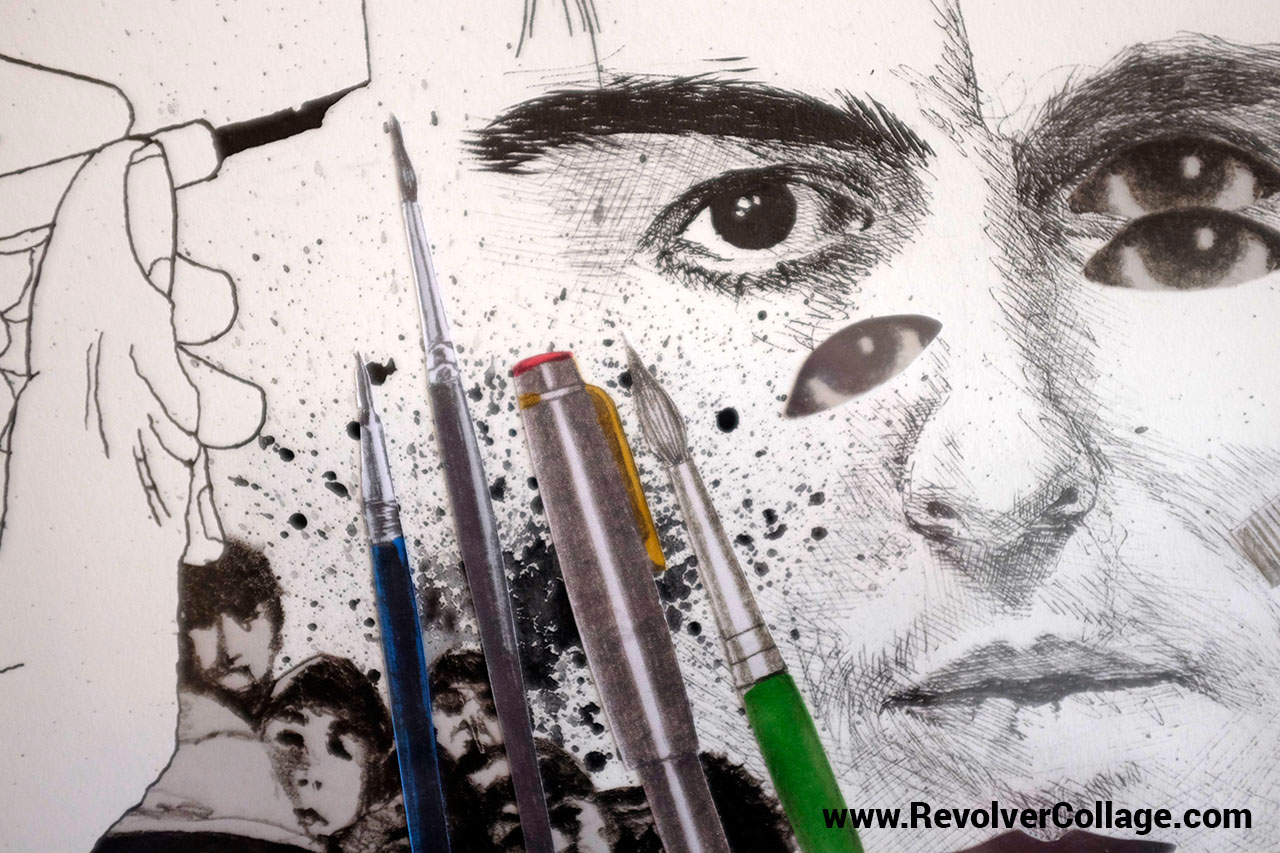
This hand-drawn aspect is also celebrated in the release of REVOLVER 50: The Collage Series; a collection of 250 unique Revolver covers, individually hand-decorated using pens, pencils, scissors, ink wells and other tools that he used for the cover design.

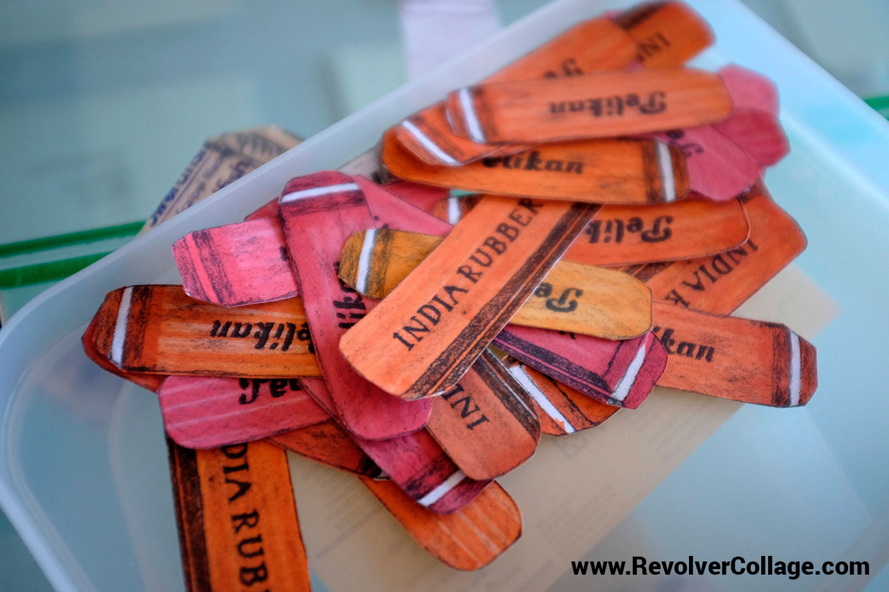
“I had these pieces printed on metal paper, see-through paper – if it was a ruler for example – and normal paper, then I coloured some of them, and that took quite a lot of time. Several thousand tools had to be prepared because there's 10 or 12 pieces on each drawing. But again, by doing this, it gives people the story of the person who created the cover, not just the cover itself.”
Voormann jokes that although 50 years have passed, the cover still “haunts” him. “I've been living with this Beatles story for a long, long time,” he says. “Even after they've gone, I'm still with it, and I suppose I’ll be with it for a long time to come.”
Related articles:
- Have we entered the era of bad graphic design?
- Why does album artwork exist in the digital age?
- The 20 best album covers of 2016

Thank you for reading 5 articles this month* Join now for unlimited access
Enjoy your first month for just £1 / $1 / €1
*Read 5 free articles per month without a subscription

Join now for unlimited access
Try first month for just £1 / $1 / €1

Sammy Maine was a founding member of the Creative Bloq team way back in the early 2010s, working as a Commissioning Editor. Her interests cover graphic design in music and film, illustration and animation. Since departing, Sammy has written for The Guardian, VICE, The Independent & Metro, and currently co-edits the quarterly music journal Gold Flake Paint.
