Get started with variable fonts in CSS
Learn how to load one font and manipulate it through CSS.
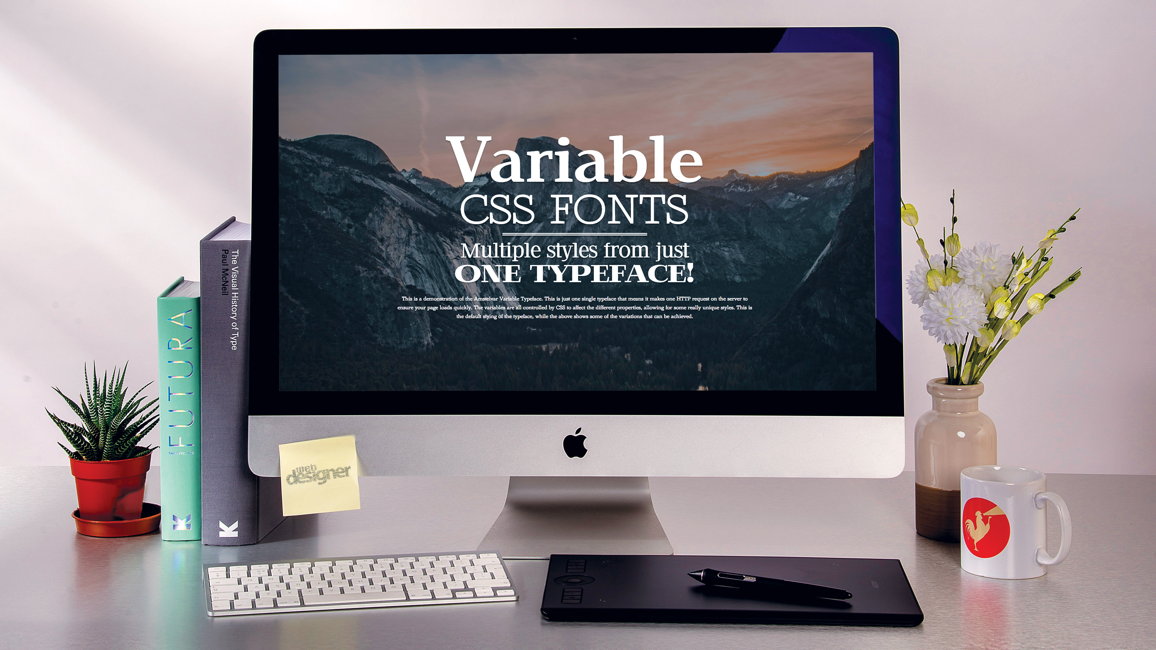
Typography on the web allows for graphic designers to be expressive with their client’s messages. The web has come a long way with typography, from only allowing fonts that are installed on the user's computer, to now having a whole raft of weird typefaces and fun fonts available from online content delivery networks.
If you’ve ever used Google Fonts, then you might notice that when you add a number of weights for the same typeface, because you would like to use it in bold etc, then Google generally warns you that adding these makes the page slow to load. This problem is because a whole typeface of every single character has to be downloaded for each of those weights, regardless of whether you use all the characters.
By contrast, a CSS variable font uses variables in the CSS to manipulate the web font properties. This means that one variable font will have all weights, so as the designer you can become far more expressive in the way that you use typography in your design.
It doesn’t have to end there though, because some typefaces allow the designer to alter more than just the weight of the typeface, and as such a great deal of flexibility can occur. We are using the open source Amstelvar font, which has no less than 17 variables associated with it, so that you can get some really interesting options from just one typeface.
Want to build a stunning looking site with ease? Use a website builder and choose the perfect web hosting service.
Download this tutorial's files here (and save them in cloud storage, for later).
01. Opening the project
Open the ‘start’ folder in your code IDE and open ‘index. html’ for editing. In the body section of the page, add the code below to give some structure and content for us to work with using the CSS variable fonts. You can change the text to suit your own needs.
Get the Creative Bloq Newsletter
Daily design news, reviews, how-tos and more, as picked by the editors.
<div class="featured">
        <div class="featuredInner">
            <h1>Variable</h1>
            <h2 class="subhead">CSS FONTS</
h2>
            <h2 class="kicker">Multiple
styles from just </h2>
            <h2 class="base">ONE TYPEFACE! </
h2>
02. Finish the content
Now add the remaining code shown below. In our example we have a larger paragraph than shown here in order to allow you a description of CSS variable fonts in the example. You can copy that text from the finished folder or add your own as necessary.
               <p class="desc">Add a paragraph
description here.</p>
        </div>
</div>
03. Link up the style
All of the CSS is going to be placed in its own separate file in the ‘CSS’ folder. As such the link to this is placed anywhere in the ‘head’ section of the code on the page. Save the ‘index.html’ page now as you are done with this and all further code will be in CSS.
<link rel="stylesheet" href="css/design.css">04. Load the typeface
From the ‘CSS’ folder, open ‘design.css’, which will be empty. Add the code as shown here at the top of your CSS. As you can see this is identical to how you would load any locally stored typeface with current CSS.
@font-face {
    font-family: Amstelvar;
    src: url(../fonts/AmstelvarAlpha-VF.ttf);
}
05. Style the page
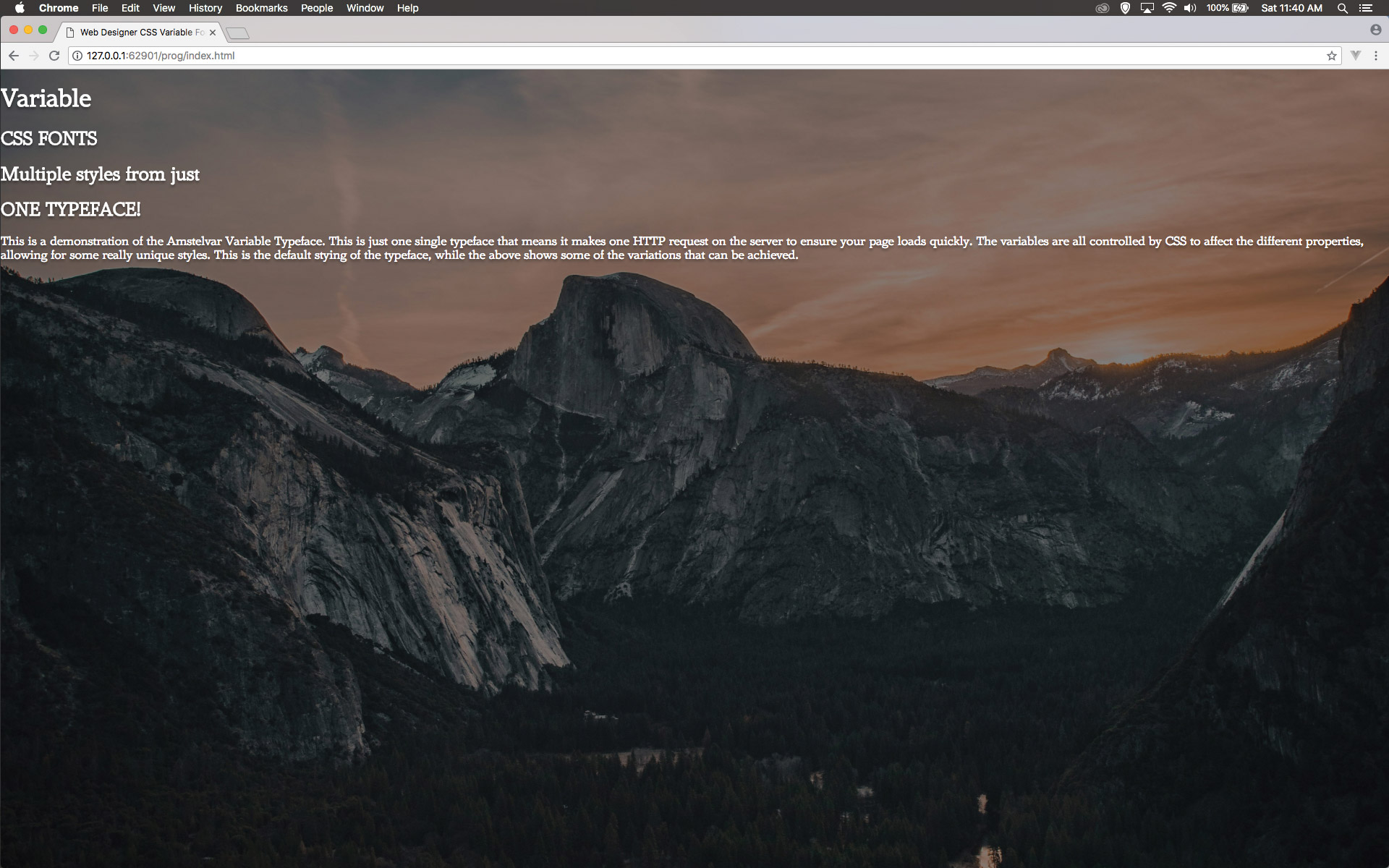
Now the HTML and body of the page are styled with the margin and padding removed. The font that was loaded in the previous step is now applied as the default font to all text on the page. A background image is added to cover the background and the text is set to white with a slight shadow to help it stand out.
html,body {
    width: 100%;
    margin: 0;
    padding: 0;
    font-family: Amstelvar;
    background: url(../img/bg.jpg) no-repeat
center center fixed;
    background-size: cover;
    color: #fff;
    text-shadow: 0px 3px 5px rgba(0, 0, 0,
0.4);
}
06. Centre the text
The easiest way to centre text both horizontally and vertically is to use the newer CSS grid as the display object. This wrapper, which encapsulates all other tags, is set to take 100% of the vertical height with the ‘vh’ property.
.featured {
    width: 100%;
    height: 100vh;
    display: grid;
}
07. Auto centre
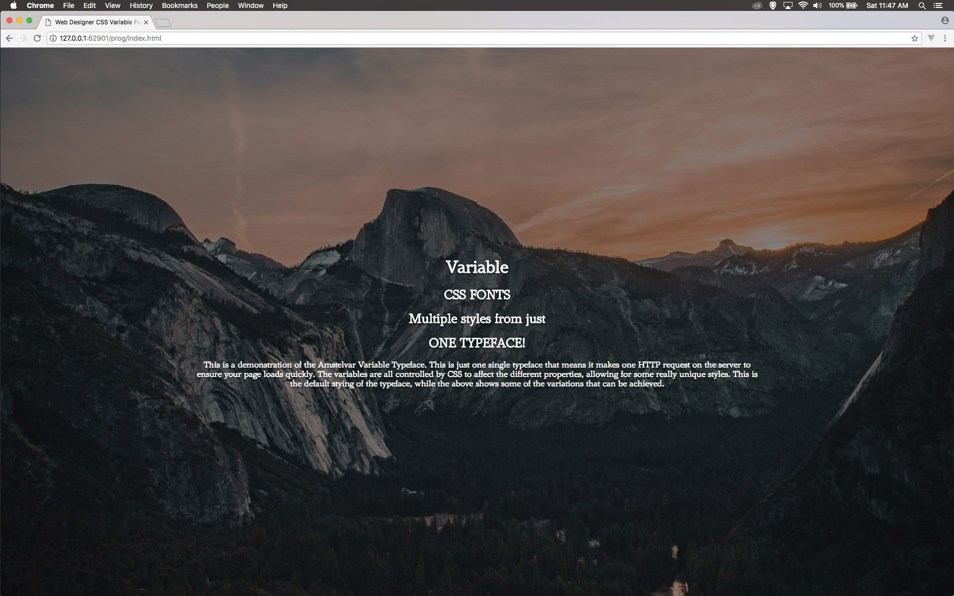
Now the content inside can make use of the auto for both the margin at the top and bottom as well as left and right. This means we get a text box that is going to take 60 per cent of the screen and centre it. The text is also centred and this will help. As you can see in the browser the variable font is applied as any normal font.
.featuredInner {
    margin: auto auto;
    text-align: center;
    width: 60%;
}
08. Vary the font
Now the font for heading 1 is going to be given some varying properties. The W3C would like us to use font-weight, stretch and optical sizing, but for this typeface the optical sizing doesn’t work. We’ll work around that in the next step but just check your progress in the browser.
h1 {
    font-size: 10vw;
    line-height: 0.1;
    font-weight: 550;
    font-stretch: 100;
    font-optical-sizing: 24;
}
09. Customise the font
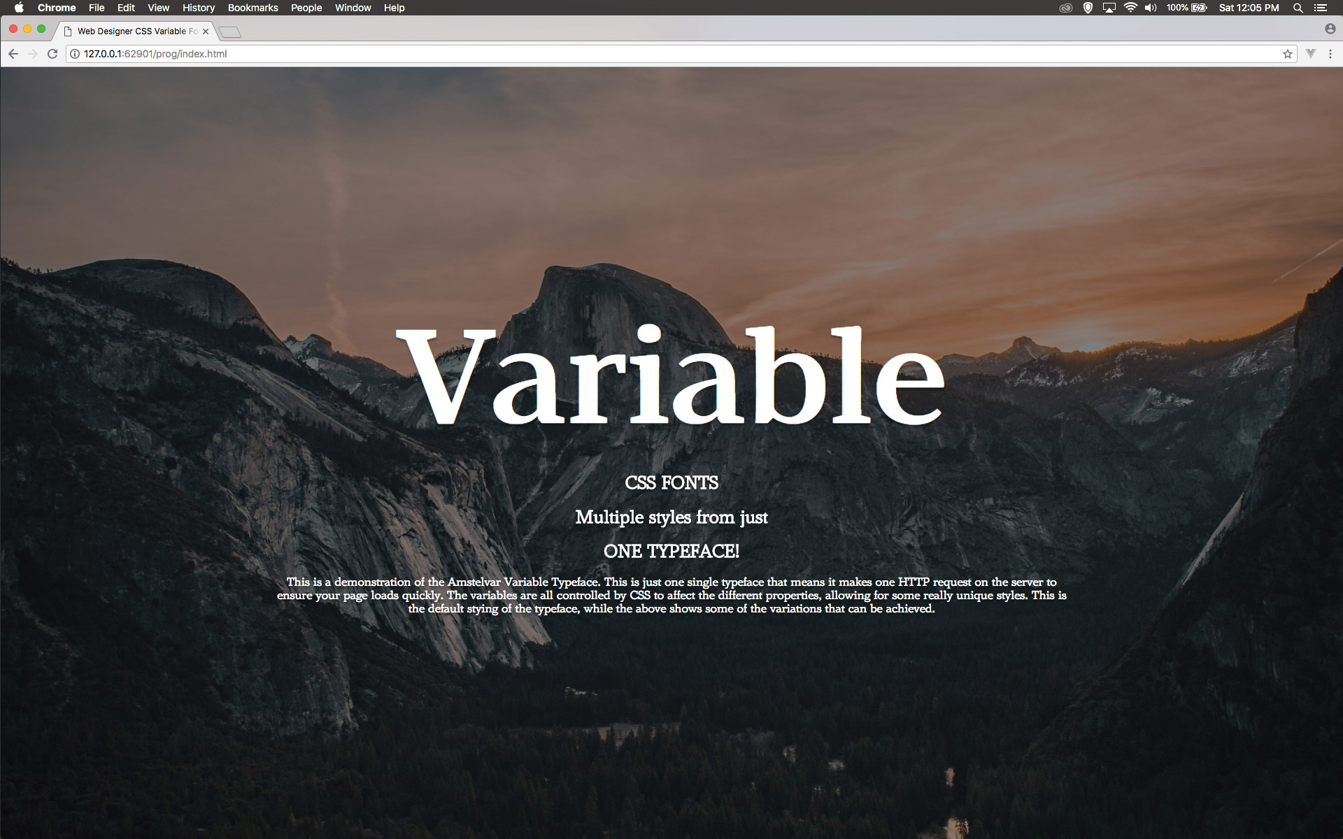
The Amstelvar font has so many variables that aren’t controlled by W3C commands, but there is a way to access them. Add this line of code that also adds the height of the y-ascender to 700 and the height of the y-upper case. In both instances, they are reduced making the type have a reduced overall height.
font-variation-settings: "wght" 550, "wdth"
100, "opsz" 24, "YTAS" 700, "YTUC" 720;
10. Make subtle changes
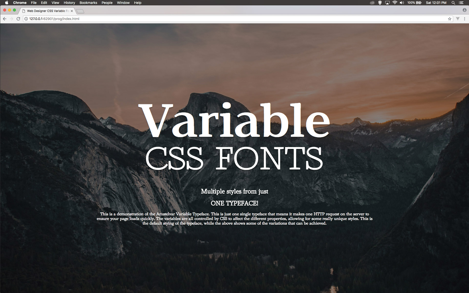
Now the styling of the subhead will be added. As you look at this you will see that the weight has been reduced as well as the optical sizing. When you look at this in the browser it almost looks like a completely different typeface given the characteristics have changed so much.
.subhead {
    font-size: 7vw;
    letter-spacing: 0.03em;
    line-height: 0.2;
    font-variation-settings: "wght" 100,
"wdth" 100, "opsz" 20, "YTUC" 700;
}
11. Create a separator
Now a double line separator will be added between the text. This will only be 40% wide, so slightly less than the text. This is also given a slight shadow behind it. This is just to help aesthetically add a break between the first two lines and the second two lines.
.kicker::before {
    content: "";
    display: block;
    margin: -4% auto 0%;
    width: 40%;
    border-bottom: 8px double #fff;
    box-shadow: 0px 3px 5px rgba(0, 0, 0,
0.4);
}
12. The next line
The next styling is added to help make a difference in the text. As it stands now it doesn’t look too different to anything done in the previous step, but in the next few steps more variables will be added to enhance the way this looks with some subtle changes.
.kicker {
    font-size: 3.3vw;
    line-height: 1.5;
    font-variation-settings: "wght" 156,
"wdth" 100, "opsz" 32,"YTUC" 795;
}
13. More variables
The new variables are marked in bold below. XOPQ is the x width of the letter, XTRA is the width of the curve. YOPQ is the y height of the letter, YTLC is the y height of lower case letters. YTSE is the serif height, GRAD is the grading of the letter. YTAS and YTDE is both the ascender and descender y height.
.kicker {
    font-size: 3.3vw;
    line-height: 1.5;
    font-variation-settings: "wght" 156,
"wdth" 100, "opsz" 32, "XOPQ" 117, "XTRA" 402,
"YOPQ" 45, "YTLC" 600, "YTSE" 9.5, "GRAD" 90,
"YTAS" 750, "YTDE" 250, "YTUC" 795;
}
14. Yet more variables
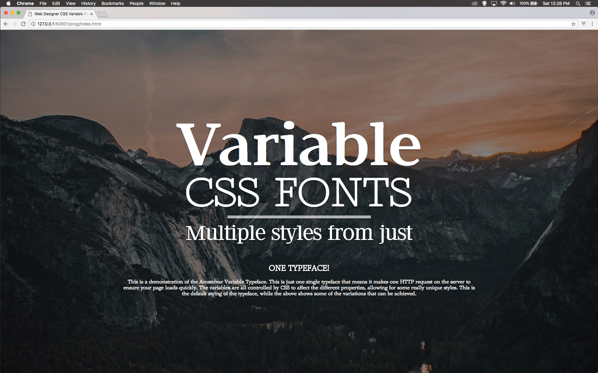
The last few variables shown here in bold are the overall y-height of the letter with the YTRA property and then the paragraph weight and paragraph width. Save this and refresh your browser to see the changes take hold. The changes are subtle, but enough to make it look like a different typeface.
.kicker {
    font-size: 3.3vw;
    line-height: 1.5;
    font-variation-settings: "wght" 156,
"wdth" 100, "opsz" 32, "XOPQ" 117, "XTRA" 402,
"YOPQ" 45, "YTLC" 600, "YTSE" 9.5, "GRAD" 90,
"YTAS" 750, "YTDE" 250, "YTUC" 795, "YTRA"
900, "PWGT" 92, "PWDT" 402;
}
15. All change
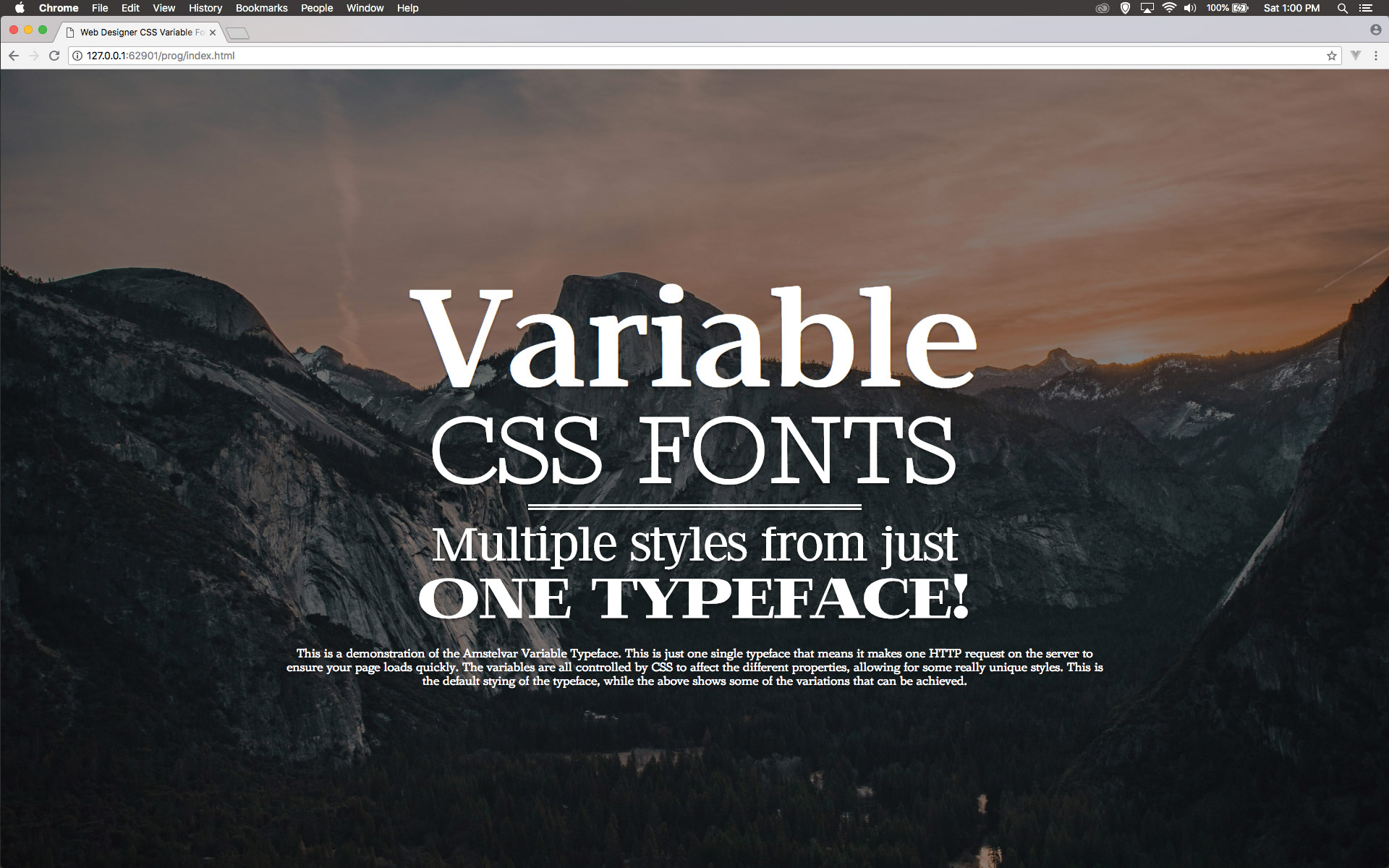
The next line of text is styled up with this CSS now. Again the settings are being adjusted to give the appearance of a different typeface. Save this and look at the effect that has been generated in the browser. The payoff here is that you have only made one HTTP request for the typeface but generated a different style.
.base {
    margin-top: -2.5%;
    font-size: 4vw;
    line-height: 0.1;
    font-variation-settings: "wght" 156,
"wdth" 100, "opsz" 32, "XOPQ" 247, "XTRA" 402,
"YOPQ" 45, "YTLC" 600, "YTSE" 9.5, "GRAD" 90,
"YTAS" 750, "YTDE" 250, "YTUC" 795, "YTRA"
900, "PWGT" 92, "PWDT" 402;
}
16. Last text
The final section of text is being left in the default setting for the Amstelvar font. All that is going to happen here is that the line height is adjusted to make it much more readable on the screen. This completes the styling of all the text. Next is to show how to animate some of the properties.
.desc {
    line-height: 1.8;
}
17. Make it animate
Let’s revisit the initial heading tag and add some animation to that. In order to do that, add in the code shown in bold. The animation name refers to the keyframes that will be defined in the next step. It will take four seconds and hold on the last keyframe.
h1 {
    font-size: 10vw;
    line-height: 0.1;
    animation-name: anim;
    animation-duration: 4s;
    animation-fill-mode: forwards;
    font-variation-settings: "wght" 550,
"wdth" 100, "opsz" 24, "YTAS" 700, "YTUC" 720;
}
18. Define the start
The keyframes for the ‘anim’ are created. Here the starting keyframes are added. The weight of the typeface is changed to its lowest value of 100 and the paragraph weight is changed to 0 so that it becomes bolder as it animates over the duration of the four seconds.
@keyframes anim {
    from {
        font-variation-settings: "wght" 100,
"PWGT" 0;
    }
19. Ending point
The keyframes are animated from one point to another in this example. The final ending point of those keyframes is defined, which as you can see takes it back to the default paragraph weight and the weight of the typeface is set to how it was originally defined earlier in the tutorial. Test this in the browser.
to {
        font-variation-settings: "wght" 550,
"PWGT" 100;     } }
20. Refine the animation
When you test the animation, you will see that it is a little jittery because of the extreme change in the paragraph width. Here this is changed to 50 and the opacity is changed to 0 so that it fades in and makes the transition smoother.
@keyframes anim {
    from {
        font-variation-settings: "wght" 100,
"PWGT" 50;
        opacity: 0;
    }
21. Finish off
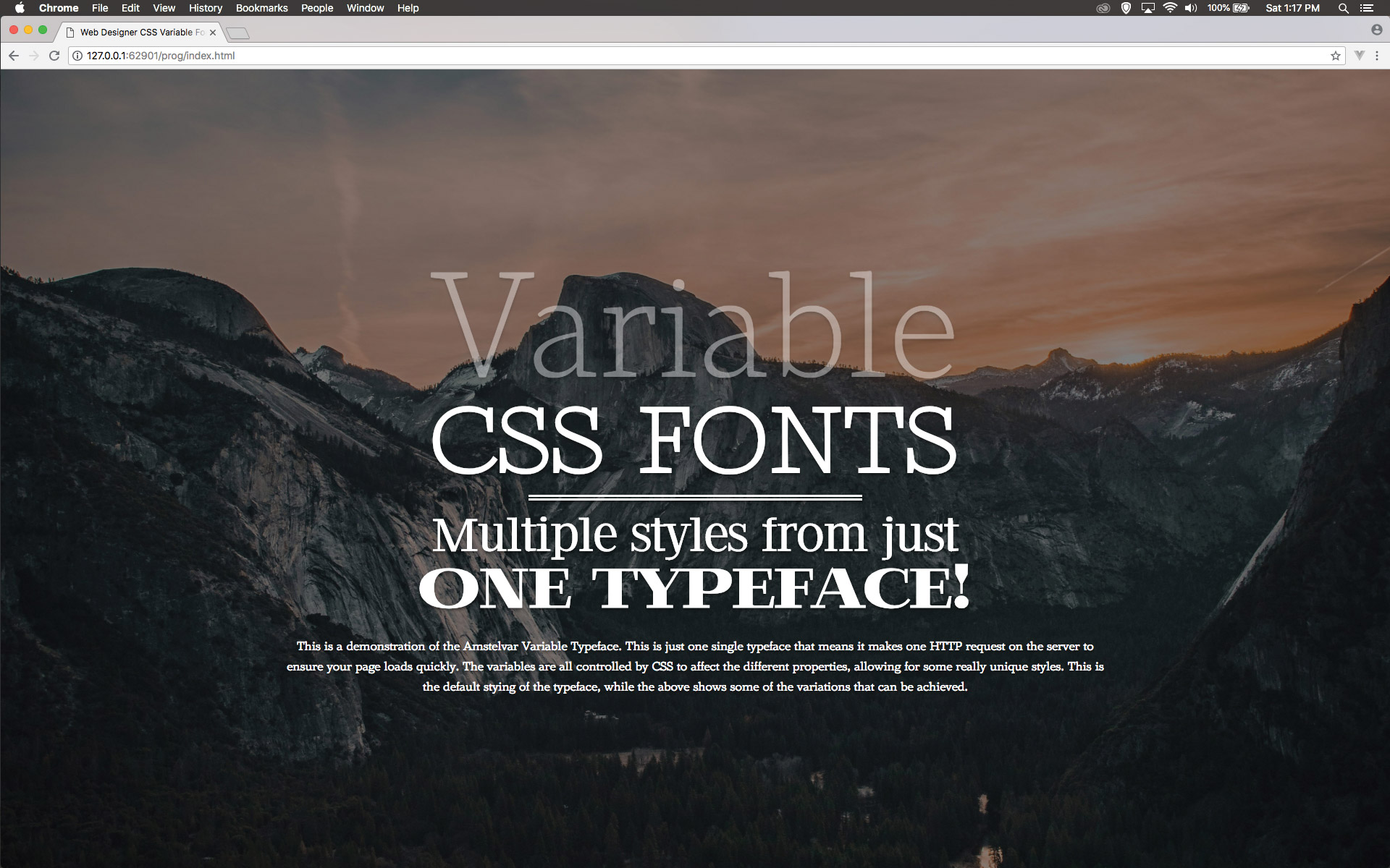
The final amendment is to add the opacity of 1 so that it fades in. Refresh the browser and this works much smoother. Experiment by animating any of the properties over time and you will get some interesting results for your type. And this is all from one typeface!
to {
        font-variation-settings: "wght" 550,
"PWGT" 100;
        opacity: 1;
    }
}
This article was originally published in issue 279 of creative web design magazine Web Designer. Buy issue 279 here or subscribe to Web Designer here.
Related articles:

Thank you for reading 5 articles this month* Join now for unlimited access
Enjoy your first month for just £1 / $1 / €1
*Read 5 free articles per month without a subscription

Join now for unlimited access
Try first month for just £1 / $1 / €1

Mark is a Professor of Interaction Design at Sheridan College of Advanced Learning near Toronto, Canada. Highlights from Mark's extensive industry practice include a top four (worldwide) downloaded game for the UK launch of the iPhone in December 2007. Mark created the title sequence for the BBC’s coverage of the African Cup of Nations. He has also exhibited an interactive art installation 'Tracier' at the Kube Gallery and has created numerous websites, apps, games and motion graphics work.
