Font vs typeface: the ultimate guide
What is the difference between font vs typeface? And does it really matter?
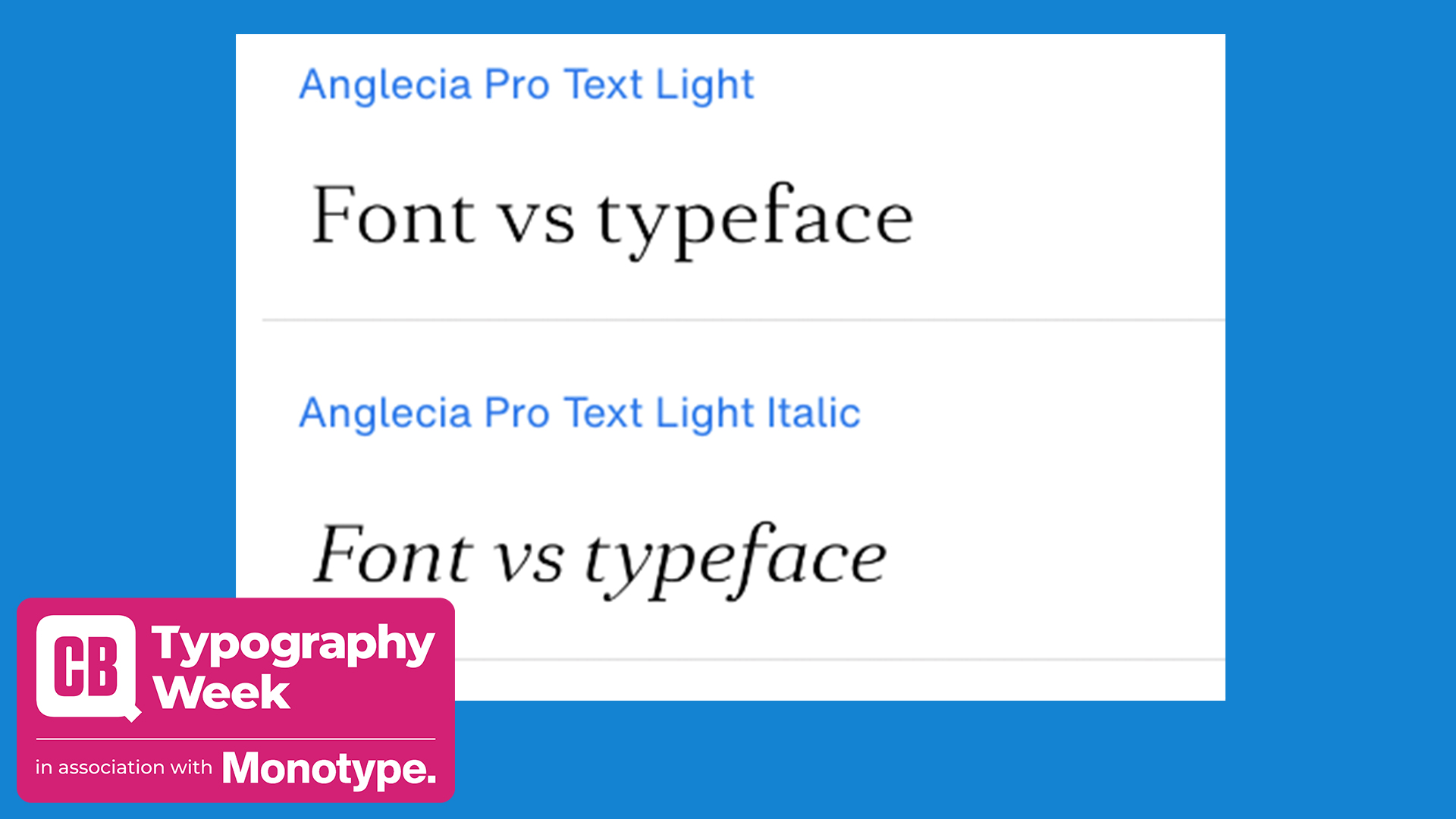
The font vs typeface debate is an example of how industry terminology can change over time, but still upset people if it's used in the non-traditional way. These days the words 'font' and 'typeface' are very often used interchangeably. And, in most cases that's just fine. Everyone knows what's being referred to and no confusion is caused. But, technically, there is actually a difference between a font and a typeface, and getting them mixed up could leave you red-faced.
So what's the difference, and which term should you be using? Here we'll examine the history of the font vs typeface debate. We'll look at the meanings of both in relation to graphic design and typography, and, hopefully, settle a few office arguments for people in the process. Not fussed about the nuances of font vs typeface? Then just crack on with our pick of the best free fonts to expand your type resources.
This is week is Typography Week on Creative Bloq – check out all our lovely content on our dedicated page.
Font vs typeface: what's the difference?

The main difference in font vs typeface is that the former exists as part of the latter. Let's explain that more clearly with an example. We'll take Helvetica. Often referred to as a 'font', Helvetica is actually a typeface. It's a complete set of sans serif characters with a common design ethos. But at the same time, the typeface comprises a collection of fonts, each in a specific weight, style and size, with different levels of condensation as well as italic versions. For example, Helvetica Regular in a particular size.
You could think of the typeface as being the whole family of fonts, which each have a different size and weight. One reason for the confusion is that if you download Helvetica and install it on your computer, at least on a Mac, you'll select it from the Font menu.
This and other generalised uses of the word 'font' mean that many people use the term to refer to the whole family of fonts. In many cases, that's hardly a major issue, but when a creative director asks you what font you’ve used in a project, they probably want to know the precise details, i.e., the exact font you used, not the typeface. So perhaps you chose Helvetica as the typeface for the project, but the font might be Helvetica Regular 9 point.
In certain contexts – not just when you’re talking to a typographer who is a stickler for accuracy – knowing the exact font is critical. For example, when coding an app for a specific type of display, adhering to a particular font selection may lead to optimum legibility.
Sign up to Creative Bloq's daily newsletter, which brings you the latest news and inspiration from the worlds of art, design and technology.
Brand guidelines (see our favourite example style guides) are another case in point, with identity designers choosing typefaces in certain sizes and weights to support the brand aesthetic they want to portray. In the world of packaging, there are consumer protection regulations to adhere to. For example, EU law stipulates a minimum size for the text in the nutrition declaration.
However, in most circumstances even experienced designers alternate between the two and we’re not ashamed to admit that it even happens right here on Creative Bloq.
For most people these days, the terms ‘font’ and ‘typeface’ are often used interchangeably
Dave Sedgwick
“It’s probably sacrilege, but I’m not sure I’ve ever known the difference,” says Dave Sedgwick, founder of Studio DBD. “For most people these days, the terms ‘font’ and ‘typeface’ are often used interchangeably and most clients probably don’t know the difference either so when we’re presenting directly to them we use simple, straightforward terminology that doesn’t suggest we’re attempting to overcomplicate things.”
Julien Fincker of Fincker Font Cuisine agrees. "In common usage, these terms are often mixed up, and a typeface is often referred to as a font. This misunderstanding has become so widespread that it is difficult to reverse it. Therefore, we should not pay too much attention to the correct term, but rather that the designer and the customer agree on what is meant. But a designer should always know the difference."
And they're right. Usually it doesn’t matter, but when the distinction is important it might help to look at it like this. We choose a typeface because of its common aesthetic qualities. Then we refine it down to a specific font by setting its size, weight, style and sometimes the character set such as Roman, Cyrillic or Greek when we use it. For example, you might love the typeface Futura because of its modernist look, and so the font you used for the captions on your site is Futura Condensed Extra Bold 8 point. If the font is the song, the typeface is the artist.
Font vs typeface: A history
The difference between a font and a typeface has its roots in the history of printing. The word font itself comes from the Middle French 'fonte', meaning cast in metal. Printers cast complete sets of metal letters to make up a font. Fonts with a common design made up a typeface. In a box containing a specific font were two cases – one for capitals and one for small letters – which is where upper and lower case comes from. Blocks of text were assembled letter by letter to form a page layout, which was then rolled with ink and pressed onto paper to make prints.
With the advent of digital typesetting, much of the hot metal terminology was maintained, but the context and the possibilities changed completely. In pure computing terms, there actually isn’t any distinction between a font and a typeface. If you have the Helvetica font data installed on your computer, you’ll be able to render the entire typeface. Each letter is completely scalable, based on the same vector formulae. A traditional typesetter might have had a font labelled Times Roman 7pt back in the day, but on your Mac the size isn’t important because your font file will contain all the data needed to change it in an instant.
The reason we focus on fonts today is largely as a result of desktop publishing and word processing applications, which have a Font menu. When you click it, you get a list of typefaces to choose from – Arial, Baskerville, Caslon etc – and from there you set the specifics of the font – Medium Italic 16 point, for example.
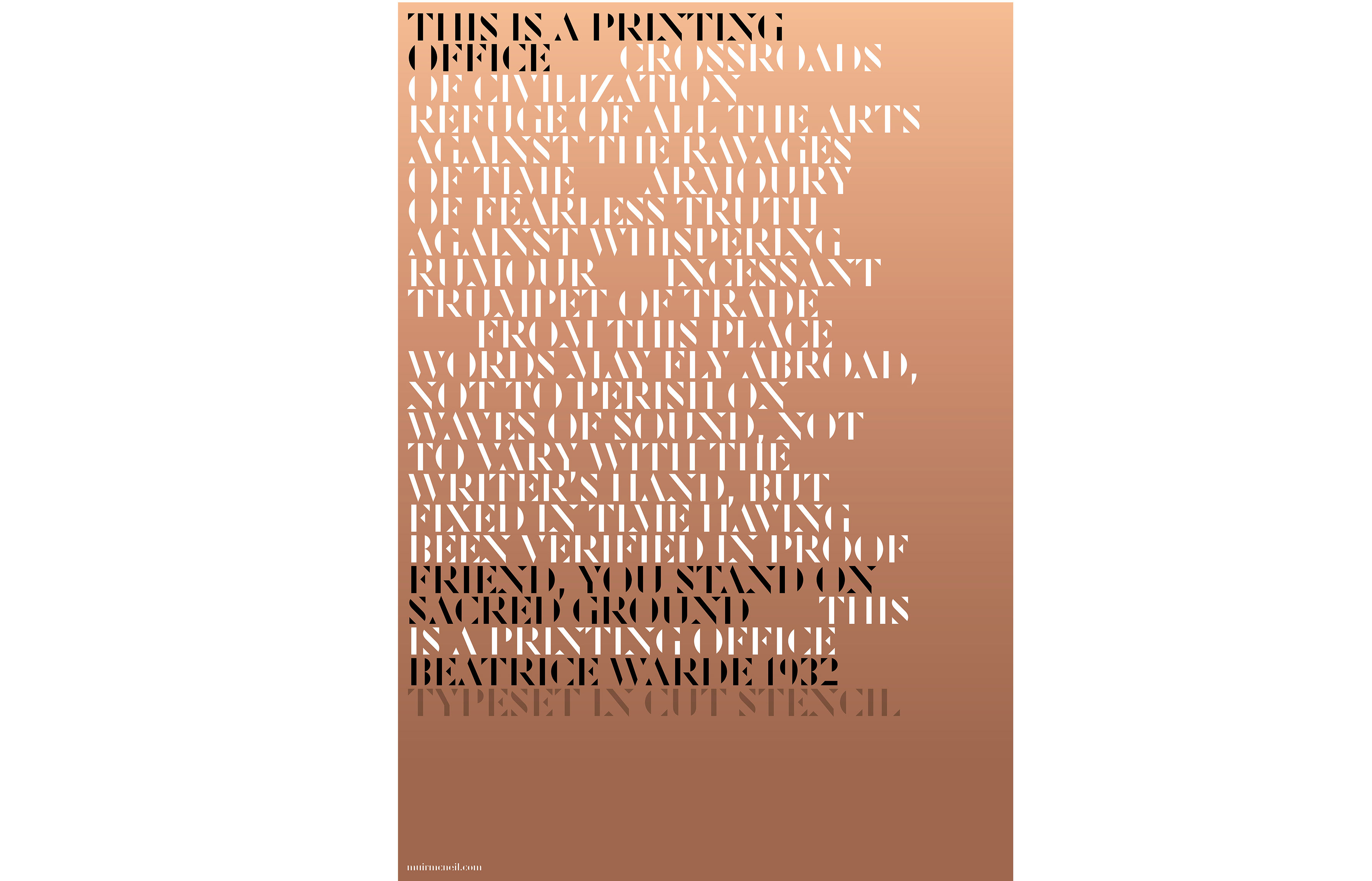
When he wrote The Visual History of Type, published by Laurence King in 2017, typographic designer Paul McNeil of MuirMcNeil avoided using the word ‘font’ to describe anything before the digital era. “Instead I referred to the embodiment of type in metal with the word ‘fount’ in order to be accurate,” he says. “The book’s editors would not accept this word, probably correctly: typographers can be too myopic.”
Ironically, although it irks typographers that people mix up the terms font and typeface, people today actually know far more about type than ever before thanks to their computers.
Font vs typeface: does the difference matter?
Whether the difference in font vs typeface matters in the industry is a different question. As we've mentioned, many people use the terms interchangeably, even when they're aware of the historic difference. And any potential confusion can usually be cleared up quite easily.
“The distinction between the two definitely serves a purpose,” says Paul, “but only for those who understand what it is – typically people who have trained in graphics, typography or type design. In my experience, typefaces are either indistinct or invisible to many people so most terms of reference are irrelevant.”
A designer not knowing the difference between font vs typeface wouldn't put Julien off hiring them. "I would hire them anyway, because the difference is explained very quickly," he says.
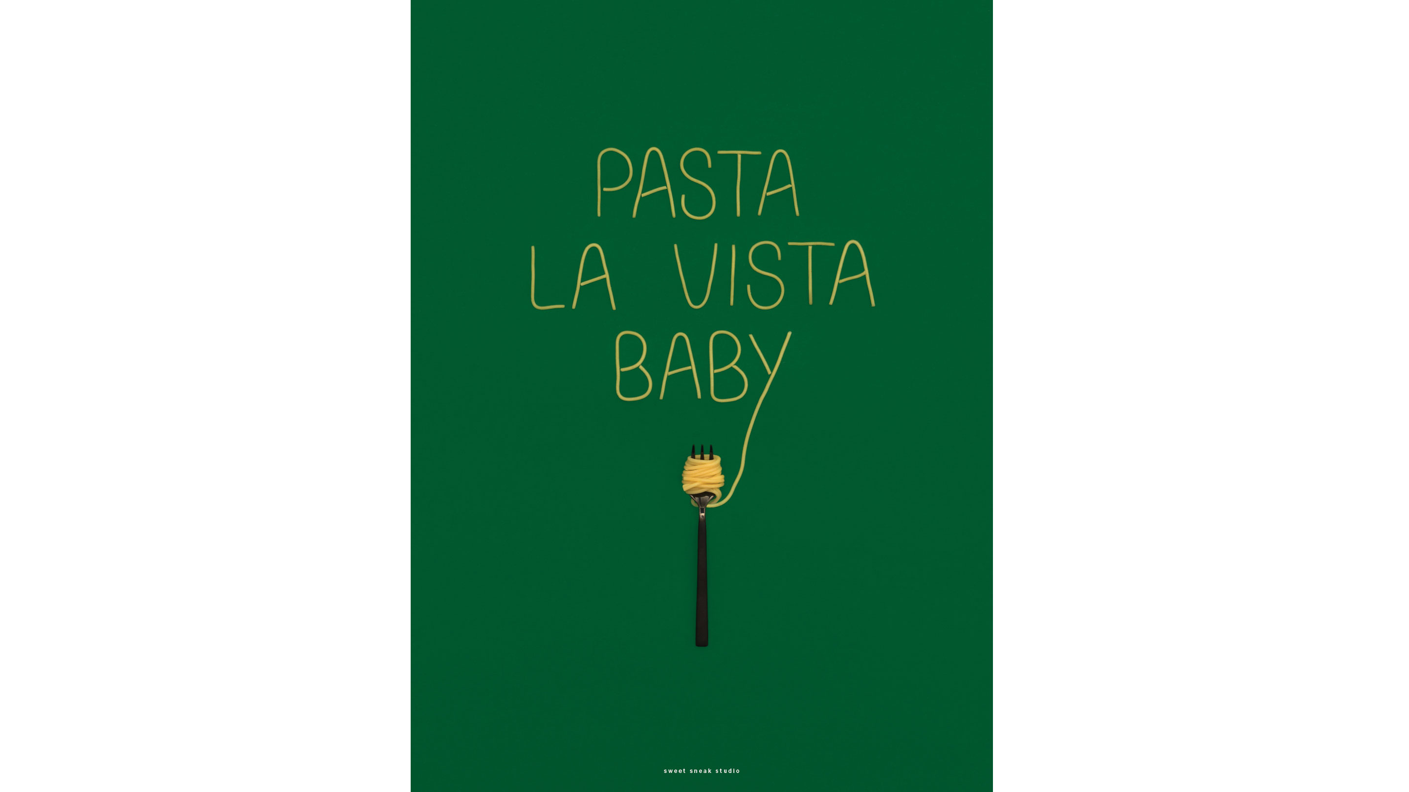
Take the discussion outside of the English-speaking world and things get even more interesting. Copenhagen studio Sweet Sneak has a multinational team that includes Germans, Austrians, Danes and Dutch creatives. When we asked them about the distinction between ‘font’ and ‘typeface’, it sparked a wider linguistic discussion. “The terminology in our native languages is a bit different, maybe even more finely nuanced than in English,” says Brini Fetz, co-founder and creative director.
If you want to express yourself precisely it is important to distinguish between the two terms
Brini Fetz
“If you want to express yourself precisely it is important to distinguish between the two terms, but we still tend to use the word ‘font’ in daily office language. The term ‘font’ in Dutch and German often refers only to the digital version of a typeface, so it gets even more complicated when you look into what the terms mean in different languages.”
Whether someone says ‘font’ or ‘typeface’ isn’t as important as how they actually work, according to Dave. “I’m more interested in how designers think than I am in about whether they are entirely clued up on all the relevant terminology. I believe a good attitude and a genuine desire to learn or find things out is more important, and I’m not even sure design students are being taught the fundamentals of type in the correct language these days anyway.”
For more definitions, see our ultimate typography glossary.

Garrick Webster is a freelance copywriter and branding specialist. He’s worked with major renewable energy companies such as Ecotricity and the Green Britain Group, and has helped develop award-winning branding and packaging for several distilleries in the UK, the US and Australia. He’s a former editor of Computer Arts magazine and has been writing about design, creativity and technology since 1995.
- Rosie HilderDeputy editor

