"Make stories that you care about," says picture book creator Flavia Z. Drago
This year's star of the London Book Fair shares her process for writing and illustrating picture books.
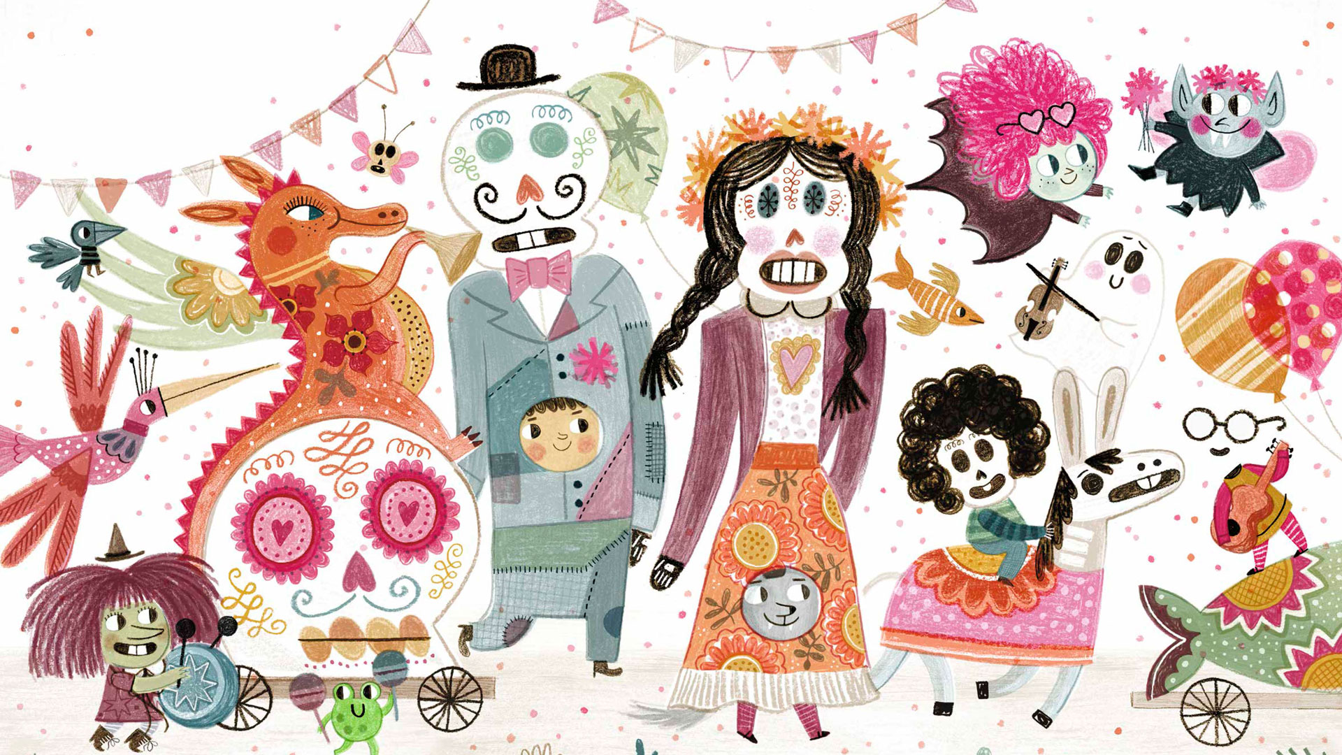
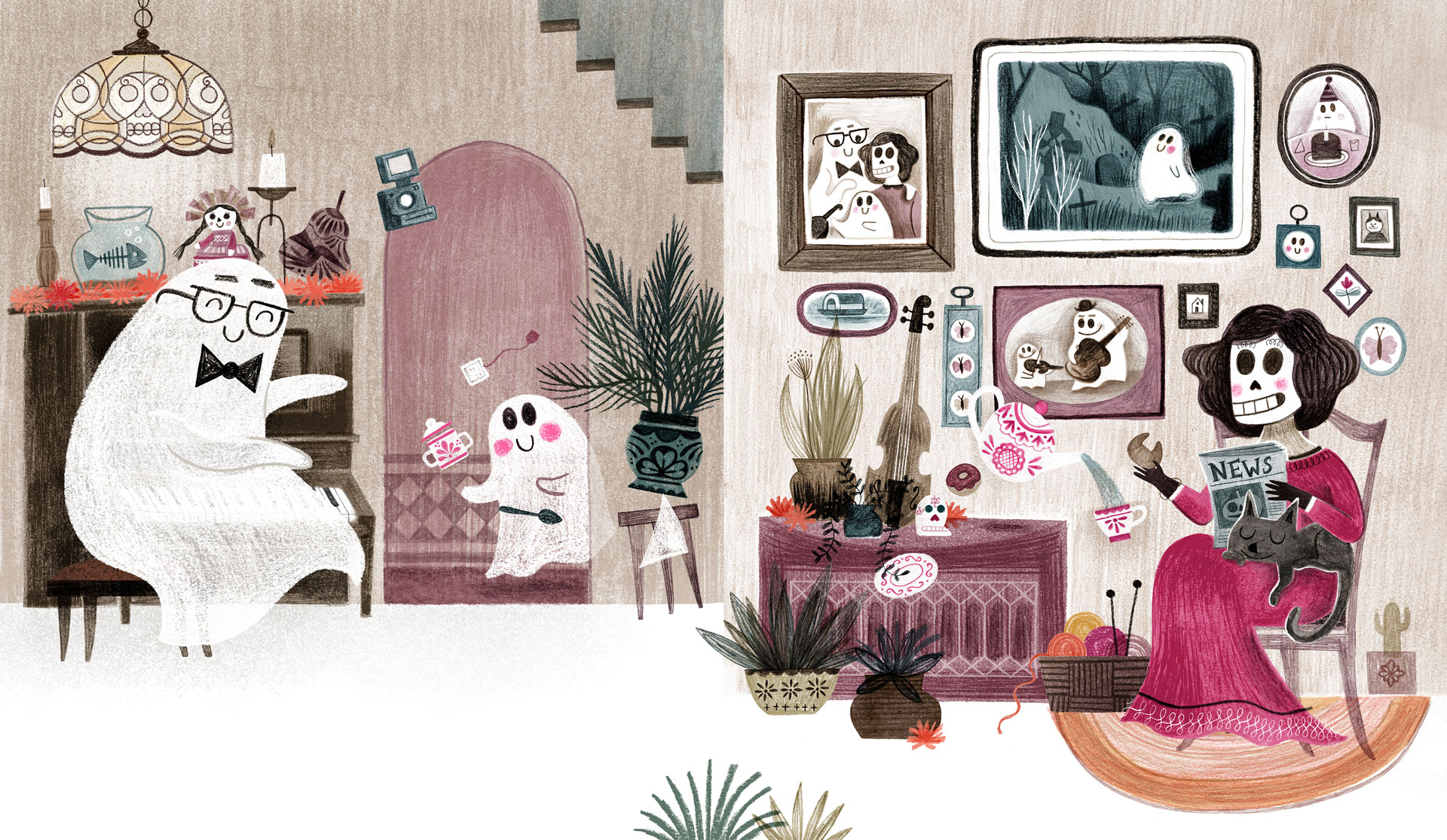
Flavia Z Drago is a Mexican-born illustrator who has become known for her picture books depicting monsters, including Gustavo, The Shy Ghost, Vlad, The Fabulous Vampire and Leila, The Perfect Witch. Inspired by her home country, her colourful illustrations sing off the page and are packed with small fun little details for kids and adults alike to spot.
Flavia career took off when she did a MA in illustration at Anglia Ruskin in Cambridge and was subsequently picked up by Walker Books. Her work has led to her being chosen as Illustrator of the Fair at the London Book Fair, which takes place 12-14 March. Ahead of the Book Fair, I caught up with her to talk about how she creates her magical worlds.

Why did you decide to focus on monsters in your latest picture books?
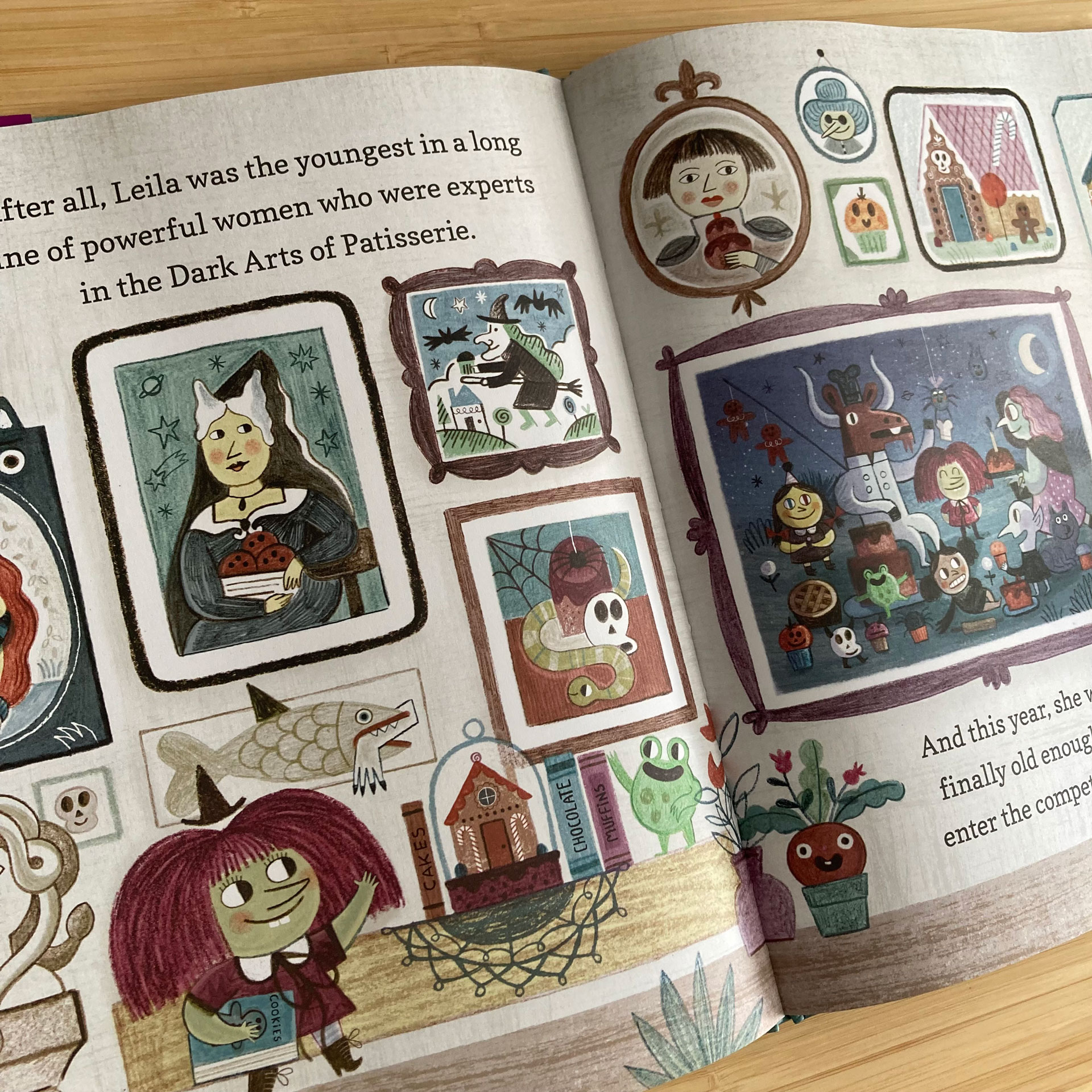
It all came organically. When I made Gustavo, I thought it was gonna be a one-off book. And then the same year I finished Gustavo, I baked a cake with my sister and my nieces and I posted the Stories on Instagram of the whole process... And then my agent looks at it and she's like, 'Oh, I saw you were baking a cake, why don't you make a book about baking?' and I was like, 'I don't like like that'.
But I had a character who is a witch in my book, and witches enjoy baking gingerbread houses and magical gingerbread men. So maybe this was the perfect opportunity for drawing lots of witches and things that I really love and make a story about sisterhood. And that's how that happened.
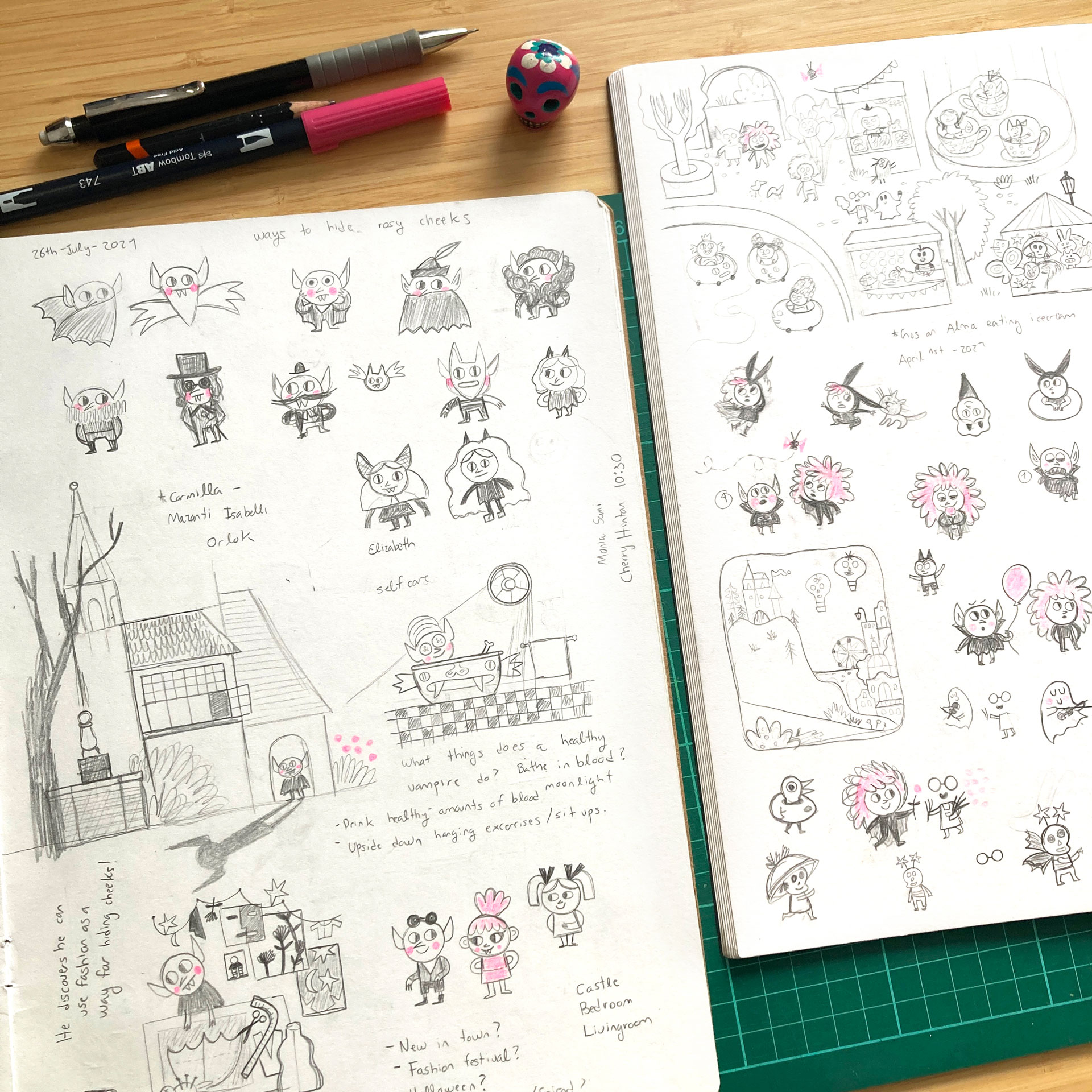
When I was working on Leila, which is the second book and it's about baking and sisters, I drew Vlad for the first time. He was just a fanciful little vampire wearing fancy clothing, wearing pink. I thought it was fun for a vampire to wear pink. I didn't have a story for him. And I finished Leila and I still didn't have a story for Vlad. So I was just trying to see how how could I make a book about the fancy, stylish vampire? I thought it was also fun to make a book about a vampire who likes fashion because in modern vampire lore, vampires are kind of sexy and stylish, and I thought that fits. Then I was talking to my partner who said, 'why doesn't he have rosy pink cheeks and feel very self conscious about that?' I said, 'that's brilliant'.
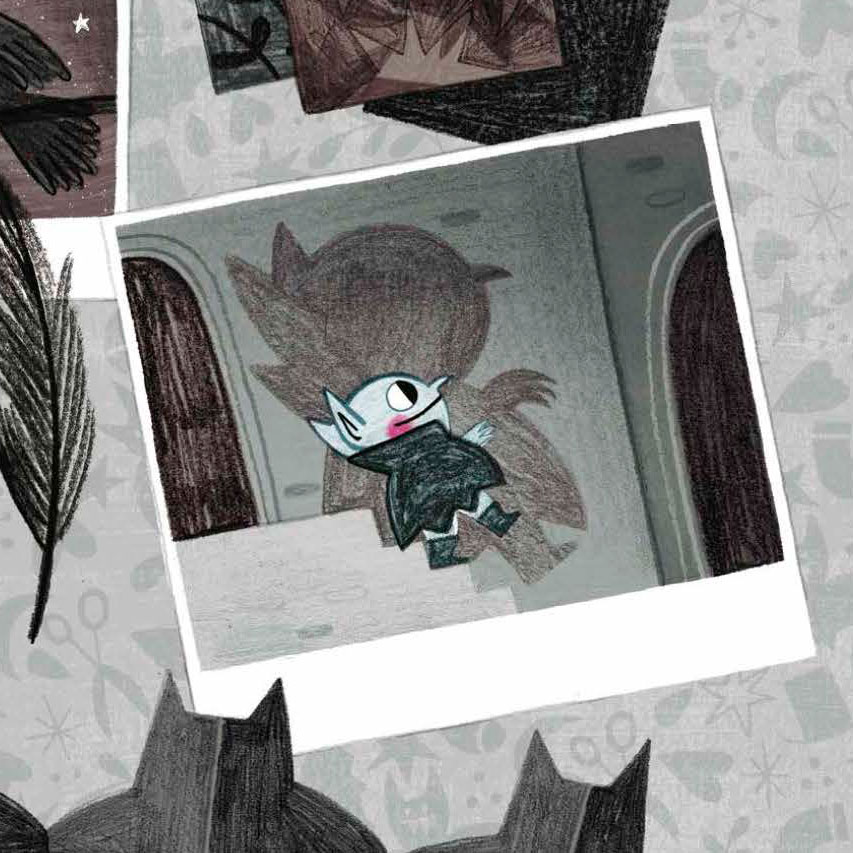
So he can be trying to use fashion to hide the cheeks. And first it's just black and white fashion because he lives in this kind of black-and-white world and then he discovers there's more.
You need to have an open mind, but ideas can come from your partner, from your sister who you bake a cake with, from watching a TV show from doing your PhD research as well. So it's about keeping an open mind and just doing the work and moving forward, throwing out ideas that are not going to work, too.
How do you develop your characters?
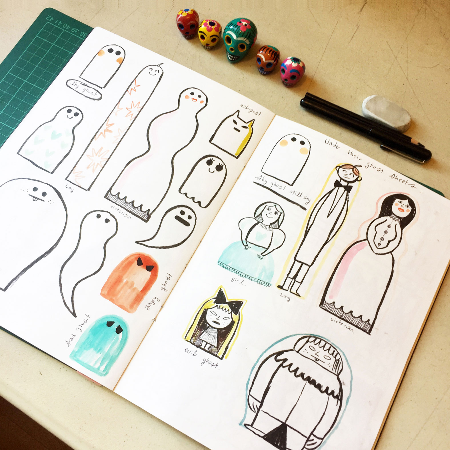
They never come fully formed. The ideas come to you in different ways. The idea for Gustavo came because I had an alter ego account on Twitter, where I was writing as if I was some sort of princess. It was a creative, weird thing that I was doing. And I would write things about fairy tales or monsters, what it means to be a princess, things like that. One of the tweets was like, 'ghosts wear sheets because they're very shy'. And I thought, 'maybe I can make a picture book about this'.
My original idea was for the ghost to be a boy disguised as a ghost. He's trying to make some friends and then by the end of the story, he removes the sheet. And I think the joke was there was another sheet underneath. That kind of didn't work in the end and as I later found out, the metaphor of this ghost as a monster works better, because it kind of mirrored the feelings of invisibility that I had when I was a child.

When I was a child, I was very shy. I used to look at other children and just think, 'how can they just talk to each other?' I felt invisible and I just wanted them to talk to me. And then as I started looking at my sketchbook, I realised it's more fun if the character is a real ghost, and then he instead of just hiding behind the bush or behind the sofa, kind of being a bit stalky, he makes clumsy attempts to get closer to monsters by shapeshifting. That works as well because children can see he's there but the monsters in the book can't. So it kind of clicked.
It came together just by sitting down, working a lot, looking at the sketchbooks and figuring out which things work better than others and having lots of conversations with my editors as well. The process is never linear. You go back and forth, back and forth and there are creative decisions that also get changed by publisher's feedback, which a lot of people are unaware of. But that happens as well.
How do you deal with getting publisher's feedback that you don't agree with?
My publishers are nice in that I we can have conversations. And you have to acknowledge that your work is inserted inside a whole context. And there are expectations and also goals... and there is always negotiation, I think. I've been really lucky because whenever I've published a book, I feel proud of what we've done as a team. So far, it's been really good, but it can get tricky sometimes because you want to do something and the market asks you to do something else or you're told 'that's not going to work'.
I think as publishers and illustrators, we should be asking ourselves, is this what should exist? Or could we do something else and push the boundaries a little bit each time? I think that's an interesting question for all of us.
What do you think makes a good picture book?
It has to have a good story, characters that are engaging, that you feel you can connect with, and to me, the visual aspect is very, very important. Like, if I look at a picture book, and I think, 'oh, this text is really good'. And then I look at the illustration, and I think 'I don't really like them' [that's not ideal]. It can be more subjective as well, but the visual aspect is very important.
Do you write the story or create the pictures first when creating a picture book?
I have never written the story first. My three first picture books are very character based. I started by getting to know my characters by drawing them. I drew all of the things I could think of, I tried to understand who they were. So I drew the world where they live, who their friends are, what they do for fun, what they do when they're alone, what they do with their friends. And that kind of helps me build this world and their personalities and create a story that feels more solid. And all those little sketches I try to organise in a sequence and then I add the text.
The last picture book I'm working on was a little bit different though. It's not really character based, but the most important thing in the book is the environment. So I started working on the environment, trying to draw this house from different points of views and different perspectives, then tried to organise images to tell the story, but I'm kind of starting all over again. I decided to write this story first and now I'm trying to do the images. I don't know how that's gonna work out but it feels like that's the right thing to do at the moment.
You've created some books for toddlers, what are the challenges in creating for this age group?
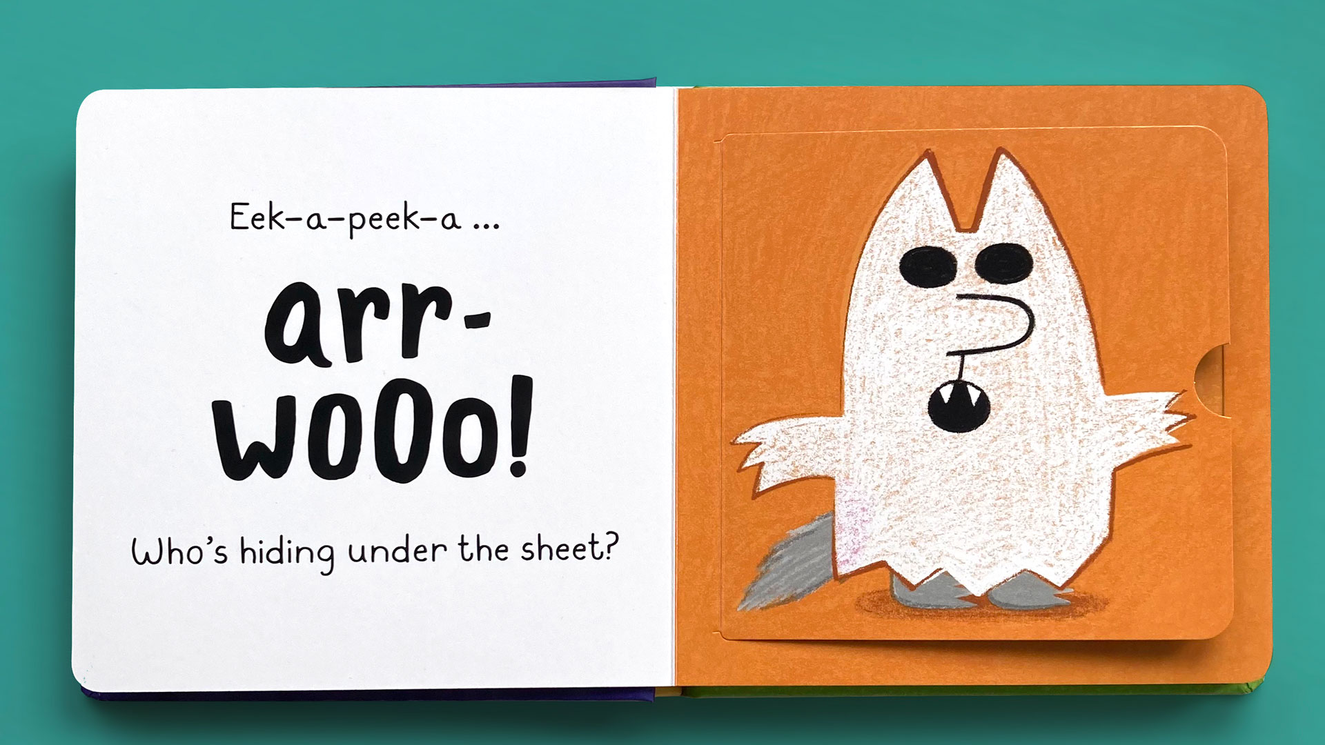
It's slightly different. I thought, 'board books are going to be very easy to do'. I thought they were going to be easier to do them picture books. Because usually, the plot is less complicated or it's just based around a theme like colours or sounds or emotions. But I discovered through attempting to make my own that's not the case.
I think it's more pleasant when the beginning and the end close in a nice circular way rather than just having a book of colours. So it requires thinking and it requires editing. The language is different, the amount of words that you use is different and the aesthetics need to be a little bit different as well, in terms of colour or maybe how complicated the images are going to be. Thing need to be more striking.
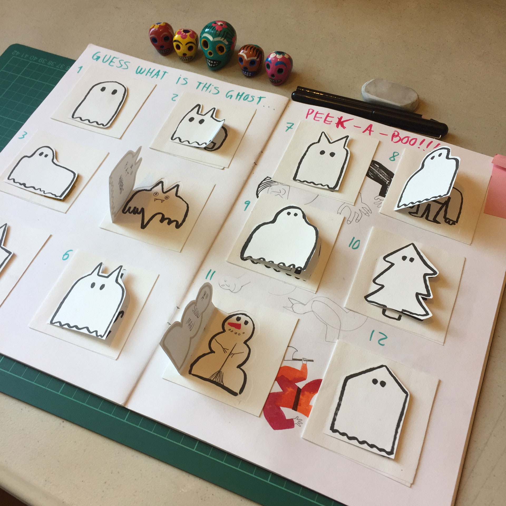
Your picture books are full of details for kids to spot, when do you add these?
I never add them at the end. They're an integral part of the process. When I'm working on the characters, I'm trying to build the world with them as well. My monsters are very much inspired by folklore and by horror literature. I'm actually doing a PhD on horror in children's books.
I like having those details because they make me have fun. They make me enjoy the project and I am aware that maybe children will not understand all of the references, parents might get a couple of them. And that's enough when you are making a picture book. I am not just making it for children. I am making it for myself and I'm thinking of other people who might like the same things I like, who might spot those details.
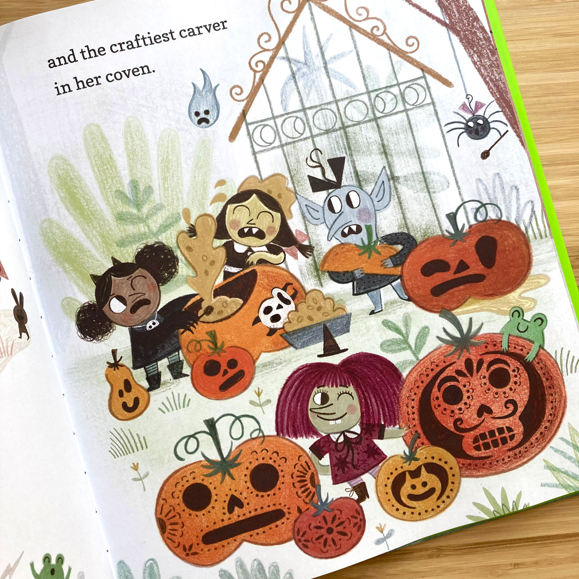
What ratio of your work is analogue compared to digital?
I don't know if I have a straightforward answer to that. Because all of my sketches I do in sketchbooks and all of the writing and the drafts I do on the computer. The artwork is maybe half and half because half of the work involves making the originals. The originals are made with black and white, different kinds of ink and pencil and wash and different types of media on layers, which then I scan, and then digitally colour. So if I have to give you a rough answer it might be 50/50.
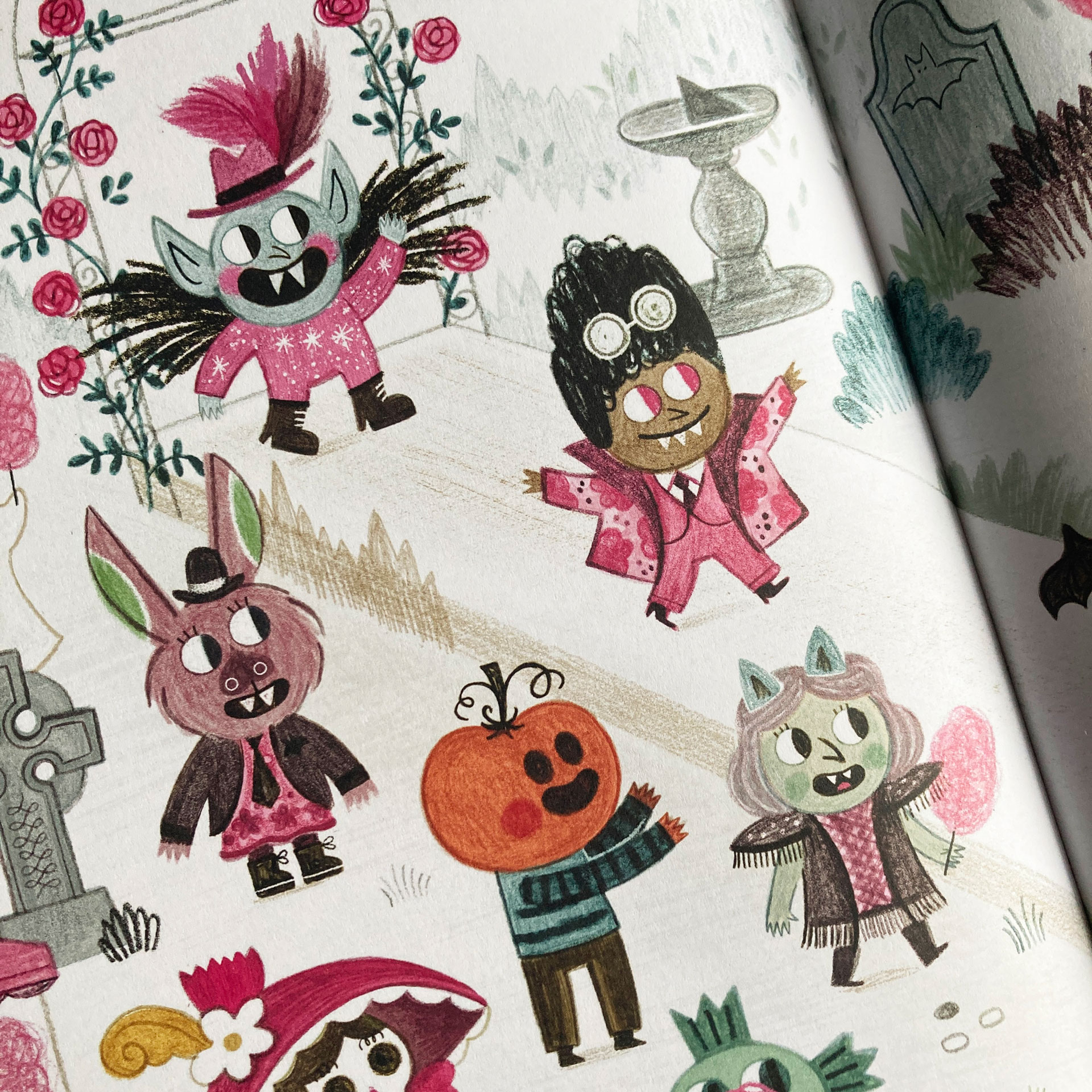
How do you make sure that your monsters aren't too scary for children?
I think you can convey the non scariness by having really round shapes and chubby little shapes that make you feel like they're not threatening. They have to feel quite soft and round and welcoming. Maybe the big eyes help as well. If you suddenly draw a shape that is pointy and big and has teeth that are very pointy, and then it's disgusting because bits of the face are falling off. So the monsters can't be really threatening or too disgusting. The roundness and the proportions help to get to convey the cuteness.
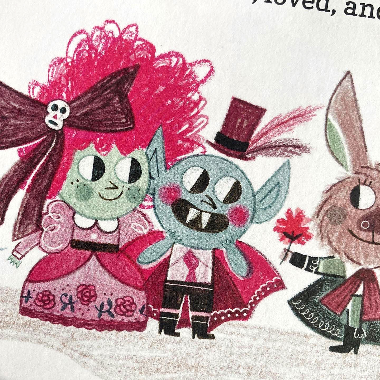
How do you make sure that you stand out amongst other illustrators?
I think the best thing you can try is be honest with yourself. So make stories that you care about, get inspiration from things that you like and that you enjoy and that you find inspiring as well. But it all has to come from the things that move you and from the things that you really care about. Not from the 'what's the market doing? I need to do that'.
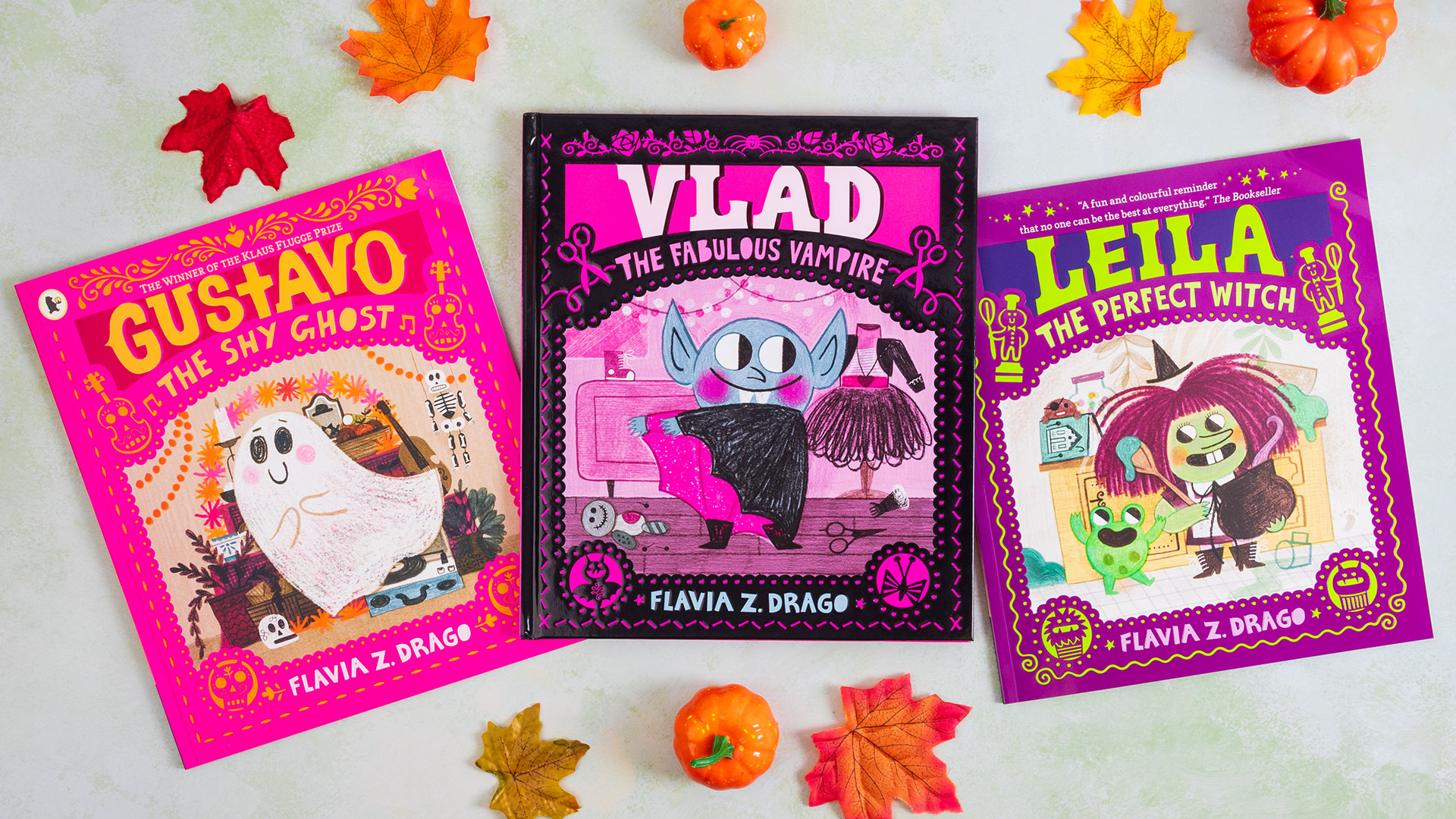
Find out more about Flavia via her website and sign up to the London Book Fair, which takes place 12-14 March at Olympia London.
Get the Creative Bloq Newsletter
Daily design news, reviews, how-tos and more, as picked by the editors.

Thank you for reading 5 articles this month* Join now for unlimited access
Enjoy your first month for just £1 / $1 / €1
*Read 5 free articles per month without a subscription

Join now for unlimited access
Try first month for just £1 / $1 / €1
Rosie Hilder is Creative Bloq's Deputy Editor. After beginning her career in journalism in Argentina – where she worked as Deputy Editor of Time Out Buenos Aires – she moved back to the UK and joined Future Plc in 2016. Since then, she's worked as Operations Editor on magazines including Computer Arts, 3D World and Paint & Draw and Mac|Life. In 2018, she joined Creative Bloq, where she now assists with the daily management of the site, including growing the site's reach, getting involved in events, such as judging the Brand Impact Awards, and helping make sure our content serves the reader as best it can.
