Famous fonts: the typefaces behind the biggest logos
Ever wondered what font the Facebook logo uses? FedEx, Apple? We explore the stories behind lettering used in some of the most recognisable logotypes ever made.
When you think of famous fonts, your mind probably conjures up Helvetica, Futura or, dare we say it, Comic Sans. However some of the most famous fonts are ones you probably don't even know the names of, but that you see almost every day. Anyone know what the Facebook font is off the top of their head? Yeah, us neither.
It's impossible to say exactly how important a typeface is to a brand's success. But all the brands listed below have two things in common: the typefaces used in their logos work really well and they're all massively successful companies. So we decided to see what fonts they use and what it is about those fonts that makes them such a good fit for the brand.
Read on to find out the famous fonts in some of the world's most recognisable logo designs , and in case you'd like to replicate the greats in your own projects, we've also provided you with links to buy these fonts too.
01. eBay
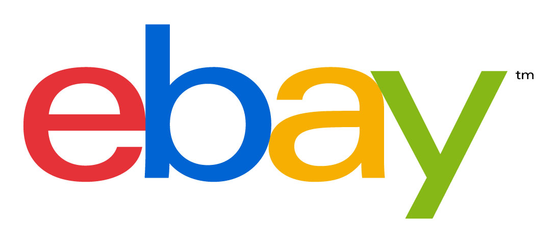
eBay uses Univers 53 Extended. Since the auction site got going in 1995, it's had two very different logos. The previous one was that wacky, overlapping-letters design – an absolute whopper. Still, it took eBay 17 years to change it. It kept the children's TV colour scheme ("Our vibrant eBay colours and touching letters represent our connected and diverse eBay community") but wisely toned down the design. The new logotype doesn't have that bonkers mismatched lettering. The letters all line up now so Univers 53 Extended looks much smarter and more grown up that it did in the previous logo, but still reflects the company's ideas about who it is. Univers was designed by Adrian Frutiger back in the 1960s and a version of it is also used on London street signs.
02. FedEx
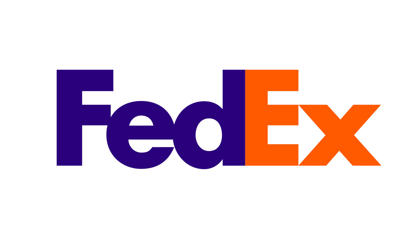
The font in the FedEx logo is a combination Futura Bold with a bit of Univers 67 mixed in. It also contains nice but subtle bit of design work with the arrow in the negative space between the 'e' and the 'x'. This gives us a good idea of how the company sees itself. The choice of font does exactly the same. Futura, designed by Paul Renner, is based on geometric shapes and has been around since the 1920s. It's strong, it's reliable, it's redolent of a company that will only sometimes lose your package. The use of bold reinforces all of those things. Looked at in isolation, the colours are a bit mad, but the logo is so iconic you don't really notice them. And the restrained two-colour scheme (you listening, eBay?) works particularly well with this font.
03. Twitter
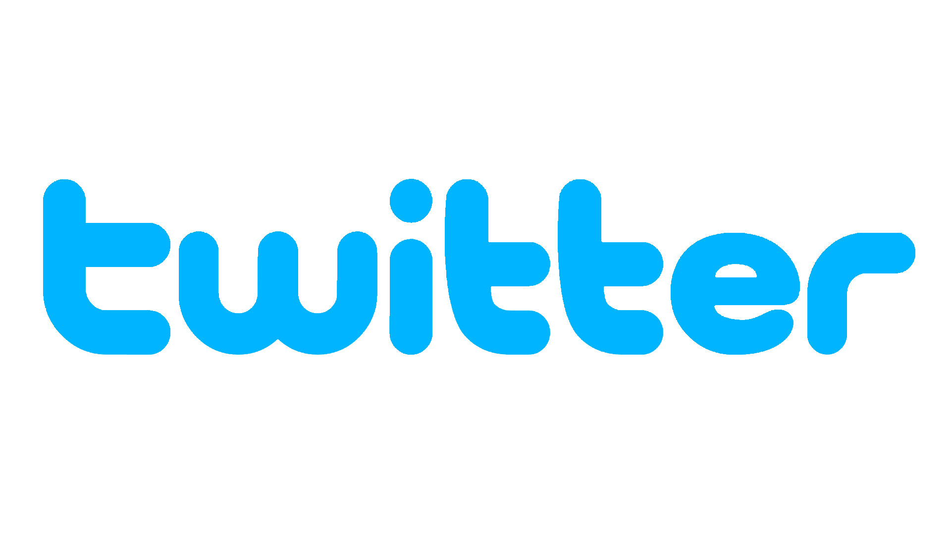
Twitter moved away from its logotype in recent years, preferring to use the bird logo by itself. The typeface it used was a modified version of Pico Alphabet. This bubbly, cartoonish font was created by Japanese company Maniackers Design – you can definitely see it has a manga and anime feel to it. Twitter in the early days felt new, weird, and playful. So this font really reflected that. The bird logo by itself is clearly a lot more sophisticated. But it definitely lacks the playfulness of the original logotype, which, critics might argue, Twitter itself is now also lacking in.
04. Facebook
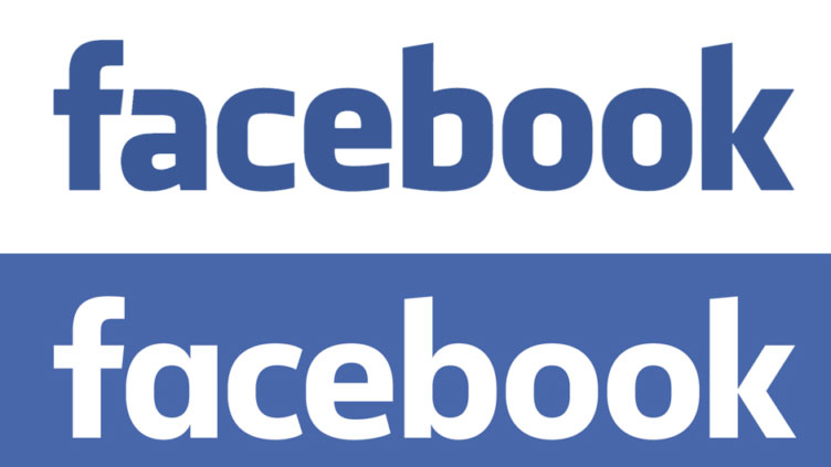
Until 2014, Facebook used a tweaked version of Klavika designed a decade earlier by Joe Kral and Cuban Council. The current logo isn't far off, with just a few subtle changes to angles and kerning to "modernise the logo to make it feel more friendly and approachable". Officially, the font in the current logo doesn't have a name – Eric Olson from Process Type Foundry developed it for Facebook in-house. The redesign switched the double-storey 'a' to single-storey, giving it a cleaner, more modern look. The other vowels are rounder too, the 'b' has a more classic stem, while the iconic 'f' remains as recognisable as ever.
Get the Creative Bloq Newsletter
Daily design news, reviews, how-tos and more, as picked by the editors.
05. Amazon

The current Amazon logo has been around since 2000. The font is close to Officina Sans Bold designed by typography legend Erik Spiekermann. Turner Duckworth designer Anthony Biles redesigned this logo. He customised the lettering slightly and added the orange smile-like arrow going from A to Z, a playful touch for the "everything store". This Amazon smile is instantly recognisable now. And the whole thing still feels pretty fresh considering its age, and it tells us a bit about the company, which is good, because it'll probably be a while before notoriously money-conscious founder Jeff Bezos pays for a new one.
06. Apple
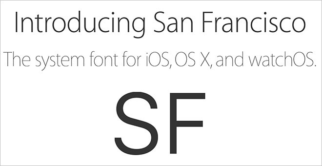
A lot of the famous Apple adds – Think Different, for example, with the rainbow Apple logo – used a custom variant of the ITC Garamond typeface called Apple Garamond. From 2002, the company started using the family of fonts known as Myriad, a switch from serif to sans-serif, which Robert Slimbach and Carol Twombly designed for Adobe. In 2017, Apple switched most of its website's text to San Francisco. That's now the official universal font. It has four variants and is clearly inspired by Helvetica and DIN. Unsurprisingly, Apple restricts its usage. Third-party developers can use it only for Apple's platforms. Like all of Apple's stuff, it works because it's really functional but also really smart to look at.
07. Microsoft

From 1987-2002, Microsoft used the Helvetica Black Oblique typeface. The current logo, with the four-colour tile symbol, was introduced in 2012. The logotype uses Segoe, designed by Steve Matteson of Agfa Monotype. Microsoft now has Segoe as its main branding font for advertising and print materials, while Segoe UI, a sub-family used by various applications, is meant to give the same visual effect on screen and in print.
08. Disney

The story goes that the font used for the Disney logo is based on Walt Disney's handwriting. But copies of his letters show it's quite different – a more stylised version, maybe, at a push – which apparently left fans disappointed when they got his autograph. This is another font that, although hard to separate from its logo, still perfectly suits its company: the flowing script style instantly makes you think of storytelling, fairytales, magic. In 2000, Justin Callaghan released Waltograph, a freeware typeface based on the lettering of the Walt Disney logo. It's an unofficial project, but a Disney spokesperson said: "When Mickey Mouse sits down to tap out his memoirs, we bet the title page will be set in Waltograph."
Read more:

Thank you for reading 5 articles this month* Join now for unlimited access
Enjoy your first month for just £1 / $1 / €1
*Read 5 free articles per month without a subscription

Join now for unlimited access
Try first month for just £1 / $1 / €1
Gary Evans is a journalist with a passion for creative writing. He's recently finished his Masters in creative writing, but when he's not hitting the books, he loves to explore the world of digital art and graphic design. He was previously staff writer on ImagineFX magazine in Bath, but now resides in Sunderland, where he muses on the latest tech and writes poetry.
