Tonal values: Everything you need to know
Master tonal values to make your artwork more realistic.
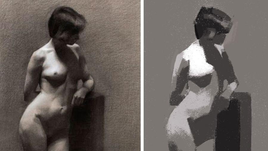
Tonal values occur in nearly every piece of drawing or painting that is created, and getting them spot on is crucial to the success of the artwork. Artists must navigate various light effects and quirks of perception, which can be frustrating. However, the principles are the same whether you are creating a figure drawing, painting a still life or tackling landscapes, so the same challenges will crop up regardless of subject or medium.
To further brush up on your art skills, explore our guide to the art techniques you should know, or our pick of the best how to draw tutorials.
If you want to create believable and realistic images, there are some key ideas to get to grips with, and having some methods to hand to help solve common problems will help your work flow more smoothly. In this workshop you'll find some top techniques to help you master tonal values. Let’s get started…
01. Separate light and shadow
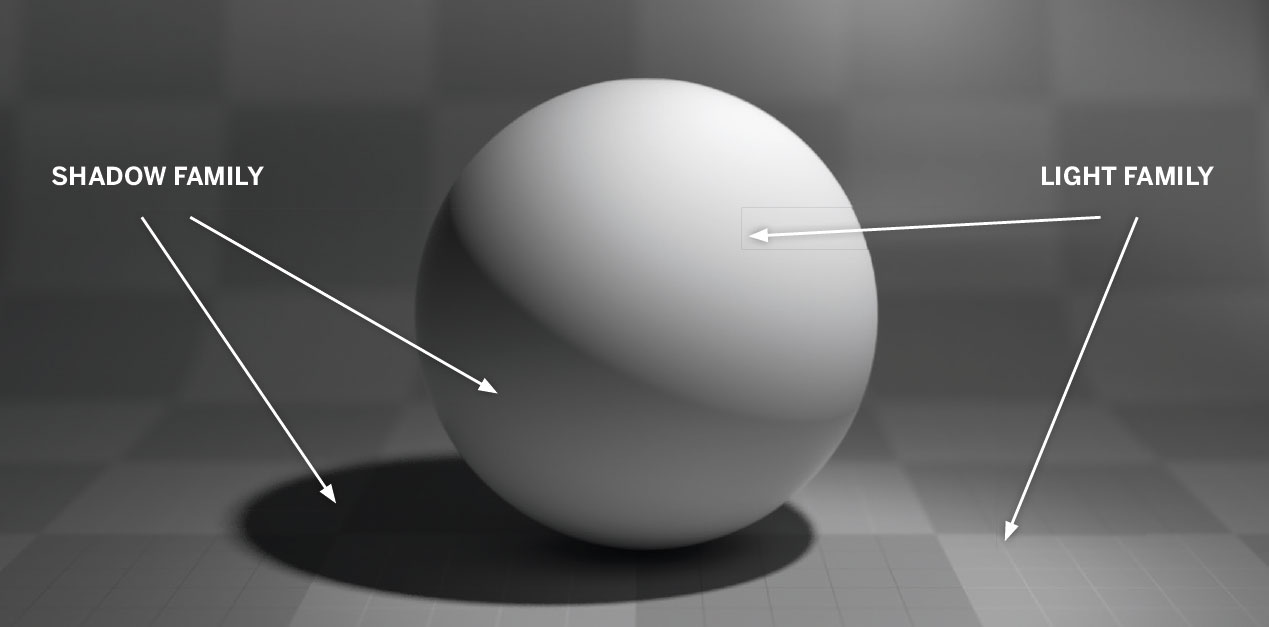
This is the foundation for all shading decisions. First, make a distinction between the ‘light family’ and the ‘shadow family’ (shown above). The light family consists of all areas that are touched directly by the light source. A good way to test this is to look at your subject from the direction of the light, so you can see what the light can ‘see’. The shadow family consists of everything that is hidden from the light source. This includes all shadows and reflected light areas.
02. Use a value scale

A value scale is a tool that will help you understand tonal relationships. We recommend a nine-step scale because it has a middle value. You can make a value scale by marking nine swatches, as shown above. Then, using light lines, begin with swatch 1 (as dark as you can go) and 9 (leaving as just paper). Then add an estimate for tone 5 in the middle. Now, add tones 3 and 7. Add the remaining tones to complete the scale.
03. Consider relative values

Our perception of how bright something is changes depending on what surrounds it. The example above shows the same 50 per cent grey surrounded by black and white. Can you see how the grey looks much darker against the white background? This effect happens all the time when we draw from observation and it can really throw off our value judgements.
04. Explore light effects
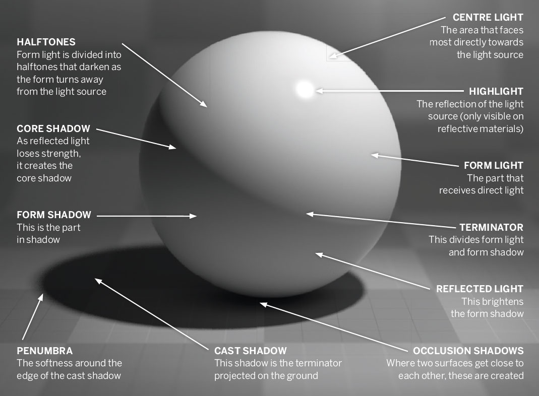
As light hits an object, there are many effects to be aware of. Click on the diagram below to see how light spills over an object and creates areas of light and shade.
Get the Creative Bloq Newsletter
Daily design news, reviews, how-tos and more, as picked by the editors.
05. Capture reflected light
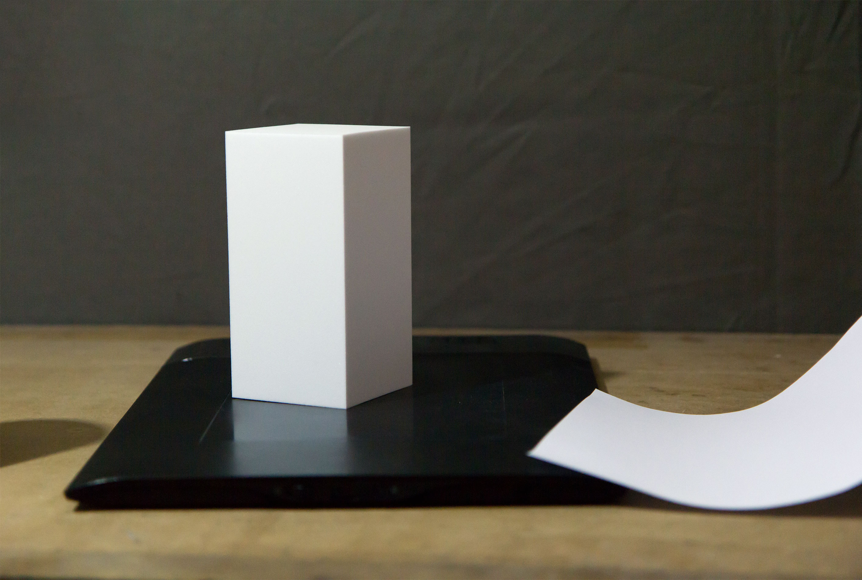
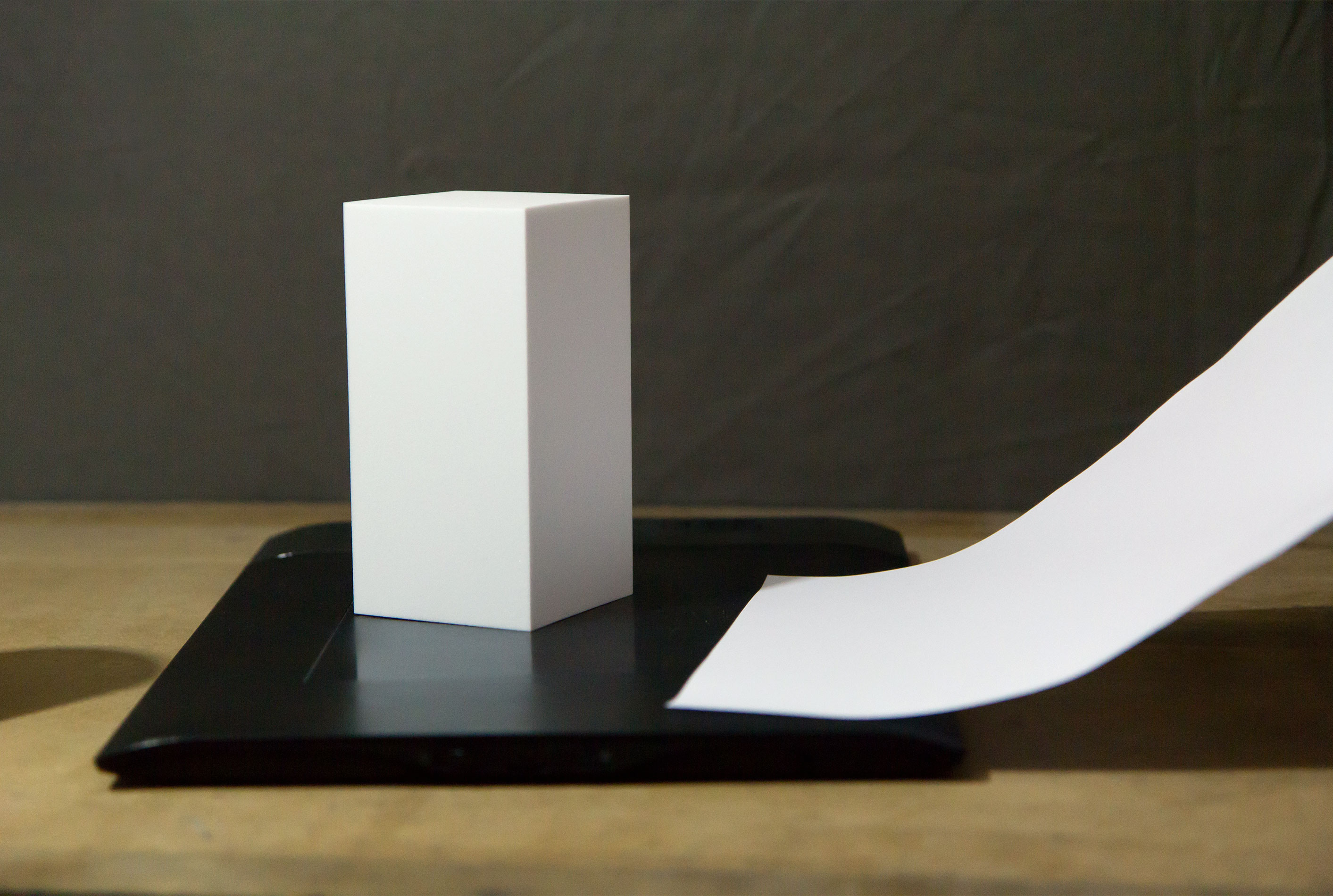
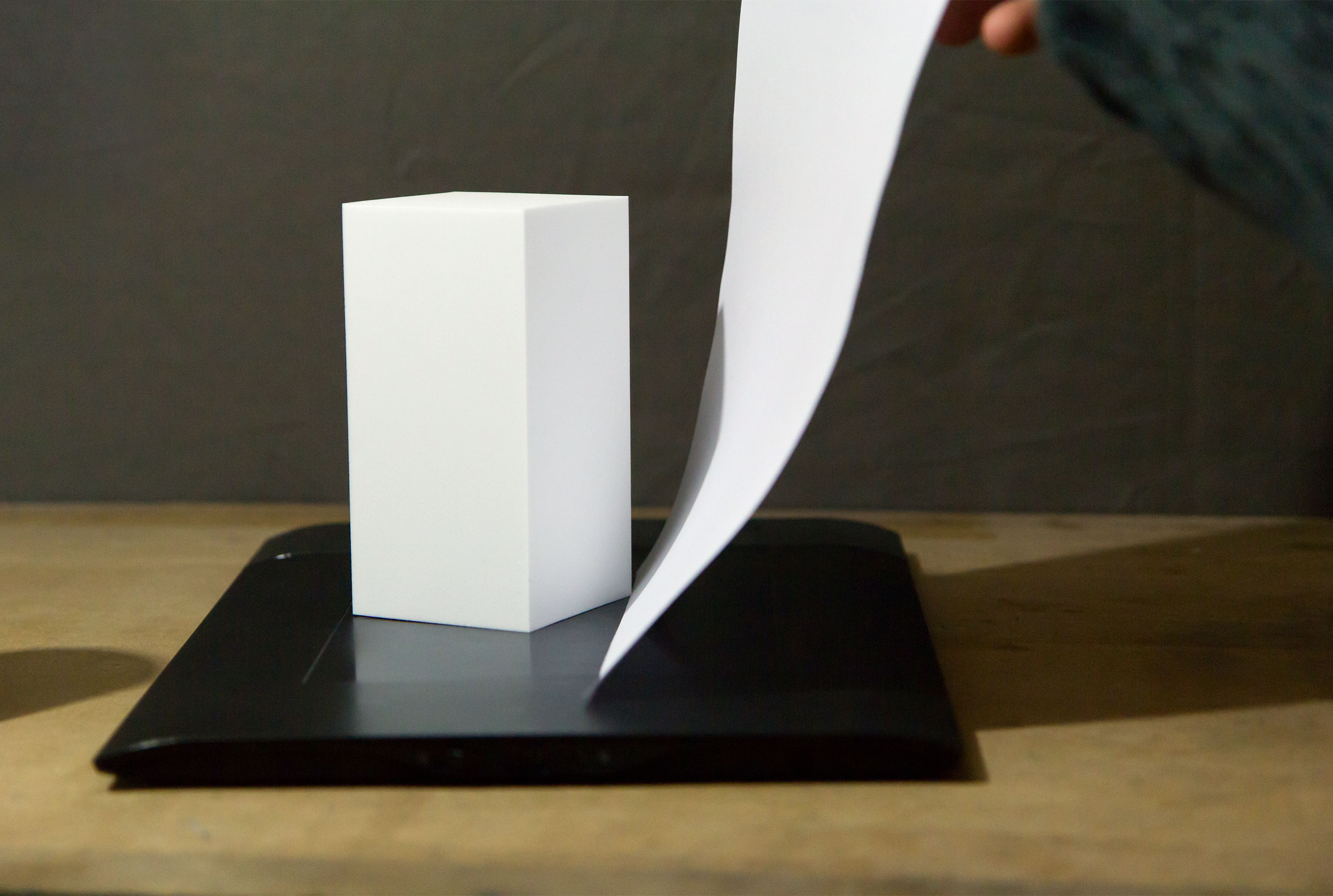
Drawing correct reflected lights gives a great sense of volume. To create a realistic sense of light, it’s important to understand what affects the intensity of indirect (reflected) light.
The first is local value. This is the ‘actual’ brightness of an object, independent of light effects. Lighter materials reflect light more strongly than darker materials. Another factor is distance – the further reflected light has to travel, the weaker it gets. The image here shows the effect of distance on a white material with maximum reflective strength.
Scroll left to right in the gallery above with the arrows to see these influences in action.
06. Avoid these common shading mistakes

The first common shading mistake is making reflected lights too light (1). This creates confusion between halftones and reflected lights, making it difficult for the viewer to interpret the image. The second is making light halftones too dark (2). This results in a dirty look. The third is making dark halftones too light (3), which takes away from the sense of form.
07. Make a value study
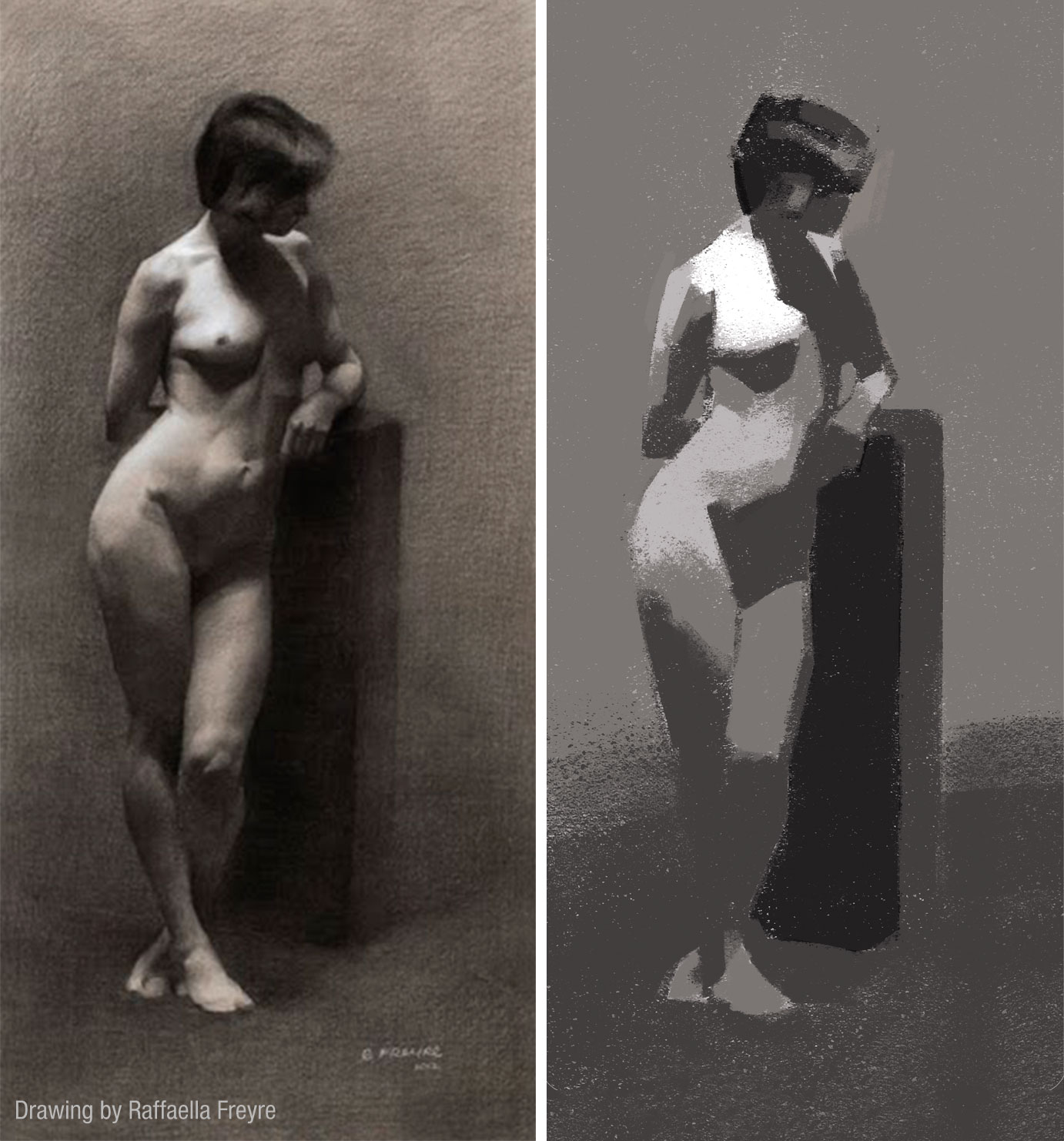
Get your head around confusing values by organising them into groups in a separate drawing (a value study). The goal is to summarise the image by grouping similar tones together. Four or five value groups are ideal. Define the lightest and darkest tones, then find two to three tones that are most common in the image. Do your best to combine similar values. You should now have a clear plan for establishing values.
08. Test your understanding

It’s always good to conduct experiments. Work with both artificial and natural light and note the differences. Try out a variety of media in order to learn how to take advantage of each. Try and create images from imagination. Can you remember all 11 effects from tip #4? Are you successfully avoiding the three common shading mistakes? The image above shows different students’ drawings of John Asaro’s Planes of the Head, shading 100 per cent from imagination.
09. Try a more limited range
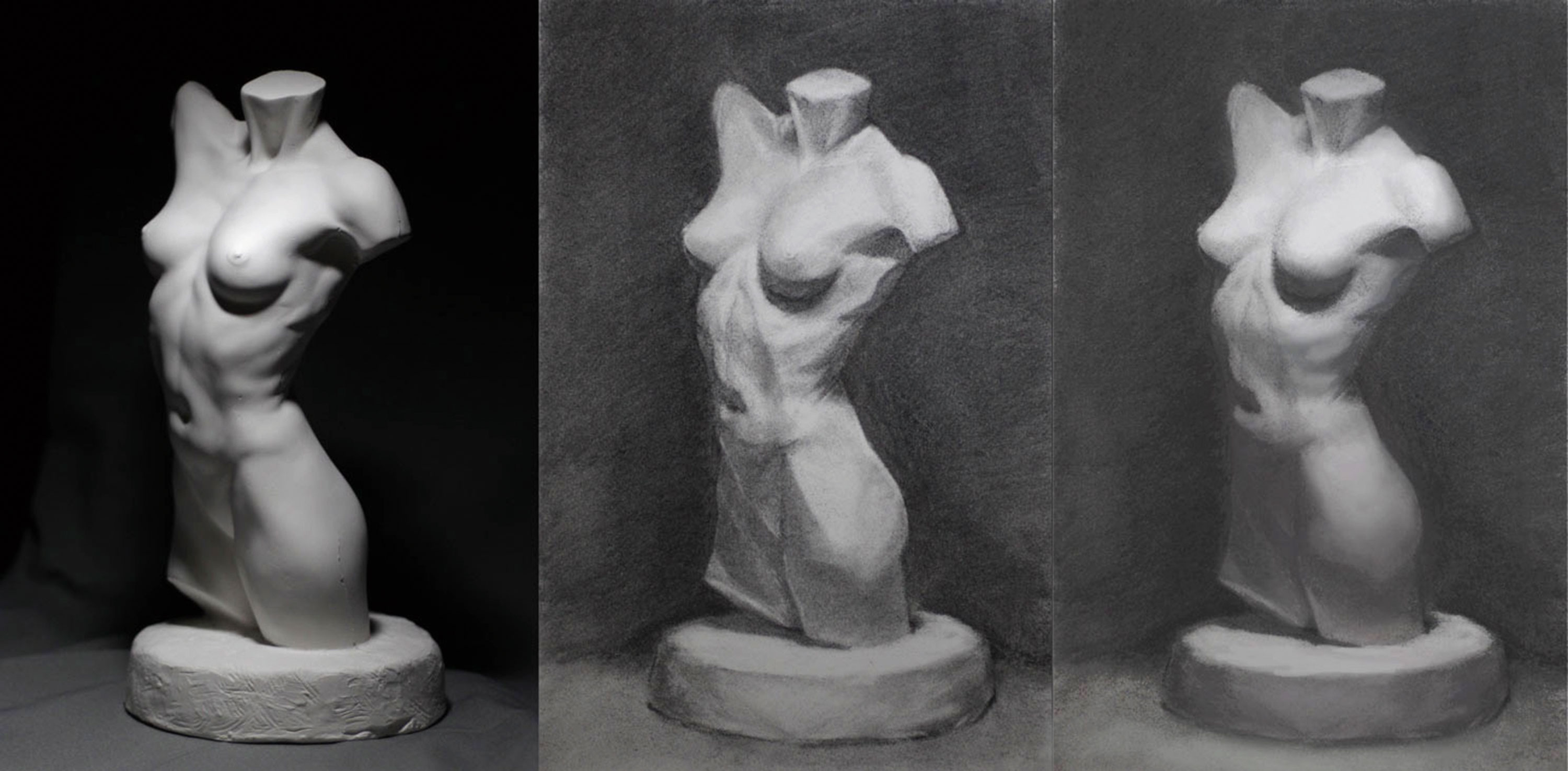
A value range describes how big the spectrum is between the lightest light and darkest dark. Each medium has its own range. Nature has an enormous range: from the brightest light (the sun) to the darkest dark (complete blackness). Often it is difficult to match the range of nature in your art. The solution is to diminish contrast at both ends of the spectrum.
10. Use a light guide

To understand the light in a scene, draw a little sphere and indicate the light direction, the brightness of the shadows, and the strength of reflected light. In a complex image, you can make a light guide for individual objects. To study nature, hold up an egg in different light scenarios and observe how these three aspects change in different environments.
Related articles:

Thank you for reading 5 articles this month* Join now for unlimited access
Enjoy your first month for just £1 / $1 / €1
*Read 5 free articles per month without a subscription

Join now for unlimited access
Try first month for just £1 / $1 / €1
