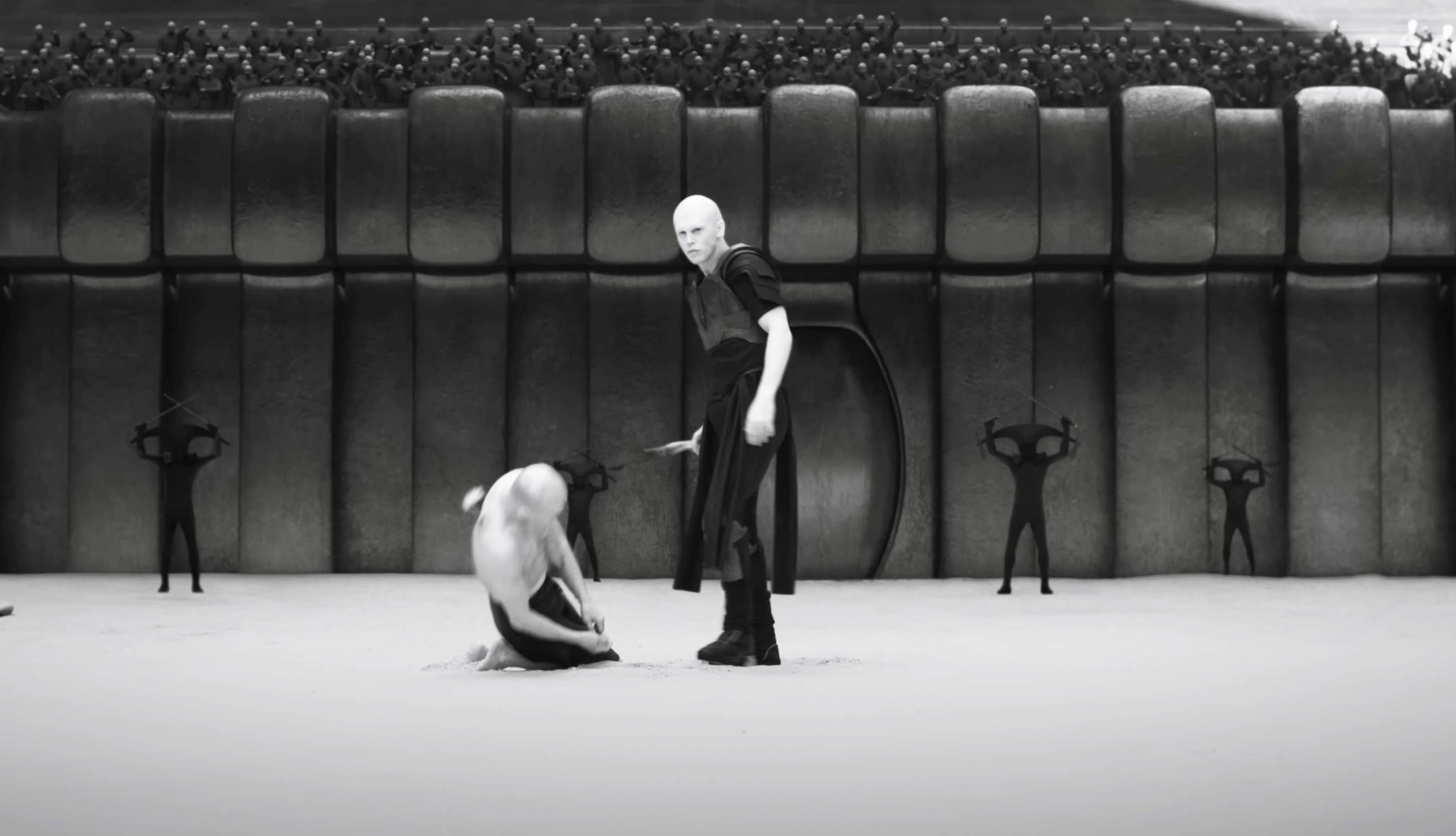
Dune Part 2 is one of those rare films that garners both critical and popular acclaim. It received rave reviews and it's on course to gross well over $500 million – the kind of success few films have achieved since the pandemic. And part of the reason the second installation in Denis Villeneuve's interpretation of Frank Herbert's first Dune novel has been so well received is the fact that it just looks so stunning.
A whole bunch of design decisions came together to make Dune Part 2 such a visual delight, from the architecture and design of Arrakis to Dune costumes and some quirky shooting choices. Here we recap five things that contributed the film's unique look. For more on Dune, see our pick of the best Dune art, from posters to book covers.
01. Vintage lenses
A post shared by IronGlass | Rehoused Vintage Lenses for Filmmaking (@ironglassadapters)
A photo posted by on
Anyone with an interest in photography and videography will probably have watched Dune Part 2 wondering what lenses were used on ALEXA cameras. And it turns that the lenses are indeed quite special. In an interview with ARRI Rental, director of photography Greig Fraser revealed that a wide range of rehoused vintage lenses were used "to dirty the image up a bit" and create more texture. The kit included rehoused Soviet glass supplied by IronGlass, beautifully customised with the Dune logo.
02. Shooting in infrared to create the look of Giedi Prime

One of the most visually arresting sections of Dune Part 2 is that set on Giedi Prime, the planet of House Harkonnen, a section that also features gladiatorial elements and Shakespearean political intrigue. The planet has a black sun, and Villeneuve wanted to represent that by showing a stark colourless kind of light never seen on screen before while also suggesting that it could be these conditions that have shaped the Harkonnen's physical appearance and cold brutality.
The solution was to modify an ALEXA LF camera to shoot infrared – like surveillance cameras only with much higher resolution. And like surveillance cameras, the results are eerie, unsettling even. Combined with menacing monolithic architecture, the results make it immediately clear that were on a very different planet from Arrakis.
03. The sumptuous Dune costumes

Like the first film, Dune Part 2 stands out in the costume design department. From Bene Gesserit headwear to the sinister banderillero-inspired slave handlers on Giedi Prime, there's a wealth of stunning costumes, some of which wouldn't look out of place in a classic Balenciaga or Channel show from the 50s or 60s.
The inspiration? Costume designer Jacqueline West told Vogue she took influence from a range of tribes on Earth, including the Toaregs, the Bedouins and the Mongols for the costume design on Arrakis, while she drew on tarot cards, especially the queen of swords, and medieval paintings by Giotto di Bondone for the Bene Gesserits. For the Harkonnens' use of black, leather, and spandex, she took inspiration from the work of Geiger, dark medieval images and bondage.
Get the Creative Bloq Newsletter
Daily design news, reviews, how-tos and more, as picked by the editors.
04. Sandscreens for the design of Arrakis
Part of the magic of Dune is the convincing design of Arrakis, the desert planet. Like with the first film, Denis Villeneuve used various techniques to create the unique aesthetic, and one of them was to use sand-colored screens instead of (or as well as) traditional green or blue screens to make the desert light look more realistic and to avoid color contamination.
Visual effects supervisor Paul Lambert told before & afters about how for the first film several colours of screen were used, including sandscreens for Arrakis and Arrakeen, grayscreens for Caladan interiors and a gray with a very slightly blue tint for Caladan exteriors. The benefit of the sandscreen for Arrakis was providing a constant colour that would be the bounce light. In non-visual effects shots, the sandscreen is reflected in soldiers' visors and in the glass of the ornithopters, for example. Meanwhile, when inverted, the sand colour becomes blue, suitable for keying for VFX.
05. Dune movie architecture
The architecture of Dune was inspired by several feats of human architecture, including the pyramids of Egypt and Petra in Jordan. The buildings of Arrakeen also respond to the design of Arrakis itself and the nature of the climate and elements on the planet. Thick concrete walls protect interiors from the heat, while screens and lightwells are influenced by the jali of Indo-Islamic architecture. In the video for Architectural Digest above, Michael Wyetzner of Michielli + Wyetzner Architects also finds links to more modern work such as Michael Heizer's desert art City in Nevada and from the board-form concrete structures of Carlo Scarpa.
The production team spent considerable time choosing the physical locations for the film, since the exterior scenes were almost all filmed on location, including in Jordan and Abu Dhabi. Villeneuve told Empire that production designer Patrice Vermette spent "weeks and weeks casting sand dunes casting sand dunes in the desert" inspecting the exact type of sand to ensure consistency between scenes.
Enjoyed Dune Part 2? Now we have the game Dune Awakening to look forward too.

Thank you for reading 5 articles this month* Join now for unlimited access
Enjoy your first month for just £1 / $1 / €1
*Read 5 free articles per month without a subscription

Join now for unlimited access
Try first month for just £1 / $1 / €1

Joe is a regular freelance journalist and editor at Creative Bloq. He writes news, features and buying guides and keeps track of the best equipment and software for creatives, from video editing programs to monitors and accessories. A veteran news writer and photographer, he now works as a project manager at the London and Buenos Aires-based design, production and branding agency Hermana Creatives. There he manages a team of designers, photographers and video editors who specialise in producing visual content and design assets for the hospitality sector. He also dances Argentine tango.
