Disney has produced some of the world's best-loved animated films. From traditional hand-drawn 2D animation to photorealistic CGI, and from Steamboat Willie to the upcoming Moana 2 and Mufasa: The Lion King, it has brought a host of memorable characters to life on the big screen and continues to delight audiences.
Behind this vast collection of movies lies a whole range of animation techniques. But several secrets that have emerged over the years that have really surprised us. As we await the release of Inside Out 2 next month, here's our pick of the most surprising Disney animation secrets we've covered (for inspiration for your own work, don't miss our expert character design tips and our piece on Disney's 12 principles of animation.
01. Disney reused animations
What? Disney cheats? The internet was in shock when this viral video came out, but sure enough Disney has recycled its animations over the years. The video above shows how several classic Disney movies featured scenes that were copied from previous films but with the characters changed.
An action scene from the Many Adventures of Winnie the Pooh (1977) appears strangely similar to one from The Jungle Book (1967). And the Jungle Book itself borrowed animations from The Sword in the Stone. Disney reused animations to cut costs. Rotoscoping was originally developed to help portray movement, with animators tracing or drawing over live footage, but Disney realised that it could use the same technique to trace over animations from previous films to save time.
02. The cobwebs in Toy Story 4 were woven by AI spiders
Moving forwards some years, Disney now uses all kinds of tech-assisted techniques to save time. And that includes using AI spiders in Toy Story 4. At our very own Vertex event in 2021, Pixar’s Dylan Sisson told attendees how technical director Hosuk Chang created a swarm of AI spiders that could weave webs like a real spider would.
The team created AI spiders in Houdini. "They would go into these nooks and crannies and start weaving webs," Sisson told us. "We’d render these webs out and that was pretty helpful." Yep, the cobwebs you saw in the film weren't created by human artists or pulled from a reference library but generated by digital spiders that don't actually exist. We just hope Toy Story 15 isn't entirely animated by AI.
03. Disney uses colour to tell stories
With all the elements that go into telling a Disney story, you might not think about colour. It's part of the story that often isn't consciously noticed by many. The colour in Disney's Aladdin is particularly unusual because it mainly comprises the three primaries: red, blue and yellow. Disney not only makes that work, but it uses the colours as a clever storytelling device, as analysed by J. Holt the Illustrator in the YouTube video above.
Get the Creative Bloq Newsletter
Daily design news, reviews, how-tos and more, as picked by the editors.
Almost all scenes contain some or all of the three primary colours in varying proportions, allowing scenes can be divided into red, blue and yellow according to the dominant colour. But it's not only for superficial reasons. The approach also helps guide the viewer through the story by using contrast to lead the eye. A deliberate control of colour is used to change the mood in transition scenes.
04. Disney sometimes breaks its character designs

We might assume animators working on CG movies aim to use rendered character models that are always anatomically correct. But it turns out that they often bend physical rules and break their characters to get the shot a director demands.
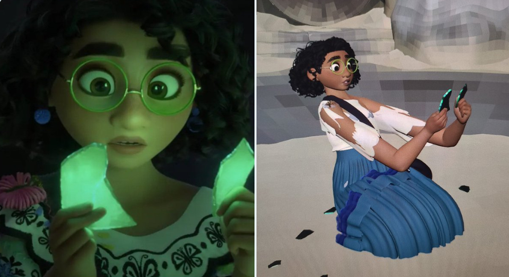
One example is a camera trick in Disney's Encanto. Animator Tony Bonilla, who also worked on Moana and Zootopia, shared a behind-the-camera image on social media of a scene in Bruno’s vision cave where Mirabel's arms were extended way longer than what is natural.
"The director went for an emotional feel that went beyond what they could do physically," Bonilla explained. He placed here arms in this position because this is where they looked best with the camera (85 mm). "If I moved them closer to her face, they would have looked like they were too close to her face, and her eyeline wouldn't work," he said.
The decision also made Mirabel's face the clear focus by making her hands slightly blurry. It was very effective, heightening the emotional tension, isolating the character and compresssing the space to create a sense of claustrophobia, but poor Mirabel would look very strange if we saw here in profile.
For more Disney secrets, see our favorite Disney character design conspiracy theories.

Thank you for reading 5 articles this month* Join now for unlimited access
Enjoy your first month for just £1 / $1 / €1
*Read 5 free articles per month without a subscription

Join now for unlimited access
Try first month for just £1 / $1 / €1

Joe is a regular freelance journalist and editor at Creative Bloq. He writes news, features and buying guides and keeps track of the best equipment and software for creatives, from video editing programs to monitors and accessories. A veteran news writer and photographer, he now works as a project manager at the London and Buenos Aires-based design, production and branding agency Hermana Creatives. There he manages a team of designers, photographers and video editors who specialise in producing visual content and design assets for the hospitality sector. He also dances Argentine tango.
