Discover the hidden flaws in 6 world-famous logos
Even the biggest brands have their imperfections.
With such huge branding budgets at their disposal, you'd think the world's most iconic logos would have every detail carefully considered. After all, if they're so ubiquitous, they must be polished to perfection, right?
Well, beauty is in the eye of the beholder. Logo design is not an exact science – often, it's about establishing an emotional connection with a brand – and sometimes perfection somehow... looks wrong. Sometimes brands will deliberately introduce little imperfections and idiosyncrasies, and unusual logo designs will often have fascinating stories behind them as a result.
In other cases, the imperfections are very far from deliberate. Many of the world's most-hated logos are flawed for all the wrong reasons, or kick up controversy and offence by missing the mark entirely.
Read on for six of the biggest imperfections in world-famous logos – some of which are intentional, others very much not – and what we can learn from them....
01. Google's imperfect circle
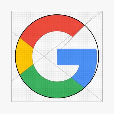
When Google swapped serif for sans serif as part of its 2015 rebrand, that wasn't the only aspect of its new logo that attracted attention: the shape of its G sparked a whole correct design debate. Detail-obsessed designers soon clocked that although the on-trend typeface choice was a geometric sans serif, the 'G' – frequently used as a standalone icon – is not based on a perfect circle.
On the one side there are advocates of perfect symmetry who believe the clean, simple minimalism that permeates the rest of the brand should be adhered to here, and criticise the slight deviation from perfection. Google insists it was intentional, to make the brand appear more approachable and unconventional.
When you place the 'G' side-by-side with a geometrically perfect equivalent, some argue the latter feels a little off-balance to the naked eye – in short, it's a deliberate imperfection that soothes some, and irks others. You can't please 'em all.
Get the Creative Bloq Newsletter
Daily design news, reviews, how-tos and more, as picked by the editors.
02. Starbucks' asymmetrical mermaid
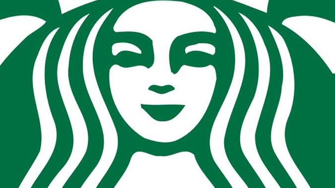
And so we come to another deliberate 'flaw' in an iconic logo, almost imperceptible to the untrained eye. When Lippincott rebranded Starbucks, as well as breaking the famous siren out of her branded restraints and turning her green, the agency also introduced a tiny imperfection.
While conventional wisdom holds that perfectly symmetrical facial features are the most attractive, in practice Lippincott found that conversely, symmetry made the mermaid look cold and inhuman. The solution? Making the shadow on the right-hand side of her nose just a fraction longer than the left, to inject some more warmth and humanity.
03. Wikipedia's Chinese blunder
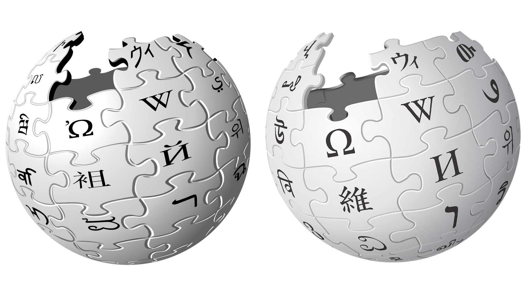
How much attention have you paid to Wikipedia's logo over the years? The world's fifth most popular website had a brand overhaul in 2010, simplifying its distinctive puzzle globe, and making it easier to scale. But you might need to be a bit more eagle-eyed – or a native Mandarin speaker – to spot what else changed.
To show the vastness of its global reach, each piece in Wikipedia's logo features a letter from a different alphabet. Many of these represent the letter that most closely resembles the English 'W' for Wikipedia. In the case of Mandarin, this would be the character anglicised as 'Wi', but its first iteration had an extra stroke added that effectively made it gibberish. After a small tweak, it did become a recognisable character, but the wrong one – 'Jie'.
In 2010, Wikipedia gave up trying to nail 'Wi', and replaced it with a different character altogether. It also replaced its Klingon character for one from the Ethiopian Ge'ez language instead. It's tough enough to make sense of 16 Earth languages, after all, without attempting interstellar communication too.
04. 7 Eleven's lowercase 'n'
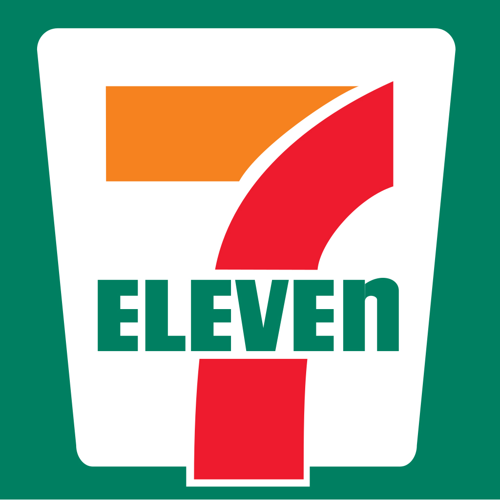
You don't need to be a typography aficionado to spot the difference between lowercase and uppercase, and you'd certainly hope that 7-Eleven's rather blatant mixture of the two – rounding off its all-caps 'ELEVE' with a cheeky lowercase 'n' – wasn't a result of a designer nudging the shift key with their elbow.
7-Eleven's official story is that back in the 1960s, the wife of the company's then-president believed that an uppercase 'N' looked too harsh at the end of the wordmark, and dropping it to lowercase was more graceful. It's an interesting theory – and her suggestion has stuck ever since, despite flouting one of the most basic rules of the English language in the process.
05. London 2012's accidental offence
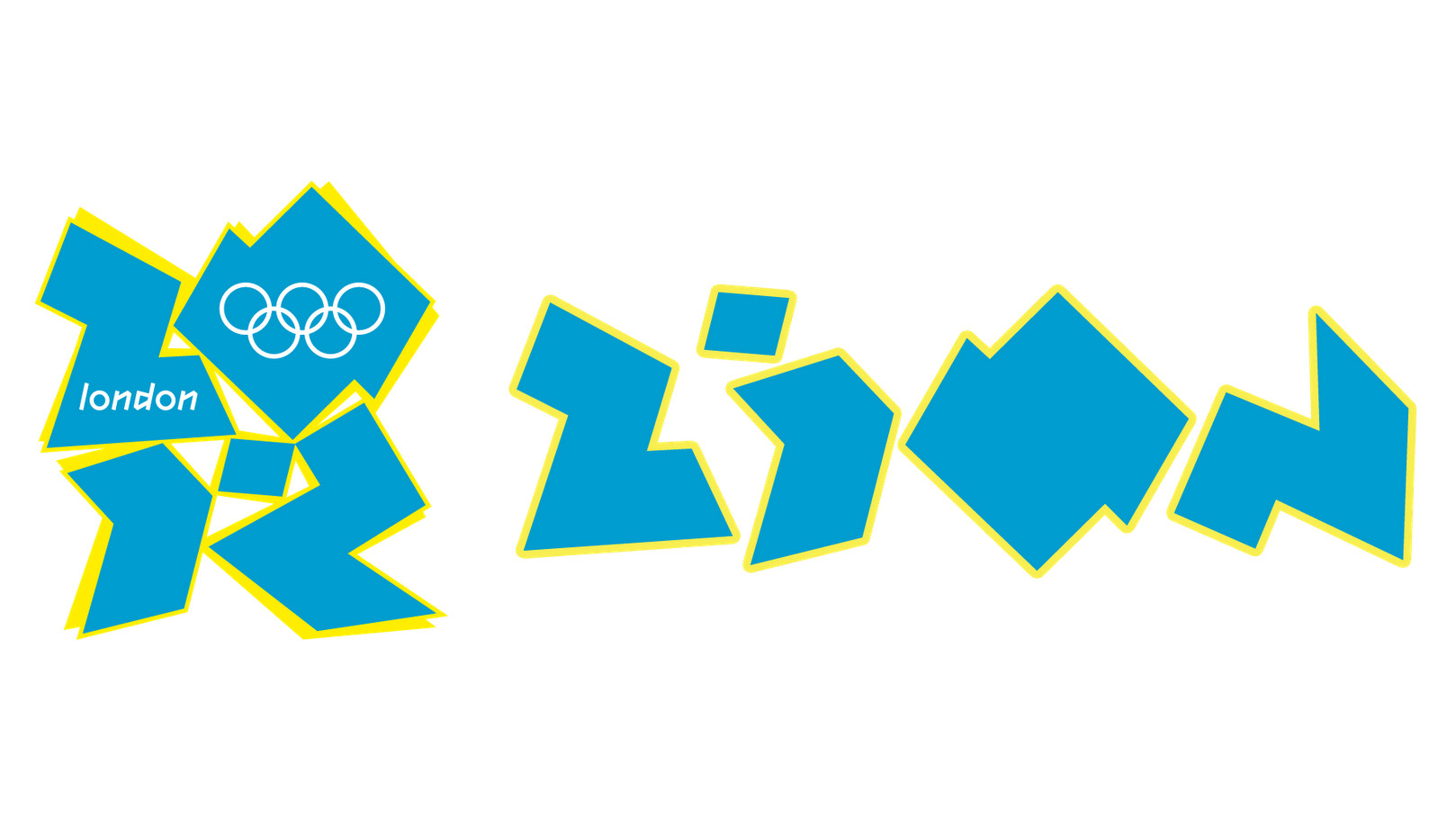
Despite making a lot more sense in application, the poor old London 2012 logo remains a popular inclusion on most-hated logos lists – with criticisms ranging from the blunt to the bizarre, such as drawing similarities to Lisa Simpson in a rather compromising position. Others just disliked the logo on a more basic level, finding its abstract graphic shapes and neon colours to be garish and illegible.
Other criticisms would be significantly more serious, if they weren't so tenuous. Some likened the shape to a Swastika – which is something of a stretch – while the Iranian Olympic team threatened to boycott the Games as they believed it spelled out 'ZION'. They were duly convinced otherwise, but it just goes to show how the harshest critics of a logo can find flaws and imperfections in the most unlikely, unintended places.
06. Pepsi's middle-aged spread
Pepsi has undergone many rebrands over the years, but has always struggled to attain the kind of effortless brand recognition that its fiercest rival Coca-Cola has enjoyed – Coke is arguably one of those brands so strong they don't need a logo.
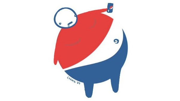
Pepsi's most recent major overhaul in 2008 rotated its circular red and blue icon, distorting the long-established wiggly white line in the centre into a kind of lopsided smile, designed to vary depending on the product in question. Unfortunately, this introduced an unintended flaw that designers soon pounced on with glee.
With a few simple additions, the 'smile' is reframed as a bulging belly, spilling out between a red shirt and blue trousers. Obesity is not something a fizzy drink manufacturer ever wants to be associated with, and artist Lawrence Yang wasted no time in pointing this out, as did many others. Creatives can be brutal.
Related articles:

Thank you for reading 5 articles this month* Join now for unlimited access
Enjoy your first month for just £1 / $1 / €1
*Read 5 free articles per month without a subscription

Join now for unlimited access
Try first month for just £1 / $1 / €1

Nick has worked with world-class agencies including Wolff Olins, Taxi Studio and Vault49 on brand storytelling, tone of voice and verbal strategy for global brands such as Virgin, TikTok, and Bite Back 2030. Nick launched the Brand Impact Awards in 2013 while editor of Computer Arts, and remains chair of judges. He's written for Creative Bloq on design and branding matters since the site's launch.
