Develop reusable React components
Learn how to use Storybook as part of a development workflow that can help create and exhibit resilient UI components.

When starting a fresh project, it can be easy to slip into some bad user experience habits (the analytics provided by good web hosting services can help negate this over time). As applications grow, components can start swelling in size and when the time comes to reuse a section of it, it can be hard to break apart. Large components become awkward to test, difficult to extend and easy to break.
The best way to avoid this problem is to split the UI into smaller, generic pieces that are easier to reuse because they get their data as props – a pattern known as presentational components. By focusing on the quality of smaller components like a button or input field, we know anything that would use those components will work as well.
Need some new web design tools? Try a website builder and update your cloud storage provider.
Storybook is an environment to help develop these reusable components. By creating them in isolation, we can be sure they have no external dependencies that we haven’t explicitly defined. The result is an interactive style guide for an application, which can be helpful not only to developers but to designers and testers also.
Storybook applications can be exported separately and run independently of the main application without the need of a development environment. As the result is just HTML, CSS and JS, they can be hosted on a service like GitHub Pages and live alongside the repositories that use them. Anyone in the company can load up the site and check it out.
Here's how to use Storybook in your React projects.
01. Add Storybook
To get started, we first need a React project ready to go. This can be any project but we can use createreact- app to generate one in a couple of lines. Open up the command line and run the following:
Get the Creative Bloq Newsletter
Daily design news, reviews, how-tos and more, as picked by the editors.
npx create-react-app storybook-app
cd storybook-app
From there we can install the Storybook CLI. This in-depth will add the basic features of the environment to the application. By installing this globally, it can be used to add Storybook to any NPM project in the future.
npx @storybook/cli getstorybookThis command updates storybook-app and adds a couple of commands to the package.json. Run the first one, which starts a local Storybook server ready to develop. Once it’s ready, run the following and head to localhost:9009 in a browser.
yarn run storybookStorybook provides an overview and an example component when it first gets installed. These can be adapted or removed entirely.
02. Get set up in Storybook
Storybook works through the concept of ‘stories’. Each component being developed will have its own set of stories that outlines a few typical use cases. The component that comes with Storybook, for example, has one story for plain text and then another for emoji.
By default, these stories are saved in stories directory at the root of the project. While this technically works, it’s nonetheless best to keep all files related to a component together alongside other related files like styles and tests. We can change where Storybook finds its stories by updating config.js in the .storybook directory.
import { configure } from “@storybook/react”;
const req = require.context(“../src/components”, true,
/\.stories\.js$/);
function loadStories() {
req.keys().forEach(filename => req(filename));
}
configure(loadStories, module);
Once Storybook is restarted, it will now look for any files ending in .stories.js anywhere inside a components directory.
03. Create a component in Storybook
Our first component will be a button. As this will be a styled <button> element, we get a lot of its default behaviour for free.
The key to a reusable UI component is that it gets all of its data from props. No application behaviour should be assumed unless explicitly defined through those props.
Create a new Button directory under components and then create an index.js file that will hold the button. Create styles.css and add some styling there also, including when the type prop is set to 'primary' or 'danger'.
import React from “react”;
import “./styles.css”;
const Button = ({ children, onClick, type }) => {
 const classes = [“Button”];
 if (type === “primary”) {
  classes.push(“Button--primary”);
 } else if (type === “danger”) {
  classes.push(“Button--danger”);
 }
 return (
  <button className={classes.join(“ “)} onClick={onClick}>
   {children}
  </button>
 );
}
export default Button;
04. Create a story in Storybook
With the component set up, we can now import it into Storybook by creating its own story.
Each set of stories start by calling storiesOf, which will group all stories after it together. The first argument is the label of that grouping.
Each story is created by calling the add method from there. The first argument labels the story, while the second is a component to render. While we could render <Button/> directly, it means we can’t change any of its props later on.
Create a Button.stories.js and create a story to render the button.
import React from “react”;
import { storiesOf } from “@storybook/react”;
import Button from “.”;
storiesOf(“Button”, module).add(“Basic Usage”, () => {
 return <Button>Button Text</Button>;
});
When you are creating reusable components, it works best to have styles such as fonts inherited from the parent. As these aren’t set yet, we get a fallback font.
05. Add global styling
Some components may rely on inherited styles from higher up the tree. While it would be impractical to include them in every story, Storybook provides a way to inject content into the <head> of an iframe that the components are rendered in.
Create a new file in the .storybook directory called preview-head.js use it to import a font and apply it to the contents of the iframe. Restart Storybook for this to take effect.
<link href=”https://fonts.googleapis.com/
css?family=Roboto+Condensed” rel=”stylesheet”>
<style type=”text/css”>
 html {
  font-family: “Roboto Condensed”, Arial, Helvetica, sansserif;
 }
</style>
06. Control props with knobs

While stories themselves are great for setting up typical scenarios, often we want to see what happens with a specific combination of props. As the number of props grow, so do the different combinations possible. Instead of trying to cover each scenario with its own story, we can use on-screen controls called knobs to adjust the props in real time.
Knobs are an example of an add-on – plugins available for Storybook that enhance the core experience. Each add-on is installed and imported separately. To use knobs, we first need to fetch them from NPM.
yarn add @storybook/addon-knobsOnce installed, we need to let Storybook know about them by adding them to ./storybook/addons.js.
import “@storybook/addon-knobs/register”;To be used within a story we need to add them as a decorator. A decorator wraps the story in a special component that provides the behaviour. For knobs, all that’s needed is to import the decorator and add it just before creating a story.
import { withKnobs } from “@storybook/addon-knobs/
react”;
[…]
storiesOf(“Button”, module)
 .addDecorator(withKnobs)
  .add(…)
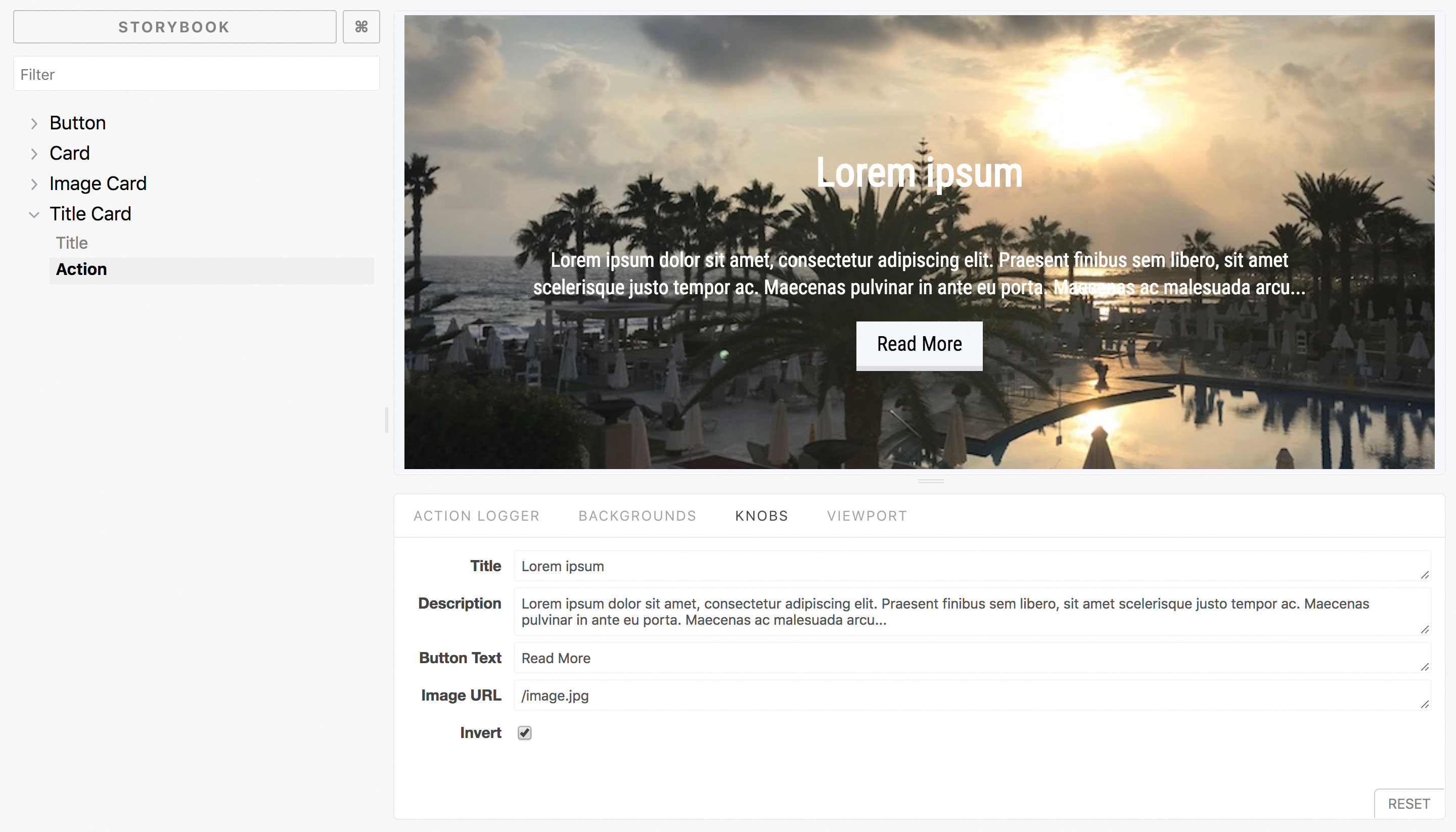
The knobs add-on comes with a set of common controls to alter the rendered props from the bottom of the screen.
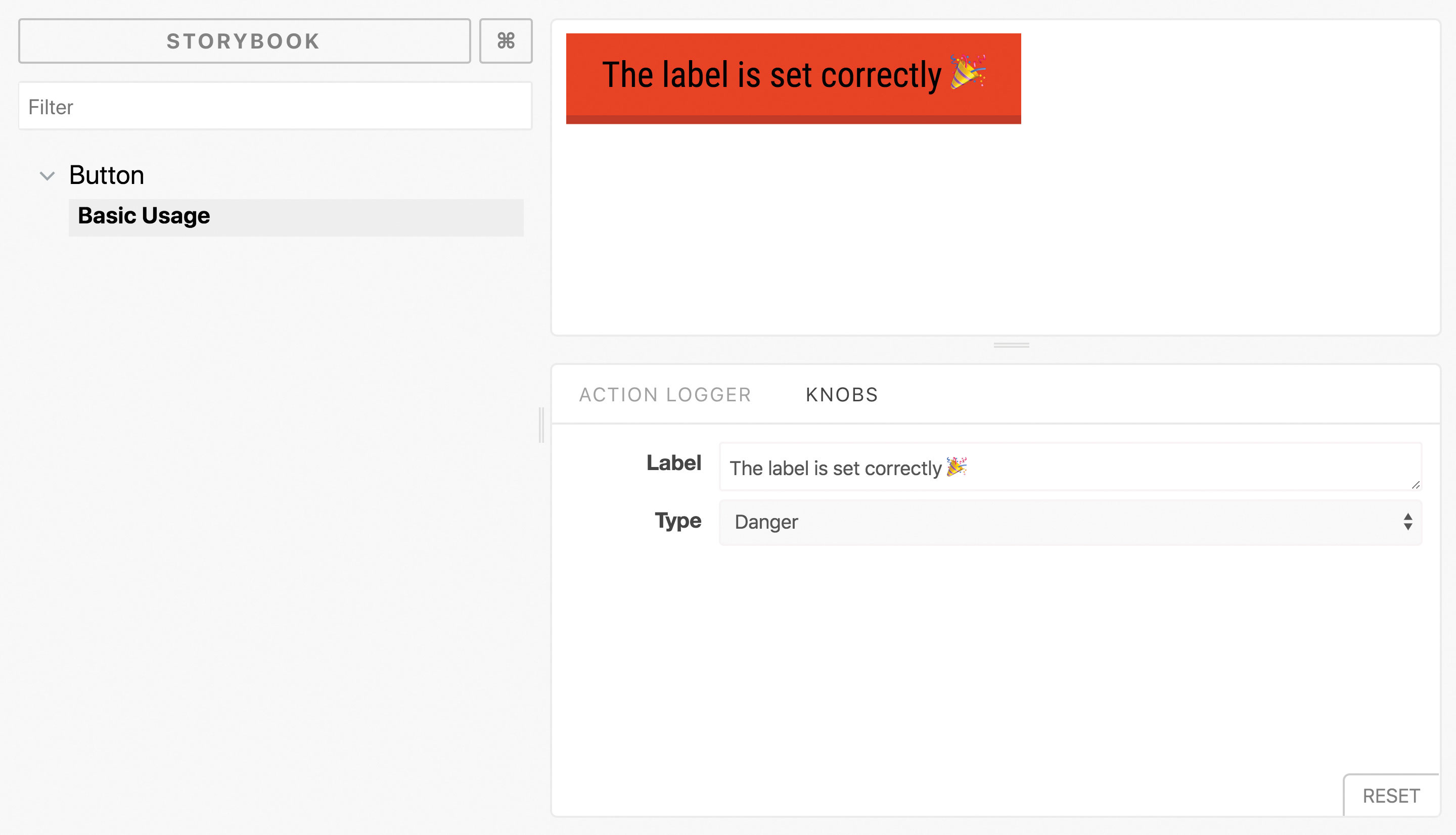
The two we want are 'text' to render a textbox for the button label and 'selectV2' to provide options for the type prop. Both take a label and default value, with 'selectV2' taking an object of options as its second argument.
import { selectV2, text, withKnobs } from “@storybook/
addon-knobs/react”;
const types = {
 Default: “default”,
 Primary: “primary”,
Danger: “danger”
};

const buttonText = text(“Label”, “This is Net Magazine”);
const type = selectV2(“Type”, types, Object.values(types)
[0]);
return <Button type={type}>{buttonText}</Button>;
The components update with the content in real time. This can be useful to see exactly at what point a design starts to break.
07. Try other add-ons
There are plenty of add-ons available to help out on any project.
The Actions add-on provides a way to dummy out actions within a component. By passing in an action as an event prop, we could check to see our button’s onClick handler was behaving correctly.
The Storyshots add-on can help create Jest snapshots from stories. When each test runs, it renders each story and compares it to the last time it ran. Any differences are flagged for investigation.
The Viewports add-on provides a pre-defined list of common viewports to check how the components behave. This helps avoid having to try and resize the window without including the Storybook sidebar.
Depending on the needs of the project, it is also possible to create custom add-ons for each Storybook project. These can be useful for common setup such as state management systems or localisation strings.
See a full list of add-ons provided by Storybook here.
This article was originally published in net, the world's best-selling magazine for web designers and developers. Buy issue 310 or subscribe.
Related articles:

Thank you for reading 5 articles this month* Join now for unlimited access
Enjoy your first month for just £1 / $1 / €1
*Read 5 free articles per month without a subscription

Join now for unlimited access
Try first month for just £1 / $1 / €1

Matt Crouch is a front end developer who uses his knowledge of React, GraphQL and Styled Components to build online platforms for award-winning startups across the UK. He has written a range of articles and tutorials for net and Web Designer magazines covering the latest and greatest web development tools and technologies.
