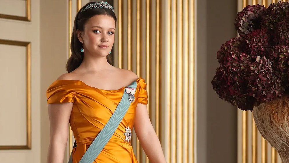
PSVR 2 has over 40 games on release, but two weeks after launch Jurassic World Aftermath Collection remains one of the standout games for Sony's next-gen virtual reality headset. Its stylised, graphic comic book visual design offers a surprisingly immersive, tense and atmospheric experience. These comic book dinos are, frankly, terrifying.
If you want to know more about Sony's new VR headset read my PSVR 2 review, and of course you'll need the latest games console, so read my PS5 review. The developer has confirmed a sequel is coming, Jurassic World Aftermath Collection 2 will release this September, so now is the perfect time to discover one of PSVR 2's best games.
So how was Jurassic World Aftermath Collection made? What choices needed to be made to ensure a cartoon Velociraptor could make you jump? And how did the the team mix in action, puzzles and taught escapes while never breaking VR's biggest rule: immersion.
To find out, I asked the team at Coatsink, including head of art Bryn Morrison-Elliot, senior UI / UX designer Adam Birch, technical lead Max Charnock and design manager Mark Wilson how they made one of PlayStation VR2's best games. Below you can read the team's reflections on developing for VR, the importance of designing in-world UI and much more.
How the Jurassic World Aftermath Collection was made
When designing UI for a VR game, what do you need to consider?
Adam Birch (senior UI/ UX): UI development in VR is very interesting, as things change a little when some UI can’t be the embedded screen solutions most players are used to in non-VR games.
When designing UI with VR in consideration, it feels like a fundamental change of the rule set in a lot of ways. There are keystones of visual design when it comes to things like a standard Heads-Up Display, almost to the degree of knowing what we are going to get from a game before we even see them.
We know a health bar will likely be near the upper left of a screen; a map upper right; a vehicle speedometer bottom right, but all of this goes out of the window when you consider that with VR there is no real ‘screen.’
While pinning UI to the players vision is a possibility, it has potential for adding towards VR sickness and so more often than not, more elegant in-world solutions have to be found. The nature of this, though, means that it's a little more difficult to have a standardized UI in the same way as a screen based one. With this in mind, extra effort has to be put into considerations such as readability, accessibility and usability.
One of the biggest benefits of the world of VR is that it is inherently more immersive over the traditional screen-based video game experience. You aren’t playing ‘as’ the character, you ‘are’ the character in a much more 1-to-1 manner of speaking. To help emphasise this, in-world UI systems help with the illusion. Nothing would snap immersion faster than having an on-screen health bar or clock counter that makes no diegetic sense being there.
How did you maintain immersion in virtual reality?
Adam Birch (senior UI/ UX): Throughout Jurassic World Aftermath, we wanted to make everything feel natural and not break the immersion.
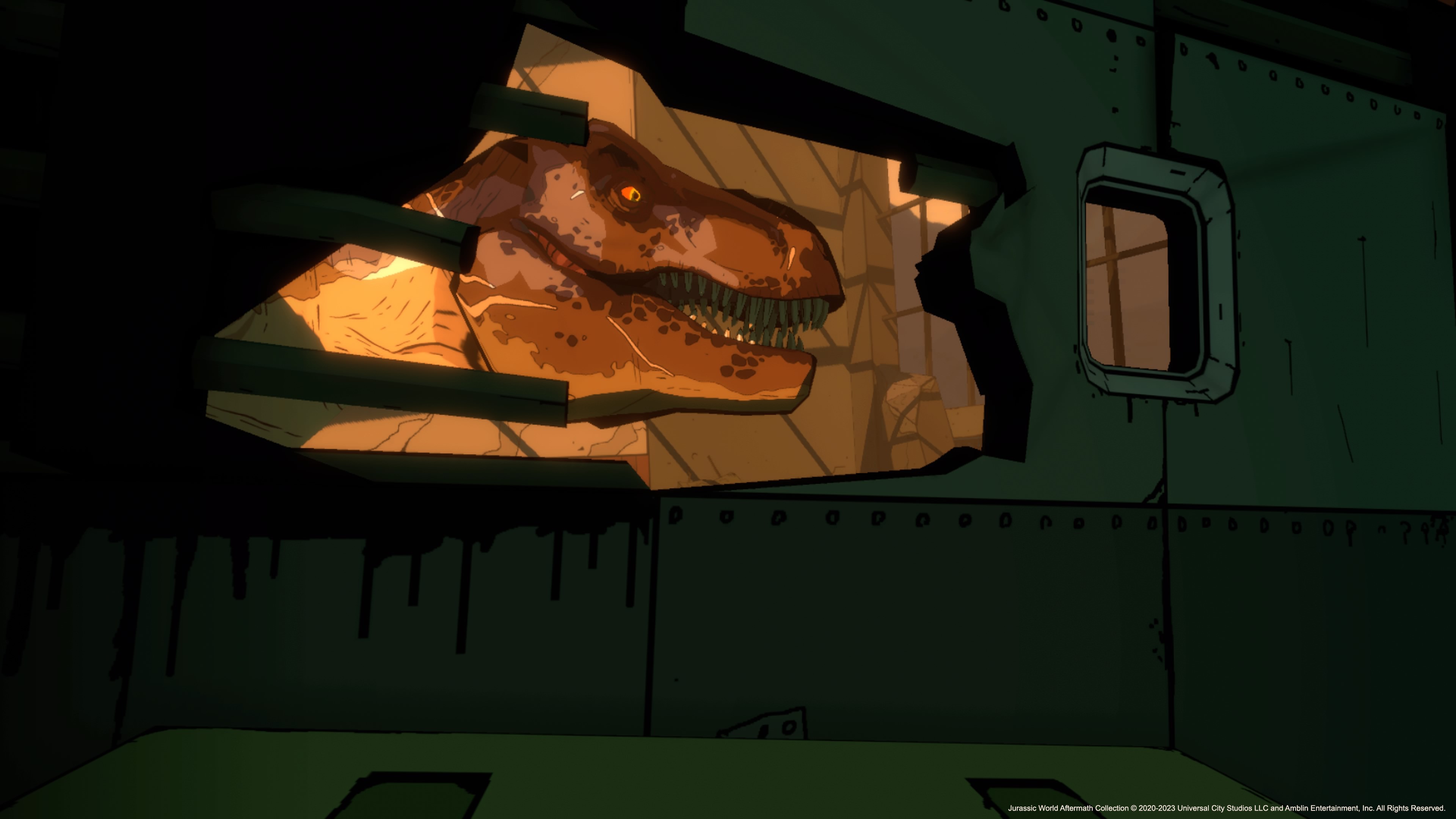
There are a few puzzles based on interactions with screens within the world. Within the game, you have access to a NavAssist on your wrist which lends itself to this world of immersion and nine times out of ten I think anything we have to do in our day-to-day real lives can be found on the digital readout of our phones, and so it isn't much of a sci-fi logic leap to have objectives and pointers on a smart watch-style device.
If we had to think traditionally, opening up a menu would take you out of the experience and back into the realisation that you are actually just playing a video game. The difficulty of this is balancing it out with the needs of the player. VR games often have many settings due to the comfort options needed for the variety of players, and as such a concession has to be made somewhere to fit these large menus in.
Why did you choose the comic book visual style?
Bryn Morrison-Ellliot (head of art): Many factors went into our decision to use a comic book visual style. While developing the game initially, we had to think creatively to overcome the graphical limitations that could come with mobile VR development. Our artists love stylization so naturally the comic book style fitted perfectly with what we wanted to achieve.
There is something timeless about comic and cel-shading visual styles in games. If you look back on previous generation titles like The Legend Of Zelda: The Wind Waker. It is a fantastic example of a stylised game that still holds up in quality. Stylisation can work well when playing into limitations. It can look intentional. Whereas with realism it can sometimes look as good as the tech you’re working with.
During pre-production we invested a lot of time into translating a comic style into 3D. Things like texturing with a pixel perfect brush to get crisp lines as well as custom lighting with flat colour and hard shadows. We wanted to add to the Jurassic World franchise in an interesting way but wanted to achieve a style that felt timeless.
Technically, how did you achieve Jurassic World Aftermath's look?
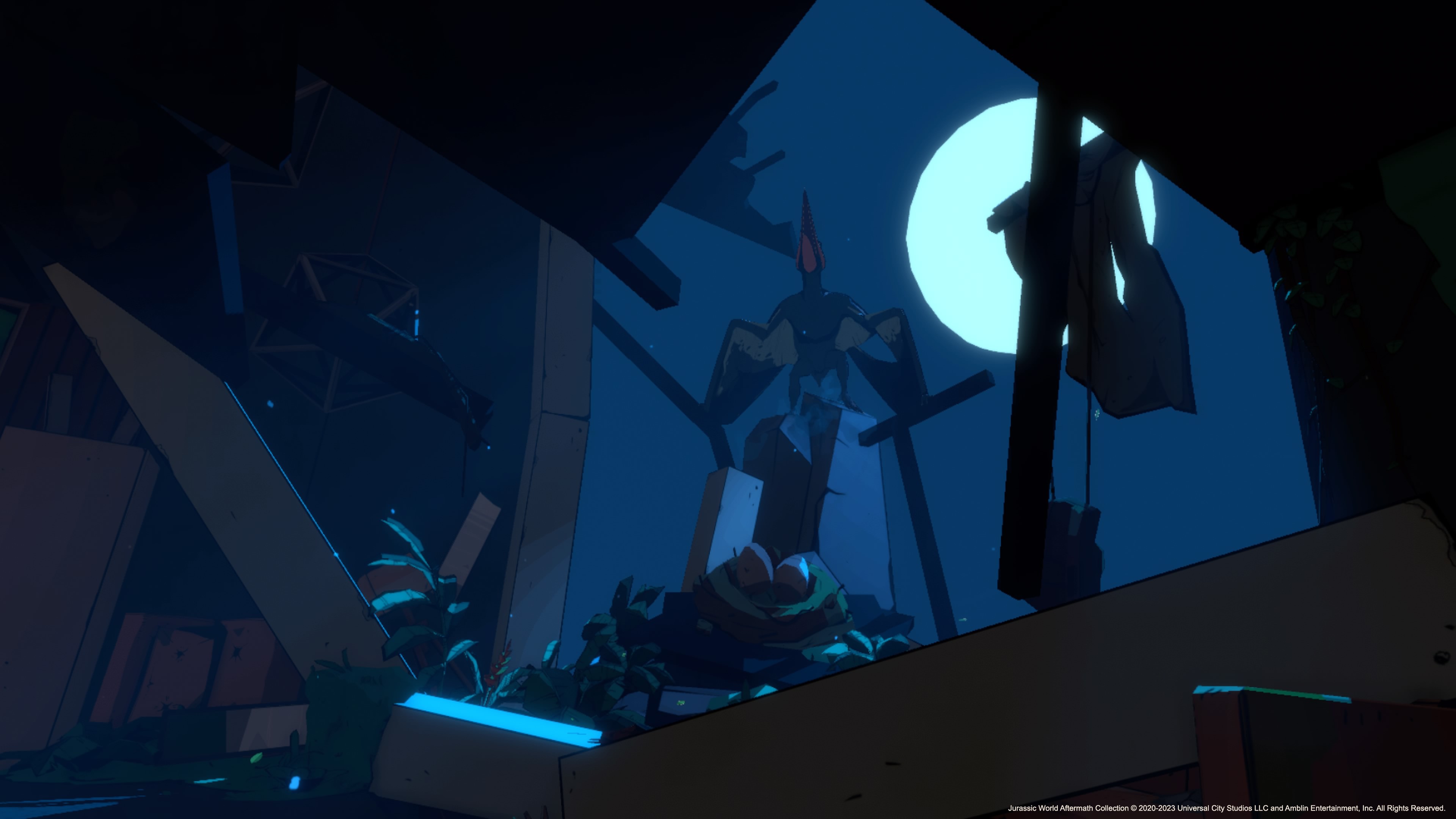
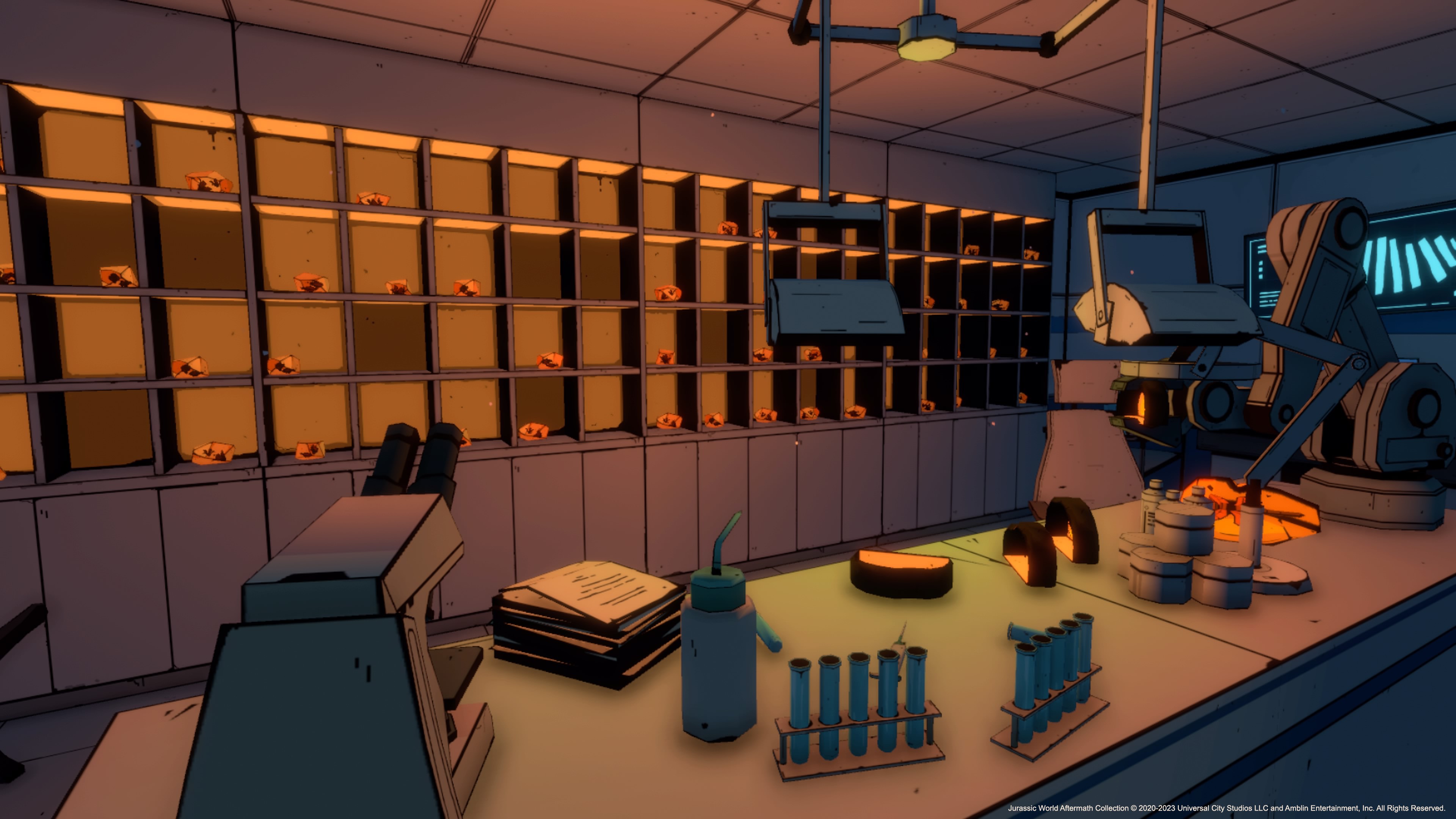
Bryn Morrison-Ellliot (head of art): On the technical side, we explored many things to achieve the style. We looked into mipmapping and pixel brushes to get crisp line work and edges that stay consistent at varying distances from the camera. Custom lighting to keep colour difference crisp and stylised. For the PlayStation VR2 version, we improved all these features. In previous versions, due to limitations, we were limited to a set number of lights per scene and utilized a lot of vertex lighting.
Vertex lights calculate per vertex instead of per pixel, which is cheaper to calculate but with a caveat that vertex lighting does not calculate shadows. In the PS VR2 version, we had the performance budget to replace many of these lights with dynamic lighting that create shadows and add depth.
For the PSVR 2 version, we felt it was important to update the render pipeline because the previous one was made specifically for the Quest and its capabilities/limitations and wouldn’t support high quality shadows, points lights and screen space effects (post processing).
These are all features we wanted to include as we knew they would add depth to the scenes which we felt would improve the tone. Jurassic World Aftermath Collection has some scary and tense moments when exploring rooms and corridors, added shadows, volumetric lighting and ambient occlusion crank that experience up to 11.
What improvements have you made to Jurassic World Aftermath Collection for PSVR 2?
Mark Wilson (design manager): The PSVR2 version of Jurassic World Aftermath Collection takes advantage of its capabilities with a range of enhancements, including volumetric lighting, Screen Space Ambient Occlusion, Bloom and improved shadows. In addition to this, we could also improve the lighting, limitations on previous versions meant were limited to the amount of lights per scene, which meant some interior areas could look flat compared with exterior areas.
The PlayStation VR2 version allowed us extra performance budget to add additional lighting to the scenes, giving more visual depth which adds to the tone. The additional background foliage gives more life to scenes within the world of the game. Visually, the PSVR 2 gave us the room to include everything we originally scoped for the game as we had less restrictions to consider compared to mobile VR.
Are there any other art or design additions on PSVR 2?
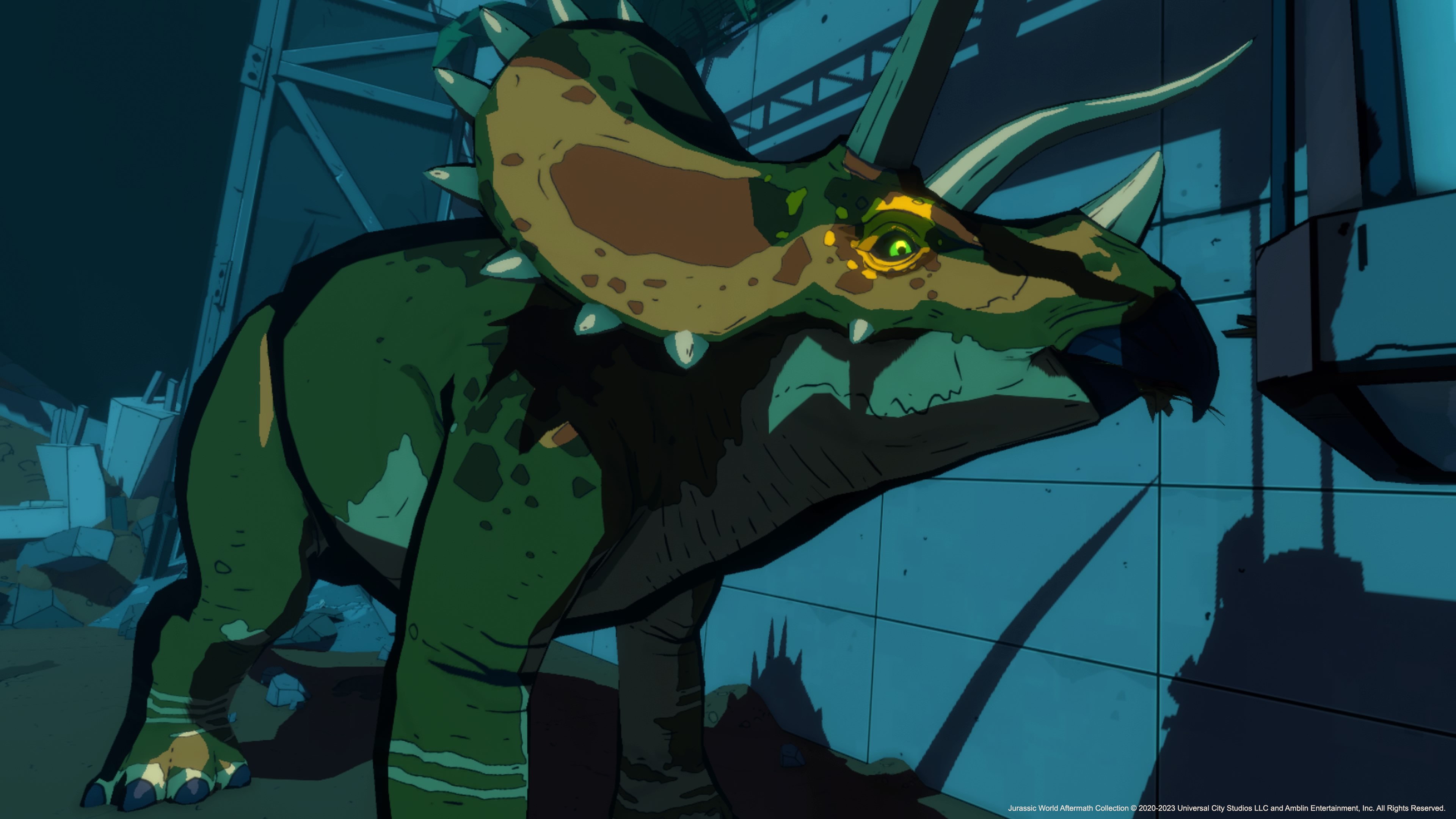
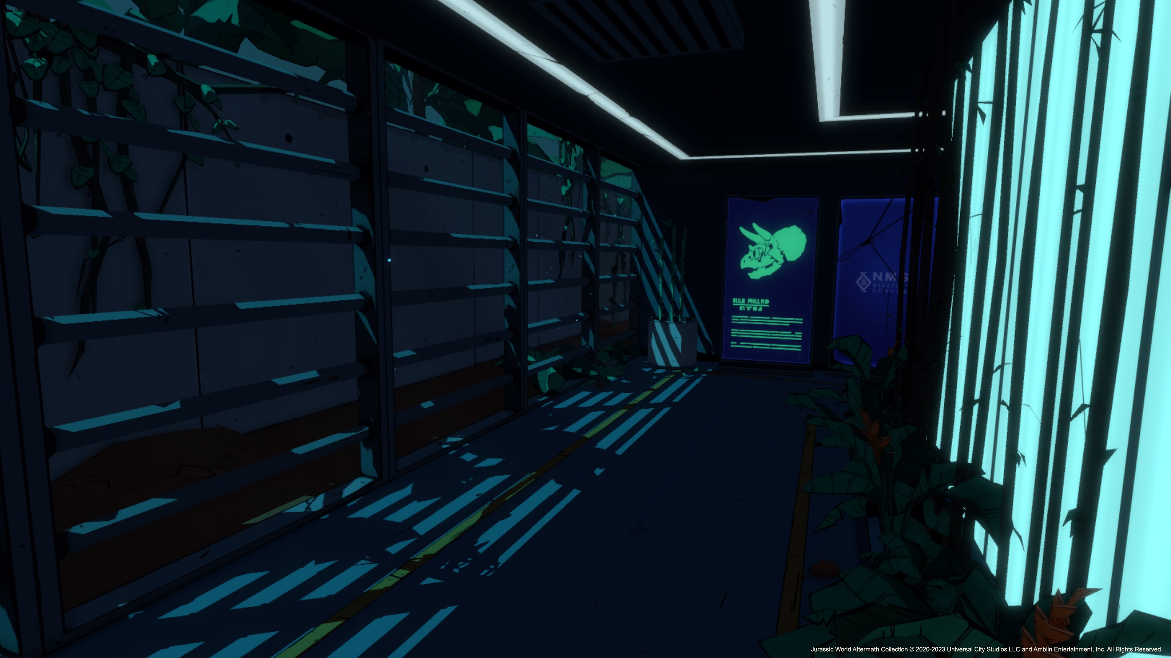
Mark Wilson (design manager): We also wanted to include an option which allowed the player to appreciate the dinosaur models and animations up close and without having to worry about their AI behaviour. To do this, we created a dinosaur gallery, a separate scene that took the form of a long corridor which looked like it could have been pulled straight from a segment of the main game. The corridor contained access to multiple rooms, with each dedicated to a dinosaur encountered in the game.
Initially we had concerns that having access to this feature from the get-go would ruin the surprise of encountering each dinosaur in the main game, so we simply locked each room off until the corresponding dinosaur was encountered. We played around with multiple options for the complexity of the Gallery, with the lowest bar option being to simply place the player in front of a console featuring a button for each dinosaur. When pressed, the corresponding dinosaur would spawn in, where it could be appreciated from a distance.
We decided that the highest bar option was the best one. The Gallery more closely replicates an actual level within the game, giving a sense of tension as you wander into each room and are brought face to face with each dinosaur in an environment built to specifically match the danger level of that particular one. A great example of this is the Dilophosaurus, which can be found at the end of a creepy staircase which gets darker as the player descends.
How long did it take to get the AI for the Velociraptor right?
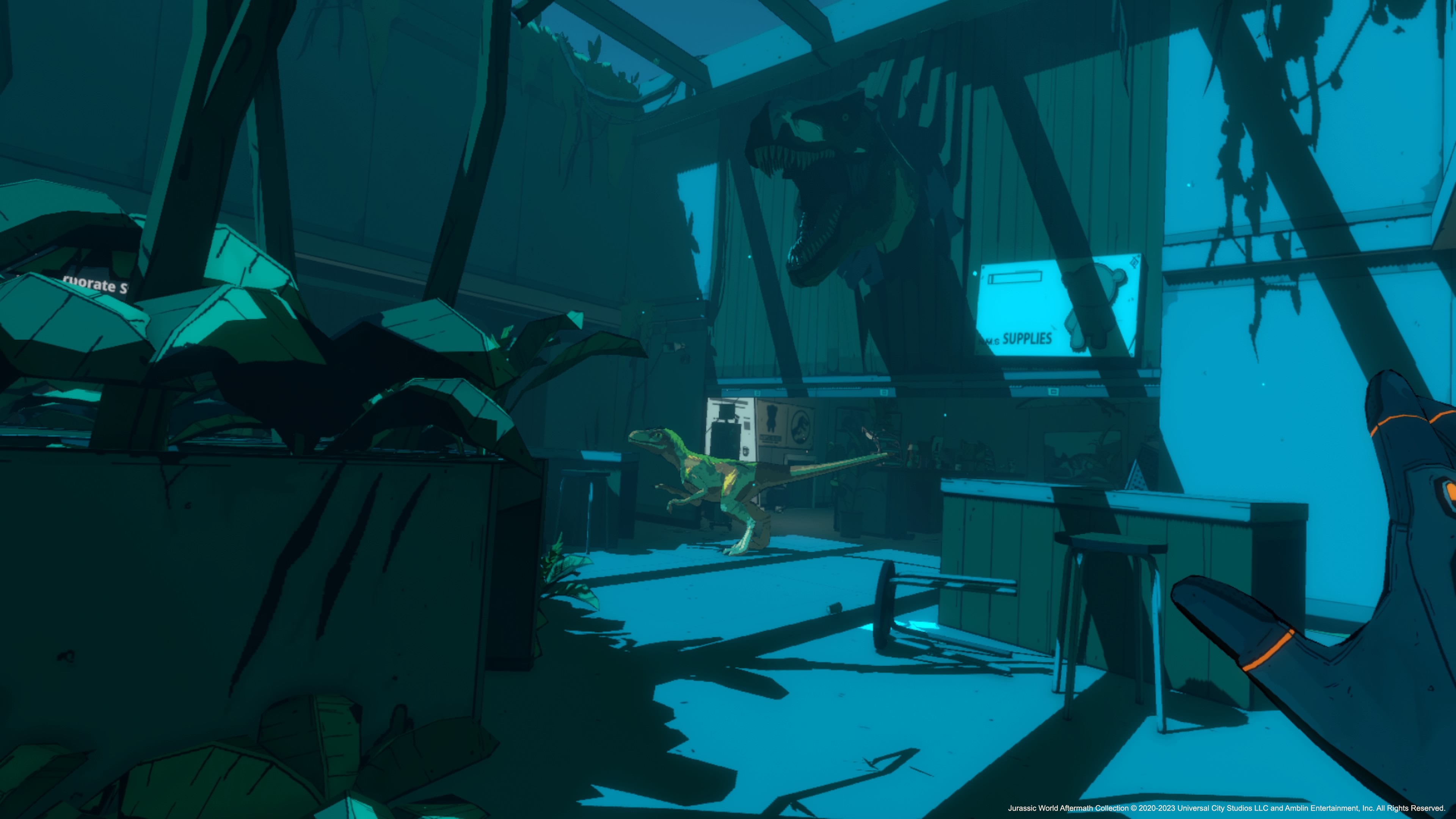
Max Charnock (technical lead): The main goal was to make it feel like an actual dinosaur which took a long time to achieve. Root motion with movement helped a lot to make its movements feel natural but required a lot of correction to ensure it didn't clip into geometry all the time. For a long time, the Velociraptor didn't feel quite right as it’s very easy to see strange behaviour in an animal as we are evolutionally trained to see it. So it took a lot of watching it play and tweaking it to refine that natural feel.
We use the experimental AI package for the Velociraptors pathing and the Velociraptor itself is relatively simple system with a state machine to handle the player interaction behaviour and the wandering behaviour, working off a queue of actions which the Velociraptor can fill if emptied by querying the environment around it or can be manually filled via events for cutscenes.
The biggest issue we ran into was that we needed to strike a hard enough balance between it functioning and feeling natural, but we struggled with the correct sizing of the Velociraptor.
It had to be a good balance between being intimidating and not being a huge burden on art and programming to make it fit in the environments. The Velociraptor was originally about 25 percent larger but that made the environments feel too open.
So what happened next?
Max Charnock (technical lead): We went back to the drawing board and rewrote it in another four months. The implementation of the AI stayed pretty much the same after we re-worked the AI from the ground up again. This gave us time to test and add new things to refine it. We were constantly adding new animations, tweaking pathing, fixing bugs with new environments and adding new features such as vaulting. It required strict guidelines to design about how large spaces could be for the Velociraptor to be able to traverse. We quickly discovered that the Velociraptor is longer than it is wide so the spaces needed to be wider than you think to support edge cases.
A lot of time was spent pathing to ensure it was adaptable enough to support a wide array of environments, by having it run through an obstacle course of bad edge cases and in different elevations as the Velociraptor required an animation to jump.
The rest of the project we tweaked and refined things late into the game's development to get the Velociraptor feeling right. AI is one of those things that can be perfectly functional but require constant tweaks for it to act natural within the environment.
Have the design rules for VR been set or are you finding new ideas?
Mark Wilson (design manager): Due to the variety of games we work on at Coatsink, it’s not always possible to carry over the same design principles from one project to another. With each project, there’s always a good amount of unknowns and key questions we simply need to work hard to find the answer to. It’s also important not to be too rigid with rules.
VR as a technology is continuing to develop, giving us new and improved ways to let the player engage with the worlds we give them, past findings and rules should simply be kept in mind, not carbon copied from one project to another.
That being said, there are some fundamental guidelines which need to be remembered when developing in VR, such as keeping affordability in mind, if an object looks like it can be picked up and used, it should be possible. There’s nothing more disappointing than trying to interact with something that looks fun to interact with in VR, only to have it be a static mesh sat in the environment.
We also want to ensure we include great comfort options to make our games as accessible as possible. This includes options for customizing the locomotion by offering snap turning, step turning or smooth turning. The vignette which appears during key actions such as moving, sprinting and crouching can also be tweaked. Players can choose to increase or decrease the size or even completely remove the vignette if they wish.
And, as a final example, we also offer the option to play in Seated Mode, which allows the player to be seated but increases the height of the player character in the game, providing a consistent experience no matter how they decide to play.
How did you find developing with the PSVR 2's haptics?
Mark Wilson (design manager): The additional headset feedback provided us with a fantastic way to further showcase the impact and awe of certain segments in the game. The best example would be the T. rex roar. In VR, seeing the scale of such a thing feels amazing, but being able to deliver the additional impact of having the headset rumble just takes the moment to new heights.
Haptic feedback is such a versatile tool - it can add impact to certain moments, such as the example above, or it can be used in more subtle ways, such as delivering feedback to the player when they’re performing an action as intended (or not), so the more options we have to make use of it, the better!
Is creating for VR something artists can dedicate themselves to?
Bryn Morrison-Ellliot (head of art): For artists, absolutely! VR development for artists can be challenging in a great way. You see more in your peripheral when in a headset which you have to consider in the composition of scenes and assets in-game. This can be very different to non-VR development.
As mentioned before, standard on screen solutions to things like UI are best solved diegetically in VR. There is a physicality to interactions in VR which art and design work together in interesting ways. Opening a door might not be the press of a button but instead, you hold and twist a doorknob and slowly open a door by pushing forward.
Other than missing our colleagues in person, we were really fortunate to not be impacted significantly during production during the Covid-19 pandemic. We have a great IT team who had the studio up and running remotely very quickly and seamlessly.
Jurassic World Aftermath Collection is out now for PSVR 2, visit the game's website for more details.
Read more:
- I played Switchback VR on PSVR 2 – it's blinking terrifying
- PSVR 2: everything you need to know
- Best PSVR 2 games: what to play first
Get the Creative Bloq Newsletter
Daily design news, reviews, how-tos and more, as picked by the editors.

Thank you for reading 5 articles this month* Join now for unlimited access
Enjoy your first month for just £1 / $1 / €1
*Read 5 free articles per month without a subscription

Join now for unlimited access
Try first month for just £1 / $1 / €1

Ian Dean is Editor, Digital Arts & 3D at Creative Bloq, and the former editor of many leading magazines. These titles included ImagineFX, 3D World and video game titles Play and Official PlayStation Magazine. Ian launched Xbox magazine X360 and edited PlayStation World. For Creative Bloq, Ian combines his experiences to bring the latest news on digital art, VFX and video games and tech, and in his spare time he doodles in Procreate, ArtRage, and Rebelle while finding time to play Xbox and PS5.
