Designers react to Grey London's speculative WWF rebrand
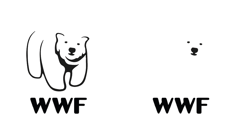
The minimalist concept logo for WWF has caused a bit of a stir with designers.

A rebrand is one of the most difficult challenges a company can embark upon, especially if you already have a distinctive image and logo design that everyone recognises. However, times move on and if your current branding is starting to look dated, maybe it's time to call in the designers.
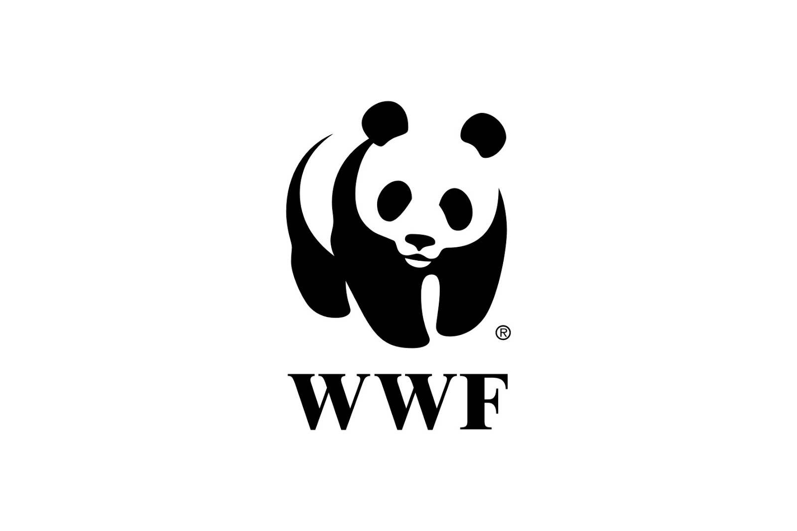
Grey London certainly thinks this is the case for WWF, whose distinctive giant panda logo has been going for years. As the giant panda has managed to work its way off the endangered species list, the team decided to explore a more relevant and contemporary design in the shape of a new polar bear logo that melts away into negative space.
The studio's reasoning was that the concept logo reflects how the polar bear's natural habitat is melting away beneath its paws. It's an interesting design loaded with WWF's message, but would it work in reality? We rounded up design experts and heard what people were saying on Twitter to gauge the logo's success.

Staying relevant
“WWF’s logo is the most iconic in conservation," says Wiktor Skoog, strategic design director at Grey London. "When it was designed in 1996, when giant pandas were one of the world’s most endangered species, and climate change wasn’t yet a going concern."
"However, fast-forward 50 years and the giant panda is no longer endangered, while climate change is the single biggest threat to all wildlife. We wanted to highlight (and get people talking about) this by designing a logo that symbolised not just one species, but all of them.
"And what better symbol than the polar bear – an animal whose habitat is literally melting away from beneath its feet, and one that has become the unwitting poster boy for the phenomenon that could one day wipe out the entire species. We offer our polar bear – as well as an entire corporate identity rebrand – to WWF free of charge.”
Scaling issues
“I think the idea of WWF celebrating that the panda bear is no longer endangered, and bringing attention to a new species in need, is great," says Kenny Lopez, UX designer at Atom Agency Design. "I only wonder how this new logo scales when applying to smaller print or digital media. The abundance of white space, combined with three small black dots for the eyes and nose, may not be enough to keep the brand recognisable at a quick glance.”
Get the Creative Bloq Newsletter
Daily design news, reviews, how-tos and more, as picked by the editors.
Beyond brand recognition
“We see a lot of speculative rebrands on Computer Arts," explains the magazine's art editor, Jo Gulliver. "Some are an attempt to beef p a thin portfolio with something more ‘big brand’; some are in direct response to student briefs from brands via the likes of D&AD New Blood; and some, like Grey’s work for WWF, are about making a statement – in this case, about endangered species.
"Responding to the fact that the giant panda featured in WWF’s iconic logo is no longer technically endangered, the agency has offered this alternative. It’s a really commendable exercise, but practically speaking, the amount of negative space makes the mark challenging to use at small sizes. And while the new concept is more factually accurate, it’s at the expense of brand recognition and heritage – a difficult trade-off for any global brand.”
Here Is How The New WWF Logo Might Look Like [nice one guys - love it - but we are sticking with the panda! 😀] https://t.co/iKiw9UdNXtMarch 1, 2017
.@DermotOz or how about a new WWF logo w/Maugean skate? Not as cuddly as a panda but #Tasmania endemic & endangered conservation status? pic.twitter.com/0kpHjaovMxMarch 3, 2017
I always loved WWF's logo, but I also love this offer from @GreyLondon https://t.co/bSuaZ21DCPFebruary 22, 2017
This article was originally published in Computer Arts magazine issue 263. Buy it here.
Related articles:

Thank you for reading 5 articles this month* Join now for unlimited access
Enjoy your first month for just £1 / $1 / €1
*Read 5 free articles per month without a subscription

Join now for unlimited access
Try first month for just £1 / $1 / €1

Rosie Hilder is Creative Bloq's Deputy Editor. After beginning her career in journalism in Argentina – where she worked as Deputy Editor of Time Out Buenos Aires – she moved back to the UK and joined Future Plc in 2016. Since then, she's worked as Operations Editor on magazines including Computer Arts, 3D World and Paint & Draw and Mac|Life. In 2018, she joined Creative Bloq, where she now assists with the daily management of the site, including growing the site's reach, getting involved in events, such as judging the Brand Impact Awards, and helping make sure our content serves the reader as best it can.
