Design with real content for a better UX
A lot has been written about how designing with real content improves the design process. But it can vastly improve the end-user’s experience too.
Before we dive into the benefits to the user experience, let’s clarify our terms a little.
First, while you’ll often hear people discuss this concept as “designing with real data,” I prefer to use content, as it better captures what a designer works with. After all, you wouldn’t normally refer to an image as “data,” would you? If it helps, you can think of content as “data in context.”
What's "real" content
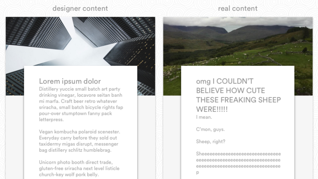
Somewhere along the evolution of design, someone got the idea that you don’t actually need real text to create a design. That you can just throw in some arbitrary Latin until the “real” stuff is ready. Hence, lorem ipsum and its many, many more-or-less hipster offshoots.
But recently, people have begun to realise how utterly mad that is. Sure, some forms of content can just be dropped into any old design and called “good.”
But usually, that’s not the case. Even your “standard” blog often features a variety of content types, including listicles, interviews, case studies, walkthroughs, etc. Each of which could certainly benefit from a unique presentation designed to highlight the content type’s unique characteristics.
Enter designing with real content. It’s an offshoot of content-first design that asks designers to not only start with content, but to start with the real content that real people in the messy, real world actually make and share.
Note that “real” content can consist of:
- Actual photos and status updates from ordinary people
- Client-produced content for freelance sites
- Polished copy produced by professional copywriters
Okay, so what’s content-first design?
Content-first design prioritises the creation of a website’s content — or a review and analysis of existing content — before design begins.
That doesn’t mean content can’t be iterated upon and refined in an agile way once the design process has begun. (In fact, it absolutely should be, to ensure that copy and design are speaking with the same voice.) It just means knowing what you’re working with before you start working with it.
Get the Creative Bloq Newsletter
Daily design news, reviews, how-tos and more, as picked by the editors.
With our terms in place, let’s get to the benefits of designing with real content.
Content highlights the “edge cases” — i.e., the real world
Designers love ideal content. And you can’t blame them: beautifying content is one small part of what they do. But in the real world, few people make pretty content.
Instead, they join the hot new website, fill out half their profile fields, upload a picture of two, and call it a day. Or they write “really long headlines” and upload low-res pics to their blogs.
That’s real life.
When you understand that, you don’t stop at designing “ideal” user profiles that feature:
- Short, Anglo Saxon first and last names
- Hundreds of beautiful photos, regularly supplied
- Short passages of textual content
- A lively variety of “updates” covering all the content types
You do one of those, sure.
But your other mocks highlight the real world. A world full of:
- Long names
- Names that need to be listed in more than one language
- Names that run right-to-left, not left-to-right
- Sparse, poorly lit, awkwardly cropped photos
- Silly avatars in place of headshots
- “Shares” that are really just bare links, without commentary, that generate empty previews
These aren’t “edge cases.” They’re snapshots from the real, messy, disorderly world. The better you understand that, the better you’ll understand your users — and how to design for them.

And lest the above example mislead you, the benefits of designing with real content don’t stop at social networks. They apply to any website that uses content generated by people who aren’t you. I.e., all of them.
After all, just imagine mocking up a blog where every headline is exactly three words long. Do you even talk to the blog editor, bro?!
Starting with real content puts you in the user’s shoes from the get-go
Most website visitors don’t come for the gorgeous design, “delightful” interactions, or quippy copy.
They come for the information they need to get stuff done.
By taking a content-first approach to your design, then going a step further to use real content, you prioritise an attempt to understand both:
- What you have to work with
- What the end user is looking for
And that helps you ensure that the right information gets highlighted in the right places in the final design.
In a sense, when you prioritise content production or analysis before the design, you’re taking the same path your user will: wading through a sea of information in search of what you need. By walking yourself through that process, you’ll gain a better understanding of what’s available, what your customers want, and how to organise your content to help them better understand what you (or your client) offer.
3 tools that help you work with real content
Obviously, you can pull real content into any design tool to bring more fidelity to your web and product designs. But there are a few tools that really shine when you’re working with real content.
Webflow CMS
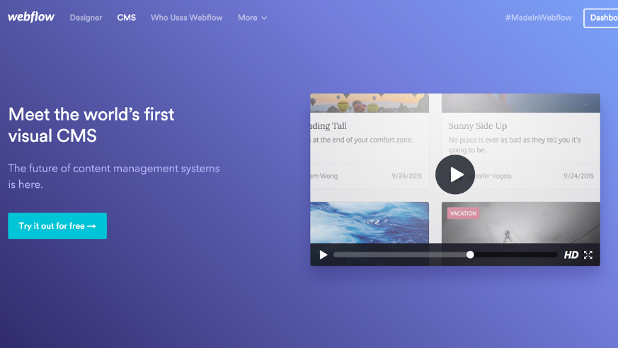
Launched late in 2015, Webflow’s visual CMS works beautifully with a content-first workflow. Just create a Collection from 13 basic building blocks (ranging from images to links to references to other Collections) to create a totally custom structure, input your content, then start working with that content to build the perfect design. You can even pull sample “dummy” data to kickstart your design process.
Craft Data plugin for Sketch
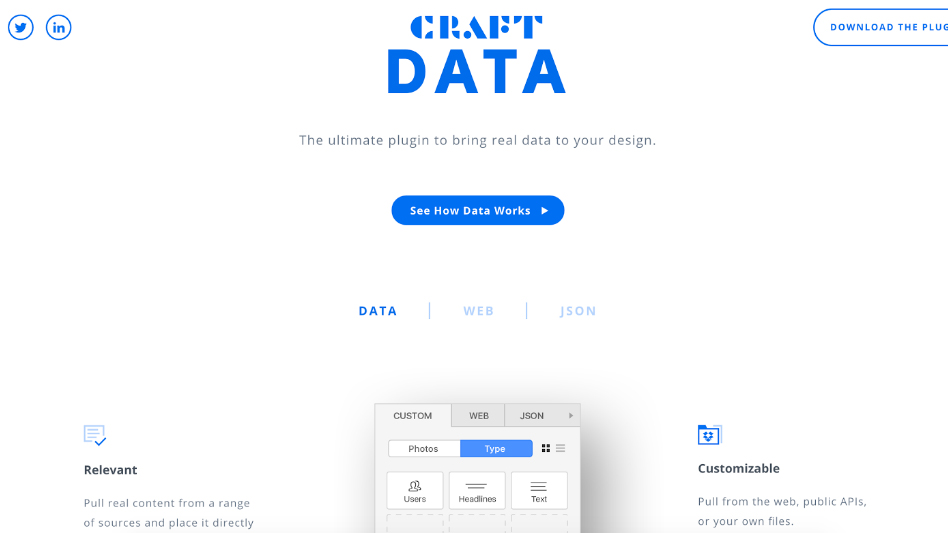
This free Sketch and Photoshop plugin from InVision LABS lets you pull real content from your own files, existing websites, or JSON files and plug it right into your designs.
Random User Generator API
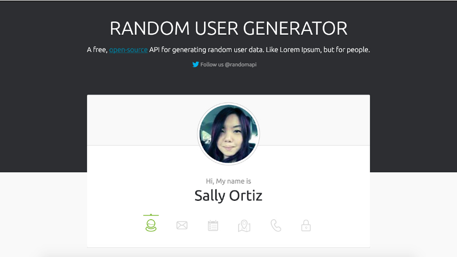
If you’re a code-slinger or Photoshopper, Random User Generator lets you generate JSON, SQL, CSV, or YAML objects you can place right into your designs.

Thank you for reading 5 articles this month* Join now for unlimited access
Enjoy your first month for just £1 / $1 / €1
*Read 5 free articles per month without a subscription

Join now for unlimited access
Try first month for just £1 / $1 / €1
