Design for offline
Discover how offline first is forcing the next evolutionary step in good UX design.
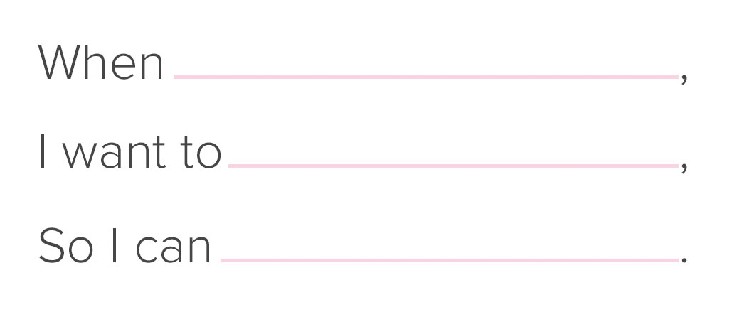
When we're ready to work on our offline UI, whether starting from scratch or improving upon an existing product, it is wise to be mindful of our product's core interaction(s). This interaction (or group of interactions) is what our users do to repeatedly get value out of our software.
Where possible, we should use this interaction model to help communicate offline state.
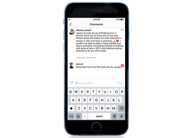
For example, Instagram's core interactions might be scrolling through lists of content as well as creating and manipulating it. When we are offline, we're able to interact as we do online, allowing us to go as far as we can without running into roadblocks of functionality.
When attempting to save, the app places the content in an unobtrusive "waiting" state that is using an existing feedback mechanism to communicate to users that it hasn't yet been uploaded.
While it may seem obvious at times, noting our core interactions is a useful practice in helping us maintain continuity in how customers expect to interact with our app. The additional benefit is that we can reuse UI where they're already looking for clues of cause and effect.
While not all breeds of software products can deliver their entire functionality when they're offline, they can provide partial value or clues that it existed to begin with. The bottom line is that they must clearly communicate state.
Instagram and Slack are great examples of apps delivering as much value as they can up to their reasonable limits while also unobtrusively communicating state.
Get the Creative Bloq Newsletter
Daily design news, reviews, how-tos and more, as picked by the editors.
The need for assurance
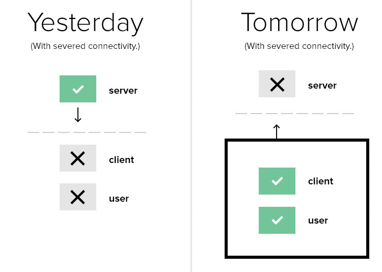
Not all applications are the same, of course, so design patterns for these situations will largely depend on who you're trying to serve, where they are and what they need to do. There are some common clues related to offline experiences, however. They are reach, freshness and reliability (Jesse Beach refers to this as assurance).
Reach is about communicating how far users may explore in our application while offline. To use a videogame analogy, if our users are bound to a single linear path, we don't necessarily want it to appear as though they're operating in an open world. The result of doing so could mean a lot of wasted time on dead-end paths on a quest to unreachable or non-existent areas.
If state isn't well communicated here, it can become difficult to know if that area is purposefully inaccessible or if there is a bug in the system.
So, we can improve our user experience by establishing clear boundaries when they are in an offline state. Those boundaries should be composed of reachable and unreachable content or actions.
The visual indication of something that is reachable or unreachable will vary by product. For instance, an eCommerce site may fade out products that are not reachable when offline, but in applications comprised of content feeds – such as Twitter – the interaction to load more content has no static visual affordance, so there is a need to find a different solution for communicating reach in this circumstance.

Instagram's approach to this is to use its intercom UI pattern to alert users to their lack of connectivity. The application provides users with a means to attempt to load more content, but is consistent with its feedback for why it was unable to perform the request.
While reach helps users understand what can be done, freshness lets them assess whether or not an action is worth their time. It might be represented as a date on a news article, a timestamp for the last time a currency converter rate was updated, a last-edited date for a collaborative document, or perhaps when a photo was last viewed.
For example, if the weather forecast was last downloaded just three minutes ago, users may as well spend the next two minutes putting on their rain coats, rather than waiting for a new forecast to download.
Comfortably offline
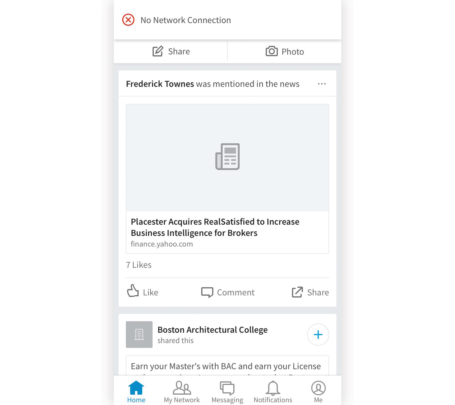
The combination of these clues helps our users breeze through our application with greater contextual awareness and agility. In the cases where offline state forms an impenetrable barrier for an action (such as saving edits to a collaborative document), the combination of clues of reach and freshness deliver a sense of reliability.
When one attempts to upload a photo to Instagram without connectivity, the photo and work they've done to it isn't destroyed due to an inability to send it to the server. Instead, Instagram saves the photo to their device and retries that upload until the user decides they don't want to anymore. This is an example that treats offline clues of reliability very well.

What we want to achieve in communicating reliability is simple: make it clear whether or not the data that users are concerned with is their responsibility or the app's when they're offline.
We need to immediately answer their questions of whether or not data syncs automatically when they reconnect, whether further action to sync is required, or whether any progress will be destroyed. A good rule of thumb is to allow users to go as far as possible while reliably preserving data locally until connectivity is restored.
With a process focused on context, motivations and accessibility combined with an awareness of reach, freshness and reliability clues, the designer improves much more than simply the offline experience. It won't be simple, but in the process they'll have created an accessible, fast and easy-to-use product from the start. This is the promise of designing offline first.
This article originally appeared in net magazine issue 293 – buy it here!
Further reading:
You might like Jesse Beach's takeaway from the second Offline Camp in Santa Margarita
Related articles:

Thank you for reading 5 articles this month* Join now for unlimited access
Enjoy your first month for just £1 / $1 / €1
*Read 5 free articles per month without a subscription

Join now for unlimited access
Try first month for just £1 / $1 / €1
