Define a brand with handmade type
Back in 2013, there was public outcry when the sort of coffee drinkers that pride themselves on being 'artisanal-inclined' suddenly tasted an extra bitterness to their lattes. They felt duped when it was revealed their friendly local cafe was, in fact, part of their perceived ‘enemy’, Tesco.
The supermarket giant had invested in a chain of coffee shops called Harris + Hoole, which have all the accoutrements of cosy little local shops; namely, black and white chalk boards detailing produce, and hand-drawn script fonts adorning the windows. Funnily enough, it was those same windows that consumers suddenly saw straight through: no longer could they assume that craft-led typography and whimsical chalk lines equalled independent.
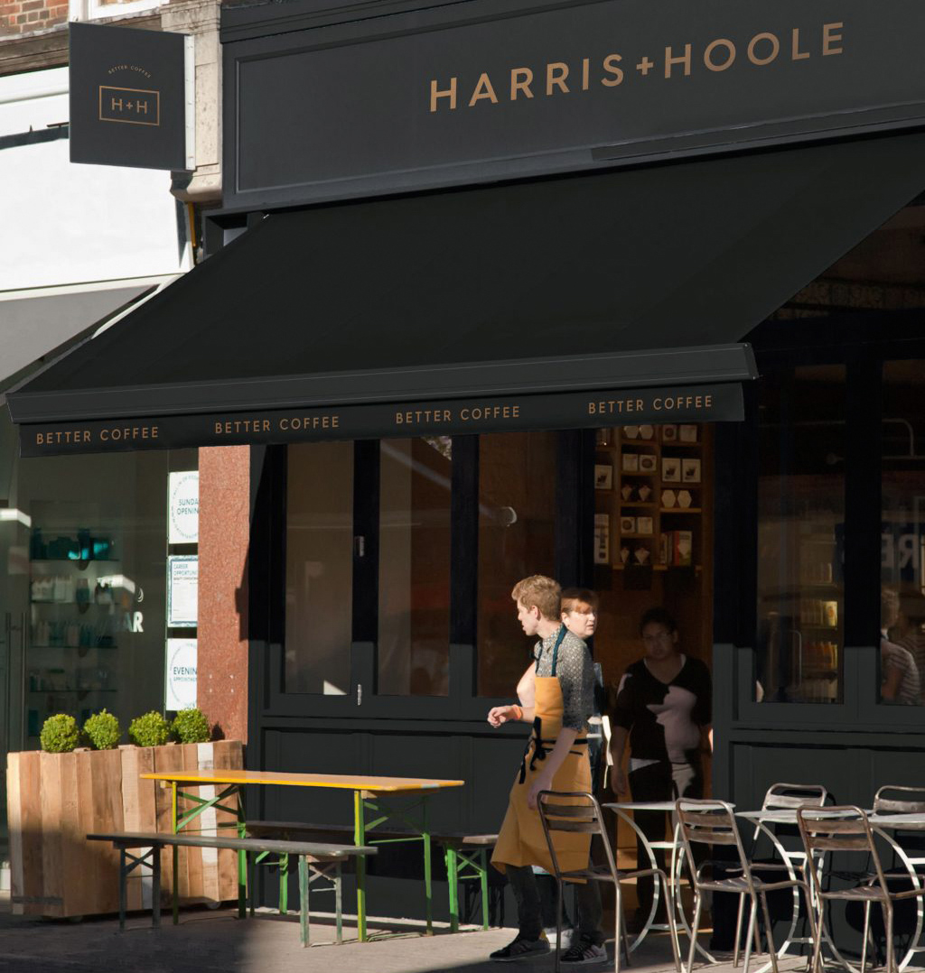
What can we learn from this? Perhaps, that it really is as simple as the typography we use – and the impression that it was done, by hand, by a real human – to persuade people of a brand’s ethos and provenance.
The Harris + Hoole hoo-hah explains a lot about the trend we’ve seen in recent years for such branding, using distinctly crafty feels and a handmade approach. It’s not just to fool people, of course: in most cases, this trend can only be seen as a boon for brands, agencies and individual lettering practitioners. It means brands are actively taking the time (and budget) to invest in thoughtful work, agencies are pushing the boundaries of their craft skills in-house and in their commissioning, and individuals are seeing skills they’ve long practised become valuable assets.
Big brands working with small specialists
Three decades have passed since Mark Josling set up his hand-sign painting business Spectrum Signs, which was founded in 1988 in his parents’ garage. Now based out of an Aladdin’s cave-like outhouse in west London, Spectrum works for clients ranging from local pubs to Pret a Manger to Coca-Cola.
The whole digital and vinyl thing went too far, and I think a lot of people wanted to get away from that
Mark Josling
A lot has changed in the industry over the past 30 years: a couple of decades ago, hand-lettering seemed to be on the way out, replaced with easily produced and increasingly cheap vinyl production. But around seven years ago, the design and branding world suddenly fell in love with hand-painting again, something that’s understandably cheered Josling.
“The whole digital and vinyl thing went too far, I think a lot of people – designers especially – wanted to get away from that. They wanted something a bit different,” he says. “The internet played a massive part, because years ago the perception was that nobody’s doing it. Now you can just put it in a search engine and find someone. I don’t think this is going to go away now.”
Daily design news, reviews, how-tos and more, as picked by the editors.
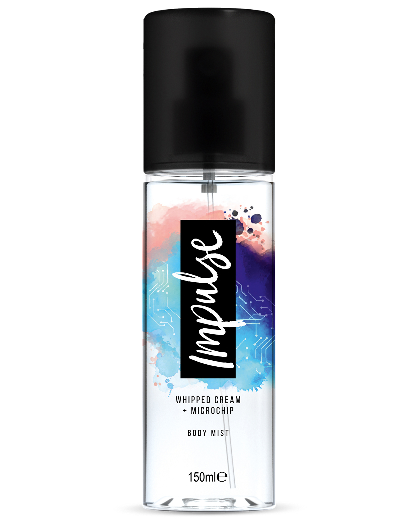
It shows that while consumers might see bigger chains using hand-lettering and the like as a duplicitous ploy to try and dupe people, brands are actually investing in good quality, highly skilled design work.
As designer Kyle Wilkinson points out: “You think Pret and those sort of companies are trying to emulate that personal feel on a completely impersonal platform; they’re trying to be something they're not, or trying to get over to people that don't like Pret for that reason – they'd rather go to the local café, something similar with a more independent feel. So it's interesting they're hiring someone and not just ripping it off, they're funding that sort of indie thing, which is great.”
Kate Marlow, creative partner at Here Design, agrees that if such a trend encourages people to learn a skill like hand-drawn type, then that’s a positive for the design community. “We had to learn it in art school, and it’s really hard. A resurgence of a skill like that can only be a good thing,” she says.
Authentic branding
The considered, handmade aesthetic is a perfect fit for the likes of coffee shops, food and beverage packaging, and indeed any company that wants consumers to get a sense of buying something with a smidgen of a personal touch.
The reasons why brands want that handmade feel are many. For most, it’s about the buzziest of current buzzwords: ‘authenticity’. While people might not see much artisanal in the likes of Tesco, that assumption can gently be tweaked with a touch of hand-drawn lettering here and there, whether on packaging, point of sale materials, campaigns or adverts.
Oli Frape is a hand-lettering artist based in Sheffield, who’s worked with brands including Tesco, Fortnum & Mason and Hovis. For him, commissions from such brands are to do with the language they want to use, “to make copy seem a bit more human or accessible when it perhaps isn’t”.
That idea that humans have spent time using skills they’ve learnt over years carries something... there’s an attached sense of nostalgia
Oli Frape
“Things that are mass produced, or that seem overly digitally produced, lack a certain humanity,” he says, adding that even though we’ve landed at a place where we can make more things with computers than ever, people still want handmade stuff.
“The technology is incredible, but it doesn’t have the same connotations as something made by the human hand or that has visible man-hours in it,” he continues. “That idea that humans have spent time using skills they’ve learnt over years and the tangibility of that carries something. It’s easier to see the kind of wobbles and mistakes and foibles with the naked eye on things made by hand than something that might have taken many hours and skills but using code. It makes people feel something, and there’s an attached sense of nostalgia.”
Storytelling in type
Frape touches on an interesting point about the natural human love of a story: if we can tangibly sense the story behind something’s creation – that it started with the simple tools of human hands, pencils, or brushes – there’s a more compelling, craft-infused tale that ‘perpetuates a myth’ for a brand than, as he puts it, “them saying ‘we employed a graphic designer who sat in his studio at a computer and emailed it to us.’ They’re making an authentic product and branding it in a way that looks authentic.”
What makes these stories so compelling for consumers – consciously or not – is the sense that a brand has actively considered its visual output. Using specialist craft skills is never the cheapest or quickest option, so there’s a visual shorthand that suggests the brand has taken the time to really think about what it’s putting out into the world, and how it’s telling us about it.
In that sense, it’s the antithesis of the kind of cookie-cutter design that’s easily bypassed on shelves or billboards. “It softens that attitude and makes people invest in their brand. It has more credibility and meaning,” says Frape.
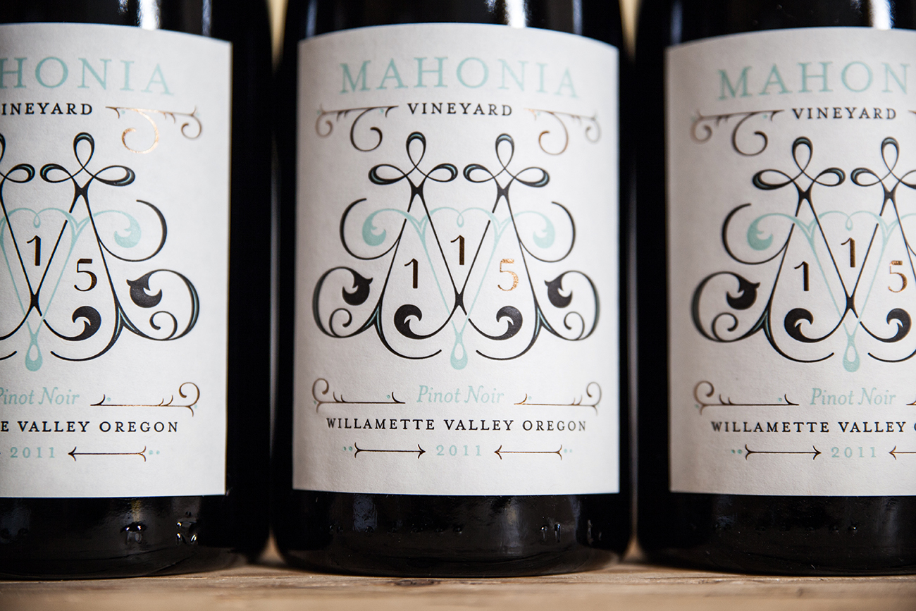
As US lettering artist Jessica Hische points out, custom lettering has always been a big part of branding. Very few companies can afford to invest in their own custom corporate typeface, so this provides a nice middle-ground, where you're not just using an existing font.
"I think lettering as an industry is in a kind of weird in-between place right now – it’s not so big that it’s become it’s own mega discipline like illustration and photography, but it’s not a small niche industry any more,” adds Hische. “There are things you can achieve through customisation and drawing from scratch that you just can’t with an off-the-shelf font.”
In Here Design’s sumptuous type-led designs for Williams Sonoma chocolate, the nostalgia-infused look and feel was the perfect conduit to tell the stories behind the variants’ artisan roots. “No brand wants to be a one-way path of communication any more,” says Marlow. “So if you imbue your brand aesthetic with a conversation through beautiful type with depth and complexity, that tells a story not only about the pack to the audience, but about the brand. For us, type is image – or can be image. It’s highly illustrative.”
The love of handmade
Wilkinson sees the craft lettering trend as a natural riposte to our increasingly digitally driven world. He sees the vogue for “hand-drawn, brushy feel type” as a symptom of the disconnect people feel with how products are made. “People think it’s just the technology creating these things or this imagery, so there’s not a person – a designer or illustrator – at the end of it.”
But as he points out, “there’s no ‘create button’ in Photoshop – everything has to be ‘made’, but people have more understanding of hand-drawn, rawer type and brush script.”
People can connect more with [hand-drawn script]. They think, ‘I wish I could write like that’
Kyle Wilkinson
Wilkinson believes this love of hand-drawn script has roots in calligraphy. “People can connect more with that. They think,‘I wish I could write like that.’”
It all comes down to the brand and its message having a more personal feel; like the joy of receiving a handwritten note over a text or email. But if it's about sincerity and a personal touch, does the fact that such a style has become a trend neutralise that? Wilkinson says that a lot of brands and agencies have been "backing that one horse," but it won’t live forever. From the style's overwhelming presence on design-led social media feeds, he surmises that: "It's surely past its peak now and will start to fade as it’s so overused and oversaturated".
The right type
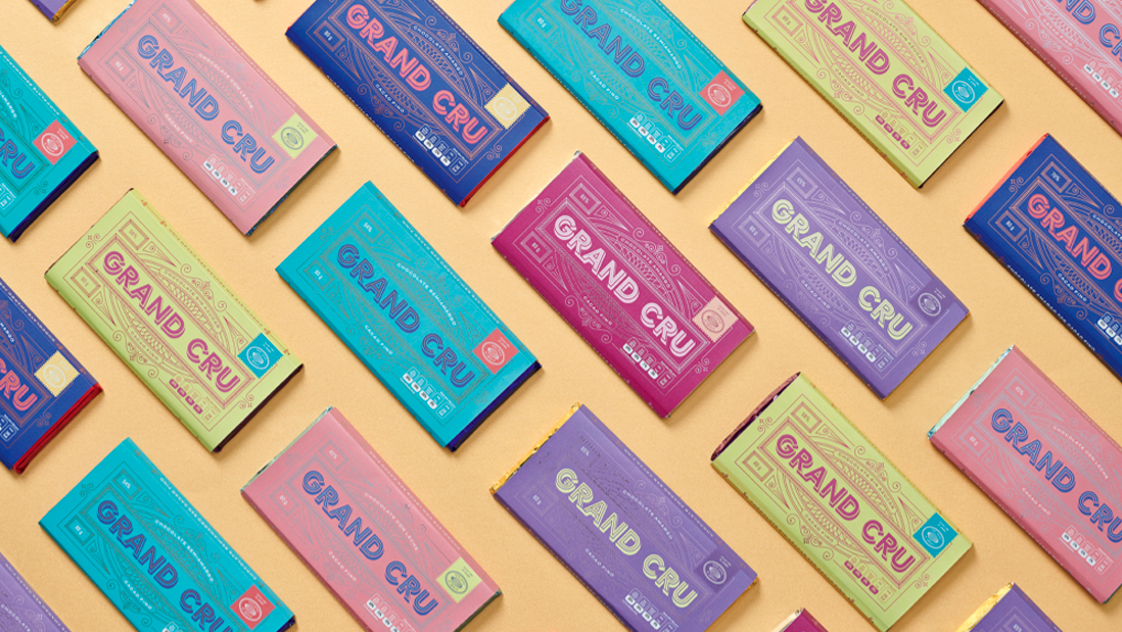
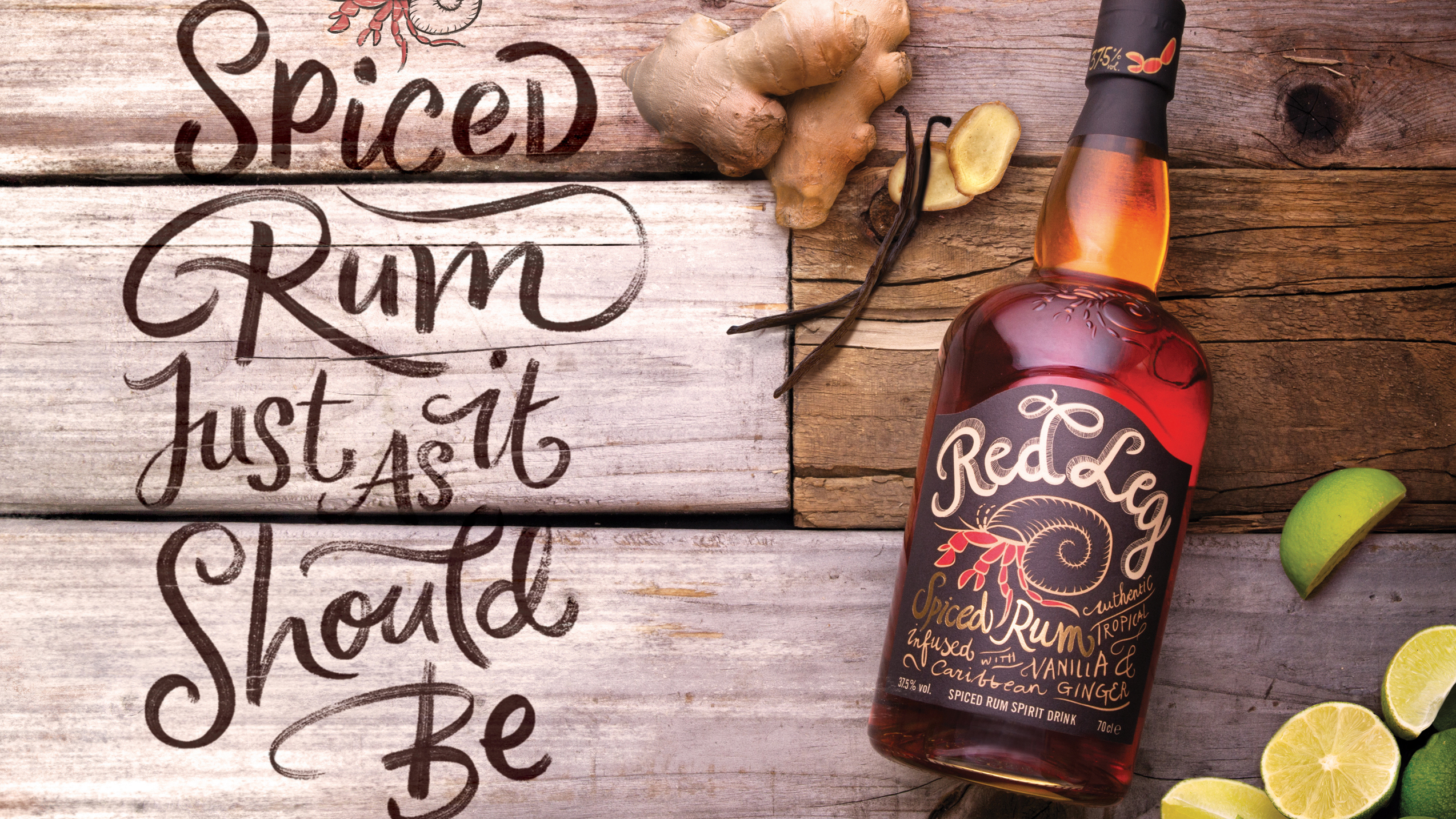
But the style really is an excellent, and very fitting solution for a number of brands; many of which truly have the provenance and artisanal qualities their typography suggests. Wilkinson’s work for RedLeg rum, for instance, is a fitting reflection of the brand’s celebrated ingredients and Caribbean heritage, while Párametro’s work for Grand Cru chocolate is similarly inspired by its artisanal origins.
The trend for specialist handscript isn't just restricted to your neighbourhood coffee shop or food and drink packaging: even a few luxury brands want in – Dolce & Gabbana, for instance, uses a mishmash of fonts online, including a geometric sans, transitional serif and humanist sans alongside a chalky handscript, and a Bodoni.
"In terms of branding, what's important is the little accents on things you always remember," says Segolene Hutter, the founder of luxury branding specialist Studio Noir. “Branding is such a broad thing, it's not just about the logo or the typography: think about the purple from Aspinal, the Christian Louboutin red soles, Tiffany blue. It’s like a subliminal message that's beyond way beyond just words and typefaces. It's the whole brand personality," she explains.
The wrong type
So when does this approach not work? Many of the designers we spoke to pointed to larger corporate brands and the mismatch with such a style. Frape thinks that any industry "synonymous with technological progress" would be a mismatch. "There’s a different aesthetic for automotive or motor sport brands, and it doesn’t work for the really high tech stuff."
Brand messaging is getting increasingly complex and nuanced, and it has to be as we’re getting wiser to brands’ messages – we’re like, ‘yawn, that’s not authentic’
Oli Frape
However, he suggests that the desire for craft-led typographic styles isn’t ever totally redundant, where it fits with a brands' wider strategy: "As we go forward, brand messaging is getting increasingly complex and nuanced, and it has to be as we're getting wiser and wiser to brands' messages – we’re like, 'yawn, that’s not authentic'."
Wilkinson agrees consumers are getting wiser, and warns against brands using the look simply to emulate competitors. "When corporate brands jump on that bandwagon to try and look cool and on the money, you see straight though it," he says. "It’s pretending to be something you're not. Just because handwritten stuff is a popular thing, that doesn't mean you should shoehorn it in – it needs to have its own voice and stay true to the values and visuals you’re creating so it stands out."
Collaboration is key
For agencies and brands looking to collaborate with specialist craft typographers on projects, the key to a successful relationship lies in trust, and a willingness to embrace experimentation.
For Wilkinson, it was a joy when his RedLeg client was open to him getting very physical with the project – scouring timber merchants for "the most knackered pieces of wood we could find," and using that as the basis for hand-drawn type to be photographed for the campaign.
"They were all up for us going out and finding the wood; doing things in camera and doing things properly is the best collaboration."
Wilkinson adds that the same principles apply when working with other brands. The best collaborations are when clients are "open to a more experimental approach, something completely unique they have ownership of and sets them apart. It's not just 'I've seen this on Instagram and want to do that' – it’s 'how can we change it up a bit, or take it to a new level that benefits the project and the brand and gives us something more individual?'"
There are always time and budget restrictions, he concludes, but you create your best work when clients are open. "The best clients put trust in you to take that step and not just play it safe and do it how it’s always been done."
This article was originally published in Computer Arts, the world's best-selling design magazine. Buy issue 278 or subscribe.
Read more:
Emily Gosling is a freelance art and design journalist currently writing for titles including Creative Review, Eye on Design, Creative Boom and People of Print. She’s previously worked at Elephant magazine, It’s Nice That and Design Week, and was editor of Type Notes magazine. Her book Creative Minds Don’t Think Alike was published by Ilex Press in 2018, and she also plays bass as one-quarter of the eight-titted beast, Superstation Twatville.
