11 CSS secrets you need to know in 2020
Discover lesser-known CSS properties you might not have used yet.

Even if you're familiar with CSS and building beautiful layouts, you can still discover new CSS properties and features. By using them, you have more influence on how the content behaves on the website, as well as having more freedom in terms of how you apply creative techniques to elements such as photography.
In this tutorial, we are going to dig into some lesser-known properties. When experimenting with them, please bear in mind that mentioned features are not supported by all the browsers, so it's worth checking them out on the Can I Use site. Let’s dive into some short and concise examples.
Want more CSS inspiration? See this pick of top CSS animation examples, as well as more CSS tricks. If you're starting from scratch building a site, try our list of brilliant website builders and, to store assets, get the right cloud storage for you.
What you will need:
- Your favourite web browser and developer tools – I recommend using Firefox or Google Chrome as they support all the features I use in this tutorial.
- A code editor.
- Assets such as images and fonts (you can download them from my repository.
Typographical direction
There are several CSS properties that help us to enhance how the text is presented on the web.
01. Text-stroke
We're familiar with text stroke (outline) from Adobe Illustrator or vector-drawing applications. We can apply the same effect using the text-stroke property.
It's good to know you can animate text-stroke with CSS but only the stroke colour – the stroke width isn't.
footer h3 {
/*more styles in style.css*/
/*...*/
   	-webkit-text-fill-color: transparent;
   	-webkit-text-stroke: 2px #000;
}
02. ::first-letter
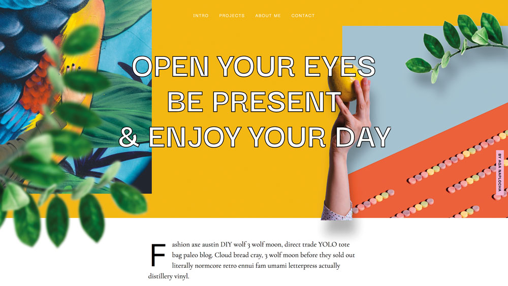
This pseudo-element applies styles to the very first letter of the block-level element. Thanks to that, we can introduce effects that are familiar to us from print and paper magazines.
Get the Creative Bloq Newsletter
Daily design news, reviews, how-tos and more, as picked by the editors.
p.intro:first-letter {
  font-size: 100px;
  display: block;
  float: left;
  line-height: .5;
  margin: 15px 15px 10px 0 ;
}
03. Gradient text
Finally we can apply gradient to our text without any complicated methods. Let’s find out how can we introduce this eye-catching effect on our website.
h2.contact-heading {
  -webkit-text-fill-color: transparent;
  -webkit-background-clip: text;
  background: radial-gradient(#ffbc00, #ff65aa);
}
Content control
Thanks to the following properties, we can enjoy greater control over how the text or images will behave depending on whatever size or proportion their container is.
04. Line-clamp
The line-clamp property truncates text at a specific number of lines. We need three properties to make it work.
The display property needs to be set to -webkit-box or -webkit-inline-box, -webkit-box-orient set to vertical and overflow set to hidden, otherwise the content won’t be clipped.
p.shortened {
  display: -webkit-box;
  -webkit-line-clamp: 3;
  -webkit-box-orient: vertical;
  overflow: hidden;
}
04. Column-count
Thanks to the column-count property, a browser evenly distributes the content in a specified number of columns.
.outro {
	column-count: 2;
}
05. Character unit
We can limit our text width or height depending on the character unit. As Eric Mayer points out, the ch unit represents the width of the character '0' (zero) in the current font, which is of particular use in combination with monospace fonts. It changes as the font family changes. We can treat it a bit like an x-height but the ch is based on the width of the 0 character instead of x.
h2.contact-heading {
/*more properties in the CSS file*
…
max-width: 8ch;
}
06. Word break tag <wbr>
Although this tutorial is based around CSS tricks I also want to mention one HTML tag: <wbr>. This is an HTML element that defines a word break opportunity – a position within text where the browser may break a line. In might be handy in some situations – it can be used when a word is pretty long and we're afraid that the browser would break the word in wrong places, for example a telephone number.
<wbr>+0043<wbr>234-343<wbr>234-234<wbr>07. Object fit
If you wonder whether we can control image behaviour depending on the size of the container, I recommend you check out the object-fit property. This one defines how the content of an <img> or <video> should be resized to fit its container. We have four options: fill, contain, cover and scale-down. For instance, with the cover value, the replaced content is sized to maintain its aspect ratio while filling the element's entire content box.
.object-fit {
  object-fit: cover;
  height: 400px;
  width: 100%;
}
Decorative and creative elements

Let's move on to adding some new elements and colours to our website.
08. Conic-gradient
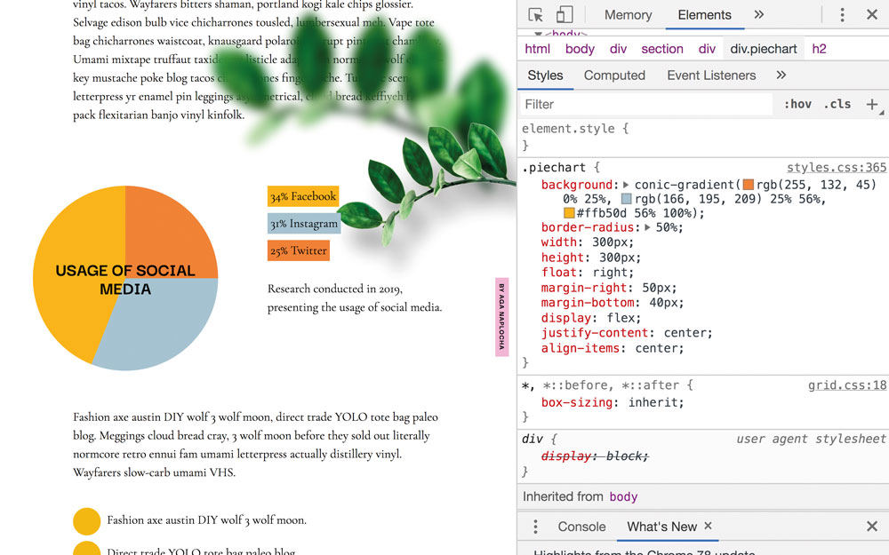
If you have ever wondered whether you could create a pie chart only using CSS, the good news is you actually can! And the solution for this brings us to the conic-gradient function. It creates an image consisting of a gradient with set colour transitions rotated around a central point (rather than radiating from the central point as you'd find with a radial-gradient).
.piechart {
  background: conic-gradient(rgb(255, 132, 45) 0% 25%, rgb(166, 195, 209) 25% 56%, #ffb50d  56% 100%);
  border-radius: 50%;
  width: 300px;
  height: 300px;
}
09. Counters
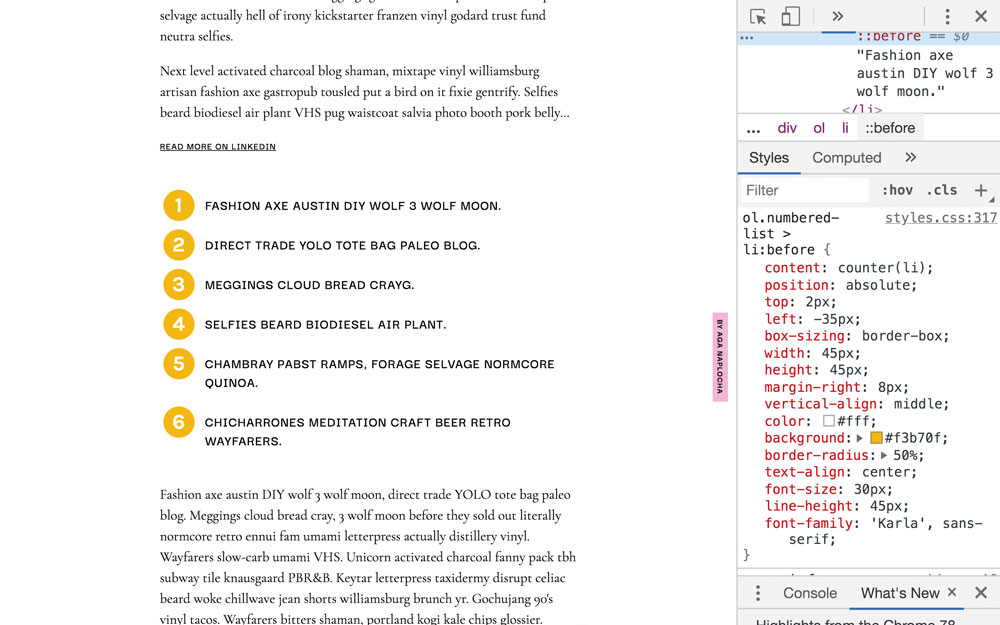
To style numbers in a numbered list, we need to play with properties called CSS counters. CSS counters let you adjust the appearance of content based on its location in a document.

To use CSS counters:
- The counters' value can be increased or decreased by counter-increment
- We can display the value of the counter by using the counter() or counters() function from within a content property
ol.numbered-list > li:before {
 content: counter(li);
 position: absolute;
 box-sizing: border-box;
 width: 45px;
 height: 45px;
 background: #f3b70f;
 border-radius: 50%;
}
ol.numbered-list li {
  position: relative;
  left: 0px;
  list-style: none;
  counter-increment: li;
}
10. Change the Text Selection colour
To change the Text Selection colour, ::selection is a pseudo-element that overrides at the browser-level to replace the text highlight colour with a colour you choose. The colour can be seen once you select the content with the cursor.
::selection {
 	background-color: #f3b70f;
 }
11. @support
Whenever you want to use a CSS property not supported by all browsers, there is a feature query called the @support rule. This enables you to check the browser support for CSS property: value pairs. The code included in the @support block will be rendered only if these conditions are true.
If the browser doesn't understand @support, it doesn't generate a given part of the code either.
@supports (text-stroke: 4px navy;) {
  	.example {
text-stroke: 4px navy;
  	}
}
Although some properties may still experience problems with the browsers' compatibility, don't hesitate to play with them. While your browser support may be limited now, these will likely become mainstream practices in the future. It is just a matter of time. If you would like to ensure these effects only load on browsers that can render them, use the @supports rule to wrap the styles.
If you would like further inspiration, Jen Simmons and Mozilla launched a Layout Land, a YouTube channel full of videos about web design and development, including tools and techniques, what's new and best practices. Additionally, you can also find out how to test colour contrast and simulate colour blindness using Firefox DevTools. And, while you're considering the complexity of your website, make sure your web hosting service reflects yiour ambitions.
This content originally appeared in net magazine. See more web design content here.
Read more:

Thank you for reading 5 articles this month* Join now for unlimited access
Enjoy your first month for just £1 / $1 / €1
*Read 5 free articles per month without a subscription

Join now for unlimited access
Try first month for just £1 / $1 / €1
