CSS Grid Layout secrets revealed
Dig into the CSS Grid Layout specification to uncover some features you might have missed – and some coming soon.
CSS Grid Layout was launched into browsers in March 2017 and, at the time of writing, well over 70 per cent of the visitors to most sites will have Grid support. That figure is rapidly growing, and stands to improve as Edge ships its updated support.
I hope that you've already had a chance to explore some of the features of CSS Grid Layout. This article will take a look at some of the features you might have missed. I'll also take a look at a few things that might be coming in future levels of the specification.
01. The minmax() function
Unlike other layout methods, where we need to set sizing on the item itself, in Grid Layout we set sizing at a container level. We define tracks, which create grid cells, into which content can be placed.
Article continues belowIn order to do this in a flexible way, allowing for content that might be smaller or larger than the design expected, Grid brings new features to CSS. One of these is the minmax() function. This function means that you can specify a minimum and a maximum size for a track.
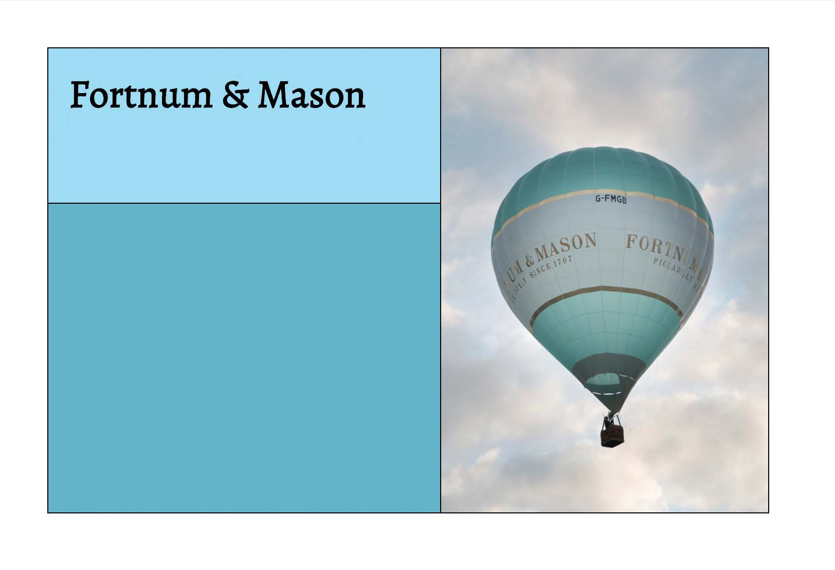
In the example below, I have a neat panel with a heading in the top-left and a large image on the right. I want the top row to be a minimum of 150 pixels tall, no matter how many rows the heading or any other content might need.
However, if there are more lines of content or the text size is larger, I want that box to grow bigger than 150 pixels. This is where I use minmax(), setting a minimum size of 150 pixels and a maximum of auto.
.grid {
  display: grid;
  grid-template-columns: 1.2fr 1fr;
  grid-template-rows: minmax(150px, auto) minmax(300px,auto);
} 
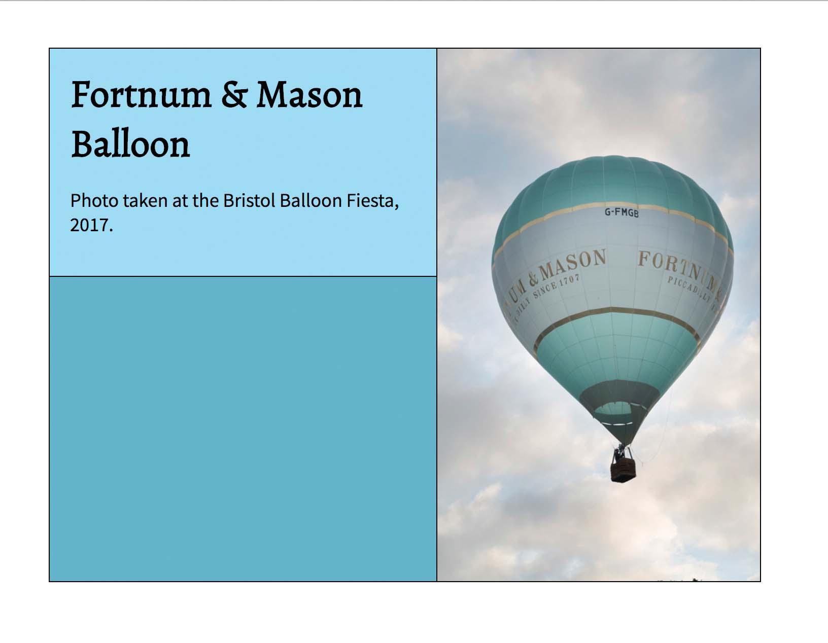
By using minmax(), if we just have the heading in that box, the box is taller than the space required. If we have a longer heading and additional text, it expands to make room.
Sign up to Creative Bloq's daily newsletter, which brings you the latest news and inspiration from the worlds of art, design and technology.
02. Auto-fill and auto-fit
Flexbox enables many responsive design patterns without us needing to lean on Media Queries. Grid goes a step further though, enabling flexible design patterns with items lined up in two dimensions: by row and by column. A useful pattern is to be able to have as many columns as will fit into a container, and to do this we use two new keywords: auto-fill and auto-fit.
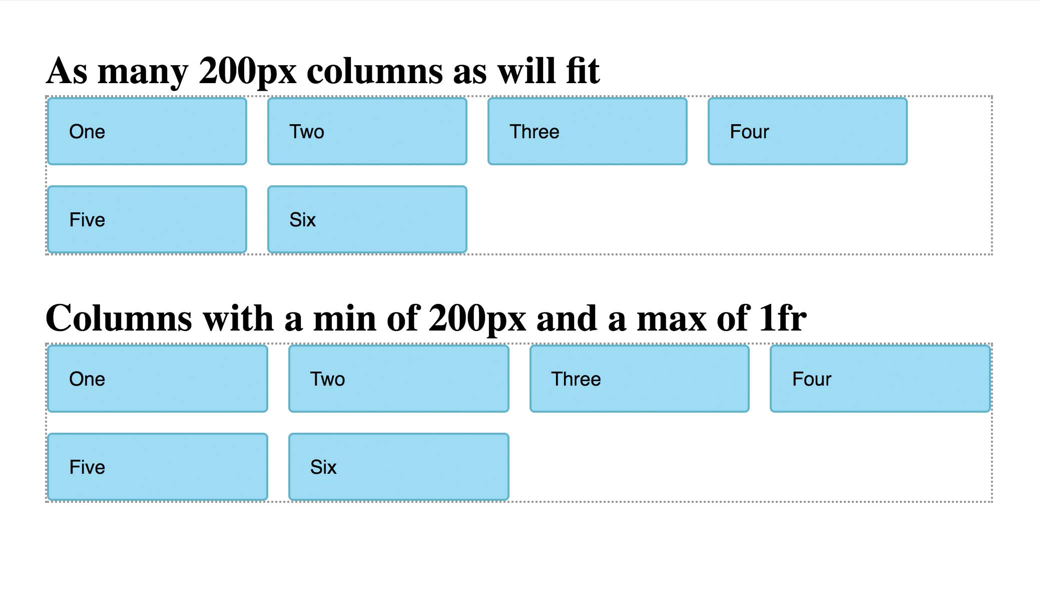
To have as many 200 pixel column tracks as will fit into a container use a track listing of:
.grid1 {
  display: grid;
  grid-template-columns: repeat(auto-fill, 200px);
}
To make those columns flexible but keeping a 200-pixel minimum, bring in the minmax() function that I described in the previous tip. We can create columns that are at least 200 pixels with a maximum of 1fr. After working out how many 200-pixel columns will fit, the browser assigns leftover space equally between our columns.
.grid1 {
  display: grid;
  grid-template-columns: repeat(auto-fill, minmax(200px, auto));
} 
I've been using the auto-fill keyword here; this will maintain space for tracks even if there is no content for them. If instead you use auto-fit, any completely empty tracks will be collapsed and their space assigned to the other tracks.
03. Dense packing mode
When you declare display: grid on an element, all of the direct children become grid items, and the items will start to automatically lay themselves out on that grid. This happens based on the auto-placement rules that are defined in the specification.
If some of your items span tracks, and this means that there are items that won't fit in an available track, they will create a new row on the grid. By default, Grid progresses forwards and displays your items in the order that they appear in the source.
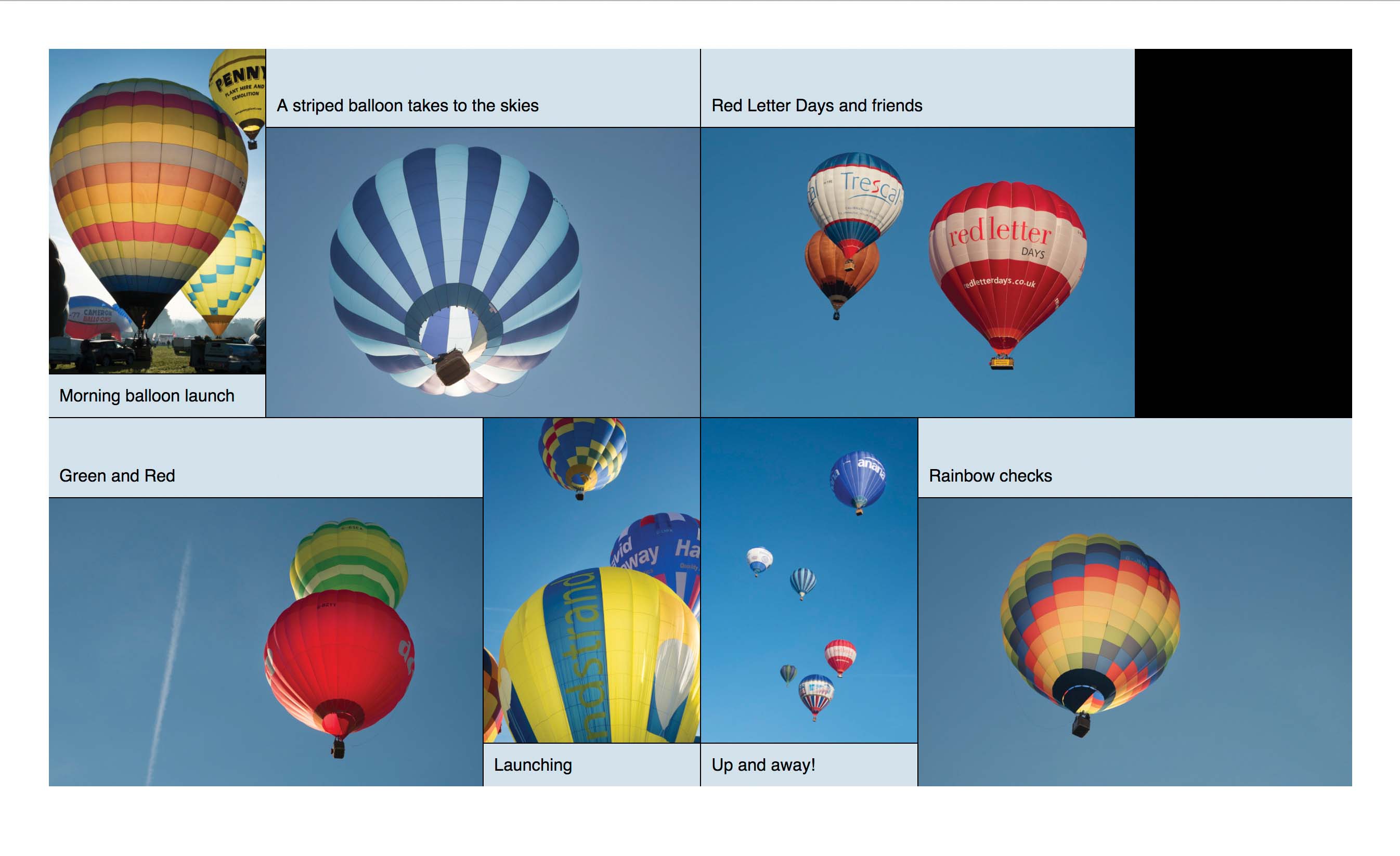
However, if you set the value of grid-auto-flow to dense, Grid will start to backtrack after leaving these gaps. If it finds an item that will fit into a gap already left, it will pick it up and place it out of source order, into the gap.
.grid {
  display: grid;
  grid-auto-flow: dense;
  grid-template-columns: repeat(auto-fill,minmax(200px, 1fr));
} 
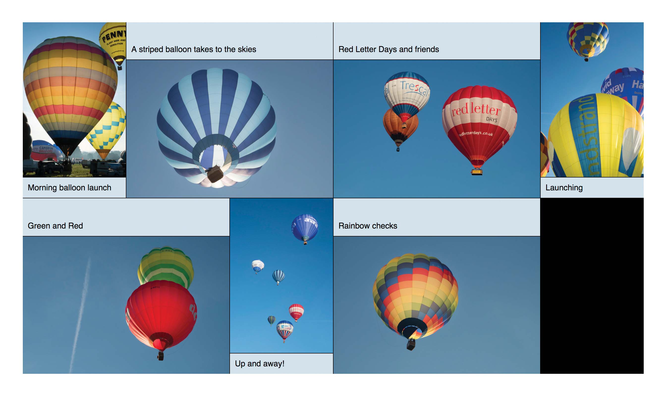
This behaviour is useful if the items you are displaying don't have a logical order, however, you could easily make a layout very difficult for someone navigating using the keyboard if they are tabbing from item to item. Use this feature with great care and testing!
04. Magic lines and magic areas
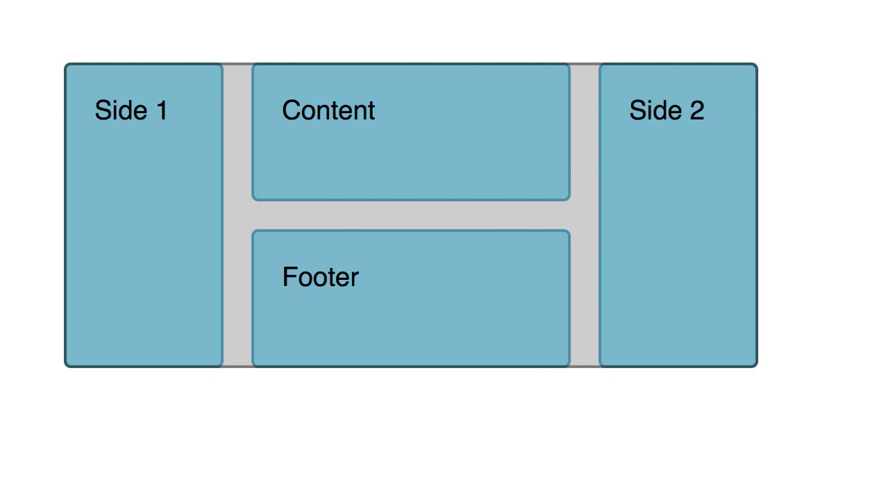
When you use the Grid Template Areas method of laying out content, you create a named area on your grid. This in turn creates a set of named lines for rows and columns that use the area name with -start and -end appended. In this next example, I have used the named lines created by positioning my grid areas to position an overlay.
.grid {
  display: grid;
  grid-template-columns: 1fr 2fr 1fr;
  grid-auto-rows: minmax(100px, auto);
  grid-template-areas:
    "sd1 content sd2"
    "sd1 footer  sd2";
}
.side1 { grid-area: sd1; }
.side2 { grid-area: sd2; }
.content { grid-area: content; }
.footer { grid-area: footer; }

.grid .overlay {
  grid-column: sd1-start / sd2-end;
  grid-row: content-start / footer-end;
}
This works in reverse when you use named grid lines. If you name lines ending with -start and -end for columns and rows, you will create a named area of the main name used.
An area defined by the lines content-start and content-end for rows and columns, would have the name content. You could place an item into that area with grid-area: content.
05. Default alignment
When an item becomes a grid item, the default behaviour is to stretch over its grid area; that is unless the item is something with an intrinsic aspect ratio. If the item has an aspect ratio, it will align to the start line in both the row and column direction. This means that Grid won't stretch your images out of proportion by default, although you can of course do so if you want to by changing the alignment behaviour.
06. Fallbacks
Written into the CSS Grid specification are the details of how CSS Grid Layout overrides other layout methods. If you have an item that is floated, uses display: table or display: inline block and then becomes a grid item, the specification explains what will happen.
In short, when an item becomes a grid item, you will find:
- If it is floated, or uses the clear property, these properties will cease to affect the item.
- If it has display: inline-block or uses a table property such as display: table-cell these no longer apply.
- In the case of table properties, anonymous boxes that are generated when using display: table-cell without a parent table are no longer created.
- vertical-align no longer applies.
I created a cheatsheet that details these overrides with examples. You can find that on my site.
While relying on this overriding behaviour will work in many cases, you need to take care with widths set on items that later become grid items. In previous layout methods, we control the width of an item on the item.
With Grid, we place the item into a grid cell that constrains it. This means that if you have an item with a percentage width set, that width will resolve to a percentage of the grid area once the item becomes a grid item.
The solution for this is another CSS specification: Feature Queries. We can use a Feature Query to test for Grid Layout support. If the browser supports Grid, I set the width to auto.
.grid > div {
  float: left;
  width: 33.333%;
}
@supports (display: grid) {
  .grid > div {
    width: auto;
  }
}
07. Sizing with min-content and max-content
The CSS Intrinsic & Extrinsic Sizing Module Level 3 specification defines additional keywords for sizing. These keywords include min-content and max-content, which can be used to define sizing in your grid tracks.
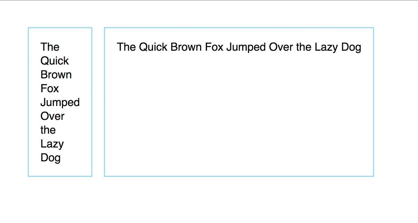
As a very simple example, I have created a two-column track grid. One column is defined as min-content size, the second column max-content. The first track is only as big as required to display a single word of the content – this is the minimum size that this track can be. The second expands to allow the whole row to display, which you might find cause overflows that you need to manage and deal with.
.grid {
  display: grid;
  grid-template-columns: min-content max-content;
} 
Level 2 features
The Grid specification is now at Candidate Recommendation status, which means that we hope to not make any major changes to the spec; instead, it moves on to a phase where we look for at least two implementations of each feature. This ensures that the specification makes sense and can be implemented by browsers.
Things are still happening for Grid, however, and in the rest of this article we will look at a recent change to the Level 1 specification and a couple of things that we might have to look forward to in Level 2.
08. Gaps are changing
The grid-gap shorthand, plus the longhand grid-column-gap and grid-row-gap properties were changed during the August 2017 CSS Working Group meeting to become gap, column-gap and row-gap. They have also been moved to have their definitions in the Box Alignment specification.
This is the specification that took the nice alignment features from Flexbox and expanded out so they could also be used in Grid – and potentially other layout methods too.
Putting the gap features into the Box Alignment specification and naming them in a more generic way means that they can be used in other layout types where they make sense. The obvious place where they make sense is in Flexbox.
This renaming means we'll ultimately get proper gaps in Flexbox; no more messing around with margins. Browsers will alias the old names to the new ones, so if you have already used gaps in Grid Layout that code won't break. However, you might like to also add both properties yourself; browsers ignore the one they don't support.
09. Grid isn't Masonry
When people first see the dense packing mode that I demonstrated earlier in this article, they often think that Grid can do the Masonry layout pattern. Masonry, however, is a completely different type of layout. A standard Masonry layout isn't a strict grid, making this pattern sit somewhere between what Flexbox is good at and what Grid does.
At the CSS Working Group, however, we are thinking about this issue. It's something that we know developers really want to be able to do. You can find the discussion in the CSS WG drafts repository over on GitHub, and even add your thoughts too.
10. Grid Area pseudo-elements
Another common feature request for Grid Layout is the ability to style the grid cells or areas, without needing to insert an element to style. Currently, to add borders to an area you would need to add an empty element to your markup or use generated content to create a grid item that can be styled.
There is an issue raised in relation to considering adding some kind of pseudo-element for grid areas. This would consequently give you something to target if you wanted to add backgrounds or borders to a particular area without adding some extra markup or using generated content.
This article originally appeared in issue 298 of net magazine, the magazine for professional web designers and developers – offering the latest new web trends, technologies and techniques. Buy issue 298 here or subscribe to net here.
Liked this? Read these!
