Creating web icons that break the language barrier
Here's some inspiration for creating effective icons that communicate clearly.
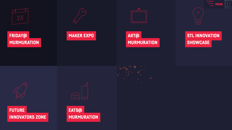
We use icons to convey an idea, an action or an object, in a split second. Icons work well on the web because they are ideal for non-verbal communication; they break the language barrier. This is why music players have rewind, fast-forward, and play icons; why airport customs always include an officer icon; and why three lines are known as a 'hamburger menu'.
Creating icons
When it comes to designing icons for the web, the treatment of line, shapes and space have everything to do with how the icons stand individually and as a group. Lines should be similar in thickness and ends (capped, beveled, and so on). Whenever possible, repeat similar shapes, angles and negative spaces. For example, if an icon set includes a 4px radius on all corners, carry that through to the rest of the icons – whether you're using Illustrator or Sketch, or sorting through The Noun Project.
Icons in code
SVGs and CSS animations make it so easy to include well-made icons (that aren't performance-draining icon font files) to any site. Consider how you could separate paths using SVGs to build dynamic, playful animations, or change colours in CSS on hover. The best part about SVGs is that there's no need to repeatedly export pixel-based image files for responsive sites, so it's possible to really stretch their capability and interactivity.
Here are three sites with great icons:
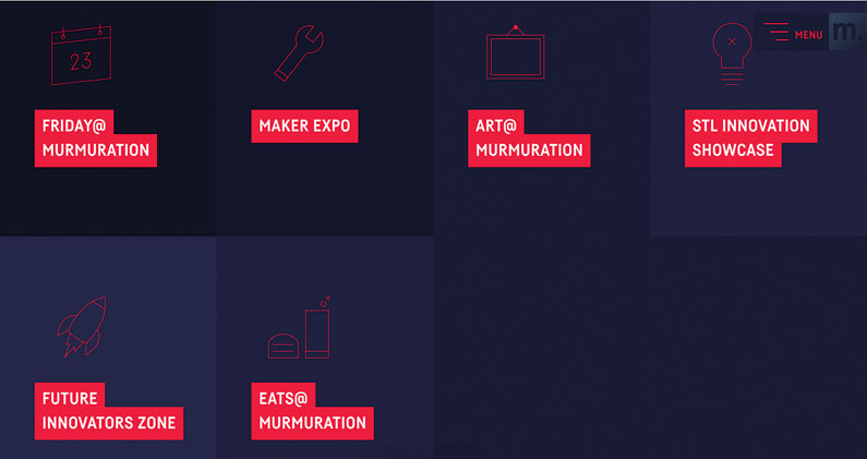
01. The St Louis Murmuration Festival
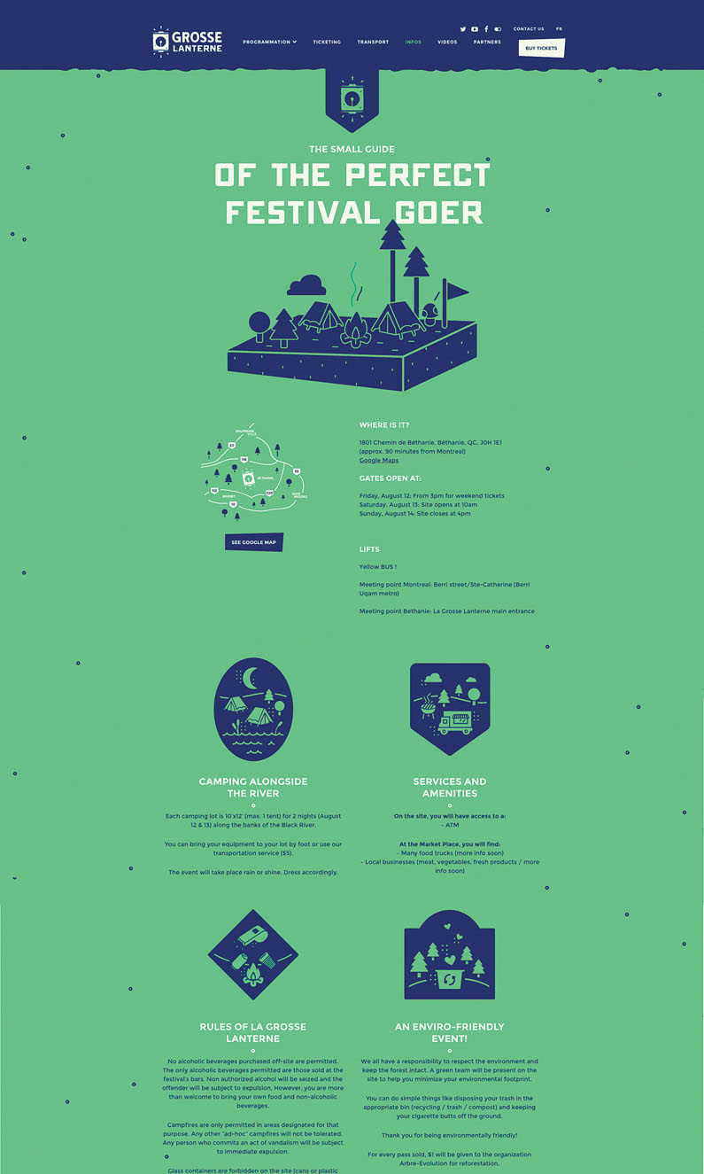
02. Grosse Laterne
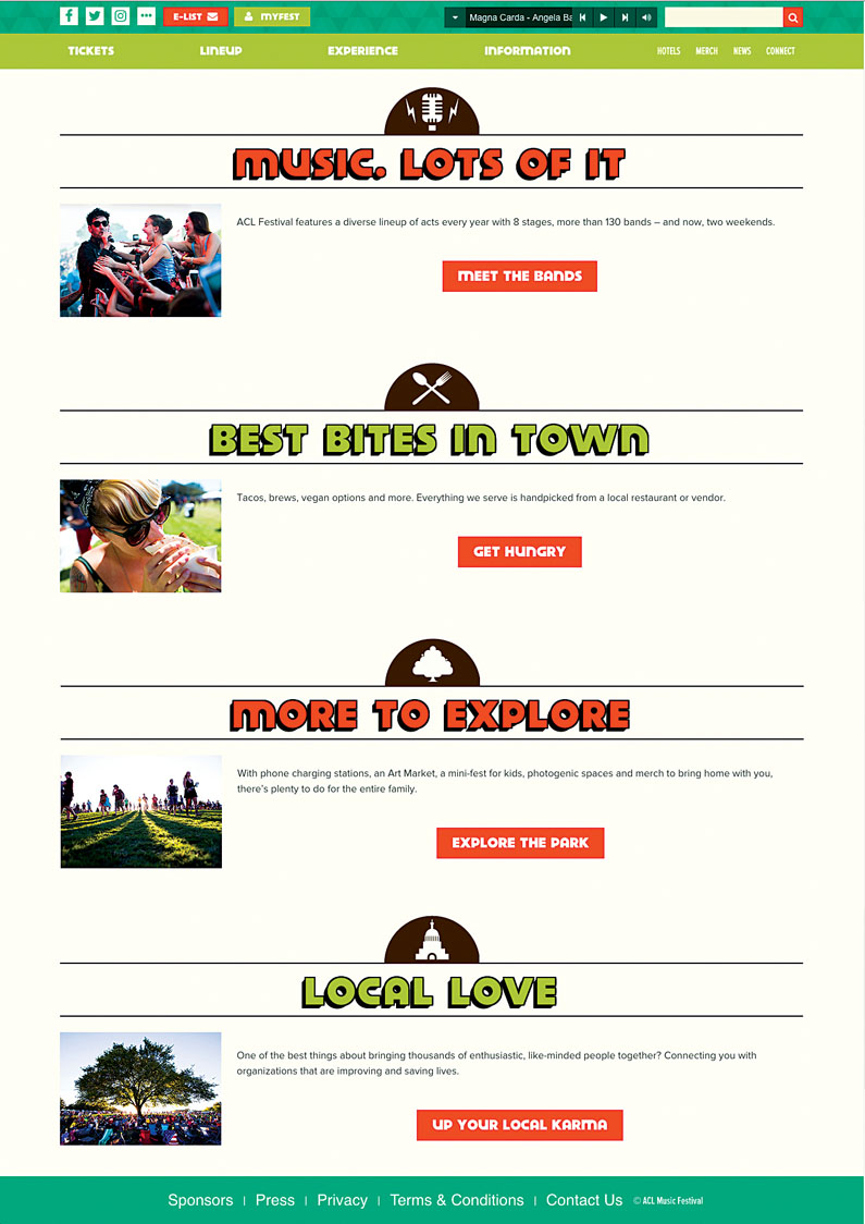
03. Austin City Limits Festival
This article originally appeared in net magazine issue 285, buy it here.
Related articles:
- How to make responsive web apps with container queries
- Christmas gift guide for web designers under £20/$25
- 40 sets of free icons
Get the Creative Bloq Newsletter
Daily design news, reviews, how-tos and more, as picked by the editors.

Thank you for reading 5 articles this month* Join now for unlimited access
Enjoy your first month for just £1 / $1 / €1
*Read 5 free articles per month without a subscription

Join now for unlimited access
Try first month for just £1 / $1 / €1

Sam is a designer living in Austin, Texas, who speaks and writes extensively about web and product design, diversity, inclusion, and equity. In 2011, she wrote the first university course on the topic of Responsive Web Design. She is currently Design Director at thoughtbot, and serves on several design advisory boards in Austin.
