Create character art with maximum visual impact
How to create striking character art using a limited colour palette, traditional materials and Photoshop.
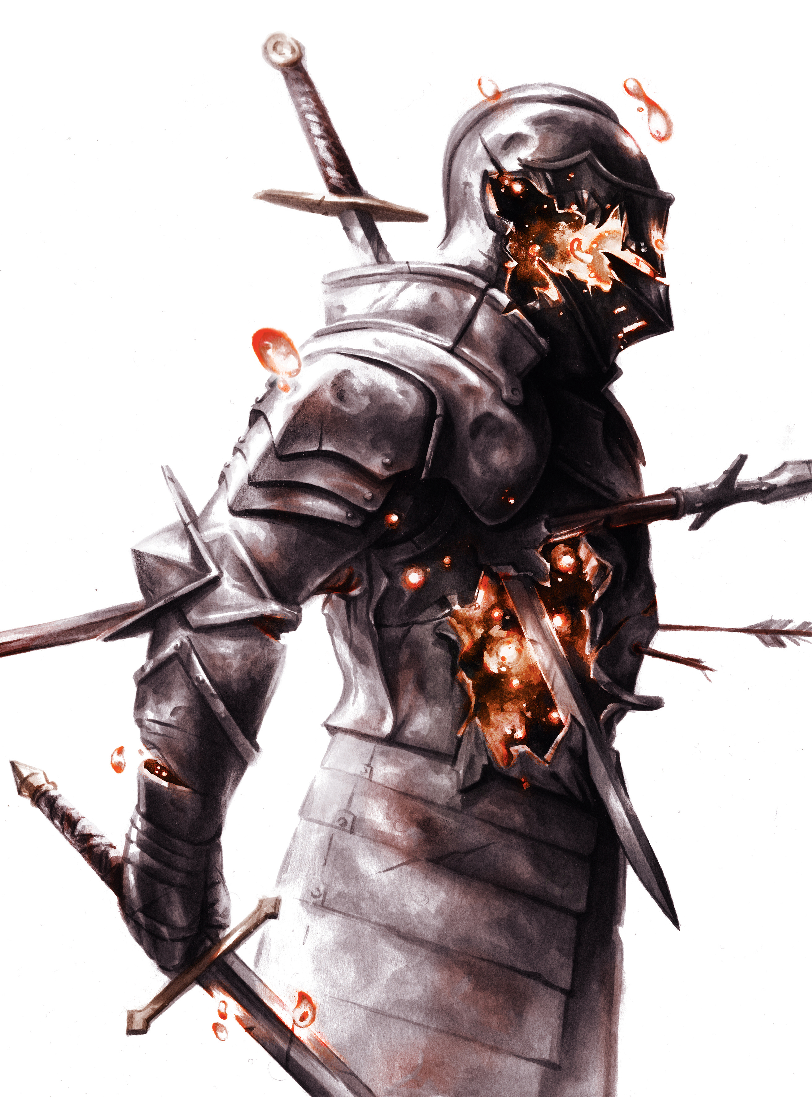
The best art is created within limitations. There is joy to arranging the bare minimum of elements for the maximum impact. Here, I’ll aim to create an impactful piece using a limited colour palette.
While attending art college I dabbled in almost every medium, but nothing quite clicked until I picked up ink. Inspired by comics artists and cartoonists, I found pleasure in creating mood and atmosphere using just a jar of black ink.
Recently, I’ve been trying to incorporate colour back into my work, while retaining what I love about ink. Digital tools have enabled me to experiment and develop my sense of colour, while still working in the traditional medium I love most.
01. Explore ideas
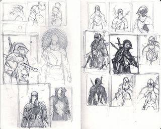
I work from my sketchbook or scratch paper, knocking out thumbnail sketches as quickly as possible, just to get something down on paper. This is often the most difficult stage for me as I figure out what the point of the piece is. I like to write down keywords to help anchor the sketching with concept, narrative or mood.
02. Lock down a concept
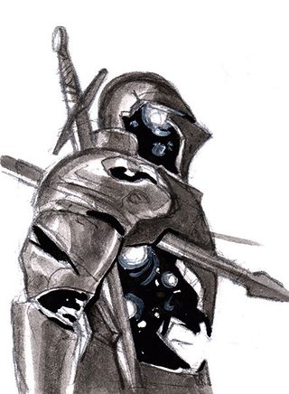
Once I settle on a thumbnail, I’ll make a more detailed and clearer version to test out basic light and dark shapes, and to make sure the concept has enough depth to be taken to finish or presented to the client. Clarity is key.
03. Draw the final form
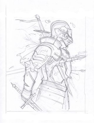
I take the drawing to its final form. I sometimes blow up the thumbnail, print it very lightly and sketch over it. Or I might start from scratch, depending how much I liked the thumbnail sketch. For this design, I started over and drew the larger to give me greater cropping flexibility later, while still adhering to the client’s requested format.
04. Try different lighting schemes
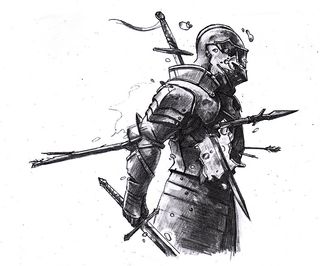
Once I have my final drawing, I scan and print out multiple copies of it, to try out different lighting schemes and compositions. When I find one I like I render it in pencil as a roadmap for the painting. Ink is unforgiving, so it pays to know where you’re putting down your dark shapes before you start.
Get the Creative Bloq Newsletter
Daily design news, reviews, how-tos and more, as picked by the editors.
05. Move onto watercolour paper
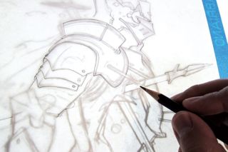
I transfer the final drawing on to watercolour paper using a lightbox. I make a conscious effort to turn the light on and off as I draw, checking the drawing as I go. This is because mindless tracing can lead to a drawing that lacks that extra bit of life or magic.
06. Lay down ink
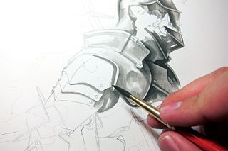
Finally: painting! Working in ink wash, I take Sumi ink and dilute it into different concentrations with water. I start with the darkest area of the painting. This anchors the piece – I refer back to this area as I build up the painting, always knowing that I can’t go darker than this starting point.
07. Block in the piece
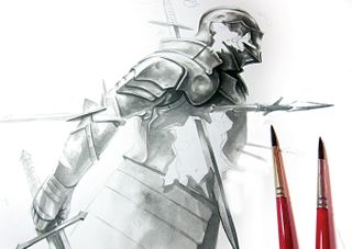
As I paint I jump around the canvas a lot, building up one area before moving to another, making sure I don’t spend too much time on certain elements. It’s important that the whole piece gets an initial pass because it’s very easy to fall in love with working on one area, inevitably overworking it.
08. Build up depth
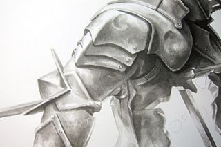
I really enjoy watching a piece emerge from the white paper. In my mind I’m using the brushes to push away the white, revealing the dimensional piece in relief underneath. I tuck ink into the nooks and crannies of the drawing, adding depth as I go, while bouncing back and forth between different areas.
09. Explore texture
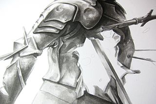
In the final tonal study I also think about what textures I’m trying to achieve, which is battered steel in this case. There’s only so far you can take it in the pencil sketch – when painting, the ink will begin to do the work of creating surface texture. Brush strokes find their marks naturally when you trust the medium.
10. Dive into colour
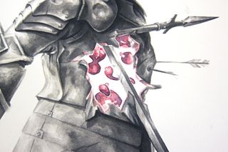
The majority of the piece is now painted. I’ve left the central area bare so far, because it scares me. The whole piece pivots around getting a convincing glow from this area. I decide to break out the watercolours and try a new effect, because recently I’ve been attempting to incorporate colour back into my work.
11. Hide the evidence
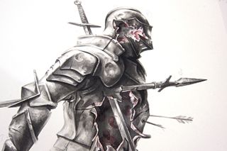
I hate what I’ve just painted in watercolour. I placed too much trust in my understanding of the medium to get the effect I wanted, when I should have worked on it more in the sketch and done colour studies. To fix it, I slather black ink over the mistake. Black hides all sins and can be a reset.
12. Try Plan B
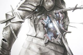
I lean back on to white gouache, a medium that I’m much more comfortable with, and paint the lights back in. I’ll have to add colour to the piece later in Photoshop. I noodle around and paint details. This is the endless polish stage and I could live here forever, but deadlines are calling, so it’s time to scan and finish digitally.
13. Move into Photoshop
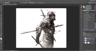
I scan the piece at 600dpi for archival purposes. This will also enable me to print the image larger if there’s ever a need to. Next I adjust Contrast and Levels, to bring the scan more in line with how I feel the piece looks in life, because something is always lost during scanning.
14. Add layers
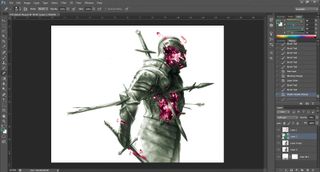
I tune some of the value structure using the Dodge and Burn tool, then add layers for each colour element in the piece. Because there’s a fully rendered ink wash painting already, all I need to do at this stage is colourise using Photoshop’s Blending modes. Soft light and Overlay are my go-to modes.
15. Finish the piece
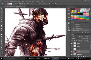
I experiment with different colour combinations using the Hue and Color Balance sliders. Once I decide on the final colours, I hone in the initially loose digital brush marks and add hot edges to the lights, to better sell the illusion of the light source. I finish the piece by cropping the larger painting to the final trim size.
This article was originally published in ImagineFX magazine issue 143. Buy it here.
Related articles:

Thank you for reading 5 articles this month* Join now for unlimited access
Enjoy your first month for just £1 / $1 / €1
*Read 5 free articles per month without a subscription

Join now for unlimited access
Try first month for just £1 / $1 / €1
