Create animations with the FLIP technique
Discover how to design meaningful UI animations with guidance from the FLIP principle.
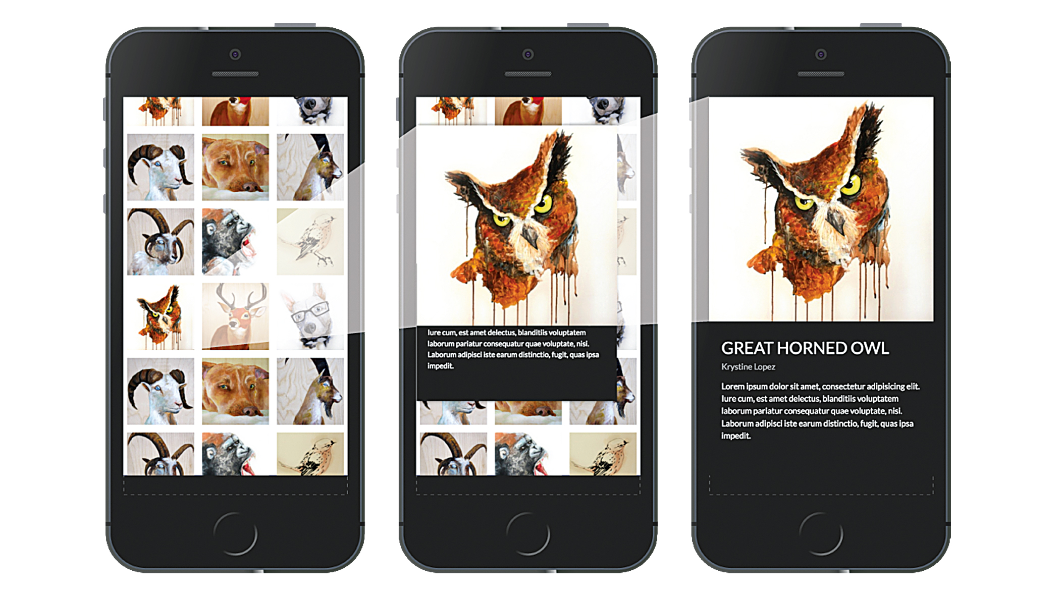
UI animation can be an incredible asset in user experience. Mobile developers know this all too well. Mobile app animations are a core part of the experience, rather than an afterthought. However, on the web, animations are commonly seen as ‘the icing on the cake’, and are omitted as they are deemed unnecessary, excessive or too complex to implement. Worse, animations that lack meaning can detract from the UX.
In this tutorial, we’re going to learn about a certain category of meaningful animation that you might be familiar with; one that enhances the user experience.
Transitioning between views
When moving from one view to another in a mobile app, focal elements often smoothly animate from one position to another between views. Examples of this include:
- Expanding a photo from a grid gallery
- Reordering table rows or list items
- Remaining items filling the empty space when single items are deleted
- An item visibly dropping into a shopping cart
- One line of text shifting vertically when a new line appears below it
- A button expanding or contracting when its contents changes 
But there’s one nagging issue when it comes to implementing these animations: how do you smoothly animate an item between two views or states when there are actually two separate items – one for each view?
Enter the FLIP principle. This is a technique for transitioning ‘shared elements’ between two states, in a performant manner. The idea is that if you know the first position of the shared element before the state change occurs, you can create the illusion that the last position of the shared element is moving from the first position. Here’s how it works:
- First: Grab the position of the shared element before it changes
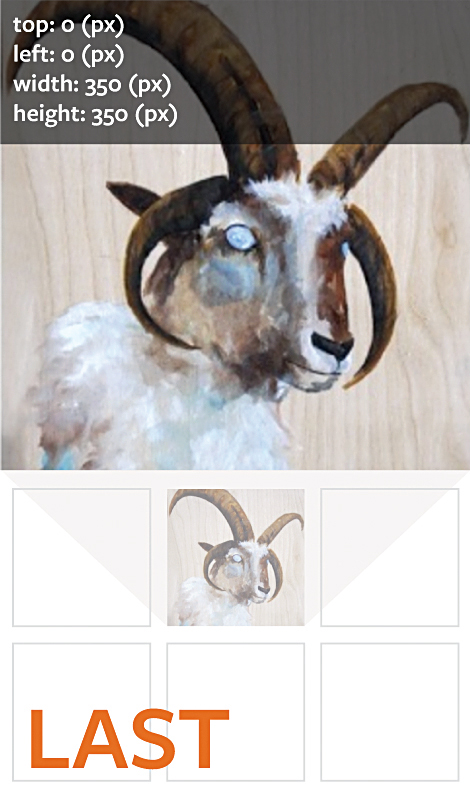
- Last: Grab the changed (final) position of the shared element
- Invert: Calculate the change in position (and size, if needed) between the first and last positions, and then move the final shared element to appear as if it were in the initial position using those numbers
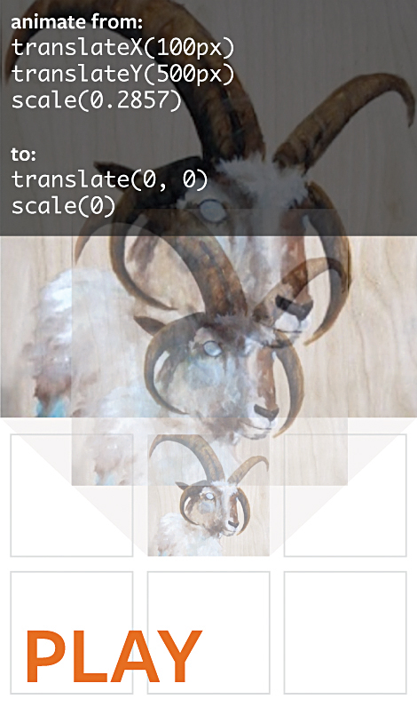
- Play: Animate the final shared element by undoing the inversion
To better understand the ‘invert’ part of this principle, imagine you had the box at the final position, attached to a rubber band. If you were to position the box at its initial position, it would look like the box hadn’t moved at all. However, since the rubber band is now stretching from the final position to the box, once you let go of the box, it will snap back to the final position.
Calculating positions
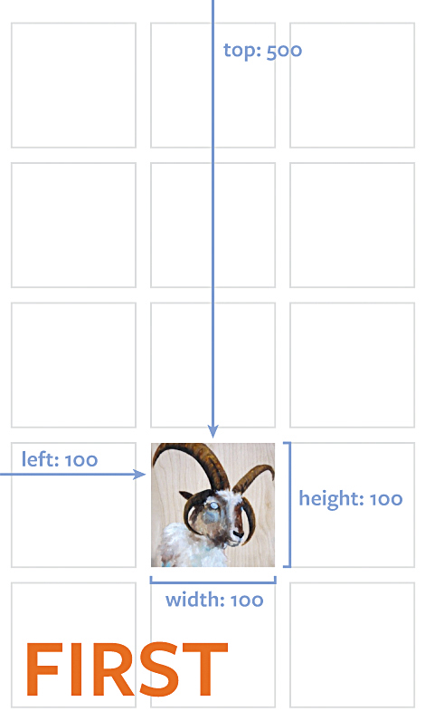
Now we’ve outlined the FLIP principle, let’s put it into practice. Let’s say you have a scrollable gallery of images. When one of those images is clicked, it seamlessly moves and expands from its initial grid position to its final full-width position. The CSS for the grid gallery is based on Flexbox:
Get the Creative Bloq Newsletter
Daily design news, reviews, how-tos and more, as picked by the editors.
.gallery {
  display: flex;
  flex-flow: row wrap
  justify-content: space-around;
  align-items: flex-start;
}

.detail {
  display: block;
  width: 100%;
  height: 100%
}
/* Image inside a gallery */
.gallery > .item {
  flex: 0 0 30%;
  height: auto;
}

.item > img {
  width: 100%;
  height: auto;
}

/* Detail view of image */
.detail > img {
  width: 100%;
  height: auto;
}
To calculate the positions, there is a useful JavaScript DOM node method called .getBoundingClientRect() that returns the size and position of the node, relative to the viewport. Thankfully, it also takes scroll position and transforms into account, so no extra maths is needed to calculate its actual position.
// get the 7th image in the gallery, for example
var imgNode = document.querySelectorAll('.item > img')[6];

imgNode.getBoundingClientRect();
// bottom: 865.375
// height: 86.0625
// left: 383.390625
// right: 498.140625
// top: 779.3125
// width: 114.75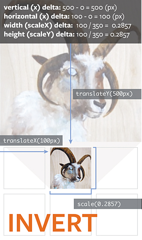
This will return an object instance of ClientRect , containing: the top , bottom , left and right positions, plus the height and width , all in pixels.
Because of the .getBoundingClientRect() method, the FLIP principle is particularly useful when you don’t know exactly where an element is going to be positioned on the document. This Flexbox layout is a good example of this, as a gallery item can be positioned on any row.
The position might also change, based on the gallery’s scroll position.
Because of the dynamic nature of elements positioned by various layout algorithms (such as relative positioning, floats, inline layouts, Flexbox, the upcoming Grid spec, and so on), CSS animations would not be the most appropriate choice for transitioning two similar but distinct items between views.
Before the views change, use .getBoundingClientRect() to store the position of the shared element in its first position.
Then use the same method to immediately calculate the last position of the element once the view changes.
From this point, all that’s left to do is a little mathematics, in order to create the illusion that the element is smoothly transitioning from one view to the next.
Inverting the position
Once you know the first and last position (and size, if applicable) of the shared elements, the distance traveled (or ‘delta’) between the two positions can be used to invert the position of the last shared element. Remember, we’re going to create the illusion that the last shared element is in exactly the same position (and size) as the first shared element, and then transition it back to its final position.
Let’s say you have the following first and last positions, using .getBoundingClientRect() :
// first position, in grid
{
  top: 100,
  left: 150,
  height: 50,
  width: 50,
  // ... etc.
}

// last position, fullscreen
{
  top: 0,
  left: 0,
  height: 360,
  width: 360,
  // ... etc.
}
From this we can calculate a few things:
- The horizontal distance traveled is the first left minus the last left ( 150 - 0 = 150 ), so it needs to travel 150px to the right
- The vertical distance traveled is the first top minus the last top ( 100 - 0 = 0 ), so it needs to travel 100px down
- The width scale delta is calculated by dividing the first width by the last width ( 50 / 360 = 0.138... )
- Similarly, the height scale delta is calculated by dividing the first height by the last height , which is the same ( 50 / 360 = 0.138... )
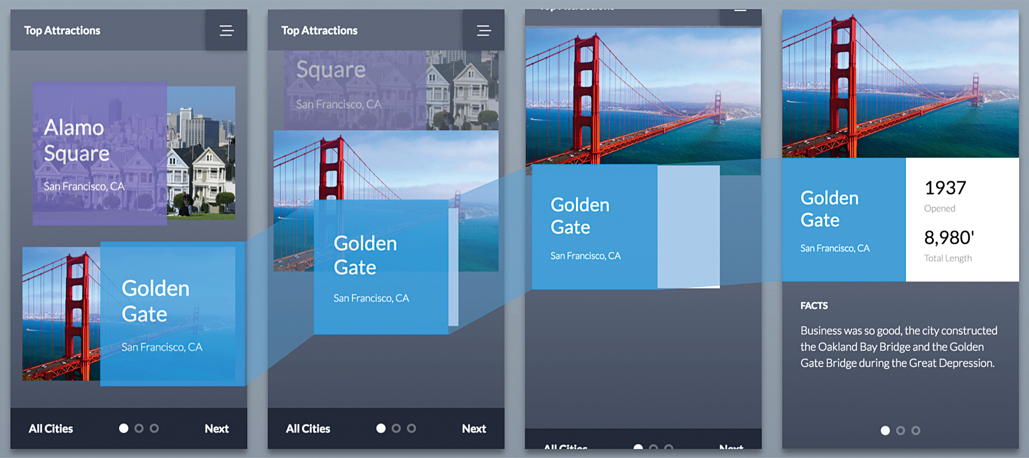
The final shared element’s position can be inverted by adjusting the top , left and width properties, but this isn’t as performant as using transforms . The inverted position can be expressed in transforms:
- Horizontal change: translateX(150px)
- Vertical change: translateY(100px)
- Horizontal scale: scaleX(0.13888)
- Vertical scale: scaleY(0.13888)
Always apply translations before scaling, as scaling before translating affects the element’s position and can produce unexpected results. The final inverted transformation will be transform: translateX(150px) translateY(100px) scale(0.1388) since, in this case, scaleX and scaleY are equal.
Playing the transition
Once the inverted transform has been applied to the last shared element, it will appear as if the first shared element hasn’t moved yet. In reality, the last shared element is just temporarily taking the place of the first, ready to be animated back to its original position.
All that’s left to do now is execute the transition. Here we will be using the Web Animations API, though you can use your favourite JavaScript animation library, such as GSAP or Velocity. The transition will go from the inverted transform to no transform (i.e. the original position):
// First image node from gallery
var imgNode = document.querySelectorAll('.item > img')[6];
// Last image node in fullscreen view
var lastImgNode = document.querySelector('.fullscreen > img');

var firstImgRect = imgNode.getBoundingClientRect();
var lastImgRect = lastImgNode.getBoundingClientRect();

var deltaX = firstImgRect.left - lastImgRect.left;
var deltaY = firstImgRect.top - lastImgRect.top;
var deltaScale = firstImgRect.width / lastImgRect.width;

// ...
// Execute code that changes view
// ...

lastImgNode.animate([
  {
          transform: `
    translateX(${deltaX}px)
    translateY(${deltaY}px)
    scale(${deltaScale})
   `
  },
  {
   transform: `translateX(0) translateY(0) scale(1)`
  }
], { duration: 300, easing: 'ease-in-out' });
FLIP in practice
Thankfully, there are a few tools and resources that you can use to get up and running quickly with FLIP transitions. Paul Lewis of Google coined the mnemonic FLIP in his wonderful article, ‘FLIP your animations’ (netm.ag/lewis-285). He has also created flipjs, a helper library for creating FLIP animations with the GreenSock Animation Platform or requestAnimationFrame (netm.ag/flipjs-285).
If you are using React, you may find the React Flip Move library by Josh Comeau useful (netm.ag/ comeau-285). This will allow you to simply nest
all items you want FLIPped inside a
Though not specifically about FLIP, Google’s Material Design guidelines on motion are also indispensable. They describe how motion should be simple, cohesive, and meaningful, and most of their examples can be achieved using FLIP transitions.
Now you understand the FLIP principle, you can tweak the functions we’ve covered here to meet your own needs. Play around with the durations, timing functions, transitioning multiple items simultaneously using FLIP, and even orchestrating more complex, creative animations.
This article was originally published in net magazine issue 285. Buy it here.

Thank you for reading 5 articles this month* Join now for unlimited access
Enjoy your first month for just £1 / $1 / €1
*Read 5 free articles per month without a subscription

Join now for unlimited access
Try first month for just £1 / $1 / €1
