Create a striking figure painting in watercolour
Recreate this stunning comic cover using watercolour and Photoshop.
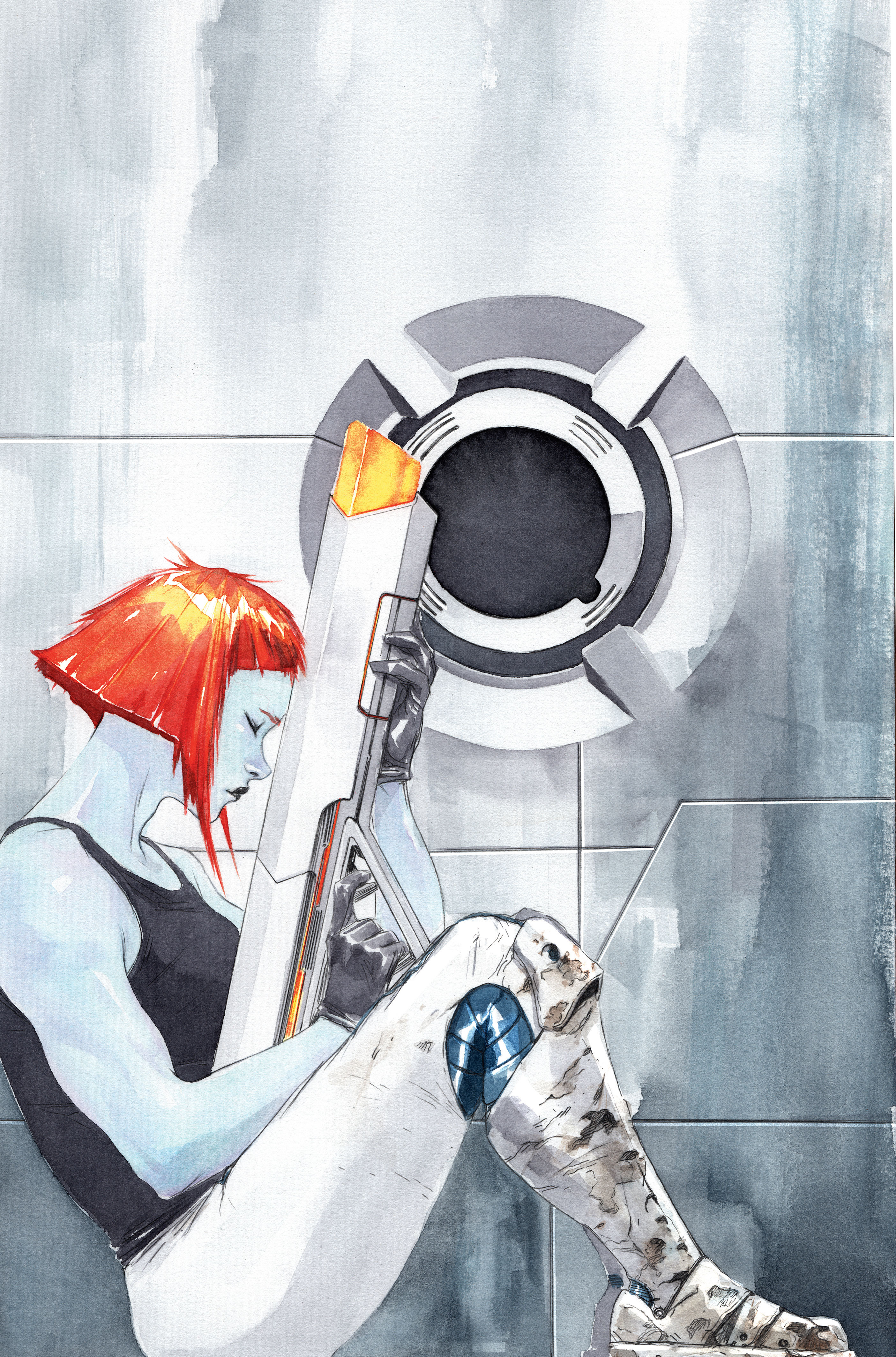
Growing up, my favourite comic covers were the ones featuring characters conveying strong emotion in tense situations. I was also fascinated with watercolour techniques. The way the paint bled off the page, the visceral nuances that the brush left, the splatter, the texture, the imperfections. Now that I’m creating covers myself, the attraction for this traditional medium is even stronger.
My process is pretty simple. I draw it, then colour it. I’ve always felt more of a storyteller than a painter, so I see it as less of a painter’s way of thinking, and more of an illustrator’s approach. Along the way, there might be some nuances and some happy accidents, but for me sketching and the initial sketch are the most important thing in my covers, I feel it should carry that emotion and weight to the final piece. The paint should complement it in the finished piece.
For this workshop, I chose to go with a cover for a monthly comic series created by myself and writer Jeff Lemire. The series is Descender, a sci-fi and fantasy tale about a galaxy in conflict – but really, it all comes down to a very personal story following a young robot child trying to find his human brother, and their place in the madness of it all.
As much as I enjoy working on licensed properties, my biggest joy (and least amount of stress) comes from working on something that we own outright. We’re able to make every decisions ourselves, sometimes on the fly, without needing approval from anyone. Going by our own judgment and imagination to create these new worlds and characters… that’s where the biggest freedom in creator-owned comics lies.
This cover features a character who we created and then watched grow over the course of the series. The finished art is close to my heart, as all Descender covers are, so drawing each one is always a joy, even if most are rushed out over a weekend!
01. Create preliminary sketch
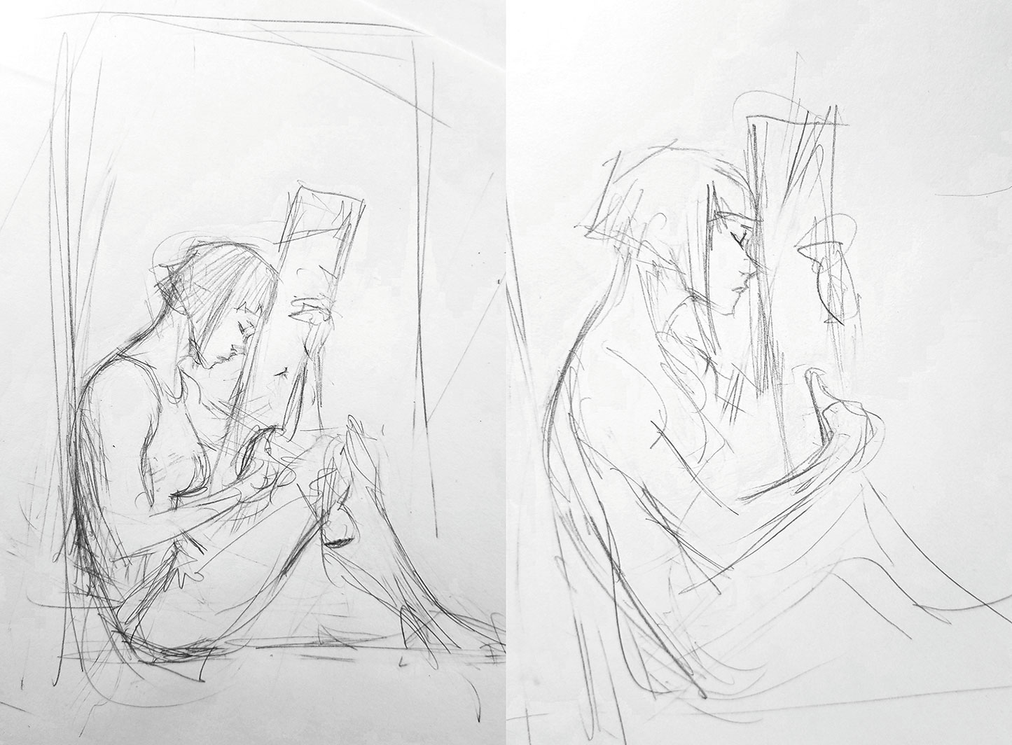
I start with a quick sketch. When working on a cover for a client, I’ll normally provide between two and four different concepts for them to choose, but because Descender is a property that’s owned by myself and Jeff Lemire, I can skip all that and go directly to what I want in an image.
02. Make the face first
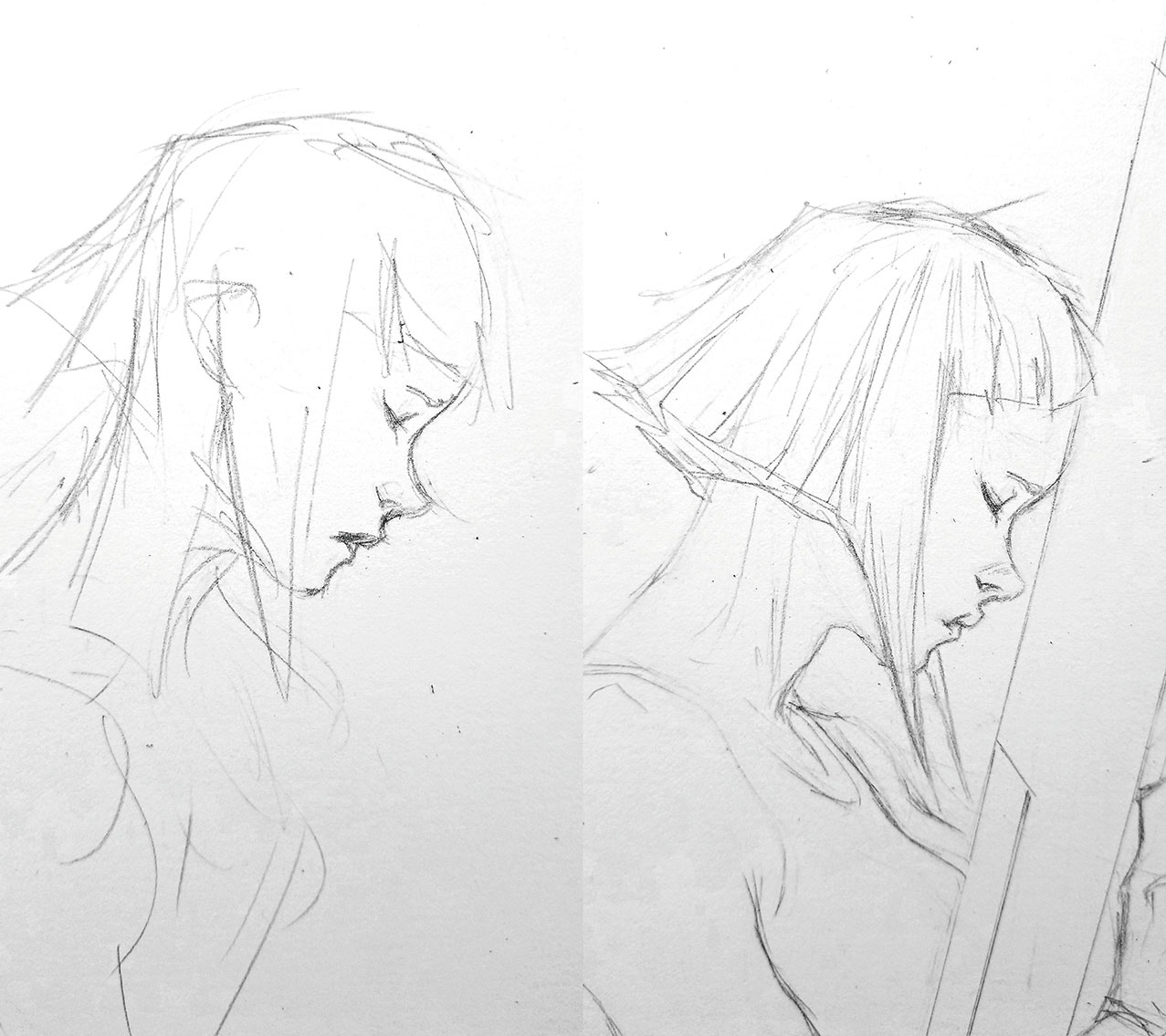
For me, faces are everything. Usually, I’ll tackle the face first so it can carry the rest of the drawing for me. It’s a bit of a motivational technique. Telsa was a character we created and watched grow throughout the series, so she’s a very personal character to me to draw.
Get the Creative Bloq Newsletter
Daily design news, reviews, how-tos and more, as picked by the editors.
03. Consider the composition
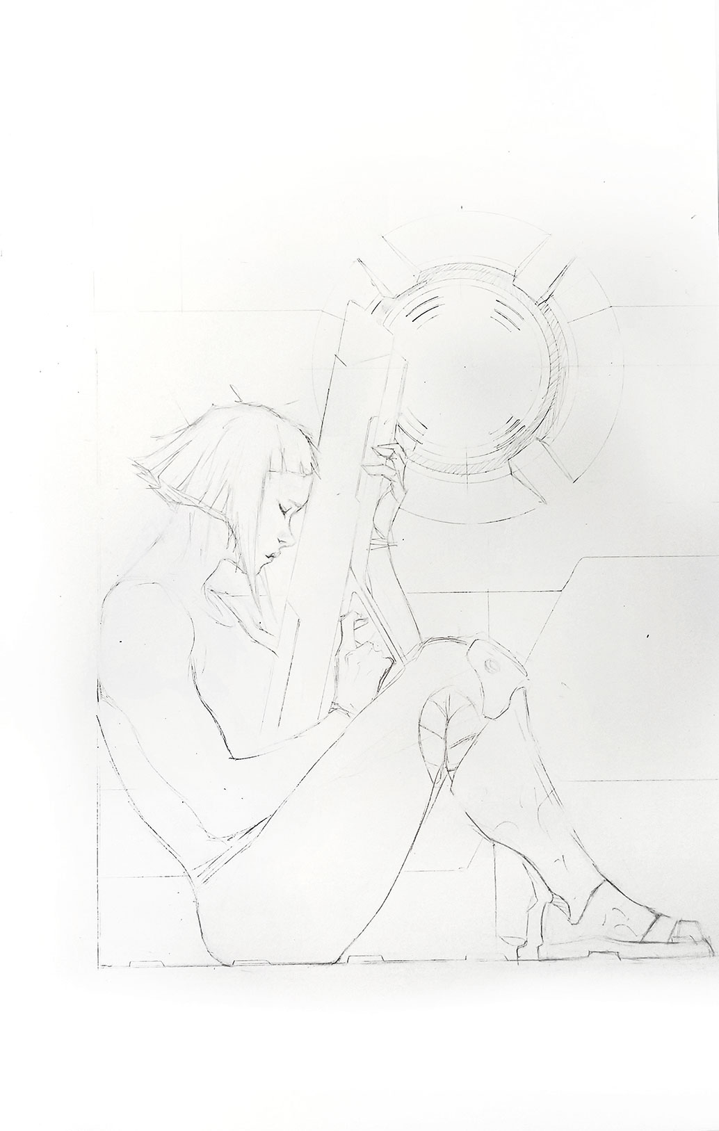
I lay out the rest of the cover, making sure to leave room for cover title logos and trade dressing (the Image Comics logo, credits, pricing and so on). One of the main differences between laying out a cover versus laying out just a pin-up or poster is making sure all those elements work together, and balance out in print.
04. Start with light colours first
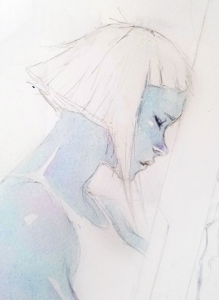
I normally start most paintings from the lightest colours first, which is usually skin tones and light sources. Even though Telsa has an alien blue-ish, purple-ish skin tone, I’ve become accustomed to starting with a character’s skin. I tackle that first, using a combination of Sennelier Turquoise green with Holbein Watercolor’s (HWC) Permanent violet and Prussian blue.
05. Use a wash on the background
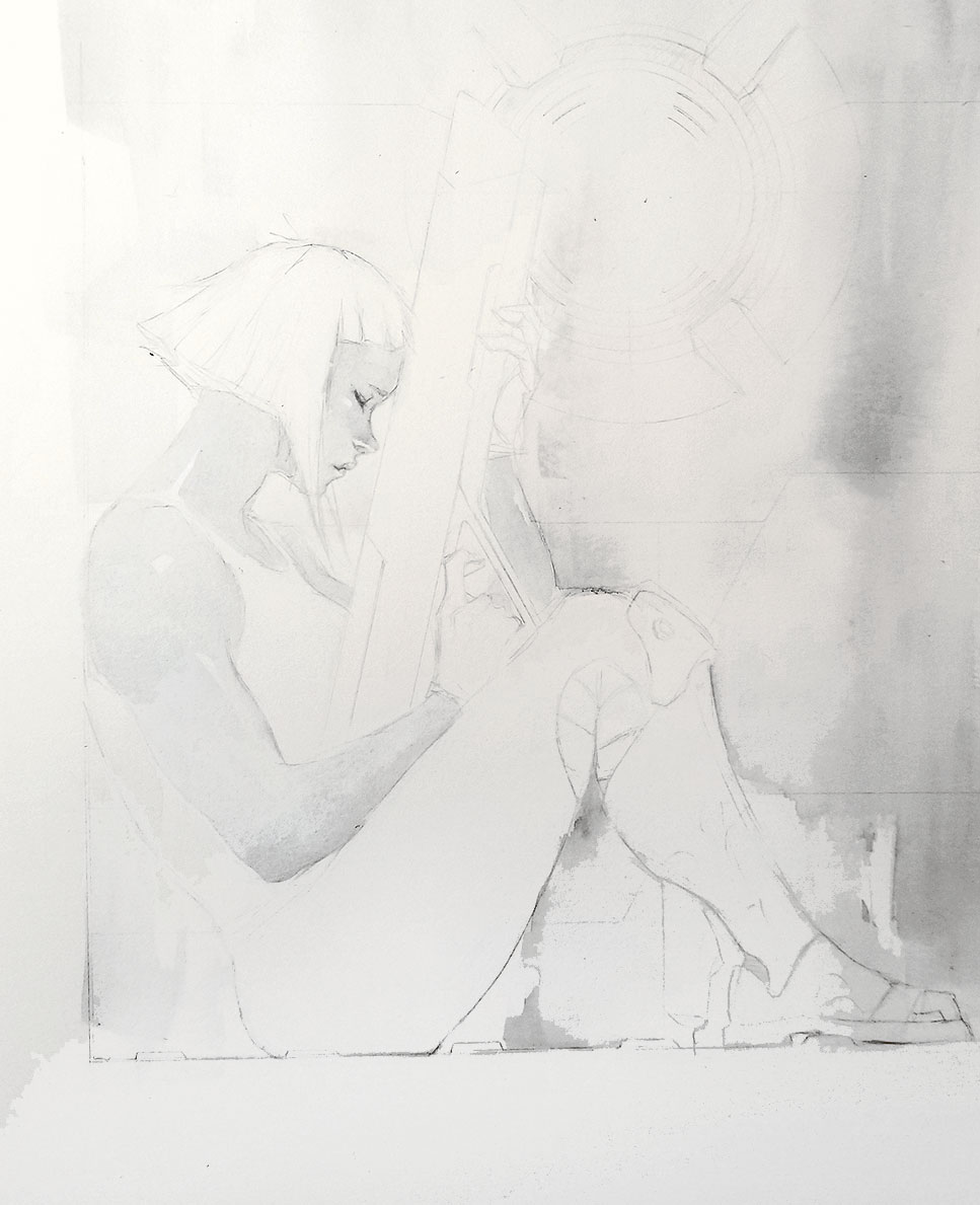
I move on to a wash of the background. In this issue, Telsa’s on an alien ship made up of mostly cold steel. There’s not old tech or any rust, but at least a bit of age to the ship, so I try to give the background some texture. It should feel cold and harsh in this part of space.
06. Add warm colours
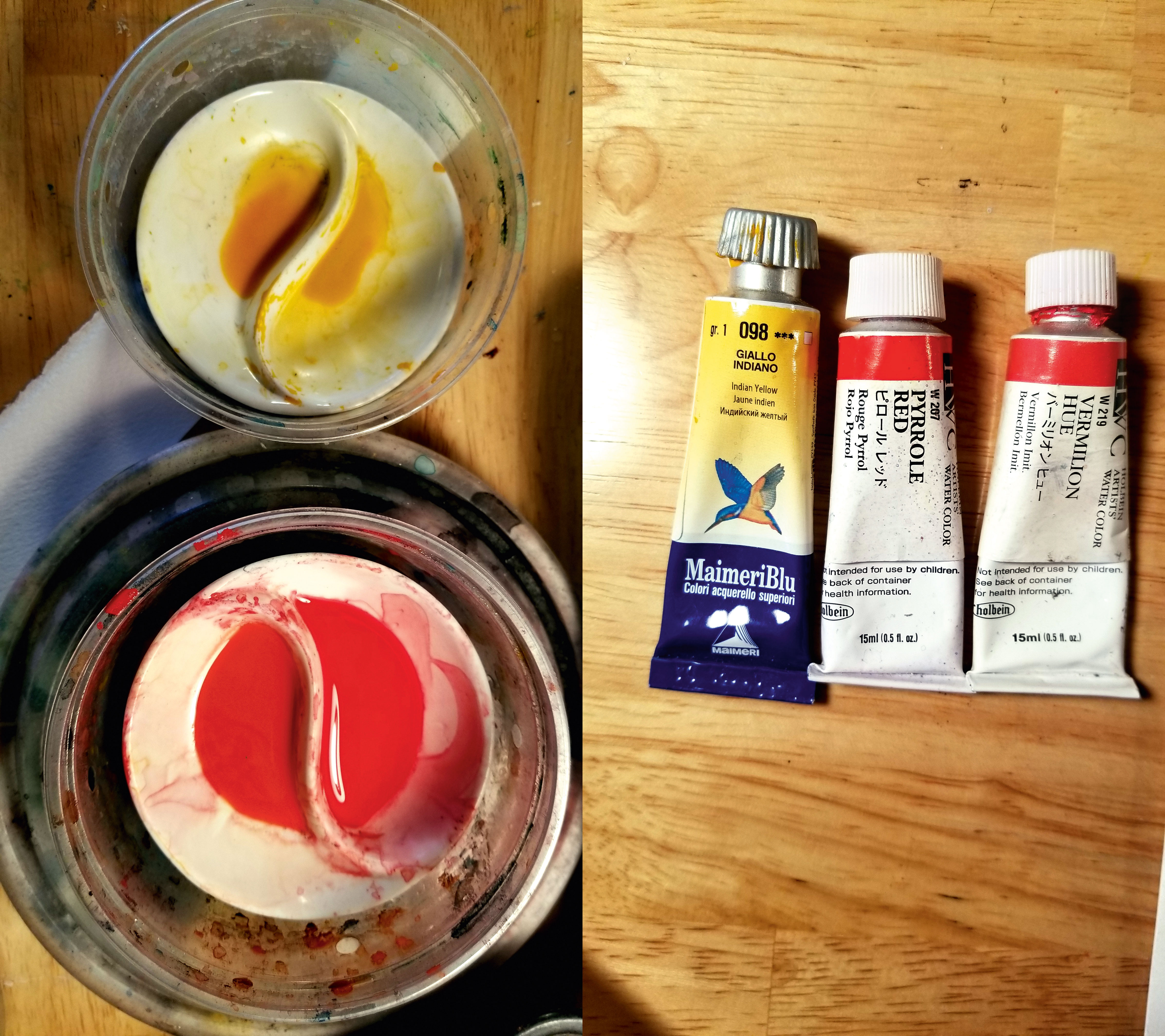
The few warm colours in this cover will be Telsa’s hair and the tip of the laser rifle that she’s carrying. I limit this warmth to these three colours (shown above). All my paints are usually kept in sealable containers with holes punched to the side so that they can dry, but not collect dust.
07. Carve out some details
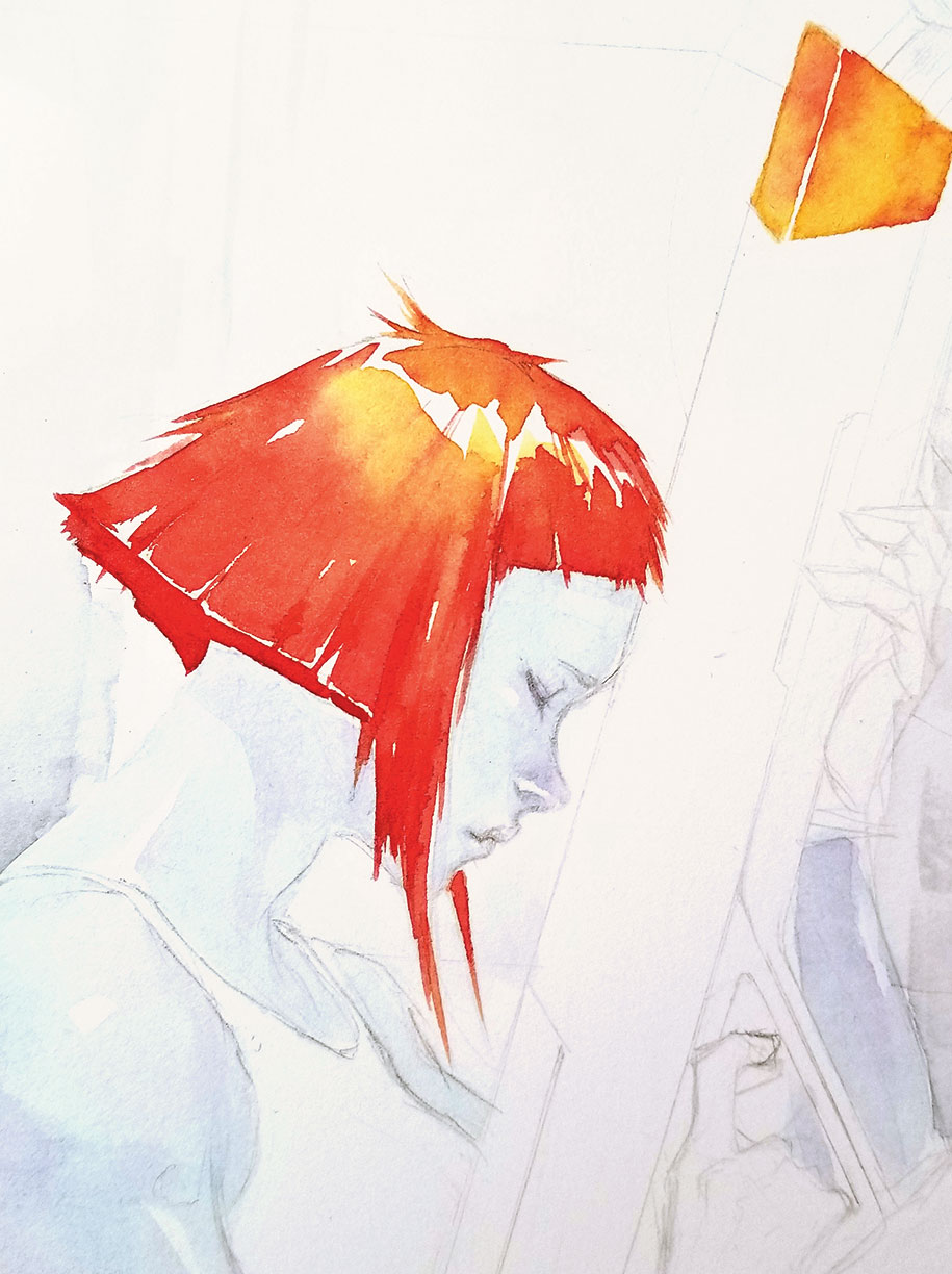
Using a smaller 1/4-inch chiselled tip flat brush, I work in Telsa’s hair and laser rifle tip, leaving nuances of highlights here and there. People often ask if I use liquid masking – I don’t. It’s just easier and more natural to just not paint in the areas you want highlighted.
08. Rough it up

On to the rest of the costume, I go with a neutral tint for her top and use a bit of HWC’s Vandyke brown and Ivory black to dirty up her boots a bit. She’s been on quite a journey up to this point, and her once-pristine military uniform is now looking tired and worn out.
09. Create a claustrophobic setting
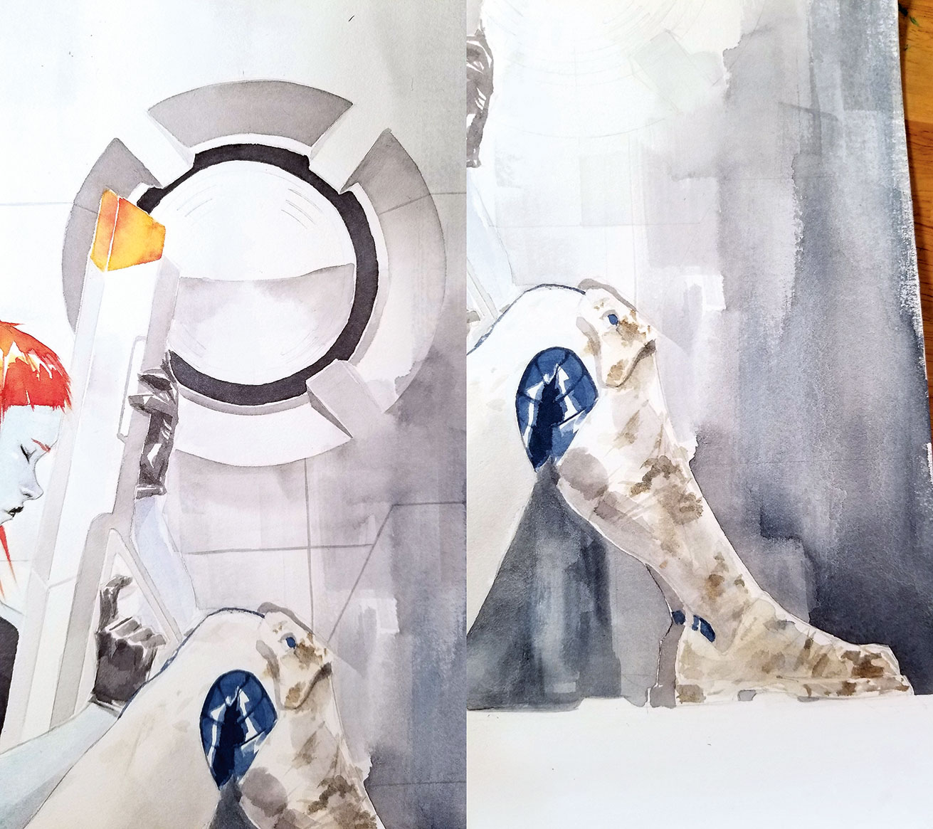
I move on to other parts of the page, giving the background some depth. I want her sitting near some sort of vent in the lower levels of the ship, holed up in a confined space with just a bit of room to think and breathe.
10. Lay down hard lines
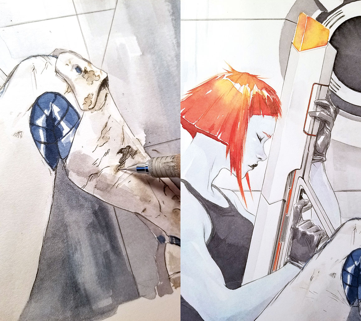
I move on to finalising the image with some hard lines, using a soft mechanical pencil and thinner brushes for the smaller details. I use a 0.3mm pencil here for some of the details on her boots and the section lines on the wall. The fine lines become finer as I bear in mind that the image will be scaled down in print.
11. Know when to stop
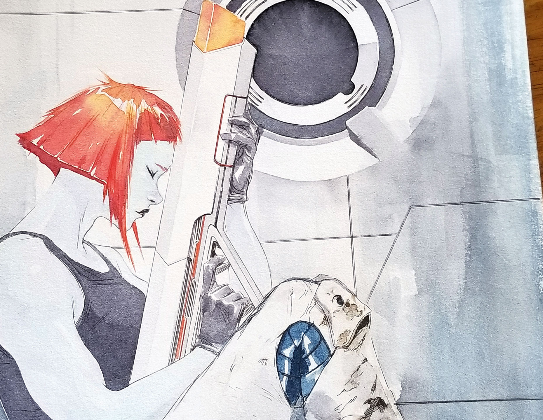
I set the piece aside and give it some time to dry. My biggest fear is that I end up overworking a painting. I’ve never considered myself a real portrait painter, or even close to drawing any sort of likeness and realism, so it worries me when I spend too much time trying to perfect a painting.
12. Clean up in Photoshop
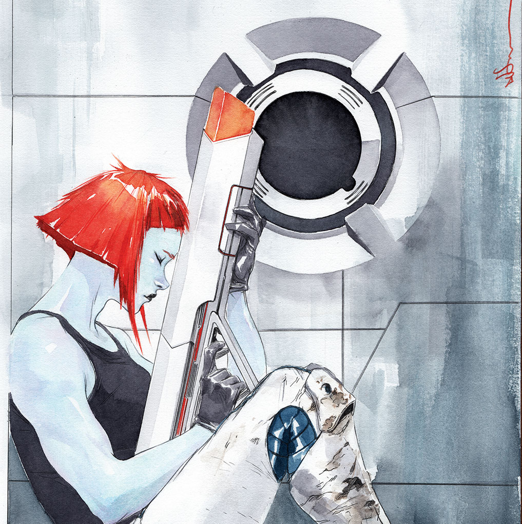
I scan in the final piece for cleaning and touch ups in Photoshop. I spilled some paint inside the dome of the fan and decided to just make it a big hole. I had to move fast so that the paint would lay evenly, so didn’t get a photograph of the accident. It turned out okay, though.
13. Address the little things
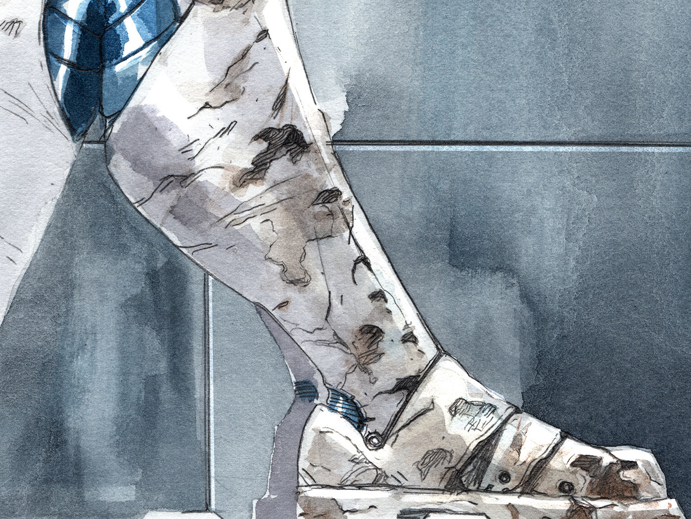
I touch up some highlights in the more saturated areas, the section lines along the walls, highlights on textures of her boots and bits of dirt. It’s mostly whatever I forgot to do in the painting phase. This is also where I clean up any dust that I scanned in by mistake.
14. Convey a sense of conflict
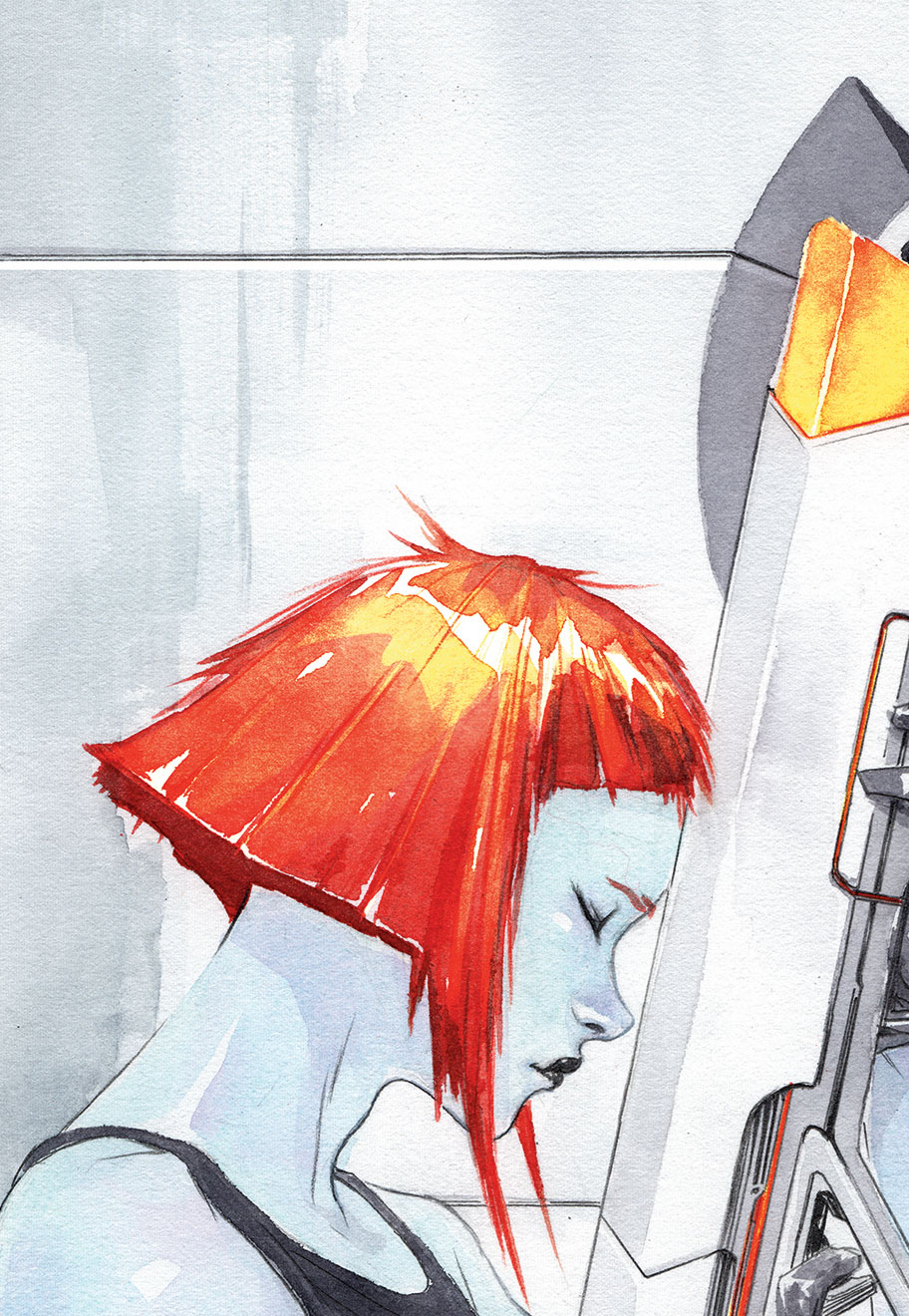
Some more touch ups. Using Photoshop I highlight parts of Telsa’s hair, the rifle tip and some more small details. My main focus, though, is Telsa’s eyes, brows and lips. I want to convey a sense of conflict, difficult choices to be made, and the heartache in making them.
15. Finish your image
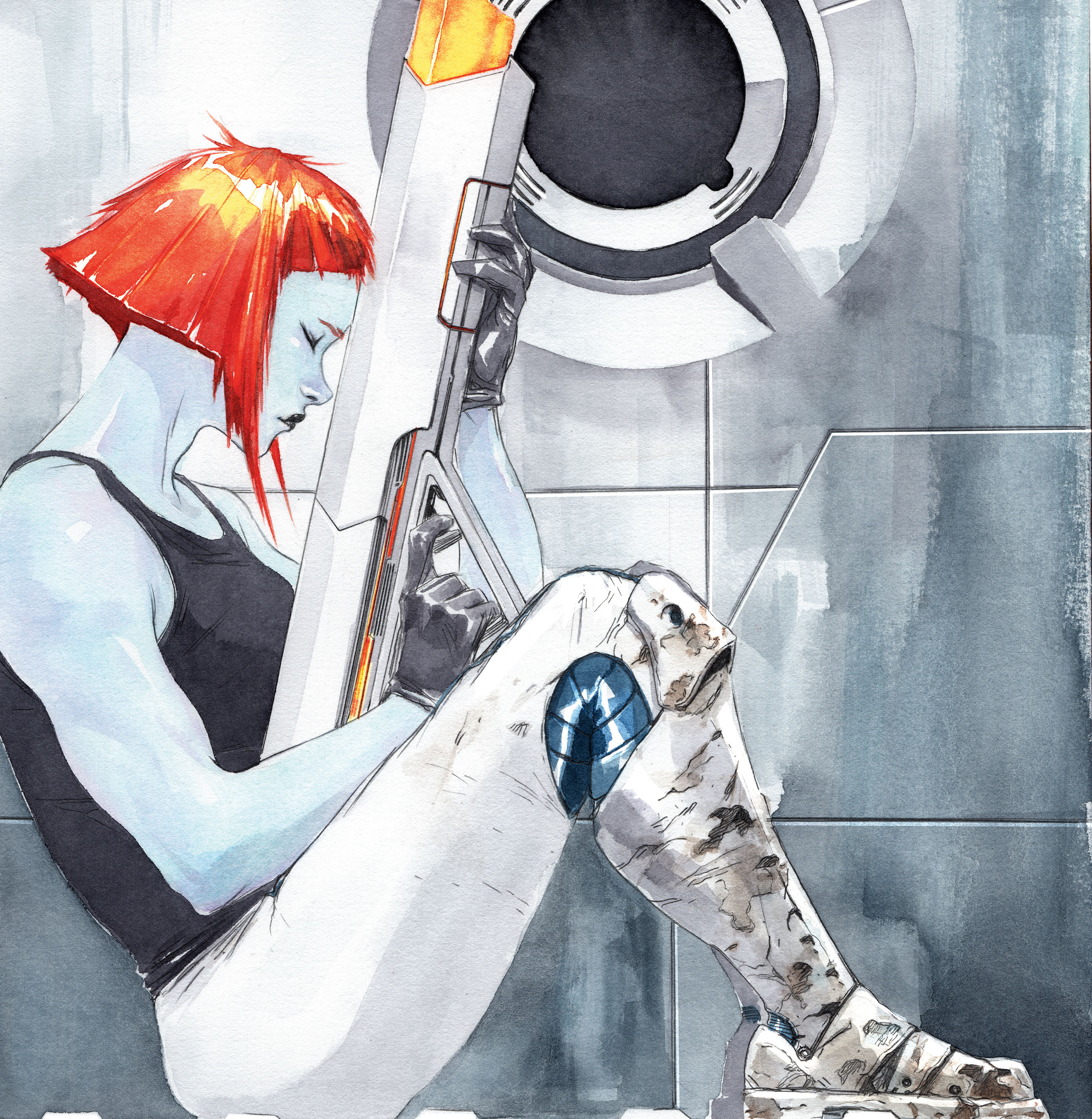
Here’s the final image of the cover. I clean up around the left and bottom, making room to cropping and text placement (that’s what the white space is for). All looks good and we’re ready to go to print.
This article originally appeared in ImagineFX issue 160; subscribe here.
Related articles:

Thank you for reading 5 articles this month* Join now for unlimited access
Enjoy your first month for just £1 / $1 / €1
*Read 5 free articles per month without a subscription

Join now for unlimited access
Try first month for just £1 / $1 / €1
