Concept design a ZBrush creature
Discover the process for designing this unique creature concept for film production.
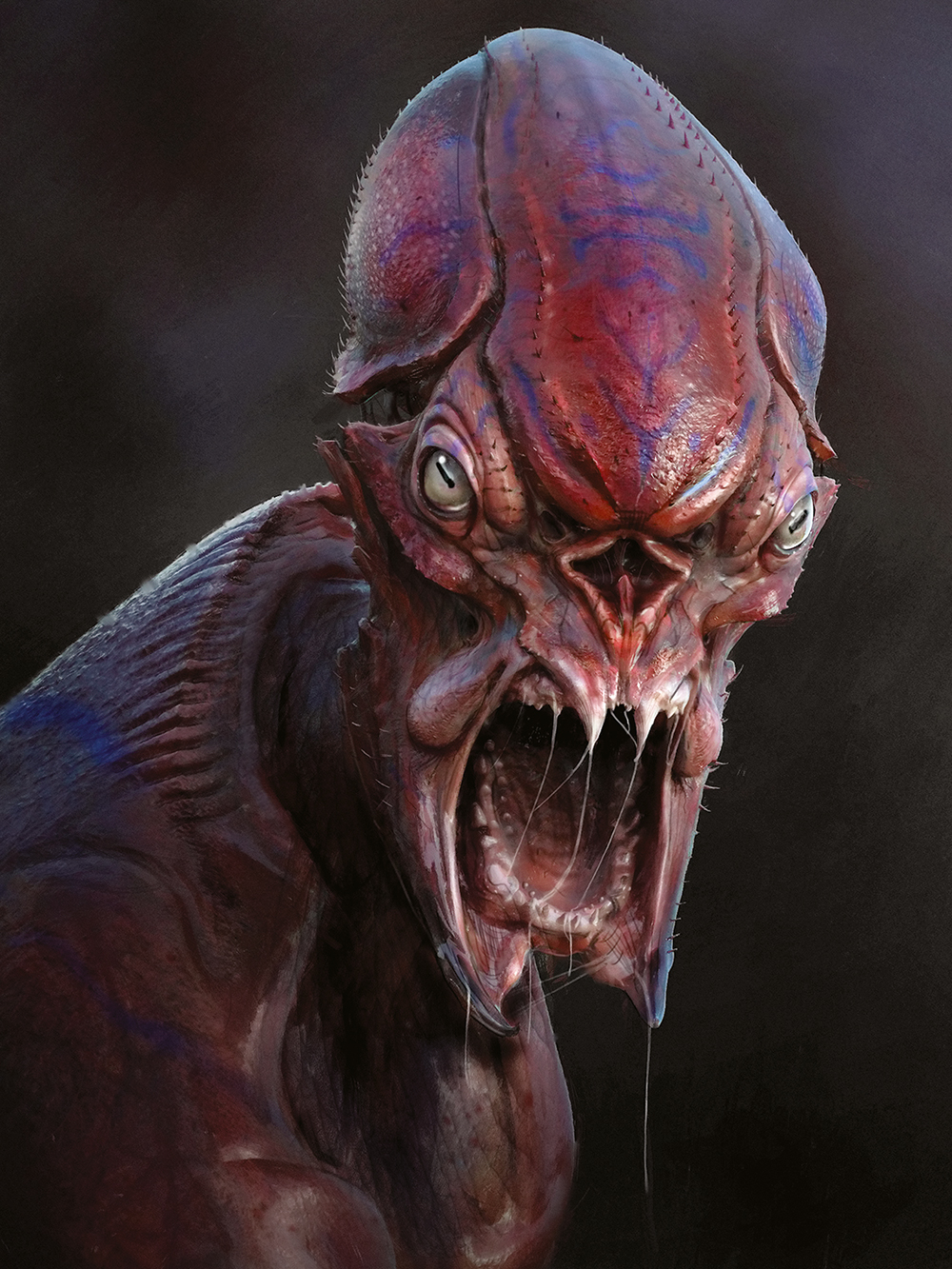
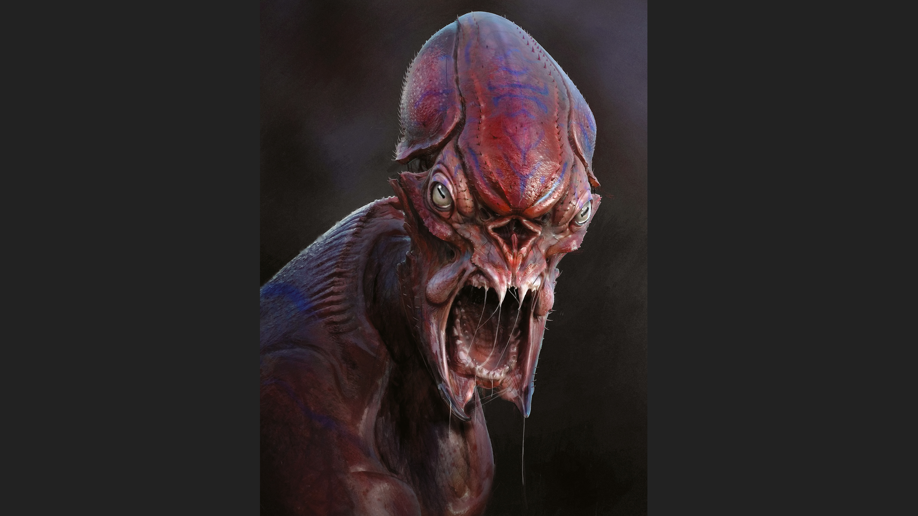
Whenever I start a new character I try and think of the how and why of what I'm doing. For this piece of 3D art, we wanted a striking creature bust, screaming at the camera. I wanted to approach this in a very open manner and see where the digital clay would go.
I did have a few things in mind. For some reason I wanted to do something red and somewhat shiny. I looked at ants, crustaceans and even rodents, and began to sketch out some rough ideas in my sketchbook. I like to start things in 2D – even if they never go anywhere it opens up my brain a bit.
Over the course of this tutorial you will learn my basic pipeline and approach, and I hope you can pick up some tips to include in your next project.
My workflow is always evolving and changing on a per project basis, but the main things that I have found to be constant is having strong foundational skills in sculpting and painting.
My studies of life, such as sketching at the zoo, studying anatomy or creating simple sculptures, always helps when I go back to doing fantasy creatures.
As you develop your art career you'll discover that software trends can come and go, but the core art skills remain the same; if you focus on those areas the tools and techniques can change as often as needed but the results will always be consistent!
01. DynaMesh
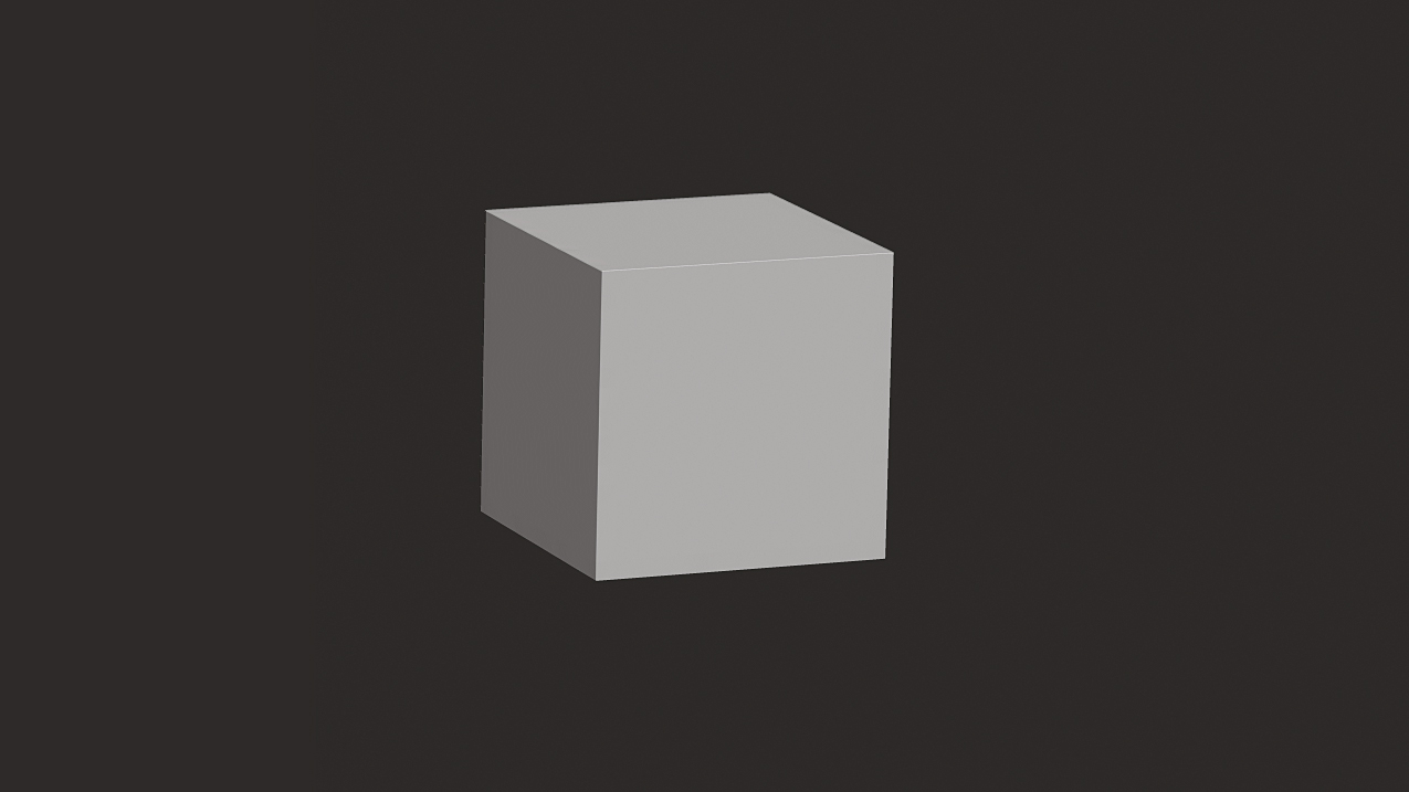
I almost always start with a sphere or box and go to DynaMesh fairly quickly. I find it is best to start at a very low DynaMesh (sometimes as low as eight or 16) and work each step until I can no longer get the result I desire. The box with a few subdivisions is great because it keeps me thinking in very simple terms. At this stage I am mostly using only the Move brush and smoothing.
02. Master 3D sketching
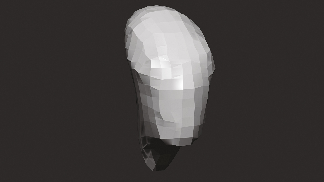
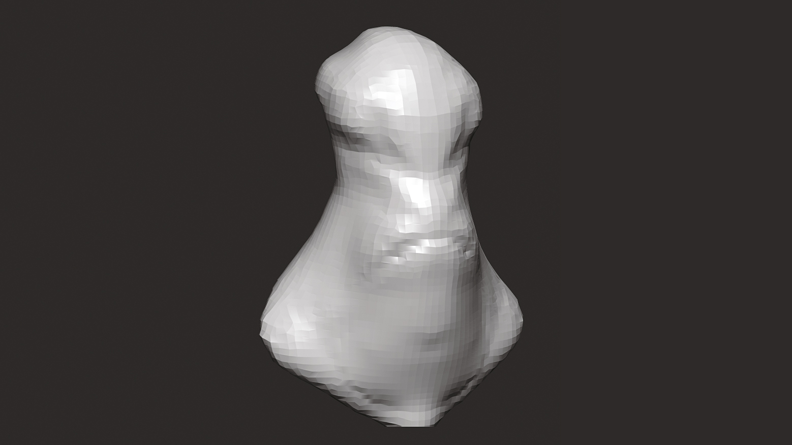
I have pushed the low DynaMesh and figured out a very simple head shape. Nothing fancy here but I do try and think of the overall character at this stage. I consider sketching this in 3D, so I want to make sure the 'doodle' is evolving as I find the character, not the other way around. At this stage I am mostly only using the Move brush and Smooth but I may use Pinch and Inflate as well.
03. Develop the character
Once I have the simple shape blocked in I will up my DynaMesh settings and begin to find the character. The beauty of designing in 3D like this is I am never stuck with my initial block-in. Early on I was thinking of a fatter and funnier kind of character. I'm still primarily sculpting with the Move and Smooth tools, but I will start to use the Standard brush or Elastic to sketch in some more distinct ideas.
04. Break creative block
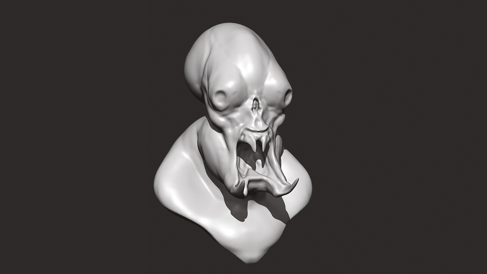
I sometimes find my initial shapes to be a bit safe, so once I get a direction, I like to use the SnakeHook brush and try to break my way of thinking. For design, 3D has a tendency to feel very stiff or lifeless, so I am always trying to fight that. I still work on the lowest Dynamesh setting I am able to and still get the form I want. Detail is not even entering my mind at this stage.
05. Finding secondary forms
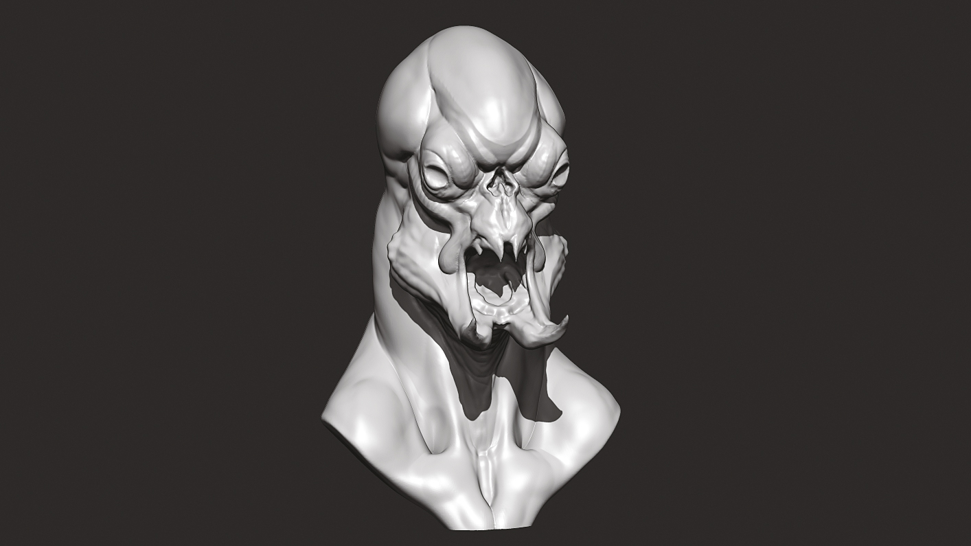
The bulb head and long prongs along with the odd neck shape are starting to really balance out well for me. I am starting to find out who the character is at this stage. I am finally stepping up the DynaMesh to start figuring out secondary forms and such. At this point the character is starting to emerge. I still have a lot to do, but I will now use ZRemesher and project this detail onto a low resolution cage to continue refinement.
06. User ZRemesh
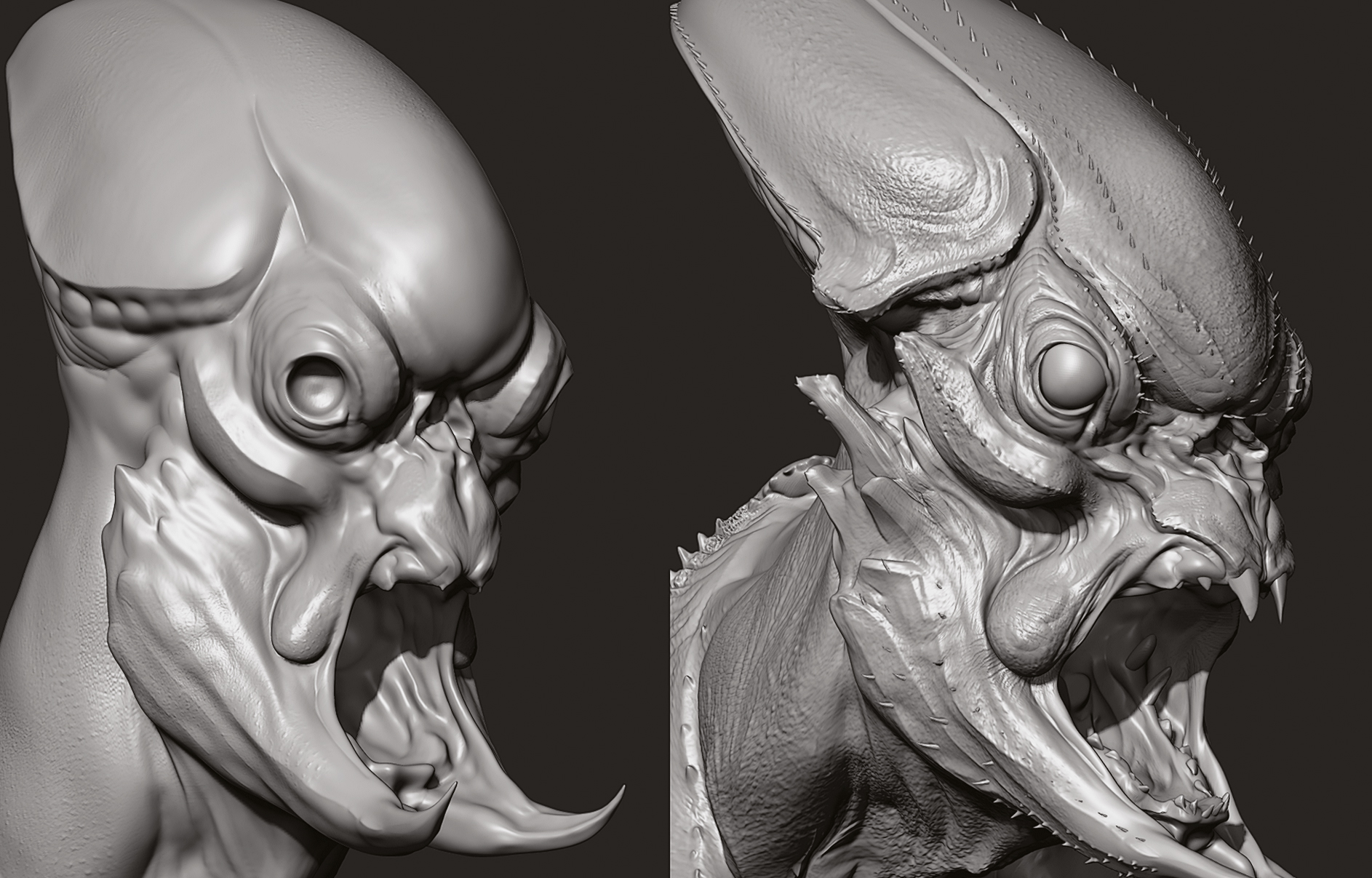
This is where I take the DynaMesh sculpt and decide it has enough information to give it a quick ZRemesh. The settings I use change on everything depending on need, but I usually change the Target Poly Count to something like one or two; Adaptive Strength between 20-50. I rarely use the more advanced controls such as Curves or Polypaint for concept remeshes, but it is nice to have those options when or if needed.
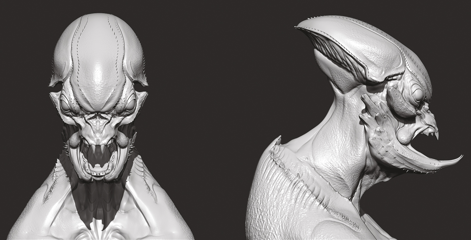
07. Using DynaMesh
Always duplicate your DynaMesh before remeshing so you can add divisions and project the detail and information back to the newly remeshed subtool. This will aid in everything, from being able to add more detail to posing. One thing I really like about this workflow is that I can now change my main forms and retain the secondary detail on the higher levels, allowing me to explore more dynamic shapes I may have otherwise ignored.
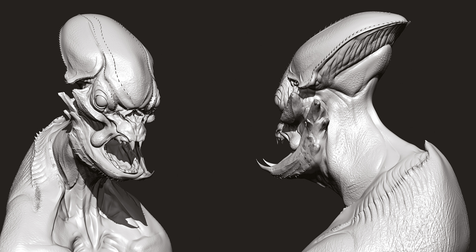
08. Begin adding detail
Once I have shapes I like, I begin adding detail. Tiny barbs, wrinkles, crustacean-based shell motif. This stage usually goes fairly fast so long as my primary and secondary forms are strong. When detailing, balance high and low areas of detail – this will draw the viewer to the areas you want them to see and really guide the eye around your character. The worst thing you can do is over detail a design. Simple is almost always better. When in doubt, look to nature.
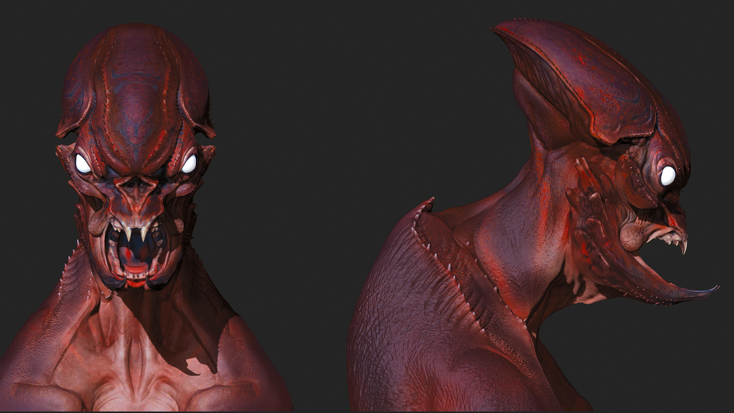
09. Now add colour
This stage sometimes bleeds into the detail step; as I add colour I may also add new detail as needed. This step is about reinforcing my sculptural detail – highlighting ridges and prongs and darkening areas to keep the viewer looking at the face. Designing in 3D can sometimes become a trap when you want to finish every aspect of a sculpt before presenting the image. Very rarely do you have the time to do this, so focus on what matters!
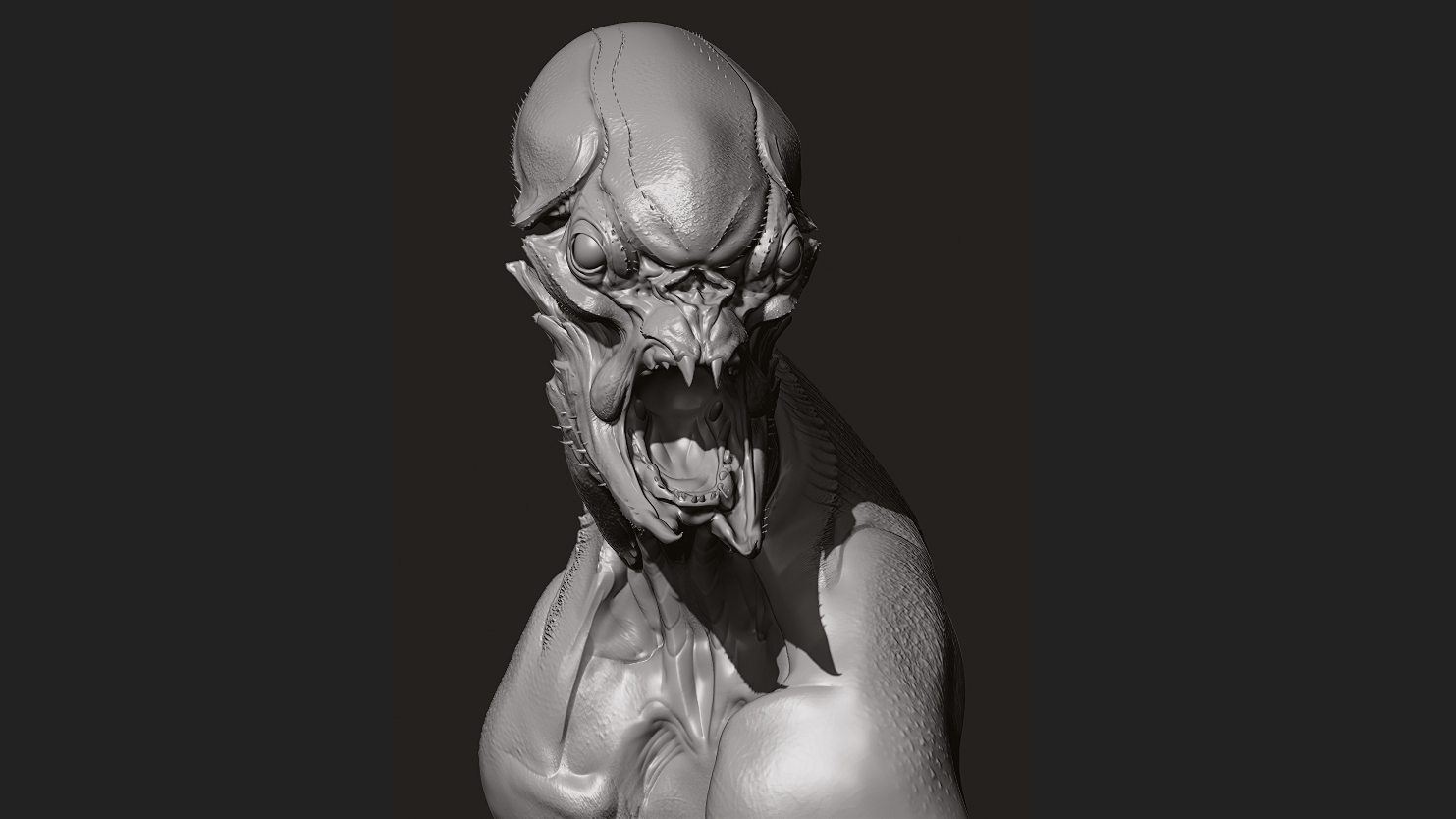
10. Understand posing
Posing is a very important and often overlooked aspect of doing 3D design. A lovely model in a static pose very rarely is altogether striking. This is a simple bust but I still try and think of balancing the creature, even with an imaginary body. If the head goes one way, the torso will try and balance it by going in the opposite direction. This adds drama and interest to the creature, as opposed to simple stacking everything on top.
11. Setting up KeyShot
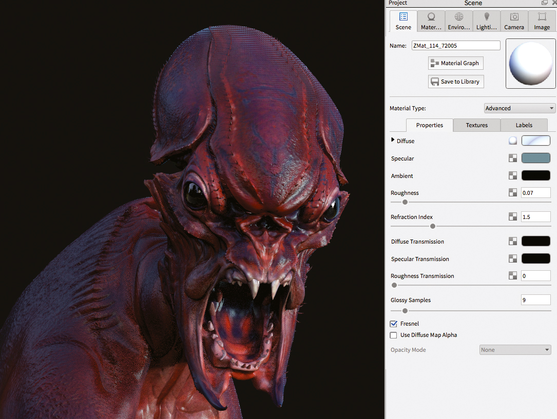
ZBrush materials in KeyShot have no specular or roughness; they use a fake baked-in specular from the ZBrush information. So, add specular and roughness to your materials to see how the lighting works. Be subtle: too glossy can look fake or wet and overly diffuse will wash away the form. For the eyes, I use a bright white specular/gloss and no roughness. For the skin I use a subtle blue-grey and turn the roughness up so it scatters the light.
12. Lighting in KeyShot
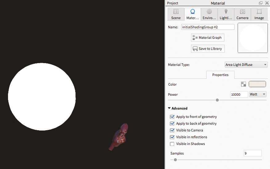
Lighting in KeyShot is amazing at first glance. The HDRI settings really open up a lot of quick lighting scenarios to play with. Sadly, I find they also lend towards a bit of a fake/product feel to nearly all of my renders. To counter this I like to add in area lights using simple spheres to really control my lighting set up. This can make your render times get a bit crazy, so be very careful when experimenting.
13. Using render passes
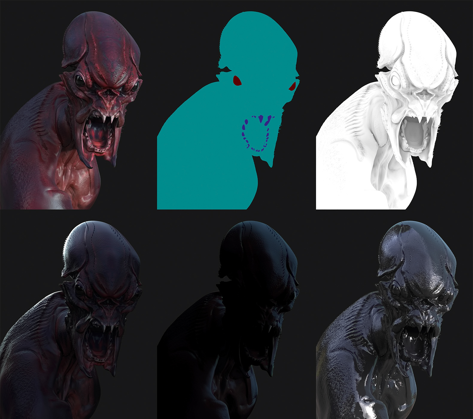
Render passes are an integral step for me. Very rarely am I thrilled with the one off material. I like to render out multiple passes and take them into Photoshop for extra control. Reflective or wet areas might look great in the eyes or mouth regions but seem oddly out of place on the overall body. By rendering out a few passes, I can have complete control over the final look of my hero shot. I’ll look at each pass in the following steps in more detail...
14. Beauty pass
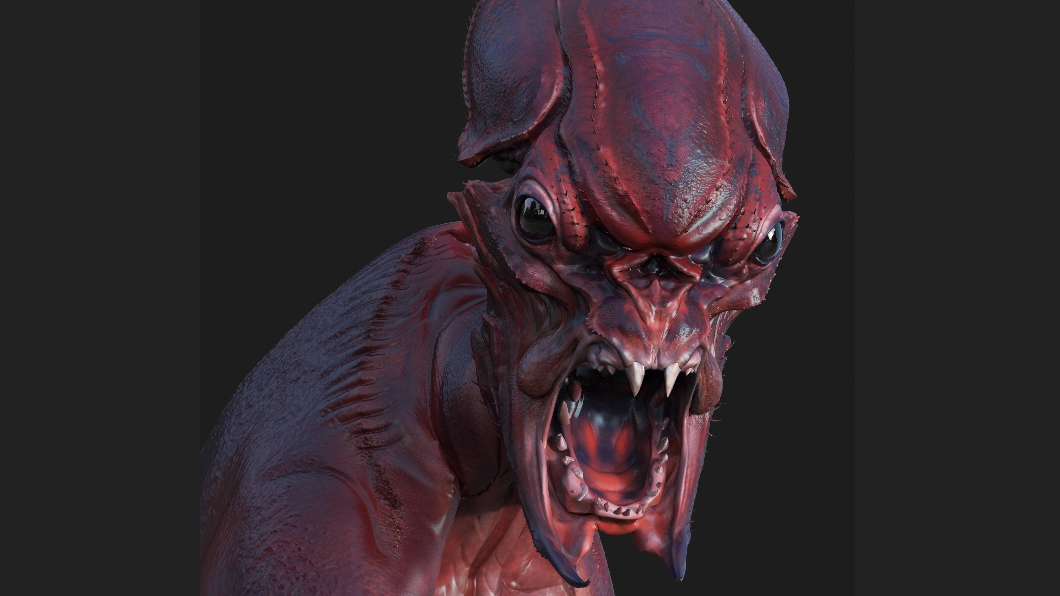
The main pass I find I always use is a Beauty pass. Basically this is the master render – it has a nice material, with texture. If all I could show was this pass it would still be presentable, just lacking the pop we get by comping together other passes.
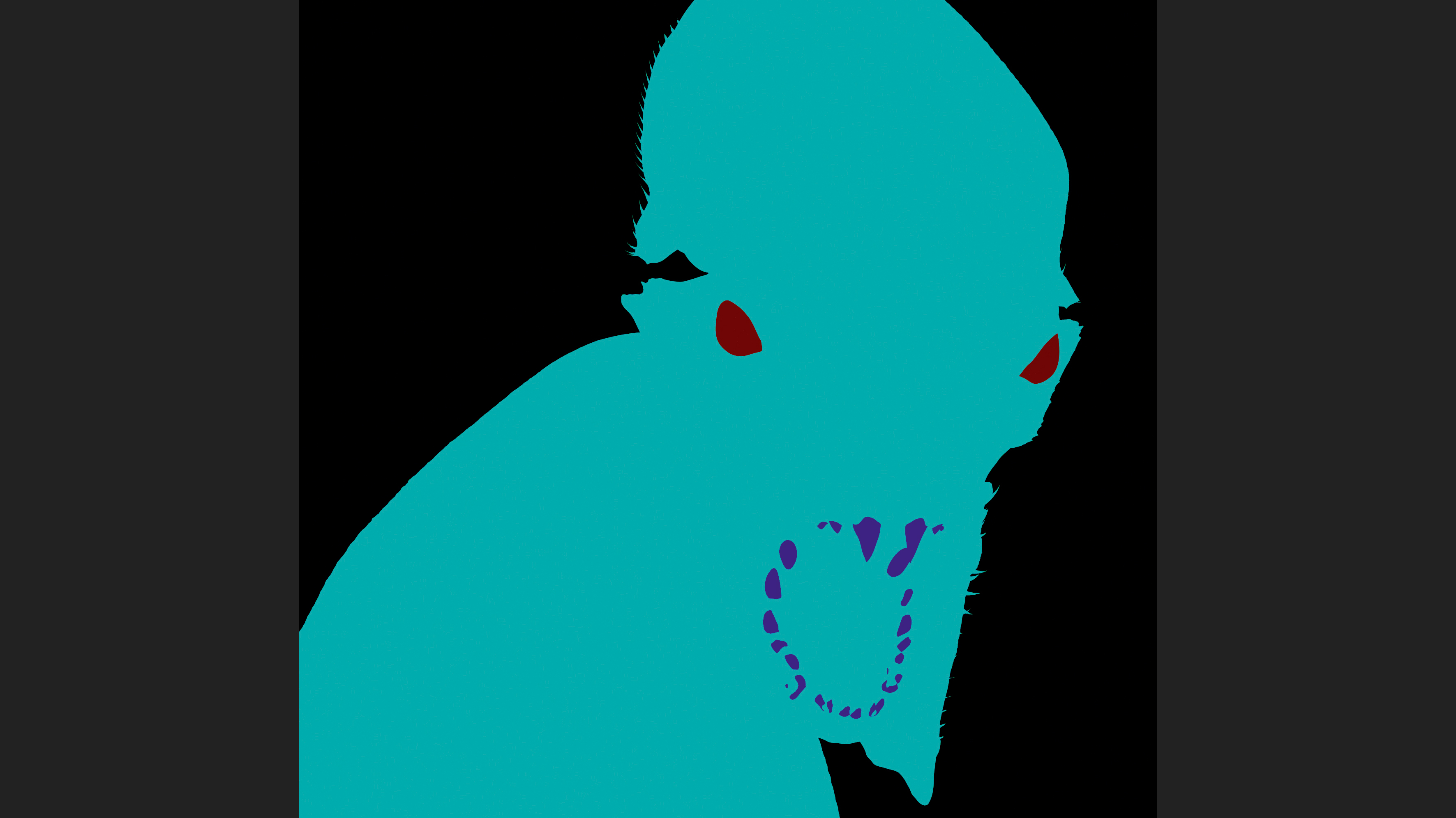
15. Clown pass
A Clown pass is useful if you have many different materials. For example, my creature has a variety of materials for the eyes, bust and teeth – as well as some of the barbs and spikes lining his shell-like areas. So using a Clown pass becomes a useful tool for quick selections and masking of these various areas, speeding up my workflow and simplifying the process.
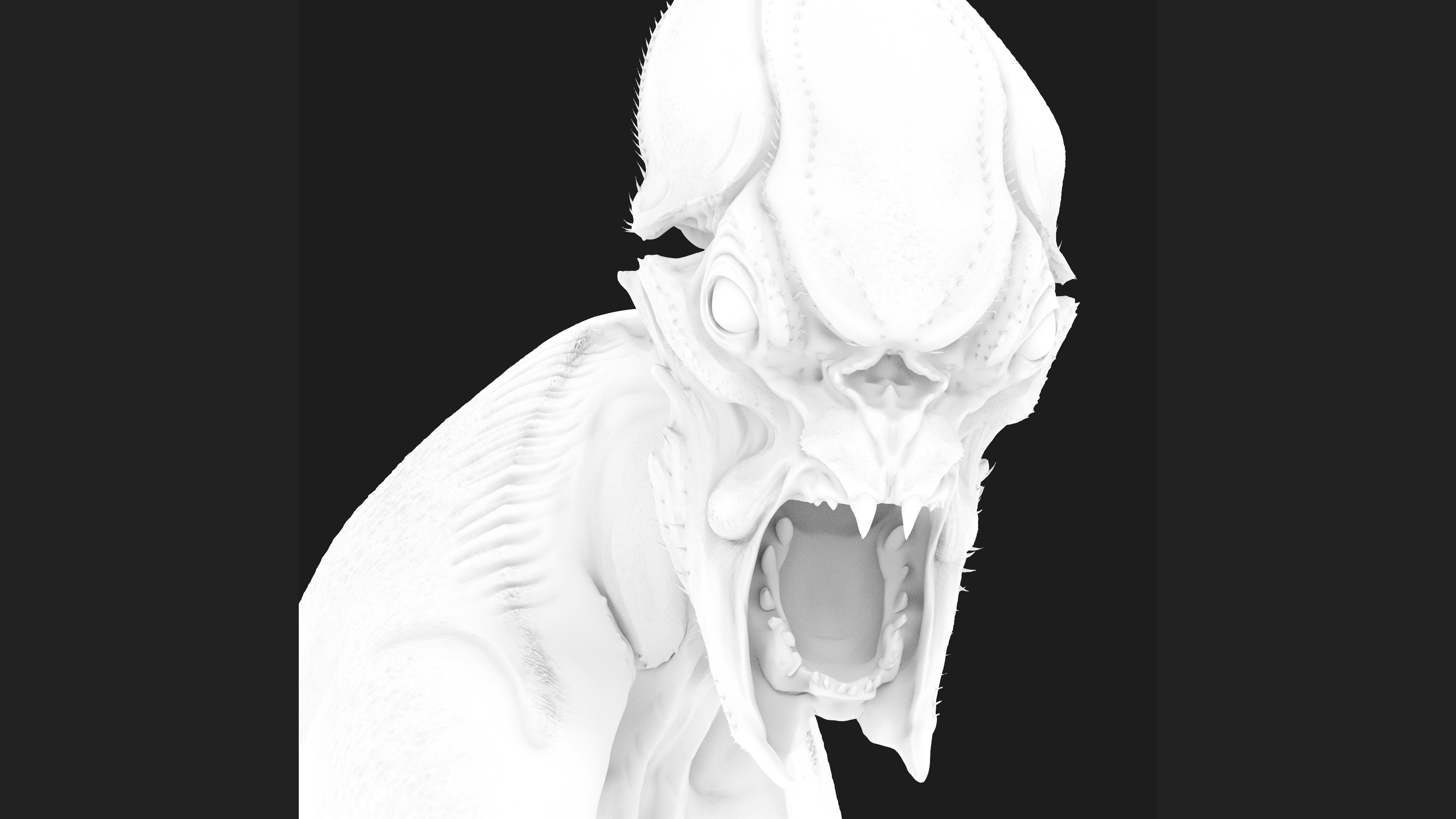
16. AO pass
The AO pass (Ambient Occlusion) is great for defining crevices and form shifts in your ZBrush creature sculpts. I like to use this on a low Multiply Opacity setting to help shadow out some areas. Sometimes I like to mask this too, and let some areas show more than others.
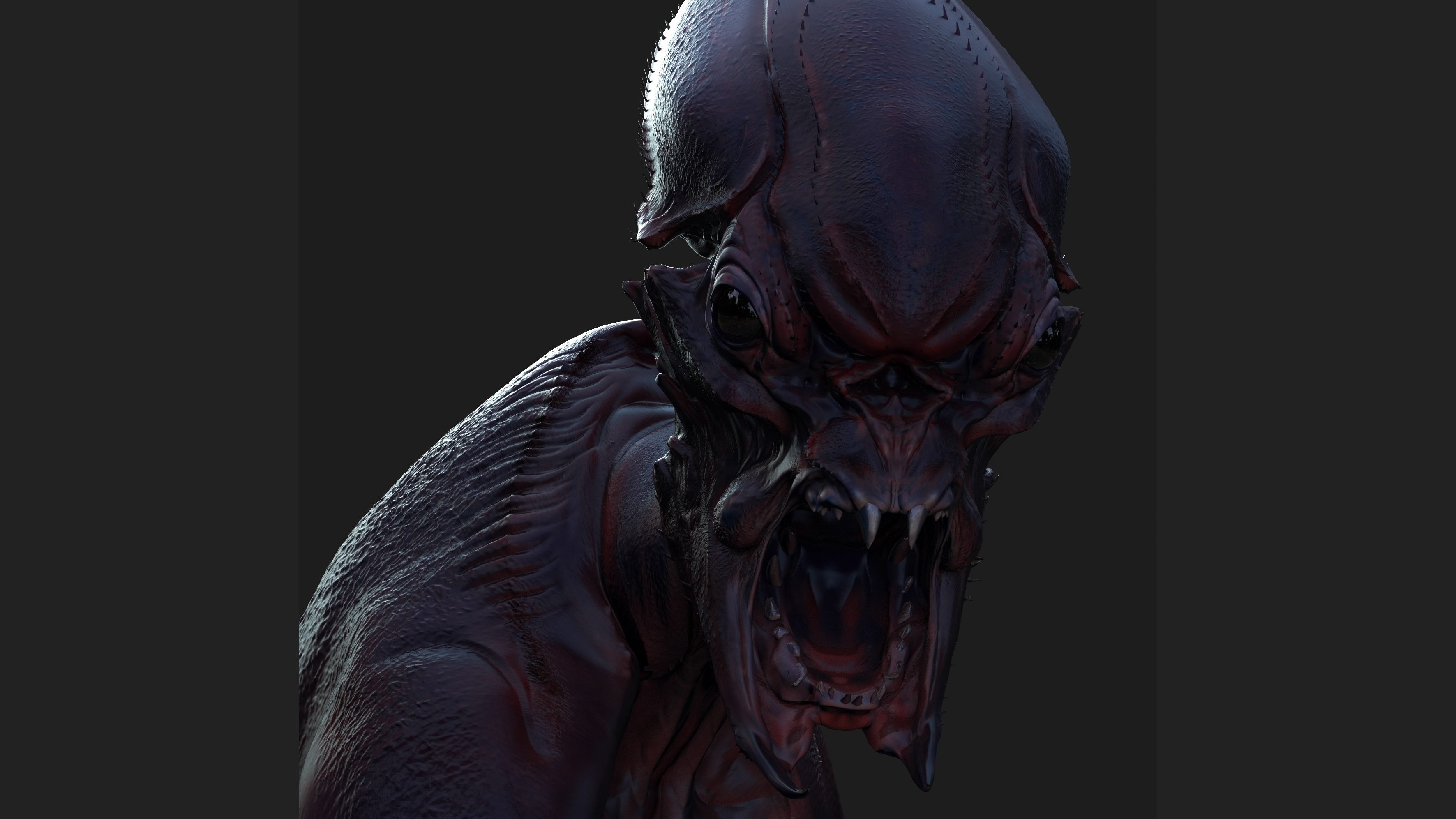
17. Rim light pass
Rim passes/Light passes are great if you want to make sure your creature sculpt is really popping off the background and the form is reading correctly. The silhouette is key to all good creature designs and this set of passes is a quick and easy way to check the sculpt is reading well. The easiest way to do this is just to turn off all other light sources but the one you want to amplify.
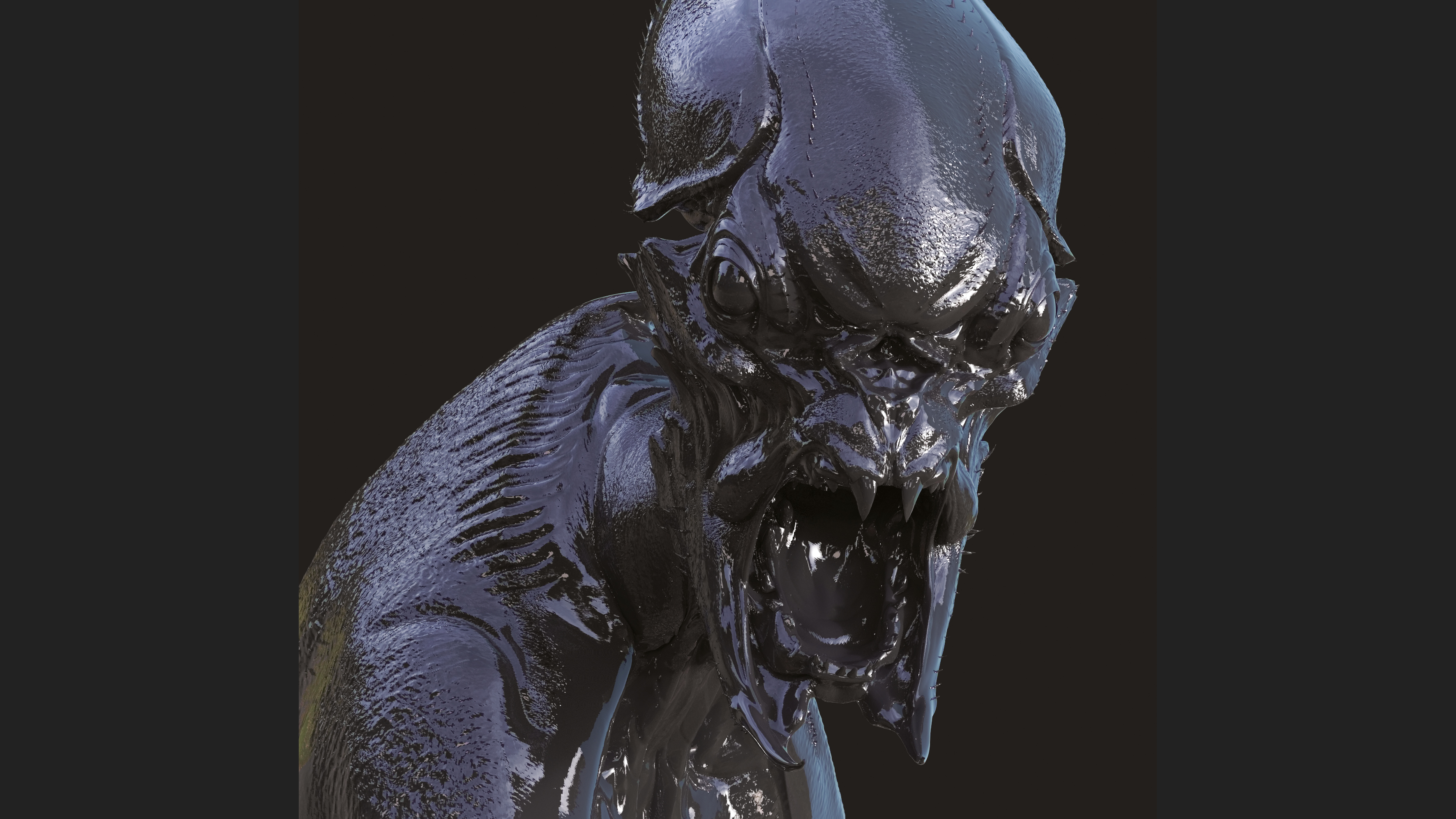
18. Reflection/specular pass
Finally, a Reflection pass/Specular pass can be great for adding a bit of gloss to areas that might be looking a bit flat. It is important to mask or paint this or you run the risk of having an overly glossy or uniform shine to everything. Think about your own face, chances are your lips and eyes (and maybe nose if you have a cold) are a bit more wet than your cheeks and forehead.
19. Using Photoshop
Once I have a few passes rendered out I will jump into Photoshop and start layering them. Specular passes on screen or softlight; Ambient Occlusion passes on multiply (or maybe as a mask for other materials). Every character has different needs. Once I get a nice base going I quickly collapse my layers and begin to just paint on the design. Again, part of this is to get rid of the CG feel on the image as it can feel a bit lifeless.
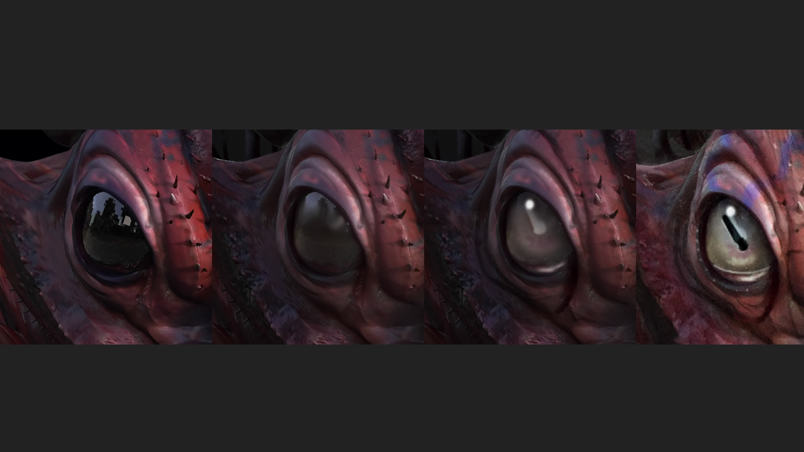
20. Final touches
I like to spend time refining key areas of the creature at the end of the process, for example, creating the eyes. I like to paint my eyes – I very rarely sculpt and render out proper eyes anymore. They are fun to paint and very easy and fast to create. Usually I will render a white sphere or black sphere and just use this shape as a guide to figure out the next steps and have fun painting in something unique.
This article was originally published in 3D World magazine issue 208. Buy it here.
Get the Creative Bloq Newsletter
Daily design news, reviews, how-tos and more, as picked by the editors.

Thank you for reading 5 articles this month* Join now for unlimited access
Enjoy your first month for just £1 / $1 / €1
*Read 5 free articles per month without a subscription

Join now for unlimited access
Try first month for just £1 / $1 / €1
