While colours don’t change overnight when the bells strike midnight on 31 December, there are shifts and developments that can almost come to define each year. The last year has been dominated by bright vivid, almost electric colours, neons and continued use of duotones and colour gradients.
While some classic colour palettes are here to stay, there are many design settings that will see new tendencies in the new year – both in the colours that designers use and the way they use them. Here we run through seven colour trends to keep a keen eye on in 2020. For how colours are classically used, see our colour theory explainer. Are trends any good for branding? It's certainly hard to avoid them if you want to connect with the moment.
01. Muted palettes
The trend through 2019 has been largely bold, vivid colours, with many brands brightening up their branding with almost dayglow electric hues. When peer-to-peer lending company Ratesetter updated its branding mid-year, the biggest change was to up the saturation and intensity of its purple brand colour.
But the counter movement has already begun. With vivid colours now so prevalent, 2020 will see a growing tendency to step back towards more muted tones. Some brands have already started to take the edge off colours, desaturating them by infusing them with black, white or a complementary colour to make them less abrasive and easier on the eye.
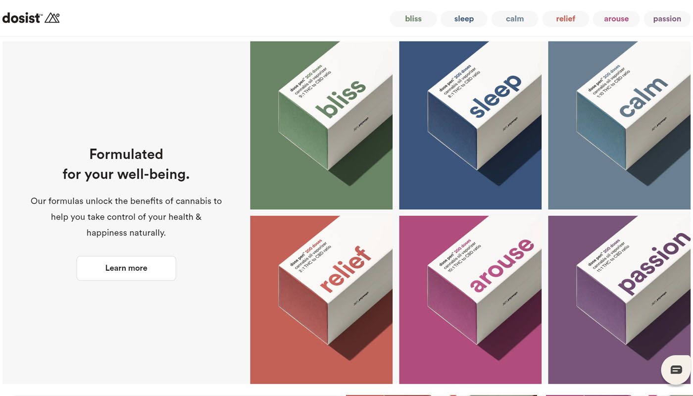
Medical cannabis company Dosist show how muted colours can give a more mature look to stand out from competitors. By using muted colours, you also avoid creating a harsh contrast with the white background. LinkedIn has been using muted colours in marketing posts on social media to make its material stand out without shouting. The brand colours are still being used, but they’re toned, showing a possibility here to develop a secondary colour palette based on brand colours by adding some black or white. It feels modern and natural.
Don’t be surprised to see the trend extend into imagery too, with designers opting for more subdued and natural-looking photography in place of oversaturated images.
02. Earthy colours
Following on from the tendency towards more muted palettes, the recent penchant for vivid neon colours and a cyberpunk aesthetic is starting to give way to a return to more earthy tones. This can sometimes generate an even retro-looking effect conjuring up the homely feel of the 1960s and '70s.
Get the Creative Bloq Newsletter
Daily design news, reviews, how-tos and more, as picked by the editors.
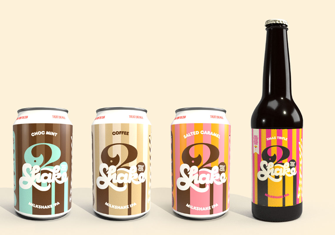
Melbourne’s Studio io has been specialising in this throwback look in its packaging designs for the city’s oldest brewery 3 Ravens. It turned to vintage juice and ice cream cartons and labels for the colour inspiration and the resulting labels feels nostalgic, but also fun and authentic.
The Nike Hyper Court app in the Philippines went for similar earthy colours to appeal to youngsters and looked much cooler than it would have done had it gone for a more obvious neon-infused futuristic palette. Estudio Santa Rita’s artwork for Dropbox’s Spotify playlist also show earthy colours can give a sense of artisan craftsmanship to tech companies.
03. Monochrome
The trend over recent years for the use of duotone and colour gradients is now getting even simpler as brands start to put the emphasis on a single brand colour. It’s another sign of a step back from so much colour, and an attempt to stand out from the noise with a simple, clear identity across all material.
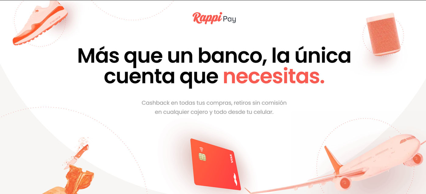
Latin American on-demand delivery startup Rappi uses tones of its brand orange through the landing page for its Rappi Pay payments service in Colombia, and Argentine insurance company Iúnigo adds colour accents in only its brand colour blue throughout its illustrations and UI (designed by DHNN).
While monochrome filters may look old-fashioned in print materials, they’re getting a new lease of life online. Monochrome colour filters are being used once more in all or partial elements in graphic composition, like the purple filter on the imagery on this site for Intelligent Artifacts.
04. Metallics
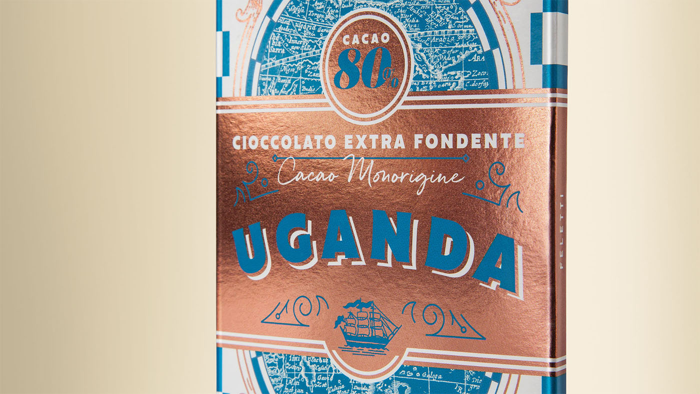
While the previous trends all suggest colours being taken down a notch in 2020, we can still expect to see plenty of bling with a growing tendency for metallic looks and effects. For physical collateral like business cards, promotional brochures and invitations, designers are taking advantage of foiling and relief engraving to give a touch of class and luxury, while web designers are adding 3D metallic effects for an equivalent effect online and a sense of dimension.
But even here the trend may be heading towards more subdued options, with copper and bronze rather than gold or silver. The packaging design for Feletti chocolates by Happy Centro Design Studio uses a warm copper/bronze to conjure up images of nautical adventures and old portholes – and it looks much better than a more glaring gold would have done. Iridescent metal effects are also being used in products like the Apple Card and By Haus’s branding for Cadabra (see below).
05. Colour gradients mature
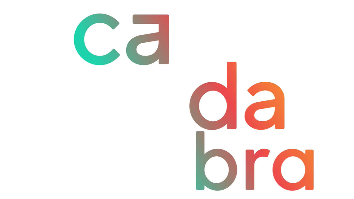
Colour gradients have defied all those who said they were the comeback that would never last. Their ability to add depth to an image has given them true staying power and they’re not likely to go anywhere yet. What we will see is their use maturing as designers start to use them as a standard design element rather than the main feature in a design.
This can mean using gradients as backgrounds to graphics and to colour text in order to accentuate headlines or key words, like in the brand identity created for visual storytellers Cadabra by By Haus. These illustrations for for Twitter by Leo Natsume show how very subtle colour gradients can be used within illustrations to give depth without being the main focus.
06. Classic Blue
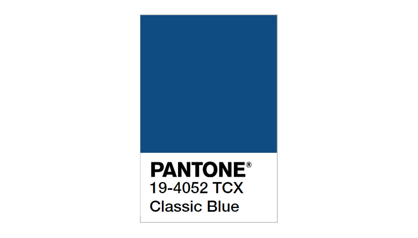
It’s almost impossible to talk about colour trends for the new year without mentioning the Pantone colour of the year. For 2020, the company behind the colour matching system has chosen 19-4052 Classic Blue, and it certainly is classic. It’s a timeless shade falls somewhere between mid-tone and deep blue. Why has Pantone matched this colour with the new year? Well, the company describes it as "Non-aggressive and easily relatable" and says it offers "the promise of protection".
There is something honest and dependable about this shade, while it’s also soothing and relaxing. This may be a reason why so many brands choose blue for their colours and logos. Pantone thinks it captures a global need for greater trust, confidence and tranquility. It’s a great sentiment to enter the new decade.
07. Dark mode
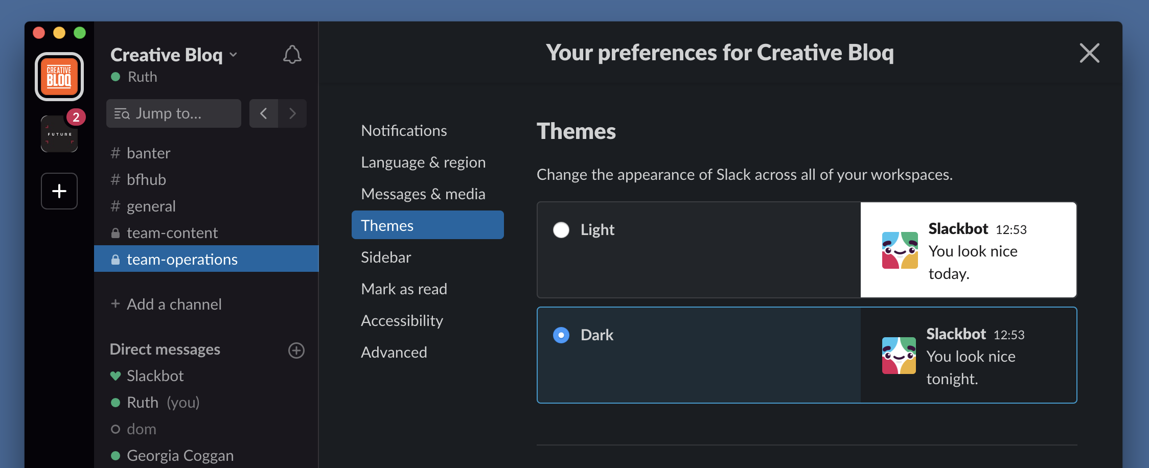
Not so much a colour, you might say but a lack of it, but dark mode is going to be influencing colour decisions across the board this year. Dark mode is a function in apps and websites that offers the user an interface which is predominantly black or grey instead of white. It’s gaining more and more adherents thanks to claims that it’s easier on the eyes and saves battery, but also because of aesthetics. The contrast of vivid colours against a dark background allows for interesting combinations with saturated colours that pop off the background.
Outlook launched a dark mode in 2019, Gmail followed, and Google now has an experimental feature that allows Chrome users to effectively force any website into dark mode by inverting the colours. Many web and UI designers working in UI will be considering designing a specifically for dark mode but in 2020 dark colour schemes aren’t restricted to websites and apps – expect to see dark mode-inspired design appearing everywhere as designers mimic the effect and use dark backgrounds to allow saturated colours to stand out. For example, as seen in some of the work by Dark Design Studio.. While white space remains the definition of clean and crisp design, we might hear people talking more about black space. Watch this (ahem) space.
Read more:

Thank you for reading 5 articles this month* Join now for unlimited access
Enjoy your first month for just £1 / $1 / €1
*Read 5 free articles per month without a subscription

Join now for unlimited access
Try first month for just £1 / $1 / €1

Joe is a regular freelance journalist and editor at Creative Bloq. He writes news, features and buying guides and keeps track of the best equipment and software for creatives, from video editing programs to monitors and accessories. A veteran news writer and photographer, he now works as a project manager at the London and Buenos Aires-based design, production and branding agency Hermana Creatives. There he manages a team of designers, photographers and video editors who specialise in producing visual content and design assets for the hospitality sector. He also dances Argentine tango.
