3 huge colour trends for 2018
Creative consultancy FranklinTill reveals the hottest colour palettes to know this year.
02. Primitive

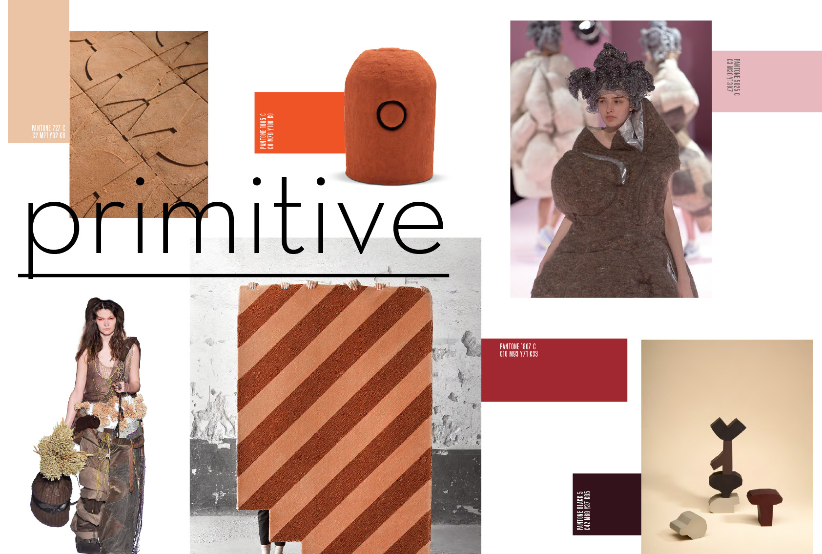
Last year, we presented a colour story titled Material Reveal. This was a celebration of the organic beauty of unadulterated natural materials and was driven by a backlash against industrial, mass produced design in a homogenised minimalist aesthetic.
This shift towards crafted material colour is showing no signs of disappearing, but the muddy earthen brown hues have evolved into saturated terracotta and burnt sienna shades.
Designers are reinitiating intimate connections to tactile materials, products and spaces, embracing a creative regression. They are devolving fabrication techniques in order to reconnect with matter and craftsmanship.

The imprints of techniques and processes are embedded in the aesthetic outcomes of new crafted products as designers employ slow, laborious methods and allow material origins to dictate final outcomes. Surfaces are rough-hewn and natural, appealing to a desire for tactile reconnection.
Celebrating terracotta
The imperfect finishes bear testament to the considered creation of each item and the respect of new craftspeople for traditional techniques. With a focus on materiality, surfaces display respectful manipulations that retain natural aesthetic qualities in honest material colours.
Rich earth tones, clay browns and nude have a grounding effect on the user, evoking a reassuring connection to organic matter.
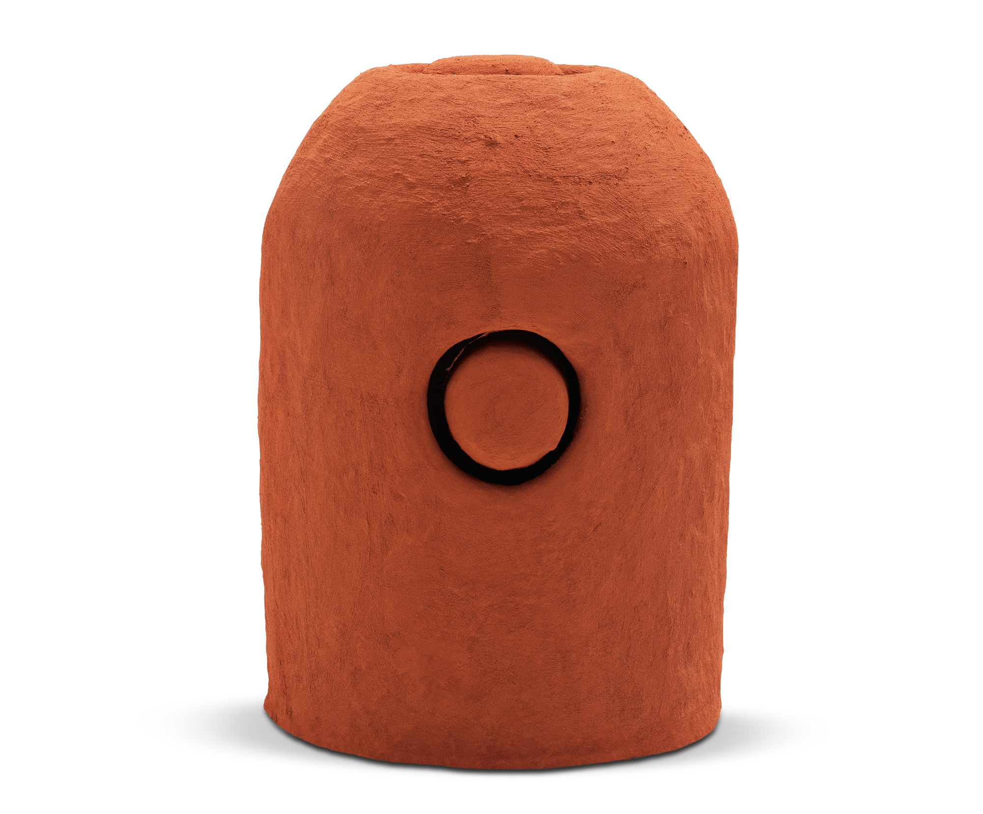
Terracotta is becoming a key material of the moment. The functional unpretentious earthenware is being celebrated for its natural orange hue, in marked contrast to more purist ceramic materials. Primitive resources suggest longevity and rough-hewn, hand-worked surfaces are respected for their honest imperfections.
Get the Creative Bloq Newsletter
Daily design news, reviews, how-tos and more, as picked by the editors.
In a true act of colour activism, sculptor Carl Emil Jacobsen created the Powder Variations series. Dissatisfied with the mass produced standardised pigments of stoneware glaze, Jacobsen looked to his environment to create various native pigments.

Collecting fieldstones, tiles and bricks from his local landscape in Denmark, he crushed and ground the materials to create bespoke pigments with a truly local narrative.
These vibrant earthen shades are even finding a place in the world of luxury fashion. The Bureau Betak design catwalk setting for Ermenegildo Zegna’s spring/summer 2018 show saw a blanket of striking burnt orange sand coat the ground, punctuated by reflective geometric plinths.
In graphic design, illustration and packaging fibrous papers allow the material to do the talking. They add texture to colour in printed material. Paper derived from unorthodox origins, waste food, such as coffee grounds or spent hops, for example, suggest and celebrate sustainable alternatives through the use of inherent natural aesthetics.
Next page: More big colour trends for 2018

Thank you for reading 5 articles this month* Join now for unlimited access
Enjoy your first month for just £1 / $1 / €1
*Read 5 free articles per month without a subscription

Join now for unlimited access
Try first month for just £1 / $1 / €1
Current page: Colour trends 2018: Primitive
Prev Page Colour trends 2018: Interactive Next Page Colour trends 2018: Playful