3 huge colour trends for 2018
Creative consultancy FranklinTill reveals the hottest colour palettes to know this year.
01. Interactive
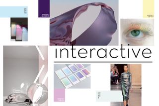
The way we interact with colour is changing. We live in a digital reality in which hyperreal and digital-real aesthetics are so ubiquitous that we often can’t tell the difference between synthetically generated and real imagery.
Realer-than-real effects, once the dominion of Hollywood editing suites, have been democratised through the advancements of CAD technologies so that creatives in wider areas can exploit the possibilities of boundless digital creation, often to a highly experimental degree.
These designers are creating New Age aesthetics. This look and feel suggests boundless movement and is being increasingly adopted by design in the physical world, as product packaging and communication lean towards this idea of an alternative real aesthetic.
One of the new wave of artists and designers exploring the digital aesthetic is Lucy Hardcastle, whose work regularly interrogates the relationship between digital and real-world design.
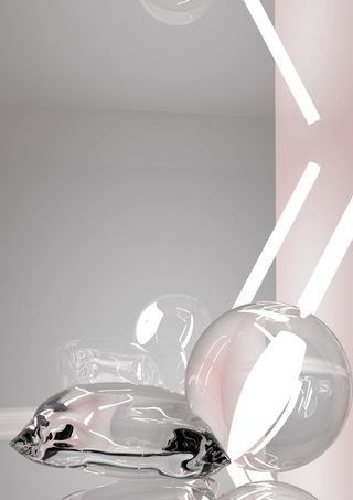
Glow, a collection of abstract, rendered images and objects, uses high-gloss and reflective surfaces, with textures of silk and velvet, to ground the work. Hardcastle describes her palette as “emotive, and atmospheric”, using “millennial” pastels contrasted with strong colour.
We are so used to colour being dynamic, fluid and interactive in our screen-based experiences that we are now demanding the same qualities from physical tangible colour.
Optical effects
A host of product and spatial designers are reprieving the aesthetics of the light and space movement of the ’60s and creating optical effects through reflection, refraction and light dispersion in order to transform environments.
Get the Creative Bloq Newsletter
Daily design news, reviews, how-tos and more, as picked by the editors.
Artists are experimenting with various materials and colour compositions to subvert perceptions of surface and space through use of clever, sensitive colour and light applications. A new generation of designers is picking up the mantle of established light artists, such as Larry Bell and DeWain Valentine, to reinterpret the experimental art movement in tangible forms.
Echoing the principles of the light and space movement, Sabine Marcelis examines how far she can push the relationship between light and materiality.
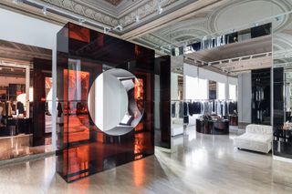
The Rotterdam-based designer uses light as a tool to transform. Mutating the presumed aesthetic characteristics of materials such as glass, mirror and metal, Marcelis’ pieces disrupt paths of light through opaque matter and form tinted reflections.
The Curved Twist screen by Kia Utzon-Frank, in collaboration with Fay McCaul, incorporates 21,500 dichroic rods that have been knitted into the screen in order to create a colour-changing effect. The perceived colour of the screen is unpredictable and totally dependent on the quality of light and the angle of the viewer.
The idea that colour should move is influencing graphic design and visual communication, by way of iridescence and special treatments. Designers are making smart use of special finishes and foil to bring ethereal movement to printed work.
Holographic and iridescent special foils mimic in print the effects achieved by product designers using glass reflective surfaces as well as the fluid gloss quality of hyperreal digital colour. An otherworldly palette synthesises the ephemeral quality of coloured light and is combined with hyperreal pastels.
Next page: More big colour trends for 2018

Thank you for reading 5 articles this month* Join now for unlimited access
Enjoy your first month for just £1 / $1 / €1
*Read 5 free articles per month without a subscription

Join now for unlimited access
Try first month for just £1 / $1 / €1
Current page: Colour trends 2018: Interactive
Prev Page Colour trends: 2017 into 2018 Next Page Colour trends 2018: Primitive