3 huge colour trends for 2018
Creative consultancy FranklinTill reveals the hottest colour palettes to know this year.
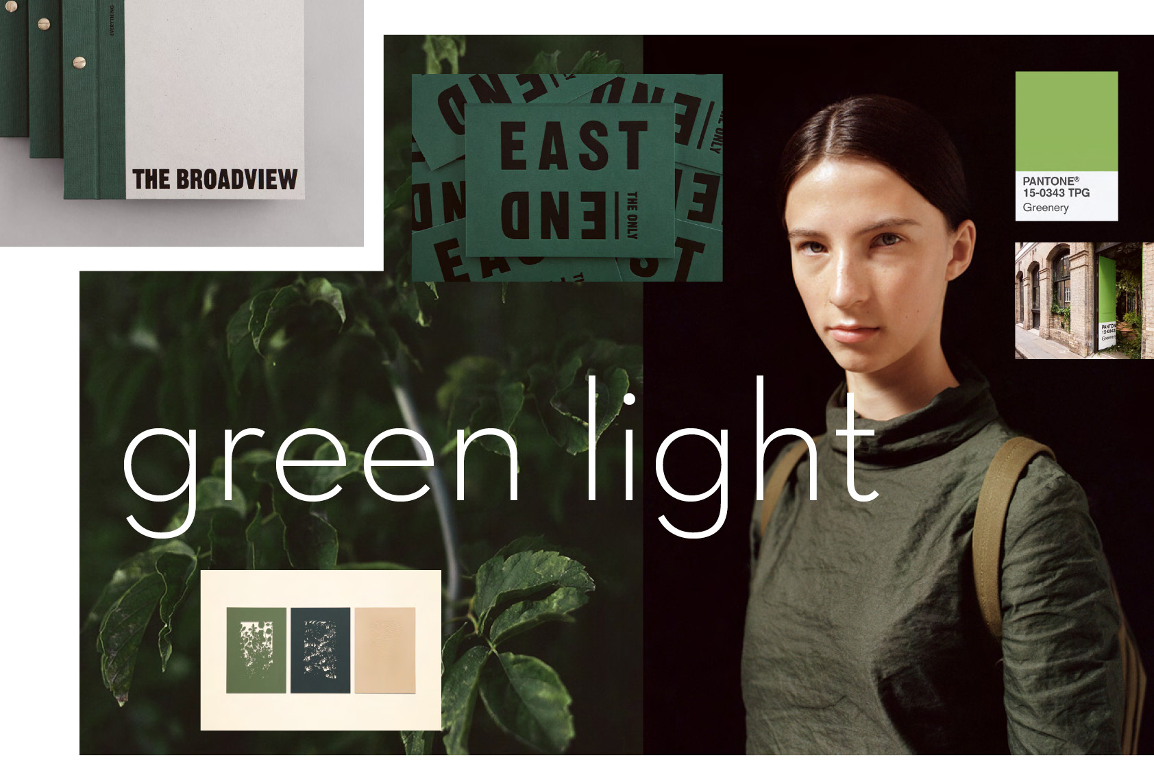
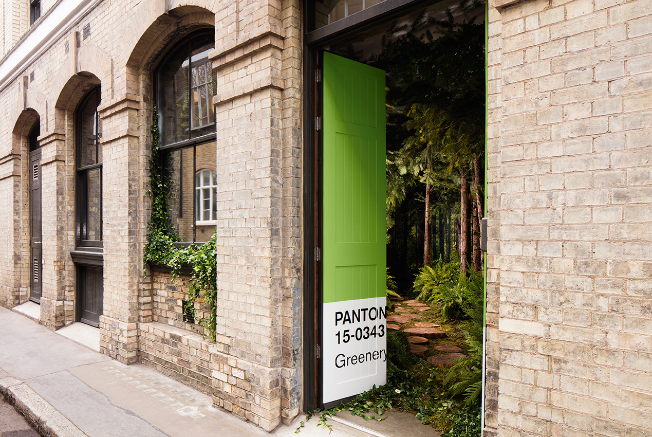
Before analysing the big colour trends of 2018, we’ll first consider the last year. Green had its year in 2017. Not only did Pantone stamp its seal on Greenery for Colour of the Year, but a variation of the hue also won the people’s vote in GF Smith’s World’s Favourite Colour campaign (you might also want to see our piece on graphic design trends in 2018 and the biggest illustration trends of 2018).
2017 also saw the realisation of the impact of our impending urban future come to the fore; the UN affirmed that more than 50 per cent of us live in cities, and owing to our increased urbanisation, pollution levels became a key global concern.
Perhaps then it is no wonder that green – the colour most synonymous with nature and the great outdoors – saw such appeal. Our environments, both work and play, have become awash with greenery, from the cultivation of house plants, window boxes and mini-ecosystems, to allotments, pop-up green oases and even vast vertical gardens.
The biophilia hypothesis
Designers and architects are increasingly buying into the biophilia hypothesis – which states that as humans, we have an inherent need to connect with greenery and the natural world – and are ‘designing-in’ nature to new spaces more and more.
Boutique houseplant stores and city conservatories have gained high design status, while accounts from the likes of plant-loving photographers Haarkon attract hundreds of thousands of followers on Instagram.
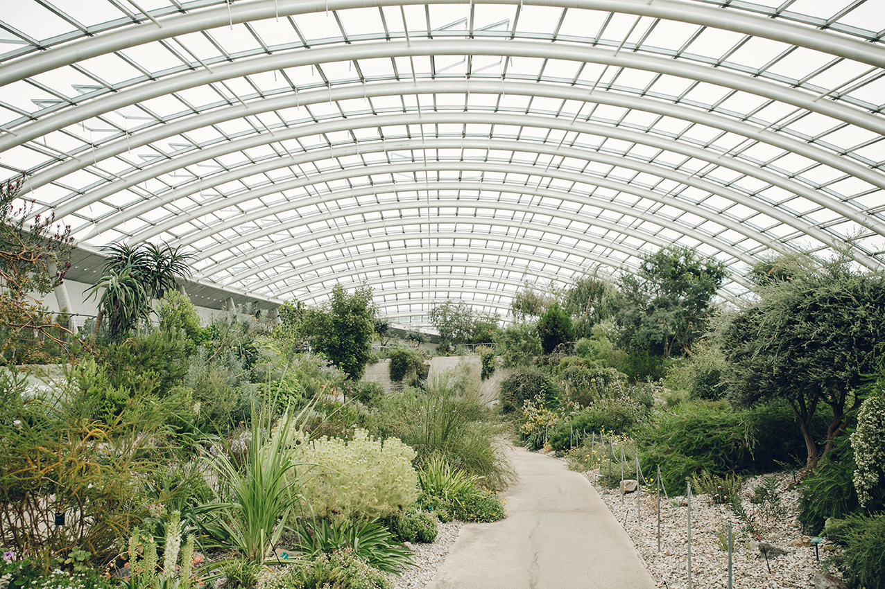
While the grassy shade of Pantone’s Greenery may not have filtered into commercial design on a mass-market level, related green tones and shades have become firmly established across specialisms.
Khaki has affirmed itself a staple shade akin to navy and black, prolific in fashion, while more exotic tones of jade and forest green are combined with rose and warm metals for a luxury aesthetic.
Get the Creative Bloq Newsletter
Daily design news, reviews, how-tos and more, as picked by the editors.
GF Smith’s World’s Favourite Colour campaign invited people to engage with an interactive website in order to finely tune and select their personal favourite colour from a seemingly infinite spectrum. The colours submitted were analysed to pinpoint ‘the world’s favourite’ and ultimately saw Annie Marrs’ teal-esque green initiated into the paper manufacturer’s Colourplan range.
Luxurious greens
Last year, we predicted the onset of an Engineered Nature palette, in which organic shades work in synergy with scientifically manipulated synthetic greens. As we enter 2018, we are seeing shades of green in design expand beyond the expected.
What began as the pursuit for a greater connection with nature – with organic greens infused into spaces and products – has evolved into more luxurious uses of green, engineered nature and the emergence of Art Deco and tropical luxe-inspired palettes.
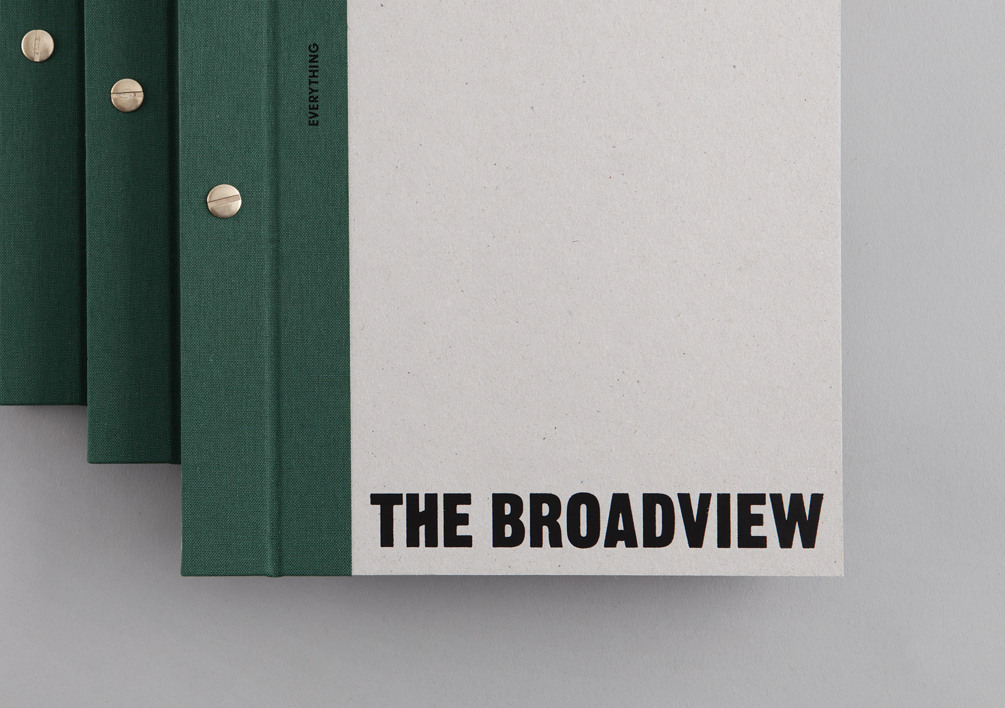
Over the next few pages, we provide you with the key colour trends for 2018, with the insights driving these palettes. At FranklinTill we don’t believe in reporting flash-in-the-pan seasonal trends. Trends don’t simply disappear, but movements gather momentum and colour palettes evolve, manifesting in different ways as they move from the periphery towards the mainstream. Neither do we believe in mimicking great design in an attempt to be ‘on trend’.
We aim to draw attention to the people behind emerging design movements and celebrate their creativity. So read on to discover three such movements, and the palettes that reflect them...
Next page: 3 huge colour trends to know for 2018

Thank you for reading 5 articles this month* Join now for unlimited access
Enjoy your first month for just £1 / $1 / €1
*Read 5 free articles per month without a subscription

Join now for unlimited access
Try first month for just £1 / $1 / €1
