Colour in Photoshop: top tricks
Discover how to paint with muted colours and create a festival scene tinged with nostalgia, featuring Hong Kong’s Lion Dancers.
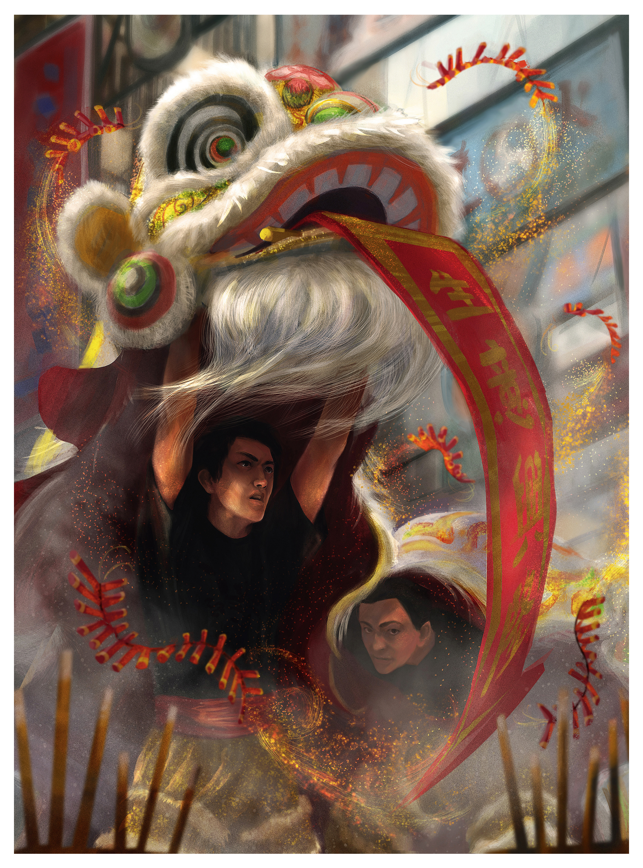
This image is part of an ongoing personal project called Hong Kong Heroes. Its purpose is to celebrate the unsung heroes of Hong Kong culture, many of whom are disappearing or possibly no longer exist as I remember them.
For this project, I’ve experimented with ways of taking greyscale compositional sketches into full colour to represent this city of vibrancy and high contrast. Knowing your intentions before starting a project is a good way to maintain consistency, and here I want to invoke a sense of nostalgia in the viewer, represented by the muted colour.
Because they’re personal icons, drawn from my teenage memories, a lot of research is required before starting each image and all manner of things can distract you from your initial intent. Being selective with your reference and having a good idea of what the basic palette will be is a good way to keep everything on track.
This image features lion dancers who perform during festivals and celebrations. These festivals are a hive of chaotic activity, but since the objective for this project is to put the characters centre stage, I chose to focus on the dancers’ faces, framing them in areas of calm among the chaos to show their concentration and focus.
For this image I’ve made use of various Photoshop effects to create a piece that’s both colourful and harmonious.
01. Deciding on a composition
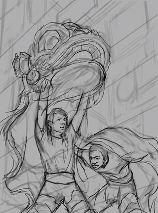
I always start with basic compositional thumbnails before moving on to a more detailed sketch. At this point I already know that I want a lively scene, with the faces of the dancers framed by calm. So I try to establish a rhythm that keeps the eyes moving, ending with them resting upon the faces.
02. Blocking in the values
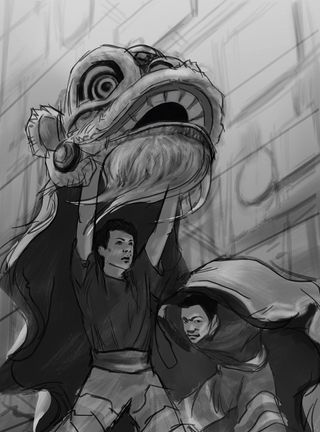
Once I’m happy with the rough sketch, I separate the elements into their own layers and start blocking in the basic values. I do a rough lighting pass using a Levels adjustment layer, which I mask and paint into. This helps me to check the overall composition and value structure before I move to colour, and I use it for reference later on when I get into lighting.
Get the Creative Bloq Newsletter
Daily design news, reviews, how-tos and more, as picked by the editors.
03. Taking the first steps into colour
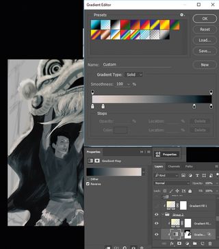
A technique I like to use when initially switching to colour is a Gradient Map Adjustment layer. Here I’ve changed 25 per cent to a light yellow and 75 per cent to a pale blue, but I’ve kept the black and white as is. The colours are subtle, but because this is still just an underpainting, I find it gives the paint something to grip onto.
04. Using Color layer blending modes
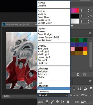
I then start applying colour to characters on a layer set to Color in the blending modes. I’m painting with Pen Pressure so that some of the blues from the Gradient Map show through in the shadows, giving this initial colour pass a bit of variety.
05. Google Dodge layers add vibrancy
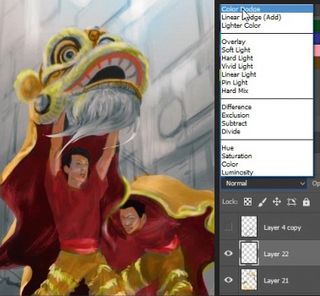
I start painting on a Color Dodge layer to punch up the colours. This affects the values dramatically, so it’s important to be careful or be prepared to knock things back later on, as I eventually do. I want to keep the lighting as diffuse as possible.
06. Painting the background
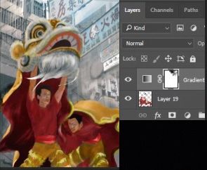
For the background I use a combination of photo textures and painting. I then duplicate the Gradient Map I made earlier for the characters and apply it to the background. I do this to maintain a uniform colour temperature throughout the image, so that all the elements feel like they’re in the same scene.
07. Actual painting - it's unavoidable
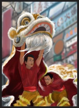
There’s only so much that layers modes can do and eventually I have to start painting for real. I use the Eyedropper to sample from the canvas and adjust the hues slightly to maintain a colour relationship. I give the characters some form by adding some loose occlusion shadow, but I’m not adding directional light and shadow just yet.
08. Wrangling colours
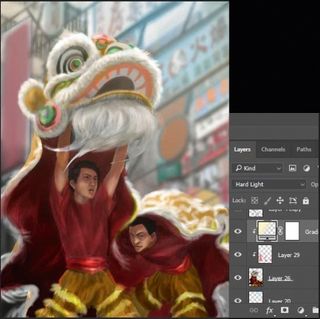
There are a lot of colours going on now, after applying photos to the background. I normally only use photos for texturing, so I wrangle my palette back using a Gradient Adjustment layer over the top set to a low Opacity on the Hard Light blending mode.
09. Checking the read
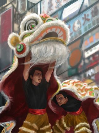
I initially wanted the character and lion costumes to blend into each other, but after stepping back I decide that this detracts too much from the characters and the overall read of the image. To separate them from the lion, I shift their shirts to a black-grey tone of similar value, again using a layer set to Color mode.
10. Separating planes with atmosphere
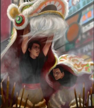
I’m keen to add a bit more depth to the image. It’s crucial to consider clear front, middle and background planes to create a sense of space, so I add joss sticks as foreground elements and use smoke to help separate the planes and add atmosphere.
11. Direct lighting
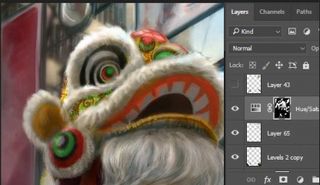
I start my direct lighting by creating a darkened Hue/ Saturation adjustment layer and mask in some of the areas in shadow. I then use a layer set to Color Dodge to paint in some areas of direct light on the faces. A window of light just hitting the side of the lion’s face should be enough to draw the eye.
12. Adjusting the composition
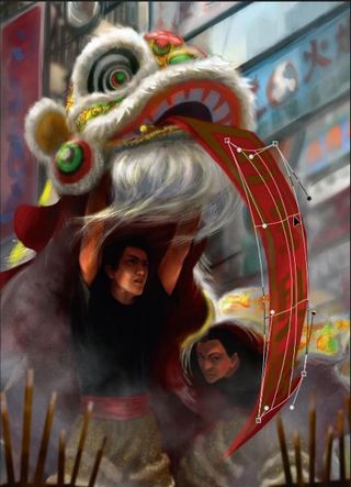
At this point in the painting process I find that the diagonal lines of the background lead the eyes off the page. I need a compositional element that will bring the eye back into the scene. My solution is to add a celebratory banner and some fringes to the lion costume, which gives the whole composition more movement.
13. Unifying the colours
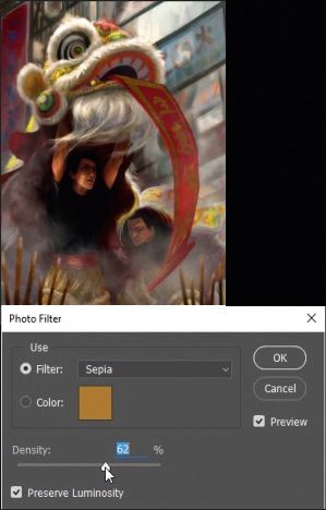
For the image to feel nostalgic, the colours need to be less vibrant. The answer is to mute the colours and add some colour harmony, so I slap on a sepia photo filter (Edit>Adjustments> Photo Filter). This unifies the colours, knocking back the blues and greens to leave a warm, nostalgic palette that ties in with my aim of recreating a scene from my memories of Hong Kong.
14. Ending with a bang
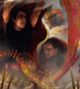
I prefer to leave any visual effects to the very end, so to finish the image off I give the image a final bit of sparkle and pizzazz. I add some magic firecracker dragonflies that help lead the eye around the image and add a sense of celebration.
This article was originally published in ImagineFX magazine issue 142. Buy it here.
Related articles:

Thank you for reading 5 articles this month* Join now for unlimited access
Enjoy your first month for just £1 / $1 / €1
*Read 5 free articles per month without a subscription

Join now for unlimited access
Try first month for just £1 / $1 / €1
