Build a better personal brand
Learn how a little self-love can help make you more attractive to potential clients and collaborators.
08. Present your work through the right lens

With its 15th anniversary in sight, a couple of years ago, London-based design practice Studio Output worked with a consultant (and former client) to identify how it could reshape its internal positioning. The result was a dramatic new strategy that recalibrated all its projects through the lens of problem-solving.
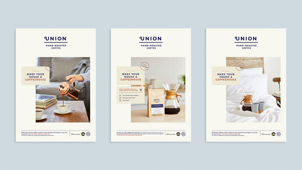
Its identity for Union Hand-Roasted Coffee is headlined as 'Supporting scale-up of a fast-growing business' for example, and its branding of Viber 'Driving user acquisition and retention in a congested market'. "The biggest issue for clients is they're going to have a big problem you need them to solve," says Studio Output's client services director Gemma Ballinger. "If you can show that quite succinctly through other work, then it's going to resonate with them."
The repositioning also involved updating the questions that the Studio Output team ask clients in order to ensure the team has solid KPIs to work towards, and by which they can assess their effectiveness at the end of a project. This set of questions was distilled to a skeleton version, which was then used as a script for their website landing page's showreel.
Many studios – from ustwo to Made Thought to ILoveDust – greet visitors to their sites with a film featuring their best projects. Whereas ILoveDust's is moody and atmospheric, ustwo prioritises its R&D model. "If clients are really short on time, it might be all they need to see," adds Ballinger.
Whether to show sketches, research or opinion pieces is another key factor when defining your brand. Dark Igloo is keen to show the development of its projects, an approach shared by motion specialists ManvsMachine and Universal Everything.
"Usually the bottom half of the project on our site is behind-the-scenes imagery," says Miller. "That's not just to show you that this can be done on a small scale, but it also represents that we pride ourselves on having fun sets and making things that don't feel like work."
But don't panic if presenting work is not an option. Dark Igloo didn't show any projects for its first three years and freelance designer Craig Jackson, whose clients include Google, BBC, Apple and HSBC, still doesn't. "It was getting really hard to actually show the work due to NDAs so I thought it was time to take things offline for a bit to see what happens," says Jackson. Luckily it was a risk worth taking, with the added bonus that it allows Jackson to handpick work for every project. "The general mystique of it all also seems to go down really well."
Get the Creative Bloq Newsletter
Daily design news, reviews, how-tos and more, as picked by the editors.
09. Consider 'brand in the hand'

Just as Dark Igloo's '80s TV-inspired landing page presents the studio as inventive and fun-loving, its brand is similarly thoughtful when entering the physical realm. Instead of business cards, the duo make lighters to give to potential clients and collaborators.
"People would always take ours," shrugs Miller. "When we added the characters people started going crazy. You would bump into someone that you hadn't seen in 10 months, and maybe they didn't remember you exactly, but they definitely still had that lighter. It was an incredible touch-point."
When it first started out, Dark Igloo gave any client taking on a major project with them badges based on a patch that the crew of the Nostromo wore in the film Alien. "It was to show we were going on a journey together," says Franzese.
Similarly the studio wooed potential clients by sending them lighters inside boxes that were inspired by old Sega packaging and featuring its Contacts page game. "Put ultimate care and craft into something you'd want yourself and share it with someone as a gift," Franzese adds.
The same is certainly true of Double Standards' foray into branded products. Its calendar – which is sold through its online shop, as well as distributed to collaborators – began as something sleek and functional for the studio, and was soon requested by a visiting client. Now, making them is an annual tradition. "Every November I get the first email asking when the new calendar is out," laughs Double Standards' Chris Rehberger.
Similarly, the necessity to create other functional products for projects, and the subsequent interest on Facebook, inspired the studio to design a lamp and table, both now stocked in one of Berlin's coolest concept stores, Andreas Murkudis. Double Standards even opened a physical shop in October.
Even though it operates in a very different landscape, Studio Output also suggests creating something useful when sending mailers. To celebrate its 15th anniversary, the studio gave prospective clients a brainstorming pack complete with branded notebooks, Sharpies, Post-it Notes and a set of thought-starter postcards.
These featured Studio Output projects on one side and related advice on how to do things such as write briefs on the other. "We do find that things we send physically – because people don't get them much any more – do have a good impact," says Ballinger. "You've just got to make sure you follow it up properly."
This article was originally published in Computer Arts – the world's leading design magazine. Subscribe to Computer Arts here.
Related articles:

Thank you for reading 5 articles this month* Join now for unlimited access
Enjoy your first month for just £1 / $1 / €1
*Read 5 free articles per month without a subscription

Join now for unlimited access
Try first month for just £1 / $1 / €1
