Boost your illustration career with these 6 tips
How to become a successful illustrator (and enjoy yourself along the way).
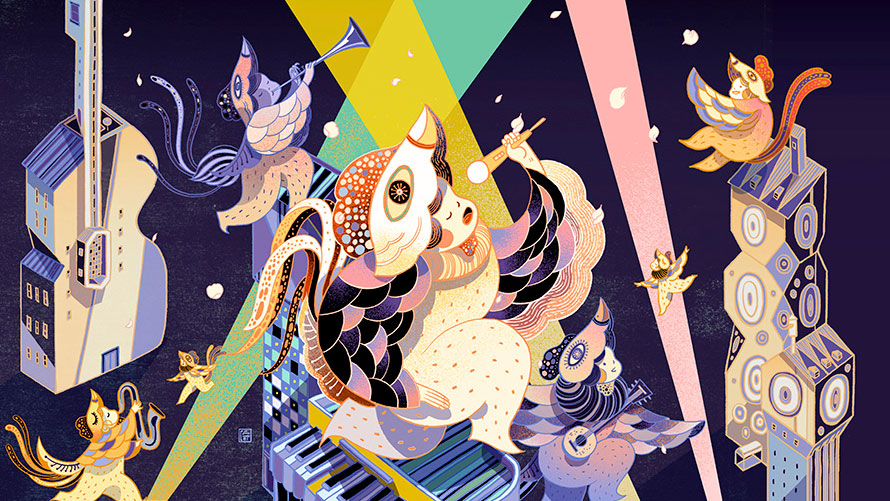
As a child, Victo Ngai didn't really fit in. She had moved to Hong Kong from mainland China, didn't really speak the local dialect and didn't have any friends. She discovered that she could create her own friends on paper, and those friends were actually "way cooler than the people at school".
All that time drawing as a child has led to a successful career in illustration. Ngai has won multiple awards, including from the Society of Illustrators, and works for clients such as The New Yorker, Dreamworks and Apple. At OFFSET Dublin this weekend, she shared some insight into how she's got to where she is, and how all illustrators can approach their work and career differently in order to get where they want to go, and more importantly, take more joy from it. Here's her advice.
And if you are looking for a new career direction – in illustration or another creative field – then don't miss our design jobs page, which lists plenty of opportunities.
01. Don't take yourself too seriously
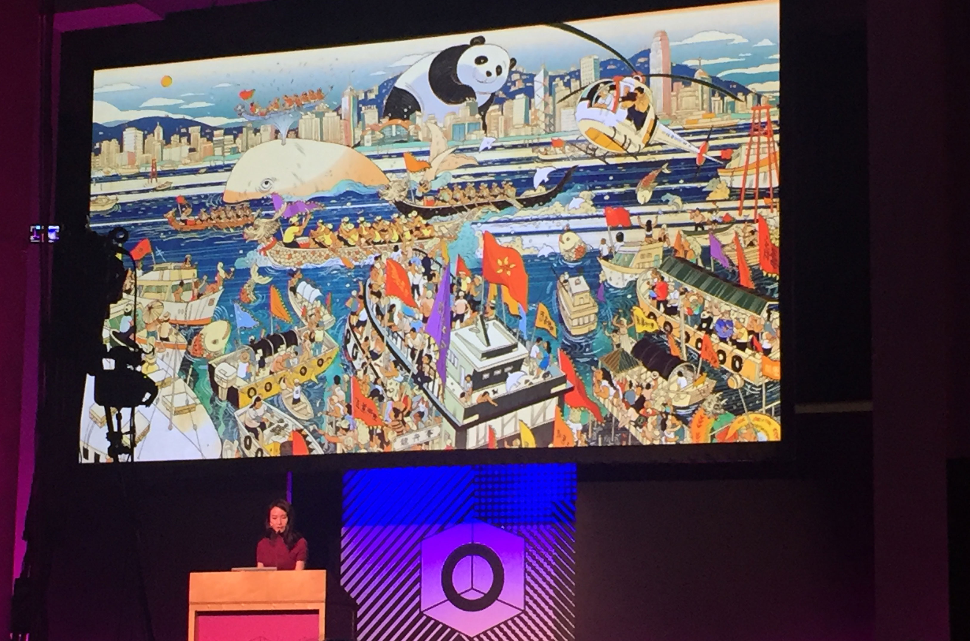
Ngai moved to the States to go to art school, and once there, she found she was bottom of the class, even though she was working hard. "While trying to pursue a passion, I stopped enjoying myself and lost my voice," she recalls.
In the end, once her teacher had pointed out what he really wanted to see was work more like the doddles in the sketchbook, she started enjoying drawing again. "I stopped worrying about coming up with something really grand, and instead just started documenting little funny moments in life," she says.
02. Don't worry about the future
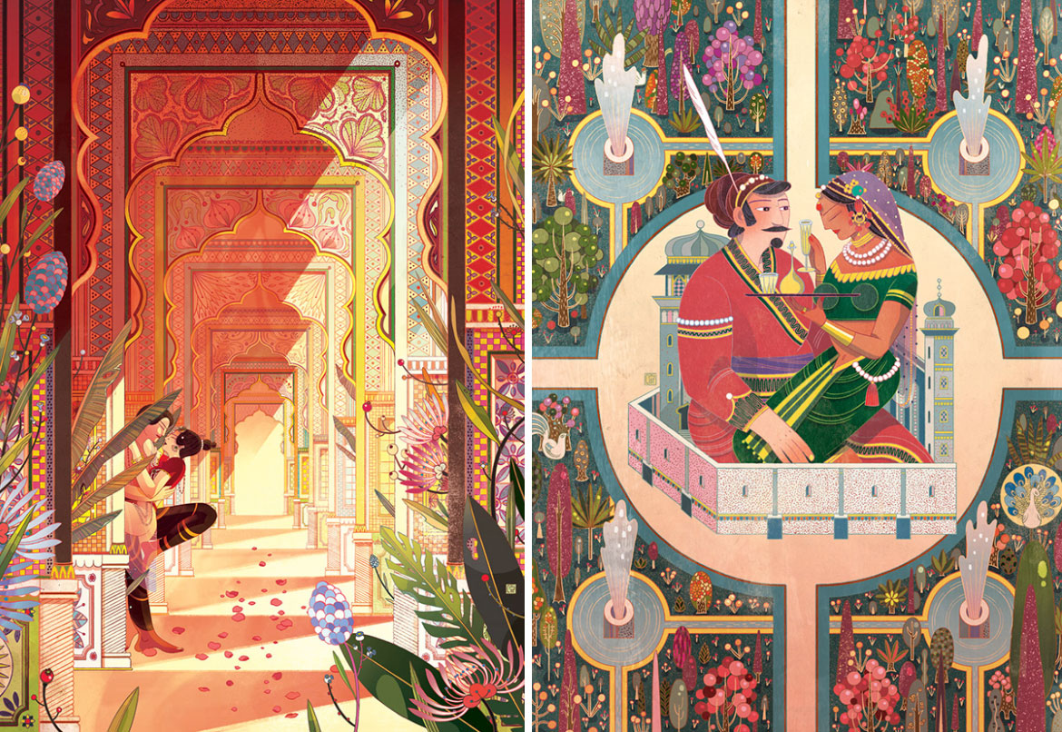
Around the same period, Ngai became concerned that she would become a "one-trick pony. I was worried I was going to end up doing the same thing over and over until I died," she says. "I was 21 at the time."
I couldn't figure out how to get over this so I just ignored it and carried on, she explains. "It's kind of pointless to worry about things I'm not ready to tackle. My energy is much better spend focusing on the now and making sure I'm giving everything my best shot."
Get the Creative Bloq Newsletter
Daily design news, reviews, how-tos and more, as picked by the editors.
03. Push yourself
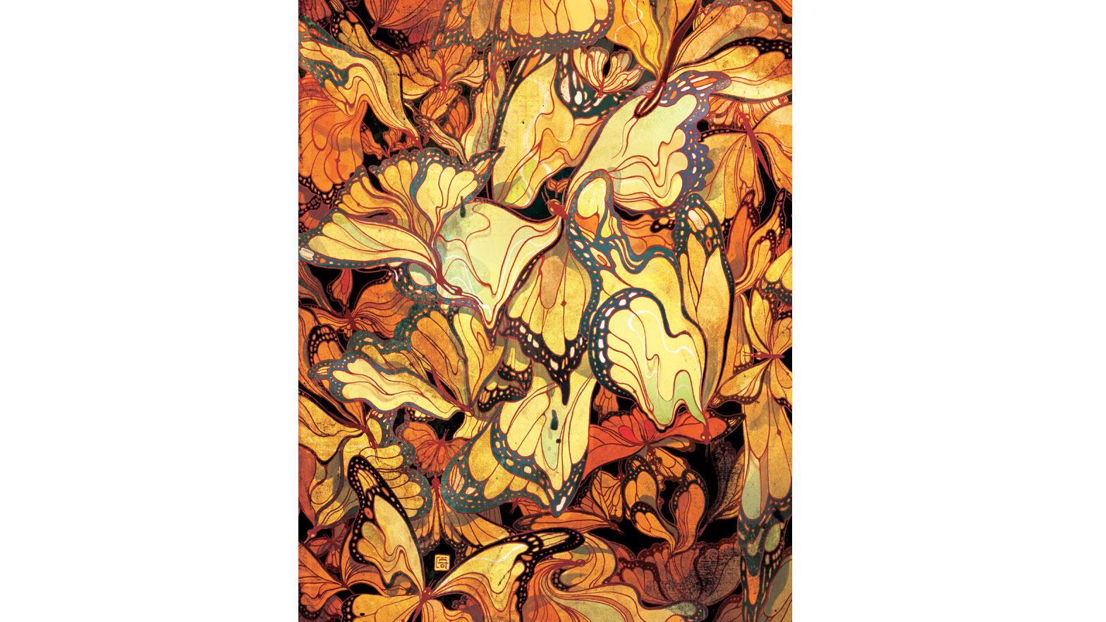
"Usually it's the last 10 per cent that separates a mediocre piece from a good piece," says Ngai. "And it's the last one per cent that really makes it."
Ngai gives an example of when she was working on a piece for The New Yorker, which showed butterflies as leaves. It was approved, she says, but she wasn't happy with it. She asked for more time and discovered that she really liked a 'melty' sort of look she was able to achieve with the Liquify tool in Photoshop. But as using this tool meant the image wouldn't be high enough resolution for print, she ended up remaking the entire illustration. And she thinks the piece is much better for it.
04. Find the fun part
"There are no boring assignments," says Ngai. "Only boring solutions." There's always something you can find in an article that's interesting. When choosing a way to go for an image, aim for "something you'll enjoy that captures the spirit of the story without giving away the ending."
Don't be afraid of adding personal touches in your client work, either. In one piece of client work, Ngai added a fox, because she likes foxes. Though if the client had asked why it was there, she stresses, I would've said it's to bring out the red in another part of the piece. "But really it's just to make myself happy."
You also need to tell your story with strategic composition. "Illustration is like a puzzle," says Ngai. "You have to make every piece fit for the whole thing to work."
05. Turn limitations into assets
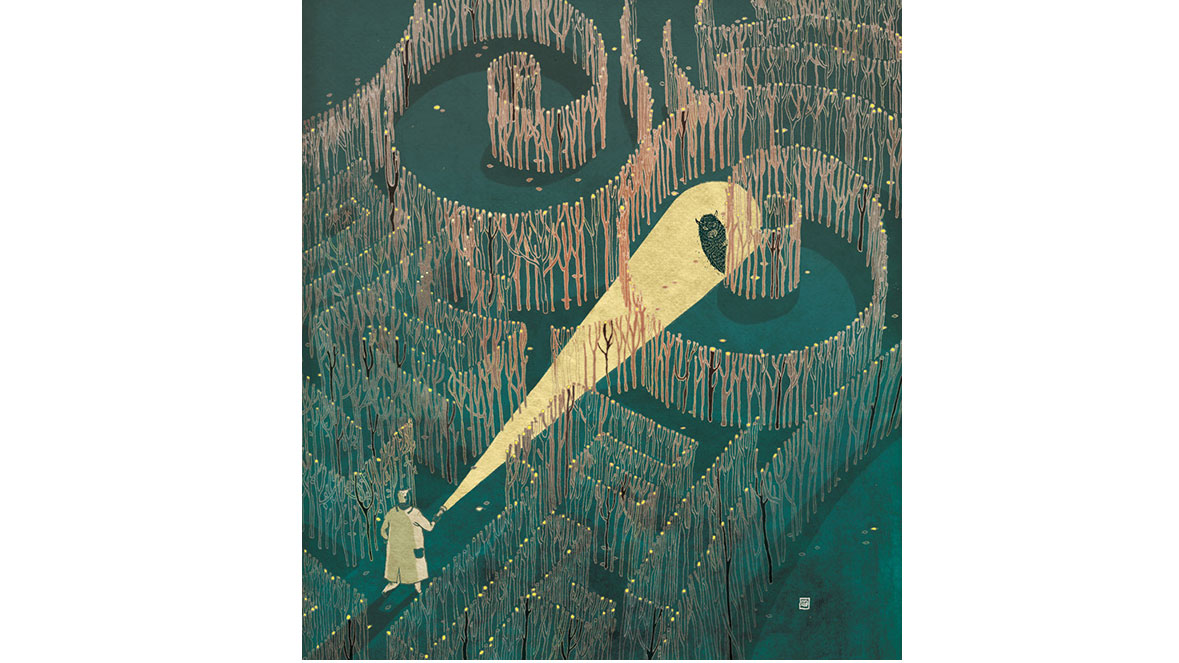
When you get a brief that seems like it might be dull or complicated, it's your job to think about what you want to draw, and see how you can work that into the brief, says Ngai.
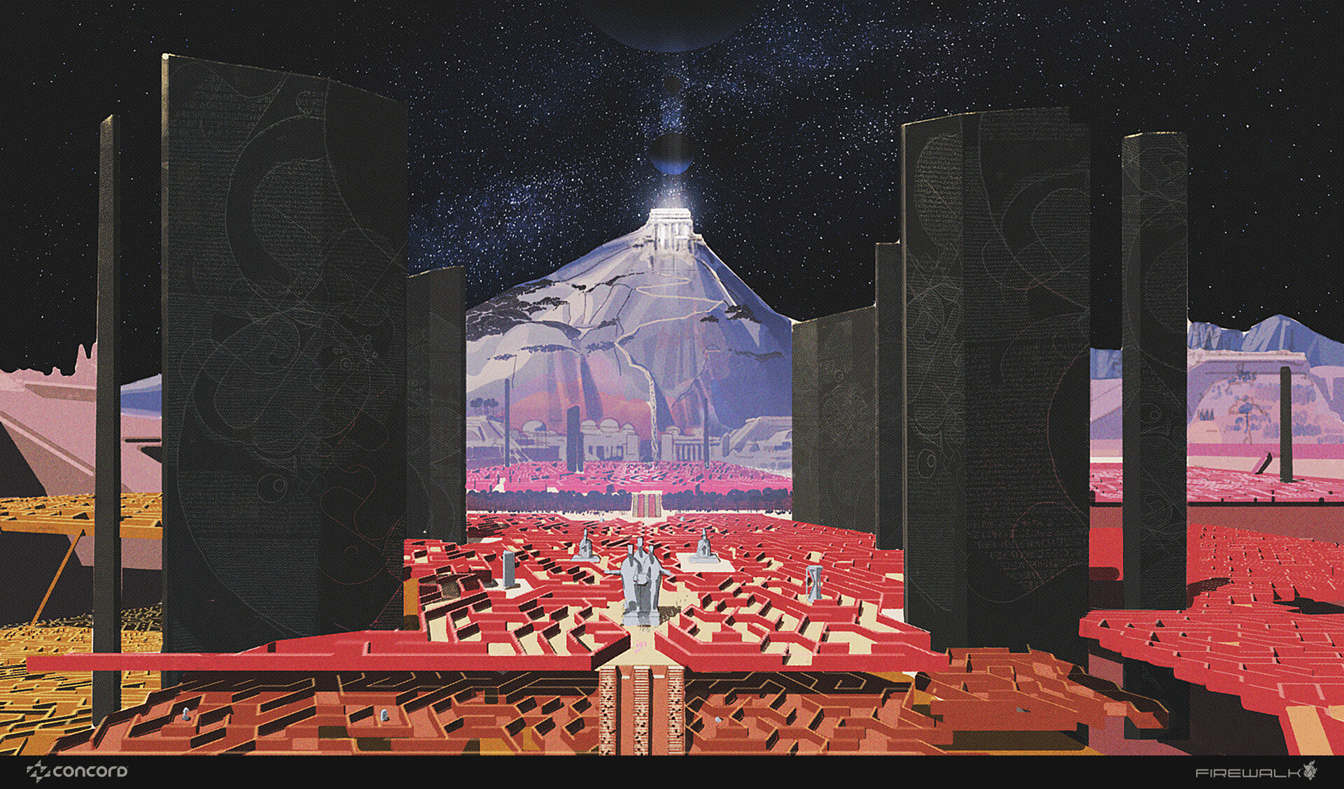
She gives the example of a piece of work for Cincinnati Magazine. The article was about new imaging technology that helps doctors accurately locate cancer cells. There were several potential problems in the piece, she didn't want the piece to be too dark or negative – for serious subjects like this, sometimes a lighter tone is needed – she didn't want to include images of breasts, as that isn't allowed in American magazines ("unless you're Playboy"). On top of that, she didn't know what this new imaging technology might look like.
Instead of despairing in this, she had to come up with a metaphor, and chose to use a maze. This is a cliché, she says, "but clichés are clichés for a reason, they're powerful signifiers. People know what you're talking about."
If you have one strong cliché in your work, you can use it as a "Rosetta Stone for the viewer to decode the other metaphors in your image," she says. "They should be used with caution, but if you can make them visually engaging, then go ahead."
In this image, she concludes, "The result is more interesting because of the limitations."
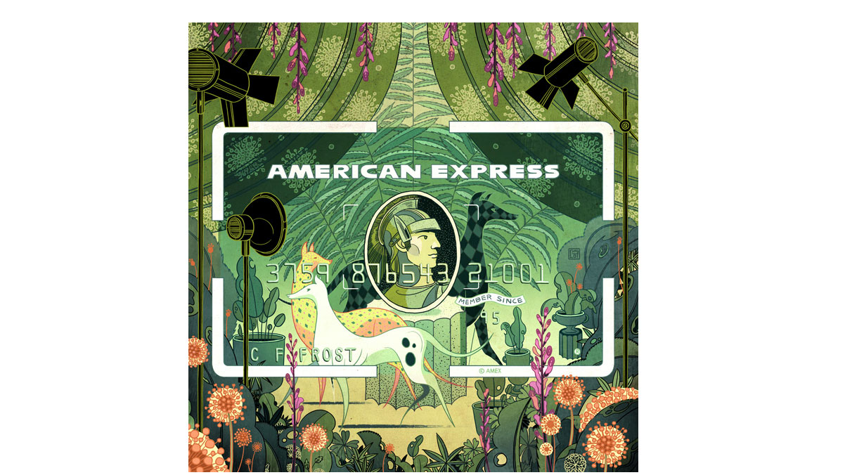
A similar thing happened with her illustrations for American Express. She found the edges of the card to be a limitation, and so turned them into an asset by making the card's border a key part of the piece.
06. Find your niche
Finding the right clients is key, says Ngai. "Why shouldn’t you find your own niche and cultivate your list of clients who appreciate what you do? The best work comes out when the other person trusts you, and you trust them to trust you."
You also should be careful of doing too much work that you're not interested in or not proud of. "What we get hired for is what goes into our portfolio, so if we keep making concessions, we’ll get further and further away from the feeling we had when we had when picking up tools as a kid." So if you ever feel you're making concessions, just remember it was when Ngai rediscovered that childlike delight in drawing that her career really began.
Images: Victo Ngai
Read more:

Thank you for reading 5 articles this month* Join now for unlimited access
Enjoy your first month for just £1 / $1 / €1
*Read 5 free articles per month without a subscription

Join now for unlimited access
Try first month for just £1 / $1 / €1

Rosie Hilder is Creative Bloq's Deputy Editor. After beginning her career in journalism in Argentina – where she worked as Deputy Editor of Time Out Buenos Aires – she moved back to the UK and joined Future Plc in 2016. Since then, she's worked as Operations Editor on magazines including Computer Arts, 3D World and Paint & Draw and Mac|Life. In 2018, she joined Creative Bloq, where she now assists with the daily management of the site, including growing the site's reach, getting involved in events, such as judging the Brand Impact Awards, and helping make sure our content serves the reader as best it can.
